tecznotes
Michal Migurski's notebook, listening post, and soapbox. Subscribe to ![]() this blog.
Check out the rest of my site as well.
this blog.
Check out the rest of my site as well.
Dec 30, 2008 9:54am
oakland crime maps XI: how close, and how bad?
Did you know that Oakland Crimespotting is still kicking hard, with hundreds of alert subscribers and a smooth, regular flow of timely data from the Oakland Police Department? The project has essentially been on auto-pilot since we re-launched it back in March, but holiday side projects have been a favorite activity of mine for years, so this time I'm thinking about the relatively short time horizon Crimespotting offers.
The current interface offers up to a month's worth of highly granular information on individual reports, and you can quickly get a sense for how active a given neighborhood is by digging around a little, doing a few searches, and checking out details on local crime reports. What we don't have is a long view.
Heat maps are one effective way to present large volumes of aggregate data over a geographical area, so I've been exploring ways to make them legible for crime data.
There's a ton of existing work out there in this area to draw on, some of it good and some of it dreadful.
First and foremost is Martin Watternberg's seminal Map Of The Market, a live and non-geographical view of stock trading activity, that celebrated its ten-year anniversary this past year. MOTM shows volume and change over time in a tight, clean, effective package most recently notable for showing how Campbell's Soup and gold mining managed to weather the recent precipitous drops in the Dow.
A more topical geographic example is Microsoft Research project How We Watch the City: Popularity and Online Maps. Danyel Fisher used server logs from Microsoft Virtual Earth tile servers to show viewing patterns around the world, with the beautiful results shown here.
Finally, HeatMapAPI offers commercial support for making your own heat maps.
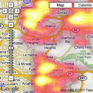
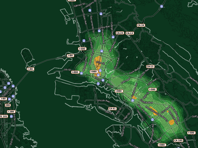
The results of HeatMapAPI's software actually illustrate a few of the things I've found weakest about geographic heat maps, a big excuse for why we've not done them for Oakland Crimespotting so far. There are two big shortfalls in the screen shot above: the data obscures the context, and simultaneously fails to communicate much in the way of specifics. The two primary questions you might want to ask of your data are "where?" and "how much?" The answers offered here are apparently "in a place near Whittier whose name I can't read" and "yellow".
So that's the starting point.
The answer I've settled on for the "where?" question is OpenStreetMap. I've been growing steadily more excited about this project for some months now, in part because it offers up the possibility of playing some beautiful visual games with high quality street data. In the HeatMapAPI example above, the context problem arises from the impossibility of manipulating Google's map data at any level more granular than their pre-rendered tiles. The overlays obscure the town and street names that help give them meaning. With OSM data and Mapnik, it's possible to create a semi-transparent streets layer specifically designed to interact well with underlaid data. It took just an afternoon's worth of modifications to my existing OSM visual design to come up with something suitable for layering with quantitative data. Gem helped tune the visual interaction between layers, so now there's a directly-overlaid set of names and icons above a translucent (25% - 50%) black street grid. Each of these layers is a separate Mapnik style, composited with the underlying color heat map.
In these maps, streets have been stripped back to translucent dark stripes, with white edges showing where the shoreline of the Bay begins.
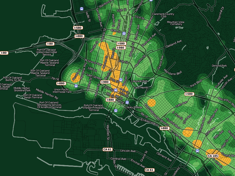
The second question, "how much?", is somewhat more interesting. The difficulty with continuous, analog data lies in communicating something of relevance and urgency in it. If the map is orange, what does that mean exactly? Will my car get broken into?
One approach I've been prodding at takes advantage of a neighborhood sense for time and space. People know how big a city block is, how it feels for a month to go by. We know something of this in our database of crime reports too, so the colors in these experimental designs are keyed to specific meanings. Orange here denotes areas where, on average, the police respond to a call once per month for every 100m x 100m city block. Inside orange, there are two more divisions shown as brighter, hotter colors: two weeks and one week. For the police to show up right on your block every week is quite heavy, and there are just a few places in town that see this kind of activity. Outside orange, there are divisions of green that represent an additional month of peace and quiet for every block at each step.
At this level, you can start to see where OpenStreetMap data really begins to shine: all those little flag icons represent Oakland public schools that I added to the OSM database specifically to have such local data available to Crimespotting. The Microsoft Virtual Earth maps we use on the current site are beautiful, but they aren't particularly helpful in the way of local, civic data relevant to a consideration of police activity.

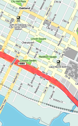
As the map zooms in closer, large amorphous blobs particulate into smaller, more granular bleeps and bloops. When you start seeing individual blocks in the map, you can also see individual corner hot spots. Here, the two downtown Oakland BART stations, a slice of MLK between 14th and 16th streets, and the area immediately around Oakland Police headquarters on Broadway and 7th are especially hot. The colors at every zoom level continue to mean the same things: always orange for "once a month, once per block". The colors here are cribbed from Cynthia Brewer's cpt-city work, a combination of YlGn and Oranges.
I'm happy that Lincoln Elementary School seems to sit in a safe zone of relatively low crime.
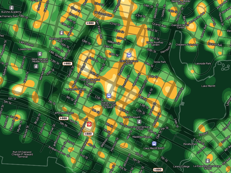
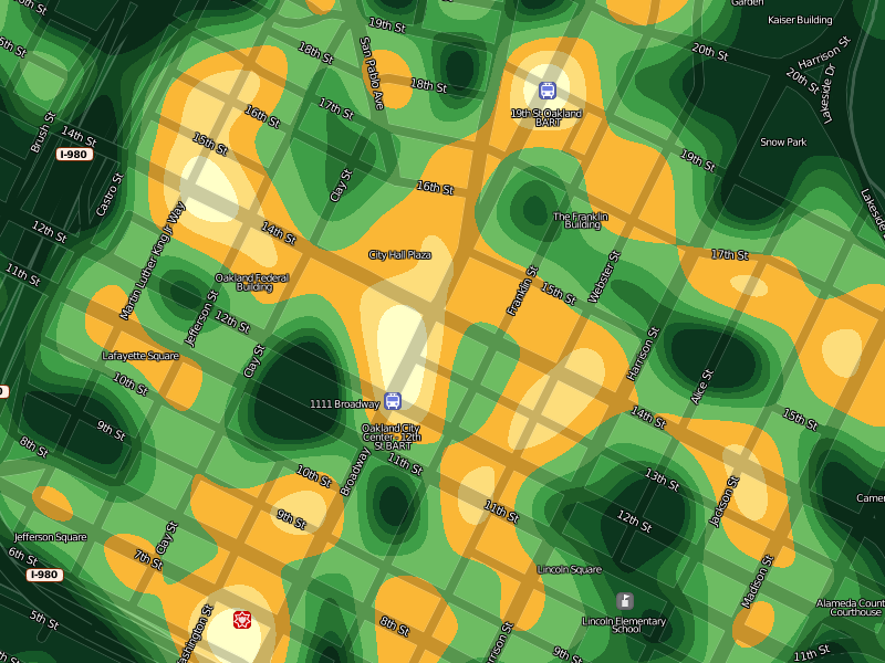
At a certain point, increased granularity becomes a problem. Our data is really only accurate to the city block level, so it doesn't make sense to generate a heat map more specific than this. The smooth, swooping whorls at the highest levels of zoom help to communicate the relative imprecision of the data at this level.
Overall, I'm happy with the results so far. These images are being generated through a combination of GDAL, Mapnik, NumPy and PIL. They're not yet ready to be integrated into the Crimespotting site proper, though I imagine that the first place they would eventually show up would be on the static map beat pages. I'm interested in comments or criticisms on how to improve the beauty or clarity of these results, before they're pushed in the direction of a proper release.
Dec 9, 2008 7:09am
making friends with hill shading
Living in a city that's quite hilly in places, street patterns make a lot more sense if you can see how they interact with the landscape. The inclusion of elevation data adds legibility to a map, and in the case of the Bay Area it's also interesting to see how overall urban development hugs the flatlands in most places. My goal here is still a beautiful map of Oakland for use with Oakland Crimespotting, with street-level details like schools, hospitals, and major buildings included.
I've just pushed a major update to the Bay Area cartography I've been working on. When I last posted about it in September, I had just added the Cascadenik CSS preprocessor to Dane's mapnik-utils repository. I was inspired to investigate elevation data by Andy Allan's addition of hill coloring to his award-winning OpenCycleMap project, and spurred on by finding the USGS BARD 10-meter elevation data for the San Francisco Bay Area.
Data
Turning a bag of digital elevation model (*.dem) files into shaded hills integrated with OSM map data is a multi-step process. Each file covers a rectangular area, and contains elevation in feet or meters for each included point. This is the northern part of San Francisco with Angel Island and a small bit of Marin showing. I exaggerated the colors somewhat to make it more obvious what the data contains:

Shading
OpenCycleMap doesn't actually use elevation data to simulate shadows; instead it's used to color the ground shades of green or brown, and to provide isolines. They look like this:
Andy told me that he used PerryGeo's DEM utilities to do his coloring, so I started there. It was a bit of a hassle to get hillshade.cpp compiled (see my comment on that page from Nov. 18), but eventually I was able to convert elevation files to GeoTIFFs with shading like this:
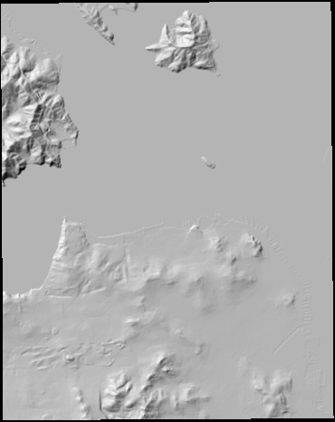
Now I had two problems. One was that the shading algorithm trims a single pixel off the edges of its input, because it can't correctly figure out the slope on the border of an area without data. The other was that the BARD *.dem files are published in a mix of meters and feet, so some sections appeared to have an exaggerated height compared to others. Happily, the heavy lifting of dealing with geographic raster data turns out to be mostly handled by the amazing GDAL library, so it was easy to write a Python script to stitch adjoining elevation files together into larger, overlapping, normalized panels and adjust for the feet-vs.-meters problem (stitch.py, 8K). It was also easy to port the C++ hillshading program to Python, which let me fine-tune some other annoying problems around the edges (hillshade.py, 4K).
Tiling
The library I use to generate map tiles, Mapnik, has a way to get raster images into a map, but it doesn't yet support niceties like warping or smooth interpolation. I still have a giant bag of multi-purpose tiling code sitting around from all my flea market mapping experimentation, so this turned out to be an easy step. I warped and tiled all the overlapping bits of shaded hill into a smooth, grayscale tile set that covers the entire SF Bay Area up to zoom level 15.
I've posted all of these hill shaded tiles to their own S3 bucket, so they can be used in slippy maps by anyone. The URL format for these is http://hills-bayarea.s3.amazonaws.com/{zoom}-r{row}-c{column}.png, e.g. Mt. Tamalpais and Mt. Diablo seen here:


I've also included a permissive crossdomain policy file, so these can be used in Flash unencumbered.
Compositing
The other thing lacking in Mapnik's RasterSymbolizer is a way to choose how a raster image visually combines with other cartography, so this ended up being a somewhat custom operation as well. I started with the OpenStreetMap style.mml style file I included as part of Cascadenik example data. I moved some roads up and down in the layering order, and made it split cleanly into two separate styles: ground.mml for ground cover, parks, and roads at very low zoom levels, and figure.mml for labels, buildings, bridges, symbols, and so on. The idea is that figure.mml and ground.mml together should look identical to style.mml, but that the split provides a convenient place to slip in a grayscale set of hills to lighten or darken the ground as necessary.
I implemented a version of Photoshop's Hard Light transfer mode because it seemed to look best in this situation. I also added a feature request to Mapnik in the hopes that this sort of thing will be a built-in feature of the library sometime.
Ta-Da
Check out the current version of the map for the results. OpenStreetMap and OpenCycleMap's own tiles are included on that page for comparison. If you see a mistake, you can correct it yourself or just mark it as a bug.
Nov 27, 2008 11:12pm
blog all dog-eared pages: implementation

The full title of this 1973 U.C. Berkeley public planning book (recommended by A Better Oakland) is formidable: Implementation: How Great Expectations In Washington Are Dashed In Oakland; Or, Why It's Amazing That Federal Programs Work At All, Economic Development Administration As Told By Two Sympathetic Observers Who Seek To Build Morals On a Foundation Of Ruined Hopes. It seems significant that all the illustrations are excerpts of Rube Goldberg machines.
I bought this book because of the Oakland connection, but there's a lot in here that's relevant to any form of project planning and completion, especially for software developers and designers (like me) trying to figure out why it's so easy to start, and so hard to finish, a project. Other writers in the development world have touched on this before, and there's an entire discipline called Agile that seeks to cut through impediments to completion like a Gordian Knot.
There's an undercurrent of misery and pathos to the book - nothing ruins dinner like 200+ pages on fucked-out-of-the-gate early 1970's social welfare programs in a city you love. The historical framing is an EDA jobs program for the hardcore unemployed that sought to deliver funding to projects and businesses which would in turn employ economically disadvantaged Oakland residents. The late-1960's urgency behind the project stemmed from a desire to nip in the bud further urban race riots like those that had taken place in Watts and elsewhere. Oakland, home of the Black Panthers, was viewed as a potential trouble spot. Rapid flows of federal money aimed at helping the unemployed was identified as the solution. As you might expect from the title, things didn't turn out as planned: money and time were generally wasted, and few people received the promised help. The program fit the general pattern of the past 50 years: splashy introduction, front page news, energy and excitement at the outset, slow leakage of enthusiasm, and an eventual page 10 notice of cancellation several years later.
This is going to get wildly relevant in the coming years, especially in light of Obama's recently-alluded-to New New Deal: "We'll be working out the details in the weeks ahead, but it will be a two-year, nationwide effort to jumpstart job creation in America and lay the foundation for a strong and growing economy." Part of me is saying "uh oh", but a bigger, louder part of me is saying "hellz yeah, where do I sign up to help?"
The core question that authors Aaron Wildavsky and Aaron Pressman hope to answer is: why is the road to hell paved with good intentions? Is there a difference between policy and implementation that can be somehow bridged, or at least described more precisely? "Implementation" refers to that often-overlooked part of the project that happens after the ideas, funding, and excitement, but before any tangible results.
Page 87, on the complexity of joint action:
When we say that programs have failed, this suggests we are surprised. If we thought from the beginning that they were unlikely to be successful, their failure to achieve stated goals or to work at all would not cry out for any special explanation. If we believed that intense conflicts of interests were involved, if people who had to cooperate were expected to be at loggerheads, if necessary resources were far beyond those available, we might wonder rather more why the programs were attempted instead of expressing amazement at their shortcomings. The problem would dissolve, so to speak, in the statement of it.
I love this idea, and it slots in neatly with the commercial world's wisdom that successful companies create room for mistakes, if those mistakes can be used to gain experience and learn. From a project point of view, no one wants to be on the job that fails. From a societal point of view, failed experiments that are adequately described point the way toward eventual success.
Page 98, on mismatched means and ends:
When programs are not being implemented, it is tempting to conclude that the participants disagreed about the special ends they sought rather than the ordinary means for attaining them. Thinking about means and ends in isolation, however, imposes an artificial distinction, especially when more than one program is involved. One participant's ends, such as a training facility, may be another actor's means. Once innumerable programs are in operation, the stream of transactions among people who are simultaneously involved in them may evidence neither clear beginning nor end but only an ebb and flow. As the managers of each program try to impose their preferred sequence of events on the others, their priorities for the next step, which differs for each one and cannot be equally important to all, may conflict. The means loom larger all the time because they are what the action is about. Actually, it is easier to disagree about means because they are there to provoke quarrels, while ends are always around the corner.
The difference between success and failure seems to be the difference between turbulent and laminar flow. Each participant has the same end in mind, but one is relaxed while another is in a hurry, one wants to start here and another there. Even with all actors ostensibly moving in the same direction, turbulence and chaotic flow result from these seemingly-small differences in chosen velocity.
Page 113, on delay:
What had looked like a relatively simple, urgent, and direct program - involving one federal agency, one city, and a substantial and immediate funding commitment - eventually involved numerous diverse participants and a much longer series of decisions that was planned. None of the participants actually disagreed with the goal of providing jobs for minority unemployed, but their differing perspectives and senses of urgency made it difficult to translate broad substantive agreement into effective policy implementation. It was not merely the direction of their decisions - favorable or unfavorable - but the time orientation of the participants - fast or slow, urgent or indolent - that determined the prospects of completion. When so many future decisions depend on past actions, delay in time may be equivalent to defeat in substance.
Much of the process methodology behind Agile seems to recognize that priority-setting is the critical point for most friction: people must agree on what the next most important task is, and this is where most negotiation is designed to take place.
Page 133, on the need for bureaucracy:
If one wishes to assure a reasonable prospect of program implementation, he had better begin with a high probability that each every actor will cooperate. The purpose of bureaucracy is precisely to secure this degree of predictability. Many of its most criticized features, such as the requirement for multiple and advance clearances and standard operating procedures, serve to increase the ability of each participant to predict what the others will do and to smooth over differences. The costs of bureaucracy - a preference for procedure over purpose or seeking the lowest common denominator - may emerge in a different light when they are viewed as part of the price paid for predictability of agreement over time among diverse participants. The price may be too high, but the cost of accomplishing little or nothing otherwise must be placed against it.
Big, dumb bureaucracy has a lubricating effect here. Things take a long time because processes are designed to insulate actors from each others' instabilities. The computation metaphor that seems appropriate here is boundedness: CPU or I/O? What exactly are you waiting for at any given time, and how can project management help participants understand that some given task or responsibility is simply going to take a while, and maybe you should find something else to do?
Page 134, on coordination:
When one bureaucrat tells another to coordinate a policy, he means that it should be cleared with other official participants who have some stake in the matter. This is a way of sharing the blame in case things go wrong (each initial on the documents being another hostage against retribution) and of increasing the predictability of securing each agreement needed for further action. Since other actors cannot be coerced, their consent must be obtained. Bargaining must take place to reconcile the differences, with the result that the policy may be modified, even to the point of compromising its original purpose. Coordination in this sense is another word for consent.
Telling another person to coordinate, therefore, does not tell him what to do. He does not know whether to coerce or bargain, to exert power or secure consent. Here we have one aspect of an apparently desirable trait of antibureaucratic administration that covers up the very problems - conflict versus cooperation, coercion versus consent - its invocation is supposed to resolve.
Everyone wants coordination on his own terms.
This is the part where I criticize unilateral approaches like 37 Signals' Getting Real. The core tenets of Getting Real seem to essentially boil down to a pathological aversion to commitment: commitment to people ("small teams"), to goals ("flexible scope"), and to details ("ignore details", "it doesn't matter"). Generally speaking, people who believe this will have already put themselves in a position to live it: it's no accident that Stamen is seven people. The act of externalizing Getting Real makes it a process, one that's spectacularly bad at addressing coordination. Fine for small projects where everyone starts on roughly the same page, but disastrous for any situation where other actors need to give consent: managers, clients, investors, customers. The universe of Getting Real is a cramped, airless one populated by to-do list managers and communication software for tiny teams.
Where someone needs to be convinced, coerced, or seduced into cooperating with you, process gives way to sub-rational animal instinct.
Pages 165-166, on implementation-as-control:
In this view, for instance, implementers must know what they are supposed to do in order to be effective. Yet, "street level" bureaucrats are notorious for being too busy coping with their day-to-day problems to recite to themselves the policies they are supposed to apply. ... Writing about the administrative process in the regulatory commissions of the New Deal era, James Landis recalls how "one of the ablest administrators that it was my good fortune to know, I believe, never read, at least more than casually, the statutes that he translated into reality. He assumed that they gave him power to deal with the broad problems of an industry and, upon that understanding, he sought his own solutions."
The planning model recognizes that implementation may fail because the original plan was infeasible. But it does not recognize the important point that many, perhaps most, constraints remain hidden in the planning stage, and are only discovered in the implementation process.
This is what I think Agile seeks to address: the idea that requirements change because they flex and respond to previous requirements already met.
Pages 167-168, on implementation as interaction:
This view is strangely reminiscent of old syndicalist doctrines summarized in once-popular slogans like "The Railroads to the Railroadmen" and "The Mines to the Miners." The syndicalists' demand for "industrial democracy" actually concealed a view of production as an end in itself rather than a means of satisfying consumers' wants. We feel the emphasis on consensus, bargaining, and political maneuvering can easily lead (and has, in fact, led) to the conception that implementation is its own reward.
The interaction model of implementation carries interesting evolutionary overtones. The results are not predictable, an element of surprise is maintained, and the outcomes are likely to be different from those sought by any single participant.
This is where I think Agile falls apart: the manifesto promises to do away with process, but introduces process of its own. In particular, the process it introduces is fundamentally introspective, a kind of "Programming for the Programmers" frame of mind that seems to focus on the needs of the development team over the needs of the broader project. The outcomes are likely to have been bent or twisted somewhat along the way.
Page 215, on implementation as adaptation:
In a world of flux, it is only through continuous negotiation between administrators, implementers, and decision makers that any "congruence between program design and program implementation" (mentioned as essential in the literature) can ever be achieved.
"Adaptation" is Pressman and Wildavsky's final watchword for a useful view of implementation. It encodes ideas of flexibility, negotiation, while still leaving room for a deeper goal. This is not willy-nilly natural selection, but a process of constant self-evaluation. There's a lot more on this topic in a future post on Arthur Bentley's The Process Of Government.
Page 228, on learning from error:
In reaction to what is widely perceived as a dismal record, students of implementation, like the evaluators before them, have sought to guard themselves against failure. Instead of learning from error as it is occurring, they hope to prevent future failure before it takes place. Since there can be little learning without mistakes to learn from, however, the field of implementation is caught in a double bind: too much error suggests incompetence and too little inhibits learning.
Nov 19, 2008 8:09am
smule's ocarina
Earlier tonight I briefly met Spencer Salazar from Smule, the makers of the iPhone Ocarina. They have a small suite of like Sonic Boom ("turns your phone into a virtual firecracker"), Sonic Vox ("the real-time voice shifter"), and Sonic Lighter ("Sonic Lighter is a lighter") that are mostly technology gimmicks. Spencer admitted as much but I'm still completely smitten with the fact that 75% of their applications have a simple globe view that uses the network features of the phone to show you what other people, all around the world, are doing with each app right now. You can hear other people's clumsy ocarina playing, watch little explosions when other people use Sonic Boom, and see who's using the lighter app with some sense of how those people are related to you based on flame-passing connections.
We've seen this all before, in Twittervision and other such globetrotting applications. These Smule globes seem strangely different and much more interesting, largely I think because you hold the phone in your hand instead of the laptop or monitor on your desk. It's a more personal, touched engagement with the screen that makes visualizing an earth-spanning army of phone lighters and flute blowers more physically personal. In particular, the Sonic Boom visualization is like watching television: no reading, no place names, just tiny explosions with audio all over the world with the same unmediated appearance as old top-down resource gathering games like War Craft I.
Having just read Teeming Void's Against Information (a critique of "data art"), I'm thinking about direct perception of data as a way of making it more visceral. The Golan Levin and Jonathan Harris pieces referenced in the paper all suffer from various forms of indirection: Levin makes breaking up look like math and physics, while Harris jumps to all sorts of crazy conclusions based on faulty language parsing and excessively abstract visual metaphor. How can a visual representation of data make itself felt right there, in your hand? Pictures help. Sound helps.
Nov 18, 2008 9:29am
flea market mapping III: here come the freeways
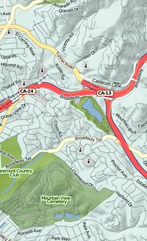
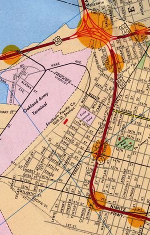
I've been expanding the georeferenced collection of Oakland maps that Gem and I started back in May. Recently, I purchased a 1967 Standard Oil map of Oakland for a few bucks from EBay. I was looking for late 1960's / early 1970's, because that's when the freeway structure here really started to take shape. Previously, we looked at a switch from rail to roads. Through the 50's and 60's, the switch was accelerated with the construction of massive highways through what had formerly been residential neighbhorhoods.
Particularly interesting is the Cypress Viaduct, a raised connection between highways 880, 580 and 80 running through West Oakland. When built, it was sharply criticized for splitting the neighborhood and further isolating it from downtown Oakland. The current site of the viaduct was where I made some of my first edits to OpenStreetMap. The structure was destroyed in the 1989 Loma Prieta earthquake shortly after my family moved to California, but on this map it's a fresh addition to the landscape:
The 19th anniversary of the quake was October 17th, one month ago.
The new 1967 map is a striking constrast to the previous 1952 map. The various freeways connected to Interstate 80 are one major difference, but the cartography is also a big contrast. This map is similar to the other Gousha-designed map from 1936 in its choice of bright colors, but it also features topographic shading up in the hills and orange highlights around freeway exits. A significant piece of infrastructure still under construction at this point is the 980 / 24 connector from downtown Oakland up into the hills toward the Caldecott Tunnel. The construction areas for the southern stretch are marked, while the northern route is still a whispy dotted line through miles of backyards.
Nov 10, 2008 9:42pm
work with me
Are you a talented developer interested in supporting our data visualization and mapping practice from the server end of things? Are you interested in a full-time gig at our San Francisco office?
You'll be working with a small team of designers and engineers who will be looking to you to make their ideas feasible. You're excited by the possibility of cutting and bending data to fit it through the thin straw of the internet. You can look at a source of information and model it as resources, rows and columns, messages and queues.
...
Our technology choices lean towards open source databases, unix-flavored operating systems, and scripting languages like Python and PHP. You'll be expected to know these things, and bring something new and unexpected besides.
Read the rest of the job description and let us know! (watch the spamarrest response on that e-mail address)
Nov 10, 2008 8:03am
web directions east
Earlier this morning, I returned from a four-day spin through Tokyo, my second visit there, to speak at Web Directions East. This trip was wholly unexpected, as I was pinch-hitting for Jeff Veen who had to cancel at the last minute and suggested me as a replacement. Fortunately it was possible to book a last-minute flight, take over a hotel reservation, and write an hour-long keynote talk in just a few days. It was an surprise honor to even be asked, and the experience was smooth sailing all the way, including the miniature hotel room.

I'm not going to post exact talk notes, but I outlined a general overview of data visualization and then focused on a range of Stamen's projects from the past four years and how they illustrate some deeper trends. Elements of this should be familiar to anyone who's heard me, Eric, Shawn or Tom speak before:
- Mark Newman's 2004 election cartograms. I learned from Karl that they'd been freshly updated to reflect last week's results.
- Examples of flow-management including 538 and John Allspaw's Flickr capacity-planning ideas.
- Our 2004 MoveOn Virtual Town Hall application, for the first time in what seemed like years. It would be amazing to revisit this project again somehow, possibly in a non-political context.
- Digg Labs, in the context of "liveness", from our Live/Vast/Deep iron triangle of visualization.
- Trulia Hindsight and Snapshot, as examples of "vastness".
- The hot, fresh, new SFMOMA ArtScope as an example of "deepness". This also served as a nice digression about map tiles, something I've been thinking and talking about a bunch.
- Oakland Crimespotting to round out some ideas about stable linking and data on the web. I also heavily name-checked Tom Coates's Native To A Web Of Data and Matt Biddulph's Designing Data For Reuse here.
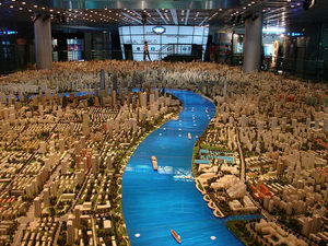
A few people asked after the source of a particular background photo from my slides - it was an image of the Shanghai Urban Planning Museum's city model, possibly gaffled from blog.360dgrs.nl.
In addition to meeting the other speakers and organizers, John, Oli, Andy, Jeremy, Eric, Dan, and Doug, I also had a chance to take an excellent nighttime Tokyo bicycle and beer ride with Craig and Verena that made me wish SF and Oakland maintained the pavements a bit more effectively. I now desperately want to add a third bike to my collection, a mama charion granny bike.
Nov 2, 2008 12:59am
blog some dog-eared pages: cognition in the wild

It's been a while since I've done one of these, I'm a bit rusty. I started Cognition In The Wild over a full year ago, put it down for a while, and only recently came back to finish the book. The topic is cognitive activity, and how it plays out in social situations. Sort of a behaviorist tract in a way, which is interesting because the idea that everyone loved to hate (everyone in UC Berkeley CogSci department ten years ago that is) is starting to pop back up in some odd places in my life: this book, another one about politics from 1908, Obama's economic policies, etc.
Edwin Hutchins frames his story in the context of an observational trip aboard a U.S. Navy vessel, the Palau, and its crew of sailors and navigators. Hutchins particularly concerns himself with the way in which practice and instrumentation constitutes a meta-cognitive process above the level of the individual: the observations and computations that enable the crew of the ship to steer it are carried out by a collection of participants, some of them quite inexperienced, all of them performing small pieces of a bigger task. Together, they form a complete computational process, a sort of full adder made of half adders. He's particularly interested in the instrumentation that lets these guys do their jobs: slide rules, sighting scopes, variations on the protractor, and conventions surrounding verbal communication on the bridge and over the ship's intercom.
Hutchins's theory seems to be that these devices and practices act as a form of cognitive jig, embodying complex trigonometric and geometric processes in tangible form the way a slide rule converts multiplication into a simple linear movement. I've been interested in this idea before, via David Pye's Nature and Art of Workmanship. Pye argued that a lot of what we consider to be "hand work" is actually jigged and regulated through external forces. Pye calls unregulated workmanship "the workmanship of risk", and it's an interesting contrast to the kind of cognitive risk minimization that Hutchins is describing here. There's joy in navigation by dead reckoning as in risky, dextrous workmanship, but the U.S. Navy is having none of it and prefers its interpersonal procedures immaculately specified to the finest detail.
The place where I think this touches some of my recent interests in tiling and flows is that the purpose of a jig is to turn the latter into the former, to transform fluid into constrained motion. In particular I'm thinking about by most recent favorite general-purpose example, the use of "remaining days" as a transposed operations metric by Flickr's capacity planning guru John Allspaw.

Flickr takes one kind of motion, the consumption of storage space or saturation of network bandwidth, and transposes it into another kind of motion, the number of days they're free to sit on their hands until everything falls to pieces.
There's an extended example in Hutchins' book that's similar in spirit to this, and it forms the only coherent set of pages I bothered to dog-ear. As a counterpoint to Western-style navigation that places a moving boat in the context of a static ocean, he offers an in-depth analysis of Micronesian navigation practices that proceed along utterly different lines and yet still allow canoe navigators to travel between tiny islands out of sight of land without losing their bearings. The background to this alternate navigation frame is rote memorization of angular relationships among islands, but the surprising bit is the way it recontextualizes the navigator as a static center with respect to the sidereal compass, surrounding islands moving past him on parallel tracks to the left and the right.
These excerpts constitute my first donation to the Analogy Library. That Flickr capacity thing above is my second. Also worth a read is UPenn's Traditional Navigation in the Western Pacific: A Search for Pattern, written by 1989-2003 This Old House host Steve Thomas.
Page 66, a bit of context:
Without recourse to mechanical, electrical, or even magentic devices, the navigators of the Central Caroline Islands of Micronesia routinely embark on ocean voyages that take them several days out of the sight of land. Their technique seems at first glance to be inadequate for the job demanded of it, yet it consistently passes what Lewis has called "the stern test of landfall." ... Western researchers traveling with these people have found that at any time during the voyage the navigators can accurately indicate the bearings of the port of departure, the destination, and other islands off to the side of the course being steered, even though all of these may be over the horizon and out of sight. These navigators are also able tack upwind to an unseen island while keeping mental track of its changing bearing - a feat that is simply impossible for a Western navigator without instruments.
Page 67, on clues from what lies beneath:
The world of the navigator, however, contains more than a ser of tiny islands on an undifferentiated expanse of ocean. Deep below, the presence of submerged reefs changes the apparent color of the water. The surface of the sea undulates with swells born in distant weather systems, and the interaction of the swells with islands produces distinctive swell patterns in the vicinity of land. Above the sea surface are the winds and weather patterns which govern the fate of sailors. Seabirds abound, especially in the vicinity of land. Finally, at night, there are the stars. Here in the Central Pacific, away from pollution and artificial light, the stars shine brightly and in incredible numbers. All these elements in the navigator's world are sources of information.
Page 68, on the sidereal compass:
Seeing the night sky in terms of linear constellations is a simple representational artifice that converts the moving field of stars into a fixed frame of reference.

This seeing is not a passive perceptual process. Rather, it is the projection of external structure (the arrangement of stars in the heaves) and internal structure (the ability to identify the linear constellations) onto a single spatial image. In this superimposition of internal and external, elements of of the external structure are given culturally meaningful relationships to one another. The process is actively constructive.
Page 71, on picturing a frame of reference:
The fundamental conception in Caroline Island navigation is that a canoe on the course between islands is stationary and the islands move by the canoe. This is, of course, unlike our notion of the vessel moving between stationary islands. A passage from Gladwin (1970: 182) amplifies this:
Picture yourself on a Pulawat canoe at night. The weather is clear, the stars are out, but no land is in sight. The canoe is a familiar little world. Men sit about, talk, perhaps move around a little within their microcosm. On either side of the canoe, water streams past, a line of turbulence and bubbles merging into a wake and disappearing into the darkness. Overhead there are star, immovable, immutable. They swing in their paths across and out of the sky but invariably come up again in the same places. ... Everything passes by the little canoe - everything except the stars by night and the sun in the day.
Page 81, intersecting lines:
It is tempting to criticize the Caroline Island navigators for maintaining an egocentric perspective on the voyage when the global perspective of the chart seems so much more powerful. Before concluding that the Western view is superior, consider the following thought experiment: Go at dawn to a high place and point directly at the center of the rising sun. Return to the same high place at noon and point again to the center of the sun. That defines another line in space. I assert that the sun is located in space where those two lines cross. Does that seem wrong? Do you feel that the two lines cross where you stand and nowhere else?
...
Our everyday models of the sun's movement are exactly analogous to the Caroline Island navigator's conception of the location of the reference island. The choice of representations limits the sorts of inferences that make sense.
Page 92, on relative difficulty in frames of reference:
All navigation computations make use of frames of reference. The most prominent aspect of the Micronesian conception is the apparent motion of the etak island against the fixed backdrop of the star points defined by the sidereal compass. Here there are three elements to be related to one another: the vessel, the islands, and the directional frame. In order to preserve the the observed relationship of motion parallax, one can have the vessel and the directional frame move while the islands stay stationary (the Western solution) or one can have the vessel and the directional frame stationary while the islands move (the Micronesian solution). ... Each of these schemes makes some things easy to compute and other difficult.
Oct 10, 2008 9:49pm
dunbar's dungeon
Thought experiment for the day, spurred by jets flying overhead for fleet week. If something out of ordinary is going on, and you need to ask people around you, what do you do?
Imagine a chat system, similar to IRC or AOL - a big room where you log in and talk to lots of other people simultaneously. When you log in, your Fire Eagle account gets a ping, so that the server can know your geographic location to some level of precision. You are then dumped into a big room, with the 150 people physically closest to you in the real world. As long as there are fewer than 150 total people in the system, everyone gets to talk to one another. As more people join, you begin to see overlapping conversation bubbles. You might be in San Francisco, talking to someone in Kansas. That person in Kansas can talk to someone else in New York, but you can't. Your conversational circle is strictly limited to the nearest 150 people, some of whom drop off occasionally as they are bumped out by more proximate newcomers.
As the population of the system grows, everyone's personal horizons begin to shrink. With enough people, eventually you're talking to the people right in your neighborhood. To get a message to someone across the country, you might lie about your location, or ask that it be passed on, Milgram-style.
Would this feel like a natural way to interact with people around you, self-limited to a reasonable number of participants but always those around you? Would people lie about their location? Would it be like Usenet, dense with microscopic subcultures? Would certain people emerge as hubs, offering to post messages around between bubbles in the absence of other means of communication?
Oct 9, 2008 5:48am
design engaged 2008
The third Design Engaged happened in Montreal, just a few days ago.
Number two, held in Berlin three years ago in November, was something like a debut party for Stamen. Many of the people whose circles we're in now, we met there and then for the first time. DE is a high water mark for conference-style events, borrowing much from the DIY ethos. In Berlin, attending meant speaking, and most of the event was occupied by rapid-fire descriptions of what each participant was up to. Adam beat the drum for peak oil and copper theft, while Jack delivered a fairly stream-of-consciousness rundown of interesting comic books and metals with low eutectic melting points. This time, my personal favorite was Russell's talk on advertising and design, the upshot of which was that "it's worth not being shit."
I adapted some of my favorite bits from the UX Week talk and described a tiling metaphor for the web, why it was interesting, and how we're about to hit something of an inflection point. The title of the talk is "Tiles Then, Flows Now", changed from "Tiles Now, Flows Soon" when I decided that too many people were saying too many things about the future for me to join in as well.


Three years ago, we first showed Cabspotting at Design Engaged 2005. It was one of our first map projects to combine a tiled base layer and constantly-updating data.

The tiled-map idea was not exactly new at the time, but it had just been immensely popularized by Google Maps, released earlier in 2005. The scale and coverage of GMaps was a wholly new thing.

I'd already spent plenty of time futzing with Terraserver and other satellite image sources looking down on familiar places, but those services always forced viewers to understand image resolution and source satellites. It was hard to pan around, the UI metaphor was ultimately form-based ("click here to go east").


GMaps showed how it was possible to fake the appearance of continuous flow by assembling mipmapped images on the client, and serving up simple 256x256 tile images. When it first came out, I spent an hour panning slowly around the Bay Area from San Francisco to San Jose.

This all coincided with the appearance of REST as a guiding metaphor for the web. REST gives you a lot of mileage; we faked the continuous flow of user activity on Digg by punctuating snapshots over time. Like film, you can string a number of these together to present a convincing illusion of continuity. Digg Swarm makes requests every 30-60 seconds, yet visually dribbles out activity continuously. Worries about certain events being dropped are basically swept under the rug here, the picture is lossy.


All of this is motivated by a desire to pump dynamic, flowing data through the "thin straw" of the internet. Here's another experiment that's starting to come back around, for SOM's San Francisco City Model. The monochrome renders are rich, heavy and detailed. The false-color renders below encode information about tax assessor's parcels. Combined, the maps give you a convincing form of interaction including per-building highlights and links to parcel information faked with simple images and a bit of code.

Oakland Crimespotting is a similar bit of foolishness. Initially data was harvested by scraping vintage late 1990's CrimeView map products, now it comes from Excel spreadsheets updated nightly. Yet the view we try to present is a continuous, unbroken surface for exploration. We routinely get asked about same-day crimes by people lulled into a sense of immediacy. It doesn't help that we promise to tell people what the sirens in their neighborhood are in realtime of course.

This project directly led to Modest Maps, a condensation of thoughts on good, flexible, online cartography for designers.


It also connects to this years-long meditation on Oakland's historical geography. Motivated by a project for a sustainable urban design class, my girlfriend Gem researched century-old maps of the east bay to understand why certain city streets were freakishly wide like this view of E. 21st St and 14th Ave. The thinking was that all this seemingly wasted space might be more effectively used with a permeable road surface and native vegetation to revive the natural water filtration systems disrupted by culverted creeks and concrete construction.


Here's a whole series of downtown Oakland maps. It's great fun to run through them, showing where construction has taken place, where rail used to run, what the oil companies considered relevant, and where the freeways were eventually dropped in. In the 1912 map you can see exactly where the old Key Route streetcars used to run, and therefore why certain roads are now uselessly wide. I've just won an EBay auction for a 1967 road map that will show the drastically modified, post 1950s landscape of raised highways.

This last Oakland map is actually sourced from OpenStreetMap, an attempt to introduce Wikipedia's crowdsourcing model to geographical data. I like that it shows a lot more pedestrian-relevant information than the Microsoft Virtual Earth one immediately before. The really interesting thing about this whole series of Oakland Maps is that they're tightly matched to the specific cartographic projection used by Google and Microsoft and everybody else: it's a standard that provides strong footing for a comparison.


This is something similar we've been working on for the London Organizing Committee for the Olympic Games. Again you can see the contrast between a map that draws attention to what's on the ground vs. one that helps your satnav get you through town unscathed.

Being able to take certain things for granted, like projections, publishing mechanisms, and display libraries, allows for enormous variations in expression. There's also a bit of Google cargo cult mentality here, looking at the technological leavings of the biggest technology company out there. For better or worse, they've set the tone for geographic publishing by using the web more effectively and deferring complexity to the client browser.

All of this is a way of showing how Roy T. Fielding's 2000 PhD thesis on Representational State Transfer has utterly dominated the discourse of publishing through the web. It's an incredibly productive architectural idea, and it's been the primary area of experimentation and development for geeks like us since the implosion of the previous web bubble.

The new thing on the horizon, though, is a promise to stop faking it with really-realtime event-based notifications. Sudden interest in Jabber / XMPP, an instant messaging protocol from ~2001, is bubbling up from the kinds of system design and operations geeks building sites like Flickr and Twitter.

There's a connection to game development here, illustrated by a favorite paper of mine called The Continuous World of Dungeon Siege. In it, author Scott Bilas describes the technical challenges inherent in presenting an illusion of seamlessness. Some of it, the way in which the environment is loaded and constructed around the ever-shifting vantage point of the player, sounds a lot like the RESTful tile-based methodology driving the maps above. A lot of it also sounds an awful lot like the pipelines and data flows I'm hearing from friends working on massive, distributed services like Flickr.

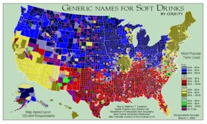
These are the cartograms published in the wake of the 2004 U.S. presidential election, they were a major influence on our geographic thinking when they were first released: imagine, using color and spatial distortion to communicate the underlying complexity of a contentious national election.

Meanwhile, these are graphics from Nate Silver's 538, a very different current approach to electoral politics from the world of continuous statistical analysis in baseball. This is a lot more like the current environment, showing constant change from multiple daily polls. Nate taps a constant stream of contradictory, voluminous data to create simulations and ultimately predictions of the election outcome in November.

They also do maps. Right now they're predicting a 90% chance of an Obama win of some form, so yay.
I'm going to close with a slide about capacity planning from Flickr's John Allspaw. I love how on the right, they're translating their capacity metrics into days-of-Flickr-remaining. REST is going to stick around for as long as it continues to be a productive metaphor that can guide action and make predictions, but we're going to see a lot of this stream-tapping behavior bubble up over the next few years.

Extra thanks to Andrew, Boris, Jenn, and Mouna for organizing the festivities. It was nice to visit Laika in person!

Sep 24, 2008 7:02am
post-ONA conference
A few weekends ago, I had the opportunity to participate in the 2008 Online News Association conference in Washington DC. Laura Cochran of the Washington Post invited me to join a panel on mapping crime, along with USAToday datacruncher Paul Overberg and LA Times power couple Sean Connelly and Katy Newton.
The conference got off to an inauspicious start when Tina Brown capped off a terrible keynote Q&A by called a journalism student an "easy lay". Fortunately, the How We Built It track featuring MSNBC, New York Times, Las Vegas Sun and others was a perfect way to spend a conference Friday. News organizations producing interactive pieces for the web described the various challenges they encountered, and it was fascinating to hear about the sausage-making process from the inside.
One of the most important things I learned in this series of talks is that no one likes their IT department, not even at the New York Times. Presenters repeatedly described ways in which they had to circumvent or overrule their own IT infrastructures to get anything interesting done. Two stood out. I asked the designers and developers at the Las Vegas Sun about the political/technical environment in their organization that allowed them to explore and refine iterative, agile production methods, and they said that it was necessary for them to go straight to the top for a mandate from the editor to give the group decision-making power over their development and deployment environment. Matt Ericson and Aron Pilhofer of the NYT described a more circuitous approach. Apparently, the NYTimes.com online election coverage is hosted entirely on Amazon's pay-as-you-go EC2 service, and totally detached from the content management and other server infrastructure at the Times. They use Ruby on Rails and other open-source software components to develop and deploy their work, and their seven-person team is wholly responsible for the care and feeding of these servers. This was a shocking thing to learn, and it raised my opinion of the NYT team by a solid order of magnitude.
Despite such a high-level of problem solving ingenuity, the majority of people in the business are journalists first and programmers last. The technical proficiency and funding available to publishers less blessed or lucky than the major dailies is substantially lower, and forces them into products like Caspio. This company had a substantial percentage of ONA attendees by the short hairs with their hosted solutions for data-driven web pages and mashups. I'm convinced that this is bad news, but I'm already predisposed to suspicion of turnkey software for this kind of work. I've also read plenty about the product in particular from journalist/technologist Derek Willis, who offers six reasons to look past Caspio in his blog archives.
The silver lining on this particular cloud is Django, the Python web framework developed by Simon Willison, Adrian Holovaty, and others. Django is finding a solid niche in the journalism world as a thoughtful, educated, D.I.Y. response to hosted rentware, and a kind of software Schelling point for journalists looking to really understand data-driven reporting.
The end-of-conference Online Journalism Awards ceremony was a parade of excellent interactive and data-driven work. The impression I got here was of deadline-motivated ingenuity on a tight budget. My co-panelists Sean and Katy especially illustrate the point with their 2007 winner Not Just A Number, a look at homicide in Oakland. Despite focusing on the same geographical area and the same topic, it's such a wildly different project from our Oakland Crimespotting. By narrowing their sights to the year's killings and entering the community itself to talk with those affected, Not Just A Number shows how narrative rigor can color statistical data with a backstory.
Overall, the conference had a distinctly different feel than the tech-oriented events I generally participate in. For one, there's an undercurrent of a siege mentality in journalism right now, with newsrooms cutting staff and print operations frozen stiff in the headlights of the internet. The focus on narrative and story gives a softer edge and an escape valve, though - this group is not primarily a tech-driven community, but they catch on to new developments quickly and bend them into the service of storytelling.
Sep 21, 2008 11:11pm
map beautiful
I'm continuing my months-long meditation on city cartography with a jump into OpenStreetMap, the "editable map of the whole world ... being built largely from scratch ... released with an open content license."
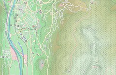
A few weeks back, I released Cascadenik, an application of cascading stylesheets to the Mapnik rendering library. The rationale for writing it in the first place was to replace the base map we're using for Oakland Crimespotting. I love the look of Microsoft's VEarth cartography, but it's missing data crucial to an understanding of urban crime: parks, schools, businesses, and transit. OpenStreetMap is the only free-as-in-speech way to create a beautiful, useful, and complete city map that can incorporate such ground truths. The NavTeqs and Teleatlases of the world where the online mapping services get their data are primarily interested in and funded by navigation, so it's not going to be in their interest to go neighborhood-deep to track locations of playgrounds or liquor licenses.
It's going to take a substantial outlay of cognitive surplus to get all this information into the map, but I've started by working on the visual appearance to get a feel for OSM's data:
(In-progress stylesheets can be found bundled with Cascadenik in mapnik-utils)
There are more than a few social decisions encoded in those styles:
- I'm trying to foreground modes of public transportation, especially rail. BART plays such a huge role in the Bay Area, and an understanding of where stations lie in relation to homes and businesses is crucial to understanding the local streetscape. For an historical view of this, check out my old flea market mapping experiment, and pay attention to the difference in appearance between the 1912 map, made to show rail coverage, and the 1936 map, made by Shell Oil to hide it.
- Taking a cue from the 1936 map and VEarth's road rendering, there's a much sharper distinction between major and minor roads, with minor roads dropping back to form a spidery matrix of connectivity between major roads and transit stops. This seems to help with the legibility of parks and other features at zoomed-out views, showing how they anchor neighborhoods and provide textural variety. It also makes room for labels on schools & parks that would otherwise be crowded out by street names.
- A lot of excess detail is being intentionally omitted. Parking lots and ATMs exist in the standard OpenStreetMap tileset, but I'm leaving those out here because I don't feel that they're helpful. I'm also omitting underground rail, it's just not relevant to surface use.
- The color of freeways is red, a fairly standard decision seen on most U.S. maps. Major roads are all fairly pale, with small variations in color around yellow and orange to make them visible but less overpowering than the blues and reds used by OpenStreetMap's own tiles.
Working with Potlatch, the Flash-based OSM editor, has been interesting. Although it does the job exceedingly well, I'd welcome an editing interface derived more from KidPix and SimCity than AutoCAD or ArcGIS. My dream is a UI that dispenses with tagging in favor of tools like "road", "school", "park", or "bulldozer".
The new tiles are being updated from fresh OSM data on an almost-daily basis, and hosting on S3 means you can hit it pretty much all you want for your nine-county Bay Area mapping needs.


Now, to get all these schools included.
Aug 31, 2008 4:34pm
tracking hurricanes
This just went out yesterday, our new Hurricane Tracker for MSNBC:
![]()
I'm so impressed with the work, co-created by Tom and Geraldine with raw data licensed from Hurricane Mapping. They're evacuating New Orleans right now, I hope the reaction to this storm isn't as tragically bungled as the last one.
Aug 30, 2008 5:24am
neocartography
Andrew just added a last-minute SXSW panel to the picker.
Here's what it's about:
Neocartography
Designers are dropping maps into their applications with little concern for usability or design and users are getting "Google Map fatigue". We need to move beyond the simple pin-dropping and consider appropriate mapping interfaces. This panel will look at the current and emerging tools to provide compelling geographic interaction and visualization.
It's going to be some combination of Andrew Turner, Aaron Cope, Paul Smith, Wilson Miner, Tom Carden, Andy Woodruff, Nathan Yau, and me.
Aug 30, 2008 5:22am
cascadenik: cascading sheets of style for mapnik
Style sheets were available in electronic publishing systems from around 1980 (see Chapter 2 and 3). Combined with structured documents, style sheets offered late binding (Reid 1989) of content and presentation where the content and the presentation are combined after the authoring is complete. This idea was attractive to publishers for two reasons. First, a consistent style could be achieved across a range of publications. Second, the author did not have to worry about the presentation of the publication but could concentrate on the content.
(Hakon Wium Lie, Cascading Style Sheets)
Mapnik, the open source map rendering library I've written about recently, uses an XML language similar in spirit to SLD for applying visual style to map vector data.
It's definitely tolerable, but otherwise not particularly good.
Having recently completed a country-wide geographic treatment of the UK for LOCOG (London Organising Committee of the Olympic Games), I've had a chance to experiment with ways to improve the state of the art in Mapnik styling. CSS, the ubiquitous format understood by all halfway-modern web browsers, offers a way forward.

I've implemented a pre-processor that accepts CSS-type stylesheets and produces traditional Mapnik stylesheets. Imagine a program that takes HTML and CSS files, sprinkles the HTML with FONT tags, and makes them viewable to Netscape 2.0 users, and you've got the idea.
Check out a brief tutorial, or grab the source code from the mapnik-utils project.
My hope here is that the characteristics of CSS that made it acceptable to designers and bumped the visual and semantic sophistication of the web will translate to the world of maps as well. Mapnik's existing styles get the job done, but are unsatisfying because they force the designer to develop and implement the kind of class-based logic that CSS makes easy. It's still early in this particular universe of concern, but the suddenly rising viability of the OpenStreetMap project is going to make map design for the web a buzzing, vibrant front in another year or two, tops.
CSS has a few properties that make it a great candidate for mapping:
- Stylesheets can live separately from the content they apply to, with many pieces of content sharing rules defined by single a source. In contrast, Mapnik's own "stylesheet" terminology refers to an XML format that blends content (the vector data that maps are made of) with appearance. This is going to be interesting as the availability of data like OpenStreetMap's creates a need for attractive CSS bases for people to work from.
- The "C" in CSS is for "Cascade", shorthand for a set of expectations governing how rules from a variety of sources can be combined. In CSS, it's possible to state the equivalent of "all text is black, but proper nouns should be highlighted with yellow." Maps present similar needs, there is often a hierarchy of feature types that need to shares some visual properties but not others: roads, toll roads, toll roads under construction, etc.
- CSS interacts with HTML largely through element types, classes and IDs. The class concept in particular makes it possible to mark content with meaningful labels, and apply visual styles based on those labels. Maps present feature classes like public buildings, various kinds of parkland, etc., yet Mapnik has no such concept of class.
- CSS clearly defines how relative addresses ought to be handled, in the case of linked files like background images. According to the CSS specs, addresses are always relative to the stylesheet in which they're used, not the content document from which the stylesheet is linked. This behavior is predictable and makes for easy centralization and re-use of visual rules. Mapnik expects that image files can be found in absolute locations, on the same computer where it's being run.
The basic improvement offered by CSS is that the linkage has been flipped around to point in the opposite direction. SLD and Mapnik both have data layers that specify how they are to be rendered via explicit connections to declarations of color, line weight, etc. It's better to do the opposite: classify data layers with meaningful categories and create separate styles that act on those categories. The style rules point to the things they apply to, e.g. "roads should be black lines, while schools should be filled in with yellow."
So far where I've gotten is a two-week-old proof of concept that generates good, clean Mapnik stylesheets. It's usable now, but there are no doubt edge cases where my handling of things like filters will need to be tweaked somewhat.
Read the quick tutorial, and grab the source code from the mapnik-utils repository.
Aug 26, 2008 6:39am
uxweek 2008
Last week was Adaptive Path's blowout annual event, UX Week. I was tremendously excited about it, and it did not disappoint. My one previous experience at this conference was in 2006, Washington DC when I gave my first talk longer than 20 minutes, Data Visualization: Why Now? That one netted us my co-presenter this year, Tom Carden, whose work on OpenStreetMap I name-checked during my hour-long survey of new data visualization work.
This time, we did two sessions. Tom and I did a really really full three hour workshop extravaganza adapted from his amazing solo show at E-Tech this year. This was awesome. I talked for 90 minutes, had great audience participation, and walked away charged and energized ... I would love to do this one again, the scale and format (small room, 30-ish people?) was perfect and the attendees asked tough, perceptive, illuminating questions that absolutely made the whole thing sing.

On Friday, I also took the main stage to deliver a bit of a departure from our usual talk topics. Generally, we talk about what we do and how we do it. This time, we put some order to a whole bag of ideas about illusion, sleight of hand, surfacing and technique that I had initially been working out for Interesting2008. I wasn't able to get to London, so I did the talk in town. This one was a sharp contrast. The material was something new and experimental for me, and the klieg light ballroom format makes for a strange speaker / audience relationship. Still, I felt like I had crossed some form of boundary and I'm anxious to polish the topic for another go.
The talk was called Greebles, Nurnies, Tiles, and Flair, and these are my slides and notes.


"Greebling" is a special effects term that makes sense if you've seen Star Wars ... all those little nubs on the Imperial Star Destroyer and other ships make it look big, and real. They're there to hide the fact that it's plywood and plaster, to help you believe that it's a mile long.

Tiles are a technique you'll be familiar with from Google Maps. The infinite, continuous road maps and satellite imagery are available over a regular broadband connection because Google serves them to you as small square images...

...that get stitched together into a seamless field by your web browser.

Sleight of hand.
Tiled image maps are a stand-in for a larger strategy for dealing with continuity. How do you use a clipped, staccato medium like the internet and the digital computer to simulate infinity?

The world of computer gaming has been dealing with these questions for some time. There's an excellent article by Scott Bilas from Gas-Powered Games called The Continuous World of Dungeon Siege. In it, he describes the technical challenges of presenting a seamless world.

It's similar in concept to the tiles slippy maps you can see in your browser: divide the world into discrete chunks, connect them to one another, and figure out how to stream everything into the play environment from outside the player's field of vision, so they are never presented with a loading screen.

There is no global coordinate system, all is relative.
This is becoming a core expectation of modern games, walk around World Of Warcraft or Grand Theft Auto for a few minutes to see.

Online mapping is a version of this in miniature. Our code library Modest Maps was developed to generalize the pattern. We started using it with geographical maps...

...but have started to apply the technique to non-geographic mappings: floorplans, ...

... and artworks, to name two.

All the Maps mashups out in the world are like portals into the Continuous World Of Google Maps - each one a square window onto the same world.
It's like looking at a blue whale through a letterbox. Nature's Timo Hannay meant this as a criticism, but Stamen's Tom Carden thinks this is awesome.

What if you could see that, as you search for driving directions from San Bruno to Marin, that someone else is simultaneously crossing your path from Oakland to SF's Sunset district?
I talk about Google because it's familiar, but there are a lot of other distributed services starting to act like this. Continuous World Of Flickr, Continuous World Of Twitter are giant services but everyone sees a very small piece at a time.

Sleight of hand again:
The magic wand is there to make the hidden coin look less conspicuous.

Greebles are the parts that "look cool, but don't actually do anything" (C3PO). There's an entire discipline here composed of special effects artists and asset designers working to hide the plywood spaceships and simple game world polygons beneath an encrusted surface texture.

Textured surface gets you several things.
One is that it's proof of reality. Check out this map of Moscow (Kosmoninki), with all the individual buildings marked and numbered. It makes the map look more like the territory.

Google Maps for Tokyo have logos for all convenience stores baked right into the imagery. I thought this was an experiment in advertising until I went there, and learned that conbini are one of the prime wayfinding mechanisms people use to figure out where they're going. The street numbering system is entirely different, so navigation takes place by landmark rather than coordinate.

With Cabspotting, we made an early decision to ditch the base map and show just the trails of each taxi. This bought us a lot of wiggle room, since the GPS trails don't match up to the roads very well and would have looked terrible. It also bought us the appearance of truth. If you can see the rush of cabs in SOMA after last call, or the dense cluster around the dispatch yard, or the thick line along Geary out to the Sunset, you believe that the data is true.

These kinds of surface signals are encountered everywhere. NASCAR without sponsor logos looks barren, everyone knows that advertising is the lifeblood of the sport, and the logos on cars and driving suits reminds you that these guys are legitimate, that someone cares about them enough to pay to be seen with them, says Adobe's Michael Gough.
AdBlock for browsers has been succeeded by ArtBlock.

Surface details like this are a kind of social signal that the textured surface is real and cared-for, that it can be grasped and held on to.

Compare and contrast the visual appearance of OpenStreetMap two years vs. now: it's more credible and therefore more useful, because it's beautiful.

Sleight of hand again:
I have been talking about surfaces and misdirection.
What's underneath?

Social sites are taken seriously when they have crowds of users, loads of data, and all the scaling problems that accompany success. "Scaling is always a catch up game, but it's the best game there is" says Flickr's Kellan Elliot McCrae.
Big data, crowds of users, sheets of information poking up through the surface.

Credibility comes from looking busy, and being continuous: having something on page two, page three, etc. You will inevitably be asked to work on "social features" - most of the labor is getting people to give a damn, and getting the details right on the unbroken layer under everything else.

Approach this by starting underneath the surface.

Aug 5, 2008 12:28am
blog all dog-eared pages: understanding media

Marshall McLuhan entered my world in 1994 or so, when I first subscribed to Wired magazine while still in high school. I still had a year before I got online, so the bits of the articles that began with "http:.." didn't yet make sense to me. I've been bathing in "medium is the message" talk since I was 16 years old, without quite knowing what it means.
I approached Understanding Media as a sort of founding work, trying to get some sense of what Web 1.0's 1960's patron saint was on about. The book is equal parts frustrating and fascinating, especially at the beginning. Right away I had difficulty with two things: McLuhan's definition of "media" (electric light is given as an example, along with the usual radio, TV, film), and his use of terms like "hot" and "cold" without explanation. Radio is a hot medium, television a cool, one. There's not a lot here to grab hold of, and I still can't quote get my head around what the temperature idea refers to.
The book is essentially a 300 page long series of metaphorical assertions. McLuhan prefaces a large number of them with "it is well-known...", "anyone could tell you...." I quickly had to acclimate to this style.
There are just a few big ideas I've walked away with.
One is the frequently-repeated image of a human nervous system extended out past the skin and body through the use of electronic communications media. The book was written well before the Internet, but the founding rhetoric of the 1990's is all there. McLuhan starts with the idea that telecommunications is a factual expansion of the human nervous system out into the world, and derives a number of metaphors on the calmness of nerves and the farming of perception to corporate interests.
Another is the following of all threads, from a technology to all its implications and outcomes. Bruno Latour used a similar "full hardware stack" approach in Artemis when pointing out that the soft, fleshy, and therefore squeezable-during-rush-hour human body is as much a design feature of public transit systems as the rails and vehicles that carry it. McLuhan focuses on perception and all the senses, showing how all the broadcast and point-to-point media imply different sensual responses, from the tactile clothing of the TV generation to the receptiveness to Hitler's rhetoric via the radio medium. In his mention of abrasiveness, I immediately thought of the "shred" / "grind" terminology in popular culture of the past 15-odd years: is there something about the skate video medium that calls up a sandpaper touch? Do the psychological effects of cocaine, ecstacy, etc. make necessary the highly-pitched fuzz of dance music? Simon Reynolds says much of techno was a functional musical form adapted to serve its physical and pharmacological environment. I don't even know how to begin applying these ideas to our emerging world of little square friends - the thought scares me.
I marked many pages than are excerpted here; McLuhan is a very quotable writer even though much of what's quoted is significant more in the reading than the writing.
Pages 65-66, on the sensitivity of the artist to technological change:
The artist can correct the sense ratios before the blow of new technology has number conscious procedures. He can correct them before numbness and subliminal groping and reaction begin. If this is true, how is it possible to present the matter to those who are in a position to do something about it? If there were even a remote likelihood of this analysis being true, it would warrant a global armistice and period of stock-taking. If it is true that the artist possesses the means of anticipating and avoiding the consequences of technological trauma, then what are we to think of the world and bureaucracy of "art appreciation"? Would it not seem suddenly to be a conspiracy to make the artist a frill, a fribble, or a Milltown? If men were able to be convinced that art is precise knowledge of how to cope with the psychic and social consequences of the next technology, would they all become artists?
Page 68:
Once we have surrendered our senses and nervous systems to the private manipulation of those who would try to benefit from taking a lease on our eyes and ears and nerves, we don't really have any rights left. Leasing our eyes and ears and nerves to commercial interests is like handing over the common speech to a private corporation, or like giving the earth's atmosphere to a company as a monopoly. Something like this has already happened with outer space, for the same reasons that we have leased our central nervous systems to various corporations. As long as we adopt the Narcissus attitude of regarding the extensions of our own bodies as really out there and really independent of us, we will meet all technological challenges with the same sort of banana-skin pirouette and collapse.
Page 158, on maps:
Prince Modupe tells in his autobiography, I Was A Savage, how he had learned to read maps at school, and how he had taken back home to his village a map of a river his father had traveled for years as a trader:
"...my father thought the whole idea was absurd. He refused to identify the stream he had crossed at Bomako, where it is no deeper, he said, than a man is high, with the great widespread waters of the vast Niger delta. Distances as measured in miles had no meaning for him.... Maps are liars, he told me briefly. From his tone of voice I could tell that I had offended him in some way not known to me at the time. The things that hurt one do not show on a map. ... With my big map-talk, I had effaced the magnitude of his cargo-laden, heat-weighted tracks."
Page 183, on clowns, bicycles, and eggs:
The clown is the integral man who mimes the acrobat in an elaborate drama of incompetence. Beckett sees the bicycle as the sign and symbol of specialist futility in the present electric age, when we must all interact and react, using all out faculties at once.
Humpty-Dumpty is the familiar example of the clown unsuccessfully imitating the acrobat. Just because all the King's horses and all the King's men couldn't put Humpty-Dumpty together again, it doesn't follow that electromagnetic automation couldn't have put Humpty-Dumpty back together. The integral and unified egg had no business sitting on a wall, anyway. Walls are made of uniformly fragmented bricks that arise with specialisms and bureaucracies. They are the deadly enemies of integral beings like eggs. Humpty-Dumpty met the challenge of the wall with a spectacular collapse.
Pages 209-210, on advertising:
The book-oriented man has the illusion that the press would be better without ads and without the pressure from the advertiser. Reader surveys have astonished even publishers with the revelation that the roving eyes of newspaper readers take equal satisfaction in ads and news copy. During the Second War, the U.S.O. sent special issues of the principal American magazines to the Armed Forces, with the ads omitted. The men insisted on having the ads back again. Naturally. The ads are by far the best part of any magazine or newspaper. More pains and thought, more with and art go into the making of an ad that into any prose feature of press or magazine. Ads are news. What is wrong with them is that they are always good news.
Page 252, on sensitivity:
Florence Nightingale (1820-1910), wealthy and refined member of the powerful new English group engendered by industrial power, began to pick up human-distress signals, as a young lady. They were quite undecipherable at first. They upset her entire way of life, and couldn't be adjusted to her image of parents or friends or suitors. It was sheer genius that enabled her to translate the new diffused anxiety and dread of life into the idea of deep human involvement and hospital reform. She began to think, as well as to live, her time, and she discovered the new formula for the electronic age: Medicare. Care of the body became balm for the nerves in the age that had extended its nervous system outside itself for the first time in human history.
Page 255, on electricity:
Many analysts have been misled by electric media because of the seeming ability of these media to extend man's spatial powers of organization. Electric media, however, abolish the spatial dimension, rather than enlarge it. By electricity, we everywhere resume person-to-person relations as if on the smallest village scale. It is a relation in depth, without delegation of functions or powers. The organic everywhere supplants the mechanical. Dialogue supersedes the lecture. The greatest dignitaries hobnob with youth.
Page 277, on Edison and indirectness:
Edison became aware of the limits of lineality and the sterility of specialism as soon as he entered the electric field. "Look," he said, "it's like this. I start here with the intention of reaching here in an experiment, say, to increase the speed of the Atlantic cable; but when I've arrived part way in my straight line, I meet with a phenomenon, and it leads me off in another direction and develops into a phonograph."
Page 294, on expectations:
Since the best way to get to the core of a form is to study its effect in some unfamiliar setting, let us note what President Sukarno of Indonesia announced in 1956 to a large group of Hollywood executives. He said that he regarded them as political radicals and revolutionaries who had greatly hastened political change in the East. What the Orient saw in a Hollywood movie was a world in which all the ordinary people had cars and electric stoves and refrigerators. So the Oriental now regards himself as an ordinary person who has been deprived of the ordinary man's birthright.
That is another way of getting a view of the film medium as monster ad for consumer goods. In America this major aspect of film is merely subliminal. Far from regarding our pictures as incentives to mayhem and revolution, we take them as solace and compensation, or as a form of deferred payment by daydreaming. But the Oriental is right, and we are wrong about this.
Page 298, a poem by Bertold Brecht:
You little box, held to me when escaping / So that your valves should not break, / Carried from house to ship from ship to train, / So that my enemies might go on talking to me / Near my bed, to my pain / The last thing at night, the first thing in the morning, / Of their victories and my cares, / Promise me not to go silent all of a sudden.
Pages 315-316, on tribal magic:
German Romantic poets and philosophers had been chanting in tribal chorus for a return to the dark unconscious for over a century before radio and Hitler made such a return difficult to avoid. What is to be thought of people who wish such a return to preliterate ways, when they have no inkling of how the civilized visual way was ever substituted for tribal auditory magic?
Page 327, on tactile television:
So avid is the TV viewer for rich tactile effects that he could be counted on to revert to skis. The wheel, so far as he is concerned, lacks the requisite abrasiveness.
Clothes in this first TV decade repeat the same story as vehicles. The revolution was heralded by bobby-soxers who dumped the whole cargo of visual effects for a set of tactile ones so extreme as to create a dead level of flat-footed dead-panism. Part of the cool dimension of TV is the cool, deadpan mug that came in with the teenager.
Page 339, possible origin for the brand name "Nerf"?
The French phrase "guerre des nerfs" of twenty-five years ago has since come to be referred to as "the cold war". It is really an electric battle of information and of images that goes far deeper and is more obsessional than the old hot wars of industrial hardware. The "hot" wars of the past used weapons that knocked off the enemy, one by one. ... Electric persuasion by photo and movie and TV works, instead, by dunking entire populations in new imagery.
Page 356, on automation, feedback, and customization:
On this machine, starting with lengths of ordinary pipe, it is possible to make eighty different kinds of tailpipe in succession, as rapidly, as easily, and as cheaply as it is to make eighty of the same kind. And the characteristic of electric automation is all in this direction of return to the general-purpose handicraft flexibility that our own hands possess. The programming can now include endless changes of program. It is the electric feedback, or dialogue pattern, of the automatic and computer-programmed "machine" that marks it off from the older mechanical principle of one-way movement.
Jul 25, 2008 1:19am
making sense of mapnik
Almost four years on from Mapping Hacks, the state of web-based mapping is moving within reach of mortals and designers. The one piece of software most directly responsible is Mapnik, Artem Pavlenko's excellent open source rendering library.
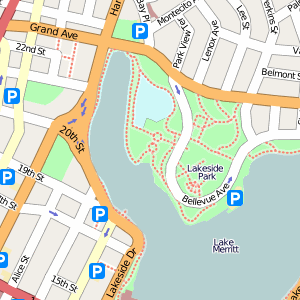
Despite a not-undeserved reputation for being difficult to install (there are even what appears to be companies offering Mapnik as a service), once you've got it running there's nothing better out there for generating your own web-based slippy maps. Mapnik's being used by a number of sites, they're worth checking out for a sense of what's available. Note the high-quality text appearance, smooth anti-aliasing on shapes, and general polish:
- OpenStreetMap (I've written about them recently) generates their own world-wide street map coverage based on user-submitted data. See example close-ups for Oakland or Copenhagen.
- Russian site Kosmosnimki (I don't know who they are, or what they do) has a lovely slippy map for Moscow and beyond - I'm especially impressed with the inclusion of individual buildings at closer zoom levels, extensive metro coverage, and general texturing overall.
- EveryBlock created their own map tiles for the handful of U.S. cities they cover, based on publicly available GIS data like TIGER/Line and shapefiles provided directly by city governments like San Francisco and Washington D.C. (click view all). See for example this view of SF's Mission District with news articles overlaid. I like the way EveryBlock's designer Wilson Miner went for a subdued, minimalist aesthetic that provides an ideal backdrop for the local information layered over the map; this is a situation where Google's fluorescent cartography would not have worked. Paul Smith has already written about Mapnik on EveryBlock's own blog and in an excellent A List Apart overview.
That last link to Paul's ALA article gives a good, mile-high overview of where Mapnik fits in. Once you've rendered out your first Hello World, though, where next?
We've been in a deep Mapnik dive for the past few months on a particular project (more on that some other time), and this post is an attempt to collect the design issues we've run into and what we did to address them along the way. I'll assume you've at least tried Mapnik out, and have some passing familiarity with what it does: the short version is that it combines potentially-large amounts of geographic data with XML-defined stylesheets to output regular images. Some of the notes near the end get into technical details around speeding up tile rendering and duplicating the projection and division of the world used by Google and other popular slippy map providers.
Showing Your Work
The thing that makes web development easy is that you can check your work in a browser as you're doing it. The same can be true for Mapnik stylesheets: set yourself up with an HTML page that includes links to live renderings of maps at a variety of scales and locations. As you edit your style rules, reload this page to see what effect you're having on the appearance as a whole. I learned this technique from Paul and Wilson of EveryBlock, it seems to have served them well as a developer + designer team. One of the easiest traps to fall into when changing a complex system with lots of moving parts is fixing problems locally that cascade into larger problems globally. Mapnik styles can get quite dense for a large and varied data set - check out OpenStreetMap's style rules for an indication of how deep the rabbit hole goes.
Order Matters
In Mapnik, order matters. It uses the painter's algorithm to draw shapes and text, which really just means that once something is down on the canvas, it stays put. The immediate, obvious result of this is that the order of layers defined in your stylesheets is significant. The ones at the top of the XML file are drawn first, the ones at the bottom are drawn last. Oceans and coastlines should go at the top, points of interest and street names should go at the bottom.
A less obvious outcome is that order also matters coming out of your data source. If you pull roads out of a shapefile or a database, the order in which those come back is the order in which they get drawn. This is a subtle point of control over the appearance of a map.
- If you're drawing roads and using PostGIS, ORDER BY LENGTH(geometry) DESC will make it so that longer roads are labeled first, which looks more correct for zoomed-out views of a city where there isn't room to label everything.
- If you're labeling towns, ORDER BY population DESC will draw the larger cities first and the smaller villages last. Combined with Mapnik's collision detection, this will result in a map with big, important places included for-sure and smaller places only where there's room. For zoomed-out views of a state or country, this ends up looking right.
- You can add explicit priority flags to your data for finer-grained control. These can be pretty much whatever you might want: capital cities before small towns, underpasses before overpasses, bars before post offices.
Mapnik lets you define those ORDER BY clauses right in the stylesheet for PostGIS, while shapefiles will need to be rebuilt with a tool called ogr2ogr and its -sql option.
The standard style of rendering roads, with labels placed inside light-colored fills and a thin outline on the edges, is accomplished by repeating layers. First, you put down a layer of thick, dark-colored roads, for example 14 pixels wide. Second, you put down another layer of thinner, light-colored roads, for example 12 pixels wide. The combination of the two yields correctly-outlined street grids, without the woven appearance of street intersections where it looks as though one road is covering another. A lot complicated visual effects can be achieved in similar ways, with repetition and layering to build up a particular effect.
Text Gotchas
Mapnik has a lot of special behaviors when placing text on paths. One thing you'll notice is that it's completely satisfied bending words around tight corners, leading to unsightly kinks in your street names. Fortunately there's a property, max_char_angle_delta, that you can add to your TextSymbolizer to keep labels away from sharp turns - 20 degrees looks pretty good. You still get curvy road labels, but no jarring corners.
If your dataset has longer roads cut up into short segments, you might find that Mapnik can't fit labels along them, or they do fit but are unnecessarily repeated for each segment. We worked with a commercial source of road data that was optimized for flexible cartography, and many longer stretches of road were segmented according to changes in number of lanes and other characteristics. Because we weren't interested in showing such a high level of detail, they were willing to deliver a version of the data with same-named, connected roads merged into longer line strings.
A common form of route and highway label is the "shield", implemented by Mapnik as the ShieldSymbolizer. Shields are a combination of text and graphic, intended to show short road numbers as distinct from names (e.g. "CA 13" vs. "Warren Freeway"). Like the order tricks above, shields need a bit of finessing to get right. You can use the regular SQL LENGTH(name) function combined with Mapnik style rule filters to create simple conditions: for example, using a wide shield graphic for long route numbers, and a narrow shield graphic for short route numbers.
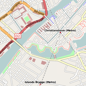
Following The Leader
The mercator projection used by Microsoft, Yahoo!, Google, OpenStreetMap, and others is ideal for world-wide coverage. Places are locally proportional and the whole thing looks right in a comforting, grade-school-wall-map-sense-memory way when zoomed out.
There are three details you need to have taken care of to duplicate this projection:
- Make sure your data is stored as plain latitude and longitude values, in degrees. San Francisco would be near (-122, 37), London near (0, 50), and so on. One appropriate definition/SRS for your data source is: "+proj=latlong +ellps=WGS84 +datum=WGS84 +no_defs".
- Omit any ellipse or datum (e.g. WGS84) from the output projection - a simplifying feature of this particular mercator projection is that its output is based on a plain, spherical earth to make calculations easy for Javascript or Actionscript clients. Most of Modest Maps is based on this assumption. An appropriate definition/SRS for your map output is: ""+proj=merc +a=6378137 +b=6378137 +lat_ts=0.0 +lon_0=0.0 +x_0=0.0 +y_0=0 +k=1.0 +units=m +nadgrids=@null +no_defs".
- Set up some sane shortcuts for the minimum/maximum zoom levels used in your style definitions. Your eyes are going to shrivel up and fall out of your head if you don't do this early. Here are ours.
Continuity
Most uses of Mapnik I have seen are presented in the form of draggable, zoomable slippy maps, often delivered in an OpenLayers or Modest Maps frame. These are universally divided up into square tiles for speedy loading. In order to present a convincing illusion of infinite scrolling, labels need to match up from tile to tile. Mapnik uses a deterministic algorithm for placing labels: for a given zoom level, they're geographically going to be in the same place regardless of your bounding box. Unfortunately that doesn't mean the text placed on points, like city names, that bleeds over the edge of one tile and onto the next is going to be properly rendered on both. Users of Mapnik seem to have come up with a strategy for this situation that involves rendering a big gutter around the visible area and then cutting it off. 128 pixels is generally considered a good gutter width, quadrupling the area of a 256x256 pixel tile to 512x512, most of which gets thrown away for the sake of continuity. I learned this from OpenStreetMap.
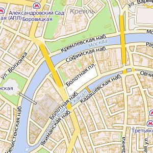
Optimization
It makes sense, therefore, to render tiles in larger batches, doing four or sixteen at a time in large swaths and then cutting them up. Mapnik's startup overhead is minimized, so that larger areas aren't significantly more expensive to draw than smaller areas. I've found a comfortable medium to be rendering tiles in groups of sixteen with half-tile gutter all around. I think OpenStreetMap may go as far as groups of 64, but it really depends on what your server can reasonably handle and how long you're willing to wait.
Known and accepted patterns for writing the Python code that drives Mapnik haven't been fully worked out yet: the TileCache / WMS approach described in Paul's article above is fairly standard, but it's not the speediest thing. We ended up developing a mod_python + memcached contraption that renders tiles on demand, but contains some basic communication logic so that concurrent requests that cover the same tile group wait for one another and re-use each other's work (see the comments below for more information on this). I think OpenStreetMap is going so far as to create a mod_tile extension for Apache to make this easier.
Mapnik appears to be pretty smart about using the scale of the map to determine whether to request data: if your style rule specifies a minimum or maximum scale denominator outside your current map zoom level, the data source will be ignored. The same is not true for filters in style rules - these are applied to each piece of geometry coming out of your datasource, and aren't optimized-for when generating queries to send to PostGIS.
Get Hopping
Designing rulesets and automating design is a topic all on its own. Controlling the appearance of maps should provide a taste of what it feels like.
The most important thing is to set yourself up with an environment where you can work rapidly, constantly getting feedback on what you're doing. Remember the painter model, and make friends with a Python developer willing to set you up with a space to work.
Jul 17, 2008 7:11am
beginner's mind
Is it possible to train or cultivate the beginner's mind? Can you teach yourself to delay preconception and judgement when seeing new things?
Jul 14, 2008 7:32pm
flea market mapping II: revenge of big oil
I've been poking at this historical tileset of Oakland lately. Last time, I posted slippy maps of Oakland in 1877, 1912, and the 1950s. I recently acquired a 1936 Shell map of the bay area that filled in a time period I was interested, the pre-war years when the Bay Area started to make the transition to an automobile society but hadn't yet been experienced the military base explosion of World War II.
Here's the thing, check the new 1936 layer:
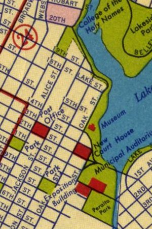
A few things I'm finding interesting about this new map:
- The visual treatment completely changes from the 1912 layer, starting to seem modern and borderline cartoonish.
- The progressive infill of Middle Harbor (just south of the Bay Bridge) visible over the years.
- The differences in highlighted driving routes between the 1930s and the 1950s, in particular the introduction of Macarthur Boulevard and West Grand Avenue.
- Still not a lot of trains shown on the second driving map.
- The Bay Bridge construction is apparently still underway, it opened in November 1936.
I'm starting to get better at quickly processing these layers from scanned images. The new one is a bit blurrier than I'd like, possibly due to the crappy Epson scanner I'm using here. Anyone within biking distance of Oakland or SF have a better scanner I can use to re-do the driving maps?
The next layer I want to get is something from the 1970s, maybe the 1980s - I'm keen to show the pre-Earthquake raised freeway structures that were ramrodded through West Oakland at the time.
Jun 30, 2008 12:57am
the map is here for you to use
Suddenly I care about OpenStreetMap, all over again.
OSM is a cognitive surplus project whose ultimate goal is a CC-licensed, crowd-sourced vector map of the world, competitive with Google, NavTeq, TeleAtlas and other geographic data providers. The project has been in motion for the past four years, with especially active support in Germany and the UK and a recent TIGER/Line infusion for the United States.
Why is OSM interesting? Having watched Oakland transition from the raw TIGER/Line data import to a more refined, watched-over state (compare the visual appearance of nearby Concord to West Oakland for a sense of the difference), I'm starting to think that the main advantage of OSM might be in the kinds of details overlooked by the larger mapping agencies, and in a certain unevenness of coverage indicating which places are cared-for. Over the past few weeks, I've spent a few hours drawing in parks near where I live:
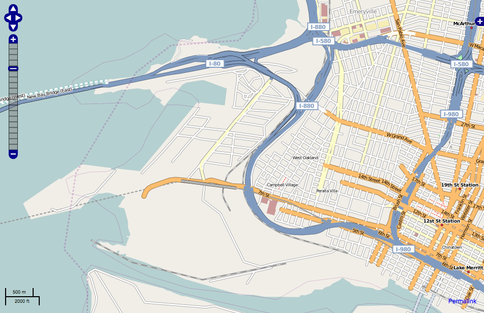
(before)
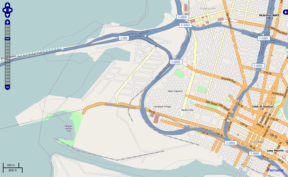
(after)
The difference isn't exactly earth shaking, but it does begin to introduce a feeling of reality into the rendered image. Raw streets are probably accurate enough for basic driving purposes. Parks fill in details, and promise that what you're seeing bears some relationship to what you'll find if you were to actually visit.
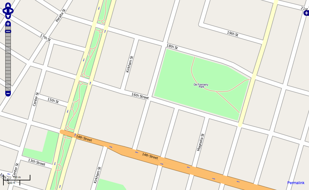
Google Maps' coverage of West Oakland is still substantially wrong, especially outside the 880 loop in the Port Of Oakland territory. They've still got Army Base roads that no longer exist, and miss Middle Harbor Shoreline Park completely. Small potatoes until you think about the effort expended to convert port and military territory to more civic uses in a part of town known more for its asthma-aggravating emissions than its amenities.

The potential for detail represented by OSM extends down into territories more conventionally associated with local-type business listings. Tagging your input with "amenity: pub" causes a little amber pint glass to be rendered to the main map, betraying the beer preference of OSM's British founders and their aims for a richer mapping experience:

What's really going on here is that a particular historical wall is being chipped away. The understanding fostered by the Googles and NavTeqs of the world is that map data is an unchanging (or at least unchangeable) base layer, with transient information such as directions or grocery stores layered over it. What's interesting about OSM is the edit button, the thing where you get to apply your own local knowledge about your area for others to benefit from. This is where I think OSM is finding its niche as a credible alternative for those who need maps. For example, we decided to go with a Virtual Earth base layer for our Oakland Crimespotting project, to expedite its launch at a busy time. Almost a year later, we may suddenly find that OSM's data for Oakland has reached sufficient quality for use in a real application, one where we might (for example) choose to mark and render liquor stores, schools, or police stations right on the map layer for added crime data context. We don't need nationwide coverage, but we do need excellent local coverage and are probably willing to do the footwork to improve an area for our own immediate benefit.
The kind of custom rendering implied by what I'm describing is starting to become a sane possibility, with software like Mapnik making available high quality visual rendering of geographic information. Paul Smith of EveryBlock described its basic use in an ALA article a few months back, while we've been using the software to a point where we can confidently predict its blackbox behavior and really start to customize its output.
Annoyingly, OSM is still finding its technical footing. Despite an excellent API, changes made to the underlying data take a few days to appear in the officially rendered tile sets, and the editing tools are still a bit dorky for general consumption. This may not ultimately matter as far as the basic idea is concerned - momentum behind the project is sufficient for it to gain a foothold in certain key metropolitan areas, and supports specialist efforts like derived cycling or topographical maps. I can imagine other specialist needs like motocross, fishing, bed and breakfasts, etc. taking over the care and feeding of certain kinds of map data. It's easy to forget that familiar road maps were once a hobbyist endeavor as well.
I'm interested in a near future where the native advantage of commercial mapping agencies becomes a liability. Might there be a situation where it's no longer economically feasible for company representatives to drive every street when there might be equally-good input from crowds of motivated participants? At some point, the quality of the basic street grid becomes Good Enough, and the kinds of details noticed only by locals takes on greater importance.
Jun 24, 2008 6:18pm
blog all open tabs II
Ugh, need to get these out before Safari utterly crashes...
- Journal of Indexes
- Cultural Anthropology: Geeks, Social Imaginaries, and Recursive Publics
- Iain Sinclair: The Olympics Scam
- 13 Ways to Quickly Improve Your Decision-Making
- Warping and resampling with gdal in python
- Two Legs, Thing Using and Talking: The Origins of the Creative Engineering Mind
- Virtual Machine Showdown: Stack Versus Registers
- http://www.tecgraf.puc-rio.br/~lhf/ftp/doc/jucs05.pdf
- What is it like to write a technical book?
- Stephen Fry: The BBC and the future of broadcasting
Jun 12, 2008 1:48am
blog all dog-eared pages: art and illusion

Almost three months have passed since my last book post, and I've been having terrible luck with non-fiction lately. A chance encounter with bkkeepr reminded me that E.H. Gombrich's Art And Illusion had been sitting on my recently-cleaned desk since April or so.
Gombrich is one of those towering academic figures whose Story Of Art dominates first year art history courses. This book is more specific, tracing the evolution of art and visual perception, arguing for a definition of style and representation that moves from primitive schemata to modern responses to light and geometry.
Page 78, on correctness and style:
To say of a drawing that it is a correct view of Tivoli does not mean, of course, that Tivoli is bounded by wiry lines. It means that those who understand the notation will derive no false information from the drawing - whether it gives the contour ina few lines or picks out "every blade of grass" as Richter's friends wanted to do. ... Styles, like languages, differ in the sequence of articulation and in the number of questions they allow the artist to ask; and so complex is the information that reaches us from the visible world that no picture will ever embody it all. That is not due to the subjectivity of vision but to its richness.
Page 106, on Egyptian art and eternity:
...what does seem likely is that picture cycles and hieroglyphs, representations and inscriptions, were more interchangeable in Egyptian eyes than they are for us. ... Mrs. Frankfort concludes that "the rendering of a typical timeless event means both a timeless presence and a source of joy for the dead." But if they are right who see the origin of these typical scenes in pictograph renderings of the round of the seasons, Mrs. Frankfort's analysis might carry even greater weight. For where would it be more meaningful to re-present the cycle of the year in typical symbolic images than on the walls of a tomb that is meant to impart eternity to its inmate? If he could thus "watch" the year come round and round again, the passage of time, the all-consumer, would be annihilated for him. The sculptor's skill would have anticipated and perpetuated the recurrent cycle of time, and the dead could thus watch it forever in that timeless cycle of which Mrs. Frankfort speaks. In this conception of representation, "making" and "recording" would merge. The images would represent what was and what will always be and would represent them together, so that time would come to a stop in the simultaneity of a changeless now.
Page 120, on the Greek invention of art:
There is a painting on one of the walls of a Pompeian house that reflects this motif. It is not a great work of art, and the same criticism applies to many other copies of Greek works found in Italy and elsewhere. But such criticism has tended to obscure the most astounding consequence of the Greek miracle: the fact that copies were ever made at all to be displayed in the houses and gardens of the educated. For this industry of making reproductions for sale implies a function of the image of which the pre-Greek world knew nothing. The image has been pried loose from the practical context for which it was conceived and is admired and enjoyed for its beauty and fame, that is, quite simply within the context of art. ... It may sound paradoxical to say that the Greeks invented art, but from this point of view, it is a mere sober statement of fact.
Page 132, on the Renaissance and schemata:
Leonardo was obviously dissatisfied with the current method of drawing trees. He knew a better way. "Remember," he taught, "that whenever a branch divides, the stem grows correspondingly thinner, so that, if you draw a circle round the crown of the tree, the sections of every twig must add up to the thickness of the trunk." I do not know if this law holds. I do not think it quite does. But as a hint on "how to draw trees," Leonardo's observation is invaluable. By teaching the assumed laws of growth he has given the artist a formula for constructing a tree - and so he can feel like the creator, "Lord and Master of all things," who knows the secrets of nature and can "make" trees as he hoped to "make" a bird that would fly. I believe what we call the Renaissance artists' preoccupation with structure has a very practical basis in their needs to know the schema of things. For in a way our very concept of "structure," the idea of some basic scaffolding or armature that determines the "essence" of things, reflects out need for a scheme with which to grasp the infinite variety of this world of change.
Pages 147-148, on active perception:
We hear a lot about training the eye or learning to see, but this phraseology can be misleading if it hides the fact that what we can learn is not to see but to discriminate. If seeing were a passive process, a registration of sense data by the retina as a photographic plate, it would indeed be absurd for us to need a wrong schema to arrive at a correct portrait. But every day brings new and startling confirmation form the psychology laboratories that this idea, or ideal, of passivity is quite unreal. "Perception," it has recently been said, "may be regarded as primary the modification of an anticipation." It is always an active process, conditioned by our expectations and adapted to situations. Instead of talking of seeing and knowing, we might do a little better to talk of seeing and noticing. We notice only when we look for something, and we look when our attention is aroused by some disequilibrium, a difference between our expectation and the incoming message.
Page 162, on seeing things from a distance:
"The Athenians intending to consecrate an excellent image of Minerva upon a high pillar, set Phidias and Alcamenes to work, meaning to chuse the better of the two. Alcamenes being nothing at all skilled in Geometry and in the Optickes made the goddesse wonderfull faire to the eye of them that saw her hard by. Phidias on the contrary ... did consider that the whole shape of his image should change according to the height of the appointed place, and therefore made her lips wide open, her nose somewhat out of order, and all the rest accordingly ... when these two images were afterwards brought to light and compared, Phidias was in great danger to have been stoned by the whole multitude, untill the statues were at length set on high. For Alcamenes his sweet and diligent strokes beeing drowned, and Phidias his disfigured and distorted hardnesse being vanished by the height of the place, made Alcamenes to be laughed at, and Phidias to bee much more esteemed."
Pages 174-175, on economy:
But no tradition of art had a deeper understanding of what I have called the "screen" than the art of the Far East. Chinese art theory discusses the power of expressing through absence of brush and ink. "Figures, even though painted without eyes, must seem to look; without ears, must seem to listen. ... There are things which ten hundred brushstrokes cannot depict but which can be captured by a few simple strokes if they are right. That is truly giving expression to the invisible." The maxim into which these observations were condensed might serve as a motto of this chapter: "i tao pi pu tao - idea present, brush may be spared performance."
Pages 247-248, on primitivism:
Because of this gravitation toward the schematic or "conceptual," we have a right to speak of "primitive" modes of representation, modes, that is, which assert themselves unless they are deliberately counteracted.
It is easy to show that these modes have their permanent and roughly predictable features which distinguish them from Constable's approach. I have asked a child of eleven to copy a reproduction of Constable's Wivenhoe Park. As expected, the child translated the picture into a simpler language of pictorial symbols. The copy is really a tidy enumeration of the principal items of the picture, particularly those which would interest a child - the cows, the trees, the swans on the lake, the fence, the house behind the lake. What has been missed, or much underrated, are the modifications which these classes of things undergo when seen from different angles or in different light. The house, therefore, is much larger than in Constable's picture, and the swans are gigantic. The boats and bridges are seen from above in that "conceptual" maplike mode which brings out the characteristic features.
Page 268, towards a reductive definition of art history:
...it is not hard to show that the vocabulary which Constable used for the portrayal of these East Anglian scenes comes from Gainsborough. ... But if this is true, are we not led into what philosophers call an infinite regress, the explanation of one thing in terms of an earlier which again needs the same type of explanation? If Constable saw the English landscape in terms of Gainsborough's paintings, what about Gainsborough himself? We can answer this. Gainsborough saw the lowland scenery of East Anglia in terms of Dutch paintings which he arduously studied and copied. We have his drawing after Ruisdael, and we know that it was this vocabulary which he applied to the rendering of his own idyllic woodland scenes. And where did the Dutch get their vocabulary? The answer to this type of question is precisely what is known as the "history or art." All paintings, as Wolfflin said, owe more to other paintings than they owe to direct observation.
Page 279, on learning:
In all these cases there is the same need to proceed by experiment, and for the same reason: the filing system of our minds works so differently from the measurements of science. Things objectively unlike can strike us as very similar, and things objectively rather similar can strike us as hopelessly unlike. There is no way of finding out except by trial and error, in other words, through painting. I believe that the student of these inventions will generally find a double rhythm which is familiar from the history of technical progress but which has never yet been described in detail in the history of art - I mean the rhythm of lumbering advance and subsequent simplification. Most technical inventions carry with them a number of superstitions, unnecessary detours which are gradually eliminated through short cuts and a refinement of means.
May 30, 2008 6:36am
trulia snapshot
We (most of all Tom and Geraldine) watched the new Trulia Snapshot slide off the blocks this morning. I worked on it only tangentially, so I can say that it's a really lovely piece of work, with a lot of care and attention paid to details and finish.
Here are the cheapest shacks in Oakland to get you started exploring, and here is Trulia's own blog post about the release.
May 13, 2008 6:13am
flea market mapping
Since it's Where 2.0 and I'm not there, I'm vicariously taking part in the fun by showing how to prepare and publish paper maps for the web so they can be used in combination with some of the better-known street mapping services on the web, like Microsoft Virtual Earth or Google Maps. There are a few steps involved, including a really tedious stretch in the middle where you cross-reference points on your scanned map with known geographical locations so you can rubbersheet it into shape.
I've been doing a bunch of this recently to help my girlfriend Gem with a project for one of her sustainable urban design courses, and so far we've got an OpenLayers-based slippy map of Oakland featuring overlays from 1877, 1912, and the 1950's:

There's a bit here that's similar to the Modest Maps AC Transit tutorial, but the idea with these maps is to match them to the same mercator projection quadtree tiling scheme used by all the popular online mapping services.
Step one is to get a map. We've been finding our historical maps at the Online Archive of California, but the particular 1950's road map we added recently came from a flea market for $7. Any halfway decent flatbed scanner should get you a workable image. I scanned this one at about 600dpi in several pieces, and used Photoshop to stitch them together. I ended up with two 500MB+ TIFF images, one for pages 12-13 of the road map showing the bay shore of Oakland, the other for pages 14-15 showing the hilly bits.
Step two is the tedious part. You have to provide geographical context for the rubbersheeting step to know how your map is positioned in the world, taking into account buckled paper, surveying mistakes, and errors in scanning. For a selection of points (a dozen or more), note the geographical location in latitude & longitude and the map position in pixels, using a tool like the Google Maps Lat, Lon Popup and Photoshop's info palette. This is my coverage of the two portions of the road map:

Each of those locations is noted along with its pixel position on the map image, e.g. the pixel at (x=184, y=202) corresponds to (37.831175 N, 122.285836 W).
The program I use to do the actual geographic work is a set of open source utilities called GDAL. I started with gdal_translate, and used it to note the positions of all the points above:
gdal_translate -a_srs "+proj=latlong +ellps=WGS84 +datum=WGS84 +no_defs" -gcp 184 202 -122.285836 37.831175 -gcp 1668 50 -122.267940 37.816158 -of VRT pages-12-13.tif pages-12-13.vrt
The parts that go "-gcp (x) (y) (lon) (lat)" are repeated for each of your reference points; I had 17 for one of the images.
So that results in a VRT file, a chunk of XML that describes the geographic orientation of the image, without actually touching the image itself.
Step three is quick, just a matter of using gdalwarp to perform the actual warping and bending of the image to its new shape:
gdalwarp -t_srs "+proj=latlong +ellps=WGS84 +datum=WGS84 +no_defs" -dstalpha pages-12-13.vrt pages-12-13.latlon.tif
Now you have a new TIFF file in a known projection suitable for slicing up into the 256x256 pixel square tiles used by Yahoo! and Google and OpenStreetMap and Microsoft and everybody else doing maps online. In my case, I did the steps above for two separate images.
Step four is where a custom-written Python script swoops in a slices the map up into a folder full of tiny images. There's a bit of opaque magic here, but you'll need to get a copy of PIL, and you'll also need to tell the script where to find the GDAL programs gdalinfo, gdalwarp, gdal_translate, and the PROJ utility program cs2cs. All of these programs are available via Debian's package management system, apt. Make a directory called "out" for all the tiles, and run the script like this:
python decompose.py pages-12-13.latlon.tif pages-14-15.latlon.tif
Now wait. This part can take forever. It took a solid few hours on the virtual server where I do most of this stuff. After it was done, I posted the whole collection to a server, like this:

Once you have a pile of tiles sitting on the web someplace, get a copy of OpenLayers and set up an HTML page where your map will live. OpenLayers is one of those architecture astronaut libraries that's so full-featured, so extensive, that it's almost impossible to figure out how to do the one obvious thing you want. A bit of conversation with the developers showed that the "right" way to make a tiled slippy map in the Google projection is to pass the following arguments to the OpenLayers.Map constructor:
{ maxExtent: new OpenLayers.Bounds(-20037508.3427892, -20037508.3427892, 20037508.3427892, 20037508.3427892), numZoomLevels: 18, maxResolution: 156543.0339, units: 'm', displayProjection: new OpenLayers.Projection('EPSG:4326'), projection: 'EPSG:900913' }
There's some other futzing around in Javascript you have to do, but ultimately you end up with a map and several layers based on the OpenLayers.Layer.TMS class, like the one I'm using. I've included a layer of Microsoft tiles there for a present-day comparison, and with just three points of historical reference, a bunch of interesting patterns emerge:
- The 1877 layer shows future plans for the dredging and widening of Oakland Harbor, before Alameda was an island and before the creation of Government a.k.a. Coast Guard Island.
- The parcel grids on the 1877 and 1912 maps extend right out into the bay. They knew what they were on about, these manifest destinarians.
- The 1912 map is principally about rail transport, and there's a ton of it. Rails everywhere that today aren't much more than uncomfortably-wide streets.
- The 1950's map was published by Standard Oil, and it makes almost no mention whatsoever of the rail travel options available in Oakland. This is especially ironic, given that SO was one of three companies (GM and Firestone were the others) convicted in 1949 of criminal conspiracy to destroy rail systems like the Key Route then operating in the East Bay. In the 1960's most of the rail routes were eventually dismantled, and we're just now starting to figure out how to make up for the loss.
- The 1950's map also has no freeways, and clicking back and forth between it and the present-day layer shows exactly which neighborhoods were cut through to introduce the 80, 880, 980, and 580 highways.
May 9, 2008 5:32am
arduino atkinson, take two
On the advice of Tod Kurt, Ben, and others, I bought some shift registers to try a second pass at the Atkinson-dithered 8x8 screen. Success!
The wiring now requires just three data pins instead of the previous 12 data pins, and results in a completely addressable screen:
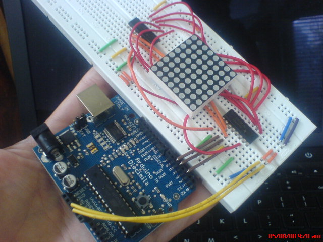
There are two chips on that board: one controls the rows and one the columns. If I added a third, and a mess of more wires, I could use the full red/green capacity of the LED matrix. Sadly, it's getting tangled. I think if I learned to solder it'd be possible to get all three shift registers squeezed under the matrix for a nice little screen module:
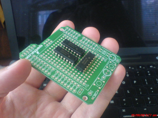
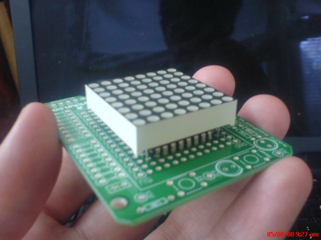
Anyone out there willing to spend an evening showing how to properly connect components to a prototype board? I can't get back to this stuff for a little while anyway, I think I may have fried the controller on the Arduino somehow.
May 8, 2008 4:56am
visual urban data slides
This is the second half of a talk that Tom Carden and I did together at U.C. Berkeley's iSchool, a few weeks ago on March 20. Tom has the first half with slides posted on his own blog. He talks about the general studio/Stamen context for our forays into visual depictions of urban data, while I go deep on Oakland Crimespotting in particular. I returned to Berkeley's Graduate School of Journalism a few weeks later to deliver a slightly-edited version of this talk alone. A video that I'm afraid to watch is on Youtube here and here.

CrimeWatch
First, it's important for us to back up a bit and understand the need that Crimespotting tries to address.


Our initial work was based on the City of Oakland's existing CrimeWatch application, a "wizard-like" form-based website available at http://gismaps.oaklandnet.com/crimewatch/. The first thing a visitor to CrimeWatch sees is a disclaimer form and a few pages of instructions.


Once past the first page, there is a long series of questions that a visitor must answer: what kind of crime to view, where to look, how far back in time to search. The crime types here seem to correspond to broadly-used categories, but there are differences among jurisdictions. For example, Oakland does not publish domestic violence as a separate category. San Francisco, which uses a similar crime mapping application, has removed homicides entirely from its online maps.


Eventually, the resulting map loads in the browser. The presentation is not entirely satisfying, with a range of tiny report icons overlaid on a map and frequently obscured by information detail windows.
Parsing Images


This is the technically difficult part. The second of the two images above shows our original data input: a compressed image covered with small, graphic icons.


We used Python Imaging Library and a collection of scraping tools to search for instances of known icons and convert them to rough GPS positions.

Because we knew what we were looking for (e.g. Vehicle Theft, Prostitution, Narcotics, Robbery, Vandalism shown here) it was possible to search by shape and color to come up with positions for these icons on CrimeWatch maps.


Early this year, Oakland City IT opened up a reliable, text-based feed of crime information for us. This was a huge help, and we no longer need to go through the slow image-scraping process detailed above. Just before IT made a better source of data available to us, we were putting the finishing touches on a Mozilla browser plug-in for distributed scraping, which introduced an element of human sanity-checking after each sweep.
Permanent Links

All of the data we collect is available in a non-mapped, text form. Everything is shown on a map, but it's also possible to slice and dice the data to show reports of a certain type or from a certain date, listed out.


The single most important improvement we think Crimespotting introduced to Oakland is the concept of a permanent link for every reported crime. These permalinks contain isolated maps of the event, connected reports, a place for people to leave comments, and other reports from the same area and time.
Patterns


Street crime in Oakland really only happens between the 880 and 13 freeways. South and west of 880 is industrial, while north and east of 13 is hilly, suburban, and quite affluent. Property crimes (marked in green) happen all over, but violent crime (marked in red) is further constrained to the poorer parts of town below 580.


We've noticed that prostitution arrests seem to come in waves - long stretches of no activity, followed by rapid bursts along San Pablo Boulevard in West Oakland or International Boulevard in East Oakland. Above we can see the result of a string of busts along International in the Fruitvale area shown in blue, the color we use for quality of life crimes like drugs, alcohol, or disturbing the peace.


Although West Oakland is commonly thought to be a dangerous place, the data we've seen shows that violent crime is really spread evenly between West Oakland and downtown. There's no cluster of violence to the West, but there is a sharp cluster of drug activity (in blue) between 580 and San Pablo.

One important lesson we learned from our users: police beats are more important than we thought. This is a map of reports from beat 04X. The beat number system is how citizens interact with the police department, and what we assumed was an arcane administrative detail is really a living, breathing idea. Not so with "police service areas" or city council districts.

Outcomes

Really, the most important thing we've learned is that motivation can come from everywhere. I initially started this project because I had hurt my back in late 2006, and had a bunch of free time on my hands over that winter. What started as a technical curiosity became a studio project and eventually a public website. Motivation comes from all over, give people data and they'll figure out something interesting to do with it.

Just showing crime is relentlessly negative, and seems to really draw out the kind of graffiti-squad neighborhood busybodies who focus solely on little problems. A near-universal reaction from non-residents to this particular project has been relief that they don't live in Oakland, but it's really not that bad here. It just looks bad when all you show is crime. We'd like to map other things: city services (police, fire, emergency), tax parcels, effects of policy, other administrative information that's hugely important.

We're also thinking about how to fill in the tapestry around Oakland - currently we're covering a very small, narrowly-defined area.

On the bright side, we're using our projects to test the assumption that there's something interesting going on with city data. Decreasing costs (money, complexity) of data analysis techniques (e.g. Google's new visualization kit) drive demand for available data.
We think in the very near future, it will become cheaper for cities to publish raw data and let citizens do their own analysis with IT in a support/enabling/superhero role. Our argument is not about "democratizing" anything and the political baggage that rides along with such terminology, it's about responding to changing costs.

Apr 28, 2008 6:29pm
solaris
Matt Webb sent this to me a while back, it's the Cliff Martinez soundtrack to the George Clooney version of Stanislaw Lem's Solaris. The soundtrack is instrumental, spooky, and calming.
- Is This What Everybody Wants
- First Sleep
- Can I Sit Next To You
- Will She Come Back
- Death Shall Have No Dominion
- Maybe You're My Puppet
- Don't Blow It
- High Energy Proton Accelerator
- Wear Your Seat Belt
- Wormhole
- We Don't Have To Think Like That Anymore
Also apropos of nothing, the Alan Parker edition of The Orb's Little Fluffy Clouds.
Apr 27, 2008 2:06am
schweddy eagle
This is so dumb.
Schweddy Eagle is an application I just wrote that yanks your location from Fire Eagle and tells you what NPR stations are in your area. You could use it with a jesus phone, perhaps in a rental car, to find quality radio wherever you happen to be.
It uses the excellent OAuth protocol to safely ask for your current location.
Apr 26, 2008 12:01am
arduino atkinson
Last October I published a tiny implementation of (Bill) Atkinson dithering in Python. Aaron ran with it and created a Modest Maps filter to prepare maps for print. Now, I'm finding Atkinson dithering useful when pumping pixels through this LED matrix I bought from Sparkfun and connected to my Arduino.
This is me messing with hardware.
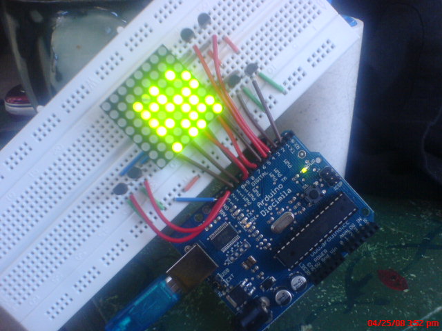
First off, the matrix isn't an easy thing to wire up. The datasheet provides these two diagrams:

A bunch of trial-and-error showed that the pins on the matrix are ordered from #1 in the lower left, to #12 in the lower right, up to #13 in the upper right and #24 in the upper left: counter-clockwise, one pin for each row and two pins (green, red) for each column. The pins are grouped in sets of (green, red, row) across the top and bottom, with the top pins controlling the left-hand columns and upper rows, and the bottom pins controlling the right-hand columns and bottom rows. It's necessary to know which end is up, shown by the (now rubbed-off) product code printed on the bottom of the matrix component. I think a little extra effort on Foryard Optoelectronics' part would have resulted in a matrix that was radially symmetrical, and worked identically regardless of how it was pushed into the breadboard.
You connect a column and a row from power to ground, and the corresponding LED lights up. You can address one entire row or one entire column at a time, but a full 8x8 image requires you to scan from one to the next, illuminating pixels in sets of 8 hundreds of times per second.
I don't have 16 digital outputs on the Arduino, so I can only address six rows and six columns. This is enough to beging to experiment with tiny images, like the fades from all-off to all-on and back shown here:
There are two pieces of code making that happen. The first, matrix.pde, is running on the Arduino, set up to accept incoming bytes and display them on the little screen. It's super dumb, but it's got scan lines and an off-screen buffer to reduce flicker, so I'm happy with how it works. The second, fade.py, is running on my laptop and pumping strings of binary data over a serial connection to make the pretty pictures. At the moment, it's fading from white to black and back and sending dithered versions of those images over the wire. If my math is right, it should be able to do this at least 100 times per second without breaking a sweat, so I'm thrilled with the time resolution.
I'm not yet sure where this goes next, but I'm going to try running some simple video over the wire to see whether it's even remotely recognizeable as an image.
Apr 24, 2008 12:52am
design your api
Two hours now, since I spoke with Twitter's Alex Payne on API design and development to a weirdly wide room at Moscone West. I think we were well received ... some excellent questions toward the end of our two-part talk. I'm exploring the idea of RESTfulness as a physical metaphor for the movement of objects to help better explain why it's winning the headspace competition against SOAP and XML-RPC.
We put our slides and notes up on Slideshare. The notes may even represent some of what came out of my mouth while I dropped into auto-pilot up there...
Apr 21, 2008 8:40pm
ffffound review
I've been an active user of Ffffound! since late summer of 2007 (sorry, I don't have any invites), here is a collection of some of my favorite images from the site. I've roughly categorized them into a few groups: maps, snow, geometry, mist, texture, grain, frozen moments, WTF?, and everything else.
Maps
Maps are what we do, here are some great ones.
Aaron Cope has been thinking about the papernet.
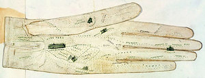
This is a map drawn on a glove that Gem found.
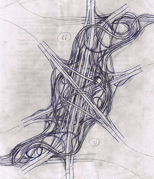
I love freeway interchanges viewed from above.
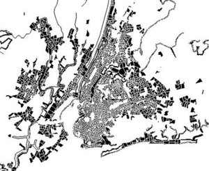
Snow
I have a soft spot for photographs taken through heavy snow, with flakes out of focus and huge in the foreground. Combined with the short-range lighting in a few of these, it makes for a lovely effect.


Geometry

Ambient occlusion is an interesting trend in rendering, like additive blending.

Mist
Many of my favorite images from Fffound! are photographed through mist.

Texture

These are some of Fred Scharmen's lovely branching sketches.
Grain
Visible grain is making a re-appearance in photography and film, see e.g. No Country For Old Men.


This one's from a collection of vintage color photos from the 1940's and later.

This one's in Wroclaw, my hometown.
Frozen Moments


WTF
A lot of completely absurd shit makes its way onto Fffound!.
The bear was my AIM buddy icon for a while.

This strongly reminds me of Madame Chao's noisecore visual style.

A lego rendering of Stephen Hawking!
Etc.

The girl's face on the right absolutely makes this photo.
Recently, one of my most-linked blog posts.
From the Helvetica movie.
I first found this amazing image in Netochka Nezvanova's ("the most feared woman on the internet") images directory, back when I gave two shits about the software abomination that was nato.0+55.
This lovely photo convinced me that black spokes with light-colored rims would be a great idea for my IRO.


Apr 19, 2008 12:22am
brandon morse
From Generator:
The stark videos of Brandon Morse present the viewer with excercises in tension, set tableaux in which structures morph and twist under physical constraints. Stripped-down architectural forms that ought to exhibit the rigidity of highrise buildings instead engage in a tug-of-war, the result of a string simulation distributing kinetic force through a network of nodes.
Apr 16, 2008 6:05pm
money
Jan Chipchase, on "Sente":
Sente is the informal practices of sending and receiving money that leverages public phone kiosks and trusted networks. In Uganda the word Sente has two meanings the first being 'money' and the second 'the sending of money as airtime'. It works like this:
Joe lives in Kampala and wants to send his sister Vicky 10,000 Ugandan Shillings - about 4 Euros. He buys a pre-paid top up card for that amount but instead of topping up his own phone calls the local phone kiosk operator in Vicky's village. The phone kiosk operator uses the credit to top up his own phone, takes a commission of anywhere between 10 and 30% and passes the rest onto Vicky in cash. The kiosk operator then resells the airtime at a profit (it is after all his business).
I love the idea that this currency has a value ceiling, an upper bound defined by the number of people with minutes in the day to talk to one another.
Jack Rusher, on money:
The early Mesopotamians used a weight of barley as their first currency. It seems important to point out to the modern reader, accustomed as she must be to the way modern currency works, that this money was different from the money of today in some very important ways. It was an actual edible commodity that could be used to make soup, bread and beer, for one thing, and for another, it was prone to decay: pests ate it, it tended to rancidity if kept for too long, and so on.
This latter property of the currency was shared with most goods in the economy, all of which fell somewhere along a continuum of impermanence. The impermanent nature of these goods is linked to the underlying ecosystem from which all value ultimately arises; everything that wasn't made of sand (pottery) or metal (tools and jewelry) was the direct product of sunlight and bio-mass, and consequently subject to unavoidable near-term wear and decay.
...
In a very real sense modern economics is still suffering the effects of a 5,000 year old swindle. The modern wisdom that a small rate of inflation is part of a healthy economy comes down to the need to make our silver behave a little more like barley.
There's an upper bound here, as well, defined by how much actual barley can be consumed.
Adam, on twitter:
If I were to design a universal currency that didn't float too badly, I'd base it on avg'd cost of balanced 2000 kCal diet in 200+ markets.
How hard could it be to design a simple currency with these characteristics and set it loose? Second Life has one; seems like all that's needed is an acceptable amount of trust and an exchange rate. Great conversation with Adam exploring this earlier today.
Instead of a gold standard, it would operate on a food bank standard where you traded your tokens in for a single balanced meal when you weren't trading them for goods and services. This also reminds me of petrodollars, another concept connected to the ultimate foundation of value: fueling biological and other activity for the purposes of movement and procreation.
Here's the scene at the 7th street post office when I dropped off my taxes last night at 10pm:

Apr 13, 2008 6:24am
index supercuts
Andy has a collection of fanboy supercuts, a "genre of video meme, where some obsessive-compulsive superfan collects every phrase/action/cliche from an episode (or entire series) of their favorite show/film/game into a single massive video montage." His collection includes some of the excellent and bizarre Lovelines isolation studies by Chuck Jones.
I'm reminded of how these constitute a kind of search index, a concept first introduced to me 11 years ago via Brian Slesinsky's Webmonkey article, Roll Your Own Search Engine. That was the first of many demystifications of big, web-scale technology for me. The thread running through all these fan cuts is the inverted index, identical to the concept introduced in that ancient article. An inverted index maps elements such as words to their source locations in a data corpus. Each of the pieces Andy links to is a kind of inverted index, pointing to locations of obscenities, audible inhalations, wilhelm screams, and so on.
The other thing it reminded me of was Simon Winchester's excellent book, The Professor And The Madman, an account of W.C. Minor's assistance in constructing the first edition of the Oxford English Dictionary. Minor was a confined lunatic with an extensive personal library, and the OED required that every sense of a word in its definition be traceable to an original, printed quotation. These were crowd-sourced from literate Englishmen of the time, but Minor's contribution went above and beyond because he noted interesting words as he read, constructing an inverted index of his library for OED-worthy terms. When dictionary editor James Murray needed a quotation for a particular word, there was a good chance Minor had already encountered and indexed it.
The works pointed to by Andy's blog post (and additions in the comments) are a special form of indexing, made possible by cheap communication and digital media. Let's hope the RIAA/MPAA don't fuck everything for an emerging form of media consumption.
Apr 8, 2008 6:04am
app engines
Google launched their app engine today, and I'd like to be the 10,000,000th pundit to comment on it. First, it's clearly a nod to Amazon's thing, a direct competitor for developers looking to host projects on proper servers without incurring proper hardware costs.
Everyone else is already describing what this is, but I'm interested in the ethical and motivational implications. Most of what I'm reading about the GAE is some variation of "joy, now I have to learn Python", which I think is an accurate stand-in for Google's entire stance on this project. A quick initial read of their documentation suggests that there's a lot more than "learn Python" here - there's also "learn Django" and "learn BigTable". GAE is as much an architectural, moral, and stylistic project as it is a technical one. Where Amazon gives you shiny rack of tools to play with, Google gives you the Tao.
At the moment, Google seems to have tuned their project towards the world of web applications, not the kind of general purpose computing offered by Amazon. I expect this to change. AWS is pushing a menu of services like SQS that provide specific pieces of a distributed infrastructure. GAE is giving you the whole shooting match in one go, but telling you approximately how it should be used. I've heard a bunch of conjectures on why this is: some people think it's a way to smooth the entry path for startups looking to get bought by Google ("hey, we already use all your stuff"), while Tom sneakily suggests it's a golden parachute for soon-to-be vested ex-employees who'd still like a bit of the old infrastructure to play with.
My own initial take on both projects has been like night and day. Amazon's services were like a breath of fresh air while so far, Google's has filled me a dread I dare not name, in spite of proudly using Python as my "thinking language" of choice. AWS exists happily as a component set for other applications, and I use S3 extensively to serve map tiles and listen to music while Crimespotting runs on EC2. I think that in this case, Google is commoditizing the wrong end of the stack. They seem to be providing the equivalent of single-language shared hosting without really opening up the benefits of a massive computing infrastructure that a tiny minority of applications need or want. I take my own initial preemptive exhaustion as a sign that they are expecting too much of their prospective users. Kiss the ring.
That said, both of these services have an ethical dimension that I appreciate. I trust that machine instances and running applications not seeing a lot of activity are swapped out in favor of those that are, a form of carbon footprint minimization impossible to achieve with your billed-monthly colocated server. In this case, scale does matter as long as the two companies keep their prying eyes out of the data and processes entrusted to them. I'm looking forward to seeing greater commoditization in this area, and I happen to think that Amazon is doing a significantly better job moving us in that direction.
Mar 26, 2008 7:45am
muxtape
Muxtape beat me to the New Amazon S3 POST Support + MP3 land rush, but here's mine anyway. It's currently constrained by pokey hotel internet, and will be filling up over the coming hours.
Update: I don't think they're actually using S3 POST at all, which means they're probably slamming their server for no good reason.
Update #2: A few example muxtapes from people I know: tma (Tomas), mattb (Matt), plasticbaguk (Tom), blackbeltjones (another more different Matt), girlwonder (Molly).
Update #3: Fastest spreading intermeme pretty much ever, I bet muxtape.com wishes they had used S3 POST: bopuc (Boris), neb (Ben), listentomy (Aaron), compulse (Shawn).
Update #4: "memetape": revdancatt (Dan), straup (Aaron).
Mar 25, 2008 3:17am
post visual urban data
We did our UC Berkeley Visual Urban Data talk on Thursday, and from this side of the podium, it went really well. Tom covered the first half with a reverse-chronological overview of Stamen's mapping work. We chose to go backwards to see whether it was a more effective presentation when the most up-to-date work was presented first, with the remainder acting as background. I then went in-depth about Oakland Crimespotting, describing the project's brief history and a number of lessons we've learned from it.
Turnout was excellent, and my first time doing a one-topic talk was loads of fun. This is definitely something I want to do again: taking a full hour to deeply explain a particular slice through our work is a welcome change from our usual rapid overview presentations. Hopefully video will be available soon, and we'll have a chance to revise and present the material a second time in another context.
The reverse-chronological order was partially inspired by Norman Davies' Heart Of Europe:
Heart of Europe: A Short History Of Poland makes no pretense of presenting a full and balanced survey of Polish affairs over the last thousand years. Although each chapter contains a brief chronological narrative, the emphasis has been firmly placed on those elements of Poland's Past which have had the greatest impact on present attitudes. ... For similar reasons, the main chapters have been written in reverse chronological order. ... In this way, the narrative leads from the more familiar to the less familiar.
Mar 20, 2008 6:51am
visual urban data
Tom and I are speaking at UC Berkeley's School of Information tomorrow:
Visual Urban Data: A Journey Through Oakland Crimespotting
- 110 South Hall, Berkeley CA
- Thursday, March 20, 2008
- 5:15 PM - 6:30 PM
We'll be talking mostly about Oakland Crimespotting, with some diversions into the rest of Stamen's mapping and urban work. Come join us!
Mar 18, 2008 6:24am
blinkenlights
I connected one of these to one of these, and made it do this:
Hardware is kind of a bitch. I have all these resistors that I'm told are necessary to prevent things from asploding, and if I want to have more than two rows of LED on there, I'll have to purchase a few more transistors. But, so far, encouraging!
Mar 17, 2008 8:03am
blog all dog-eared pages: aramis, or the love of technology

Bruno Latour's investigation of the stillborn French transit system Aramis was recommended to me by Mike Frumin after another recent book post. Latour dissects the abandonment of Aramis in the form of an academic mystery novel, featuring a cranky sociology researcher/investigator and his young, upstart graduate intern ploughing through two collected decades of first-hand accounts from technologists and bureaucrats. The Aramis PRT occasionally speaks up for itself in the voice of a temporally transposed Frankenstein's Monster.
Latour builds on his translation model from Science In Action and shows how a successful technology project changes in response to its environment, taking on new features and satisfying new needs as it navigates the landscape of human and non-human actors from conception to delivery. No change, no project. Stasis.
Aramis in particular is an example of a late-1960's fad in public transportation that sought to marry the convenience and flexibility of the automobile to the high volumes and socialized costs of mass transit. PRT's never really panned out despite multiple attempts, though in some ways the current crop of car-sharing services is fulfilling this dream from the opposite direction. In this particular case, Latour shows how Aramis was never moved past the "technically sweet" stage: always an engineer's dream, worked on by idealists with little interest in taking its revolutionary technological concepts and adapting them to the physical, financial, and political realities of Paris in the 1970's and 80's.
I marked a lot of pages here, and this is a long post. Normally I'd try to summarize everything but Latour is a lucid, enjoyable writer and his prose is a joy, so this small bit of background should be enough.
Page 24, on state:
The observer of technologies has to be very careful not to differentiate too hastily between signs and things, between projects and objects, between fiction and reality, between a novel about feelings and what is inscribed in the nature of things. In fact, the engineers the observer is studying pass progressively from one of these sets to another. The R-312 was a text; now it's a thing. Once a carcass, it will eventually revert to the carcass state. Aramis was a text; it came close to becoming, nearly became, it might have become, an object, an institution, a means of transportation in Paris. In the archives, it turns back into a text, a technological fiction.
Page 45, on variability, solidity, and resilience:
Mr. Legardere may vary in size, the ministry will change hands ten times - it would be unwise to count on stability there; but the signatures and stamps remain, offering the alliances a relative durability. Scripta manent. That will never be enough, for signed documents can turn back into scraps of paper. Yet if, at the same time, the interlocking of interests is actively maintained, the law offers, as it were, a recall effect. After it is signed, a project becomes weightier, like a little sailboat whose hull has been ballasted with some heavy metal. It can still be overturned, but one would have to work a little harder to prevent it from righting itself, from returning to its former position. In the area of technologies, you cannot ask for more.
Page 59, on metaphor:
"It's a confusion of genres," I said, forgetting my place. "Chips don't talk any more than Chanticleer's hens do. People make them talk - we do, we're the real engineers. They're just puppets. Just ordinary things in our hands." "Then you've never talked to a puppeteers. Here, read this and you'll see that I'm not the one getting carried away with metaphors. Anyway, do you know what 'metaphor' means? Transportation. Moving. The word metaphoros, my friend, is written on all the moving vans in Greece."
Page 67, on the moveable frontier:
The frontier between "the bulk of the work" and "fine-tuning the details" remains in flux for a long time; its position is the object of intense negotiation. To simplify its task, every group tends to think that its own role is most important, and that the next group in the chain just needs to concern itself with the technical details, or to apply the principles that the first group has defined. Moreover, this way of looking at things is integrated into project management.
Page 72, defining "innovation":
Here is the difference between a project that is not very innovative and one that is highly innovative. A project is called innovative if the number of actors that have to be taken into account is not a given from the outset. If that number is known in advance, in contrast, the project can follow quite orderly, hierarchical phases; it can go from office to office, and every office will add the concerns of the actors for which it is responsible. As you proceed along the corridor, the size or degree of reality grows by regular increments. Research projects, on the other hand, do not have such an elegant order: the crowds that were thought to be behind the project disappear without a word; or, conversely, unexpected allies turn up and demand to be taken into account.
Page 88, time is what is counted:
The time frame for innovations depends on the geometry of the actors, not on the calendar. ... Is VAL's time the same as Aramis'? No, even though 1975, 1976, 1977, 1979, and 1980 are critical years for both. It's no good taking out a chronometer or a diary so you can measure the passage of time and blame the first project for going too quickly and the second one for going too slowly. The time of the first depends on local sites, on Notebart's role as engine, on Ferbeck, and on Matra, just as the time of the second depends on the absence of sites, on hesitation over components, on the motor's fits and starts. All you have to do is reconstruct the chain of permissions and refusals, alliances and losses, to understand that a project may not budge for a hundred years or that it may transform itself completely in four minutes flat. The obsession with calendar time makes historians sprinkle technologies with agricultural metaphors referring to maturation, slowness, obsolescence or germination, or else mechanical metaphors having to do with acceleration or braking. In fact, time does not count. Time is what is counted. It is not an explanatory variable; it is a dependent variable that needs to be explained.
Pages 109-110, on tinkering and engineering:
"But wait a minute," I exclaimed, indignant at so much bad faith and because, by chance, I had read Levi-Strauss for my exams. "Levi-Strauss contrasts modern engineers with mythical tinkerers. We engineers don't tinker, he says. We rethink all programs in terms of projects. We don't think like savages." "Hah!" Norbert muttered ironically. "That's because Levi-Strauss did his field work in the Amazon rain forests, not in the jungle of the Paris metro. What he says about tinkerers fits engineers to a T, his ethnologist's bias notwithstanding. ...when everything is going along swimmingly; of course, then it's as if there were 'experts' quite unlike tinkerers and negotiators. But at the end, only at the end. And since Aramis wasn't lucky enough to have such an end ... No, believe me, you don't have those who tinker on one side, and those who calculate on the other."
Page 118, Matra's M. Freque on arguing:
"The arguments sometimes got pretty lively. You heard everything: 'Greedy industrialist!' 'Profiteers!' 'Assholes!' But in the long run we reached an agreement. The problem with Aramis is that not enough people yelled at each other. Below a certain level, that's not good. You see, sometimes my ideas got rejected, other times I came out the winner; sometimes things got simplified, other times they got complicated. That proves it was a real debate, a real negotiation."
Pages 126-127, on mobilization:
As a project takes shape, there is an increase in the number, quality, and stature - always relative and changing - of the actors to be mobilized. Petit was just one highly placed official. Now ministers and presidents are involved. By moving from conceptual phases to production phases, you move from saints to the God they serve. Since the project is becoming more and more costly, since it is agitating more and more people, since it is mobilizing more and more factories, since the nonhumans it has to line up are numbered in the thousands, since it is a matter no longer of plowing up a beet field but of tearing up parts of southern Paris, actors capable of providing resources adequate to the new scale must henceforth be reckoned with. Ten times as many actors are now needed for the project, and they cannot be recruited one by one - one pipe smoker after another, one iron bar at a time. We have to move from those who represent small numbers to those who represent large numbers.
Page 157, Aramis speaks for itself:
Why reject me? Have I not been good? Was I not born well-endowed with virtues, unlike my brother VAL? Have I not been the dream, the ideal? What pains were not taken for my conception! Why recoil in horror today? Did not all the fairies hover over my cradle? Oh, my progenitors, why did you turn your heads away, why do you confess today that you did not love me, that you did not want me, that you had no intention of creating me? ... Of all the sins, unconsummated love is the most inexpiable. Burdened with my prostheses, hated, abandoned, innocent, accused, a filthy beast, a thing full of men, men full of things, I lie before you. Eloi, eloi, lama sabachthani.
Pages 159-160, on private doubt:
"To account for this survival, this delay, we have two elements: up above, in the higher spheres, everyone is now in favor of Aramis, unanimously. Although everybody has private doubts about the project, they give it their own backing, however half-heartedly, because they see all the others supporting it enthusiastically. Down below, with the technicians, everybody is skeptical..." "At least that's what they're saying now. At the time, no one noticed the skepticism..." "Exactly. Everybody was skeptical, but only in private. That's the whole problem: half-doubts are all scattered, isolated, buried in notes that we are often the first to see, in any case the first to bring together as a whole."
Page 174, on smoothness:
Let's calculate the sum of forces - using this expression to designate both the work all the actors do to sum up and the diversity of the ontological models they use. Let's add the thrusts of human labor, the fall of ballistic missiles, the responsibility of promises, amorous seduction, the shame of more killing, vanity, business - everything that makes Aramis impossible to suspend. Yes, it's definitely a strange monster, a strange physics. It's the Minotaur, plus the labyrinth, plus Ariadne and her thread, plus Daedalus, who is condemned to die in it and who dreams of escaping. They're really fun, those people who write books in which they think they're castigating technology with adjectives like smooth, cold, profitable, efficient, inhuman, irreversible, autonomous! These insults are qualities with which the engineers would be delighted indeed to endow their hybrid beings. They rarely succeed in doing so.
Page 180, on bureaucracy:
To make fun of the files of the bureaucrats, to make fun of the two-page notes of synthesis and the thousand-page appendixes, is to forget the work of stabilization necessary to the interdefinition of the actors. It is to forget that the actors, large or small, are as lost in the action as the investigator is. The human sciences do not show up as the curtain falls, in order to interpret the phenomenon. They constitute the phenomenon. And the most important human sciences, always overlooked, include accounting, management, economics, the "cameral sciences" (bureau-graphy), and statistics.
Page 199, on common sense:
"Everything happens in defiance of common sense, but there is no common sense for innovations, since they happen, they begin, they invent common sense, the right direction, the correct procedure."
Page 213, on figure-ground reversal:
Where is this thing, the microprocessor, to be situated? On the side of human beings? No, since humans have delegated, transcribed, inscribed their qualities into nonhumans. On the side of nonhumans, then? Not there either. If the object were lying among nonhumans alone, it would immediately become a bag of parts, a heap of pins, a pile of silicon, an old-fashioned object. Thus, the object, the real thing, the thing that acts, exists only provided that it holds humans and nonhumans together, continuously. ... On the one hand, it can be said to hold people together, but on the other hand it is people who hold it together.
Page 280, on stasis:
The report presented the 1987 Aramis, word for word, as identical to Petit and Bardet's 1970 Aramis. I found myself twenty-one interpretations, but the technological documents remained mute about this dispersion. Aramis had not incorporated any of the transformations of its environment. It had remained purely an object, a pure object. Remote from the social arena, remote from history; intact. This was surely it, the hidden staircase Norbert had been looking for. Its soul and its body, as he would say, never merged.
Page 292, on Aramis unloved:
"Yet in spite of its fragility, its sensitivity, how have we treated it? Like an uncomplicated development project that could unfold in successive phases from the drawing boards to a metro system that would run with 14,000 passengers an hour in the south Paris region every day; twenty-four hours a day. Here is our mistake, one we all made, the only one we made. You had a hypersensitive project, and you treated it as if you could get it through under its own steam. ... You believed in the autonomy of technology."
Page 295, Aramis speaks again:
Of what ends am I the means? Tell me! you hid from one another in order not to admit that you didn't want me. You built the CET the way human couples produce one child after another when they're about to divorce, trying to patch things up. What horrible hypocrisy, entrusting to the whimperings of the most fragile of beings the responsibility for keeping together creatures that are much stronger than itself.
Mar 11, 2008 5:41am
georectifying
I amused myself this weekend by pulling maps from the Online Archive Of California and grinding them up with Python and gdalwarp to make map tiles:


Mar 3, 2008 8:09am
oakland crime maps X: return of the jedi
We launched Oakland Crimespotting back in August, and all was well for a short time. There were friendly mails from Pete Wevurski, John Russo, and others who liked what we were up to. Unfortunately, we ran afoul of Oakland's website availability, and by late October it became completely impossible for us to collect data at a sustainable rate. We closed up shop and replaced the front page of the site with an apology and a promise.
After several months of general stagnation, Oakland City IT reconnected us to a current, reliable, and accessible data source in January, and I can now confirm that it all Just Works.

There are a few bits of New sprinkled throughout the site.
We've added pages for individual police beats, such as this one for 04X, where I live. A large number of our users asked for these, though truthfully it wasn't something I expected. I've been historically critical of the forms-first approach that CrimeView Community takes ("Easy wizard interface"), eschewing it in favor of a maps-first approach. Changing standards of cheapness are a recent interest of mine, and it's cheaper to show everything. Expect to hear more of this from Tom at E-Tech tomorrow. In fact, Police Service Area and City Council District aren't ways that Oakland residents commonly locate themselves. The Police department is organized into beats, and this turns out to be the right way to interface with them if you're a concerned, active citizen. Each beat has a consistent set of officers and public contact information. Oakland CTO Bob Glaze told me the beat designations haven't changed in decades. Clearly, maps and data for individual beats were going to be necessary.
Each beat page features a map of recent reports in that area. These maps are the result of Aaron's heroic work in extending Modest Maps' static mapping abilities. WS-compose is now a sweet little map generator that will happily report geographic dot locations in HTTP response headers if you ask it nicely, among other tricks.
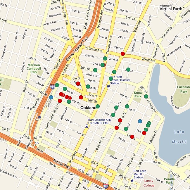
There are also per-beat news feeds and downloadable spreadsheets of detailed information for neighborhood crime prevention councils.
The other addition is a proper comment feature. In the past, we've had an error report form on each crime report page where residents could alert us to improperly-placed reports or other mistakes, but this wasn't as effective as it could have been. The primary problem was that posting an error report didn't really set off any alarm bells, and it certainly didn't appear on the site anywhere. I've grown to feel that replacing a clunky web interface with a mute one isn't necessarily much of an improvement, so it's valuable to provide a direct feedback mechanism right there on the site.
The error reports have now been replaced by actual comment forms where you can leave your name, a message, and an optional link at the bottom of each individual report page. The comments are keyed on the case number, so case numbers with multiple reports share a set of comments. Right now these just look like regular blog comments, but the intent of the link is to add news articles or connect reports to one another. I hope very much to see this feature of the site grow into something interesting and unexpected.
Here is the mail I sent last month announcing our return:
Hello Everyone,
We're happy to announce that Oakland Crimespotting is back, thanks to the generous help of Oakland's City Information Technology Department. After three months without access to report data, we've been granted a reliable, regularly-updated source of crime report information. This is great news: it means that the website is back up and running with current information, e-mail alerts and RSS feeds work again, and we at Stamen Design can explore new ways of presenting and publishing this important information.
Here are a few things you can do, now:
Visit the site at http://oakland.crimespotting.org/. View a map at http://oakland.crimespotting.org/map/. Sign up for alerts at http://oakland.crimespotting.org/alerts.
We are also interested in what additions to the site you would find useful or interesting. So far, we've had a number of suggestions that we're actively looking into: spreadsheet-friendly downloads, details on individual police beats, a search function, and more than one month's worth of data. If you have any thoughts on these or other ideas, send us a mail at info@crimespotting.org.
Our return would not have been possible without the help of a few key people. Ahsan Baig, Ken Gordon, and Bob Glaze at Oakland City IT built and published a source of information for us. Ted Shelton, Charles Waltner, and others helped us navigate the difficult waters of City Hall communications. Jason Schultz, Ryan Wong, Karla Ruiz, and Jeremy Brown at U.C. Berkeley Law School helped us understand how to best approach city governments for information. Kathleen Kirkwood and Pete Wevurski at The Oakland Tribune helped us understand the journalistic context of the project. Dan O'Neil and Adrian Holovaty at EveryBlock.com were a valuable sounding boards for ideas
Mar 1, 2008 7:13pm
slippy faumaxion, take two
Two weeks ago, I posted the faumaxion slippy map, an interactive interpretation of Buckminster Fuller's Dymaxion World Map. I was curious to see whether the continuous re-orientation of the map would be jarring or confusing to users. Based on some helpful feedback, I've updated the map so that the dragging and rotation behaviors are separate. Instead of continuously re-orienting itself to face North for whatever point happens to be in the center of the map during a click-and-drag, a tiny compass rose shows which way the map will rotate itself once the mouse is released. This version feels calmer, and makes for a more predictable (and therefore better?) interaction:
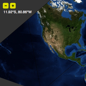
Feb 24, 2008 7:14pm
blog all open tabs
Need to get these out of my tab pile ... You And Your Research, What single book is the best introduction to your field (or specialization within your field) for laypeople?, digital elph sd1000, Social Design Notes: An Introduction to Information Design, What Specifically Do Generalists Do?, Systeme D Cartography, Movement, Web Directions North 2008 closing keynote, analysis of competing hypotheses, Arduino troubleshooting.
Feb 21, 2008 8:20am
blog all dog-eared pages: the nature and art of workmanship

Until his death in 1993, David Pye was a professor of furniture design at the Royal College of Art in London. The Nature And Art Of Workmanship is a guide to his theory of workmanship as distinct from design. The tone of the book is slightly musty, frequently dipping into old-mannish complaints that ring slightly of "the kids today", but on balance Pye is a clear writer with a coherent idea to communicate.
The book focuses on laying to rest the fallacy of "things done by hand" in favor of the terminology of risk and certainty. These two terms form the core of Pye's theory of workmanship, and boil down to "can it be fucked up?" For Pye, the meaningful distinction is whether a thing is a result of a risky process, or a certain one. The former requires dexterity and judgement while the latter requires an assembly line and planning. The division was a new one to me, but it has occasionally snapped into focus since I started this book over Christmas, as when reading Jeff Veen's latest blog post on Indi Young's new book:
In the end, using Indi's process, we were able to convince teams that we weren't researching all the creativity out of their projects. We were researching the risk out. And no matter how the industry is faring, that's a story people want to hear.
For what it's worth, Stamen is teetering on the cusp of this distinction (among other cusps we teeter on) as we investigate the sense of formalizing our process with an explicit producer role. Thus far, our work has been raw risk. I don't mean to say that we routinely snatch victory from the jaws of defeat, but we consciously lack a "process" as someone like Jeff, Indi, or the company they helped found might understand it. It's personally interesting to me that computation and programming can still be seen to be risky in the same way that woodworking or pottery can, especially with the rapid growth of social websites whose success can not be measured by technical means alone.
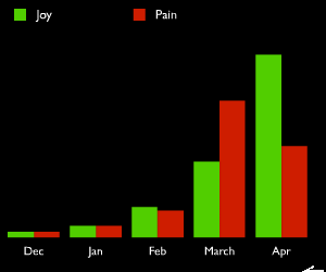
(slide nabbed from Scaling Twitter)
As we take on larger slices of work, there's a natural inclination to manage risk by introducing certainty into the workflow. Namely, developing a process, knowing whether we're sticking to it, and starting think about hiring as filling holes rather than seeking out fellow travelers. I offer no opinions on this, except to say that it's an active debate.
It's also worth noting that Pye is no dogmatic fan of doing things the hard way. He devotes a number of pages (some excerpted below) to exploring why precise workmanship has been historically valued, notes that much work traditionally thought of as "hand labor" is really as jigged and regulated as machine work, observes that in many settings certainty and uniformity are desirable, and takes the Arts and Crafts movement itself to task for misunderstanding the potential joy inherent in competent work.
Page 17, on design, workmanship, and defining terms:
In the last twenty years there has been an enormous intensification of interest in Design. The word is everywhere. But there has been no corresponding interest in workmanship. ... This has not happened because the distinction between workmanship and design is a mere matter of terminology or pedantry. The distinction both in the mind of the designer and of the workman is clear. Design is what, for practical purposes, can be conveyed in words and by drawing: workmanship is what, for practical purposes, can not. In practice the designer hopes the workmanship will be good, but the workman decides whether it shall be good or not. On the workman's decision depends a great part of the quality of our environment.
Page 20, on risk, certainty, and defining more terms:
If I must ascribe a meaning to the word craftsmanship, I shall say as a first approximation that it means simply workmanship using any kind of technique or apparatus, in which the quality of the result is not predetermined, but depends on the judgement, dexterity, and care which the maker exercises as he works. The essential idea is that the quality of the result is continually at risk during the process of making; and so I shall this kind of workmanship, "The workmanship of risk": an uncouth phrase, but at least descriptive. ... With the workmanship of risk we may contrast the workmanship of certainty, always to be found in quantity production, and found in its pure state in full automation. In workmanship of this sort the quality of the result is exactly predetermined before a single salable thing is made.
Page 25, on doing by hand:
Things are usually made by a succession of different operations, and there are often alternative ways of carrying any one of them out. We can saw, for instance, with a hand-saw, an electrically driven band-saw, a frame-saw, and in other ways. To distinguish between the different ways of carrying out an operation by classifying them as hand- or machine-work is, as we shall see, all but meaningless. ... The source of power is completely irrelevant to the risk. The power tool may need far more care, judgement and dexterity in its use than the hand-driven one.
Pages 32-33, on roughness:
In the workmanship of risk rough work is the necessary basis of perfect work, just as the sketch is of the picture. The first sketchy marks on the canvas may become the foundation of the picture and be buried, or they may be left standing. Similarly the first approximations of the workman may afterwards disappear as the work proceeds, or they may be left standing. For the painter and the workman it is sometimes difficult to know when to stop on the road towards perfect work, and sooner may be better than later. In the workmanship of certainty, on the other hand, there is no rough work. The perfect result is achieved without preliminary approximation.
Pages 49-50, on design intent:
The intended design of any particular thing is what the designer has seen in his mind's eye: the ideally perfect and therefore unattainable embodiment of his intention. The design which can be communicated - the design on paper, in other words - obviously falls far short of expressing the designer's full intention, just as in music the score is a necessarily imperfect indication of what the composer has imaginatively heard. The designer gives to the workman the design on paper, and the workman has to interpret it. If he is good he may well produce something very near the designer's intention. If the workman is himself the designer he almost certainly will (but that does not imply that the designs a workman intends are necessarily good ones).
Pages 58-59, on the origins of precision:
In nature we see varying degrees of disparity between the idea and the achievement wherever we look. To Plato it may perhaps have seemed that things would look better if there were no such disparities. We, having lived in an age where to all appearances such disparities really can be banished from our environment, may doubt it. ... Our traditional ideas of workmanship originated along with our ideas of law in a time when people were few and the things they made were few also. For age after age the evidence of man's work showed insignificantly on the huge background of unmodified nature. There was then no thought of distinguishing between works of art and other works, for works and art were synonymous. ... Then and for a long time afterwards - and even now in some remote places - all the things in common use for everyday purposes were of fairly free or rough workmanship and anything precise and regular must have been a marvel, amazing and worshipful.
This reverence for precision had, I think, two explanations. ... The second, and I believe deeper, reason lay in the opposition of art to nature. The natural world can seem beautiful and friendly only when you are stronger than it, and no longer compelled with incessant labor to wring your livelihood out of it. If you are, you will be in awe of it and will propitiate it; but you will find great consolation in things which speak only and specifically of man and exclude nature. When you turn to them you will have the feeling a sailor has when he goes below at the end of his watch, having seen all the nature he wants for quite a while. Precision and regularity, in those days signified that, to the extent of his intellect, man stood apart from nature, and had a power of his own.
Page 62, on spatial frequency and diversity:
It is a matter of the greatest moment in the arts of design and workmanship that every formal element has a maximum and minimum effective range. In can only be "read" - perceived for what it is - by an observer stationed within those limits. ... In nature, as in all good design, the diversity in scale of the formal elements is such that at any range, in any light, some elements are on of very near the threshold of visibility: or one should say, more exactly, of indistinguishability as elements. As the observer approaches the object, new elements, previously indistinguishable, successively appear and come into play aesthetically. Equally, and inevitably, the larger elements drop out and become ineffective as you approach. But new incidents appear at every step until finally your eye gets too close to be focused. The elements that at any given range, long or short, are just at the threshold, that we can just begin to read, though indistinctly, are of great important, aesthetically. They are perhaps analogous to the overtones of notes. They are a vitalizing element in the visible scene.
Page 118, David Pye doesn't like John Ruskin:
The deficiencies in the Arts and Crafts movement can only be understood if it is realized that it did not originate in ideas about workmanship at all. Indeed it never developed anything approaching a rational theory of workmanship, but merely a collection of prejudices which are still preventing useful thought to this day.
Much of what Ruskin writes is ambiguous because it is impossible to be sure what he is referring to. When he cites examples he always manages to leave room for doubt about his meaning. So far as one can judge, the essence of the ideas he wanted to express was that: 1) To make men do tedious repetitive tasks is unchristian. 2) High regulation always involves such tasks and must therefore be eliminated. 3) If the workman is allowed to design he will do rough work and so will eliminate it.
Above all, the workman's naive designs will be admirable. What Ruskin is inveighing against is not hard labor, but patient work. He did not realize, or so it seems, perhaps because he never had to work for a living, that a fair proportion of patient tedious work is necessary if one is to take any pleasure in any kind of livelihood, whether it be designing or making, for no one can continuously create and no one ever has. He did not realize there is great pleasure in doing highly regulated workmanship.
Feb 18, 2008 7:43am
slippy faumaxion
"Your side projects always seem to involve the Hard Way" (Tom Carden, November 14th, 2007)
(Update, March 1: Check out a new revision of this map with a calmer, more predictable drag behavior)
Late last year, I posted about the "faumaxion" world map, a slightly modified version of Buckminster Fuller's famous Dymaxion World Map. I've finally put the finishing touches on this project, implementing it as a command-line script for composing static images (similar to Modest Maps compose.py) and a Flash slippy map.
Go play:
Or download the Python library: faumaxion-py.tar.gz (requires PIL).
There are a bunch of interesting things going on here.
The panning action is different from a typical Google Maps interface. With the mercator projection centered on (0N, 0E) that all the popular providers use, North is always vertical. Here, the faces of the icosahedron wrap around the sphere and meet at non-right angles. As you pan the map, the focal point marked by the small circle is kept North-oriented. A less jarring way to design this would be have the drag action work just like a normal slippy map, and animate the reorientation to North at the end of a move. I'm curious, though, how this version is perceived, and whether it's too infuriating to use.
I definitely think it does a good job of illustrating how the interrupted projection works.
Unlike your typical mercator or albers projection, the map is divided into twenty separate gnomonic projections, each framed in one triangle from an icosahedron. Buckminster Fuller designed his original projection so that the edges of the triangles fell on water as much as possible, dividing the globe neatly into chunks of inhabited land - it's a humanistic map, designed to focus on human views of the world. I'm calling this one "faumaxion" because it doesn't strictly follow Fuller's model - he didn't use the gnomonic projection, and I don't do any additional cuts near Australia to keep it whole (sorry, George).
Typically, the imagery we handle in Modest Maps is continuous, with aerial photography or road maps covering large areas that are broken down into smaller and smaller squares. The math for handling rectilinear tiles is fairly straightforward, and is covered by Modest Maps' geometry classes: Location, Point, and Coordinate. In the faumaxion case, the tiles are equilateral triangles at a range of zoom levels.


The tiles are all being served from Amazon S3. They're regular square JPEGs in the Flash version, masked behind triangles in the display. For the Python version, I'm using 24-bit transparent PNGs with the bits outside the triangle already cut out. You'll notice that at the higher zoom levels, some tiles are missing or screwed up. Sorry.
The imagery source is all NASA Blue Marble loveliness, which I've raved about before and use in the first Modest Maps demo.
A strategy that seems to work for interactively arranging icosahedron faces here is based on an article from Scott Bilas of Gas Powered Games, The Continuous World Of Dungeon Siege. I make no claims about this interactive toy being anything like a complete 3D game, but I borrowed Scott's idea of maintaining a central reference point ("there is no world space") and performing whatever linear transformations are necessary to arrange a world around that point on every frame. Faumaxion's central reference point is the circle in the middle - it's the first face to be drawn, and every other face is continually arranged around it using a variation of the "ghost finger" hack I described in "gefingerpoken," a recent post on multi-touch interfaces.
My hope is that in combination with some excellent work that Tom Carden's been doing to port Modest Maps to Processing, the transformation-based placement of faces here will eventually migrate into the mainstream ActionScript 3.0 version of Modest Maps, making it possible to display a wider range of intermediate zoom levels and generally make the TileGrid a little less crazy.
Although I didn't go so far as to add geographic markers to this map, it's possible to do so, and I threw the tiny latitude/longitude display into the upper-left hand corner to show it. For all its oddities, the Dymaxion World Map is wonderfully suited to showing global concerns: Fuller created arrangements focused on different parts of the globe to demonstrate the sense of historical political and military moves, such as Japan's grab for empire in the 1930s and 40s, or British domination of the south seas in the early 19th century. Other uses might include visualization of transcontinental flights that otherwise look like wasteful loops when plotted on a standard mercator projection. I'm looking at you, noted Web 2.0 travel-sharing website.
Feb 10, 2008 10:09pm
now with comments
I've been toying with Akismet and ReCAPTCHA a bit, and I feel comfortable adding comments to this blog again. I last tried this this almost four years ago, and the near-instant flood of Texas Hold 'Em spam made me turn them off. ReCAPTCHA uses the Internet Archive's book-scanning project as a source of difficult-to-read text, so there's a social good that results from any submitted comments.
I had originally wanted to use Akismet as a primary filter, so that the ReCAPTCHA form was only displayed if a comment triggered their spam alarm. However, I became uncomfortable with the comments on my personal site being used to stock a commercial database. I will still use this pattern elsewhere, because it's a self-evidently better user experience, but while you are in my house you shall be forced to suffer.
Comments only work on relatively recent posts - anything older than three months or so has the form turned off.
Feb 9, 2008 8:40pm
thinking about spreadsheets while washing the dishes
I've had reasons to think about spreadsheets in the context of a number of clients recently. They're becoming something like a lingua franca for delivery of sample data. In some ways, this is frustrating: files are inevitably in Excel format, sizes are limited, delivery is clunky, etc. In other ways, it marks a sort of graduation into "real business" land for us, where we have to buy copies of MS Office and use them more than once or twice each month. That or just hit xlrd.
I'm inevitably reminded of Ian C. Rogers' post on music, Convenience Wins, Hubris Loses. There, he introduces the genius metaphorical arithmetic iTunes is a spreadsheet that plays music. For Rogers, this is a critique: It's context-free. You just paid $10 for that album - who plays drums? I dunno, WHY DON'T YOU GO TO THE WEB TO FIND OUT, BECAUSE THAT'S WHERE THE CONTEXT IS. Ian, as a Yahoo! Music guy, makes the point that background context for music is the domain of the web, and the missing piece to iTunes. For me, the analogy is a reminder of what makes iTunes so great: my listening habits have become much more spreadsheet-like lately: my two most-used smart playlists are "Been A While" (all tracks where last played is not in the last 3 months) and "Top Songs" (all tracks where rating is greater than two and time is less than 15:00). The first one feeds the second one as I listen to music and get around to rating it. The first one also helps guarantee a continuous degree of novelty.
The spreadsheet has an older, wiser cousin, and it is called database.
My first exposure to a database in the now-familiar application context was during an early contracting gig for which I learned ColdFusion and modified some sort of forms-based site. Everything made sense for the most part, except that there was this monster lurking under the covers and I could ask it to SELECT and UPDATE things, but only Tim in the room next door knew how to modify tables or make new instances. I had no mental model for what it was doing. The thing that makes a relational database more interesting to me than a spreadsheet is that it is meant to store a bag of facts rather than a particular representation of them. Excel's rows have a given order, and that's meaningful. I continue to be confused when I open the program, select a row header, and no automated sorting happens. I bump up against a particular idea of permanence that makes order matter for a spreadsheet and not matter for a database, and I've been conditioned to expect the latter by eight years of working on the web with a succession of open source SQL engines.
A blog post by Theresa Neil that I encountered early last week, Seek Or Show, pokes at this distinction from the interface point of view. She talks about two paradigms: the Seek (Search) paradigm is typically used in web sites, and the Show (View Based Lists) paradigm exists mainly in desktop applications. The distinction comes from differing economies of scale on the web vs. the desktop: the seek/search paradigm works when storage is cheap but transmission expensive, as in the context of a large database published over the web. The show/lists paradigm works when transmission is cheap, as on a desktop computer.
Theresa describes ways in which the show/lists pattern might move onto the web. I'm interested in the ways in which traditionally show-based applications might switch paradigms entirely. Local storage is becoming cheap, and technologies like Spotlight, CoreData, and SQLite are making it easier for all kinds of developers to think like a database admin (not to mention the way that Apple and Mozilla have their sites on actual application development with WebKit and XULRunner). Above all, the volumes of information typically associated with a show/lists UI are growing past the point of reason.
If iTunes is a spreadsheet that plays music, what would a database that plays music look like? There are a few hints out there at what this would be. The most obvious is Last.fm, the UK music site that observes your listening habits through an iTunes plug-in and publishes them on the web. My primary use of Last.fm is a the presence of a frequently-updated script that displays Shawn's recently-played music on my desktop. Up until a few months ago, this would migrate into search terms on OiNK (now it goes nowhere). Friends Ryan and Gabe eschew iTunes altogether and play their music from a custom-built web application that streams everything in via Flash in the browser. Here's a screenshot:
The blue dot at left is an animated radial EQ, the gray arc around it is the MP3 loading progress, and the orange arc is the track time progression. The orange dot at right is a growing/shrinking volume control.
The interesting thing about this case is that the site has rudimentary social features that mimic a few of Last.fm's, but you can actually listen to the music on it. It's storage as well as index. The thing it does not do is present a view of its music too far outside the traditional album-artist-track hierarchy.
Feb 5, 2008 6:42am
super duper tuesday
Tomorrow morning is Super Duper Tuesday, the first time I get to vote in a presidential election, and the first time that my vote (as a Californian) will count for anything.

(photo yoinked from the New York Times)
Jan 30, 2008 6:32pm
immaculate heart college art department rules
This (by Sister Corita Kent) was worth retyping:
- Find a place you trust and then try trusting it for a while.
- General duties of a student: pull everything out of your teacher, pull everything out of your fellow students.
- General duties of a teacher: pull everything out of your students.
- Consider everything an experiment.
- Be self-disciplined. This means finding someone wise or smart and choosing to follow them. To be disciplined is to follow in a good way. To be self-disciplined is to follow in a better way.
- Nothing is a mistake. There is no win and no fail. There is only make.
- The only rule is work. If you work it will lead to something. It’s the people who do all of the work all the time who eventually catch on to things.
- Don’t try to create and analyse at the same time. They’re different processes.
- Be happy whenever you can manage it. Enjoy yourself. It’s lighter than you think.
- “We’re breaking all of the rules. Even our own rules. And how do we do that? By leaving plenty of room for X quantities.” - John Cage.
Helpful hints: Always be around. Come or go to everything always. Go to classes. Read anything you can get your hands on. Look at movies carefully often. Save everything, it might come in handy later.
There should be new rules next week.
Jan 29, 2008 7:10am
what vs. how
An AIGA post from last summer (The Amazing Visual Language of Processing) has got me thinking about the tension in the relationship between design and technology, especially in a firm like Stamen.
One of the ways in which we describe our work to ourselves is a balance between Divergence and Convergence, words that my dad explained to me a while back in a design context. Divergence means sketching, exploring, playing, choosing the right metaphors to use. Convergence means you have a goal in sight, and you're problem-solving to attain it within known constraints. We shift from one mode to another over the course of a client engagement, and we're starting to get better at self-awareness in this process. There's a perpendicular division/dialogue as well, between what and how, and I think it operates above the project level, maybe even above the company and industry level in some cases.
Our What is the content you see in a Hindsight or Swarm, the visual presentation of an information source like home construction or popular news stories. This is the obvious bread and butter of what we do, and generates a lot of phone calls, e.g: "we saw Digg Labs, and we have this new website idea that we can't talk about, but we'd like a Labs of our own, please, for when we launch." I think a lot of traditional design (for an ever-changing definition of "traditional") happens here: if you already know how to do CMYK or HTML, you can focus on the communication, the content, and finally the finesse.
Our How is the way we get things done, and is the sum total of all the data, web, presentation, shaping, protocol, publishing, processing, algorithmic, and other domain knowledge we've built up over the years. I think about this a lot. In addition to being a partner/owner, my official role is Director of Technology. This means that much of my time is spent with a machete in the jungle of new stuff that might be interesting to us at some point in the future: new technology, new sources of interesting data, and new ways of cramming it all through the thin straw of the web for viewing in a browser.
The thing that keeps me going is that all this How work is really fascinating. A lot of it happens in the early phases of a project, and not all of it sees the light of day, but I like to think that one of our competitive advantages as a company is having a deep well of technique to draw from, and the ability to keep a dialogue going between the two poles. The reason I say above that this dialogue frequently seems to span companies is because in many cases, it is obstructed by force of habit. If you already know how to do something, there's no need to learn to do it another way. Dialogue keeps novelty flowing up and back to the visible work, and inspiration and movement down and towards the coalface where all the dicking around happens. Groups that lack this line of communication seem to either get stuck in techno-noodling/experimentation on one hand or cul-de-sacs of process fervor on the other.
Some of the most interesting people I know are adept at shuttling back and forth along the line between the two poles. Matt Biddulph seems to spend 75% of his time running Dopplr, and the other 75% of his time exploring hardware, Erlang, Second Life, and Jabber. My friend Bryan is a builder and carpenter, and talking to him about his new house show a similarly expansive scope: I'm fascinated by the idea of pointing to doors and windows and being able to assert that they should be moved this way or that, holes for new doors punched in existing walls, and entire new spaces carved out of basements and foundations. Eric Sink had a great way of explaining this constant peering-into-things in a 2003 blog post where he talks about constant learning ("Don't work for a manager who is actively hindering your practice of constant learning. Just don't do it."). I also enjoyed Clayton Christensen's Innovator's Dilemma and its examples drawn from the disk drive industry (the mayflies of computing) for an extended explanation of the ways in which an existing What can block the view to a new How, to the point that entire companies and even industries are plowed under. For whatever reason, technology (as much a moving target as "traditional") freaks people out, e.g. Miko's extensive comments on the GiveWell fiasco from last month: "Though the 'elders' were universally extremely bright and accomplished people, I was struck by what I can only call a sort of fundamental insecurity.... As soon as technology is mentioned, many of them seem to forget what they already know, and fail to ask the basic questions they have been asking all their lives."
Back to the convergence/divergence thing, I think the what/how conversation spins on a different axis, more slowly than individual projects. Just as an example, the granularity of Stamen's mapping work exploded this past year when we started the Modest Maps project and introduced a city-scale level of detail to our work and served as the backdrop to a series of efforts at representing time. The previous year, our work with Digg (designing their API, the Labs work) led to a multi-client exploration of liveness. This year, we've identified responsiveness as a seam to mine, looking at ways in which new and old projects might incorporate user feedback to change the underlying systems.
Jan 24, 2008 2:16am
everyblock launches
Adrian's baby EveryBlock launched today, offering locative neighborhood information for San Francisco, Chicago, and New York. They include things like alcohol permits, restaurant inspection reports, craigslist missed connections, filming permits, police and fire activity. No SF crime yet, but that's something we may be able to help with.
I love a site that has the gumption to roll their own maps:
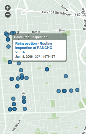
A challenge for EveryBlock: make a write API for other towns.
Jan 19, 2008 12:57pm
on the design of future things
Chris makes some excellent comments on Don Norman's new book, The Design of Future Things.
On smugness:
I'd posit that these smug systems may have resulted from use cases, and traditional user-centred design. We've been taught to design systems for a purpose - preferably one purpose - collected through use cases and designed against them. Use case collection never really includes crazy ideas or tries to foretell unexpected and unplanned uses. Good design, in my mind, is designing enablers or tools that include the use cases given, but have breathing room, rather than designing strictly to the use cases. It could be said that this reduces usability, and it often does, but with the flipside of user value.
On digital marks of wear and tear:
Argh. No. This isn't digital art. And again, it's unnatural given the situation. If we have wear marks, we should really use the metaphor of real paper, and real books. The natural marks of electronic text are the links to, the referrers, the views, the links out: the hypertext, the associations, and the metadata. These can be visualised to provide implicit signals.
On IDEO and design science:
Any attempt at providing the "science bit" only works if you have great designers who know when to break the rules (this is the sleight-of-hand that IDEO play - provide a seemingly rigourous process to pacify management, then use designers who don't need to follow the process to produce good results).
Jan 12, 2008 8:41pm
blog all dog-eared pages: the unfolding of language

Guy Deutscher's The Unfolding Of Language was just returned to me after an extended loan, where it was apparently passed on to half a dozen more people or so.
Unfolding is a pop-linguistics book that describes the forces that shape language evolution, illustrates them with copious examples, and finishes up with a lengthy narrative showing how modern language (not necessarily English) might evolve from simple conceptual building blocks. Much of the content would be familiar to anyone in an introductory university linguistics class or one of George Lakoff's frumpy lectures on conceptual metaphor. The book is written in a chatty, at times grating tone, but it neatly presents a picture of linguistic evolution as a whole.
Deutscher shows how changes in language might be viewed from within as a form of decay or destruction, while the deeper currents of creative evolution and expansion remain hidden from view. He recounts familiar worries about degenerate forms like "gonna" or "hella", showing the phonetic drifts that erode longer forms into shorter, more economic ones. At the same time, he describes the expressive changes that get you a verb phrase like "going to go" in the first place, explaining how the mundane conversational furniture of linking verbs and tense markers all around us evolved from concrete analogies to physical space and time.
The examples are classic comparative linguistics. Words and phrases from early written history are compared to modern usage, and metaphors from across languages are showed to have a common conceptual origin. I've chosen a few of the more forceful paragraphs here, but the book is a goldmine of familiar examples and their counterintuitive origins.
Pages 61-62, on how language evolves:
The point is that no one in particular created this footpath, and no one in particular even intended to. The path did not emerge from some project of landscape design, but from the accumulated spontaneous actions of the short-cutters, who were each following their own selfish motives in taking the easiest and quickest route.
Changes in language come about in a rather similar fashion, thghout the accumulation of unintended actionse. These actions must stem from entirely selfish motives, bot from any conscious design to transform language. But what could these motives be? This is a rather more involved question, and doing justice to it will occupy us in the next few chapters. But in essence, the motives for changes can be encapsulated in the triad economy, expressiveness, and analogy.
Economy refers to the tendency to save effort, and is behind the shortcuts speakers often take in pronunciation. ... Expressiveness relates to speakers' attempts to achieve greater effect for their utterances and extend their range of meaning.
Page 62, on analogy which wants its own section:
The third motive for change, analogy, is shorthand for the mind's craving for order, the instinctive need of speakers to find regularity in language. The effects of analogy are most conspicuous in the errors of young children, such as "I goed" or "two foots", which are simply attempts to introduce regularity into areas of the language that happen to be quite disorganized. Many such "errors" are corrected as children grow up, but some innovations do catch on. In the past, for example, there were many more irregular plural nouns in English: on boc (book), many bec; one hand, two hend; one eye, two eyn; one cow, many kine. But gradually, "errors" like "hands" crept in by analogy on the regular -s plural pattern. So bec was replaced by the "incorrect" bokes (books) during the thirteenth century, eyn was replaces by eyes in the fourteenth century, kine by cows in the sixteenth.
Pages 76-77, on decay:
Taking it from the authorities, then, it seems a miracle that language did not degenerate into the grunts of apes long ago. ... There must be some very strong reasons why so many intelligent people should believe something that is so patently irrational: that language is always changing for the worse, and that it is even teetering on the brink of collapse. But what is it exactly that dazzles these scholars and makes them see only decay? Of course, one could write it all off as merely the consequence of some deep-rooted conservatism, a general harking back to bygone better days. "The longer, the worse", as Archbishop Wulfstan so pithily put it - just as people were more polite in one's youth, the weather was nicer, and the apples tasted better, so was language more refined and less abused.
But it would be rather unfair to blame it all on irrational nostalgia, since there is a much more serious reason why so many people think that language is constantly decaying. The reason is quite simply that decay is indeed a pervasive type of change in language, and what is more, it is the aspect of change that is by far the most easily observable to the naked eye. The forces of destruction almost seem to leap out of the pages of practically any language's history, but the contrary processes, the productive forces of renewal and creation, are much more difficult to spot - so difficult, in fact, that it is only in the last few decades that linguists have fully grasped their significance and have made real headway in understanding them.
Pages 112-113, on historical illusions:
The first of these two problems, the alleged perfection of prehistoric languages, was much easier to tackle, since on closer inspection the Golden Age of perfection turned out to be an optical illusion caused by one small but critical oversight. Recall that the idea of a past age of perfection stemmed from simple but apparently compelling logic: the attested languages are riddled with irregularities (such as flos-floris), but when such irregularities are pursued into the past, they can usually be traced or at least reconstructed to a more regular pattern from which they sprang (flos-flosis). The clear implication, then, is that the further back in time one goes, the more regular languages should become. Unassailable logic, surely? Well, there is one snag in this line of reasoning, and to identify it, let's consider another simple example, this time from English. Take a look at the final consonant in the following two forms of the verb "choose": I chose-they chose. But what is there to note here? Both forms have exactly the same consonant, and so there is no irregularity to be accounted for.
And that's precisely the point. One would never feel the need to justify the sound here, or look for any explanation for it, let alone dream up an irregularity behind this well-behaved pair. But as it happens, there are records from earlier stage of English which reveal that in the past "choose" was not quite the pillar of uprightness it is today. In fact, "choose" has quite a doubtful history, since the corresponding two forms in Old English were ceas ("I chose") but curon ("they chose"). It turns out the English "choose" was rather riotous in its youth, and only acquired a mantle of respectability in later stage of English, when the irregularity in ceas-curon was ironed out. But we only know about this juvenile delinquency because we happen to have records from the right period. If the written history of English happened to start at 1200, rather than around 800, there would never be any reason to suspect that "choose" had such a chequered history.
Page 127, on metaphor and its origins in the physical world:
At first, the ubiquity of metaphors even in the plainest of speech may seem perplexing, and their persistent one-way course even more so. Why is it that when one scratches a bit, most abstract words tend to have concrete origins? Why should the surge of metaphors always flow from concrete to abstract, and so rarely in the other direction? Why do we say about legislation that it is "tough", but not about a steak that it is "severe"?
The answer to these questions is quite straightforward. Imagine for a moment that the metaphor "tough" was not at our disposal, and that some alternatives for describing "tough legislation" had to be found. Except "severe", what options are there? We could say that the legislation was "inflexible", "strict", "repressive", "oppressive", "firm", "stern", "stringent", "unyielding", "unbending", "harsh", and so on. But there's the rub - none of these alternatives would help dodge a metaphor, since, just like "tough", all these tough-talking terms originally derive from the physical world. They all set out in life in the domain of materials. Some, like "unbending", "firm", "unyielding" or "inflexible", still betray traces of their old selves - thing of "flexing your muscles", for instance. But even the other options, those that are no longer recognizable, are skeletons of what once were full-blooded metaphors in the world of materials. "Oppressive", for instance, comes from "press against" (opprimere in Latin); "stringent" is derived from "bind tight" (stringere), while "harsh" (from Middle English harsk) originally meant "hard and rough to the touch".
Page 132, more on physical origins:
The images here are simple: what one holds or carries or seizes is used to convey what one "has". And in fact, English does the same thing with the verb "get" in sentences like "the man's got a car", which means the same as "the man has a car". So like Waata and Nama, English takes a verb of taking, and uses it as a metaphor for possession: "what one has got, one has". And if you are still unpersuaded, and are inclined to discount the expression "he's got" as just a sloppy substitute for the more respectable "have", then you might like to know that the origin of "have" itself is as grasping as the rest. "Have" ultimately derives from a Proto-Indo-European root *kap, which meant "seize". The original sense of *kap survives in the Latin root cap "seize", which found its way into English in the borrowed words "capture" (as well as in "captive", "caption", "capable", "recipe", "occupy", and even "catch"). The reason why the English homegrown "have" looks so different from its forebear *kap is simply Grimm's law, the series of sound changes in Germanic mentioned in the previous chapter, in which k was weakened to h, and p to f, thus turning *kap into *haf. So while "capture" and "have" look rather un-identical, they are in fact a pair of separated twins, deriving from the same source, *kap "seize".
Pages 154-155, on the forces of creation as rendered in a hypothetical conference dialogue and the word "gonna":
DE TROY: But seriously, there's nothing especially mysterious about this "particular combination" of metaphor and erosion. What happens to the "going" verbs in all these languages is the result of two common motives that are always behind the scenes: the desire to enhance our expressive range on the one hand, and laziness on the other. The flow towards abstraction is a consequence of this expressive urge: even if a language already has a future marker, speakers will always seek fresher ways of emphasizing that something is really going to happen. For example, they may want to stress that something will happen very soon indeed. Just think of the promise "I'm going to do it right away" - doesn't it sound much more promising than a mere "I'll do it"?
CHAIRMAN: But how does the erosion of language know when to start?
DE TROY: It doesn't. It carries on regardless, and keeps trying to hack away at everything all the time. But some constructions are more susceptible to it, while others are more resistant. So what happened to "going to" was really just a consequence of its hackneyed use in its new domain. As long as "going to" retained its independent meaning, it had a much stronger resistance and this is why no one says "I'm gonna bed". But once "going to" lost its independent content, it became much more exposed, because it was now used more often, in more predictable circumstances, and with far less stress. So naturally the temptation to take shortcuts in pronunciation grew, and the risk of misunderstanding decreased. In such conditions, the phrase was more prone to erosion than ever before, and so it's not surprising that the bleached future sense was shortened to "gonna".
Page 213, the introduction to an extended example showing how language can evolve from a defined starting point:
Now it is all very well to say that the starting point should already have some words to go on - but which? I suggest that just three groups are sufficient as the raw materials: words for physical things (such as body parts, animals, objects, kinship terms like "father"), words for simple actions (like "throw", "run", "eat", "fall"), and a third group small group consisting of the pointing words "this" and "that". We do not need to include at the starting point words for any abstract concepts, now do we require any grammatical words and elements (prepositions, conjunctions, articles, endings, prefixes, and the like). All these can subsequently develop from the raw materials in the three groups above.
Another point about this initial setup which one might want to take issue is the division of words into things and actions. Why should such a distinction be built into the system at the starting point? Shouldn't our evolutionary scenario actually account for it in some way? But it would be unreasonable to require our scenario to explain the emergence of the distinction between things and actions, since the conceptual basis for this distinction runs much deeper than language, and must have crystallized long before language was around.
Jan 7, 2008 9:05am
napkin vs. towel
This is the post where I say pessimistic things about sustainability and sustainable design, Bruce Mau be damned.
Design blogs (incl. Inhabitat, Yanko Design, and Core77, among others) frequently feature student projects where sustainability has clearly been considered in the design process. These seem to fall into two rough camps. On one side, there are projects like the Napkin PC by Avery Holleman, a note-taking computer in a square, flat form that you can write on. On the other, there's NIIMI's Towel With Further Options, a towel.
Both of these designs are lovely, but the Napkin PC wears its environmental claims like a fig leaf: it "replaces" printers, and the layers of material (plastic, circuits) can be pulled apart for separate recycling. This is sustainability as an expectation of future dividends, active only at the end of the product's life cycle in a specific set of circumstances. Don't forget to peel the layers apart, and send each to its proper recycling destination!
The towel has a complete lifecycle embedded in its construction:
Towels take every day dirt and gradually become damaged. In accordance with such changes, you can downsize the towel with "further options" from a bath towel to a bath mat, and then to a floor cloth and dust cloth. The towel has a vertical and horizontal textured surface that does not produce pile-fabric waste when cut with scissors.
It's hard to exaggerate how happy this makes me. It's a beautiful answer to the variety of wiping cloths we use day-to-day, and the place each occupies on a "dirt gradient" from snowy white bath towels to the pile of old rags under the kitchen sink. No more difficult to manufacture than a regular towel, modifiable with just a pair of scissors, and addresses a mundane, universal situation.
The Napkin PC, on the other hand, is an expression of the technoutopian approach to sustainability, an attitude I see in many areas beyond design. I'm ignoring the questionable choice of a form factor that aims to replace ubiquitous, cheap napkins and post-its in favor of a mini table PC. 15 years ago, Saturday Night Live considered an equivalent idea funny enough for a commercial spoof, the Macintosh Post-it, but now it's seeing serious consideration.
The hallmarks of technoutopianism are faith in technological advances and the assumption that it's possible to black-box environmental considerations. Sustainability becomes a product feature that the designer put there, instead of a heightened awareness of everyday actions and their environmental consequences. There's a mismatch here between a need for conscious practice and a desire to make it disappear behind a curtain of curbside recycling, carbon offsets, and hybrid cars. An example of this tension lives in the difference between "green" building and "natural" building. My girlfriend Gem explains that the difference lies in the "green" focus on consuming new products that save resources in some way (e.g. efficient appliances, high-tech windows) vs. the "natural" focus on modifying plans to fit available resources (e.g. re-use of old materials, responding to local conditions). Both are good, I suppose, but "green" is less-good: you get situations like the City of Berkeley stipulating that new building permits require energy efficient appliances, nevermind the upfront environmental cost of ditching a washer that works in favor of buying a replacement.
I'm interested in sustainable solutions that refuse to black-box the problems they seek to address. NIIMI's towel has a patterned grid whose presence is a constant reminder of its purpose. Carbon offsets leave no such imprint on your awareness: your plane flies just as quickly and burns just as much fuel as it did before you paid for the indulgence, and it's unclear where your money went: did you pay for someone else to take a train or stay home? Check out CheatNeutral for a hilarious send-up of the offset-trading concept. Bruno Latour highlighted the weakness of the black box in Science In Action: it "moves in space and becomes durable in time only through the actions of many people; if there is no one to take it up, it stops and falls apart however many people may have taken it up for however long before." Resource and energy use is one concern that gets harder to lock up the more it's ignored, and at some point the daily consequences will make themselves felt. I don't expect it to be tragic, Jared Diamond notwithstanding: people once crossed oceans in sailing ships, and the internet is making it increasingly easier to not have to travel around so damn much.
I do believe that there's going to be a shrinking of our horizons that will need to occur over the next century in the form of increasingly expensive energy and all its implications for agriculture, travel, and the choices reified in our environmental infrastructure. The current sub-prime mortgage fiasco is an early warning shot, and I'm burning with curiosity to see how it plays out. Will the suburbs around places like Sacramento, CA or Phoenix, AZ shrink back to reflect changing realities, or will they simply be abandoned and left to decay? If they are dismantled, can the land they currently occupy be returned to food production, or is it effectively dead from prolonged concrete encasement? How long does it take for a formerly built-up area to return to a state of productive nature?
These are the kinds of ghoulish, unpleasant questions that I would be interested in seeing addressed more effectively. I'm unimpressed by a big-D Design community with a tabula rasa mindset that solves problems by replacement rather than repurposement. Like the NIIMI towel, there are ways for designers to make conscious re-use desirable and interesting in our day-to-day lives, in favor of the silly, useless, or misguided.
Jan 3, 2008 9:02pm
happy 2008
Well, a Happy New Year to you!
I'm sitting here looking back on a full year of blog posts (warning, big) trying to make sense of 2007. Here's what I've been up to, in chronological order and ultracondensed form:
Oakland Crime
I hurt my back at the end of 2006, and by winter I found myself in full-on convalescent mode. It was bad: I slept on the hard floor for almost two months, could barely walk, etc. etc. To take my mind off the pain and give myself something to do, I started poking at the City of Oakland's CrimeWatch website, a classically-user-hostile government "service" displaying up-to-date, mapped crime reports. I found I was able to dissect the site, extracting details of individual crime reports for use in an improved map services. In August, we took the initial collecting and organizing work I had done in my spare time, and turned it into an actual Stamen research project called Oakland Crimespotting. Our site had a number of interface improvements to the original, and I think we raised some eyebrows in City Hall, because it took barely a week or two for them to start blocking our data collection. We got a lot of mumbly excuses about imposing too much of a load on their server (despite having just spent 8+ months happily collecting away, unnoticed), and after a month or two of wildgoosechasen, we were forced to shutter the site.
Prediction
My one prediction for the year was that "design" and "math" were going to move a lot closer this year, and I feel confident saying that it's been borne out. We hosted a weekly Math Club at Stamen with friends from O'Reilly in the winter and spring, I threw myself on the rocky shores of recommendation engineering for a few weeks, and we've started to see a lot of algorithmic, procedural branding and design work from folks like Moving Brands.
OpenID
In February and again in March, I posted twice about OpenID and why I'm not a fan. It's been a year, there's been a bunch of noise, and I'm still not seeing this silly standard get any traction beyond its inner geek circles. I have, however, been a close observer of the OAuth standard development process, and I think this second thing stands a much better chance of seeing some real-world adoption due to its inherent nerd-focus.
Standing Up
My good friend Bryan made me a beautiful desk, at which I work standing up 100% of the time. At first, this was a back-pain thing, but has since become a habit at home and at the office. It just feels better, and I have no intention of retiring it.
Japan
My other good friend Boris invited me to visit Tokyo for a week, which I did with great pleasure. We ate well, touristed around a lot, and ultimately made good on the excuse for my trip, new sidebar maps for Global Voices Online. These were produced with an early draft of...
Modest Maps
So much of Stamen's work focuses on geographical maps, and the only official Flash-based component out there is Yahoo's miserable Flash API. As part of the Oakland Crime effort, I started the Modest Maps project with my good friend Darren. Since March, we've used Modest Maps in a number of projects such as Trulia Hindsight, and we're on our way to a final 1.0 release of the mapping library Real Soon Now.
Digg
Digg is one of Stamen's banner clients, and as part of our Labs work in 2006, we designed a RESTful web API with them. This chugged along in an unofficial form for a while, then finally saw a public, official release in April. I'm still proud of the result and I'm happy to have worked on it.

I was also part of the process that resulted in Digg Arc, and posted a collection of in-progress screenshots here and more on Stamen's blog.
Blog All Dog-Eared Pages
Also in April, I posted a few excerpts from Marc Levinson's The Box, which transmogrified over time into a longer series of posts featuring my non-fiction reading. The format has been lightly picked up by Chris, Ryan, and adapted by Adam for what I hope represents a new twist on public reading.
Bean
In June, our rabbit, Bean, died due to something called "bloat".
iDeNtITY
I wrote a fan letter to the London 2012 logo, the controversial branding of the forthcoming Olympic games. I continue to stand by my opinion, and I was especially happy to re-find the brand video after it was pulled from YouTube. Sadly, the Saved By The Rave Olympic Remix is gone for good. If YouTube is going to operate anything like a repository of cultural, moving-image memory, Google is going to need to step up a little and show some testicular fortitude when dealing with copyright takedowns. I'm interested in building an automagic YouTube backup system that mirrors videos to a service like Amazon's S3 and packages a simple Flash player, but where will I find the time?
API Authentication
I took a load of notes on authentication for web APIs that got OAuth on my radar.
Design Camp and Ffffound!
I also posted a bunch of notes on the idea of "design camps", in the mold of unconferences like BarCamp. A bunch of interesting commentary and answers there for sure. Oddly, this was followed the next month by my discovery (thanks Lydia) of Ffffound!, an image bookmarking service for designers. Almost wordless, almost community-free, in some ways this was the proper response to the design camp question. I still use Ffffound! constantly, but they've not responded to my e-mails.
Uselessness
"Beauty vs. Utility" was definitely a theme that I expect will be explored in greater depth by Tom at E-Tech.
Bikes
In mid-2006, Adam put the fixed-gear bug in my ear, and I bought a new bike. This past summer, I found a crusty old Univega road bike in the trash across the street, and used it to build a second bike that I very much enjoy riding.
Aging
My brother and I both hit milestones this year: I'm 30, he's 18. Holy hell.
Crime Again
Now, it's Christmas break, my back doesn't hurt, I'm back from spending a lovely few days up in Sonoma County with friends both good and new for New Years Eve, and I'm hacking on the Oakland CrimeWatch website again seeing if I can't get this guy re-launched in the new year. Stay tuned!
subscribe to ![]() this site.
|
contact Michal Migurski
this site.
|
contact Michal Migurski