tecznotes
Michal Migurski's notebook, listening post, and soapbox. Subscribe to ![]() this blog.
Check out the rest of my site as well.
this blog.
Check out the rest of my site as well.
Jun 2, 2009 11:17pm
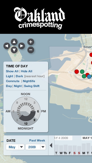
oakland crime maps XII: the pie of time
We just made a substantial change to Oakland Crimespotting that addresses two big ideas: Big Time and Little Time.
Big Time is about history and trends, and you can see it in the newly-opened archives that offer links deep into the past of our crime database, from our first launch of the site in 2007, such as the assassination of Chauncey Bailey that first spurred us to release the project after I'd been personally collecting data for most of Spring and Summer 2007.
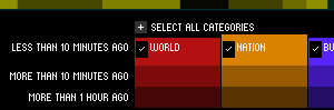
Little time is about the hours of the day, and the possibility of seeing neighborhood crime activity on a micro scale: your commute, your evening stroll with the dog, your morning run. The navigation concept we developed to support this is something we've been jokingly calling the "time pie", and it looks like this:
There's more about this on the Crimespotting blog, I encourage you to check it out.
Dec 30, 2008 9:54am
oakland crime maps XI: how close, and how bad?
Did you know that Oakland Crimespotting is still kicking hard, with hundreds of alert subscribers and a smooth, regular flow of timely data from the Oakland Police Department? The project has essentially been on auto-pilot since we re-launched it back in March, but holiday side projects have been a favorite activity of mine for years, so this time I'm thinking about the relatively short time horizon Crimespotting offers.
The current interface offers up to a month's worth of highly granular information on individual reports, and you can quickly get a sense for how active a given neighborhood is by digging around a little, doing a few searches, and checking out details on local crime reports. What we don't have is a long view.
Heat maps are one effective way to present large volumes of aggregate data over a geographical area, so I've been exploring ways to make them legible for crime data.
There's a ton of existing work out there in this area to draw on, some of it good and some of it dreadful.
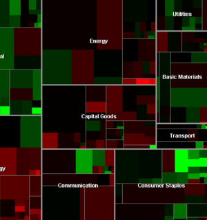
First and foremost is Martin Watternberg's seminal Map Of The Market, a live and non-geographical view of stock trading activity, that celebrated its ten-year anniversary this past year. MOTM shows volume and change over time in a tight, clean, effective package most recently notable for showing how Campbell's Soup and gold mining managed to weather the recent precipitous drops in the Dow.
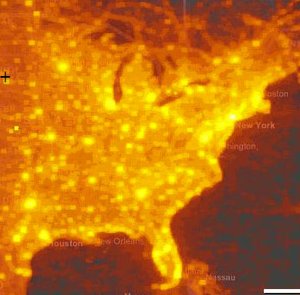
A more topical geographic example is Microsoft Research project How We Watch the City: Popularity and Online Maps. Danyel Fisher used server logs from Microsoft Virtual Earth tile servers to show viewing patterns around the world, with the beautiful results shown here.
Finally, HeatMapAPI offers commercial support for making your own heat maps.
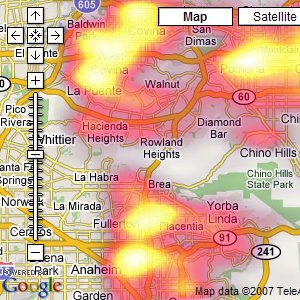
The results of HeatMapAPI's software actually illustrate a few of the things I've found weakest about geographic heat maps, a big excuse for why we've not done them for Oakland Crimespotting so far. There are two big shortfalls in the screen shot above: the data obscures the context, and simultaneously fails to communicate much in the way of specifics. The two primary questions you might want to ask of your data are "where?" and "how much?" The answers offered here are apparently "in a place near Whittier whose name I can't read" and "yellow".
So that's the starting point.
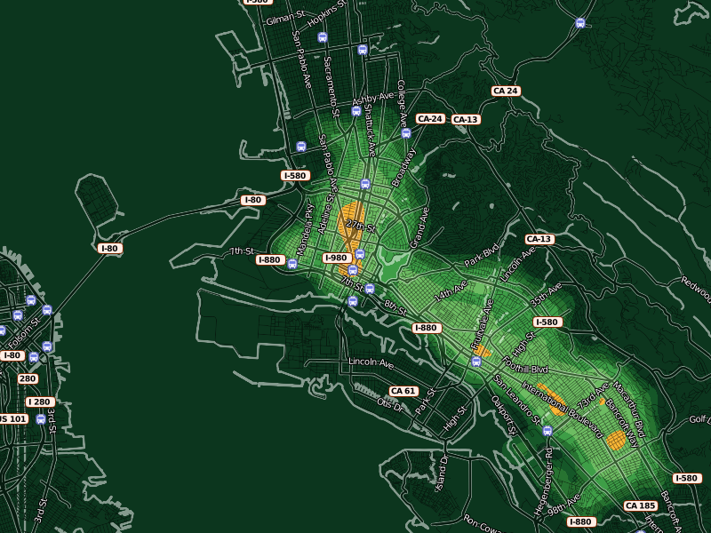
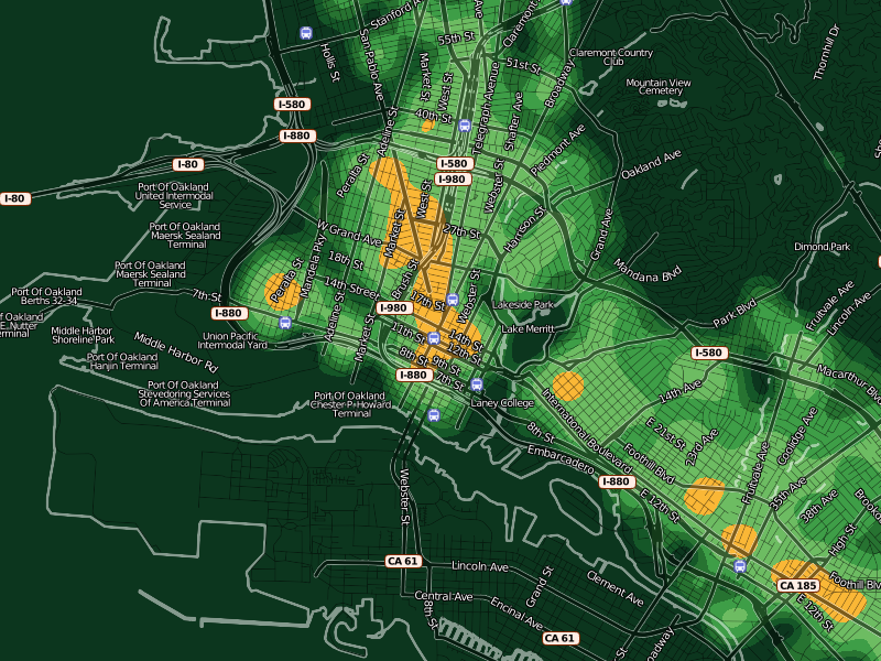
The answer I've settled on for the "where?" question is OpenStreetMap. I've been growing steadily more excited about this project for some months now, in part because it offers up the possibility of playing some beautiful visual games with high quality street data. In the HeatMapAPI example above, the context problem arises from the impossibility of manipulating Google's map data at any level more granular than their pre-rendered tiles. The overlays obscure the town and street names that help give them meaning. With OSM data and Mapnik, it's possible to create a semi-transparent streets layer specifically designed to interact well with underlaid data. It took just an afternoon's worth of modifications to my existing OSM visual design to come up with something suitable for layering with quantitative data. Gem helped tune the visual interaction between layers, so now there's a directly-overlaid set of names and icons above a translucent (25% - 50%) black street grid. Each of these layers is a separate Mapnik style, composited with the underlying color heat map.
In these maps, streets have been stripped back to translucent dark stripes, with white edges showing where the shoreline of the Bay begins.
The second question, "how much?", is somewhat more interesting. The difficulty with continuous, analog data lies in communicating something of relevance and urgency in it. If the map is orange, what does that mean exactly? Will my car get broken into?
One approach I've been prodding at takes advantage of a neighborhood sense for time and space. People know how big a city block is, how it feels for a month to go by. We know something of this in our database of crime reports too, so the colors in these experimental designs are keyed to specific meanings. Orange here denotes areas where, on average, the police respond to a call once per month for every 100m x 100m city block. Inside orange, there are two more divisions shown as brighter, hotter colors: two weeks and one week. For the police to show up right on your block every week is quite heavy, and there are just a few places in town that see this kind of activity. Outside orange, there are divisions of green that represent an additional month of peace and quiet for every block at each step.
At this level, you can start to see where OpenStreetMap data really begins to shine: all those little flag icons represent Oakland public schools that I added to the OSM database specifically to have such local data available to Crimespotting. The Microsoft Virtual Earth maps we use on the current site are beautiful, but they aren't particularly helpful in the way of local, civic data relevant to a consideration of police activity.

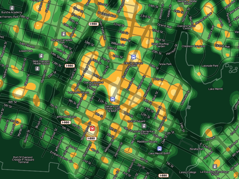
As the map zooms in closer, large amorphous blobs particulate into smaller, more granular bleeps and bloops. When you start seeing individual blocks in the map, you can also see individual corner hot spots. Here, the two downtown Oakland BART stations, a slice of MLK between 14th and 16th streets, and the area immediately around Oakland Police headquarters on Broadway and 7th are especially hot. The colors at every zoom level continue to mean the same things: always orange for "once a month, once per block". The colors here are cribbed from Cynthia Brewer's cpt-city work, a combination of YlGn and Oranges.
I'm happy that Lincoln Elementary School seems to sit in a safe zone of relatively low crime.
At a certain point, increased granularity becomes a problem. Our data is really only accurate to the city block level, so it doesn't make sense to generate a heat map more specific than this. The smooth, swooping whorls at the highest levels of zoom help to communicate the relative imprecision of the data at this level.
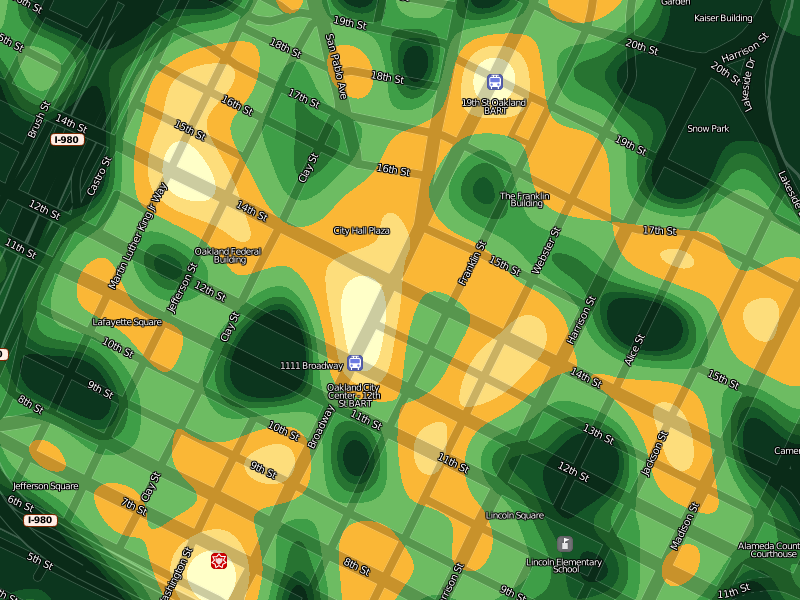
Overall, I'm happy with the results so far. These images are being generated through a combination of GDAL, Mapnik, NumPy and PIL. They're not yet ready to be integrated into the Crimespotting site proper, though I imagine that the first place they would eventually show up would be on the static map beat pages. I'm interested in comments or criticisms on how to improve the beauty or clarity of these results, before they're pushed in the direction of a proper release.
Mar 3, 2008 8:09am
oakland crime maps X: return of the jedi
We launched Oakland Crimespotting back in August, and all was well for a short time. There were friendly mails from Pete Wevurski, John Russo, and others who liked what we were up to. Unfortunately, we ran afoul of Oakland's website availability, and by late October it became completely impossible for us to collect data at a sustainable rate. We closed up shop and replaced the front page of the site with an apology and a promise.
After several months of general stagnation, Oakland City IT reconnected us to a current, reliable, and accessible data source in January, and I can now confirm that it all Just Works.

There are a few bits of New sprinkled throughout the site.
We've added pages for individual police beats, such as this one for 04X, where I live. A large number of our users asked for these, though truthfully it wasn't something I expected. I've been historically critical of the forms-first approach that CrimeView Community takes ("Easy wizard interface"), eschewing it in favor of a maps-first approach. Changing standards of cheapness are a recent interest of mine, and it's cheaper to show everything. Expect to hear more of this from Tom at E-Tech tomorrow. In fact, Police Service Area and City Council District aren't ways that Oakland residents commonly locate themselves. The Police department is organized into beats, and this turns out to be the right way to interface with them if you're a concerned, active citizen. Each beat has a consistent set of officers and public contact information. Oakland CTO Bob Glaze told me the beat designations haven't changed in decades. Clearly, maps and data for individual beats were going to be necessary.
Each beat page features a map of recent reports in that area. These maps are the result of Aaron's heroic work in extending Modest Maps' static mapping abilities. WS-compose is now a sweet little map generator that will happily report geographic dot locations in HTTP response headers if you ask it nicely, among other tricks.
There are also per-beat news feeds and downloadable spreadsheets of detailed information for neighborhood crime prevention councils.
The other addition is a proper comment feature. In the past, we've had an error report form on each crime report page where residents could alert us to improperly-placed reports or other mistakes, but this wasn't as effective as it could have been. The primary problem was that posting an error report didn't really set off any alarm bells, and it certainly didn't appear on the site anywhere. I've grown to feel that replacing a clunky web interface with a mute one isn't necessarily much of an improvement, so it's valuable to provide a direct feedback mechanism right there on the site.
The error reports have now been replaced by actual comment forms where you can leave your name, a message, and an optional link at the bottom of each individual report page. The comments are keyed on the case number, so case numbers with multiple reports share a set of comments. Right now these just look like regular blog comments, but the intent of the link is to add news articles or connect reports to one another. I hope very much to see this feature of the site grow into something interesting and unexpected.
Here is the mail I sent last month announcing our return:
Hello Everyone,
We're happy to announce that Oakland Crimespotting is back, thanks to the generous help of Oakland's City Information Technology Department. After three months without access to report data, we've been granted a reliable, regularly-updated source of crime report information. This is great news: it means that the website is back up and running with current information, e-mail alerts and RSS feeds work again, and we at Stamen Design can explore new ways of presenting and publishing this important information.
Here are a few things you can do, now:
Visit the site at http://oakland.crimespotting.org/. View a map at http://oakland.crimespotting.org/map/. Sign up for alerts at http://oakland.crimespotting.org/alerts.
We are also interested in what additions to the site you would find useful or interesting. So far, we've had a number of suggestions that we're actively looking into: spreadsheet-friendly downloads, details on individual police beats, a search function, and more than one month's worth of data. If you have any thoughts on these or other ideas, send us a mail at info@crimespotting.org.
Our return would not have been possible without the help of a few key people. Ahsan Baig, Ken Gordon, and Bob Glaze at Oakland City IT built and published a source of information for us. Ted Shelton, Charles Waltner, and others helped us navigate the difficult waters of City Hall communications. Jason Schultz, Ryan Wong, Karla Ruiz, and Jeremy Brown at U.C. Berkeley Law School helped us understand how to best approach city governments for information. Kathleen Kirkwood and Pete Wevurski at The Oakland Tribune helped us understand the journalistic context of the project. Dan O'Neil and Adrian Holovaty at EveryBlock.com were a valuable sounding boards for ideas
Aug 21, 2007 6:53am
oakland crime maps IX: post-launch
Last week, we launched Oakland Crimespotting, capping off eight months of the occasional data sketching I've been recording on this site. I've covered a few speculative topics here that didn't graduate to the public version of the site, and there have been a number of interesting new things that were sure to add.
The initial work on scraping (post I, post II) is still in use. Thankfully, the city hasn't changed CrimeWatch much since December, so our nightly collection runs are still chugging along happily. We do four collections every evening: past four days, and then individual days a week, two weeks, and one month in the past. The overlap is because we've noticed that the Oakland PD amends and modifies crime reports, and the whole map site is frequently down altogether.
Two later pieces (post III, post IV) introduced an idea on time-based display, but ultimately it was effective to just drop in the dots and add live draggy/zoomy controls. This is something we've consistently found with other projects, too: it's so often the case that the "right" design is not the technically complicated one, but the one that gets feedback and interactivity just so.
Finally, I wrote up a few pieces (post VI, post VII) on public data indexing. This is something I continue to find interesting, but at the volume of traffic we're pushing, it's totally unnecessary. Turns out MySQL is kind of awesome at this sort of thing.
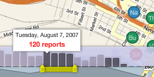
There are two big features on the map interface that only emerged when designing and developing it with Tom and Eric. The date slider is something that we shamelessly nicked from Measure Map, though we added the bit where per-day columns act as a display showing which data has been loaded. This part is still under active development. The idea is that the background should be draggable, to allow people to navigate back further in time than 30 days.
Measure Map:
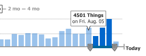
Ours:
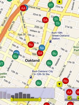
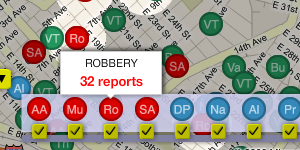
The second is the crime type picker, an interface whose affordances we borrowed from Newsmap. This one's quite simple, but it does trigger the visual spotlight effect that makes it possible to pick out crimes of a certain type throughout the map.
Newsmap:
Ours:
It was important that every view of the map be linkable and sharable, so we imported a number of ideas that Tom developed for our last map project, Trulia Hindsight. The thing to watch for is how the URL of the page you're looking at changes as you pan and zoom around. It can be copied, shared in an e-mail, sent over IM to a friend, and posted in a blog.
An "official" API has not been described or announced, but it will most likely include the site's Atom / GeoRSS feeds. These implement a small subset of the OpenSearch request specification:
- bbox is a geographical bounding box in the order west, south, east, north.
- dtstart and dtend are start and end dates, in YYYY-MM-DDTHH:MM:SSZ format.
Look for these hanging off of the /crime-data endpoint.
The site is hosted on Amazon's EC2 service, on a 10 cent/hour virtual server running Debian Linux, MySQL, Apache, and PHP. The static maps are generated by Aaron Cope's recent addition to Modest Maps, ws-compose.py. It's a BaseHTTPServer that stitches tiles into map PNG's, and I've been running four of them (and caching the responses) for the past week with no troubles.
I've rediscovered the joys of procedural PHP4 with this project. EC2 has proven to be a real champ, allowing us to set up a test machine, deploy a living site, but always holding out the possibility of migration to a "real" server. At a total of $80/month, the virtual Debian machine may last for a while.
Next steps may include San Francisco and Berkeley.
Aug 15, 2007 11:16pm
oakland crime maps VIII: first public launch
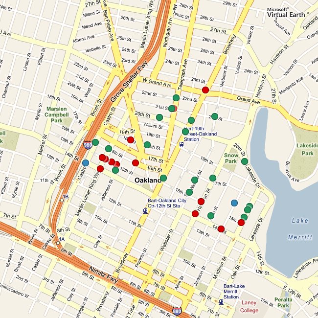
I promised we'd have something to show, right? In response to the red wave of homicides that swept Oakland two weeks ago, Tom and I published a visual map of crime reports in Oakland.
I'll write more later, but for now go and explore.
subscribe to ![]() this site.
|
contact Michal Migurski
this site.
|
contact Michal Migurski