tecznotes
Michal Migurski's notebook, listening post, and soapbox. Subscribe to ![]() this blog.
Check out the rest of my site as well.
this blog.
Check out the rest of my site as well.
Feb 18, 2008 7:43am
slippy faumaxion
"Your side projects always seem to involve the Hard Way" (Tom Carden, November 14th, 2007)
(Update, March 1: Check out a new revision of this map with a calmer, more predictable drag behavior)
Late last year, I posted about the "faumaxion" world map, a slightly modified version of Buckminster Fuller's famous Dymaxion World Map. I've finally put the finishing touches on this project, implementing it as a command-line script for composing static images (similar to Modest Maps compose.py) and a Flash slippy map.
Go play:
Or download the Python library: faumaxion-py.tar.gz (requires PIL).
There are a bunch of interesting things going on here.
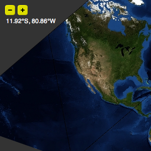
The panning action is different from a typical Google Maps interface. With the mercator projection centered on (0N, 0E) that all the popular providers use, North is always vertical. Here, the faces of the icosahedron wrap around the sphere and meet at non-right angles. As you pan the map, the focal point marked by the small circle is kept North-oriented. A less jarring way to design this would be have the drag action work just like a normal slippy map, and animate the reorientation to North at the end of a move. I'm curious, though, how this version is perceived, and whether it's too infuriating to use.
I definitely think it does a good job of illustrating how the interrupted projection works.
Unlike your typical mercator or albers projection, the map is divided into twenty separate gnomonic projections, each framed in one triangle from an icosahedron. Buckminster Fuller designed his original projection so that the edges of the triangles fell on water as much as possible, dividing the globe neatly into chunks of inhabited land - it's a humanistic map, designed to focus on human views of the world. I'm calling this one "faumaxion" because it doesn't strictly follow Fuller's model - he didn't use the gnomonic projection, and I don't do any additional cuts near Australia to keep it whole (sorry, George).
Typically, the imagery we handle in Modest Maps is continuous, with aerial photography or road maps covering large areas that are broken down into smaller and smaller squares. The math for handling rectilinear tiles is fairly straightforward, and is covered by Modest Maps' geometry classes: Location, Point, and Coordinate. In the faumaxion case, the tiles are equilateral triangles at a range of zoom levels.


The tiles are all being served from Amazon S3. They're regular square JPEGs in the Flash version, masked behind triangles in the display. For the Python version, I'm using 24-bit transparent PNGs with the bits outside the triangle already cut out. You'll notice that at the higher zoom levels, some tiles are missing or screwed up. Sorry.
The imagery source is all NASA Blue Marble loveliness, which I've raved about before and use in the first Modest Maps demo.
A strategy that seems to work for interactively arranging icosahedron faces here is based on an article from Scott Bilas of Gas Powered Games, The Continuous World Of Dungeon Siege. I make no claims about this interactive toy being anything like a complete 3D game, but I borrowed Scott's idea of maintaining a central reference point ("there is no world space") and performing whatever linear transformations are necessary to arrange a world around that point on every frame. Faumaxion's central reference point is the circle in the middle - it's the first face to be drawn, and every other face is continually arranged around it using a variation of the "ghost finger" hack I described in "gefingerpoken," a recent post on multi-touch interfaces.
My hope is that in combination with some excellent work that Tom Carden's been doing to port Modest Maps to Processing, the transformation-based placement of faces here will eventually migrate into the mainstream ActionScript 3.0 version of Modest Maps, making it possible to display a wider range of intermediate zoom levels and generally make the TileGrid a little less crazy.
Although I didn't go so far as to add geographic markers to this map, it's possible to do so, and I threw the tiny latitude/longitude display into the upper-left hand corner to show it. For all its oddities, the Dymaxion World Map is wonderfully suited to showing global concerns: Fuller created arrangements focused on different parts of the globe to demonstrate the sense of historical political and military moves, such as Japan's grab for empire in the 1930s and 40s, or British domination of the south seas in the early 19th century. Other uses might include visualization of transcontinental flights that otherwise look like wasteful loops when plotted on a standard mercator projection. I'm looking at you, noted Web 2.0 travel-sharing website.
subscribe to ![]() this site.
|
contact Michal Migurski
this site.
|
contact Michal Migurski