tecznotes
Michal Migurski's notebook, listening post, and soapbox. Subscribe to ![]() this blog.
Check out the rest of my site as well.
this blog.
Check out the rest of my site as well.
Sep 24, 2008 7:02am
post-ONA conference
A few weekends ago, I had the opportunity to participate in the 2008 Online News Association conference in Washington DC. Laura Cochran of the Washington Post invited me to join a panel on mapping crime, along with USAToday datacruncher Paul Overberg and LA Times power couple Sean Connelly and Katy Newton.
The conference got off to an inauspicious start when Tina Brown capped off a terrible keynote Q&A by called a journalism student an "easy lay". Fortunately, the How We Built It track featuring MSNBC, New York Times, Las Vegas Sun and others was a perfect way to spend a conference Friday. News organizations producing interactive pieces for the web described the various challenges they encountered, and it was fascinating to hear about the sausage-making process from the inside.
One of the most important things I learned in this series of talks is that no one likes their IT department, not even at the New York Times. Presenters repeatedly described ways in which they had to circumvent or overrule their own IT infrastructures to get anything interesting done. Two stood out. I asked the designers and developers at the Las Vegas Sun about the political/technical environment in their organization that allowed them to explore and refine iterative, agile production methods, and they said that it was necessary for them to go straight to the top for a mandate from the editor to give the group decision-making power over their development and deployment environment. Matt Ericson and Aron Pilhofer of the NYT described a more circuitous approach. Apparently, the NYTimes.com online election coverage is hosted entirely on Amazon's pay-as-you-go EC2 service, and totally detached from the content management and other server infrastructure at the Times. They use Ruby on Rails and other open-source software components to develop and deploy their work, and their seven-person team is wholly responsible for the care and feeding of these servers. This was a shocking thing to learn, and it raised my opinion of the NYT team by a solid order of magnitude.
Despite such a high-level of problem solving ingenuity, the majority of people in the business are journalists first and programmers last. The technical proficiency and funding available to publishers less blessed or lucky than the major dailies is substantially lower, and forces them into products like Caspio. This company had a substantial percentage of ONA attendees by the short hairs with their hosted solutions for data-driven web pages and mashups. I'm convinced that this is bad news, but I'm already predisposed to suspicion of turnkey software for this kind of work. I've also read plenty about the product in particular from journalist/technologist Derek Willis, who offers six reasons to look past Caspio in his blog archives.
The silver lining on this particular cloud is Django, the Python web framework developed by Simon Willison, Adrian Holovaty, and others. Django is finding a solid niche in the journalism world as a thoughtful, educated, D.I.Y. response to hosted rentware, and a kind of software Schelling point for journalists looking to really understand data-driven reporting.
The end-of-conference Online Journalism Awards ceremony was a parade of excellent interactive and data-driven work. The impression I got here was of deadline-motivated ingenuity on a tight budget. My co-panelists Sean and Katy especially illustrate the point with their 2007 winner Not Just A Number, a look at homicide in Oakland. Despite focusing on the same geographical area and the same topic, it's such a wildly different project from our Oakland Crimespotting. By narrowing their sights to the year's killings and entering the community itself to talk with those affected, Not Just A Number shows how narrative rigor can color statistical data with a backstory.
Overall, the conference had a distinctly different feel than the tech-oriented events I generally participate in. For one, there's an undercurrent of a siege mentality in journalism right now, with newsrooms cutting staff and print operations frozen stiff in the headlights of the internet. The focus on narrative and story gives a softer edge and an escape valve, though - this group is not primarily a tech-driven community, but they catch on to new developments quickly and bend them into the service of storytelling.
Sep 21, 2008 11:11pm
map beautiful
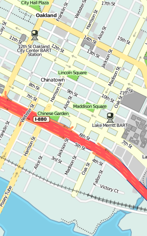
I'm continuing my months-long meditation on city cartography with a jump into OpenStreetMap, the "editable map of the whole world ... being built largely from scratch ... released with an open content license."
A few weeks back, I released Cascadenik, an application of cascading stylesheets to the Mapnik rendering library. The rationale for writing it in the first place was to replace the base map we're using for Oakland Crimespotting. I love the look of Microsoft's VEarth cartography, but it's missing data crucial to an understanding of urban crime: parks, schools, businesses, and transit. OpenStreetMap is the only free-as-in-speech way to create a beautiful, useful, and complete city map that can incorporate such ground truths. The NavTeqs and Teleatlases of the world where the online mapping services get their data are primarily interested in and funded by navigation, so it's not going to be in their interest to go neighborhood-deep to track locations of playgrounds or liquor licenses.
It's going to take a substantial outlay of cognitive surplus to get all this information into the map, but I've started by working on the visual appearance to get a feel for OSM's data:
(In-progress stylesheets can be found bundled with Cascadenik in mapnik-utils)
There are more than a few social decisions encoded in those styles:
- I'm trying to foreground modes of public transportation, especially rail. BART plays such a huge role in the Bay Area, and an understanding of where stations lie in relation to homes and businesses is crucial to understanding the local streetscape. For an historical view of this, check out my old flea market mapping experiment, and pay attention to the difference in appearance between the 1912 map, made to show rail coverage, and the 1936 map, made by Shell Oil to hide it.
- Taking a cue from the 1936 map and VEarth's road rendering, there's a much sharper distinction between major and minor roads, with minor roads dropping back to form a spidery matrix of connectivity between major roads and transit stops. This seems to help with the legibility of parks and other features at zoomed-out views, showing how they anchor neighborhoods and provide textural variety. It also makes room for labels on schools & parks that would otherwise be crowded out by street names.
- A lot of excess detail is being intentionally omitted. Parking lots and ATMs exist in the standard OpenStreetMap tileset, but I'm leaving those out here because I don't feel that they're helpful. I'm also omitting underground rail, it's just not relevant to surface use.
- The color of freeways is red, a fairly standard decision seen on most U.S. maps. Major roads are all fairly pale, with small variations in color around yellow and orange to make them visible but less overpowering than the blues and reds used by OpenStreetMap's own tiles.
Working with Potlatch, the Flash-based OSM editor, has been interesting. Although it does the job exceedingly well, I'd welcome an editing interface derived more from KidPix and SimCity than AutoCAD or ArcGIS. My dream is a UI that dispenses with tagging in favor of tools like "road", "school", "park", or "bulldozer".
The new tiles are being updated from fresh OSM data on an almost-daily basis, and hosting on S3 means you can hit it pretty much all you want for your nine-county Bay Area mapping needs.


Now, to get all these schools included.
subscribe to ![]() this site.
|
contact Michal Migurski
this site.
|
contact Michal Migurski