tecznotes
Michal Migurski's notebook, listening post, and soapbox. Subscribe to ![]() this blog.
Check out the rest of my site as well.
this blog.
Check out the rest of my site as well.
May 30, 2008 6:36am
trulia snapshot
We (most of all Tom and Geraldine) watched the new Trulia Snapshot slide off the blocks this morning. I worked on it only tangentially, so I can say that it's a really lovely piece of work, with a lot of care and attention paid to details and finish.
Here are the cheapest shacks in Oakland to get you started exploring, and here is Trulia's own blog post about the release.
May 13, 2008 6:13am
flea market mapping
Since it's Where 2.0 and I'm not there, I'm vicariously taking part in the fun by showing how to prepare and publish paper maps for the web so they can be used in combination with some of the better-known street mapping services on the web, like Microsoft Virtual Earth or Google Maps. There are a few steps involved, including a really tedious stretch in the middle where you cross-reference points on your scanned map with known geographical locations so you can rubbersheet it into shape.
I've been doing a bunch of this recently to help my girlfriend Gem with a project for one of her sustainable urban design courses, and so far we've got an OpenLayers-based slippy map of Oakland featuring overlays from 1877, 1912, and the 1950's:

There's a bit here that's similar to the Modest Maps AC Transit tutorial, but the idea with these maps is to match them to the same mercator projection quadtree tiling scheme used by all the popular online mapping services.
Step one is to get a map. We've been finding our historical maps at the Online Archive of California, but the particular 1950's road map we added recently came from a flea market for $7. Any halfway decent flatbed scanner should get you a workable image. I scanned this one at about 600dpi in several pieces, and used Photoshop to stitch them together. I ended up with two 500MB+ TIFF images, one for pages 12-13 of the road map showing the bay shore of Oakland, the other for pages 14-15 showing the hilly bits.
Step two is the tedious part. You have to provide geographical context for the rubbersheeting step to know how your map is positioned in the world, taking into account buckled paper, surveying mistakes, and errors in scanning. For a selection of points (a dozen or more), note the geographical location in latitude & longitude and the map position in pixels, using a tool like the Google Maps Lat, Lon Popup and Photoshop's info palette. This is my coverage of the two portions of the road map:

Each of those locations is noted along with its pixel position on the map image, e.g. the pixel at (x=184, y=202) corresponds to (37.831175 N, 122.285836 W).
The program I use to do the actual geographic work is a set of open source utilities called GDAL. I started with gdal_translate, and used it to note the positions of all the points above:
gdal_translate -a_srs "+proj=latlong +ellps=WGS84 +datum=WGS84 +no_defs" -gcp 184 202 -122.285836 37.831175 -gcp 1668 50 -122.267940 37.816158 -of VRT pages-12-13.tif pages-12-13.vrt
The parts that go "-gcp (x) (y) (lon) (lat)" are repeated for each of your reference points; I had 17 for one of the images.
So that results in a VRT file, a chunk of XML that describes the geographic orientation of the image, without actually touching the image itself.
Step three is quick, just a matter of using gdalwarp to perform the actual warping and bending of the image to its new shape:
gdalwarp -t_srs "+proj=latlong +ellps=WGS84 +datum=WGS84 +no_defs" -dstalpha pages-12-13.vrt pages-12-13.latlon.tif
Now you have a new TIFF file in a known projection suitable for slicing up into the 256x256 pixel square tiles used by Yahoo! and Google and OpenStreetMap and Microsoft and everybody else doing maps online. In my case, I did the steps above for two separate images.
Step four is where a custom-written Python script swoops in a slices the map up into a folder full of tiny images. There's a bit of opaque magic here, but you'll need to get a copy of PIL, and you'll also need to tell the script where to find the GDAL programs gdalinfo, gdalwarp, gdal_translate, and the PROJ utility program cs2cs. All of these programs are available via Debian's package management system, apt. Make a directory called "out" for all the tiles, and run the script like this:
python decompose.py pages-12-13.latlon.tif pages-14-15.latlon.tif
Now wait. This part can take forever. It took a solid few hours on the virtual server where I do most of this stuff. After it was done, I posted the whole collection to a server, like this:

Once you have a pile of tiles sitting on the web someplace, get a copy of OpenLayers and set up an HTML page where your map will live. OpenLayers is one of those architecture astronaut libraries that's so full-featured, so extensive, that it's almost impossible to figure out how to do the one obvious thing you want. A bit of conversation with the developers showed that the "right" way to make a tiled slippy map in the Google projection is to pass the following arguments to the OpenLayers.Map constructor:
{ maxExtent: new OpenLayers.Bounds(-20037508.3427892, -20037508.3427892, 20037508.3427892, 20037508.3427892), numZoomLevels: 18, maxResolution: 156543.0339, units: 'm', displayProjection: new OpenLayers.Projection('EPSG:4326'), projection: 'EPSG:900913' }
There's some other futzing around in Javascript you have to do, but ultimately you end up with a map and several layers based on the OpenLayers.Layer.TMS class, like the one I'm using. I've included a layer of Microsoft tiles there for a present-day comparison, and with just three points of historical reference, a bunch of interesting patterns emerge:
- The 1877 layer shows future plans for the dredging and widening of Oakland Harbor, before Alameda was an island and before the creation of Government a.k.a. Coast Guard Island.
- The parcel grids on the 1877 and 1912 maps extend right out into the bay. They knew what they were on about, these manifest destinarians.
- The 1912 map is principally about rail transport, and there's a ton of it. Rails everywhere that today aren't much more than uncomfortably-wide streets.
- The 1950's map was published by Standard Oil, and it makes almost no mention whatsoever of the rail travel options available in Oakland. This is especially ironic, given that SO was one of three companies (GM and Firestone were the others) convicted in 1949 of criminal conspiracy to destroy rail systems like the Key Route then operating in the East Bay. In the 1960's most of the rail routes were eventually dismantled, and we're just now starting to figure out how to make up for the loss.
- The 1950's map also has no freeways, and clicking back and forth between it and the present-day layer shows exactly which neighborhoods were cut through to introduce the 80, 880, 980, and 580 highways.
May 9, 2008 5:32am
arduino atkinson, take two
On the advice of Tod Kurt, Ben, and others, I bought some shift registers to try a second pass at the Atkinson-dithered 8x8 screen. Success!
The wiring now requires just three data pins instead of the previous 12 data pins, and results in a completely addressable screen:
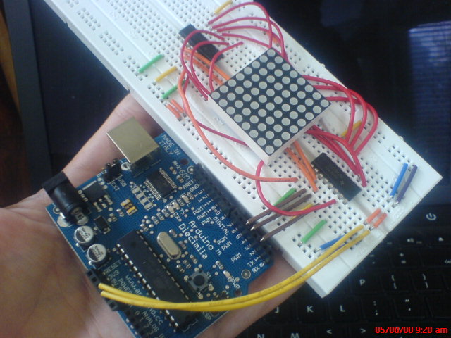
There are two chips on that board: one controls the rows and one the columns. If I added a third, and a mess of more wires, I could use the full red/green capacity of the LED matrix. Sadly, it's getting tangled. I think if I learned to solder it'd be possible to get all three shift registers squeezed under the matrix for a nice little screen module:

Anyone out there willing to spend an evening showing how to properly connect components to a prototype board? I can't get back to this stuff for a little while anyway, I think I may have fried the controller on the Arduino somehow.
May 8, 2008 4:56am
visual urban data slides
This is the second half of a talk that Tom Carden and I did together at U.C. Berkeley's iSchool, a few weeks ago on March 20. Tom has the first half with slides posted on his own blog. He talks about the general studio/Stamen context for our forays into visual depictions of urban data, while I go deep on Oakland Crimespotting in particular. I returned to Berkeley's Graduate School of Journalism a few weeks later to deliver a slightly-edited version of this talk alone. A video that I'm afraid to watch is on Youtube here and here.

CrimeWatch
First, it's important for us to back up a bit and understand the need that Crimespotting tries to address.


Our initial work was based on the City of Oakland's existing CrimeWatch application, a "wizard-like" form-based website available at http://gismaps.oaklandnet.com/crimewatch/. The first thing a visitor to CrimeWatch sees is a disclaimer form and a few pages of instructions.


Once past the first page, there is a long series of questions that a visitor must answer: what kind of crime to view, where to look, how far back in time to search. The crime types here seem to correspond to broadly-used categories, but there are differences among jurisdictions. For example, Oakland does not publish domestic violence as a separate category. San Francisco, which uses a similar crime mapping application, has removed homicides entirely from its online maps.


Eventually, the resulting map loads in the browser. The presentation is not entirely satisfying, with a range of tiny report icons overlaid on a map and frequently obscured by information detail windows.
Parsing Images


This is the technically difficult part. The second of the two images above shows our original data input: a compressed image covered with small, graphic icons.


We used Python Imaging Library and a collection of scraping tools to search for instances of known icons and convert them to rough GPS positions.

Because we knew what we were looking for (e.g. Vehicle Theft, Prostitution, Narcotics, Robbery, Vandalism shown here) it was possible to search by shape and color to come up with positions for these icons on CrimeWatch maps.


Early this year, Oakland City IT opened up a reliable, text-based feed of crime information for us. This was a huge help, and we no longer need to go through the slow image-scraping process detailed above. Just before IT made a better source of data available to us, we were putting the finishing touches on a Mozilla browser plug-in for distributed scraping, which introduced an element of human sanity-checking after each sweep.
Permanent Links

All of the data we collect is available in a non-mapped, text form. Everything is shown on a map, but it's also possible to slice and dice the data to show reports of a certain type or from a certain date, listed out.


The single most important improvement we think Crimespotting introduced to Oakland is the concept of a permanent link for every reported crime. These permalinks contain isolated maps of the event, connected reports, a place for people to leave comments, and other reports from the same area and time.
Patterns


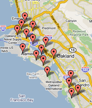
Street crime in Oakland really only happens between the 880 and 13 freeways. South and west of 880 is industrial, while north and east of 13 is hilly, suburban, and quite affluent. Property crimes (marked in green) happen all over, but violent crime (marked in red) is further constrained to the poorer parts of town below 580.


We've noticed that prostitution arrests seem to come in waves - long stretches of no activity, followed by rapid bursts along San Pablo Boulevard in West Oakland or International Boulevard in East Oakland. Above we can see the result of a string of busts along International in the Fruitvale area shown in blue, the color we use for quality of life crimes like drugs, alcohol, or disturbing the peace.


Although West Oakland is commonly thought to be a dangerous place, the data we've seen shows that violent crime is really spread evenly between West Oakland and downtown. There's no cluster of violence to the West, but there is a sharp cluster of drug activity (in blue) between 580 and San Pablo.

One important lesson we learned from our users: police beats are more important than we thought. This is a map of reports from beat 04X. The beat number system is how citizens interact with the police department, and what we assumed was an arcane administrative detail is really a living, breathing idea. Not so with "police service areas" or city council districts.

Outcomes

Really, the most important thing we've learned is that motivation can come from everywhere. I initially started this project because I had hurt my back in late 2006, and had a bunch of free time on my hands over that winter. What started as a technical curiosity became a studio project and eventually a public website. Motivation comes from all over, give people data and they'll figure out something interesting to do with it.

Just showing crime is relentlessly negative, and seems to really draw out the kind of graffiti-squad neighborhood busybodies who focus solely on little problems. A near-universal reaction from non-residents to this particular project has been relief that they don't live in Oakland, but it's really not that bad here. It just looks bad when all you show is crime. We'd like to map other things: city services (police, fire, emergency), tax parcels, effects of policy, other administrative information that's hugely important.

We're also thinking about how to fill in the tapestry around Oakland - currently we're covering a very small, narrowly-defined area.

On the bright side, we're using our projects to test the assumption that there's something interesting going on with city data. Decreasing costs (money, complexity) of data analysis techniques (e.g. Google's new visualization kit) drive demand for available data.
We think in the very near future, it will become cheaper for cities to publish raw data and let citizens do their own analysis with IT in a support/enabling/superhero role. Our argument is not about "democratizing" anything and the political baggage that rides along with such terminology, it's about responding to changing costs.

subscribe to ![]() this site.
|
contact Michal Migurski
this site.
|
contact Michal Migurski