tecznotes
Michal Migurski's notebook, listening post, and soapbox. Subscribe to ![]() this blog.
Check out the rest of my site as well.
this blog.
Check out the rest of my site as well.
Mar 4, 2017 6:32pm
baby steps towards measuring the efficiency gap
In my last post, I collected some of what I’ve learned about redistricting. There are three big things happening right now:
- Wisconsin is in court trying to defend its legislative plan, which is being challenged on explicitly partisan grounds. That’s rare and new, and Wisconsin is not doing well.
- A new metric for partisan gerrymandering, the Efficiency Gap, is providing a court-friendly measure of partisan effects.
- Former U.S. Attorney General Eric Holder is building a targeted, state-by-state strategy for Democrats to produce fairer maps in the 2021 redistricting process.
Use this map to find out what three districts you’re in.
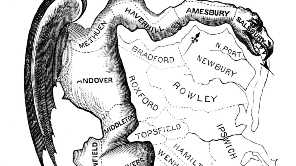
Gerrymandering is usually considered in three ways: geographic compactness to ensure that constituents with similar interests vote together, racial makeup to comply with laws like the Voting Rights Act, and partisan distribution to balance the interests of competing political parties. The original term comes from a cartoon referencing a contorted 1812 district plan in Massachusetts:
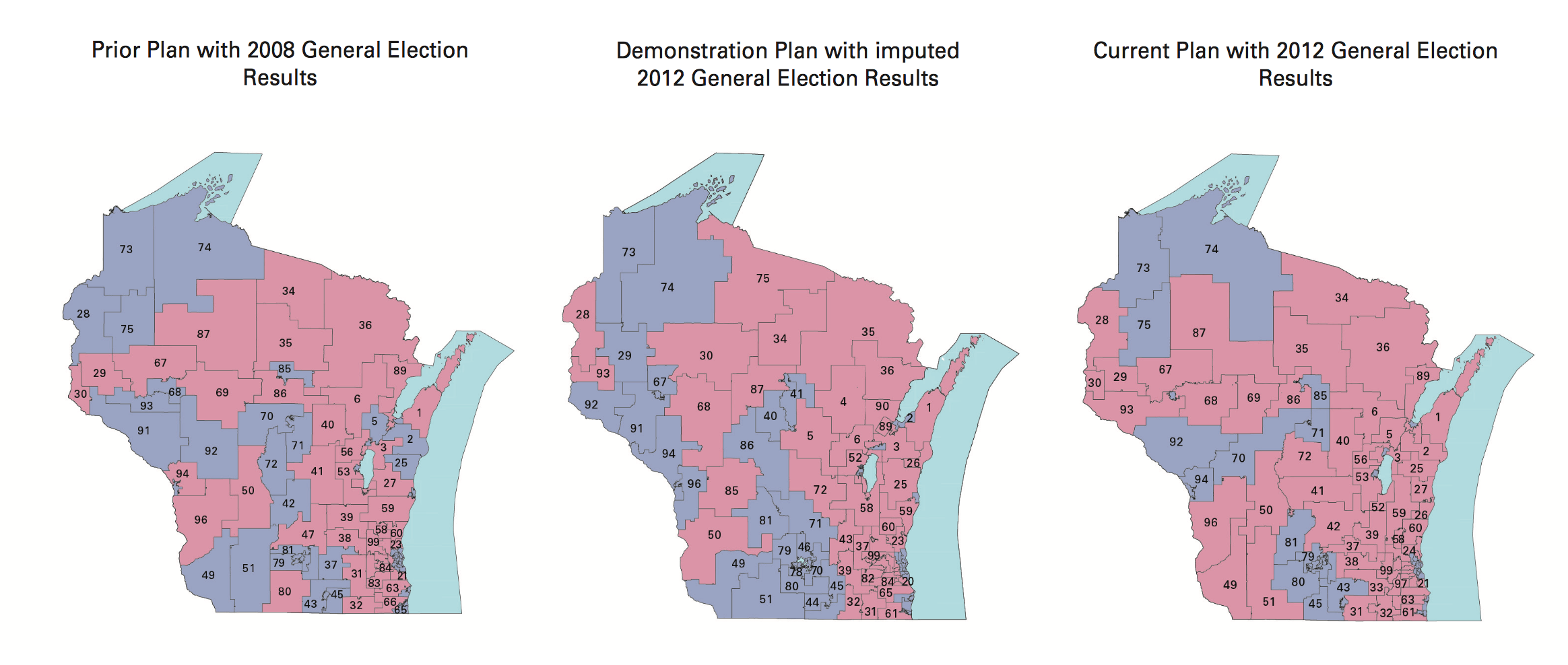
Since publishing that post, I’ve been in touch with interesting people. A few shared this article about Tufts professor Moon Duchin and her Tufts University class on redistricting. Looks like I just missed a redistricting reform conference in Raleigh, well covered on Twitter by Fair Districts PA. Bill Whitford, the plaintiff in the Wisconsin case, sent me a collection of documents from the case. I was struck by how arbitrary these district plans in Exhibit 1 looked:
Combined with Jowei Chen’s simulation approach, my overall impression is that the arbitrariness of districts combined with the ease of calculating measures like the efficiency gap make this a basically intentional activity. There is not an underlying ideal district plan to be discovered. Alternatives can be rapidly generated, tested, and deployed with a specific outcome in mind. With approaches built on simple code and detailed databases, district plans can be designed to counteract Republican overreach. There’s no reason for fatalism about the chosen compactness of liberal towns.
I’m interested in partisan outcomes, so I’ve been researching how to calculate the efficiency gap. It’s very easy, but heavily dependent on input data. I have some preliminary results which mostly raise a bunch of new questions.
Some Maps
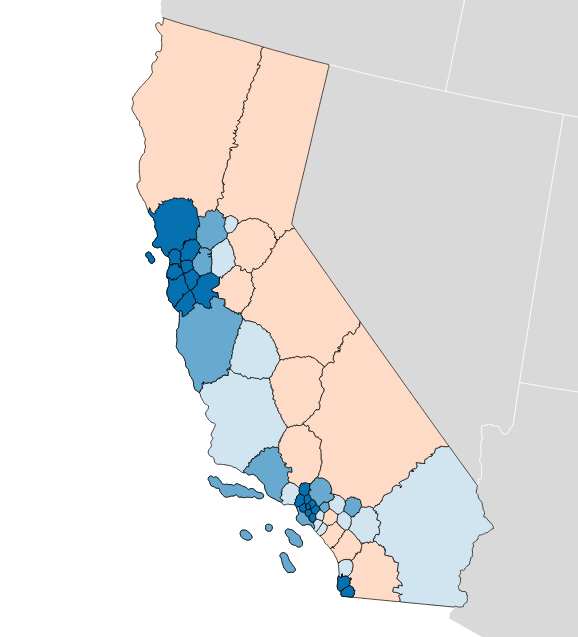
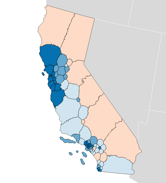
The “gap” itself refers to relative levels of vote waste on either side of a partisan divide, and is equal to “the difference between the parties’ respective wasted votes in an election, divided by the total number of votes cast.” It’s simple arithmetic, and I have an implementation in Python. If you apply the metric to district plans like Brian Olson’s 2010 geographic redistricting experiment, you can see the results. These maps show direction and magnitude of votes using the customary Democrat blue and Republican red, with darker colors for bigger victories.
Olson’s U.S. House efficiency gap favors Democrats by 2.0%:
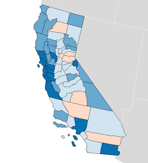
Olson’s State Senate efficiency gap favors Democrats by a whopping 9.7%:
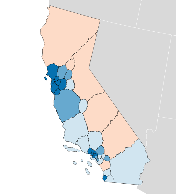
Olson’s State Assembly efficiency gap also favors Democrats by 9.8%:
So that’s interesting. The current California U.S. House efficiency gap shows a mild 0.3% Republican advantage. Olson’s plans offer a big, unfair edge to Democrats, though they have other advantages such as compactness.
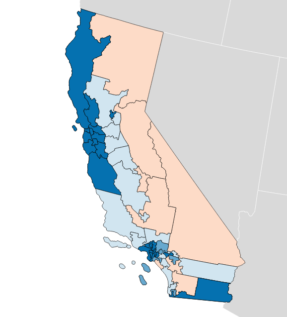
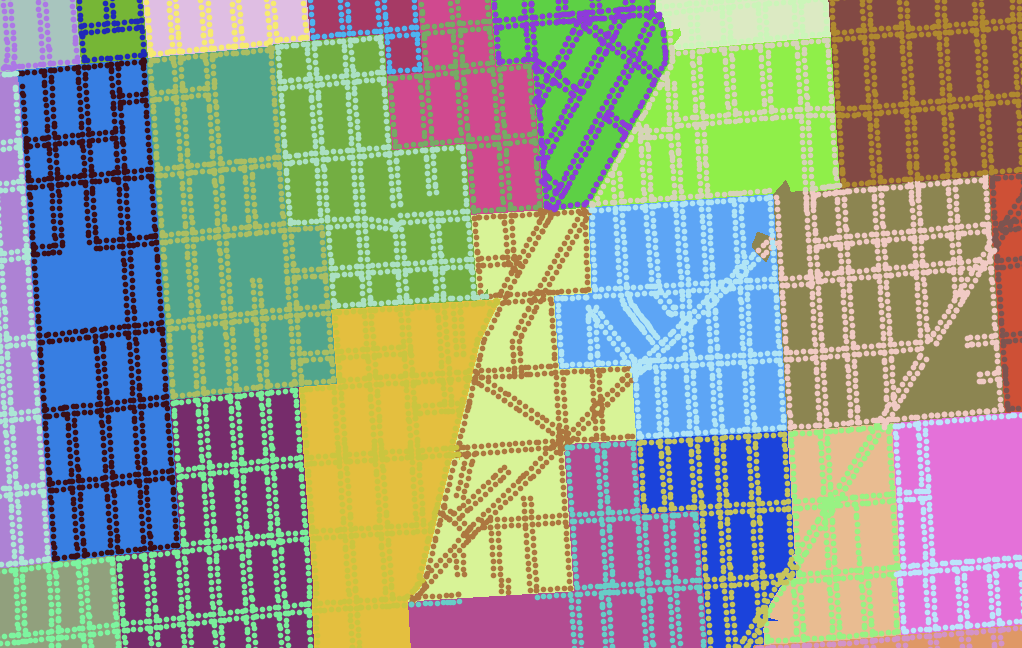
You can measure any possible district plan in this way: hexbins, Voronoi polygons, or completely randomized Neil Freeman shapes. Here’s a fake district plan built just from counties:
This one shows a crushing +15.0% gap for Democrats and a 52 to 6 seat advantage. This plan wouldn’t be legal due to the population imbalance between counties.
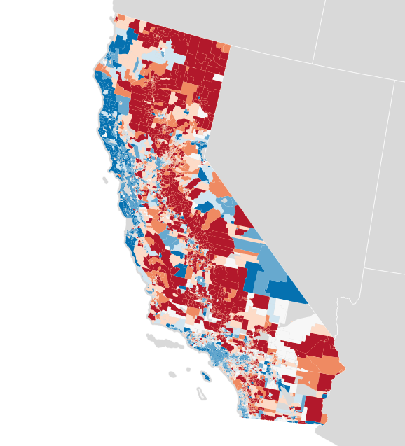
Each of these maps shows a simple outcome for partisan votes as required for the efficiency gap measure. Where do those votes come from? Jon Schleuss, Joe Fox, and others at the LA Times on Ben Welsh’s data desk created a precinct-level map of California’s 2016 election results, so I’m using their numbers. They provide two needed ingredients, vote totals and geographic shapes for each of California’s 26,044 voting precincts. Here’s what it looks like:
When these precincts are resampled into larger districts using my resampling script, vote counts are distributed to overlapping districts using a simple spatial join. I applied this process to the current U.S. House districts in California, to see if I got the same result.
There turns out to be quite a difference between this and the true U.S. House delegation. In this prediction from LA Times data the seat split is 48/8 instead of the true 38/14, and the efficiency gap is 8.6% in favor of Democrats instead of the more real 0.3% in favor of Republicans. What’s going on?
Making Up Numbers
The LA Times data includes statewide votes only: propositions, the U.S. Senate race, and the Clinton/Trump presidential election. There are no votes for U.S. House, State Senate or Assembly included. I’m using presidential votes as a proxy. This is a big assumption with a lot of problems. For example, the ratio between actual U.S. House votes for Democrats and presidential votes for Hillary Clinton is only about 3:4, which might indicate a lower level of enthusiasm for local Democrats compared to a national race:
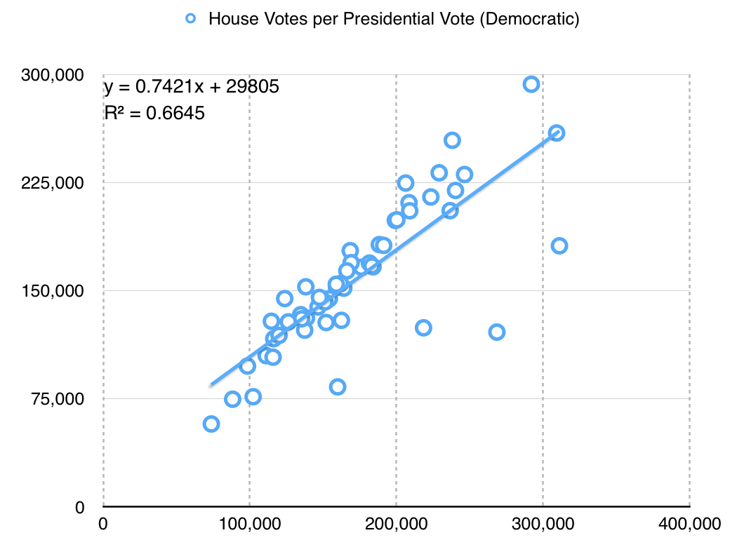
The particular values here aren’t hugely significant, but it’s important to know that I’m doing a bunch of massaging in order to get a meaningful map. Eric McGhee warned me that it would be necessary to impute missing values for uncontested races, and that it’s a fiddly process easy to get wrong. Here, I’m not even looking at the real votes for state houses — the data is not conveniently available, and I’m taking a lot of shortcuts just to write this post.
The Republican adjustment is slightly different:
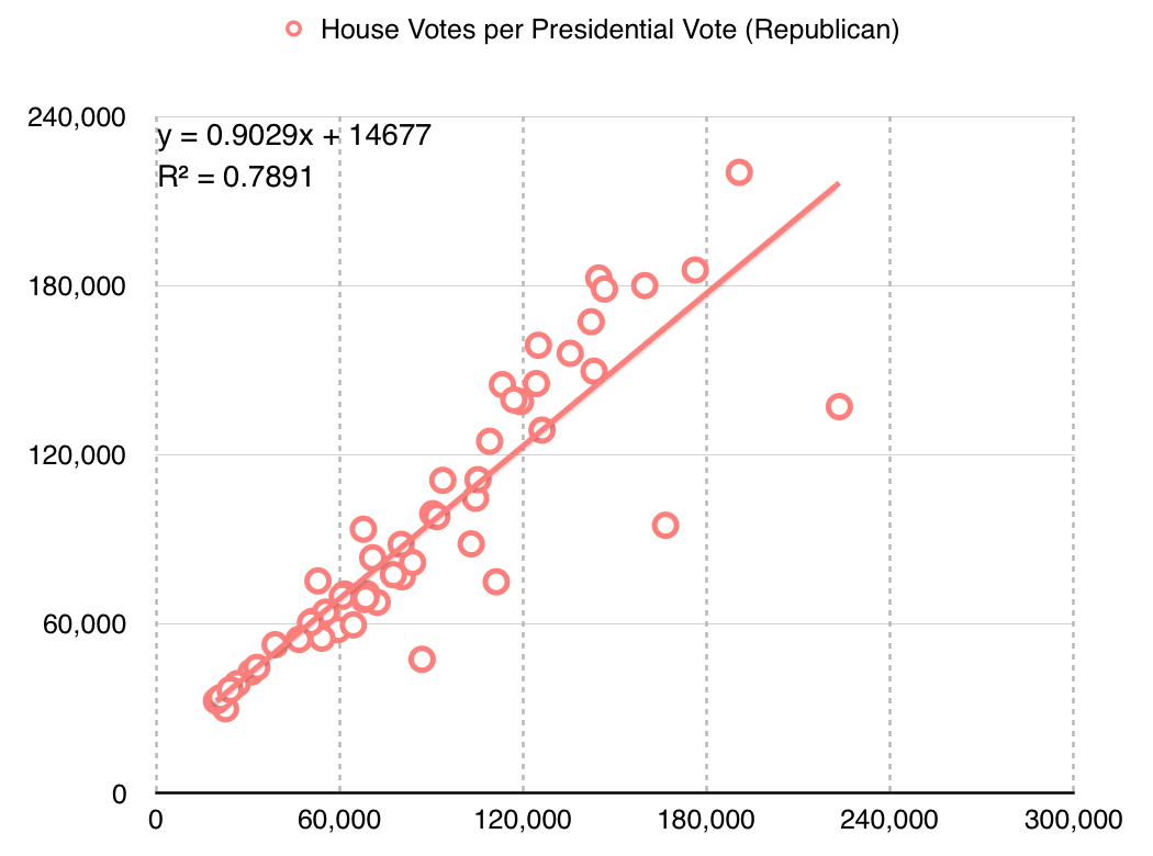
They are more loyal voters, I guess?
Availability of data at this level of detail is quite spotty. Imputing from readily-available presidential data leads to misleading results.
Better Data
These simple experiments open up a number of doors for new work.
First, the LA Times data includes only California. Data for the remaining states would need to be collected, and it’s quite a tedious task to do so. Secretaries of State publish data in a variety of formats, from HTML tables to Excel spreadsheets and PDF files. I’m sure some of it would need to be transcribed from printed forms. Two journalists, Serdar Tumgoren and Derek Willis, created Open Elections, a website and Github project for collecting detailed election results. The project is dormant compared to a couple years ago, but it looks like a good and obvious place to search for and collect new nationwide data.
Second, most data repositories like the LA Times data and Open Elections prioritize statewide results. Results for local elections like state houses are harder to come by but critical for redistricting work because those local legislatures draw the rest of the districts. Expanding on this type of data would be a legitimate slog, and I only expect that it would be done by interested people in each state. Priority states might include the ones with the most heavily Republican-leaning gaps: Wyoming, Wisconsin, Oklahoma, Virginia, Florida, Michigan, Ohio, North Carolina, Kansas, Idaho, Montana, and Indiana are called out in the original paper.
Third, spatial data for precincts is a pain to come by. I did some work with this data in 2012, and found that the Voting Information Project published some of the best precinct-level descriptions as address lists and ranges. This is correct, but spatially incomplete. Anthea Watson Strong helped me understand how to work with this data and how to use it to generate geospatial data. With a bit of work, it’s possible to connect this data to U.S. Census TIGER shapefiles as I did a few years ago:
This was difficult, but doable at the time with a week of effort.
Conclusion
My hope is to continue this work with improved data, to support rapid generation and testing of district plans in cases like the one in Wisconsin. If your name is Eric Holder and you’re reading this, get in touch! Makes “call me” gesture with right hand.
Code and some data used in this post are available on Github. Vote totals I derived from the LA Times project and prepared are in this shapefile. Nelson Minar helped me think through the process.
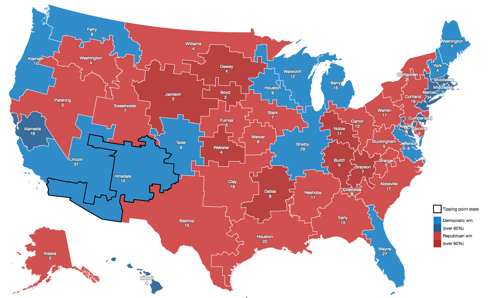
In closing, here are some fake states from Neil Freeman:
subscribe to ![]() this site.
|
contact Michal Migurski
this site.
|
contact Michal Migurski
Comments (4)
Should we strive to minimize the political/legal part of the process in favor of a computer-assisted one? Sort of: demographics data + neutral legal requirements > computer-generated distrct maps > limited political choice. Let's say, the "approved" software generates 5 official variants, party A rejects 2 and party B selects 1 out of remaining 3. With the order of A and B decided by a coin toss. Philosophically speaking, the efficiency concept seems problematic. It might be a good and detectable symptom of things going "wrong", but it assumes that there is some definitive "right". It is a utopian mentality. Living systems are based on a fluctuating, dynamic balance between various and relative "bads" and "goods". This is the basic insight underlying the constitutional "checks and balances". The current system is obviously faulty. First however, we have to recognize that we can strive for an improved one, but not the perfect one. The main fault we need to address is the tendency to "safe" districts as a result of party manipulations. We cannot eliminate the natural geographic demography, but we can limit the impact of money, small interest groups and party politics. Automating greater parts of the process can lead to greater, if imperfect neutrality. It would follow the concept of the "rule of law" - as opposed to the rule of people. I'm thinking of a court-approved software to generate multiple stochastic district variants that would follow an ideologically neutral algorithm, including the legally mandated requirements. The unavoidable (and necessary) political choice would be limited to a selection from a pool. Availability of such software would be a huge step, Mike. Making a common knowledge of its existence would be another. The most important audience though would be the constitutional law professors in academia, not the party lawyers. It might actually be very appealing to true (philosophical) conservatives, however few of them are left.
Posted by Tomasz Migurski on Sunday, March 5 2017 8:14pm UTC
You admire Eric Holder? Really? I don't mean to be rude, but you are a clueless idiot.
Posted by Amazed on Friday, March 24 2017 12:56pm UTC
You admire Neil Freeman? Really? I don't mean to be rude, but this is a thoughtful and simply explained post on an important topic.
Posted by Stupefied on Sunday, March 26 2017 1:12am UTC
I found this through a github gis election data project: https://github.com/nvkelso/election-geodata I see you're interested in measuring gerrymandering and in automating redistricting. Well - so am I! I have my own project on github for that: https://github.com/happyjack27/autoredistrict I also created a nation-wide map showing gerrymandering, as well as fairer alternatives: http://autoredistrict.org/all50/version3/CD_PRES/interactive_map.php and a -- well, three -- online gerrymander calculator(s): http://autoredistrict.org/count_sv.php
Posted by Kevin Baas on Wednesday, April 19 2017 10:04pm UTC
Sorry, no new comments on old posts.