tecznotes
Michal Migurski's notebook, listening post, and soapbox. Subscribe to ![]() this blog.
Check out the rest of my site as well.
this blog.
Check out the rest of my site as well.
Nov 19, 2008 8:09am
smule's ocarina
Earlier tonight I briefly met Spencer Salazar from Smule, the makers of the iPhone Ocarina. They have a small suite of like Sonic Boom ("turns your phone into a virtual firecracker"), Sonic Vox ("the real-time voice shifter"), and Sonic Lighter ("Sonic Lighter is a lighter") that are mostly technology gimmicks. Spencer admitted as much but I'm still completely smitten with the fact that 75% of their applications have a simple globe view that uses the network features of the phone to show you what other people, all around the world, are doing with each app right now. You can hear other people's clumsy ocarina playing, watch little explosions when other people use Sonic Boom, and see who's using the lighter app with some sense of how those people are related to you based on flame-passing connections.
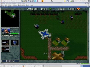
We've seen this all before, in Twittervision and other such globetrotting applications. These Smule globes seem strangely different and much more interesting, largely I think because you hold the phone in your hand instead of the laptop or monitor on your desk. It's a more personal, touched engagement with the screen that makes visualizing an earth-spanning army of phone lighters and flute blowers more physically personal. In particular, the Sonic Boom visualization is like watching television: no reading, no place names, just tiny explosions with audio all over the world with the same unmediated appearance as old top-down resource gathering games like War Craft I.
Having just read Teeming Void's Against Information (a critique of "data art"), I'm thinking about direct perception of data as a way of making it more visceral. The Golan Levin and Jonathan Harris pieces referenced in the paper all suffer from various forms of indirection: Levin makes breaking up look like math and physics, while Harris jumps to all sorts of crazy conclusions based on faulty language parsing and excessively abstract visual metaphor. How can a visual representation of data make itself felt right there, in your hand? Pictures help. Sound helps.
