tecznotes
Michal Migurski's notebook, listening post, and soapbox. Subscribe to ![]() this blog.
Check out the rest of my site as well.
this blog.
Check out the rest of my site as well.
Mar 20, 2017 6:57pm
district plans by the hundredweight
For the past month, I’ve been researching legislative redistricting to see if there’s a way to apply what I know of geography and software. With a number of interesting changes happening including Wisconsin’s legal battle, Nicholas Stephanopoulos and Eric McGhee’s new Efficiency Gap metric for partisan gerrymandering, and Eric Holder’s new National Democratic Redistricting Committee (NDRC), good things are happening despite the surreal political climate in the U.S.
My stopping point last time was the need for better data. We need detailed precinct-level election results and geographic boundaries for all 50 states across a range of recent elections, and lately the web has been delivering on this in spades.
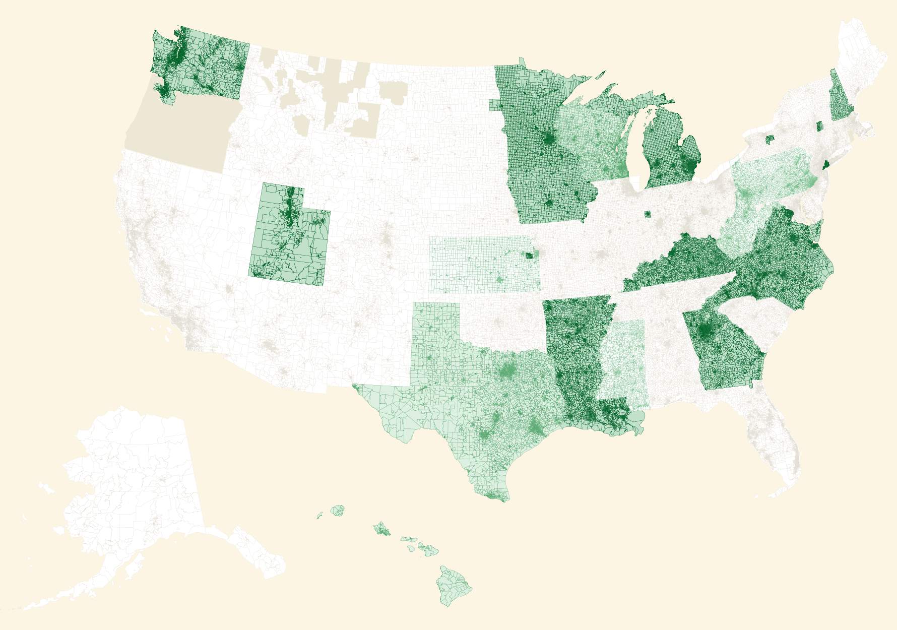
My former Stamen and Mapzen colleague Nathaniel Vaughn Kelso created a new home on Github for geographic data, and the collection has grown swiftly. In our research, we also found this excellent overlapping collection from Aaron Strauss and got in touch. This is a current render showing overall data coverage and recency (darker green states have data from more recent elections):
If you want to help, browse the issues in the repo to find data that needs collecting.
Meanwhile, the annual NICAR conference for digital journalism brought a renewed call for participation from the Open Elections project. Project cofounder Derek Willis particularly calls out these areas in need of data entry:
North Carolina and Virginia are two important states with electronic data on the way, and volunteers are working on Wisconsin. Try some of the links above to find data entry tasks for Open Elections.
So, the volume and quality of data required for accurate measurement of partisan gerrymandering has been growing. Previously, I’ve been using detailed California data to experiment as described in my previous post a couple weeks ago. Wisconsin is a particularly high-profile state in this area, and we happen to have great 2014 general election precinct level data in the repositories above.
Wisconsin
This week, I’ve switched my focus to Wisconsin and experimented with a bulk, randomized approach. Borrowing from Neil Freeman’s Random States Of America idea and Professor Jowei Chen’s randomized Florida redistricting paper, I generated hundreds of thousands of district plans based on counties and census tracts and attempted to measure their partisan efficiency gap for U.S. House votes.
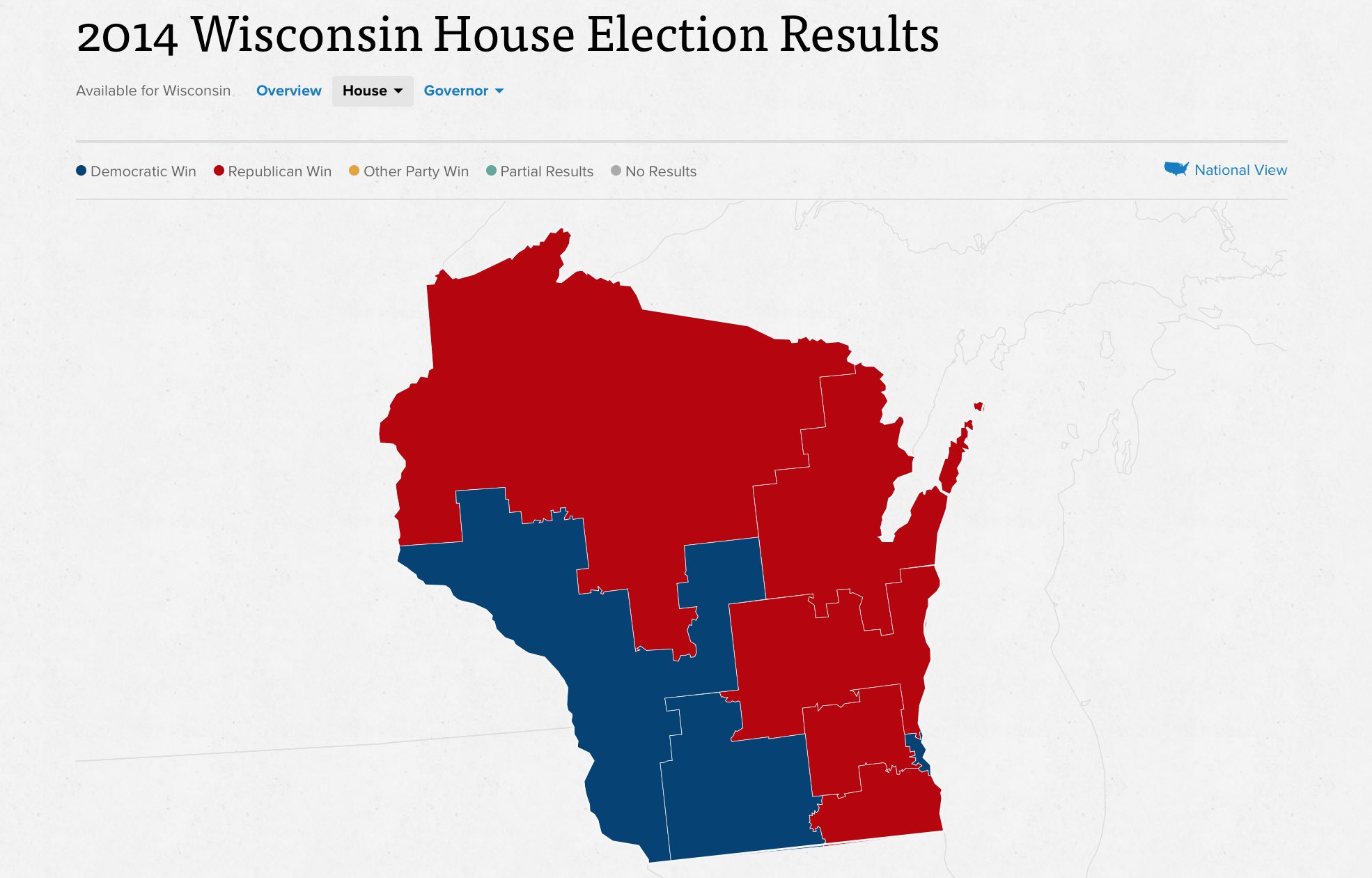
Wisconsin’s 2014 general election resulted in five Republican congressional seats and three Democratic ones, with 1,228,145 votes cast for Republicans and 1,100,209 votes cast for Democrats. There are just eight Congressional districts in Wisconsin, and all candidates in 2014 ran with a major-party opponent. Unopposed races present a special challenge for efficiency gap calculations, and I’m happy to have skipped that here. This is a results map from Politico:
My process is coarse and unsophisticated, but it adequately demonstrates the use of randomization and selection for both counties and tracts. Random plans make it possible to rapidly generate a very wide set of possibilities and navigate among them, selecting for desired characteristics. Code is here on Github.
This is a progress report. Some caveats:
- All random plans produce valid contiguous districts, because of the graph-traversal method I’m using.
- Most random plans don’t produce equally-populated districts, because I have not yet taken this into account when building plans. I’m experimenting with selecting valid plans from a larger universe.
- Most random plans produce Republican-weighted efficiency gaps, because liberal voters tend to cluster geographically in cities and towns.
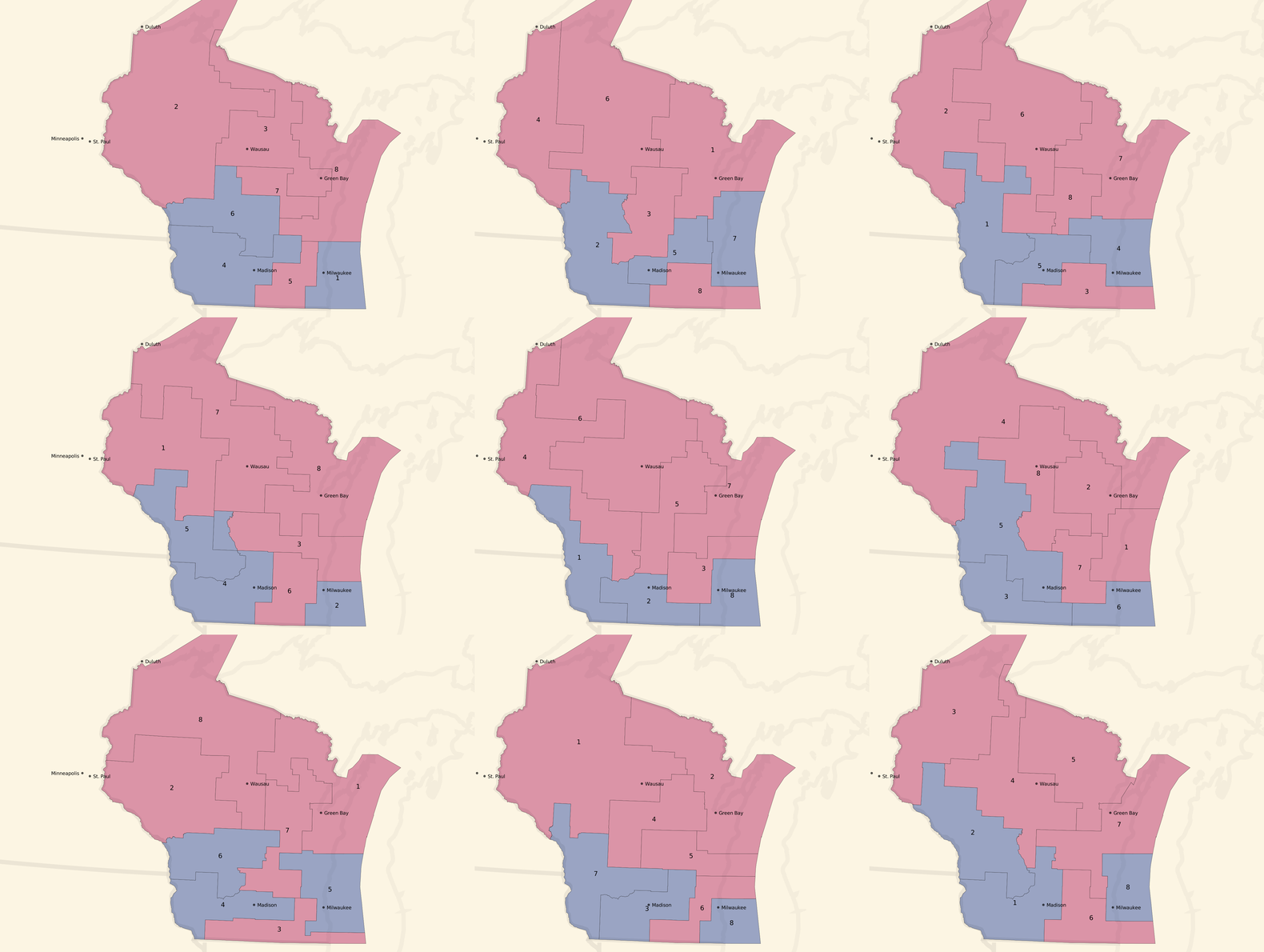
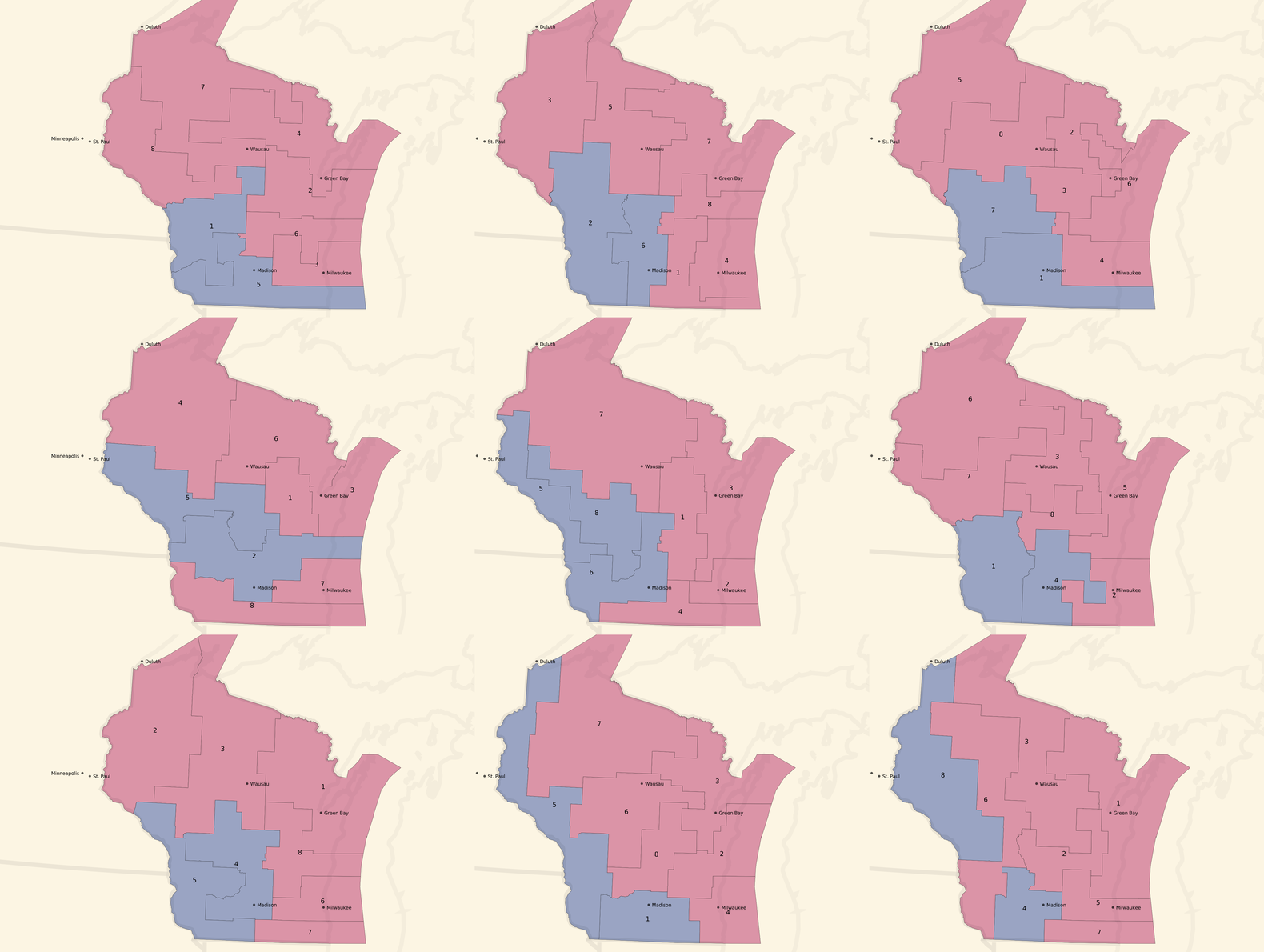
Here are some partisan-balanced county-based plans:
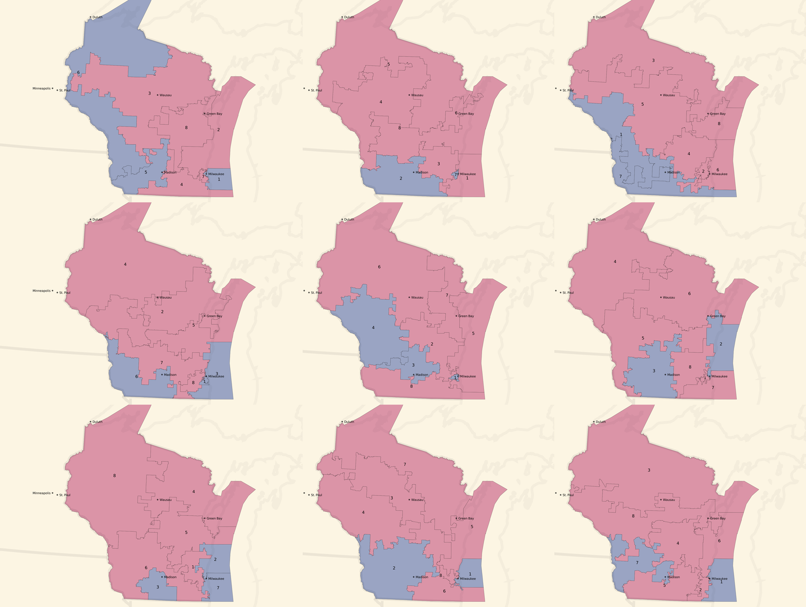
And here are some partisan-balanced tract-based plans:
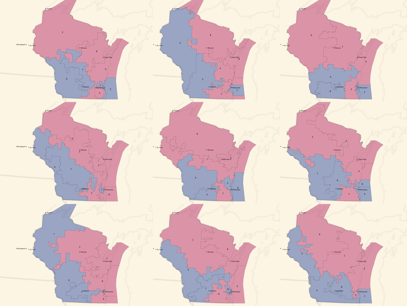
The plans are all random, but a few common features jump out immediately:
- Milwaukee and Madison are both strongly Democratic cities, and come up blue in all randomized sample plans.
- The southwest of the state also tilts Democratic, and comes up blue in all randomized sample plans.
- The resulting seat balances hovers between 5 Republican / 3 Democratic and an even 4/4 split, which generally reflects the slim 5% Republican statewide vote advantage.
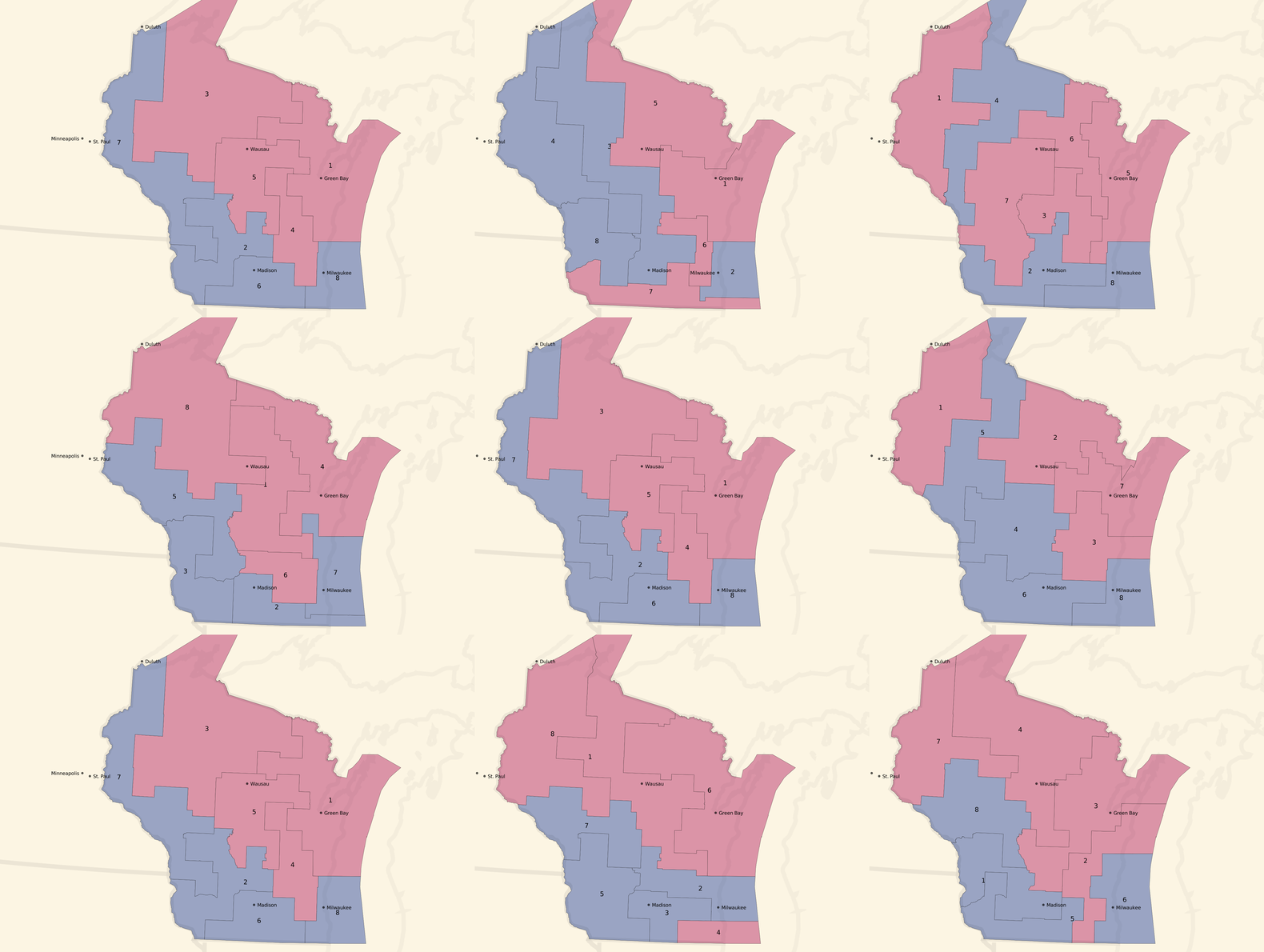
We can turn the dial to the right, and look at some unbalanced, pro-Republican county-based plans:
Unbalanced, pro-Republican tract-based plans:
Most of these unbalanced plans show a seat balance that shifts closer to 6 Republican / 2 Democratic seats, and the blue around Milwaukee and in western Wisconsin is often erased.
Or, we can turn the dial to the left, and look at some unbalanced, pro-Democratic county-based plans:
Unbalanced, pro-Democratic tract-based plans:
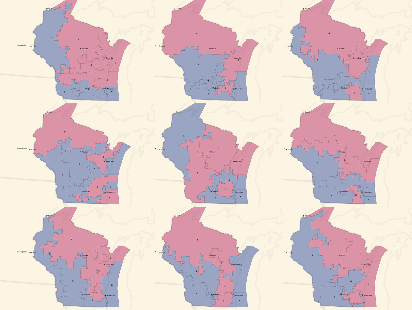
These are less dramatic, but you can see a few instances of 5 Democratic / 3 Republican seat advantages and a lot more 4/4 balances. The original geographic distribution remains, but the blue areas creep northwards.
We can zoom out a bit, and look at scatterplots of the county and tract approaches instead of maps. These plots show left/right efficiency gap plotted on the x-axis, and population gap (ratio between highest-population and lowest-population district) on the y-axis. Right away, the first graph shows us some limitations of building district plans from counties: it’s hard to get the necessary population balance required for a legal district, and many randomized plans result in lopsided population distributions. All of the sample plans illustrated above have been pulled from the bottom edge of this graph:
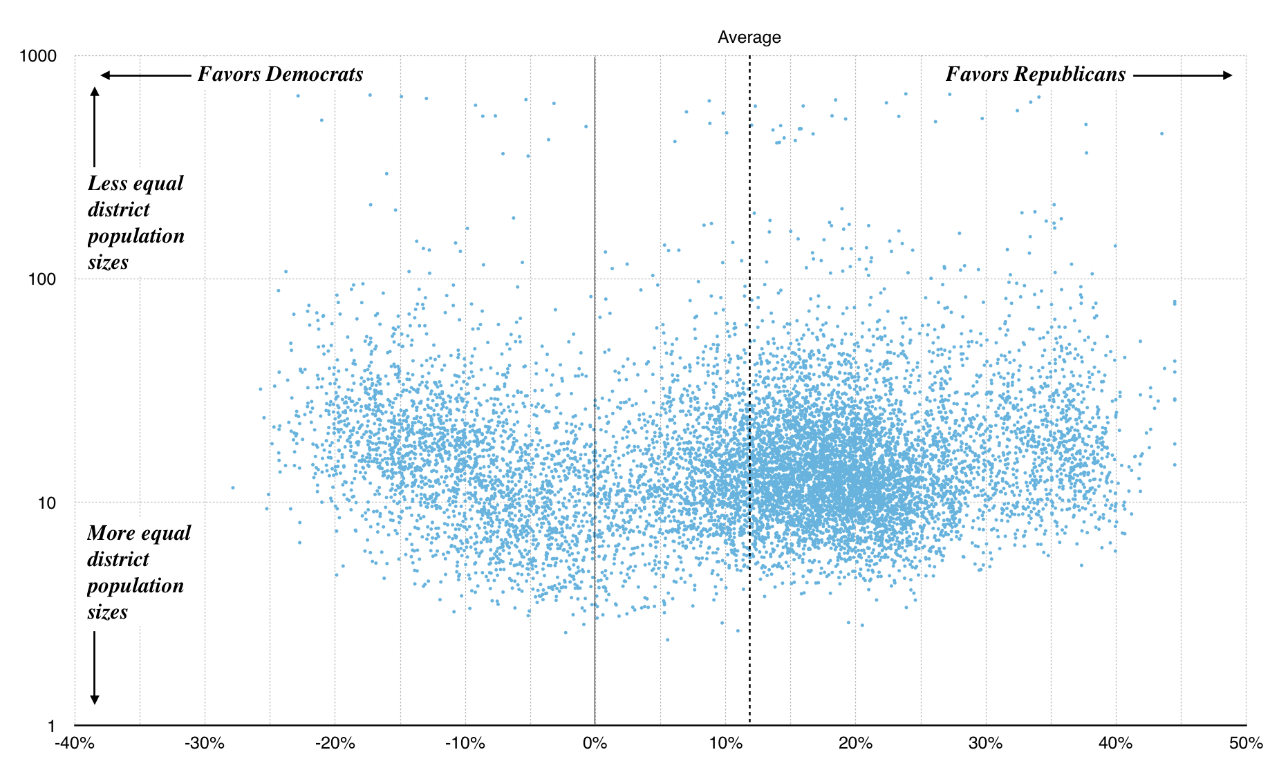
Graph made with Nathaniel Vaughn Kelso
Because U.S. Census tracts are population-weighted, the tract-based plans fare a bit better with many more showing up near 1.0:
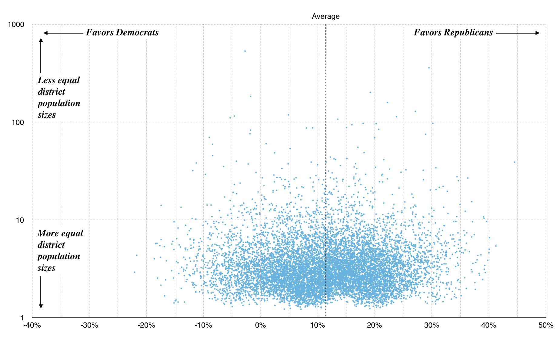
Graph made with Nathaniel Vaughn Kelso
The average efficiency gap for both county and tract plans is around 12%. This is outside McGhee and Stephanopoulos’s suggested 8% cutoff. In other words, in drawing random districts you are more likely to accidentally gerrymander Big Sort urban liberals out of power than the reverse because they are more geographically concentrated.
If you’re interested in checking out some of the district plans I’m generating and selecting from, I’ve provided downloadable data here, with one JSON object per plan per line in a pair of big files using Census GEOIDs for counties and tracts:
Next Steps
- With a way to generate a population of random candidates, run an optimizer to find the “best” candidate for the criteria we want: hill climbing, genetic algorithms, etc. The key here is to define a score for a plan that incorporates several factors: population and partisan balance, demographics, etc.
- Knowing that random plans can lead to big population imbalances, improve the plan generator to make equal-population plans more likely. Population gaps are a baseline requirement for a valid plan, so waste less time generating and evaluating these.
- Look at state legislative results. How many candidates ran unopposed? Can we generate similar plans for Wisconsin’s 33-seat Senate and 99-seat Assembly?
Thanks to Nelson, Zan, and Nathaniel for feedback on early versions of this post.
subscribe to ![]() this site.
|
contact Michal Migurski
this site.
|
contact Michal Migurski
Comments (2)
Love that you are doing this work. Thanks Mike.
Posted by Zachary Coffin on Thursday, March 23 2017 4:12am UTC
Thanks, Zachary!
Posted by Michal Migurski on Sunday, March 26 2017 12:54am UTC
Sorry, no new comments on old posts.