tecznotes
Michal Migurski's notebook, listening post, and soapbox. Subscribe to ![]() this blog.
Check out the rest of my site as well.
this blog.
Check out the rest of my site as well.
Dec 31, 2011 7:19am
solar stylesheet
A little more Mapnik work for the week: Aaron Huslage and Roger Weeks of Tethr asked about a map stylesheet for OSM data that could generate maximally-compressed tiles to fit onto a portable GIS / disaster response system they’re prototyping.
OSM Solar is a response to that requirement, and generates tiles that in many cases are 30%-40% the size of their OSM Mapnik counterparts. The job is mostly accomplished through drastic color reduction to a 4-bit (16 color) palette and aggressive pruning of details: parks are named but not filled, buildings are just barely visible for minimal context, color transitions and road casings are avoided.
The colors are sampled from Ethan Schoonover’s Solarized, “Precision colors for machines and people.” They’re designed for editing text, but work well for maps too. I’ve plucked out a narrow range, made the freeways bright magenta, and otherwise left everything alone.
The stylesheets can be found on Github, and I’ve tried to minimize external dependencies to the absolute minimum PostGIS, Mapnik, and osm2pgsql setup imaginable. If you use this to render tiles, you’ll want to use TileStache because it understands what to do with the included 16-color palette file.

Dec 29, 2011 8:07am
blog all kindle-clipped locations: normal accidents
I’m reading Charles Perrow’s book Normal Accidents (Living with High-Risk Technologies). It’s about nuclear accidents, among other things, and the ways in which systemic complexity inevitably leads to expected or normal failure modes. I think John Allspaw may have recommended it to me with the words “failure porn”.
I’m only partway through. For a book on engineering and safety it’s completely fascinating, notably for the way it shows how unintuitively-linked circumstances and safety features can interact to introduce new risk. The descriptions of accidents are riveting, not least because many come from Nuclear Safety magazine and are written in a breezy tone belying subsurface potential for total calamity. I’m not sure why this is interesting to me at this point in time, but as we think about data flows in cities and governments I sense a similar species of flighty optimism underlying arguments for Smart Cities.
Loc. 94-97, a definition of what “normal” means in the context of this book:
If interactive complexity and tight coupling—system characteristics—inevitably will produce an accident, I believe we are justified in calling it a normal accident, or a system accident. The odd term normal accident is meant to signal that, given the system characteristics, multiple and unexpected interactions of failures are inevitable. This is an expression of an integral characteristic of the system, not a statement of frequency. It is normal for us to die, but we only do it once.
Loc. 956-60, defining the term “accident” and its relation to four levels of affect (operators, employees, bystanders, the general public):
With this scheme we reserve the term accident for serious matters, that is, those affecting the third or fourth levels; we use the term incident for disruptions at the first or second level. The transition between incidents and accidents is the nexus where most of the engineered safety features come into play—the redundant components that may be activated; the emergency shut-offs; the emergency suppressors, such as core spray; or emergency supplies, such as emergency feedwater pumps. The scheme has its ambiguities, since one could argue interminably over the dividing line between part, unit, and subsystem, but it is flexible and adequate for our purposes.
Loc. 184-88, on the ways in which safety measures themselves increase complexity or juice the risks of dangerous actions:
It is particularly important to evaluate technological fixes in the systems that we cannot or will not do without. Fixes, including safety devices, sometimes create new accidents, and quite often merely allow those in charge to run the system faster, or in worse weather, or with bigger explosives. Some technological fixes are error-reducing—the jet engine is simpler and safer than the piston engine; fathometers are better than lead lines; three engines are better than two on an airplane; computers are more reliable than pneumatic controls. But other technological fixes are excuses for poor organization or an attempt to compensate for poor system design. The attention of authorities in some of these systems, unfortunately, is hard to get when safety is involved.
Loc. 776-90, a harrowing description of cleanup efforts after the October 1966 Fermi meltdown:
Almost a year from the accident, they were able to lower a periscope 40 feet down to the bottom of the core, where there was a conical flow guide—a safety device similar to a huge inverted icecream cone that was meant to widely distribute any uranium that might inconceivably melt and drop to the bottom of the vessel. Here they spied a crumpled bit of metal, for all the world looking like a crushed beer can, which could have blocked the flow of sodium coolant.
It wasn’t a beer can, but the operators could not see clearly enough to identify it. The periscope had fifteen optical relay lenses, would cloud up and take a day to clean, was very hard to maneuver, and had to be operated from specially-built, locked-air chambers to avoid radiation. To turn the metal over to examine it required the use of another complex, snake-like tool operated 35 feet from the base of the reactor. The operators managed to get a grip on the metal, and after an hour and a half it was removed.
The crumpled bit of metal turned out to be one of five triangular pieces of zirconium that had been installed as a safety device at the insistence of the Advisory Reactor Safety Committee, a prestigious group of nuclear experts who advise the NRC. It wasn’t even on the blueprints. The flow of sodium coolant had ripped it loose. Moving about, it soon took a position that blocked the flow of coolant, causing the melting of the fuel bundles.
During this time, and for many months afterwards, the reactor had to be constantly bathed in argon gas or nitrogen to make sure that the extremely volatile sodium coolant did not come into contact with any air or water; if it did, it would explode and could rupture the core. It was constantly monitored with Geiger counters by health physicists. Even loud noises had to be avoided. Though the reactor was subcritical, there was still a chance of a reactivity accident. Slowly the fuel assemblies were removed and cut into three pieces so they could be shipped out of the plant for burial. But first they had to be cooled off for months in spent-fuel pools—huge swimming pools of water, where the rods of uranium could not be placed too close to each other. Then they were placed in cylinders 9 feet in diameter weighing 18 tons each. These were designed to withstand a 30-foot fall and a 30-minute fire, so dangerous is the spent fuel. Leakage from the casks could kill children a half a mile away.
That’s completely insane.
Dec 27, 2011 1:21am
angry, productive birds
You can control time when you can see it.
For a few years now, we’ve been diligently recording our time spent on various projects at Stamen. Earlier this year, I wrote a small Protovis-based browser app that makes this time visible so we can act on it. It looks like this:
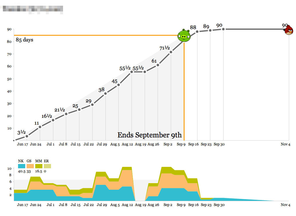
- The object of the game is to hit the pig with the bird.
- Bird over the pig means the project is at risk of losing money.
- Bird past the pig means it’s at risk of being late.
Time is recorded in half-day-or-larger chunks. Zeroes are meaningful for when all you’ve done is a meeting or a phone call. Clients don’t actually see these; they’re for institutional memory, internal sanity checks, comparisons to other numbers, and definitely not for billing. We’ve always used a big, gridded-out whiteboard to record our time, and we do it on Fridays in a big group in the corner room so everyone can see what everyone else is up to. The whiteboard looks a lot like this actual web page form:

There’s a big wall of the bird graphs up in the back of the office, and they get printed out weekly so everyone can see what our work looks like on any given project. Here’s one that’s currently in progress:
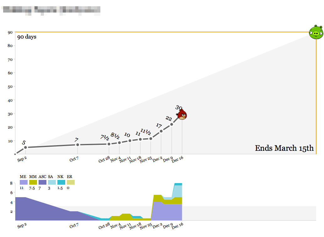
We’ve spent about a third of the total time spread out over the past few months, slowly at first and recently accelerating with a new addition to the team. As we get into the real meat of the project between now and March, we’ll pace ourselves and ideally come in at 90 days. The outside edges of the top graph—90 days and March 15th—are decided at the beginning of the project, and represent a target delivery date and an educated guess at the number of person-days we should spend to maintain a healthy margin. As with all round-looking numbers there’s some slop space built into this, but it serves as a useful guide.
Here’s a short, speedy project:
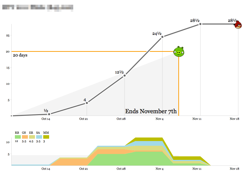
The bottom graph shows the breakdown of who’s working on the project each week. At first glance this one looks like it went overtime, but that last week of time was actually compressed into the days between Nov 4th and Nov 7th, and the final mark on the right represents clean-up time and a project post-mortem meeting. This project was a fast, easy win for a recurring client we enjoy working with.
Here’s us learning something new:
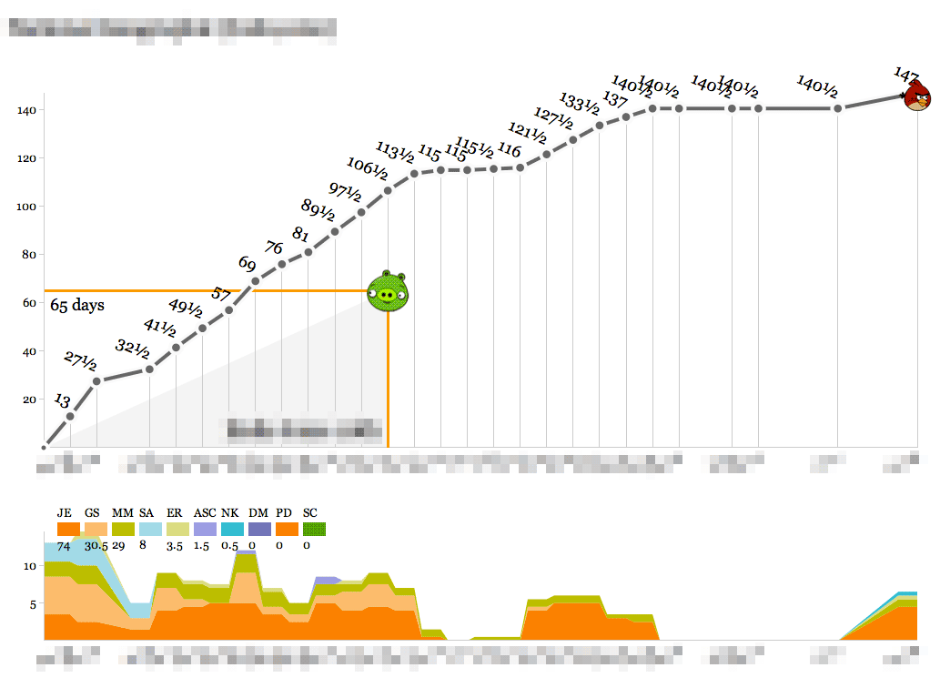
This one definitely cost a substantial amount of research and development time, and the bump in the second half of the timeline represents a series of post-delivery revisions with the client after a period of quiet for reviews. On a strict time/money basis this looks like a tragedy, but looks can be deceiving. The new knowledge, experience and goodwill from this project should go a long way toward balancing out the sunk time.
By contrast, here’s almost the opposite picture:
An intense ramp of upfront work representing almost half of the studio’s total resources, following by a launch right in the middle and a relatively calm second half. The budget for this one was designed around known-knowns, an unmissable public release, and a lot of headroom which we were fortunate to not have to cut into.
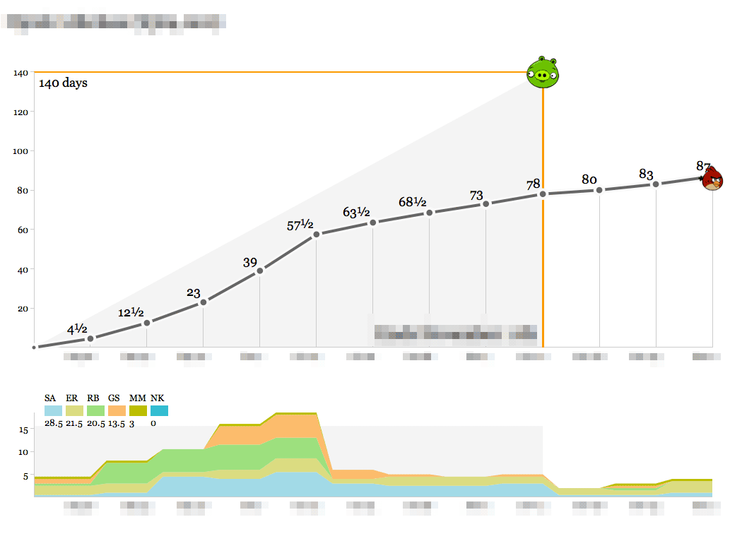
Finally, here’s the ideal:
Steady progress toward a known goal, very little deviation from the plan and ultimately a delivery right on the nose with a few mails and a November post-mortem thrown in.
We’ve used these graphs as the simplest-possible visualization of how we spend our time so we know how we’re doing relative to the budget for a project. Operationally, the data output of these graphs feeds directly into an accrued revenue model that lets us predict our income earlier. The day/week granularity makes it possible to collect the data as a team without making everyone unhappy with management overhead, and the bias toward whole- or half-day increments helps stabilize fractured schedules (not for me, though—my time is probably the most shattered of anyone in the studio).
If you want to set these up for yourself, the code that drives the birds is in an as-yet undocumented repository on Github with a few Stamen-specific things, and requires PHP and MySQL to run. I’ll write up some installation and user documentation and clean it up if there’s enough interest.
Dec 20, 2011 7:33am
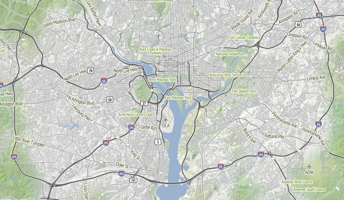
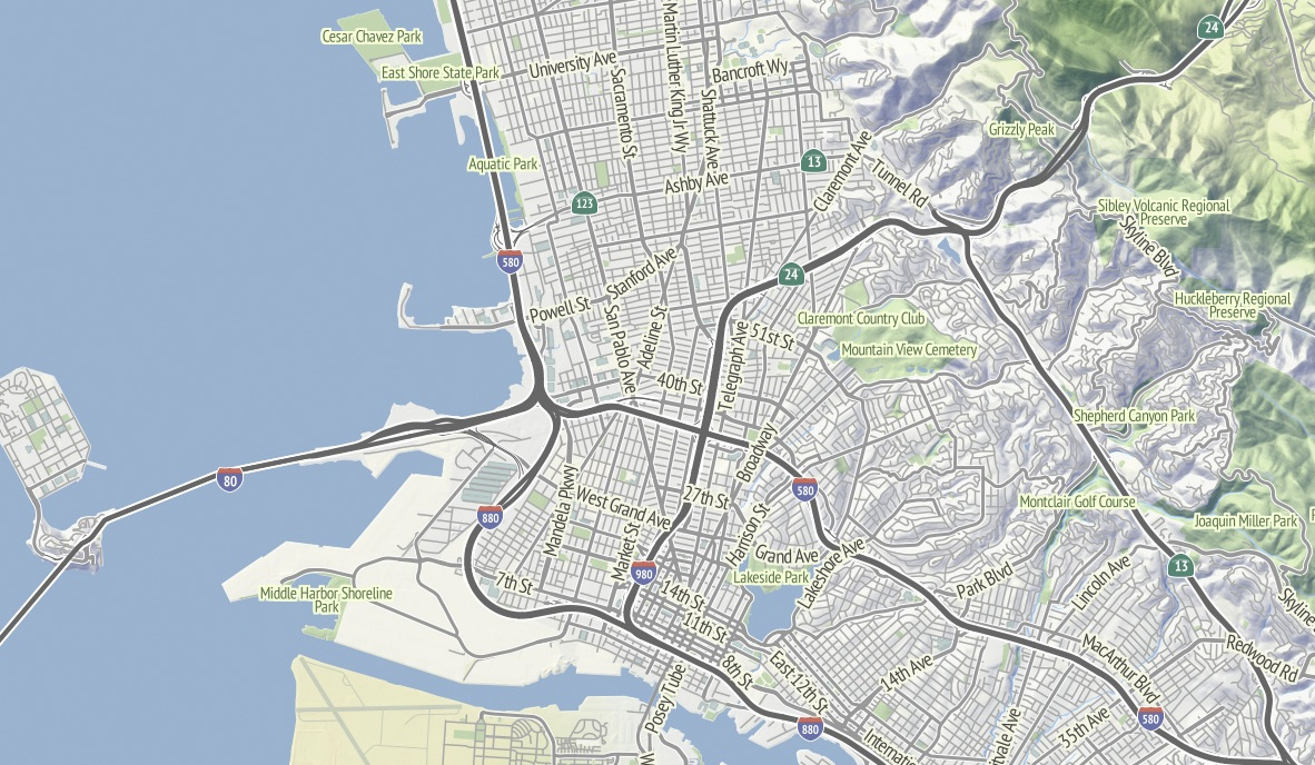
OSM terrain layer: come and get it
TL;DR: We’re making the terrain map available as a US-only tile layer. It has shaded hills, nice big text, and green where it belongs. The map is made of 100% free and open data, including OpenStreetMap for the foreground and USGS landcover and national elevation for the background. Code here.

Left unchecked, I’d hack at the map indefinitely without launching anything. This week I shaved a few final yaks and now there are U.S. map tiles for you to use, along with an interactive preview. Tile URLs come in the same format as other slippy map tiles, they look like this:
http://tile.stamen.com/terrain/zoom/x/y.jpg
You can add a subdomain to the beginning to help pipeline concurrent browser requests, e.g. a.tile.stamen.com, b.tile.stamen.com, up to d.
The source for everything is on Github, but it’s in a messy, half-described state which Nelson Minar is helping triage and disentangle.
Notable Yaks
The street labels and route shields for this map probably accounted for the majority of the time spent. I’m using a combination of Skeletron and route relations to add useful-looking highway shields and generate single labels for long, major streets. One particular OpenStreetMap contributor, Nathan Edgars II, deserves special mention here. I feel as though every time I did any amount of research on correct representation or data for U.S. highways, NE2’s name would come up both in OSM and Wikipedia. He appears to be responsible for the majority of painstakingly organized highways on the map. Thanks, Nathan!
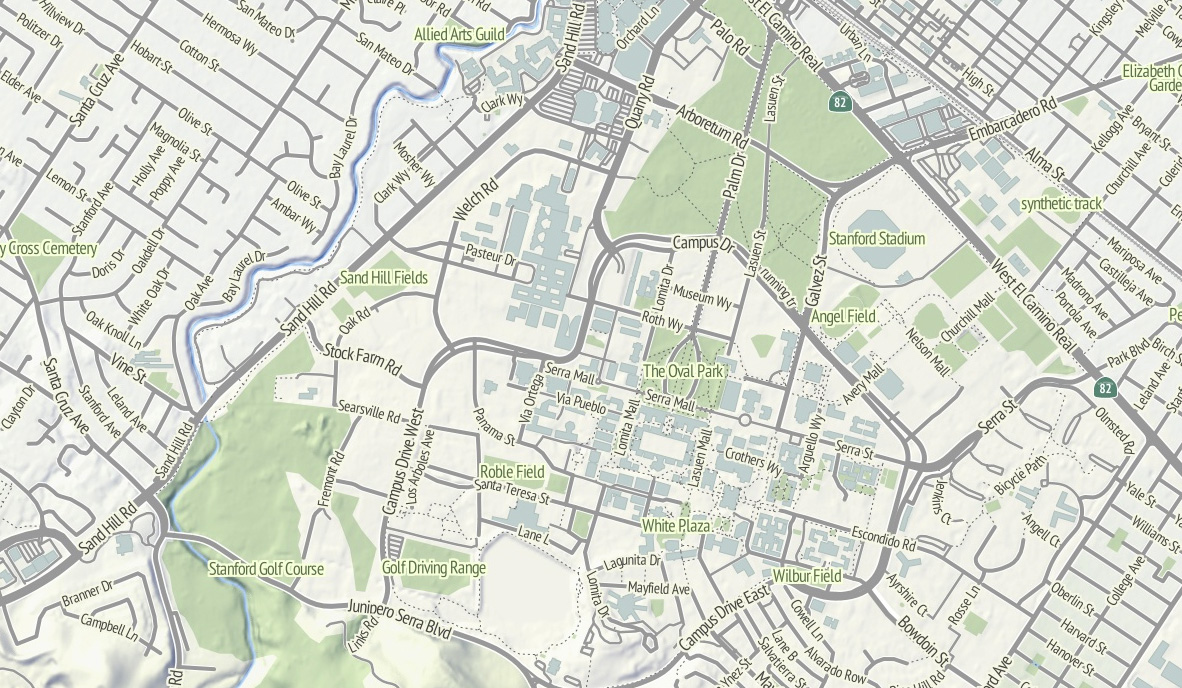
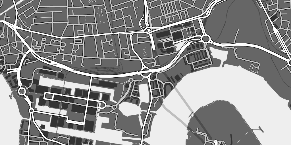
Skeletron also helped handle the dual carriageways, a common peculiarity of geographic street data where the individual sides of divided roadways are in the database as separate one-way lines, visible in the image of Stanford above. It can make for some pretty frustrating renders (the “MarketMarket DoloresDolores GuerreroGuerrero” problem I’ve mentioned before) so I’m literally processing every major street in the continental United States at a range of four different zoom levels to do the merging. There’s a great big code repo showing how it works; skeletron-roads.sh is the important part; I’ll get some shapefiles posted someplace useful in the near future.
I’ve done a bit of High Road-style work with town names to figure out the range of representations in OpenStreetMap, and I think I’ve figured out a scheme for about zoom 12 and above that allows major cities to show at high priority and not flood the map with a layer of useless GNIS “hamlets” like Peralta Villa. It still looks wrong to me in places, but it’s a lot better than OSM’s omission of Boston in favor of Cambridge until zoom 10.
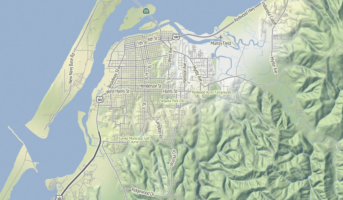
I’m thinking that Stamen can probably commit to OSM updates about once every month or so, since we’re not Frederick Ramm and have to do them semi-manually. Because this map style makes such an explicit and noticeable difference between major and minor roads, I’m expecting many resulting changes to be road classification edits. For example, Nathaniel reclassified a bunch of streets in his hometown of Eureka from residential to tertiary or secondary to reflect the major routes around town, and now they are labeled more usefully at lower zooms.
Pretty Pictures
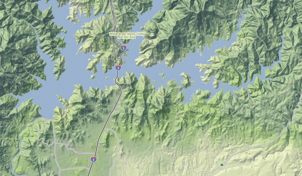
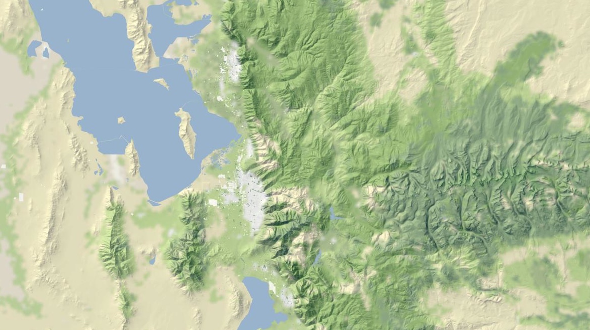
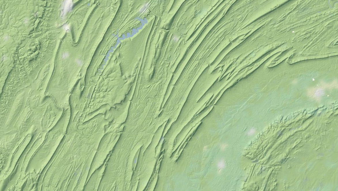
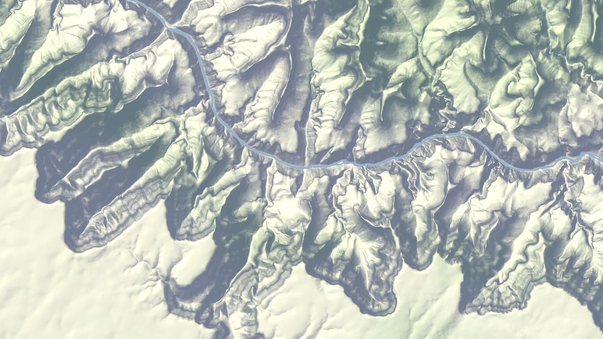
I love this image of Lake Shasta, with the sharply-rising hills around the land and Interstate 5 loping through. This is the northern end of the Central Valley, and the landscape here rapidly shifts to larger, more complex hills as you move north.

Madison, Wisconsin sits between two lakes, and there is a small plaque on the southwestern side of the state capitol building showing how deep under ice you’d be at the same spot 15,000 years ago. I like how the regular grid of the town adapts itself to that narrow spit of land between the two lakes, which I’m told are good for ice fishing and driving during the winter. Thanks to NACIS, I spent a fun few days here in October.
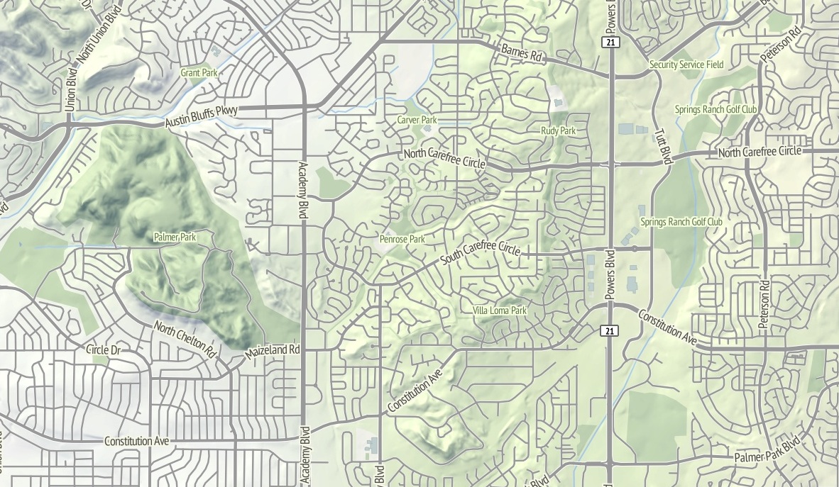
The interaction between the suburban cul-de-sac development and the foothills in this part of northeast Colorado Springs renders well with the warm sunlight on the northwest slope. I’d be curious to know of there’s a difference in property prices here, maybe between the southern exposures to the right and the northern exposures to the left?
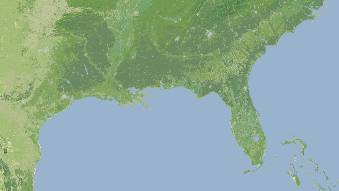
I continue to be fascinated by the topography of the Appalachians. Birmingham has this incredible swirl-hill to its immediate southeast, and I wonder if any of these large-scale structures are obvious at ground level when you’re among them?
Dec 5, 2011 8:19am
OSM terrain layer: background tiles now available
Lots of progress this week on the map, including state borders, more city labels, parks, and improvements to highway rendering at low zoom levels. Some forthcoming progress, too: more states, local points of interest, and Nate Kelso’s airport data and icons.
The thing that’s definitely ready is the base terrain, so I’ve decided to give it a little push before I release the rest of the map. Look, here’s a tile. This is another, and this is an interactive preview (shift-double-click to zoom out). Tile URLs come in the same format as other slippy map tiles, they look like this:
http://tile.stamen.com/terrain-background/zoom/x/y.jpg
You can add a subdomain to the beginning to help pipeline concurrent browser requests, e.g. a.tile.stamen.com, b.tile.stamen.com, up to d.
This terrain background tile layer is intended for use where you might otherwise choose satellite imagery because you don’t want text or other map junk showing up. It’s meant to recede quietly into the background, give useful terrain context, and look good with points and data in front. You can use them with OpenLayers, Modest Maps, Leaflet, Polymaps and even the Google Maps API.
The tiles are defined for the continental United States, and include land color and shaded hills. The land colors are a custom palette developed by Gem Spear for the National Atlas 1km land cover data set, which defines twenty-four land classifications including five kinds of forest, combinations of shrubs, grasses and crops, and a few tundras and wetlands. The colors are at their highest contrast when fully zoomed-out to the whole U.S., and they slowly fade out to pale off-white as you zoom in to leave room for foreground data and break up the weirdness of large areas of flat, dark green.
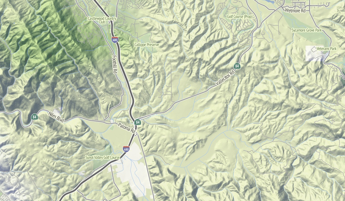
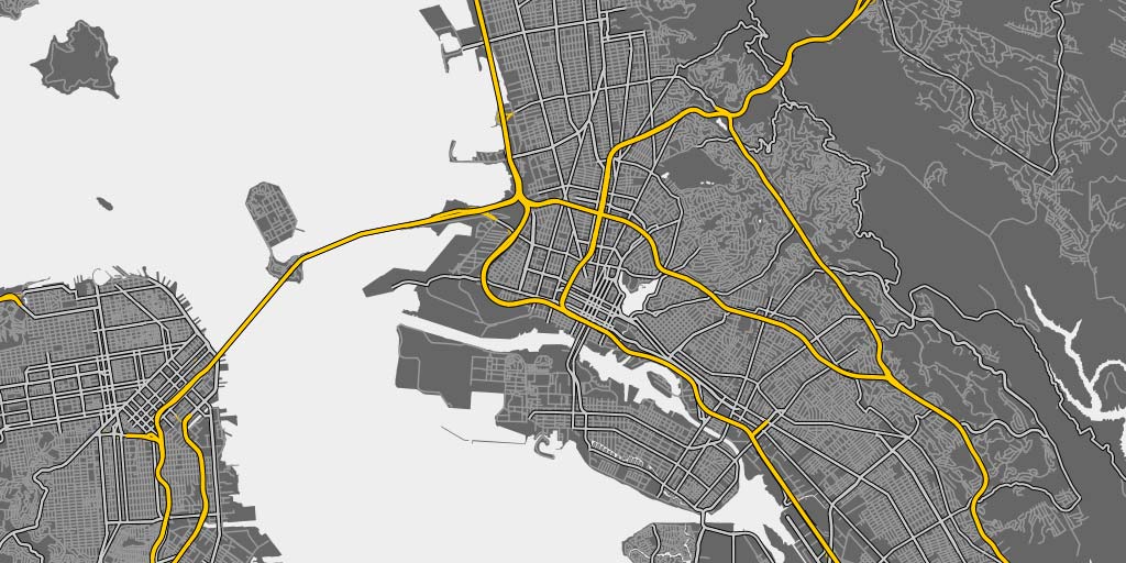
Also at higher zoom levels, details from OpenStreetMap such as parks and land use patterns begin to show up, as in this example of Almaden Valley and the Santa Cruz Mountains:

The hills come from the U.S.-only ten-meter National Elevation Dataset, which allows for usable hills at zooms as high as 16 or 17. Instead of cross-blending NED 10m with SRTM and its many holes, I’ve simply downsampled the full resolution data to provide for smoother hills at lower zooms, and over time I’ve come to prefer this approach to Google Terrain’s much more crispy hills.
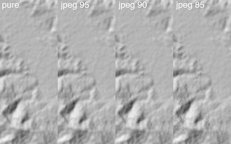
There’s some mildly interesting stuff going on with the shading, where I’ve decided to pre-process the entire country down to zoom 14 “slope and aspect” tiles (in some places, zoom 15) stored in two-channel 8-bit GeoTIFFs compressed with JPEG at quality=95 (here’s a sample tile for Mount Diablo—check out its two channels in Photoshop). The short version of this is that every bit of elevation data is stored in a form that allows for rapid conversion to shaded hills with arbitrary light sources, and still compresses down to sane levels for storage. It’s a happy coincidence that 256 levels of 8-bit grayscale is enough to usefully encode slope and degrees of aspect, though it took a bit of trial and error to determine that JPEG quality really needed to be 95 to remove ugly artifacts from the shaded output.
Check out read_slope_aspect() and save_slope_aspect() in the DEM-Tools code if this sounds interesting.
Anyway.
I particularly like the appearance of the layer in places like Pennsylvania’s ridge-and-valley Appalachians, with its sharp ridges and long smooth transitions. At this zoom level, you can still see the base green of the forested landscape:
Further out west, here’s part of the Grand Canyon in all its Haeckelian glory:
Use the tiles and tell me what you think. In a few weeks, if all goes according to plan, there’ll be a layer just like this one with all the OpenStreetMap goodness in the foreground.
Nov 27, 2011 6:51am
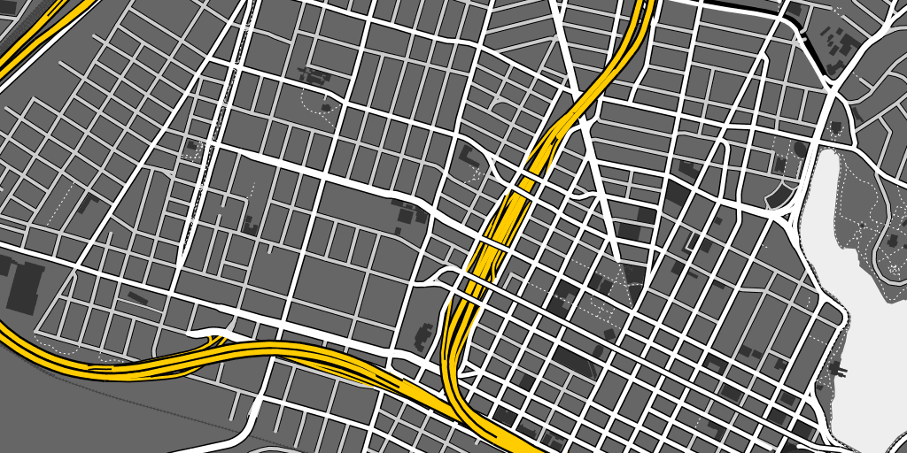
OSM terrain layer
I’ve been working on a new OpenStreetMap base map, using recent experiments in vector processing and elevation rendering, and modeled on some of the characteristics of Google’s terrain layer. There are screen shots here, and an actual tile layer Real Soon Now.
Many months ago Nelson Minar prodded me to think about an open-source alternative to the Big G’s terrain map, and after some initial experiments with hill shading based on an old post of mine from three years ago, I started working on a more extensible set of stylesheets and TileStache layers.
It usually doesn’t take long for me to overthink a project, so this simple task turned into kind of a behemoth that’s I’m just managing to bring in for a landing now. Among other distractions, this project has been a vehicle to think about bringing the techniques of manual cartography to an automated workflow, the role of a basemap in non-navigational contexts on the web, and hopefully the possibility of a single cartography that can coexist on laptop screens and high-res iPhone displays. Google’s terrain layer has become a popular background map due to its relative calm compared to the electric kool-aid acid zest of Google’s road cartography, why not a similar product for OpenStreetMap and build completely from open sources?
(all images are links to large versions)
The image above includes a few details worth calling out:
- There are non-generic shields on the highways.
- The labels on the big, main dual-carriageway roads aren’t doubled-up as they often are in OSM-driven automated map labeling.
- The hill highlights are warm and yellow, the shadows are cool and blue.
- The ground is colored according to land cover, which means that the urban parts are cold and gray like concrete while further up in the hills you start to see browns and greens.
The shields and labels are both driven by some work I’ve been doing with Schuyler Erle on Skeletron. It’s an attempt to generalize complex linework in code using a range of techniques from the straight skeleton to Voronoi tesselation. I’ll write more about that in a later post, but it’s been kind of a multi-year adventure getting past my visceral distaste for the way that doubled-up “Market St.Market St.” labels tend to show up in renderings of OpenStreetMap data. I’ll follow up with another post specifically about the roads and highways.
The ground and hill renderings are about imitating the work of Eduard Imhof, whose use of color derived from grayscale relief simulated the appearance of hills in sunlight. My version is drastically toned-down from his, but the hint of warm and cool are there. I’ve been using the TileStache Composite provider as a vehicle for these experiments, mostly with the aim of a tile-based mini-Photoshop for performing specific composition effects inspired by Lars Ahlzen’s TopOSM.

The colors are built on the National Atlas 1km land cover data set, and Gem Spear developed a color palette for each class of land cover from forest to tundra. The colors change in appearance as you zoom in and out: they are closest to our starting point when you’re zoomed furthest-out and fade out slightly as you zoom in to make streets and other features more legible in the foreground. Bill Mill provided a very timely patch to TileStache to make this behavior easy.
When you zoom out completely, you see a selection of cities visually organized to leave the text big and legible. The placement is driven by an update to the simulated annealing code we wrote for GeoIQ’s Acetate last year, and I’ve used the tall and narrow PT Sans font recommended by Ian Hex in his excellent article on UI typefaces.
There are still gobs of work left to do, including labels for water, schools and buildings, state and national borders at all zoom levels, and publishing actual tiles that you can use in your own projects (soon!). The various bits of code that actually do the lifting are mostly available via Git: Skeletron, TileStache, DEM-Tools, HighRoad, and Dymo.
Oct 12, 2011 6:14am
high road, for better OSM cartography
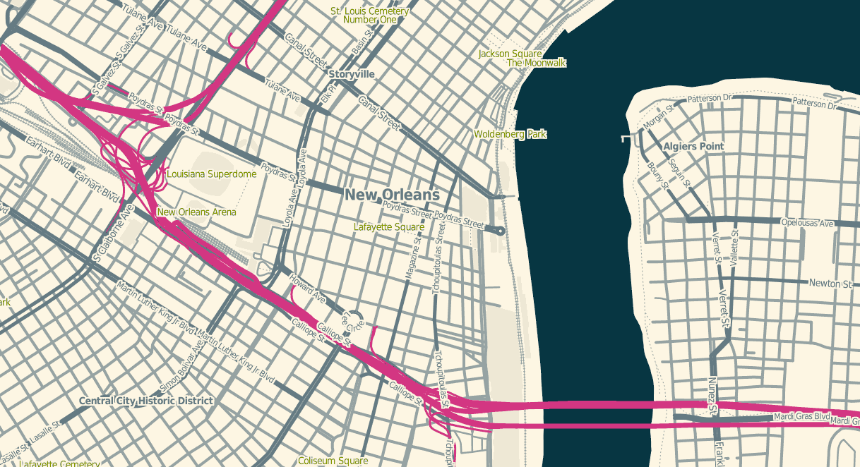
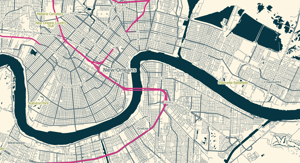
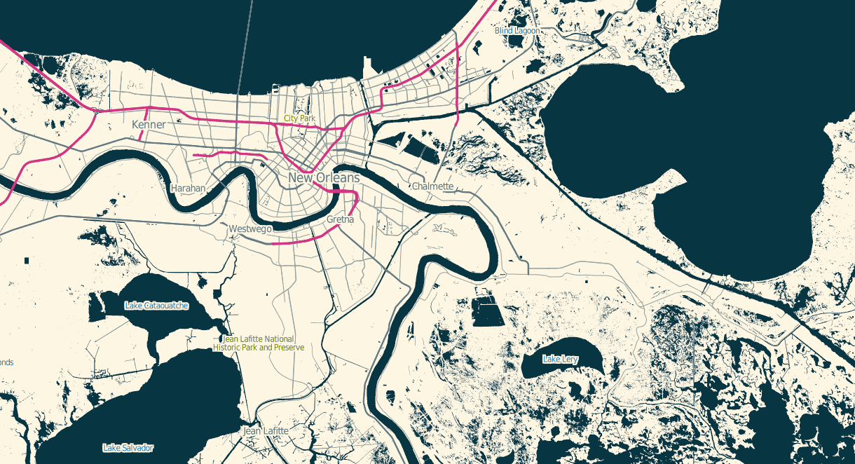
Tomorrow morning, I’m flying to Wisconsin for NACIS 2011, where I gave the keynote two years ago. Between this and last month’s OpenStreetMap conference I’ve been pushing forward on a number of OSM-related cartography projects. High Road, an answer to the confusion of rendering highways in Mapnik, is probably worth writing about.
High Road is a framework for normalizing the rendering of highways from OSM data, a critical piece of every OSM-based road map we’ve ever designed at Stamen. Deciding exactly which kinds of roads appear at each zoom level can really be done just once, and ideally shouldn’t be part of a lengthy database query in your stylesheet. In Cascadenik and regular Mapnik’s XML-based layer definitions, long queries balloon the size of a style until it’s impossible to scan quickly. In Carto’s JSON-based layer definitions the multiline-formatting of a complex query is completely out of the question. Further, each system has its own preferred way of helping you handle road casings.
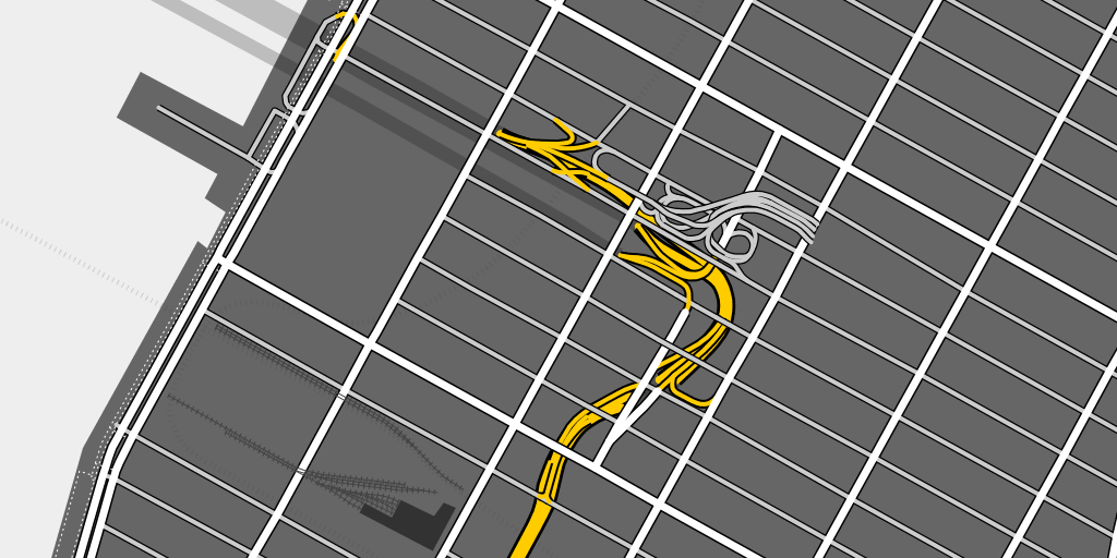
Here’s a rendering of the approach to Lincoln Tunnel in Manhattan, where you can see how the underground roads turn into a maze of ramps that rise up from below the streets to connect to the surface roads between 9th and 10th Avenues:
This is London near Canary Wharf, where there are no freeways but a complex collection of overpasses and tunnels:
High Road works using a few tags: “highway” provides basic information on the kind of road shown, “tunnel” and “bridge” provide some hints as to the correct layering, and finally “layer” (where used) lets OSM editors explicitly specify the physical arrangement of roads. At high zoom levels High Road attempts to draw a faithful picture of physical reality, and as you zoom out it progressively switches to a more semantic, route-based view that sorts streets by importance. Only three general classes of road—highway, major road, minor road—are used, following the advice of 41Latitude.com’s final post on Google’s legibility.
At low zoom levels, Oakland’s freeway network is layered on top of all smaller roads:
Finally, High Road uses the Postgres UNION feature to explicitly collect and sort road casings. This is easier to show than explain, so here’s that Lincoln Tunnel approach again with inner lines in white, casings shown in green (the local edge intended for use on bridges and overpasses), and outlines in yellow (the global edge meant for separation from the background):
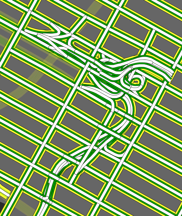
Normal again:

If you render OSM data, High Road can help your streets look right.
Sep 26, 2011 12:06am
piecemeal geodata
Two weeks ago, I attended the 5th annual OpenStreetMap conference in Denver, State of the Map. My second talk was called Piecemeal Geodata, and I hoped to communicate some of the pain (and opportunity) in dealing with OpenStreetMap data as a consumer of the information, downstream from the mappers but hoping to make maps or work with the dataset. Harry Wood took notes that suggested I didn’t entirely miss the mark, but after I was done Tom MacWright congratulated me on my “excellent stealth rage talk”. It wasn’t really supposed to be ragey as such, so here are some of my slides and notes along with some followup to the problems I talked about.
tl;dr version: OSM Cartography really should be a lot easier. Part of what makes it hard is understanding where useful, small parts of the data come from. I made new metro-area extracts for world cities, and I’ve got a proposed change to the Planet page that’s easier for new data consumers to understand.
First, the pain.
To make your own useful map of OpenStreetMap, you need OSM data and a derived coastline. To turn that data and coastline into something good, you need to understand how to use a whole belt of tools: getting data from Planet or one of the extracts, importing into a rendering database with osm2pgsql, pulling out relevant data with Osmosis, getting a separate coastline data set, and getting that into a rendering database with shp2pgsql. Once you get your head around it, it’s not so bad, but recently I’ve had the privilege of seeing all this through a beginner’s eyes thanks to two Stamen clients, and I think there’s a lot that can be improved here.
Frederik Ramm’s 2010 talk, Optimising the Mapnik Rendering Toolchain, put it better than I can right on the first slide: “Things you could have found out yourself if only it didn’t take so damn long to try them!” This is the story of OSM in a nutshell, though I should point out there’s nothing actually wrong with this state of affairs. A conversation with Matt Amos after I spoke showed how sensitive to the risk of attractive nuisances the OSM community can be—“if we do this thing, then people will use our half-assed solution instead of doing it right for themselves”. OpenStreetMap should provide a bulletproof full-planet wholesale service intended for use by serious developers, in preference to retail services like the extracts.
The opportunity here is that the data is actually incredibly valuable all on its own, without the bogeyman of commercial data licenses or crown copyright. Tom Churchill argued in his Saturday talk that OSM data was better for his law enforcement clients than commercial data, even though price for his is not a factor. For Churchill’s ARS product, the presence of details like leisure=playground or building names on college campuses is a critical element of situational awareness missing from navigation-focused commercial data sets.

It’s possible to shrink this problem by providing a wider variety of OSM extracts, and improving the usability of the Planet page.
One way to provide better planet extracts is to make them geographic and tiled. I’ve had some similar experiences with raster elevation data from the USGS, and it took a lot of digging to find that NED 10-meter data is actually findable in simple .zip files, instead of the confusing collection of slippy-view-and-download tools (“The National Map Legacy Viewer”, “The National Map Seamless Server”, “New National Map Viewer”, “National Map Viewer Beta”, “Seamless Data Warehouse”, “Earth Explorer”, etc.).

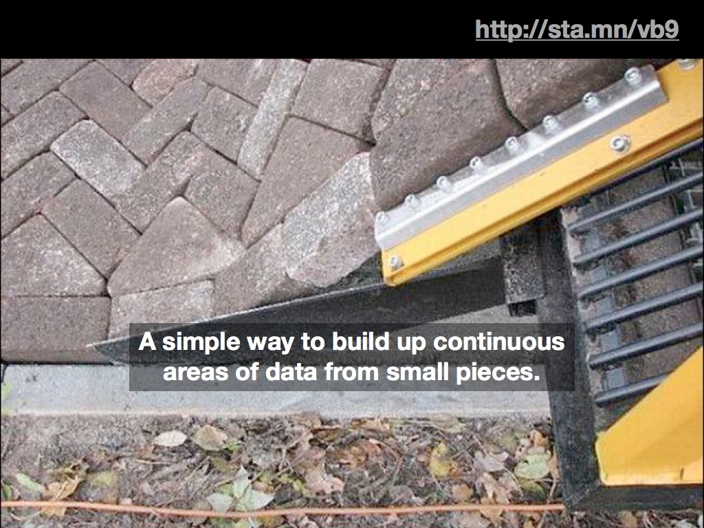
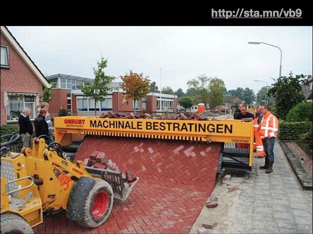
(Watch a video of the Dutch brick-laying machine)
Anyway, the value of tile-based downloads is something I covered in my NoGIS talk a few months ago, and I’m seeing some movement on this idea on the list through tools like OSM Split and Merge Tool.
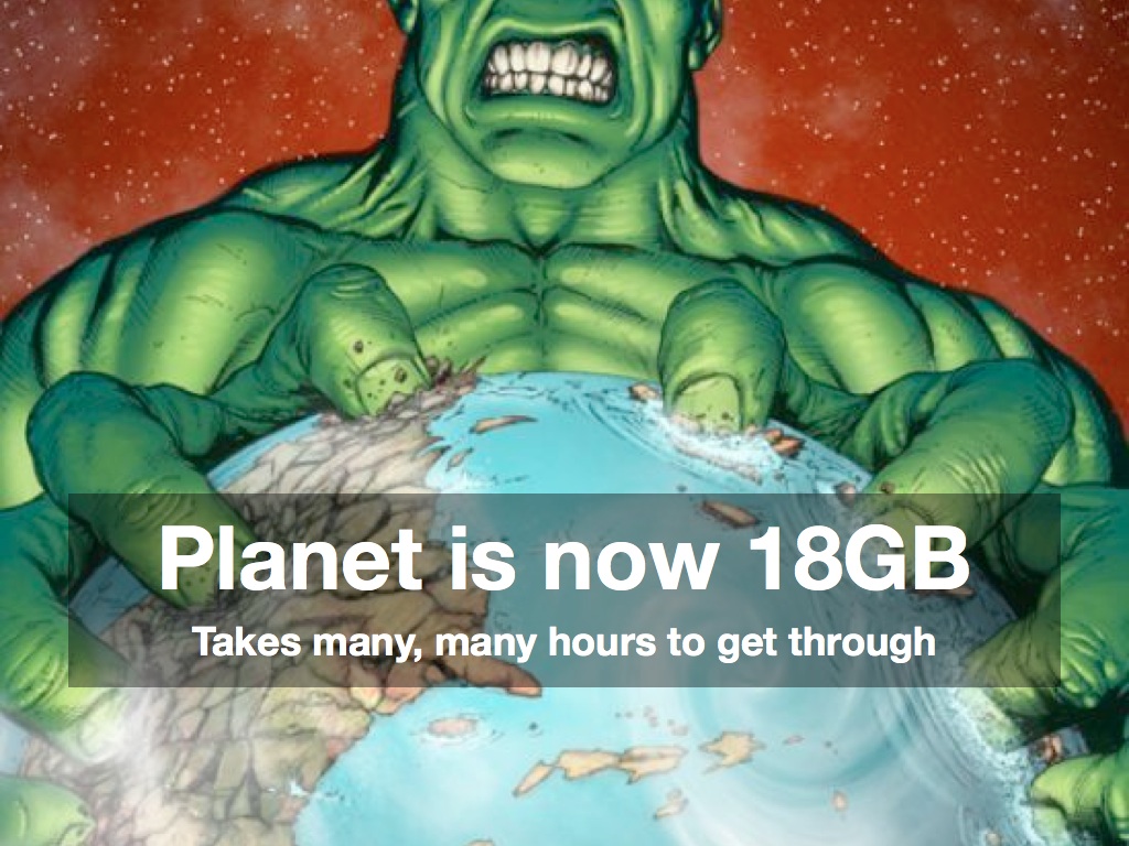
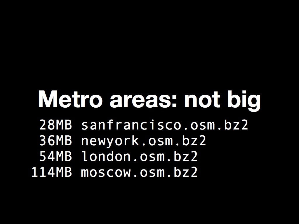
Perhaps more interesting is the possibility of per-city extracts that cross national and administrative boundaries. This is one place where I’ve been experimenting with Osmosis to release metro.teczno.com, a collection of extracts for worldwide cities. I think there’s a real opportunity here, with so many emerging cartography tools like mbtiles that assume limited-coverage tile collections, often at the scale of a single country or metro area. Extractotron, the code behind these extracts, is additionally an experiment with how to best use cloud-computing resources to support distributed data. Amazon has offered to host full-planet datasets in the past but these efforts have often floundered due to the fast-moving nature of OSM data. With a bit of experimentation I’ve determined that it takes about a half-day to run a full 18GB planet file on a few dozen metro areas, or about $2.00 in EC2 costs. Combined with the ability of an EC2 instance to terminate itself, it’s possible for me to maintain worldwide metropolitan extracts on a regular basis for less than the cost of sponsoring a child.

The final opportunity I discussed was the sad state of the Planet index, a webserver-default file listing with almost no introduction or considerations for novice users:
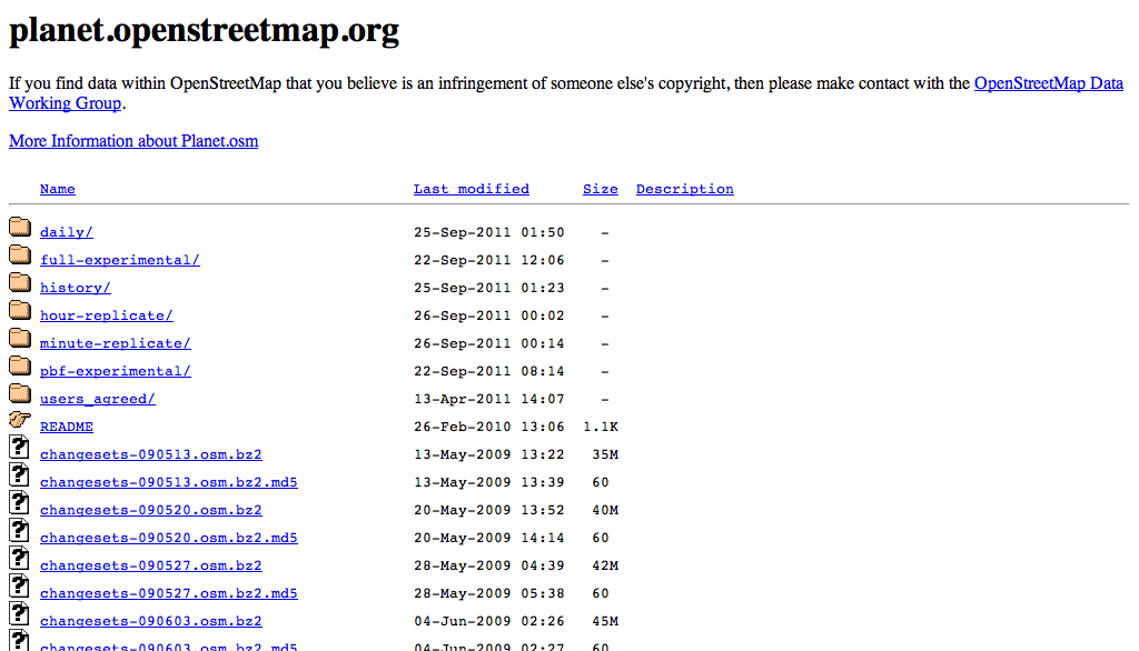
There’s a link to the wiki, but in my mind “link to the wiki” is collaborative project code-speak for “teach the controversy”*. My recommendation for fixing the index page is on Github, and boils down to just a few things:
- Say what’s on the page, ideally multiple times.
- Link to the latest data near the top.
- Say how big and old the data is.
- No surprises: it should still be an autoindex page.
- Say what’s on the page again.
- Help people understand how they might use data.
- Help people not have to use the whole thing at once.
- Sort the list by recency instead of alphabetically.
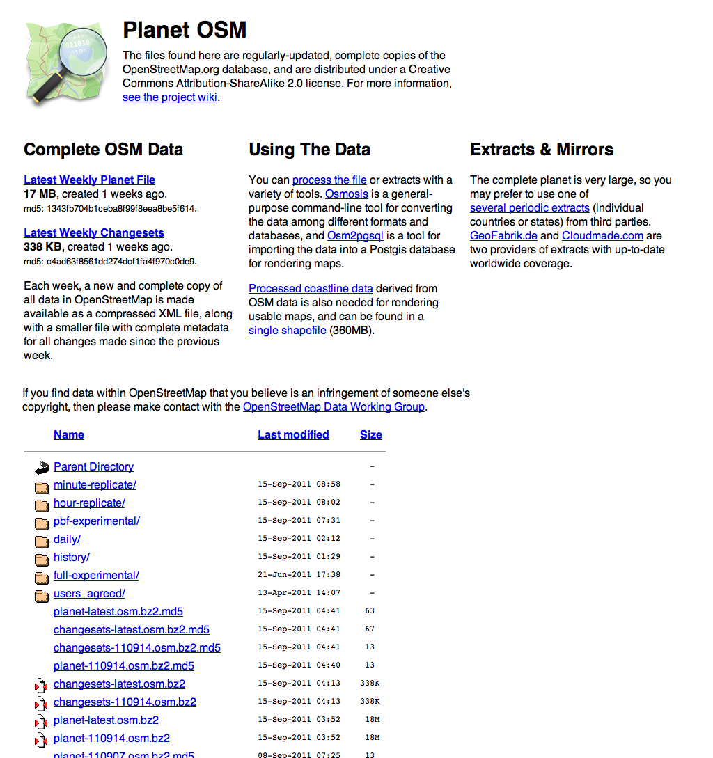
It looks like this:
I was asked at the talk whether a better Planet index was not also a job for a motivated outsider, and I think this is one situation where OSM.org itself needs to step up and take visible ownership of the situation. Regular data publishing is no longer an experimental sideshow to the OSM project, it’s right on the main stage. It reminds me of Twitter’s streaming “firehose” API history. We were one of the first groups to consume the live stream when Twitter had under 100K active users in 2007 and a persistent TCP stream was a fairly weird idea Blaine Cook and Kellan Elliott-McCrea were experimenting with under the name “social software for robots”. Today, the Streaming API is a major part of Twitter’s business and powers 100% of our work with MTV, NBC, and other live Twitter event visualization projects. It has levels of service and real documentation, and generally points toward the future of what OSM’s planet files and minutely-diffs can be to data consumers. With a small amount of effort, those planet files can be mode more usable for non-technical users, which means more happy, enthusiastic and creative users of OSM data overall.
Jul 19, 2011 6:08pm
help make pre-quake san francisco seeable
Take five minutes, and help place a few of these historic Sanborn maps of pre-earthquake San Francisco in their modern locations.


Maptcha is a thing I’ve been poking at since simultaneously finding the newly-rescanned 1905 San Francisco Sanborn Insurance Atlas via John “Burrito Justice” and being tipped off to Paper.js by Tom Carden. It’s a simple, minimal-code interface doing rough placements of historical maps on modern geography, and I’ve been getting completely amazing feedback from all the people who’ve checked out early versions (thanks Paul, Ryan, Cal, Boris, Heather, Tim, Matt, Schuyler, Ian, Tom, Eric and especially George).
Historical maps come with all the usual bibliographic context, but almost no geographic context: the point-to-point correspondences that make it possible to overlay them on modern maps. Tim, Schuyler and Shekhar have been doing some fantastic work in this area with map librarian Matt Knutzen at the New York Public Library on the NYPL Map Warper, something we were lucky enough to participate in last year. The release of the new Sanborn scans was an out-of-band inspiration along these same lines, and an opportunity to test some ideas that wouldn’t quite fit in the NYPL context.
- All of the Sanborn maps were at a similar scale and time period, which meant that we could ask people to look for cross-streets and be mostly confident that they still exist in a modern geocoder.
- There are a limited number (700 or so), making it possible to create a bounded task with a clear end-point. You can finish it, an important feature for crowdsourcing initiatives that might not have a realistic end.
- We know they’re roughly conformal despite the massive distortions in street width. Most of the time, it’s fine to make the north arrow point up and fiddle with the size to get a good-enough placement. This has the added bonus of not bringing GDALwarp into the mix—it’s made of Canadian geo-magic but imposes its own technical burdens.
A lot of these specific adaptations come from the Internet Archive’s George Oates, whose comments on my initial UI sketches helped greatly clarify some of the knowns we’ve got to hand in an atlas like this one.
I’m not sure what happens to the output data from this process. Certainly it will be made available in some open format that links geographic placement back to the original scans in the Rumsey collection. John’s been nudging me toward a second-pass, more advanced UI that can help refine all these rough placements to something more precise that can help answer real questions about San Francisco’s history immediately prior to the earthquake of 1906. I’ve long been curious about the train line that led to such a gorgeous stripe of scar tissue through the Mission, but what about all the extra information you can glean from business and construction listings as detailed as these?
Anyway, go give it a shot. Let’s see if we can’t get all these images placed.
Jun 26, 2011 2:42am
seeing like a state, lying with pictures
![]()
Eyeo Festival is this week in Minneapolis, and I’m gathering notes for my panel with Mark Hansen, Laura Kurgan, and Lisa Strausfeld. I’m thrilled that Mark extended an invitation, especially since our conversation will be about data visualization and social justice:
This panel will look into the relationship between data (collection | sharing | analysis | visualization) and social justice. What can we reveal about the state of things by creating new views of the data? Can making the data more meaningful actually effect change in society?
We’re up on Wednesday afternoon just before the closing wrap-up, and as I consider some initial answers to the questions above I keeping coming back to Seeing Like A State, James C. Scott’s book-length argument on visibility and power, recommended to me a few years ago by Adam Greenfield. I’m finding myself expanding the premise of the panel somewhat: do we reveal new things about society by viewing data, or do we bend society into new forms by choosing data that can be viewed?

Scott talks about the state and his examples are mostly large-scale agricultural programs and high-modernist city planning, but I’m seeing echoes of his argument in current excitement about infographics and visualization as a medium, well-documented in blogs like Fast Co Design, Infosthetics, and artfully lampooned by Phil Gyford last year. The core piece of terminology in Seeing Like A State is “legibility”, and as a powerful institution demands more its methods shift from descriptive to prescriptive, from more-effectively seeing reality to modifying reality to make it more easily seeable.
Page 38 defines the problem, from the point of view of the state:
Rural living in seventeenth- and early eighteenth-century Denmark, for example, was organized by ejerlav, whose members had certain rights for using local arable, waste, and forest land. It would have been impossible in such a community to associate a household or individual with a particular holding on a cadastral map. The Norwegian large farm (gard) posed similar problems. Each household held rights to a given proportion of the value (skyld) of the farm, not to the plot land; none of the joint owners could call a specific part of the farm his own. Although it was possible to estimate the arable land of each community and, making some assumptions about crop yields and subsistence needs, arrive a plausible tax burden, these villagers derived a substantial part of their livelihood from the commons by fishing, forestry, collecting resin, hunting, and making charcoal. Monitoring this kind of income was impossible.
My co-panelist Laura Kurgan is maybe best-known for her astonishing Million Dollar Blocks project, a data investigation into New York prison spending dating back to 2004. Million Dollar Blocks has always been a favorite of mine, for a few reasons: our instinctual response at Stamen to this type of data is to put a slider on it, but Laura Kurgan and Eric Cadora went with the much more expressive, emotional $1,000,000 cutoff to make a point. If you’re not from Brooklyn it’s not even all that important which blocks make the cut. A slider is a slider and a million bucks is a million bucks, but only one of them fits into a short headline to make the point truly armor-piercing. The name of the project gathers up a jumble of data and history and offers it up in a legible form that snaps into instant relief the wisdom of spending seven figures on incarceration.

If you can’t see the value, you can’t judge its relative worth.
Back to Scott, Page 39:
As long as the common property was abundant and had essentially no fiscal value, the illegibility of its tenure was no problem. But the moment it became scarce (when “nature” became “natural resources”), it became the subject of property rights in law, whether of the state of the citizens. The history of property in this sense has meant the inexorable incorporation of what were once thought of as free gifts of nature: forests, game, wasteland, prairie, subsurface minerals, water and watercourses, air rights (rights to the air above buildings or surface area), breathable air, even genetic sequences, into a property regime. In the case common-property farmland, the imposition of freehold property was clarifying not so much for the local inhabitants—the customary structure of rights had always been clear enough to them—as it was for the tax official and the land speculator.
The imperative of legibility is a result of scarcity, and the audience for it may not necessarily be its subjects. “The order in question is most evident, not at street level, but rather from above and from outside” (page 57).
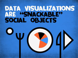
Moving on to visualization of data for non-state entities or corporations, many of them have the same state-scale needs and means at their disposal. The blanket term for this is business intelligence (or “insight” if you prefer the advertisements in airport terminals), and we’re seeing the popularization of infographics derived from this genre change focus from inward-facing charts (such as Stephen Few’s work on bullet graphs) to “snackable social objects” as Brad and Jesse from JESS3 call them. I won’t say too much about that except to point out one terrible, terrible bit of nonsense by David McCandless to illustrate what happens when large, interested entities decide to push the idea of visualization as a way to package and communicate facts.
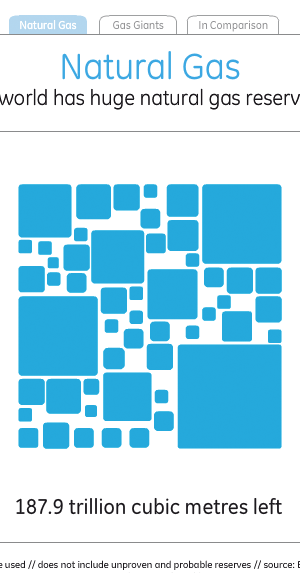
David made it for General Electric, which says this about its efforts in visualization:
At GE, we believe data visualization is a powerful way to simplify complexity. We are committed to creating visualizations that advance the conversation about issues that shape our lives, and so we encourage visitors to download, post and share these visualizations.
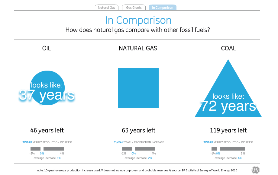
It’s just one number, but you can roll over each one of the little squares to see a country’s reserves (as measured by BP in 2010), which sort of makes you think of a heatmap until you start to wonder about the grout in between all the bricks that adds up to almost a full fifth of the total visual area.

Switching to the “comparison” tab is where this choice of visual style comes home to roost, and it becomes obvious that McCandless’s decorative decisions clash with GE’s stated goal of advancing the conversation.
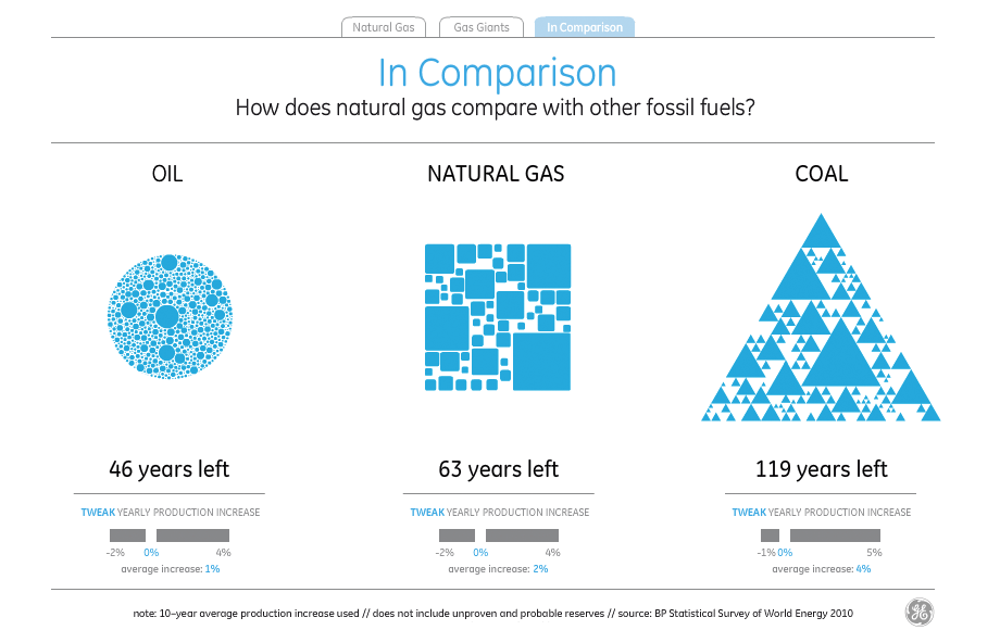
I’ve not found a way to make those numbers and shapes match up. Doing the same trick as above with visual density, it looks as though the amount of visual error in the white parts between the shapes reaches as high as 50%.
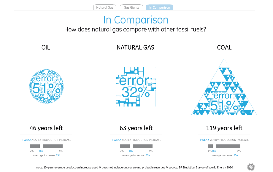
If you treat the natural gas supply of 63 years as a standard and try to read the visual density of the shapes to represent oil and coal to the left and right, you end up with visual variables very different from what the numbers say. The amount and density of blue circles understates the amount of oil by 17 years, while the amount and density of blue triangles understates the amount of coal by a shocking 62 years, making it look like there’s less coal than natural gas.
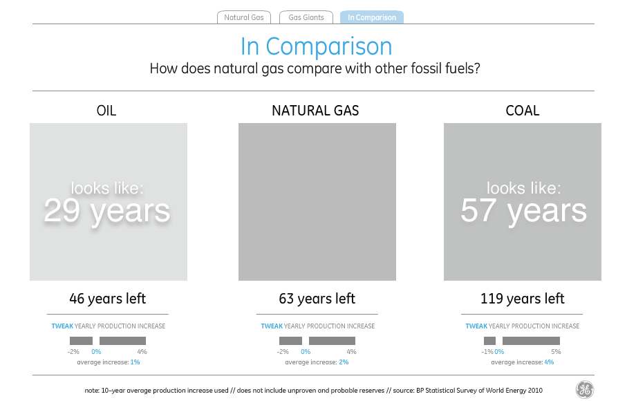
Just in case David really meant the shapes to be interpreted as filled-in and all those little bits are just him wanking around in Flash, I checked and found that the shapes still consistently understate everything except natural gas by as much as 40%. Since the title of the visualization is “the world has huge natural gas reserves”, I guess one way to make the point is to lie about the oil and coal reserves.
It’s obvious that even if McCandless’s snow job on the part of General Electric managed to show accurate numbers, it would still illustrate many of the characteristics of abstract legibility from Seeing Like A State. From page 80,
State simplifications have at least five characteristics that deserve emphasis. Most obviously, state simplifications are observations of only those aspects of social life that are of official interest. They are interested, utilitarian facts. Second, they are also nearly always written (verbal or numerical) documentary facts. Third, they are typically static facts. Fourth, most stylized state are also aggregate facts. Aggregate facts may be impersonal (the density of transportation networks) or simply a collection of facts about individuals (employment rates, literacy rates, residence patterns). Finally, for most purposes, state officials need to group citizens in ways that permit them to make a collective assessment. Facts that can be aggregated and presented as averages or distributions must therefore be standardized facts.
It’s worth noting that James C. Scott isn’t blindly criticizing statistical simplifications: “They are anything but simple-minded, and they are often wielded with great sophistication by officials. … the grouping of synoptic facts necessarily entails collapsing or ignoring distinctions that might otherwise be relevant.” (page 81). What he does criticize is the misinterpretation or outright modification of objective reality to fit that synoptic view, and this is where the argument becomes relevant to the panel again.
My response to all this is something to the effect that people should help other people to see and represent their world usefully and accurately. While it’s so often true that the power of synoptic viewing is available only to those members of society perched near the top, I can think of a number of cases where that same power is distributed democratically. The U.S. Census and U.S.G.S. both come to mind as organizations whose data product is made relentlessly public as a matter of normal operation, giving ordinary citizens the means to see their world as the state chooses to see it. The same state apparatus that puts people in prisons helps create the conditions under which Laura Kurgan can research the financial impact of those prisons.
Public data projects like Wikipedia or OpenStreetMap similarly provide for the creation of high-quality, shared data sets that cannot be taken away once released, thanks to the parallel efforts of legal experts like Creative Commons, the Free Software Foundation, and others.
The data issue I hope we manage to touch on in the panel might be better phrased as how to use new views of data to activate the creation and maintenance of reliable social data.
![]()
Jun 16, 2011 6:14am
parting gifts
I jumped on the @towerbridge teacup-outrage bandwagon fairly early, so I’ve had a few days to think about how Twitter could have improved their response to the situation.
Meanwhile, this arrived:

Coming up on a few years of joining and leaving online services, I’ve become interested in graceful exits. What responsibilities does a Flickr or Facebook have when you decide to move elsewhere, or simply stop sharing some aspect of your life? So much effort goes into user acquisition and new account creation, so little into the sunset process.
After a few years on image-sharing service Ffffound!, I moved my activity to the more-explicitly social and more account-having Pinterest. There are friends there, you can comment on other people’s pictures, and if you decide to use it as-advertised you can track pictures of things you might want to buy. Hello Pinterest, goodbye Ffffound!. Still, I’d been using Ffffound! since 2007 and amassed something like 5,500 images—about five per day or one every five hours. What to do with all that stuff? Inspired by James Bridle’s work with printed recordings of ephemeral data streams and the U.K.-based Newspaper Club, a bound printed book seemed like the obvious thing.

Produced with Lulu and a bit of PDF-bashing code, I created a multi-volume print of everything I ever posted. The images here are from the color proof print that showed up at the office on Tuesday. The real thing will be somewhere in the neighborhood of 1,400 pages, probably spread over four volumes, with a hardback cover and hopefully capable of surviving the death of Ffffound! and all of its stable hash identifiers. It will contain everything I know about every image: the web page it came from, a title if there was one, and the highest quality version of the original image I can find.
The complete image and data collection is close to 700MB, so with a bit of compression I could probably cram it all onto a CD and stick that in the back—animated GIFs of popular rappers don’t print well.

Twitter eventually did right by Tom when they reinstated the old Tower Bridge bot under a different name, but it really only came together after a weekend’s worth of unhappiness from its fans. Assuming that the only way to respond to a trademark claim from a London event space was to unilaterally reassign Tom’s account, Twitter should have planned a less robo-legal approach to moving people around. If the content of the account (as opposed to its name) was not a violation of the terms of service, they should have changed the name and informed Tom. If the content of the account was itself a problem, they should have collected it into a downloadable form such as a spreadsheet or zip file, and shipped that to Tom along with notice of his termination. I understand the complexity of online service legal concerns, but the perils of reasoning by stereotype mean that genuinely brilliant creations like the original @towerbridge can be easily (and irreversibly) abused by the process.

Back to books, Craig Mod describes the post-artifact book:
A system of unlocking. A system concerned with engagement. Sharing. Marginalia. Ownership. Community. And, of course, reading. It’s the system that transforms the book from isolated vessel for text into a shared interface. It’s a system that’s beginning to appear in fits and starts in reading applications we use today. It’s the system most directly connected with readers. And it’s a system that, when executed well, makes going back to printed books feel positively neutered.
Neutered or not, leaving a living, breathing service is a valid step in the opposite direction, from post-artifact to post-service artifact, to a parting gift.
Jun 3, 2011 3:26pm
code for oakland
Code For Oakland is a thing I am involved in, tomorrow. It’s a one-day bar camp on using local data to build apps for Oakland at Kaiser Center, and you’re invited.

Apr 15, 2011 5:40am
last week: NoGIS
On Wednesday last week, Sha Hwang and Zain Memon of Trulia née Movity hosted the first “NoGIS” meetup at their San Francisco office. I opened, SimpleGeo’s lead architect Mike Malone followed, and Stamen alum Sha Hwang closed out the night. In the audience were many of the folks mentioned in this talk: Mike Bostock of Stanford University and Polymaps, Mano Marks and Josh Livni from Google, Schuyler Erle from SimpleGeo and elsewhere on the geoweb, Tom Carden of Bloom.
Patterned on 2009’s “NoSQL” trend, this new name began as a tongue-in-cheek joke and seemingly transformed into a viable series of talks.
The previous week saw a medium-sized Tweetstorm of speculation as to the meaning of the name: was this round two in the old paleo- vs. neogeographer grudge match? Were we hoping to crush the rich history of GIS and geography under our boot heels? Was the meetup going to attract a crowd of arrogant 20-year-olds? Generally speaking, none of those things are true. I can report that the overarching theme of the talks was a shift in focus, from geoprocessing with publishing as an output, to geopublishing with processing as an input. NoGIS is a response to a shift in the technical environment, encompassing new strategies for scaling large data sets and and new responses to a rapidly shifting client-side browser execution environment for dynamic content.
To put it another way: big databases, tiles, and Javascript.
I promise that these notes bear a non-coincidental resemblance to what I actually said on Wednesday.

Ordinarily, you expect triplets like this to force a choice: Fast, Cheap, or Good: Pick Two. We’ve been developing approaches at Stamen for the past few years that value a form of simplicity or “dumbness” around the deployment of projects, to help eliminate some of the uncertainties around launching projects and keeping them launched.
Stamen is a service business, which mostly just means that we have clients who write us checks in exchange for the work that we do. This is one of the few non-negotiable constraints on our process: when the last check clears and everyone shakes hands, the things we build must continue to work out on the web. We can’t afford much creativity in how we deploy projects—they have to be fixable and comprehensible to the kinds of administrators and generalists available to corporations, cultural institutions, museums, services, charities, societies, and other Stamen clients.

Stamen is also a design firm, and the majority of our work is intended for public consumption. We produce visual interpretations of flowing data that must be understandable to a lay audience, often for clients who have an expert’s familiarity with that data and need to communicate it simply. We might be dealing with climate change datasets one week, transportation numbers the next, and iterating on a project around Kanye West’s tweets throughout that time. Lots of variability here.
The easiest way I can think of to contextualize the title of this talk and the fuzzy concept of “NoGIS” in general, would be to contrast it with the mission of geography and by extension traditional GIS: smart, correct, and generalized techniques for dealing with spatial information.
In response to Sean Gorman’s first blog post on NoGIS, Eric Wolf had this to say:
One of the “features” of big-name GIS is a set of “standard” geoprocessing operations. I believe the concept stems originally from Goodchild’s GISystems vs. GIScience articles in the early 90s. The idea is that these geoprocessing operations would be sort of like the tool bag of tests wielded by statisticians. That the people wielding the operations would be Geographers rather than Computer Scientists. Goodchild wanted to keep GIS inside of Geography and not let it become a specialty area in Computer Science.
That’s really it in a nutshell: standard operations on data for Geographers, with the attention to detail and accuracy that you might expect from domain experts dealing with complex data sets.

One of the first things that academic geography and traditional GIS values is the idea of a projection: a transformation from the round earth to a flat map. In the case of projections like the Universal Transverse Mercator grid, the point is to convert spherical geometry to something that can literally be used with a piece of paper and a ruler. This theme of tool-appropriateness will repeat itself a few times, and in large part I think the bias of a given “worldview” in disciplines like GIS is really something governed by the particular technosocial relationship between the user and the object.

Projections also are the first confusing thing for non-GIS people. Everyone knows the earth is a spheroid, and generally systems like Google Maps or GPS will express locations in terms of latitude and longitude. These are easy to visualize in your mind. If you’re a surveyor or other engineer, these units are a problem and so you must use one of the thousands of shared projections in the world, like the U.S. State Plane system, to flatten your local area so that your measurements can shake out on plans and drawings. Most people are not surveyors, and so when they visit the DataSF collection and find that all the street centerlines are in something called “California State Plane III”, they become confused. Schuyler Erle shouted “meters or feet?” at this point.
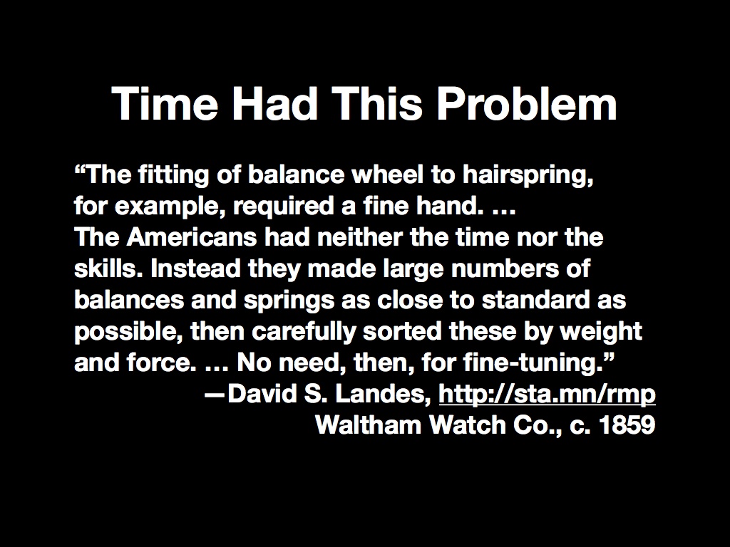
It’s worth noting that this kind of complexification for newcomers isn’t a problem unique to geography. Measured time had it too, with the expensive and painstaking process of building a quality watch making the idea of punctuality inaccessible to most people. New, seemingly-shoddy American development practices and the needs of mass coordination of soldiers in the U.S. Civil War put precision time into the hands of ordinary people.

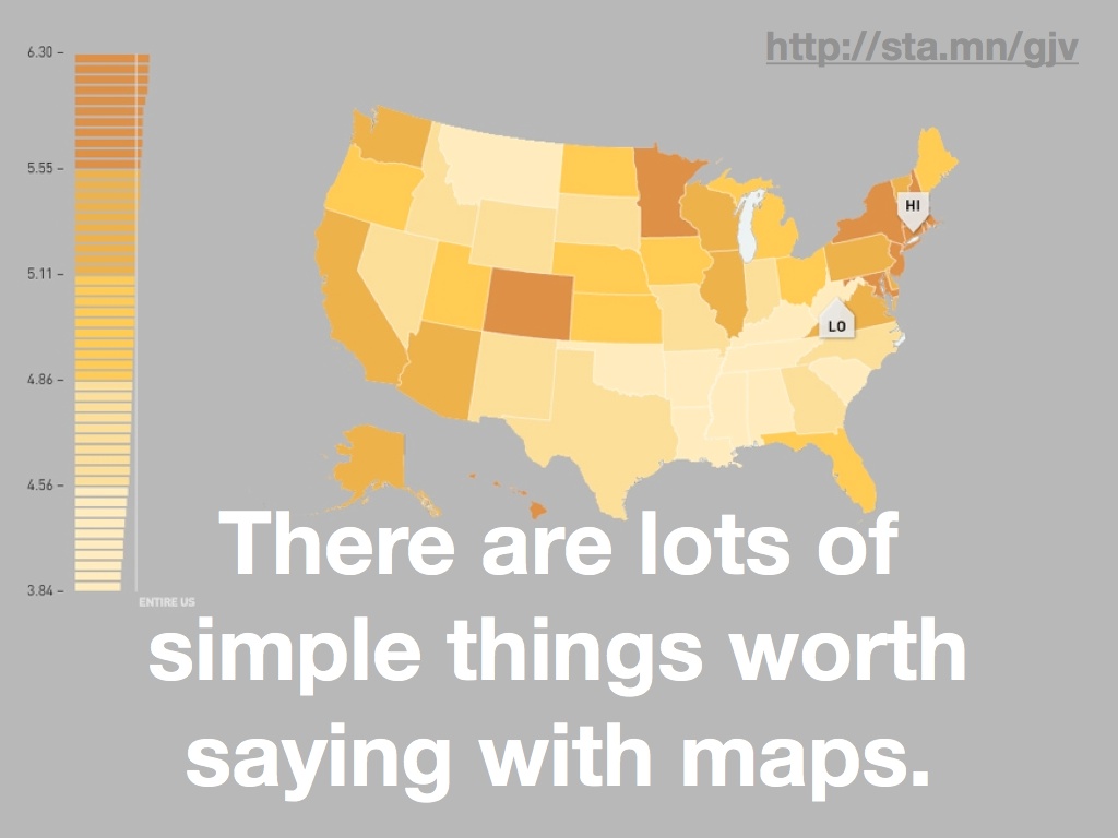
The thing is that there is a lot of geographic data that’s simple to display, and a lot of things worth saying with simple data.

This rent vs. buy map from our hosts at Trulia is an example of complex data boiled down to a simple visual display. Here the specific projection used is not really important, and the data display of each market’s price characteristics doesn’t really conform to the layers of data paradigm assumed in most GIS tools. It’s just not the same thing, but it has tremendous value. The biases are different, it’s more directly communicable, and there’s a more obvious visual payoff with the big red dot in New York.

The complexity of GIS took a turn about seven years ago, give or take.
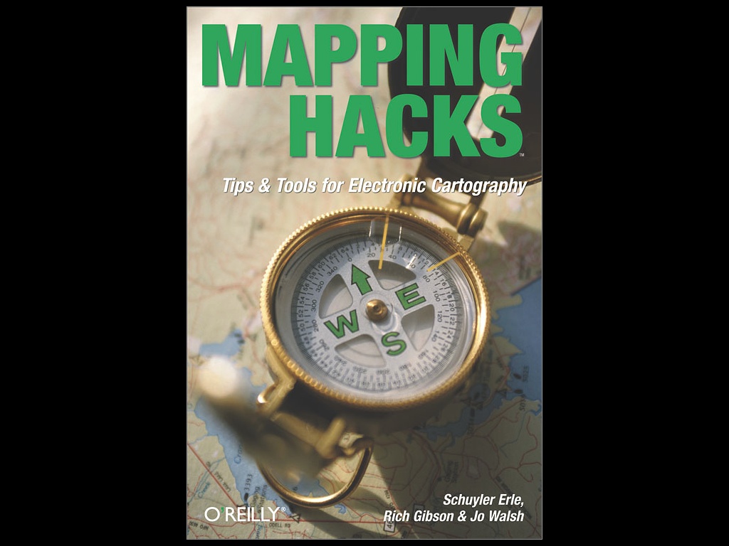
First, O’Reilly’s book Mapping Hacks was published, in which Schuyler Erle, Jo Walsh, and Rich Gibson explained how geographic tools could be used by the more traditional Unix hacker audience of O’Reilly’s books. While many of the file formats in the book came from the universe of traditional GIS, the reversion back to command line and script mentality was an interesting shift. Here you had a world of Linux users accustomed to batch processing and text-based interaction starting to realize that geography, too, was in their reach. This interest in processing ran contrary to the historical trend toward graphical user interfaces, but it put the tools of geoprocessing into the hands of the most vocal open source community.
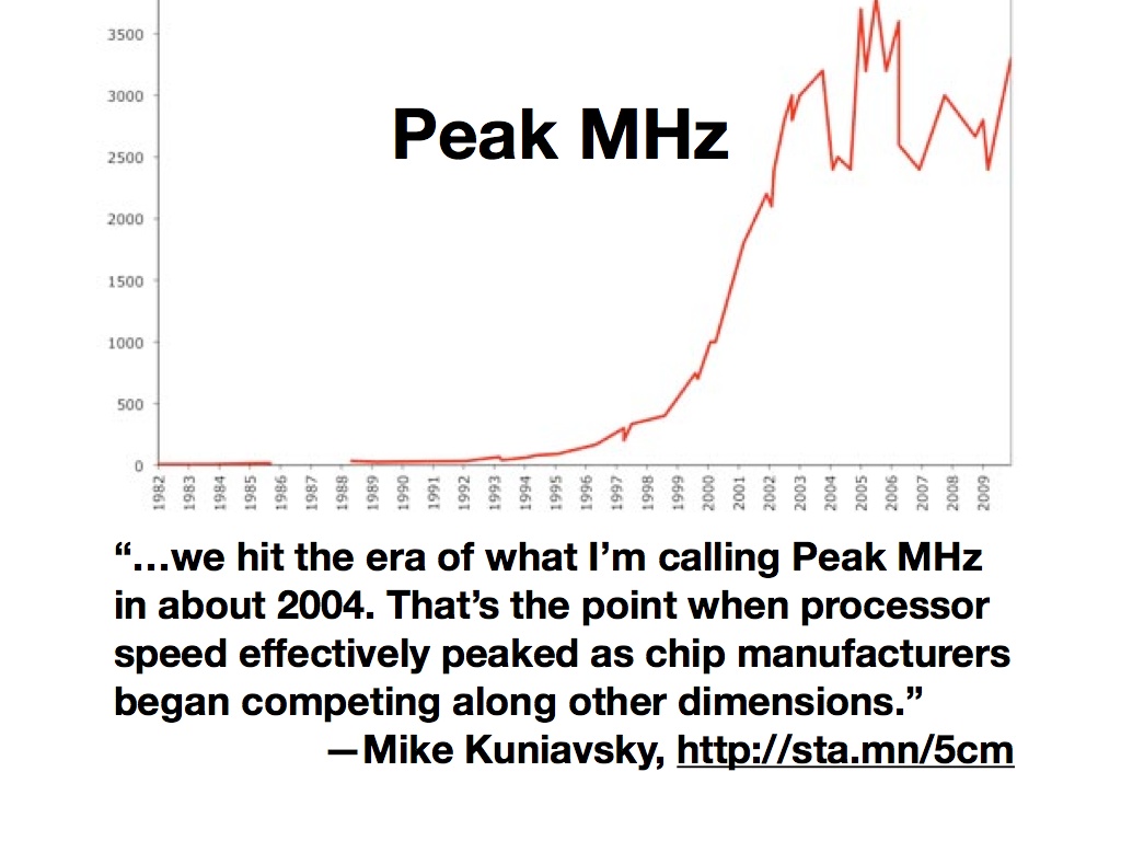
Around the same time, the CPU speed race began to slow down. Mike Kuniavsky calls this “Peak MHz”, and notes that attention shifted away from ever-more-vertiginous processor speeds to new dimensions of competition: power consumption, physical size, cost. The practical effect of this for GIS was that you could no longer rely on next year’s computers making your work faster by default, and for developers it became necessary to respond to the change by modifying development tactics. Storage, for example, continued to get cheaper by the gigabyte, so it began to make sense to precompute things like basemaps or data collections into readily retrievable forms.
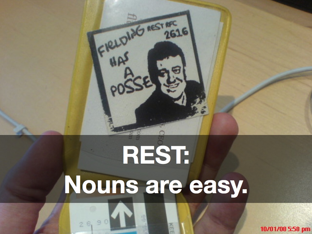
Finally, Roy Fielding’s 2000 thesis on architectural styles in network software began to get an increasing amount of attention. This is the year I first heard the term “REST”, and it instantly struck a chord with me. Specifically, it showed a clear path from remote-procedure-based communications toward a hypertext-driven exchange of representational states. A switch from verbs to nouns, in other words. We’ve seen how Peak MHz capped the speed of verbs, but nouns continued to get cheaper to store and serve.

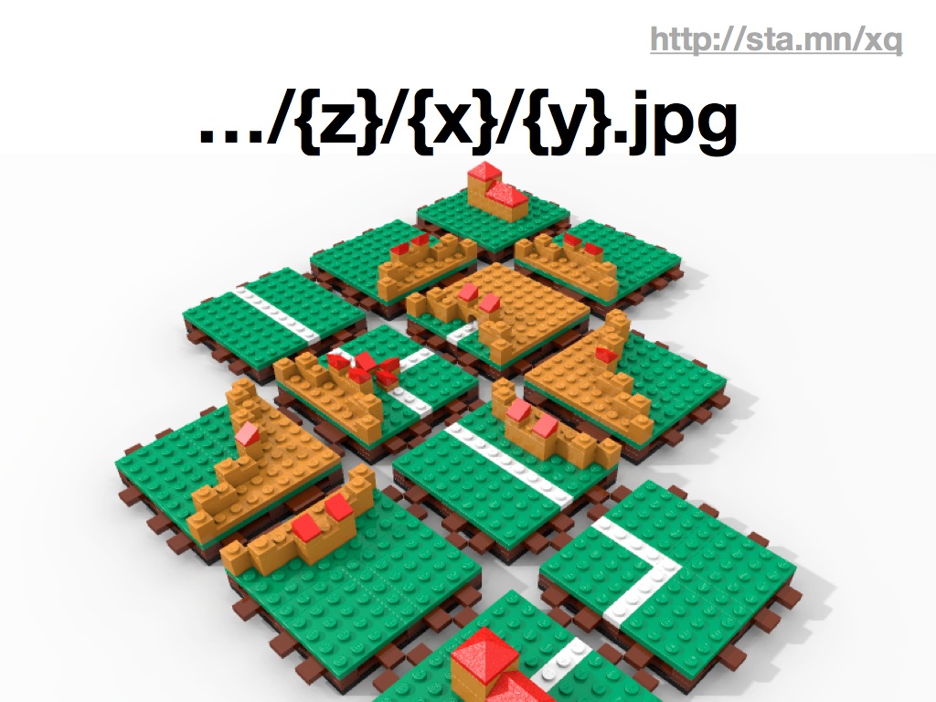
The noun that everyone thinking about NoGIS is probably most familiar with is the lowly map tile, that 256x256 pixel building block of most modern browser-based cartography. In early 2005, Google released its Maps product onto the web, showing how a country’s worth of complex geographic data could be beautifully pre-rendered and served at web speeds in a dynamic, interactive container. Overnight, the server-side CPU-intensive but primitive-looking cartography of MapQuest went out the window in favor of “slippy maps” built out of tiles.

Tiles happen to have an incredibly simple API. At this point, many of the early tile naming schemes like Microsoft’s “qrst” and Google’s “0123” quadtree conventions have been replaced with much simpler, more transferrable “Z/X/Y” coordinates. The ubiquitous use of the spherical mercator projection, which offers simpler arithmetic by assuming a spherical earth and square base map, makes the tiles for one imagery provider essentially interchangeable with any other.

Stamen’s done a few projects over the years that we think are good examples of NoGIS in action. All of them feature maps on some level, but deviate from the traditional analytic and process role of GIS to something more in the realm of pop culture and publishing.
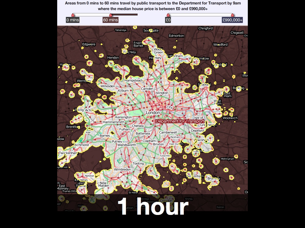
We worked with MySociety a few years ago to produce these interactive maps of London. They were based on housing price and commute time data, and featured a pair of simple sliders for selectively limiting display to a range of acceptable prices and times, something like an amoeba-shaped Venn diagram. As you moved the sliders, the parts of the map outside your parameters would go dark, giving you an immediate shape of where you might reasonably look for a home in London.

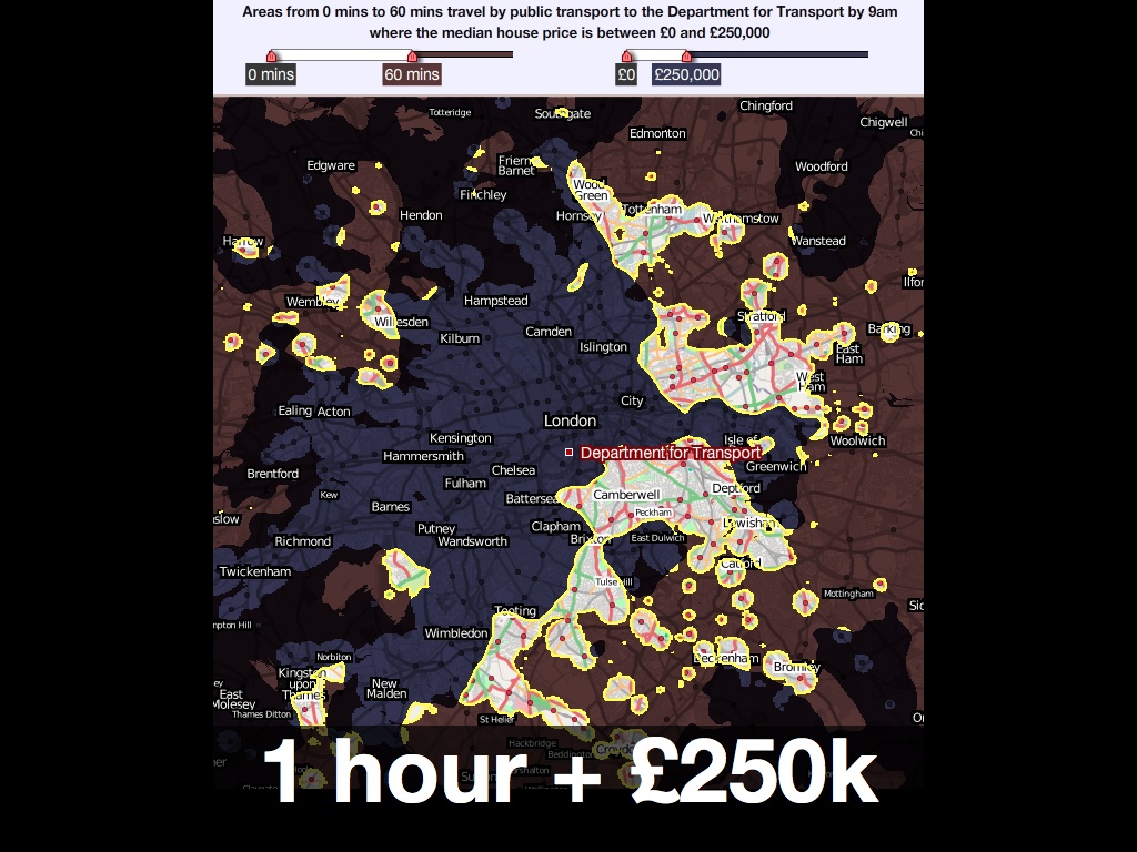
The nicest thing anyone ever said about it was this:
“… in three clicks it reveals what it took us years to learn: that the only place you can buy a house for £300K and still live 30 minutes from your office is the Kennington / Oval / Vauxhall triangle.”
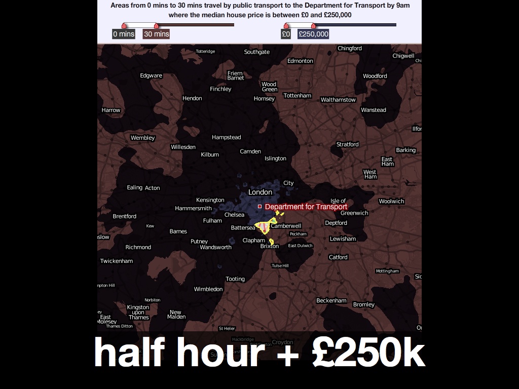

The MySociety map was based on a technique that takes advantage of the dynamic pixel-based processing possibilities available in Flash at the time, and Javascript canvas today. Map tiles don’t need to show images, they can also use the numeric color values in each pixel to carry data like time or identifiers. Sha Hwang’s talk later in day showed how Trulia is using this technique with census and other geometries to investigate color options in the browser, all based on cheap-to-host pre-rendered map tiles.
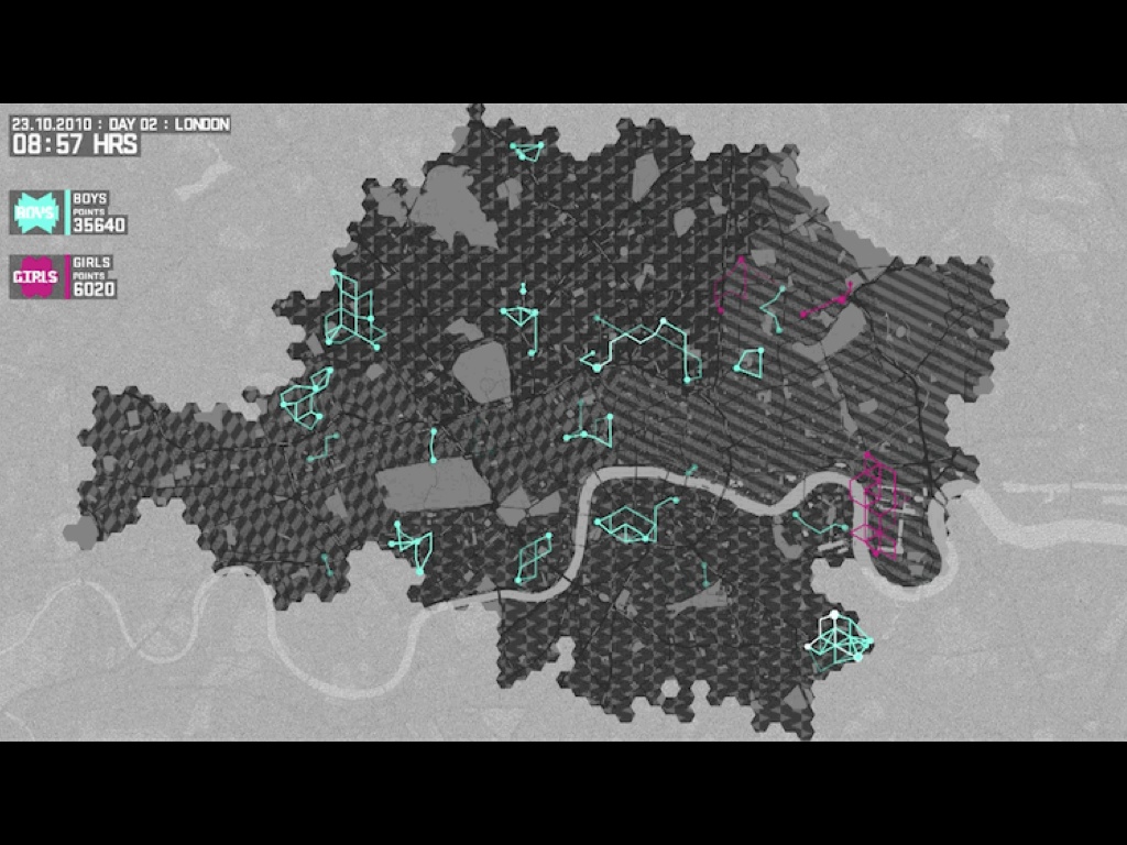
Late last year, we worked with Nike and W+K to create this dynamic map of London for the Nike Grid game, a two-week long distributed race around town using phonebooths as checkpoints and collecting and republishing data on a daily basis.

The visual design of the map was based on Nike’s existing art direction, and was not unlike our Midnight Commander cartography for Cloudmade. It was also developed using open sources of data like the Ordnance Survey’s post code points and OpenStreetMap for streets. This project had to be handed off to an advertising firm, and although it was live for only a few weeks it was important that they be able to host the cartography and other elements with minimal fuss. No fuss is more minimal than a simple bag of image files on a web server.

Back to the subject of tools, there’s an incredible gesture of re-appropriation in the Nike Grid project. The geographic expression of the data in Nike Grid skipped technologies like GPS entirely, and instead borrowed BT’s phone booth infrastructure, at this point just a distributed network of support structures for advertisements. Runners would check at various points in the grid run by dialing numbers from specific booths with their personal ID numbers.

It may not look like GIS, but these participants are taking advantage of deep backbench of geospatial technologies.

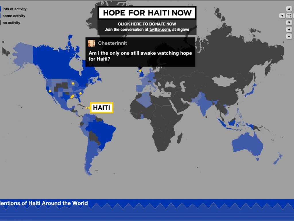
One week after the 2010 Haiti earthquake, George Clooney hosted the Hope For Haiti Now telethon and raised an astonishing $60 million for victims of the disaster. We took part in MTV’s broadcast of that telethon, with a rapidly-built dynamic map that collected data in realtime from Twitter users and displayed messages of support and encouragement on the open web and in the post-show. The dynamic map we developed categorized tweets into countries based on each user’s self-reported location, and displayed a selection of those tweets on a pulsing, shifting display.
This is really an example of speed, and shows how a geographic display can be used to communicate energy and participation, regardless of the particular details of the geographic projection or even the strict accuracy of the geolocation process. In this project, visual impact was key and the input was often messy. Did you know that running “inurass” through the Yahoo! geocoder gives a response of “Nagasaki, Japan”?
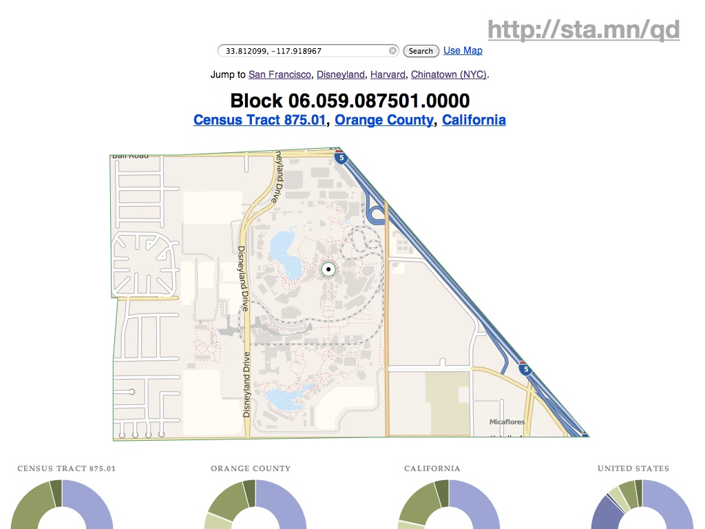
The last project I mentioned is This Tract, a browser-based viewer for Year 2000 U.S. Census data. This was a research project, looking at methods of deploying geographic data on the static file-hosting platform S3. It’s an experiment in late-binding: how possible is it to assemble completely static data from a variety of web sources in the browser, creating a dynamically-generated page that might ordinarily come from a server-side script or application.
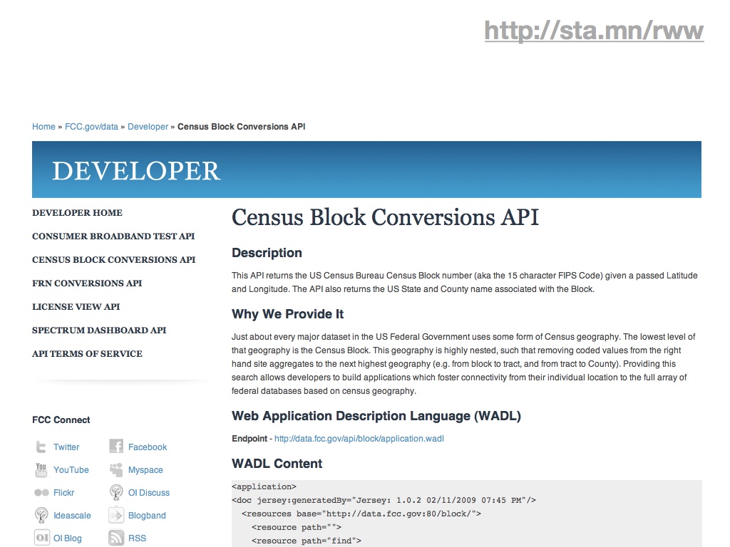
It’s possible to get around the spatial index problem by offloading the requirement to external, public services, in this case the FCC’s Census Block Conversions API. The service accepts a latitude and longitude from browser-provided geolocation information, and converts it to a Census block ID. From there, it’s just a few string manipulations to the tract, county, and state summary levels. This pattern of using one dynamic service to come up with a foreign key into another is one that will repeat. It’s made doubly-powerful by the work put into naming conventions and code design by the U.S. Census.
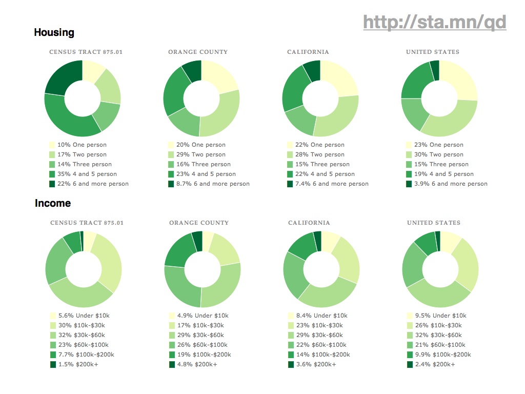
Ultimately, the application provides a fairly simple, big-here/small-here view into demographic data. On the left column are statistics for the typically-neighborhood-sized tracts, while to the right are numbers for increasingly-general areas: the county, the state, the country. Here you can see that housing and income around Disneyland (California tract #875.01) are lower and more crowded than elsewhere in the same county. These donut charts, like the map above and every other component of the page, are built using new Javascript and HTML5 features such as the drawing canvas, SVG, and the graphing library Protovis.
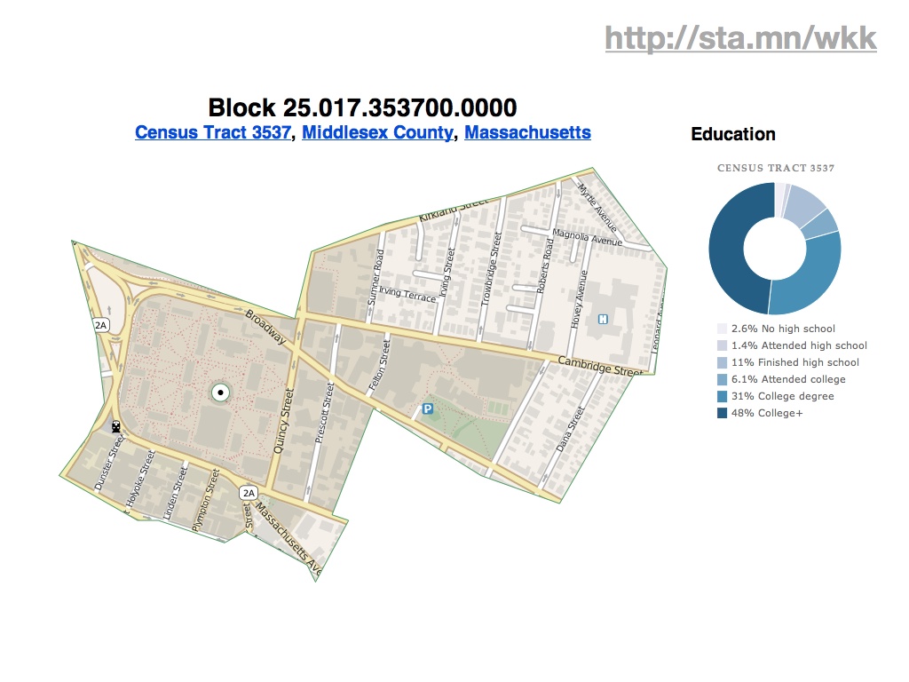
You can drill into individual tracts across the country, such as this highly-educated area directly around Harvard University…

…or this unusually older waterfront community in Florida…

…or this minimum-population leper colony in Hawaii.
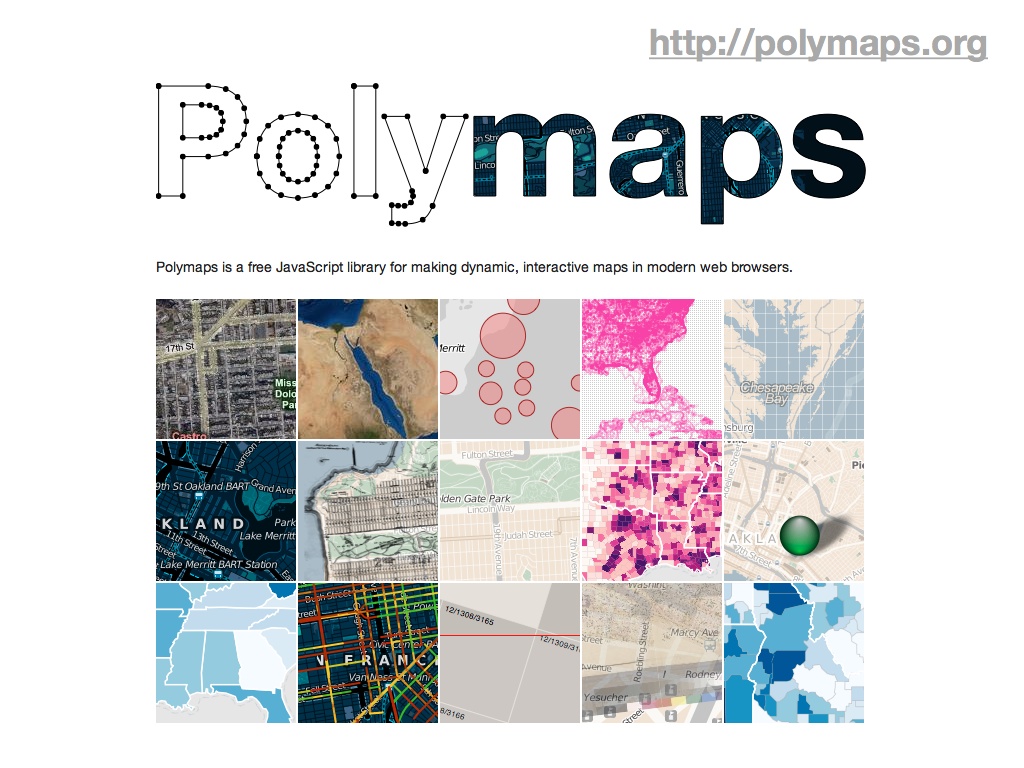
Where you end up with this new environment is something like Polymaps, developed at Stamen with Mike Bostock and SimpeGeo last year. Polymaps explicitly turns its back on Internet Explorer in favor of vector graphics and dynamic features in new browsers. If you’re interested in where a possible future for a trend like NoGIS might lie, you could stop here and have a pretty good idea. Native support for GeoJSON-formatted vector tiles, visual display assembled client-side, and support for numerous background imagery providers.
In looking back on these selected projects, what are some of the simplifying assumptions that made them fast, cheap and easy to launch?
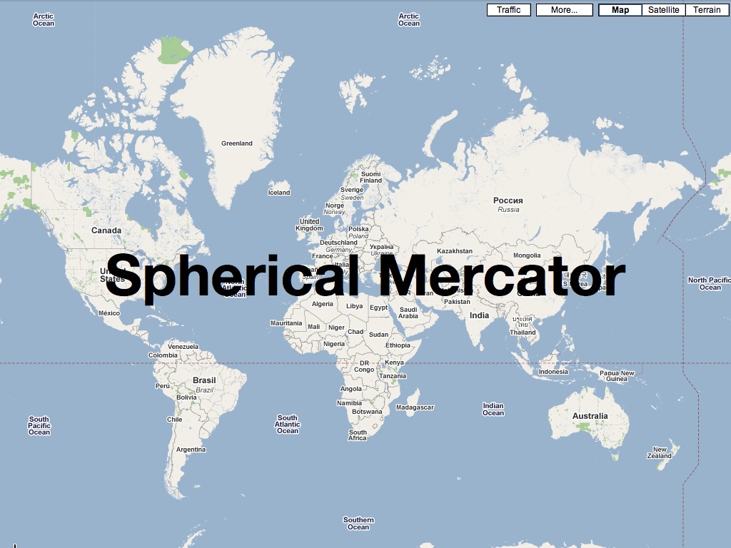
First is the use of the popular spherical mercator projection, or “popular visualization CRS” as it’s referred to by the EPSG and other projection authorities. You can almost taste the contempt in a name like that, and in fact for some time the normal categorizing authorities refused to give this common projection an official number, leaving geographic developers to use the clumsy, cheeky “900913” designation (hint: it’s in calculator writing). Spherical mercator has a number of properties that make it ideal for web-based use: the projection math is simple, and if you’re willing to ignore the North and South poles it’s possible to render the entire planet in a neat square shape that’s a snap to decompose into quarter tiles. At high zoom levels it’s conformal, at low zoom levels it looks as familiar as the world map on the wall of your second grade classroom, and as long as you’re not using it to build a sewer it’s probably a good-enough approach.

Second is to pay attention to the tools at hand. In some cases, that means using Adobe Flash to distribute cartographic visualizations, as we did with the Hope For Haiti Now and MySociety examples. In other cases, that means using Javascript. In most cases, it means reaching for what’s comfortable rather than what is strictly correct. We’re actually in an very uncertain time in this regard—Sha Hwang quoted Tom Carden by saying that for dynamic interactive work, you generally must choose between spurning the iPad or Internet Explorer users. That situation is likely to continue for some time, at least until IE9 sees hoped-for broader adoption.

In some ways, the whole NoGIS concept can be boiled down to a movement away from relying on rising processor speeds to paper over rushed development practices. While we often find ourselves pegging all sixteen processors of a colossal server to prepare tiles and other data for publishing, once it needs to go out in the world it’s enough to rely on part-time Apache admins or blob storage services like Amazon’s S3. The real key here is assembling raw geographic data components in the end-users browser rather than the server.

Apr 9, 2011 4:47pm
electronic computation is invisible: maeda at RISD
This post about John Maeda’s difficulties at RISD (via Sha) is interesting, but I was particularly struck by the broader resonance of this comment way down near the bottom:
The Medialab is much more random than that. This may help to illuminate why John’s approach is so alien to traditional art students. Paul Rand seems to think it’s John’s engineering background which interferes with his leadership ability at RISD, but I think it’s actually scarier. John’s approach is hands off and experimental. Anything goes. Confusing and startling people is valorized.
…
I believe John wants people to apply that same surrealist/minimalist strategy (e.g. scanning food) to new media. This can be confusing because as soon as he demonstrates an “iPhone processing video using HTML5 in realtime” (as one person decried a recent Maeda work) it seems to be ditching the concept of minimalism, but that’s precisely the paradox I mentioned earlier: John does minimal things atop complex multimedia platforms. Give him a multi-GHz computer and he draws random lines with it like the 80s video game Qix. … This irony is not John’s alone—nearly every new media artist must struggle with the concept of their systems only operating atop complex technical artifacts (e.g. Java running inside a web browser on a Mac or an iPhone, or MAX/MSP or Microsft Kinect or Nintendo Wii Controller), and unfortunately, most of them don’t even recognize it as an issue. I can see it because of the art classes I’ve taken at the ML, MIT, and Harvard taught me to interrogate the situation.
A similar tension is visible in the work of Alvin Lucier (Music on a Long, Thin Wire), Steve Reich (Pendulum Music), some musique-concrete artists (Murray Schafer), and more contemporaneously, Keith Fullerton Whitman and Tristan Perich. Nevertheless, NONE of these artists have managed to broach the basic limitation that electronic computation is invisible. All techno artwork thus far relies on impenetrable microchips which require observer/participants to form abstractions in order to appreciate them. Look how hard it is to teach art students to program. Many of them get it, but it requires activation of a virginal configuration of gray matter.
I think it would be fair to say that John’s work attempts to transplant the user into a fantasy world of pseudo-concrete. E.g. once you get into that coding/processing/minimal graphics environment of his, you may process multimedia to your heart’s content. And it’s seductive... you may actually easily forget that it requires so much expensive, finicky hardware. This is also visible in the work of his students such as Amber Frid-Jimenez (her complex projects intermingling telephony and network video required months of customization of the open-source Asterisk voicemail software), Kyle Buza (his colonization, usurpment and exploitation of the Atari 2600 into the Max/MSP environment), and Takashi Yamimoto (his transplantation of the Processing environment into the web browser). Most of these projects establish alternate virtual worlds in which play and flow do take place, but, only temporarily as they are contingent on the operator to attend to and maintain them: As one poster here noted, once you go back in time and look at a Maeda or PLW project and realize you can’t run their code anymore, the collapsing of reality can be devastating.
Mar 28, 2011 8:12am
walking papers cheaply
Where was I.
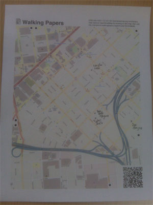
Since launching Walking Papers almost two years ago, we’ve seen a volume of activity and attention for the site that we never quite anticipated, not to mention the thing where it’s currently living at the Art Institute Of Chicago.
(photo by Nate Kelso)
A thing that’s always bothered me is that for all the whizz-bangery of the SIFT technique for parsing images, we’ve had about a 50/50 success ratio on the scanning process. A lot of this is attributable to low-quality scans and blurry QR codes, but that just serves to underscore the issue that Walking Papers should be substantially more resilient in the face of unpredictable input. More to the point, it should work with the kinds of equipment that our surprise crisis response user base has available: digital cameras and phonecams. They fit in your pocket and everyone’s got one, unlike a scanner. Patrick Meier from Ushahidi and Todd Huffman have been particularly badgering me on this point.
(tl;dr: help test a new version of Walking Papers)
Fortunately, around the same time I was looking for answers I encountered a set of Sam Roweis’s presentation slides from the Astrometry team: Making The Sky Searchable (Fast Geometric Hashing For Automated Astronomy). Bingo!
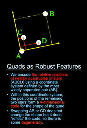
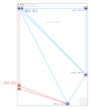
Dots are the answer. Dots, and triangles. The Astrometry project (which by the way is on Flickr) uses sets of four points to make a “feature”, while I went for three with the addition of a set of inter-triangle relationships that have to be satisfied:
That’s an image of all six size/orientation combinations supported by Walking Papers, and the placement of dots on each. The five blue dots to the top and right maintain their relative positions regardless of print style and act as a kind of signature that this is in fact a print from Walking Papers. The remaining two red dots differ substantially based on the size of the paper and the print orientation, making it possible to guess page size more reliably than with the current SIFT-based aspect ratio method. The entire arrangement is only “ratified” by a successful reading of the QR code in the lower right corner.
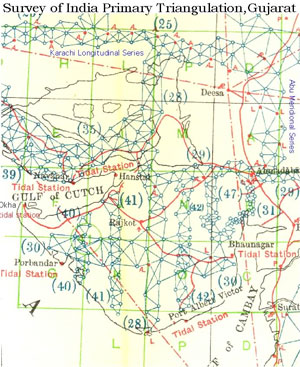
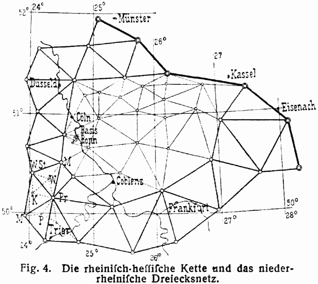
This triangle traversal put me mind of the Great Trigonometrical Survey of India, an early 19th century mapping effort by the British led by George Everest:
Finally, in 1830 Everest returned to India. He started by triangulating from Dehra Dun to Sironj, a distance of 400 miles across the plains of northern India. The land was so flat that Everest had to design and construct 50 foot high masonry towers on which to mount his theodolites. Sometimes the air was too hazy to make measurements during the day so Everest had the idea of using powerful lanterns, which were visible from 30 miles away, for surveying by night. … The survey’s line of triangles up the spine of India covered an area of 56,997 square miles, from Cape Comorin in the south to the Himalayas in the north.
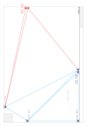
The process of finding these dots starts with an image like this:
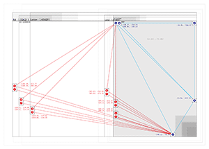
…and moves on to an intermediate step that looks for all localized dark blobs using a pair of spatial filters:

Once we have a collection of candidate dots, the problem looks quite similar to that faced by Astrometry: looking for likely features based on similar triangles, starting with the three blue dots in the upper right, and walking across the page to find the rest.
If you’re inclined to help test this new thing, I’ve installed a version of the cameraphone code branch at camphone.walkingpapers.org. When I’m satisfied that it works as well as the current Walking Papers, I’ll replace the current print composition and scan decoding components with the new version, and helpfully we’ll start to see even more scans and photos submitted.
Thank you!
Mar 28, 2011 6:39am
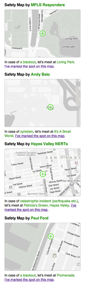
safety maps is go
We made a new thing live a few days ago, it’s called Safety Maps.
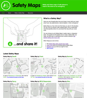
It’s a collaboration between myself, Tom Carden, and most significantly Adam Greenfield and Nurri Kim’s Do Projects imprint. Nurri has been exploring language and visual representation around disaster preparedness, and I was incredibly attracted to the need for gentleness in communication when creating something that should ideally never be used: “Have you ever thought about how you’d stay in touch with your loved ones if your city experienced a natural disaster or other emergency?”
The purpose of the service is generating emergency preparedness maps for family members and loved ones. “Make it, print it, cut it, fold it, save it, and share it.” You select a disaster scenario, name a meeting spot, and the service cooks up a set of PDFs meant to be printed and kept in a wallet or stuck on a fridge. Nurri created a soft-toned, muted energy look for the service, and we chose maps with minimally abrasive colors intended to act as a subtle and constant reminder of ever-present danger counterbalanced by ever-present love.
We’ve seen a pleasing stream of visitors to the site, and maybe surprisingly there are about four unlisted (private or hidden) maps created for every publicly shown one on the front page. In and amongst the predictable yuks and zombie jokes, we’ve had a number of serious and poignant submissions. Some of the public ones come from established neighborhood safety groups like NERT, others are from individuals—MPLS Responders, Andy Baio, Hayes Valley NERTs, Paul Ford (“So that we can admire the darkness of downtown NYC”) and others:
Feb 17, 2011 7:23am
over there
I told myself I'd never write one of those "wish I could blog like I used to" posts. Better to just stop and not apologize for changing your priorities. Instead, it's nicer to say "Mostly I've been doing my writing over there.", where "there" is Oh Yeah, Paper, the thing I started over the holidays to document all the interesting uses of paper technology I encounter.
Also, this was a really nice thing to see this week:
Nobody makes data accessible and beautiful like Stamen. ... The firm's technological and aesthetic savvy has helped visualize much more, including taxi traffic, real-estate values, even crime patterns--all depicted in jarringly gorgeous maps.
We're in Fast Company's 50 Most Innovative Companies. BERG and Local Projects are in the design section, too. I also love that this is the second or third time that a print publication seeking to illustrate our work reach for Cheerio Maps. I'm truly looking forward to hearing from the legal department of General Peter Mills about our naming.
Jan 14, 2011 9:07pm
this tract again
I’m sad to have almost completely fallen off the wagon with my winter sabbatical posts, initially because holidays intervened and later because of habit.
A bunch of interesting things have happened with This Tract since I announced it in October. It was always a one-day hack, but has seemingly bubbled up to greater visibility just in the first few weeks of 2011. Working backwards…
This week I’m in New York City, purely by coincidence at the same time at the Microsoft Social Computing Summit. Tuesday, Chrys Wu and Jenny 8. Lee invited me a talk at Hacks/Hackers, where I spoke about Crimespotting and This Tract.

I posted my slides online, in PDF form. Kennedy Elliott is working on a better set of notes from the talk.
I had a chance to visit Steven Romalewski at CUNY’s Center For Urban Research with Nate Kelso earlier that day, which helped crystallize a lot of what’s interesting about census data for a project like This Tract. We spent a few hours chatting about the emerging value of vector-based public data sets pretiled into directly usable form, something we first experimented with around the PolyMaps project and a bit of early work in the project that ultimately led to Stamen’s efforts for Bing Maps. In particular, the way we’re using FIPS codes as a pivot yields interesting benefits for creators of country-wide public data maps in the form of reduced storage requirements. Using known codes like FIPS or other identifiers can help eliminate the need for expensive, large-scale storage of pre-rendered choropleth tile imagery for an entire country, for each relevant variable. CUNY is doing this using ESRI tools and the Flash AMF format, but that’s just an implementation detail.
Last week, Fast Company made This Tract their Infographic Of The Day, followed by a very nice post from Nathan Yau.
I credit this to the help of Craig Mod, who offered a bit of rapid, focused design advice and implementation around the textual layout of the site the previous week. Craig helped loosen up the appearance of the site, moving a giant slug of technical details from the top of the page to the bottom, opening up the visual design of the header, and finally suggesting that it was important to provide a few hot-links to interesting tracts. I chose San Francisco City Hall, Disneyland in L.A., Harvard University, and New York’s Chinatown. This ended up being really important on Wednesday, when the FCC Census Block API we rely on to eliminate the need for a hosted spatial database stopped working (Oracle). It was back up a day later, and in the mean time Tom Carden suggested that I connect those suggested links to known tracts so people could at least see what This Tract does, even if it didn’t work for everywhere at the time.
A major change I made prior to Craig’s intervention was the replacement of Google Charts API with Protovis, which had a few benefits. Interactively-labeled, dynamic pie charts could be rendered in the browser. The overall page layout could be made multi-column, thanks to the elimination of the 900px-wide Google pie chart images with potentially-long labels. I could also use Economist-style donut charts, which I completely love. I took advantage of the narrower charts to switch to a dynamic, responsive layout with media queries. In a modern browser, narrowing your browser window should at some point convert the page layout to a tall, narrow column (as it used to be) instead of the now-default comparisons.
Finally, I found this explanation of tracts generally while doing research for the H/H talk, it seemed worth calling out:
Census tracts are small, relatively permanent statistical subdivisions of a county. Tracts are delineated by a local committee of census data users for the purpose of presenting data. Census tract boundaries normally follow visible features, but may follow governmental unit boundaries and other non-visible features in some instances; they always nest within counties. Designed to be relatively homogeneous units with respect to population characteristics, economic status, and living conditions, census tracts average about 4,000 inhabitants.
Such minute attention to the best possible way of representing people in space, when “it’s a short jump from numbers to stories” as Kate Lutz says.
subscribe to ![]() this site.
|
contact Michal Migurski
this site.
|
contact Michal Migurski