tecznotes
Michal Migurski's notebook, listening post, and soapbox. Subscribe to ![]() this blog.
Check out the rest of my site as well.
this blog.
Check out the rest of my site as well.
Dec 27, 2004 8:01am
media crisis 2004
Eyebeam brought this article, on MediaChannel, to my attention. It contained the following gem:
Much of the new investment in journalism today is in disseminating the news, not in collecting it. Most sectors of the media are cutting back in the newsroom. While there are exceptions, in general journalists face real pressures trying to maintain quality.
This feels to me like the core problem with journalism today, and a larger problem with the news cycle of the internet. The big communications story of the 2004 presidential election was Blogs, and how political bloggers like Wonkette or DailyKos are making a new name for micropublishing, tightening the feedback loop of the news cycle from days to hours to minutes.
Blogs and bloggers do a shit job of documenting actual news, though - their sources are generally other blogs (or insiders, or other journalists, or rumors, which amounts to basically the same thing minus Moveable Type). This is fine for the national exercise in navel-gazing that makes up a great presidential campaign, but it does a real disservice to the the job of collecting and interpreting new information from places and cultures less wired than ours. I'm curious how the communications-medium-as-story story will play out in 2005.
Dec 22, 2004 4:22pm
slashdot loves poland (poland loves slashdot?)
Indulge me in a little old-fashioned nationalism, okay? Today on Slashdot:
Thanks to the Polish Minister of Science and Information Technology, Wlodzimierz Marcinski, Europe has dropped the current proposal for software patents. He made a special journey to Brussels to withdraw the proposal, basically in protest at the way the patents were being pushed through by the back door. Since the European presidency is about to pass to Luxembourg, this has effectively killed the idea, at least for the immediate future."
Comments include:
- At least slashdot didn't forget about Poland. :)
- Thank Poland!
- It's about time one of the countries in Europe had a government with a spine ... Go POLAND!!!
- First to break the German's Enigma machine and now this.
Dec 21, 2004 7:02pm
grass as canvas
Wonderful, though I'm surprised this hasn't been done earlier. Grass as a light-reactive plate was the example used by David Macaulay in the children's technology book The Way Things Work, one of my favorite books from my childhood.
Dec 21, 2004 8:09am
re-announcing mappr
Last week, we posted a few images from our ongoing Mappr project:

Over the past few days, word has been getting around. We've been mentioned by a few people I respect tremendously, including Adam Greenfield, Andy Baio, and the Flickr folks themselves. The Mappr Group is humming along with over 100 members and a slew of great suggestions for improvements.
Notably:
- Awareness of a world outside the United States. I'm working on it, hoping to solve this one in a way that supports the future addition of arbitrary place designations like "Disney Land" or "The Eiffel Tower." Dealing with synonyms is hard. Dealing with inferences based on multiple tags is hard. Accounting for place names split up among tags (e.g. "San", "Jose") is also hard. Well... hard in the sense that I'm still trying to make this work without every nontrivial database query pegging the CPU for half a minute. :)
- An open API. This is on my list in a huge way. My goal is to model this closely on Flickr's API, so there's not a lot of duplication of effort, and users can use our API to augment theirs.
- User-defined maps. I bit a chunk out of this one tonight by solving a linear algebra problem that has been percolating for the past week, thanks to a well-placed hint from Cassidy.
I've also been plunged into an interesting learning experience in facets and ontologies, through helpful prodding from Boris Anthony.
Dec 16, 2004 12:10am
light cones
Now this is a web service:
Xi Ursae Majoris is 27.2 light years away and only 5 weeks from the outer surface of your light cone - your ever-growing sphere of potential causality - which began its expansion from Earth on November 16 1977.
Courtesy of Matt Webb's Light Cone.
Dec 14, 2004 11:10pm
quote of the day
"First they came for the verbs, and I said nothing because verbing weirds language. Then they arrival for the nouns, and I speech nothing because I no verbs."
Dec 14, 2004 5:30am
announcing mappr
We're launching the first peeks of our most recent research project, Mappr. 
Photos from flickr are often tagged with information that can be used to make educated guesses about their locations in the world. Mappr uses this data, which is provided by flickr users, to place their images on a map.
What we like about it is that we can all start to explore the idea of a collaborative mapped photo space, without having to wait for cameras to come with automatic GPS locators in them.
Read more at the group on flickr or mappr.com.
Dec 13, 2004 4:40pm
ambient interfaces
Boffins at BT's Research Labs have developed a futuristic interface that uses ambient light sequences and sound alerts to notify users of personalised news and information. ... Incoming data such as emails or weather reports generates animated light patterns and sounds from the device. Users can then wave their hand over the front of the interface, prompting it to provide more detailed data using Laureate, BT's text-to-speech software, to read out the information.
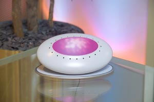
Looks like the same general idea as Ambient Devices' products with a few extra dimensions of information and interactivity added in. It's a less attractive object than the Ambient Orb, though the built-in text recognition and hand-waving interface may make it more useful as a source of information.
Dec 7, 2004 6:18am
ambient devices
Ambient Devices released their new "Ambient Executive Dashboard":
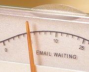
Thanks to unique patent-pending wireless broadcasting, users can tune in to basic channels and never pay any monthly fees. And since the Ambient Information Network has the best coverage of any data network, virtually everywhere you can get a cell phone signal, and many places you can't, your Dashboard can listen in to your information.
I found this company in September, in the context of a little desktop-color-changing script I wrote to warn of high CPU usage in Mac OS X. The Dashboard displays a range of information: weather, traffic, stocks, job listings, or customizable channels. Unfortunately the information is limited to a linear full/empty continuum: traffic good/bad, weather good/bad (?!), stocks high/low. Also, I'm not sure why they opted to transmit information to this gizmo via a national FM radio network - this looks like an obvious potential consumer of web services, and it feels like Ambient Devices is rejecting a potentially huge hacker market by using such a weird information delivery mechanism.
On the other hand, I can also see this being useful for geeks who tend to get lost in their work, if it can be configured to display information that's less obvious than 1996's web portal wing dings.
For example:
- Time since last meal or walk
- Unreturned voicemail messages
- Errands left on to-do list
- Friends owed a phone call
- Days until family member's birthday/annual merchandise exchange holiday
I'm tempted to update my desktop background changing script to reflect some of the information listed on AD's site, but with Apple's own dashboard on the way next year it might be smarter to wait and build a distributable widget.
Dec 7, 2004 2:32am
inexplicable
This item showed up in my RSS aggregator today:

I don't know what it means, flash games I suppose. But typographically, it's beautiful.
Dec 5, 2004 4:01am
buy button
At issue is whether marketers can exploit advances in brain science to make more effective commercials. Is there a "buy button" in the brain? Some corporations have teamed up with neuroscientists to find out. Recent neuromarketing experiments have explored reactions to movie trailers, cars, a pretty face and gut reactions to political campaign advertising, as well as the power of brand loyalty.
So here's my holiday productivity wish: assuming that there were no scary Orwellian drawbacks to exploiting the brain's "buy button", I would like a gizmo which combines the functions of simple calendar or PDA with mind control.
I don't just want to be notified when I'm scheduled to complete some task, I want to be filled with a deep longing to see it done. If there was a way to transfer the ecstatic concentration I feel when I'm obsessively working on some technical problem (or flow, as Mihaly Csikszentmihalyi names it) to the more mundane responsibilities in my life, I'd be first in line.
I expect it's relevant that methamphetamine usage skyrocketed among U.C. Berkeley's student population whenever finals time arrived, since the functional benefit of speed is said to approach at least a few of the characteristics of "flow".
Dec 3, 2004 2:57am
ann on reblog
Enters reBlog, a system in which not only lets you subscribe to and read the feeds as they come in, you are also able to send those feed information, item by item, to your website (if you have one) without having to copy the info by hand. you press a button, it adds to its blog feed list. you press another button, the blog feed gets posted to your website. reBlog allows you to easily be your own newsroom, choose and pick what you like or what you think is interesting and worthy to pass on to more people.
For real. Ann is the current reBlogger, and has been doing a great job hilighting some cool stuff.
A few thoughts that have popped up as Michael and I were writing reBlog 1.0 over the past few months:
- How important is a proper attribution chain? The "via" link is added automatically by reBlog, and manually by other link lists like Waxy or Daring Fireball, but it can only tell you two links in the attribution chain: the first, and the previous. Does this matter? Is every step along the chain a creative act, or just the first? Is previous link is just a tummy rub tip-of-the-hat to your sources? Design Oberver has the excellent Observed series, which trades rigorous attribution for thematic unity (mostly) between groups of links.
- This is fun! I don't regularly visit many sites anymore, it's too easy to get my news dropped into my inbox and marked for later. I subscribe to a bunch of tag feeds from del.icio.us, photo feeds from flickr, and more journals, news sites, and other reblogs.
- This is dangerous! I don't regularly visit many sites anymore. The New York Times and the SF Chronicle have both dropped off my radar, even though I'm subscribed to a few NYT feeds. Eric has pointed out that it's still important for him to go visit the NYT once in a while, just to see what stories get a lot of attention on the front page. Does the fact that I often see a new item hit my aggregator 4 or more times in the space of an hour from different sources imply that I am cocooning myself into media echo chamber?
- This is weird. I maintain a page of snippets, which started out as a shell script to aggregate the random pieces of text and URL's I come across on a daily basis, and evolved into a public link list. I often find myself second-guessing items of interest I'd normally like to hold onto, because I worry whether I seem like too much of a dork, or obsessed about one topic, or suffer from various other perceived personal failings that can be divined from careful analysis of my URL trail. I can see why blogging makes people extremely self-conscious.
- Who's going to use this dumb thing? I've been thinking of reBlog as the semantic web equivalent of two turntables and a microphone, and if the late 90's DJ cult is any indication of future trends, there's going to be a lot of people using some combination of reBlog, del.icio.us, and other feed services to entertain and amuse their friends and coworkers with funny or interesting information, minus the burden of actually writing something themselves. On the flip side, my former housemate Ted had this to say about the success of the DJ image in 2002: "Several strange and new ladies write rocker guy. DJ guy, who had a very nice photo that made him look like a bonafide DJ, got zero hits from the ladies, but my male friends who DJ'd all wrote to say how great the pics were." (Friendster, An Addict's Perspective). Does the cultural repackager eventually get exposed as a shill?
Dec 3, 2004 12:20am
things to read
Paul Graham, The Age Of The Essay:
An essay is something you write to try to figure something out.
Nominations for the Best Software Essays of 2004.
Dec 1, 2004 11:03pm
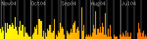
new snippet graph
I've been playing with PHP's image-generation functions, and have added a graph of my link-foraging habits to my snippets page. Five years of plasticbag it ain't, but at least it's live!
Nov 29, 2004 7:40pm
worst. band. ever.
I saw "The Invisibles" perform at the Rickshaw Stop saturday night. I thought the group might be a clever joke on the coke-fueled electroclash scenester plague, but I found this today:
For those who haven't yet heard The Invisibles' first single, "Liebeschokolade," Langan describes the band's sound as "definitely dance oriented with some techno influences and punk influences. (It's) two-parts no wave, two-parts Detroit techno, one-part goth, one-part electro, two-parts punk rock, two-parts glam, two-parts post-punk, two-parts '86 Chicago house, one-part new wave, one-part synth pop, one-part industrial, a half-pint of gabber and a pinch of ghetto tech."
...and ten parts suck. Turns out they were merely the worst fucking band I have ever had the misfortune to witness live, and I like pop music.
So I don't sound like a complete grump, I should point out that Doormouse and 396, two other performers that night, both completely rocked.
Nov 25, 2004 6:02pm
buy a mac, john
"The computer knows me as its enemy," says John Maeda. "Everything I touch doesn't work." Take those plug-and-play devices, such as printers and digital cameras, that any personal computer (PC) allegedly recognises automatically as soon as they are plugged into an orifice called a USB port at the back of the PC. Whenever Mr Maeda plugs something in, he says, his PC sends a long and incomprehensible error message from Windows, Microsoft's ubiquitous operating system. But he knows from bitter experience that the gist of it is no. ... Yet Mr Maeda is not just any old technophobic user. He has a master's degree in computer science and a PhD in interface design, and is currently a professor in computer design at the Massachusetts Institute of Technology (MIT).
Nov 23, 2004 1:41am
announcing reBlog 1.0
Michael and I have been working on this one for the past few months, and we hit 1.0 this weekend.
The reBlog concept includes a super-sexy online RSS/Atom Aggregator/Reader (play with an example) that is geared towards filtering and selecting items for re-publishing/re-syndication.
This is accomplished with an outgoing RSS feed, and through plugins into your favorite blogging software (Movable Type, WordPress) that allow for the importing of selected posts, and the publishing of those posts with the appopriate meta-data for attribution to original authors.
If you're into blogs, feeds, personal publishing, and/or syndication, we think it's worth your time to check out reblog.org, and maybe even install and try using the software.
Nov 23, 2004 1:32am
birds and dogs
From Aquarius Records' review of Caninus:
We know you've been waiting for this one. At least judging by the rabid (tee hee) reaction to the recent 7" by the band Hatebeak, a death metal outift fronted by a parrot. Well now, along comes Caninus to up the stakes. Sure, the parrot in Hatebeak is able to squawk up a storm, and his maniacal screechings fit perfectly amidst the churning riffs but a parrot on its own is hardly a scary proposition. But with Caninus, you've got the same crushing, downtuned metal juggernaut, only this time the vocals come from the drooling fanged mouths of Budgie and Basil, two snarling pitbulls! That's right, pitbulls. Thankfully, barking is kept to a minimum, and instead Basil and Budgie spend most of the time growling furiously, their gutteral grunts and grrr's WAY more evil than even the scariest of death metal vocals.
Courtesy of Tomas.
Nov 17, 2004 8:45pm
welcome, dogg
Snoop Dogg made his first appearance in In The News today. From running drills with the USC Trojan football team, MC'ing on Spike TV, to starring in movies or video games, he's a busy guy.
Nov 16, 2004 8:07pm
everything is right with the universe
As I was leaving Adobe yesterday, I noticed the title of the exhibit: There Is Nothing Wrong In This Whole Wide World. I was reminded of a recent New Yorker article about Edward Stratemeyer, the brains behind Nancy Drew, the Hardy Boys, and other factory-written kids' fiction series of the past century:
Wirt gave the early volumes a "New Woman" flavor, but the core of Nancy's appeal is similar to the Hardys'. The mode is adventure with a flourish of mystery. The plot is furthered by coincidence. Nancy discovers "clues" everywhere: A tire tread? "A clue!" A ransom note with a fire-dragon crest? "It may be a clue," Nancy cries. Needless to say, these "clues" don't function as a puzzle that the enterprising reader can piece together for herself, as they do in Sherlock Holmes or Encyclopedia Brown mysteries. Instead, they are reassurances that order reigns behind the scenes. Nancy later happens to walk into a store in Chinatown and discovers that the store sells notepaper with a fire-dragon crest. Happily, the owner recalls not only that Nancy's suspect had been in the store several months earlier but also his name and build. The message is confidence-inspiring: The world is rife with crooks, but it is negotiable, and fundamentally rational. Hard work pays off. The damned remain damnedunless they repentand the wronged (long-lost maharajas' sons, heirs to candlemakers' fortunes) are restored to their rightful life at the intersection of High and Elm, among the rangy Colonials and the tall trees.
Great stuff. So much information visualization and data mining work rests on this assumption as well: there are patterns out there, recognizing them points to truth. Last week's Ten x Ten illustrates this beautifully, showing a frequently-updated batch of images gleaned from the news, owing much to Flickr's Daily Zeitgeist display of recent photos.
My own In The News project from last summer relies on this underlying order as well, so I was thrilled to see that sometime Saturday, news.google.com switched its algorithm for choosing the top ten "In The News" items back to the previous, pre-August 2004 version. The visual difference in display is striking, with a greater and more subtle range of names making the cut showing a more accurate (I hope) picture of the topics making the headlines.
When you're feeling blue about War and Politics, it's helpful to believe that the universe is negotiable, and fundamentally rational.
Nov 16, 2004 3:24am
clockwise web traffic
Yum:
Working with log data from webservers, I wrote software that looked at the referrer data and created a site tree. This map of the site is interesting because it is formed by how the users travel through the site. It is the aggregate view of how the user base views the hierarchy of the website.
Simple straight lines between pages are not used. Instead all traffic moves clockwise around the map. A clockwise circular pattern is used because directionality can not be clearly labeled with straight lines.
Nov 15, 2004 11:52pm
books by color
Tomas and I swung by Adobe Books this afternoon. Artist Chris Cobb has rearranged every book on Adobe's shelf by color, for an unsettling faded-rainbow effect:

Especially cool is the shelf where the enormous white book collection abruptly moves through a few grays, and switches to black:

The floor is littered with tiny scraps of paper that seem to indicate which shelf each book was originally pulled from, to aid in next week's herculaean reorganizational effort when the show ends.
Nov 13, 2004 8:02pm
boozled!
So, we've been working on a new website for Patron Tequila (with local design agency Gershoni for some time - the initial soft launch was last week, and we're polishing off some final elements this week.
It's a great site, etc. etc., but it's built in flash and has an age verification entry screen, so it's not quite as "google friendly" as it could be. Yesterday I discovereed that our page about the project had a higher PageRank for the term "Patron Tequila" than the company's own site:
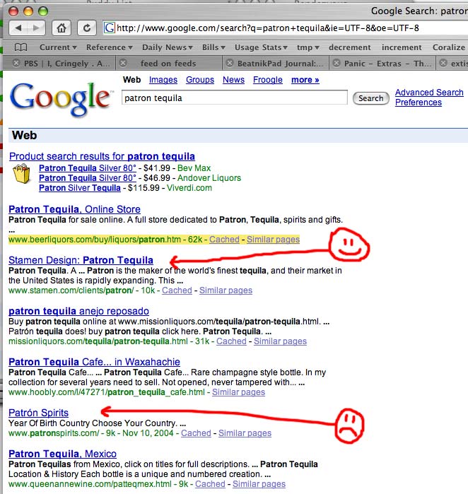
If that weren't enough, we also received a phone call from a bar owner in New Orleans who was hoping to deal with some interruptions in his tequila shipments. Could we put him in touch with marketing? How did he find us? Google, of course.
Nov 10, 2004 11:47pm
three about the uncanny valley
I saw three items today written about the "Uncanny Valley".
The Beat confirms my suspicions that the new Polar Express movie will be a creep show of the first order:
While the POLAR EXPRESS trailer is supposed to fill tots with joyful feelings of glee and awe and meeting Santa, the actual result of these not-quite-humans is more likely to be a deep sense of insecurity and fear. Take it from The Beat : the beds of American children are going to be soaked with anxiety pee after watching a creepy digital Tom Hanks shout "All aboard!!!" and wave his arms for a couple of hours.
My thoughts exactly - every time I see the trailer, all the children seem to move like reanimated corpses, dead eyes and lips channelling speech from beyond the grave. It's the same fundamental problem exhibited in the Final Fantasy movie from a few years ago, when I first read about the Uncanny Valley. The characters in that movie were also too close to real.
Pixar generally takes the opposite route, forgoing hyperrealism for cartoon realism. You can see it in the models for the new Incredibles movie: characters' ears are left undetailed, eyes are enormous, and the motion is sleek and stylized. RobotJohnny says as much in a post about the movie (which I saw and loved - go see it!):
The moment I saw the trailer for The Incredibles, I knew that Pixar had done something that no 3D film had done yet--they had created human characters that had some style to them and that didn't try to emulate life. ... Whats great about the characters in The Incredibles is that they are first and foremost cartoons. They look like they've jumped out of a Chuck Jones short or something Disney might have produced in the 60s.
I'm not sure I agree that no 3D film has done this before - director Brad Bird's previous feature film was the underappreciated Iron Giant, which features a remarkable robot modelled in 3D but rendered in 2D cartoon style. There's a revelatory moment about halfway into the film when the Giant smiles, and the motion is expressed perfectly through the movement of just four active pieces: one jaw, two eyelids, one head. The theatre lit up in response. Pixar's previous movies also exhibit such attention to the right level of realism - I'm sure it's no accident that their first few films focused on toys, lamps, bicycles and other inanimate objects, where you can get more mileage out of focusing on characteristic motion instead of rendering flesh correctly.
Some last thoughts stolen from Imomus:
The place where the 'credibility gap' or the 'uncanny valley' occurs is not at the point furthest from the truth, but at the point closest to it. When something is almost credible, it lacks credibility. When it's completely incredible, it has an odd sort of believability. Once a thesis gets overstated, the antithesis has a tendency to rush in, even if the truth lies closer to the thesis than the antithesis.
Nov 9, 2004 2:07am
flash won, followup
I recently posted an excerpt from The Inquirer's article about interactive maps used during the election. Ben Metcalfe, software engineer for BBC Interactive, also has a collection:
We've been having a look at the way different news websites have been displaying their election results. It's fair to nearly everyone has been using maps to depict the state-by-state results. In almost all cases, Macromedia Flash has been chosen as the preferred presentation technology. Here are the links to compare, starting with BBC News' offering (obviously!).
Nov 8, 2004 6:16pm
video riot 2004 photos up
Dimension 7's Video Riot came off smoothly for the third time last night. Instead of my involvement from past years, I chose to spectate and photograph this time around.
Photos can be found here, in a variety of sizes, freely licensed.
Nov 6, 2004 9:44pm
flash won the election
Fernando Cassia of The Inquirer writes:
...perhaps this presidential election will go down in history as the first one where Macromedia Flash was widely used for reporting the progress of the election count with Flash based "interactive maps". Some had nice animations, some were simple, and in one case... they were done in *shock* DHTML *shock*. Yes, you can do animated "mouse-over" interactive maps with DHTML, and ABC News did just that.
What great news. Eric and I spent a large portion of this election season working on interactive maps for MoveOn's various campaign efforts, and the heavy use of maps in all the election-night reporting we saw validated the strength that visual displays of information can have. It's also worth noting that some of these maps could deceive as well as enlighten: compare USA Today's busy, disinformative county-by-county map with Robert Vanderbai's more nuanced version based on the same data.
I plan to use our planned November downtime to work on a few other map-related projects, including the PEAR Map Projection toolset I'm working on to try to make complex flash-based map projections more accessible to users of PHP.
Nov 5, 2004 1:07am
political signage
M. Kingsley writes A Contribution to the Ethical Taxonomy of Political Signage:
Delegates at both conventions had an uncanny ability to erupt with cued spontaneity, depending on who was speaking. When the Democratic candidate for Illinois Senate, Barack Obama spoke, they loved Obama... When Hillary Clinton, spoke, they loved Hillary... and when Teresa Heinz Kerry appeared, they loved Teresa.
During the Republican Convention, one minor item was occasionally mentioned in the news media and blogosphere -- the handmade signs visible throughout the week were not home-made by delegates, but actually mass produced by volunteers.
This article really underscored the scripted nature of politics in the U.S. It reminded me of two things, for better or worse:
- Immaculately choreographed National Socialist Party rallies in Germany, as seen in Hitler And The Power Of Aesthetics
- NASCAR hat advertising, where members of the crowd are employed to wear hats advertising beer, motor oil, and other products for specific periods of time, typically by jumping into and out of the throng of celebrants surrounding the winner of a race being interviewed by TV crews.
Nov 2, 2004 6:30am
three moves
I'm undertaking three simultaneous, short-distance moves right now:
- Gem and I have left the Otherworld. We've settled in a classy late-nineteenth century apartment near Lake Merritt, so we're still close to the warehouse.
- Stamen is taking the office across the hall. Good times, sunlight, 16th & Mission views.
- This weblog is moving next door, from /nb to /notes. I'm ditching Nanoblogger in favor of Blosxom, because it's a cleaner system, and I need to use a more popular program to test features with while I work on a new RSS project (more on that later).
Oct 23, 2004 7:04pm
video riot 2004
Video Riot 2004 is coming, November 2004 in San Francisco. I was lucky to be part of the first two VR's, these events are a load of fun. This one seems to have a political slant to it, which is to be expected given the contentious election that's about to go down. I'd like to be able to say that on November 7th we'll have the pleasure of greeting a new president, but realistically we'll be embroiled in voter intent lawsuits that will make Florida in 2000 pale in comparison.
VideoRI0T_2004
"last gasp of freedom"

November 7th, 2004
7:00PM

150 Folsom (@ Spear)
San Francisco CA
Artists Release Election Tensions on a Giant Wall
The 3rd annual "Video RIOT", organized by Video Salon SF, will coalesce again on Sunday Nov. 7th. In case you've missed the last two years, a video riot is a unique event. To the casual observer, it comes off as part multi screen drive-in, part head bobbin' tailgate party, but to those involved, its an assault on the urban landscape--using live video mixing tools.
"Video RIOT" is a miracle of transformation. Dozens of performers descend on the block-long parking lot near Folsom and Embarcadero and project video, lights and lasers on a seven-story wall. The underground nature of the VJ artists and the fact that they set up 30 projectors within an hour has earned this chaotic event the often misunderstood name "RIOT".
In fact, there's actually a lot of planning going on behind the scenes. Video Salon, the group throwing the event, has been a guild of sorts for VJs for the last four years. Their semi-monthly jam sessions feature screenings, software demos, and mixing sessions open to any artists who show up. Dimension7, an internationally recognized VJ institution, hosts both Video Salon, and the RIOT.
"We try to include a broad spectrum of people. Computer graphic artists, experimental filmmakers, and live VJs all come and show their work." say organizers Jon Schwark and Grant Davis. "We want to actively promote experimentation and aesthetic development within this community."
But the pair is also interested in the message that artists can bring to the public. This year�s "Video RIOT", with its political theme "gasp of freedom", is a perfect case study on the peaceful expression of dissent with words and images that are bigger than the media that surround us every day.
Considering the date of the event, its a timely message. On November 7th 2004, we're unlikely to know who the next president of the United States will be. It may be too close to call, and many people have unresolved questions about the process. No one can say for sure if we're just getting ready to dive, or finally coming up for air, but this group of artists will be using this video projection soapbox to claim their "gasp of freedom."
Coming Soon...our website:
www.videosalon.orgSee the first one:
dimension7.com/live/video_riot_for_web.movHosted at:
www.dimension7.comSites and Reviews:
www.phidelity.com/ph2/album10
mike.teczno.com/videoriot.html
Oct 12, 2004 12:13am
to game, or to optimize?
So sayeth the Online Journalism Review:
"I think what you're seeing is an odd little linguistic artifact," said Zuckerman, former vice president of Tripod.com and now a fellow at Harvard's Berkman Center for Internet and Society who studies search engines. The chief culprit, he theorized, is that mainstream news publications refer to the senator on second reference as Kerry, while alternative news sites often use the phrase "John Kerry" multiple times, for effect or derision. To Google News' eye, that's a more exact search result.
A second possible factor, Zuckerman said, is that small, alternative news sites have no hesitancy about using "John Kerry" in a headline, while most mainstream news sites eschew first names in headlines. The inadvertent result is that the smaller sites score better results with the search engines.
...
What Zuckerman calls gaming the system, others call optimizing your site.
Oh man.
I don't think it's an odd linguistic artifact, I think it's a technological broadside against The Rockridge Institute's Strategic Framing Initiative, a linguistic project aiming to shift the terms of contemporary political debate. Word choice is everything. The Rockridge Institute hopes to frame the terms of debate about economics and politics by developing a common language (e.g. "moral economy") with embedded assumptions about the metrics that ought to matter.
If link text is to language as URL is to meaning, then Googlebombing is a strategic framing initiative of its own, and what what J.D. Lasica is seeing with Google News is a new kind of "discourse optimization," with all the beauty and nastiness that entails.
Oct 7, 2004 4:56pm
style over substance?
What Barry Says (26Mb quicktime movie) is a stylish visual monologue about "War Corporatism" - the current political situation in the United States that gives weapons manufacturers and military-industrial complex participants a say in the country's foreign affairs, including a near-continuous state of U.S. conflict in some part of the world or another for decades. It's a typographical animation narrated by Barry McNamara.
I'm curious whether the visual punch of this piece overloads its message. Is it possible to take a monologue seriously when it's accompanied by jarring imagery of planes, tanks, bombs and maps in an intentional 1930's fascist throwback style? Or is it a necessary component of the piece, with visual allusions to last century's propaganda part of the message? The piece reminds me strongly of The Fire This Time, a 2-CD set from last year, featuring a history of the lead-up to the current Iraq war overlaid on the music of electronic artists like Aphex Twin, Orbital, and Speedy J.
I was also taken back to the animated portions of Errol Morris' The Fog Of War, monochromatic illustrations of General Curtis LeMay's bombing campaign against cities in Japan, with comparisons to U.S. cities based on population. I was lucky enough to enjoy that movie from a seat ordinarily far too close to the screen, in the second row. The animated sequences and Morris' unconventional framing of his interviewee made for a delicious, overwhelming, almost architectural visual experience. Everything wrapped around me. The film occupied my entire visual field, stretched out to my peripheral vision. In viewing the current Barry McNamara piece, i wanted to see it projected against a building, with the stark red/black/white images filling up the space in front of me. I'm not surprised that the Nazi Party's visual identity has been called the most effective branding exercise in history.
Oct 4, 2004 4:27am
30 days, 2368 attacks
Pardon my recent silence, I've been in M&uunl;nich for work. Good times, Oktoberfest!
The New York Times has been publishing a steady stream of beautiful information graphics this year, especially on the subjects of the Iraq War and the Presidential race.
Just saw their latest via Waxy: A map of Iraq showing 30 days' worth of attacks on U.S. forces. They are broken down by attack type (landmines, homemade bombs, rocket-propelled grenades, etc.), and the territory occupied by Arab Sunnis is marked. The majority of attacks appear to occur in Sunni territory. A plurality of the attacks were within or around Baghdad. This was neither the quietest, nor the most violent month in Iraq so far.
Sep 23, 2004 5:36pm
corporate death penalty
Courtesy of an unidentified slashdot commenter:
I like the idea of a corporate death penalty. To expand a bit upon the idea, I think the following would be more fair than the current situation.
1) Taking current bankruptcy proceedings a bit further, once a "CDP" is declared, the corporation must immediately sell all existing assets at market value or as close to market value as possible to complete a fast sale. Supposing "Renron's" corporate HQ building is worth 20 million dollars, a 15 million dollar bid for that building by anyone should be considered reasonable, accepted, and that money should go into a "corporate funeral fund." Same with all of the rest of the company's assets.
2) The corporation must dissolve and may never operate in business again, no matter who's supposedly in charge. Regardless of who purchases the assets, no one who was an executive at the failed company may be allowed to work for any company who acquires any part of the failed corporation. If Lenny Kay was CEO at Renron, and Renron's assets are bought up by Ding-Dong Corporation, Lenny Kay cannot go to work for Ding-Dong Corporation in any capacity.
3) Individual, non-corporate investors in the failed company _must_ be compensated first. This means that Joe Average who bought 500 shares of Renron must be given his fair share of the "funeral fund" long before BigBank or AngelVenture get any of their loan money back. Same goes for all of the retirement funds who, on behalf of Joe Averages, invested in Renron. If BigBank or AngelVenture loses out, boo hoo. Maybe next time around, they'll be a bit more responsible with the blank checkbooks loaning a few billion here and a few billion there.
4) With a corporation given a "CDP," the executives should have to pay back into the process. CEO got a 10 million dollar bonus last year? Fine him 10 million dollars and put it into the "funeral fund." Any inappropriate spoils should be returned to the death fund of the company, to be recompensed to its shareholders, individuals first.
With some tweaks like these, corporations might become responsible again.
Hot on the heels of The Corporation.
Sep 22, 2004 5:14pm
ambient desktop
Silly me.
Macosxhints.com published my first hint, but I didn't bother to create a user account, so it's listed as "anonymous." Money quote:
If this works correctly, you will have a desktop image that smoothly changes from normal.pct to warn.pct when your load average stays over 1.7 for five minutes or so. In my case, warn.pct is solid red, and heightened CPU usage for an extended period of time shows up as a slow background fade to fire engine red. If you are comfortable with perl, you can modify the if() statement to change images based on other chosen conditions, or show different images depending on situations that demand your attention.
In the discussion thread, a few people rightly point out that CPU monitors are a dime a dozen, and can be placed on the desktop, dock, or anywhere else you like. The broader point was that Mac OS X provides an easy entry into ambient visual displays, and the background can be used to show whatever information you like - unread RSS feeds, instant messages, to-do list backup, wind speed in Chicago.
An excellent example of this is Dunstan Orchard's site, where the whole masthead is a visual indicator of the weather near his parents' home.
Jason Tester has a good run-down of ambient information (as it applies to electricity meters) and the qualities that make a piece of a data a good candidate for ambient display:
- complex
- regularly changing
- constant awareness isnt necessary.
Andrew Baio notices the similarity to Ambient Devices, physical manifestations of the same idea. I'm not sure that I'd be willing to pay $150 to get my stock market information as a subtly shifting color (WTF is it with stocks as the standard pretext for any interesting information-related investigation?), and there's a powerful tradeoff involved in choosing one specific piece of data for your ambient display. On the other hand, I'm constantly amazed at my girlfriend's intuition for plant health (she is a gardener). When you're looking for signs of disease or parasites, what is a plant but an subtle gestalt of color, texture, and smell indicating some complex internal state?
Sep 16, 2004 10:26pm
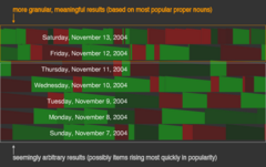
newsmap squarifies
Visited Newsmap today for the first time in a few weeks, and was pleased to find that they made a few adjustments that address my biggest gripe with the site. The news is now "squarified", which means that the color chips containing the various news stories are being arranged slightly differently. The old layout made comparative sizes of each item a breeze - you could quickly see what percentage of the news was taken up by Sports, or Health, or National news. The main drawback was that it made reading the actual headlines a royal pain. Smaller items would have text so small it was illegible, or shoehorned in sideways, or available only on rollover. The new version takes advantage of a treemap technique called "squarifying", an algorithm that adjusts the display of each item so that its aspect ratio is as close to 1:1 as possible - more square-like is better.
Some of the text is still too small to be readable. This is okay - it's inevitable that smaller items will fit less text, but now the illegibility cutoff point has been set lower. Also the whole thing just feels a little more balanced.
Very swanky.
Sep 14, 2004 9:44pm
En Las Noticias
La Vanguardia has mentioned In The News in an article about visual representations of the news (en/es), along with Newsmap and News Is Free:
It is perhaps true that graphical representation of the news does not in itself bring much of value. It is like visually creating the front page of a paper or the headlines of a news bulletin, only in this case using thousands of sources simultaneously. The value of the graphics is that they help to explain things a little better.
I had not seen News Is Free before. It feels informationally richer and visually weaker than News Map; its extensive configurability is both a liability and an asset. As a nerd, I appreciate the ability to custom-fit the data I'm seeing to my own aesthetic tastes, but I feel as though the really important configurability is still missing. It's one thing to allow me choose whether size == age or color == position, but another to provide controls to filter by the content of the news iteself. News Map does this excellently, letting me choose to look at Sports or Health new, grouped by country.
Sep 9, 2004 5:50pm
recipe flow
I just saw Cooking For Engineers' recipe for tiramisu. Also the meat lasagna. The recipe graphics are excellent process flow diagrams:
| about 20 lady's fingers | dip | layer & spread twice | cover | |
| 2 shots espresso | mix & chill | |||
| 1/2 cup coffee | ||||
| 1 cup heavy whipping cream | whisk to stiff peaks | fold | ||
| 1 lb. mascarpone cheese | mix | |||
| 1/2 cup granulated sugar | ||||
| 3 tablespoons rum (or brandy) | ||||
| cocoa powder | ||||
| shavings of unsweetened dark chocolate | ||||
They're similar in spirit to Gantt charts, but more compact, and (I think) more readable by cooks not experienced in project management ephemera. I especially like the clarity of task divisions: recipes are often confusing when they dictate sequence for tasks that really could be done in arbitrary order, and these diagrams clearly show which step of the recipe depends on others. I'm not sure how they might handle ingredients used in multiple parts of the recipe -- should sugar be listed twice in the ingredients column at left, if it's used twice? -- or whether there is a need to explain the actions in more depth.
For recipes aimed at engineers, I guess they have to keep such things simple to begin with. No port reduction sauce for you, now where's that TPS report?
Sep 4, 2004 12:49am
facing new york
I can't describe how much I enjoy We Fail's website for the band Facing New York.
I was just reminded of it during a conversation about the meta-news site Week In Review, which puts an organic, hand-drawn spin on news aggregation. Such an intentional move away from crisp, swiss fonts and layout makes a project feel more ephemeral, and underscores the dependence on individual creativity.
Sep 3, 2004 3:48pm
words speakers use
this beautiful infographic seems to be making the rounds this morning - it's a pair of images showing the frequency of words used by speakers at both major party conventions this summer, so far. "War", "Jobs", "Freedom", "Health Care" are the big ones.
A few questions I have about it:
- How did the New York Times decide which words to include in the survey?
- Why now? The graphic pointedly omits Bush - seems like they would have wanted to wait until the RNC was over, to have a full record.
- How is the top graphic organized? Is there a reason why "Hope" and "Iraq" are neighbors, for example?
- "Girlie Men" ???
Sep 2, 2004 6:09pm
regarding meta mail
Jon Udell writes today about Meta-mail:
We spend a lot of time, in email, enacting protocols that could be (to some degree) formalized. There's a delicate balance to be struck here, of course. Most business processes mediated by email have both formal aspects (you ask me to perform a task by a certain date) and informal aspects (we negotiate, and realize something else we hadn't thought of should take precedence). The conversational nature of email is its irreplaceable strength.
It's a response to Phil Windley's comments regarding meta-data in e-mail:
I think the answer to this problem lies in creating a task dashboard and having the various applications, including email, post control messages to the dashboard so that I have a single place to manage the various messages that are coming to me, albeit outside email.
Unfortunately, formalizing the kinds of desires and activities that are engaged in on a day-to-day basis is as difficult as the general problem of meta data. The features that currently exist in mail to handle this need (return receipts, urgency levels) are often misused, and in my experience unhelpful. Often, they are simply left unimplemented in many mail clients - the List-* headers are recognized by Pine, but not by Apple's Mail.app.
Fortunately, e-mail is an easily extensible communications medium.
I imagine that a potential approach to addressing this need would be to delegate a solution to the people who need it most - the IT and operations departments already tasked with formalizing process flows within a company. Many such formal processes take the form of simple expressions of desire, belief, and intent.How difficult could it be to augment mail headers with entries such as X-Desire-A-Meeting or X-Intend-To-Visit that could be customized to an organization's specific formal processes? Tie these to a DTD-like definition that specifies the syntax and potential range of expected responses to each message. Couple this with a few extensions to an open-source webmail client like Squirrelmail that implement a minimal interface to the message composition window and incorporate the inbox/outbox fusion of Gmail's conversation view, and you're on your way to a workable method. The key for me is that it should not be necessary to wait for a corporate software powerhouse such as Microsoft to develop a one-size-fits-all extension to Exchange or Outlook. Technologies like the world wide web or RSS have shown that one way to solve a communications technology problem is to use the tools at your disposal, and build a solution incrementally.
Aug 29, 2004 11:25pm
reinventing a party
How To Reinvent The G.O.P. (New York Times, reg. required, blah blah blah) is a fascinating read, especially during the current national convention in New York.
Gripes about the party's socially-retarded platform aside, it's interesting to read some background about the core beliefs of the republican party, and to try to understand what it is that George W. Bush was sent to Washington to accomplish. I don't agree that he's worthy of reelection, but I do believe that the underlying Republican position is one that is morally defensible.
In an Interview with Bill Moyers, Lou Dobbs summarizes well the one thing that I'd like to hear during one of these rah-rah conventions (from the delegates inside, or the protesters outside):
I want to hear one of these candidates sharply and clearly say this country is about the people who live in it.
One week into writing this thing, and I've already broken my rule about politics.
Aug 26, 2004 8:07pm
a cloud of black ink
This New York Times opinion piece was as notable for its source, as its content: Hiding the Truth in a Cloud of Black Ink.
...But too often, Congress and the American people lack the best information - in the form of declassified intelligence and national security materials - to ensure that the job is done right.
The authors of this article are Trent "all these problems over all these years" Lott [open secrets, wikipedia] and Ron Wyden [open secrets, wikipedia].
Lott and Wyden propose the creation of an independent national security classification board, which would oversee the national security classification system, set and review standards used to classify information, and review classification decisions. There's a small gotcha at the end, regarding the status of information that is "born classified", but overall it shows tremendous respect for the value of reliable, accessible data for the healthy functioning of a free and open society.
The article's title reminded me of another possible cloud of black ink: the meaningless haze of an information surplus, where so much data is being released that it becomes impossible for the average citizen to form a clear mental model of what's going on. As I've been researching Open Secrets, it has struck me that much valuable information becomes lost in the flood of government disclosure. Normally, the task of comprehending, digesting and reporting this information falls to journalists, but the advent of a 24-hour news cycle and reliance on press releases to fill in details appears to have made it more difficult to derive specific, meaningful knowledge or understanding from the facts made available.
Open Secrets (bless their hearts) strives to process these facts so that they can be presented in a concise, readable format: the site features pages and tables of top campaign donors, lists of lobbying firms, campaign contributions broken down by party, industry, and channel. Everything is derived from FEC filings, and can be traced and fact-checked.
The information provided lacks a higher-order: it's possible to find facts, but difficult to compare them. It's easy to match funds to legislators, parties or congressional committees, but difficult to relate these facts to contextual information. Open Secrets is sorely missing is a visual component.
Aug 23, 2004 3:51pm
two maps
Aug 22, 2004 2:56am
temporary troubles with In The News
Aug 19, 2004 8:45pm
In The News 1.2
Aug 18, 2004 4:00pm
a structured delivery mechanism
This page has existed in various iterations for almost 8 years, though until now it has always been strictly a static portfolio of my work.
I have decided to convert a part of it into a blog, to take advantage of the structure provided by commodity blogging software and to stop kidding myself that CVS makes for a good content management system.
I plan to use this space as notebook and journal, a warehouse for links and information, and a sounding board for projects I've got in the works.
Topics I'm interested in writing about:
- Visual representation of information. Graphs, charts. Data visualization.
- Pervasive flow of data, through autamated means. News feeds, aggregation, cURL, cron jobs, open data formats. Social, political implications of same.
- Internet application development.
Topics I'm interested in, but don't think I ought to discuss here, because I feel that I have little to add to the copious amounts of existing discussion/noise:
- Web development and W3C minutiae, including XHTML/CSS/etc.
- U.S. politics, impending de-election of George Bush.
- Social software.
Enjoy.
subscribe to ![]() this site.
|
contact Michal Migurski
this site.
|
contact Michal Migurski