tecznotes
Michal Migurski's notebook, listening post, and soapbox. Subscribe to ![]() this blog.
Check out the rest of my site as well.
this blog.
Check out the rest of my site as well.
Nov 19, 2008 8:09am
smule's ocarina
Earlier tonight I briefly met Spencer Salazar from Smule, the makers of the iPhone Ocarina. They have a small suite of like Sonic Boom ("turns your phone into a virtual firecracker"), Sonic Vox ("the real-time voice shifter"), and Sonic Lighter ("Sonic Lighter is a lighter") that are mostly technology gimmicks. Spencer admitted as much but I'm still completely smitten with the fact that 75% of their applications have a simple globe view that uses the network features of the phone to show you what other people, all around the world, are doing with each app right now. You can hear other people's clumsy ocarina playing, watch little explosions when other people use Sonic Boom, and see who's using the lighter app with some sense of how those people are related to you based on flame-passing connections.
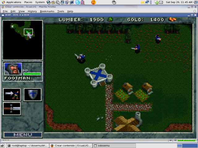
We've seen this all before, in Twittervision and other such globetrotting applications. These Smule globes seem strangely different and much more interesting, largely I think because you hold the phone in your hand instead of the laptop or monitor on your desk. It's a more personal, touched engagement with the screen that makes visualizing an earth-spanning army of phone lighters and flute blowers more physically personal. In particular, the Sonic Boom visualization is like watching television: no reading, no place names, just tiny explosions with audio all over the world with the same unmediated appearance as old top-down resource gathering games like War Craft I.
Having just read Teeming Void's Against Information (a critique of "data art"), I'm thinking about direct perception of data as a way of making it more visceral. The Golan Levin and Jonathan Harris pieces referenced in the paper all suffer from various forms of indirection: Levin makes breaking up look like math and physics, while Harris jumps to all sorts of crazy conclusions based on faulty language parsing and excessively abstract visual metaphor. How can a visual representation of data make itself felt right there, in your hand? Pictures help. Sound helps.
subscribe to ![]() this site.
|
contact Michal Migurski
this site.
|
contact Michal Migurski
Comments (2)
Thanks for the link Michal. This is a fascinating question - how to create a direct, visceral experience of data. A few thoughts. I think music is a good place to look for a model - not necessarily sound alone, but musical culture and experience. You could think of electronic music (and related visuals) as a process of hooking up data (MIDI, waveforms, polygons) with bodies for maximum visceral effect. Admittedly in these cases the "datasets" are hand-crafted for exactly this purpose. I think some of the works I discuss in that paper come close to visceral data. Lisa Jevbratt's 1:1 internet maps overload our visual sense to the point where you can't really "read" the images - they are overwhelming, so we just "feel" them more or less. Salavon's abstractions (eg Everything All At Once - http://salavon.com/EAO3/EAO3_inst.php?num=2) work in almost the opposite way, they decimate familiar "information" into a stream of abstract data, for the same result (feeling over reading). The slit scan / image visualisation experiments I've been doing work on the idea of gathering lots of dense, multiplexed data from the world, and doing as little as possible to it (eg http://teemingvoid.blogspot.com/2008/07/image-data-and-environment-notes-on.html). Sort of perceptual data mining - leaving the pattern detection to the user, without making too many assumptions about what the data "means." Finally, direct, visceral perception of data also sounds a bit like normal, everyday consciousness, right? cheers, Mitchell
Posted by Mitchell on Wednesday, November 19 2008 9:25pm UTC
Hi Mitchell! You're right that "direct, visceral perception of data also sounds a bit like normal, everyday consciousness" - this is approximately what I was thinking about when linking that screen from Warcraft I. The game is a fairly complex assembly of simulation and feedback, but it's perceived as a direct representation of little serfs and warriors moving around in a sort of ant-farm. This is the same thing that struck me about the Sonic Boom globe mentioned above, somehow the data-ness of the visualization melted away behind something more graspable. I just stumbled on this collection of "Dynamic Enterprise Dashboards" (http://www.microstrategy.com/digital-dashboard/demos.asp) and felt the same desire to concretize abstract status variables into physical representations of dials and maps. Financial variables and the chain of data entry and processing infrastructure that generates them are funneled into the everyday experience of a gas gauge. It's funny, one of the first things we did with Crimespotting was to run away from the awful little pictograms (http://mike.teczno.com/notes/oakland-crime-maps/I.html) yet here I am thinking there's a way to do them better without going full abstract. Also those slit scan images are beautiful, I hadn't made the connection with you before.
Posted by Michal Migurski on Friday, November 21 2008 3:11pm UTC
Sorry, no new comments on old posts.