tecznotes
Michal Migurski's notebook, listening post, and soapbox. Subscribe to ![]() this blog.
Check out the rest of my site as well.
this blog.
Check out the rest of my site as well.
Aug 31, 2008 4:34pm
tracking hurricanes
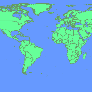
This just went out yesterday, our new Hurricane Tracker for MSNBC:
![]()
I'm so impressed with the work, co-created by Tom and Geraldine with raw data licensed from Hurricane Mapping. They're evacuating New Orleans right now, I hope the reaction to this storm isn't as tragically bungled as the last one.
Aug 30, 2008 5:24am
neocartography
Andrew just added a last-minute SXSW panel to the picker.
Here's what it's about:
Neocartography
Designers are dropping maps into their applications with little concern for usability or design and users are getting "Google Map fatigue". We need to move beyond the simple pin-dropping and consider appropriate mapping interfaces. This panel will look at the current and emerging tools to provide compelling geographic interaction and visualization.
It's going to be some combination of Andrew Turner, Aaron Cope, Paul Smith, Wilson Miner, Tom Carden, Andy Woodruff, Nathan Yau, and me.
Aug 30, 2008 5:22am
cascadenik: cascading sheets of style for mapnik
Style sheets were available in electronic publishing systems from around 1980 (see Chapter 2 and 3). Combined with structured documents, style sheets offered late binding (Reid 1989) of content and presentation where the content and the presentation are combined after the authoring is complete. This idea was attractive to publishers for two reasons. First, a consistent style could be achieved across a range of publications. Second, the author did not have to worry about the presentation of the publication but could concentrate on the content.
(Hakon Wium Lie, Cascading Style Sheets)
Mapnik, the open source map rendering library I've written about recently, uses an XML language similar in spirit to SLD for applying visual style to map vector data.
It's definitely tolerable, but otherwise not particularly good.
Having recently completed a country-wide geographic treatment of the UK for LOCOG (London Organising Committee of the Olympic Games), I've had a chance to experiment with ways to improve the state of the art in Mapnik styling. CSS, the ubiquitous format understood by all halfway-modern web browsers, offers a way forward.

I've implemented a pre-processor that accepts CSS-type stylesheets and produces traditional Mapnik stylesheets. Imagine a program that takes HTML and CSS files, sprinkles the HTML with FONT tags, and makes them viewable to Netscape 2.0 users, and you've got the idea.
Check out a brief tutorial, or grab the source code from the mapnik-utils project.
My hope here is that the characteristics of CSS that made it acceptable to designers and bumped the visual and semantic sophistication of the web will translate to the world of maps as well. Mapnik's existing styles get the job done, but are unsatisfying because they force the designer to develop and implement the kind of class-based logic that CSS makes easy. It's still early in this particular universe of concern, but the suddenly rising viability of the OpenStreetMap project is going to make map design for the web a buzzing, vibrant front in another year or two, tops.
CSS has a few properties that make it a great candidate for mapping:
- Stylesheets can live separately from the content they apply to, with many pieces of content sharing rules defined by single a source. In contrast, Mapnik's own "stylesheet" terminology refers to an XML format that blends content (the vector data that maps are made of) with appearance. This is going to be interesting as the availability of data like OpenStreetMap's creates a need for attractive CSS bases for people to work from.
- The "C" in CSS is for "Cascade", shorthand for a set of expectations governing how rules from a variety of sources can be combined. In CSS, it's possible to state the equivalent of "all text is black, but proper nouns should be highlighted with yellow." Maps present similar needs, there is often a hierarchy of feature types that need to shares some visual properties but not others: roads, toll roads, toll roads under construction, etc.
- CSS interacts with HTML largely through element types, classes and IDs. The class concept in particular makes it possible to mark content with meaningful labels, and apply visual styles based on those labels. Maps present feature classes like public buildings, various kinds of parkland, etc., yet Mapnik has no such concept of class.
- CSS clearly defines how relative addresses ought to be handled, in the case of linked files like background images. According to the CSS specs, addresses are always relative to the stylesheet in which they're used, not the content document from which the stylesheet is linked. This behavior is predictable and makes for easy centralization and re-use of visual rules. Mapnik expects that image files can be found in absolute locations, on the same computer where it's being run.
The basic improvement offered by CSS is that the linkage has been flipped around to point in the opposite direction. SLD and Mapnik both have data layers that specify how they are to be rendered via explicit connections to declarations of color, line weight, etc. It's better to do the opposite: classify data layers with meaningful categories and create separate styles that act on those categories. The style rules point to the things they apply to, e.g. "roads should be black lines, while schools should be filled in with yellow."
So far where I've gotten is a two-week-old proof of concept that generates good, clean Mapnik stylesheets. It's usable now, but there are no doubt edge cases where my handling of things like filters will need to be tweaked somewhat.
Read the quick tutorial, and grab the source code from the mapnik-utils repository.
Aug 26, 2008 6:39am
uxweek 2008
Last week was Adaptive Path's blowout annual event, UX Week. I was tremendously excited about it, and it did not disappoint. My one previous experience at this conference was in 2006, Washington DC when I gave my first talk longer than 20 minutes, Data Visualization: Why Now? That one netted us my co-presenter this year, Tom Carden, whose work on OpenStreetMap I name-checked during my hour-long survey of new data visualization work.
This time, we did two sessions. Tom and I did a really really full three hour workshop extravaganza adapted from his amazing solo show at E-Tech this year. This was awesome. I talked for 90 minutes, had great audience participation, and walked away charged and energized ... I would love to do this one again, the scale and format (small room, 30-ish people?) was perfect and the attendees asked tough, perceptive, illuminating questions that absolutely made the whole thing sing.

On Friday, I also took the main stage to deliver a bit of a departure from our usual talk topics. Generally, we talk about what we do and how we do it. This time, we put some order to a whole bag of ideas about illusion, sleight of hand, surfacing and technique that I had initially been working out for Interesting2008. I wasn't able to get to London, so I did the talk in town. This one was a sharp contrast. The material was something new and experimental for me, and the klieg light ballroom format makes for a strange speaker / audience relationship. Still, I felt like I had crossed some form of boundary and I'm anxious to polish the topic for another go.
The talk was called Greebles, Nurnies, Tiles, and Flair, and these are my slides and notes.


"Greebling" is a special effects term that makes sense if you've seen Star Wars ... all those little nubs on the Imperial Star Destroyer and other ships make it look big, and real. They're there to hide the fact that it's plywood and plaster, to help you believe that it's a mile long.

Tiles are a technique you'll be familiar with from Google Maps. The infinite, continuous road maps and satellite imagery are available over a regular broadband connection because Google serves them to you as small square images...

...that get stitched together into a seamless field by your web browser.

Sleight of hand.
Tiled image maps are a stand-in for a larger strategy for dealing with continuity. How do you use a clipped, staccato medium like the internet and the digital computer to simulate infinity?

The world of computer gaming has been dealing with these questions for some time. There's an excellent article by Scott Bilas from Gas-Powered Games called The Continuous World of Dungeon Siege. In it, he describes the technical challenges of presenting a seamless world.

It's similar in concept to the tiles slippy maps you can see in your browser: divide the world into discrete chunks, connect them to one another, and figure out how to stream everything into the play environment from outside the player's field of vision, so they are never presented with a loading screen.

There is no global coordinate system, all is relative.
This is becoming a core expectation of modern games, walk around World Of Warcraft or Grand Theft Auto for a few minutes to see.

Online mapping is a version of this in miniature. Our code library Modest Maps was developed to generalize the pattern. We started using it with geographical maps...

...but have started to apply the technique to non-geographic mappings: floorplans, ...

... and artworks, to name two.

All the Maps mashups out in the world are like portals into the Continuous World Of Google Maps - each one a square window onto the same world.
It's like looking at a blue whale through a letterbox. Nature's Timo Hannay meant this as a criticism, but Stamen's Tom Carden thinks this is awesome.

What if you could see that, as you search for driving directions from San Bruno to Marin, that someone else is simultaneously crossing your path from Oakland to SF's Sunset district?
I talk about Google because it's familiar, but there are a lot of other distributed services starting to act like this. Continuous World Of Flickr, Continuous World Of Twitter are giant services but everyone sees a very small piece at a time.

Sleight of hand again:
The magic wand is there to make the hidden coin look less conspicuous.

Greebles are the parts that "look cool, but don't actually do anything" (C3PO). There's an entire discipline here composed of special effects artists and asset designers working to hide the plywood spaceships and simple game world polygons beneath an encrusted surface texture.

Textured surface gets you several things.
One is that it's proof of reality. Check out this map of Moscow (Kosmoninki), with all the individual buildings marked and numbered. It makes the map look more like the territory.

Google Maps for Tokyo have logos for all convenience stores baked right into the imagery. I thought this was an experiment in advertising until I went there, and learned that conbini are one of the prime wayfinding mechanisms people use to figure out where they're going. The street numbering system is entirely different, so navigation takes place by landmark rather than coordinate.

With Cabspotting, we made an early decision to ditch the base map and show just the trails of each taxi. This bought us a lot of wiggle room, since the GPS trails don't match up to the roads very well and would have looked terrible. It also bought us the appearance of truth. If you can see the rush of cabs in SOMA after last call, or the dense cluster around the dispatch yard, or the thick line along Geary out to the Sunset, you believe that the data is true.

These kinds of surface signals are encountered everywhere. NASCAR without sponsor logos looks barren, everyone knows that advertising is the lifeblood of the sport, and the logos on cars and driving suits reminds you that these guys are legitimate, that someone cares about them enough to pay to be seen with them, says Adobe's Michael Gough.
AdBlock for browsers has been succeeded by ArtBlock.

Surface details like this are a kind of social signal that the textured surface is real and cared-for, that it can be grasped and held on to.

Compare and contrast the visual appearance of OpenStreetMap two years vs. now: it's more credible and therefore more useful, because it's beautiful.

Sleight of hand again:
I have been talking about surfaces and misdirection.
What's underneath?

Social sites are taken seriously when they have crowds of users, loads of data, and all the scaling problems that accompany success. "Scaling is always a catch up game, but it's the best game there is" says Flickr's Kellan Elliot McCrae.
Big data, crowds of users, sheets of information poking up through the surface.

Credibility comes from looking busy, and being continuous: having something on page two, page three, etc. You will inevitably be asked to work on "social features" - most of the labor is getting people to give a damn, and getting the details right on the unbroken layer under everything else.

Approach this by starting underneath the surface.

Aug 5, 2008 12:28am
blog all dog-eared pages: understanding media

Marshall McLuhan entered my world in 1994 or so, when I first subscribed to Wired magazine while still in high school. I still had a year before I got online, so the bits of the articles that began with "http:.." didn't yet make sense to me. I've been bathing in "medium is the message" talk since I was 16 years old, without quite knowing what it means.
I approached Understanding Media as a sort of founding work, trying to get some sense of what Web 1.0's 1960's patron saint was on about. The book is equal parts frustrating and fascinating, especially at the beginning. Right away I had difficulty with two things: McLuhan's definition of "media" (electric light is given as an example, along with the usual radio, TV, film), and his use of terms like "hot" and "cold" without explanation. Radio is a hot medium, television a cool, one. There's not a lot here to grab hold of, and I still can't quote get my head around what the temperature idea refers to.
The book is essentially a 300 page long series of metaphorical assertions. McLuhan prefaces a large number of them with "it is well-known...", "anyone could tell you...." I quickly had to acclimate to this style.
There are just a few big ideas I've walked away with.
One is the frequently-repeated image of a human nervous system extended out past the skin and body through the use of electronic communications media. The book was written well before the Internet, but the founding rhetoric of the 1990's is all there. McLuhan starts with the idea that telecommunications is a factual expansion of the human nervous system out into the world, and derives a number of metaphors on the calmness of nerves and the farming of perception to corporate interests.
Another is the following of all threads, from a technology to all its implications and outcomes. Bruno Latour used a similar "full hardware stack" approach in Artemis when pointing out that the soft, fleshy, and therefore squeezable-during-rush-hour human body is as much a design feature of public transit systems as the rails and vehicles that carry it. McLuhan focuses on perception and all the senses, showing how all the broadcast and point-to-point media imply different sensual responses, from the tactile clothing of the TV generation to the receptiveness to Hitler's rhetoric via the radio medium. In his mention of abrasiveness, I immediately thought of the "shred" / "grind" terminology in popular culture of the past 15-odd years: is there something about the skate video medium that calls up a sandpaper touch? Do the psychological effects of cocaine, ecstacy, etc. make necessary the highly-pitched fuzz of dance music? Simon Reynolds says much of techno was a functional musical form adapted to serve its physical and pharmacological environment. I don't even know how to begin applying these ideas to our emerging world of little square friends - the thought scares me.
I marked many pages than are excerpted here; McLuhan is a very quotable writer even though much of what's quoted is significant more in the reading than the writing.
Pages 65-66, on the sensitivity of the artist to technological change:
The artist can correct the sense ratios before the blow of new technology has number conscious procedures. He can correct them before numbness and subliminal groping and reaction begin. If this is true, how is it possible to present the matter to those who are in a position to do something about it? If there were even a remote likelihood of this analysis being true, it would warrant a global armistice and period of stock-taking. If it is true that the artist possesses the means of anticipating and avoiding the consequences of technological trauma, then what are we to think of the world and bureaucracy of "art appreciation"? Would it not seem suddenly to be a conspiracy to make the artist a frill, a fribble, or a Milltown? If men were able to be convinced that art is precise knowledge of how to cope with the psychic and social consequences of the next technology, would they all become artists?
Page 68:
Once we have surrendered our senses and nervous systems to the private manipulation of those who would try to benefit from taking a lease on our eyes and ears and nerves, we don't really have any rights left. Leasing our eyes and ears and nerves to commercial interests is like handing over the common speech to a private corporation, or like giving the earth's atmosphere to a company as a monopoly. Something like this has already happened with outer space, for the same reasons that we have leased our central nervous systems to various corporations. As long as we adopt the Narcissus attitude of regarding the extensions of our own bodies as really out there and really independent of us, we will meet all technological challenges with the same sort of banana-skin pirouette and collapse.
Page 158, on maps:
Prince Modupe tells in his autobiography, I Was A Savage, how he had learned to read maps at school, and how he had taken back home to his village a map of a river his father had traveled for years as a trader:
"...my father thought the whole idea was absurd. He refused to identify the stream he had crossed at Bomako, where it is no deeper, he said, than a man is high, with the great widespread waters of the vast Niger delta. Distances as measured in miles had no meaning for him.... Maps are liars, he told me briefly. From his tone of voice I could tell that I had offended him in some way not known to me at the time. The things that hurt one do not show on a map. ... With my big map-talk, I had effaced the magnitude of his cargo-laden, heat-weighted tracks."
Page 183, on clowns, bicycles, and eggs:
The clown is the integral man who mimes the acrobat in an elaborate drama of incompetence. Beckett sees the bicycle as the sign and symbol of specialist futility in the present electric age, when we must all interact and react, using all out faculties at once.
Humpty-Dumpty is the familiar example of the clown unsuccessfully imitating the acrobat. Just because all the King's horses and all the King's men couldn't put Humpty-Dumpty together again, it doesn't follow that electromagnetic automation couldn't have put Humpty-Dumpty back together. The integral and unified egg had no business sitting on a wall, anyway. Walls are made of uniformly fragmented bricks that arise with specialisms and bureaucracies. They are the deadly enemies of integral beings like eggs. Humpty-Dumpty met the challenge of the wall with a spectacular collapse.
Pages 209-210, on advertising:
The book-oriented man has the illusion that the press would be better without ads and without the pressure from the advertiser. Reader surveys have astonished even publishers with the revelation that the roving eyes of newspaper readers take equal satisfaction in ads and news copy. During the Second War, the U.S.O. sent special issues of the principal American magazines to the Armed Forces, with the ads omitted. The men insisted on having the ads back again. Naturally. The ads are by far the best part of any magazine or newspaper. More pains and thought, more with and art go into the making of an ad that into any prose feature of press or magazine. Ads are news. What is wrong with them is that they are always good news.
Page 252, on sensitivity:
Florence Nightingale (1820-1910), wealthy and refined member of the powerful new English group engendered by industrial power, began to pick up human-distress signals, as a young lady. They were quite undecipherable at first. They upset her entire way of life, and couldn't be adjusted to her image of parents or friends or suitors. It was sheer genius that enabled her to translate the new diffused anxiety and dread of life into the idea of deep human involvement and hospital reform. She began to think, as well as to live, her time, and she discovered the new formula for the electronic age: Medicare. Care of the body became balm for the nerves in the age that had extended its nervous system outside itself for the first time in human history.
Page 255, on electricity:
Many analysts have been misled by electric media because of the seeming ability of these media to extend man's spatial powers of organization. Electric media, however, abolish the spatial dimension, rather than enlarge it. By electricity, we everywhere resume person-to-person relations as if on the smallest village scale. It is a relation in depth, without delegation of functions or powers. The organic everywhere supplants the mechanical. Dialogue supersedes the lecture. The greatest dignitaries hobnob with youth.
Page 277, on Edison and indirectness:
Edison became aware of the limits of lineality and the sterility of specialism as soon as he entered the electric field. "Look," he said, "it's like this. I start here with the intention of reaching here in an experiment, say, to increase the speed of the Atlantic cable; but when I've arrived part way in my straight line, I meet with a phenomenon, and it leads me off in another direction and develops into a phonograph."
Page 294, on expectations:
Since the best way to get to the core of a form is to study its effect in some unfamiliar setting, let us note what President Sukarno of Indonesia announced in 1956 to a large group of Hollywood executives. He said that he regarded them as political radicals and revolutionaries who had greatly hastened political change in the East. What the Orient saw in a Hollywood movie was a world in which all the ordinary people had cars and electric stoves and refrigerators. So the Oriental now regards himself as an ordinary person who has been deprived of the ordinary man's birthright.
That is another way of getting a view of the film medium as monster ad for consumer goods. In America this major aspect of film is merely subliminal. Far from regarding our pictures as incentives to mayhem and revolution, we take them as solace and compensation, or as a form of deferred payment by daydreaming. But the Oriental is right, and we are wrong about this.
Page 298, a poem by Bertold Brecht:
You little box, held to me when escaping / So that your valves should not break, / Carried from house to ship from ship to train, / So that my enemies might go on talking to me / Near my bed, to my pain / The last thing at night, the first thing in the morning, / Of their victories and my cares, / Promise me not to go silent all of a sudden.
Pages 315-316, on tribal magic:
German Romantic poets and philosophers had been chanting in tribal chorus for a return to the dark unconscious for over a century before radio and Hitler made such a return difficult to avoid. What is to be thought of people who wish such a return to preliterate ways, when they have no inkling of how the civilized visual way was ever substituted for tribal auditory magic?
Page 327, on tactile television:
So avid is the TV viewer for rich tactile effects that he could be counted on to revert to skis. The wheel, so far as he is concerned, lacks the requisite abrasiveness.
Clothes in this first TV decade repeat the same story as vehicles. The revolution was heralded by bobby-soxers who dumped the whole cargo of visual effects for a set of tactile ones so extreme as to create a dead level of flat-footed dead-panism. Part of the cool dimension of TV is the cool, deadpan mug that came in with the teenager.
Page 339, possible origin for the brand name "Nerf"?
The French phrase "guerre des nerfs" of twenty-five years ago has since come to be referred to as "the cold war". It is really an electric battle of information and of images that goes far deeper and is more obsessional than the old hot wars of industrial hardware. The "hot" wars of the past used weapons that knocked off the enemy, one by one. ... Electric persuasion by photo and movie and TV works, instead, by dunking entire populations in new imagery.
Page 356, on automation, feedback, and customization:
On this machine, starting with lengths of ordinary pipe, it is possible to make eighty different kinds of tailpipe in succession, as rapidly, as easily, and as cheaply as it is to make eighty of the same kind. And the characteristic of electric automation is all in this direction of return to the general-purpose handicraft flexibility that our own hands possess. The programming can now include endless changes of program. It is the electric feedback, or dialogue pattern, of the automatic and computer-programmed "machine" that marks it off from the older mechanical principle of one-way movement.
subscribe to ![]() this site.
|
contact Michal Migurski
this site.
|
contact Michal Migurski