tecznotes
Michal Migurski's notebook, listening post, and soapbox. Subscribe to ![]() this blog.
Check out the rest of my site as well.
this blog.
Check out the rest of my site as well.
Jul 25, 2008 1:19am
making sense of mapnik
Almost four years on from Mapping Hacks, the state of web-based mapping is moving within reach of mortals and designers. The one piece of software most directly responsible is Mapnik, Artem Pavlenko's excellent open source rendering library.
Despite a not-undeserved reputation for being difficult to install (there are even what appears to be companies offering Mapnik as a service), once you've got it running there's nothing better out there for generating your own web-based slippy maps. Mapnik's being used by a number of sites, they're worth checking out for a sense of what's available. Note the high-quality text appearance, smooth anti-aliasing on shapes, and general polish:
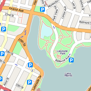
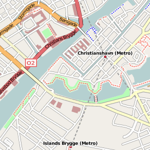
- OpenStreetMap (I've written about them recently) generates their own world-wide street map coverage based on user-submitted data. See example close-ups for Oakland or Copenhagen.
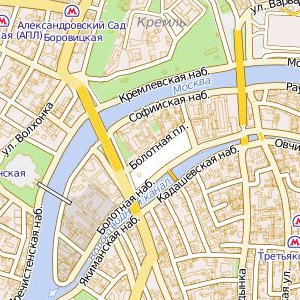
- Russian site Kosmosnimki (I don't know who they are, or what they do) has a lovely slippy map for Moscow and beyond - I'm especially impressed with the inclusion of individual buildings at closer zoom levels, extensive metro coverage, and general texturing overall.
- EveryBlock created their own map tiles for the handful of U.S. cities they cover, based on publicly available GIS data like TIGER/Line and shapefiles provided directly by city governments like San Francisco and Washington D.C. (click view all). See for example this view of SF's Mission District with news articles overlaid. I like the way EveryBlock's designer Wilson Miner went for a subdued, minimalist aesthetic that provides an ideal backdrop for the local information layered over the map; this is a situation where Google's fluorescent cartography would not have worked. Paul Smith has already written about Mapnik on EveryBlock's own blog and in an excellent A List Apart overview.
That last link to Paul's ALA article gives a good, mile-high overview of where Mapnik fits in. Once you've rendered out your first Hello World, though, where next?
We've been in a deep Mapnik dive for the past few months on a particular project (more on that some other time), and this post is an attempt to collect the design issues we've run into and what we did to address them along the way. I'll assume you've at least tried Mapnik out, and have some passing familiarity with what it does: the short version is that it combines potentially-large amounts of geographic data with XML-defined stylesheets to output regular images. Some of the notes near the end get into technical details around speeding up tile rendering and duplicating the projection and division of the world used by Google and other popular slippy map providers.
Showing Your Work
The thing that makes web development easy is that you can check your work in a browser as you're doing it. The same can be true for Mapnik stylesheets: set yourself up with an HTML page that includes links to live renderings of maps at a variety of scales and locations. As you edit your style rules, reload this page to see what effect you're having on the appearance as a whole. I learned this technique from Paul and Wilson of EveryBlock, it seems to have served them well as a developer + designer team. One of the easiest traps to fall into when changing a complex system with lots of moving parts is fixing problems locally that cascade into larger problems globally. Mapnik styles can get quite dense for a large and varied data set - check out OpenStreetMap's style rules for an indication of how deep the rabbit hole goes.
Order Matters
In Mapnik, order matters. It uses the painter's algorithm to draw shapes and text, which really just means that once something is down on the canvas, it stays put. The immediate, obvious result of this is that the order of layers defined in your stylesheets is significant. The ones at the top of the XML file are drawn first, the ones at the bottom are drawn last. Oceans and coastlines should go at the top, points of interest and street names should go at the bottom.
A less obvious outcome is that order also matters coming out of your data source. If you pull roads out of a shapefile or a database, the order in which those come back is the order in which they get drawn. This is a subtle point of control over the appearance of a map.
- If you're drawing roads and using PostGIS, ORDER BY LENGTH(geometry) DESC will make it so that longer roads are labeled first, which looks more correct for zoomed-out views of a city where there isn't room to label everything.
- If you're labeling towns, ORDER BY population DESC will draw the larger cities first and the smaller villages last. Combined with Mapnik's collision detection, this will result in a map with big, important places included for-sure and smaller places only where there's room. For zoomed-out views of a state or country, this ends up looking right.
- You can add explicit priority flags to your data for finer-grained control. These can be pretty much whatever you might want: capital cities before small towns, underpasses before overpasses, bars before post offices.
Mapnik lets you define those ORDER BY clauses right in the stylesheet for PostGIS, while shapefiles will need to be rebuilt with a tool called ogr2ogr and its -sql option.
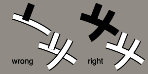
The standard style of rendering roads, with labels placed inside light-colored fills and a thin outline on the edges, is accomplished by repeating layers. First, you put down a layer of thick, dark-colored roads, for example 14 pixels wide. Second, you put down another layer of thinner, light-colored roads, for example 12 pixels wide. The combination of the two yields correctly-outlined street grids, without the woven appearance of street intersections where it looks as though one road is covering another. A lot complicated visual effects can be achieved in similar ways, with repetition and layering to build up a particular effect.
Text Gotchas
Mapnik has a lot of special behaviors when placing text on paths. One thing you'll notice is that it's completely satisfied bending words around tight corners, leading to unsightly kinks in your street names. Fortunately there's a property, max_char_angle_delta, that you can add to your TextSymbolizer to keep labels away from sharp turns - 20 degrees looks pretty good. You still get curvy road labels, but no jarring corners.
If your dataset has longer roads cut up into short segments, you might find that Mapnik can't fit labels along them, or they do fit but are unnecessarily repeated for each segment. We worked with a commercial source of road data that was optimized for flexible cartography, and many longer stretches of road were segmented according to changes in number of lanes and other characteristics. Because we weren't interested in showing such a high level of detail, they were willing to deliver a version of the data with same-named, connected roads merged into longer line strings.
A common form of route and highway label is the "shield", implemented by Mapnik as the ShieldSymbolizer. Shields are a combination of text and graphic, intended to show short road numbers as distinct from names (e.g. "CA 13" vs. "Warren Freeway"). Like the order tricks above, shields need a bit of finessing to get right. You can use the regular SQL LENGTH(name) function combined with Mapnik style rule filters to create simple conditions: for example, using a wide shield graphic for long route numbers, and a narrow shield graphic for short route numbers.
Following The Leader
The mercator projection used by Microsoft, Yahoo!, Google, OpenStreetMap, and others is ideal for world-wide coverage. Places are locally proportional and the whole thing looks right in a comforting, grade-school-wall-map-sense-memory way when zoomed out.
There are three details you need to have taken care of to duplicate this projection:
- Make sure your data is stored as plain latitude and longitude values, in degrees. San Francisco would be near (-122, 37), London near (0, 50), and so on. One appropriate definition/SRS for your data source is: "+proj=latlong +ellps=WGS84 +datum=WGS84 +no_defs".
- Omit any ellipse or datum (e.g. WGS84) from the output projection - a simplifying feature of this particular mercator projection is that its output is based on a plain, spherical earth to make calculations easy for Javascript or Actionscript clients. Most of Modest Maps is based on this assumption. An appropriate definition/SRS for your map output is: ""+proj=merc +a=6378137 +b=6378137 +lat_ts=0.0 +lon_0=0.0 +x_0=0.0 +y_0=0 +k=1.0 +units=m +nadgrids=@null +no_defs".
- Set up some sane shortcuts for the minimum/maximum zoom levels used in your style definitions. Your eyes are going to shrivel up and fall out of your head if you don't do this early. Here are ours.
Continuity
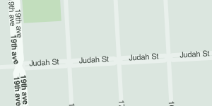
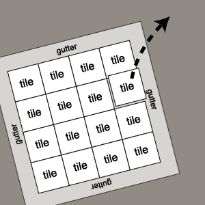
Most uses of Mapnik I have seen are presented in the form of draggable, zoomable slippy maps, often delivered in an OpenLayers or Modest Maps frame. These are universally divided up into square tiles for speedy loading. In order to present a convincing illusion of infinite scrolling, labels need to match up from tile to tile. Mapnik uses a deterministic algorithm for placing labels: for a given zoom level, they're geographically going to be in the same place regardless of your bounding box. Unfortunately that doesn't mean the text placed on points, like city names, that bleeds over the edge of one tile and onto the next is going to be properly rendered on both. Users of Mapnik seem to have come up with a strategy for this situation that involves rendering a big gutter around the visible area and then cutting it off. 128 pixels is generally considered a good gutter width, quadrupling the area of a 256x256 pixel tile to 512x512, most of which gets thrown away for the sake of continuity. I learned this from OpenStreetMap.
Optimization
It makes sense, therefore, to render tiles in larger batches, doing four or sixteen at a time in large swaths and then cutting them up. Mapnik's startup overhead is minimized, so that larger areas aren't significantly more expensive to draw than smaller areas. I've found a comfortable medium to be rendering tiles in groups of sixteen with half-tile gutter all around. I think OpenStreetMap may go as far as groups of 64, but it really depends on what your server can reasonably handle and how long you're willing to wait.
Known and accepted patterns for writing the Python code that drives Mapnik haven't been fully worked out yet: the TileCache / WMS approach described in Paul's article above is fairly standard, but it's not the speediest thing. We ended up developing a mod_python + memcached contraption that renders tiles on demand, but contains some basic communication logic so that concurrent requests that cover the same tile group wait for one another and re-use each other's work (see the comments below for more information on this). I think OpenStreetMap is going so far as to create a mod_tile extension for Apache to make this easier.
Mapnik appears to be pretty smart about using the scale of the map to determine whether to request data: if your style rule specifies a minimum or maximum scale denominator outside your current map zoom level, the data source will be ignored. The same is not true for filters in style rules - these are applied to each piece of geometry coming out of your datasource, and aren't optimized-for when generating queries to send to PostGIS.
Get Hopping
Designing rulesets and automating design is a topic all on its own. Controlling the appearance of maps should provide a taste of what it feels like.
The most important thing is to set yourself up with an environment where you can work rapidly, constantly getting feedback on what you're doing. Remember the painter model, and make friends with a Python developer willing to set you up with a space to work.
Jul 17, 2008 7:11am
beginner's mind
Is it possible to train or cultivate the beginner's mind? Can you teach yourself to delay preconception and judgement when seeing new things?
Jul 14, 2008 7:32pm
flea market mapping II: revenge of big oil
I've been poking at this historical tileset of Oakland lately. Last time, I posted slippy maps of Oakland in 1877, 1912, and the 1950s. I recently acquired a 1936 Shell map of the bay area that filled in a time period I was interested, the pre-war years when the Bay Area started to make the transition to an automobile society but hadn't yet been experienced the military base explosion of World War II.
Here's the thing, check the new 1936 layer:
A few things I'm finding interesting about this new map:
- The visual treatment completely changes from the 1912 layer, starting to seem modern and borderline cartoonish.
- The progressive infill of Middle Harbor (just south of the Bay Bridge) visible over the years.
- The differences in highlighted driving routes between the 1930s and the 1950s, in particular the introduction of Macarthur Boulevard and West Grand Avenue.
- Still not a lot of trains shown on the second driving map.
- The Bay Bridge construction is apparently still underway, it opened in November 1936.
I'm starting to get better at quickly processing these layers from scanned images. The new one is a bit blurrier than I'd like, possibly due to the crappy Epson scanner I'm using here. Anyone within biking distance of Oakland or SF have a better scanner I can use to re-do the driving maps?
The next layer I want to get is something from the 1970s, maybe the 1980s - I'm keen to show the pre-Earthquake raised freeway structures that were ramrodded through West Oakland at the time.
subscribe to ![]() this site.
|
contact Michal Migurski
this site.
|
contact Michal Migurski