tecznotes
Michal Migurski's notebook, listening post, and soapbox. Subscribe to ![]() this blog.
Check out the rest of my site as well.
this blog.
Check out the rest of my site as well.
Dec 30, 2008 9:54am
oakland crime maps XI: how close, and how bad?
Did you know that Oakland Crimespotting is still kicking hard, with hundreds of alert subscribers and a smooth, regular flow of timely data from the Oakland Police Department? The project has essentially been on auto-pilot since we re-launched it back in March, but holiday side projects have been a favorite activity of mine for years, so this time I'm thinking about the relatively short time horizon Crimespotting offers.
The current interface offers up to a month's worth of highly granular information on individual reports, and you can quickly get a sense for how active a given neighborhood is by digging around a little, doing a few searches, and checking out details on local crime reports. What we don't have is a long view.
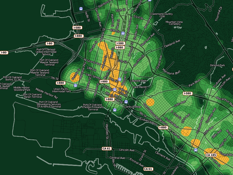
Heat maps are one effective way to present large volumes of aggregate data over a geographical area, so I've been exploring ways to make them legible for crime data.
There's a ton of existing work out there in this area to draw on, some of it good and some of it dreadful.
First and foremost is Martin Watternberg's seminal Map Of The Market, a live and non-geographical view of stock trading activity, that celebrated its ten-year anniversary this past year. MOTM shows volume and change over time in a tight, clean, effective package most recently notable for showing how Campbell's Soup and gold mining managed to weather the recent precipitous drops in the Dow.
A more topical geographic example is Microsoft Research project How We Watch the City: Popularity and Online Maps. Danyel Fisher used server logs from Microsoft Virtual Earth tile servers to show viewing patterns around the world, with the beautiful results shown here.
Finally, HeatMapAPI offers commercial support for making your own heat maps.
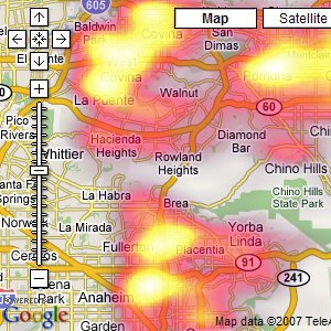
The results of HeatMapAPI's software actually illustrate a few of the things I've found weakest about geographic heat maps, a big excuse for why we've not done them for Oakland Crimespotting so far. There are two big shortfalls in the screen shot above: the data obscures the context, and simultaneously fails to communicate much in the way of specifics. The two primary questions you might want to ask of your data are "where?" and "how much?" The answers offered here are apparently "in a place near Whittier whose name I can't read" and "yellow".
So that's the starting point.
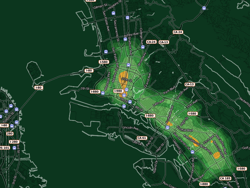
The answer I've settled on for the "where?" question is OpenStreetMap. I've been growing steadily more excited about this project for some months now, in part because it offers up the possibility of playing some beautiful visual games with high quality street data. In the HeatMapAPI example above, the context problem arises from the impossibility of manipulating Google's map data at any level more granular than their pre-rendered tiles. The overlays obscure the town and street names that help give them meaning. With OSM data and Mapnik, it's possible to create a semi-transparent streets layer specifically designed to interact well with underlaid data. It took just an afternoon's worth of modifications to my existing OSM visual design to come up with something suitable for layering with quantitative data. Gem helped tune the visual interaction between layers, so now there's a directly-overlaid set of names and icons above a translucent (25% - 50%) black street grid. Each of these layers is a separate Mapnik style, composited with the underlying color heat map.
In these maps, streets have been stripped back to translucent dark stripes, with white edges showing where the shoreline of the Bay begins.
The second question, "how much?", is somewhat more interesting. The difficulty with continuous, analog data lies in communicating something of relevance and urgency in it. If the map is orange, what does that mean exactly? Will my car get broken into?
One approach I've been prodding at takes advantage of a neighborhood sense for time and space. People know how big a city block is, how it feels for a month to go by. We know something of this in our database of crime reports too, so the colors in these experimental designs are keyed to specific meanings. Orange here denotes areas where, on average, the police respond to a call once per month for every 100m x 100m city block. Inside orange, there are two more divisions shown as brighter, hotter colors: two weeks and one week. For the police to show up right on your block every week is quite heavy, and there are just a few places in town that see this kind of activity. Outside orange, there are divisions of green that represent an additional month of peace and quiet for every block at each step.
At this level, you can start to see where OpenStreetMap data really begins to shine: all those little flag icons represent Oakland public schools that I added to the OSM database specifically to have such local data available to Crimespotting. The Microsoft Virtual Earth maps we use on the current site are beautiful, but they aren't particularly helpful in the way of local, civic data relevant to a consideration of police activity.

As the map zooms in closer, large amorphous blobs particulate into smaller, more granular bleeps and bloops. When you start seeing individual blocks in the map, you can also see individual corner hot spots. Here, the two downtown Oakland BART stations, a slice of MLK between 14th and 16th streets, and the area immediately around Oakland Police headquarters on Broadway and 7th are especially hot. The colors at every zoom level continue to mean the same things: always orange for "once a month, once per block". The colors here are cribbed from Cynthia Brewer's cpt-city work, a combination of YlGn and Oranges.
I'm happy that Lincoln Elementary School seems to sit in a safe zone of relatively low crime.
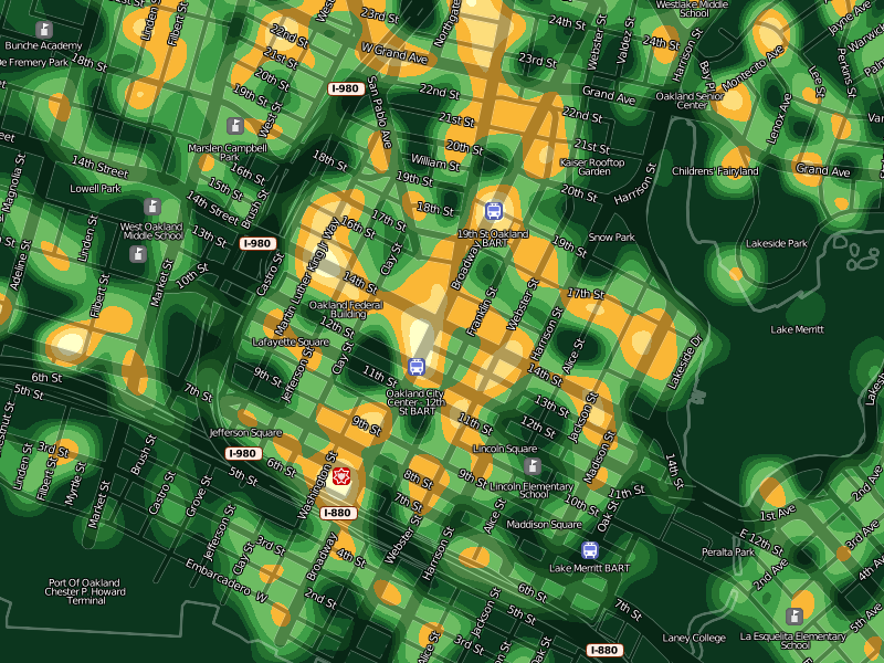
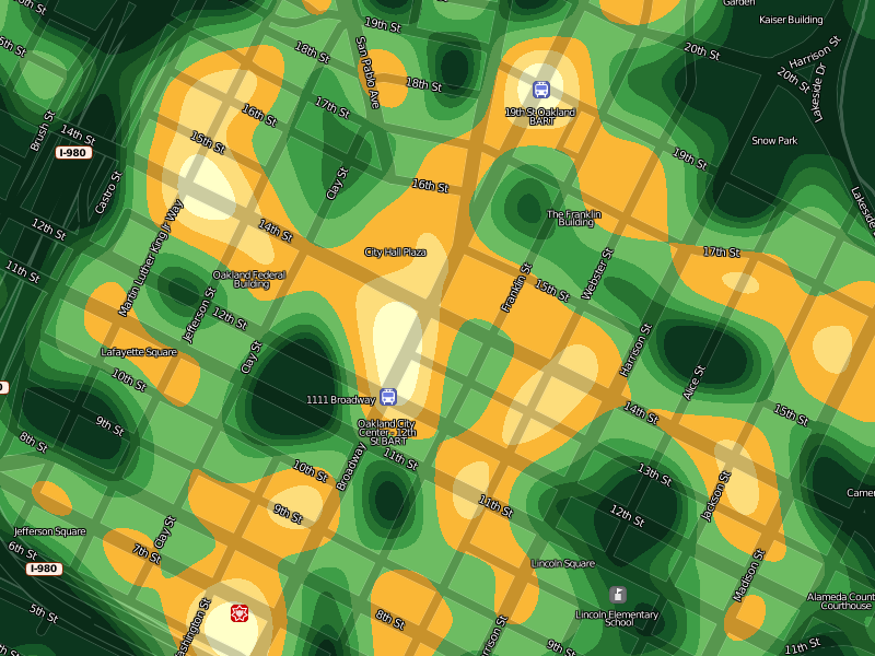
At a certain point, increased granularity becomes a problem. Our data is really only accurate to the city block level, so it doesn't make sense to generate a heat map more specific than this. The smooth, swooping whorls at the highest levels of zoom help to communicate the relative imprecision of the data at this level.
Overall, I'm happy with the results so far. These images are being generated through a combination of GDAL, Mapnik, NumPy and PIL. They're not yet ready to be integrated into the Crimespotting site proper, though I imagine that the first place they would eventually show up would be on the static map beat pages. I'm interested in comments or criticisms on how to improve the beauty or clarity of these results, before they're pushed in the direction of a proper release.
subscribe to ![]() this site.
|
contact Michal Migurski
this site.
|
contact Michal Migurski