tecznotes
Michal Migurski's notebook, listening post, and soapbox. Subscribe to ![]() this blog.
Check out the rest of my site as well.
this blog.
Check out the rest of my site as well.
Oct 17, 2017 5:36pm
planscore: a project to score gerrymandered district plans
Last winter, I first encountered the new work being done in legislative redistricting and wrote about it in a blog post here. Three groups were pushing for changes to the way we draw lines that could put a halt to GIS-accelerated partisan gerrymandering. Now, we’re publicly launching PlanScore, a new project to measure gerrymandering.
In February, Gill v. Whitford, Wisconsin’s gerrymandering case, was on its way to the Supreme Court of the United States with Paul M. Smith arguing on behalf of the plaintiffs. As of this month, the case has been argued and we’re waiting for a decision.
The Efficiency Gap (E.G.), a new measure of partisan bias, was providing a court-friendly measure for partisan effects. Its authors, Nicholas Stephanopoulos and Eric McGhee, developed the measure with cases like Wisconsin in mind. The E.G. has now been argued before its primary audience, Justice Anthony Kennedy.
Former U.S. Attorney General Eric Holder started the National Democratic Redistrict Committee, a national group helping Democrats produce fairer maps in the 2020 redistricting cycle.
I got excited about fixing partisan gerrymandering because it’s a urgently, viscerally unfair, and because all of my skills and experience feel specifically tailored toward working on this problem. My own background is a mix of data visualization and mapping at Stamen, open government data and technology at Code for America, and open source geospatial code and data at Mapzen and now Remix. This weekend at the Metric Geometry And Gerrymandering Group’s workshop in Madison, Wisconsin, I was surrounded by geometers, mathematicians, political scientists, lawyers, and other nerds who each believe their various backgrounds give them the tools to help fix it.

The new project is called PlanScore. To explain how my collaborators and I will use it to attack partisan gerrymandering I want to briefly talk about cars.
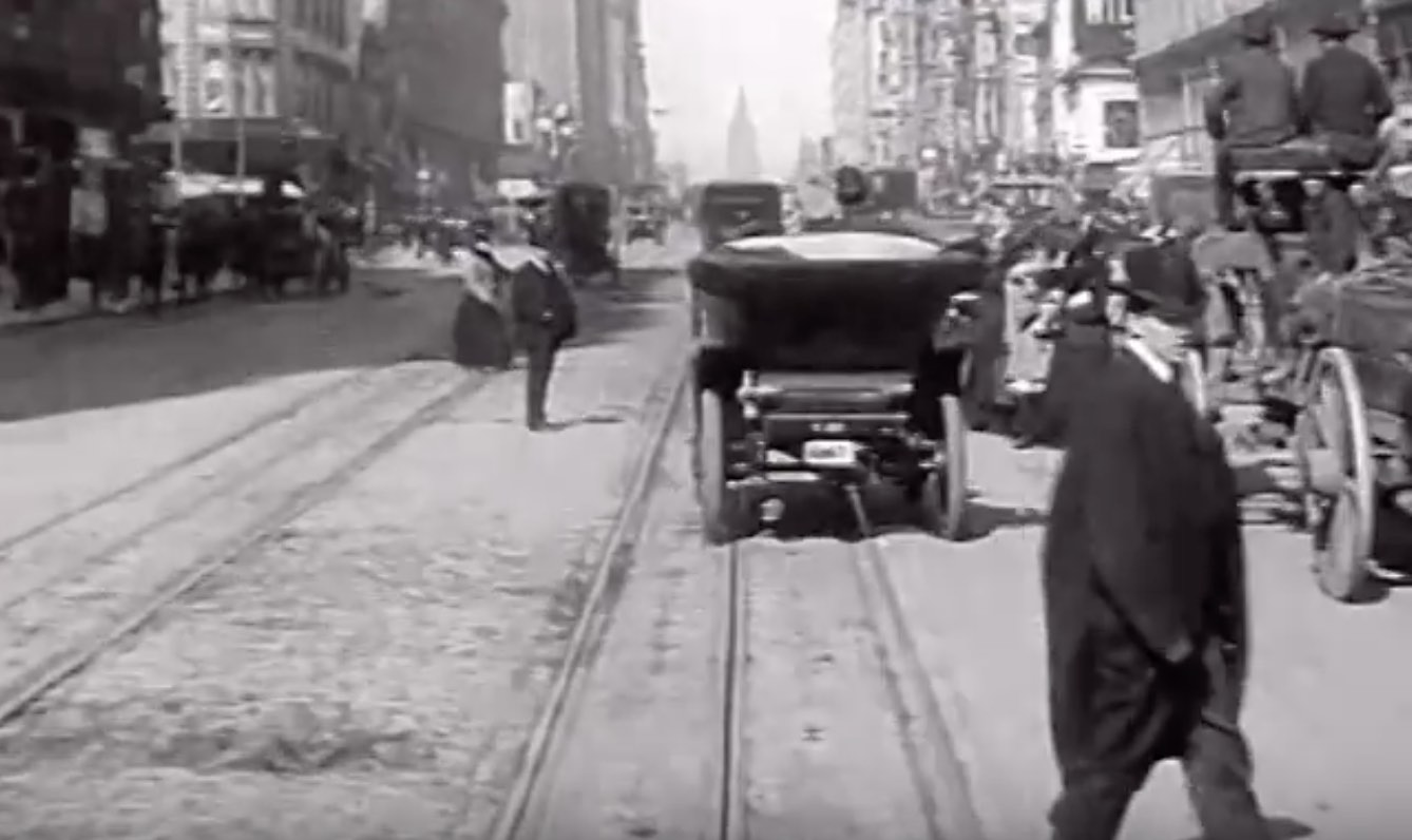
Before the mass adoption of the automobile in the 20th century, people walked, took trains, and used horses to move around. Walking was a normal part of urban life. Watch this incredible video of San Francisco in 1906 for a taste of how people moved through cities: early cars, horse-drawn carriages, cable cars, bicycles, and pedestrians mix it up on San Francisco’s largest street. People are fit and sprightly. With the introduction of the automobile, we gained the ability to move longer distances and more weight. Cities were redesigned around cars, crimes like jaywalking were invented, and freeways emerged to carry commuters to more distant suburbs. The early magic of fast-moving cars paved the way for new, unwanted externalities like traffic and pollution.
In response, writers like Jane Jacobs began introducing some of the ideas that we would later call “walkability”: streets are for people and cities should be planned around smaller and slower forms of movement. This would bring back some of the good things that were lost with the ascent of automobiles. For many years, walkability was an emerging idea in urban planning and academic circles but not otherwise well-known. Technology had introduced a new kind of problem. An idea of resistance was forming, but efforts were only beginning to coalesce into an identifiable movement.
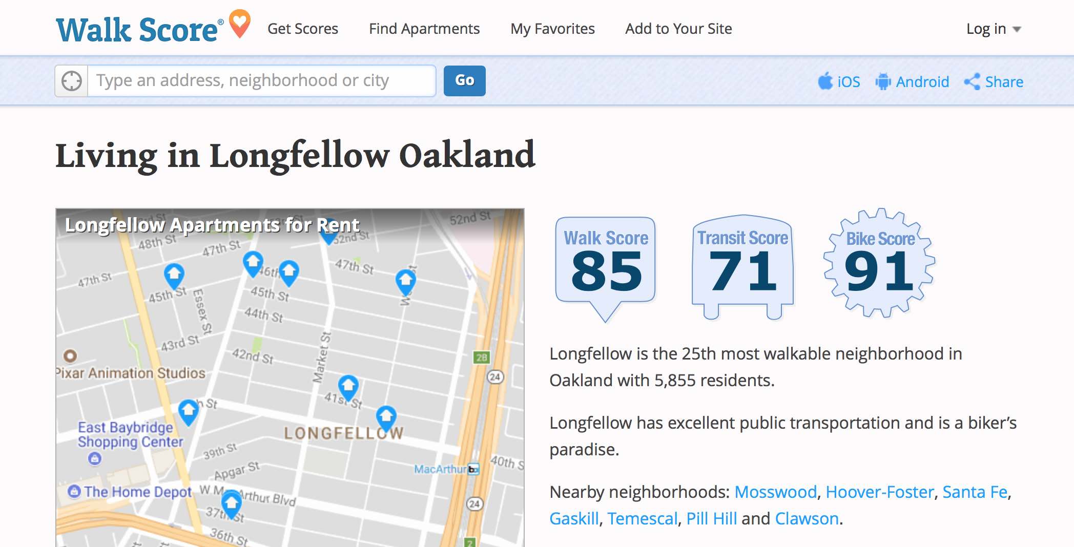
In 2007 Josh Herst founded Walk Score to help people find walkable places to live. The website is significant for two reasons.
First, it publishes scores as easy-to-understand numbers. It’s common to debate the precision of these numbers but they’re an accessible tool for conveying the idea of walkable neighborhoods. Based on measures of local businesses and infrastructure, good scores are now a common feature of real estate and apartment listings. A simple, portable number is an important handle for making a new idea accessible, and I take it as a sign of success that real estate agents and other non-political actors can now consider walkability in their work.
Second, Walk Score publishes scores for everywhere in the United States. It’s built on a mountain of both public and proprietary data. Scores are assembled from business listings, street networks, Census demographics, and USGS physical features. Walk Score accepted the challenge of producing a nationwide number based on complete data, something previously done by planners or researchers in limited local form.
So, we saw the technical advancement of gasoline-powered engines and an explosion of cars and car-oriented city planning, followed by an awareness of new problems and disadvantages once the initial shock and excitement had worn off.
In legislative redistricting, we’re living in a post-RedMap world. In 2010, the Republican party targeted low-level state legislative races with strategic funding injections in order to take control of state houses and subsequently the redistricting process in numerous states. They took full advantage of new technologies in GIS, mapping, and large-scale demographic data. We now see an unfair national map skewed in favor of various relatively-unpopular interests, and we’re seeing evidence that the skew allows even more extreme views to gain power.
There was a huge Republican wave election in 2010, and that is an important piece of this. But the other important piece of RedMap is what they did to lock in those lines the following year. And it's the mapping efforts that were made and the precise strategies that were launched in 2011 to sustain those gains, even in Democratic years, which is what makes RedMap so effective and successful … it gives them, essentially, a veto-proof run of the entire re-districting in the state. (NPR)
PlanScore is doing two things to address partisan gerrymandering.
We are creating score pages for district plans to provide instant, real-time analysis of a plan’s fairness. Each district plan will be evaluated for its population, demographic, partisan, and geometric character in a single place, with backing methodology and data provided so you can understand the number. We’ll publish historical scores back to the 1970s for context, current scores of proposed plans for voters and journalists, and dynamic scores of new plans for legislative staff who are designing tomorrow’s plans.
We are also assembling a collection of underlying electoral data from sources like Open Elections, elections-geodata, and other parallel efforts. Our goal is to provide valid scores for new plans in any state. As we await the outcomes of gerrymandering challenges in Wisconsin and North Carolina, voters and legislative staff in other states are wondering how to apply new ideas to their own plans. In 2020, everyone will have to redraw their maps. PlanScore will be a one-stop shop for district plan analysis.
The team behind PlanScore is uniquely positioned to do this well. Ruth Greenwood is a senior litigator on both major partisan gerrymandering cases, Gill v. Whitford in Wisconsin and LWVNC v. Rucho in North Carolina. Eric McGhee and Nicholas Stephanopoulos co-invented the efficiency gap. Simon Jackman is an expert witness in partisan gerrymandering cases and has collected and analyzed 40 years of relevant data. Our friends at GreenInfo Network will bring their years of expertise in mapping for the public interest to support the work. We’re currently doing two things: writing code in the PlanScore Github repository and raising money for the project for a launch before the decision in Whitford comes down in early 2018! Find us on Twitter @PlanScore for project updates.
Jun 9, 2017 10:31pm
blog all dog-eared pages: human transit

This week, I started at a new company. I’ve joined Remix to work on early-stage product design and development. Remix produces a planning platform for public transit, and one requirement of the extensive ongoing process is to have read Jarrett Walker’s Human Transit cover-to-cover. Walker is a longtime urban planner and transit advocate whose book establishes a foundation for making decisions about transit system design. In particular, Walker advocates time and network considerations in favor of simple spatial ones.
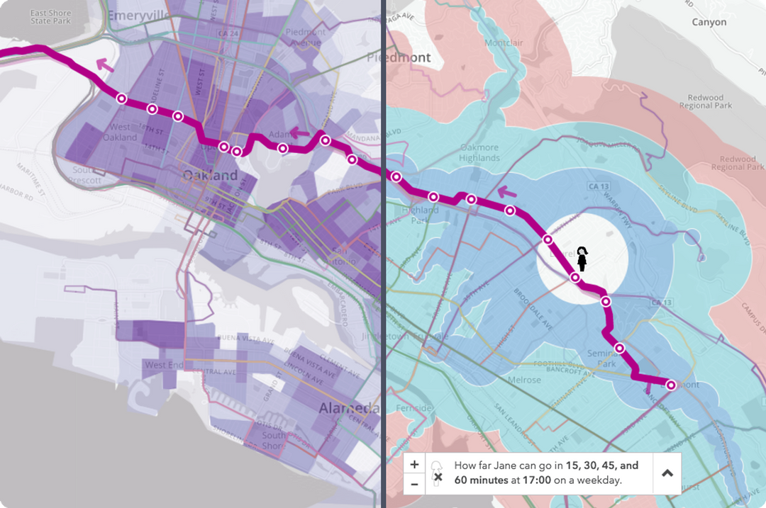
Many common public ideas about transit system design are actually misapplied from road network design when the two are actually quite different. For example, the frequency of transit vehicles (headway) has a much greater effect than their speed on the usability of a system. Uninformed trade-offs between connected systems and point-to-point systems can lead to the creation of unhelpful networks with long headways. Interactions between transit networks and the layout of streets they’re embedded in can undermine the effectiveness of transit even when it exists. All of this suggests that new visual mapmaking tools would be a critical component of better transit design that meets user needs, like the “Jane” feature of the current Remix platform showing travel times through a network taking headways into account. Here’s how far a user of public transit in Oakland can move from the Laurel Heights neighborhood on a weekday:
There’s an enormous opportunity here to apply statistical, urban, and open data to the problems of movement and city design.
These are a few of the passages from Human Transit that piqued my interest.
What even is public transit, page 13:
There are several ways to define public transit, so it is important to clarify how I’ll be using the term. Public transit consists of regularly scheduled vehicle trips, open to all paying passengers, with the capacity ti carry multiple passengers whose trips may have different origins, destinations, and purposes.
On the seven demands for a transit service, page 24:
In the hundreds of hours I’ve spent listening to people talk about their transit needs, I’ve heard seven broad expectations that potential riders have of a transit service that they would consider riding: 1) It takes me where I want to go, 2) It takes me when I want to go, 3) It is a good use of my time, 4) It is a good use of my money, 5) It respects me in the level of safety , comfort, and amenity it provides, 6) I can trust it, and 7) It gives me freedom to change my plans. … These seven demands, then, are dimensions of the mobility that transit provides. They don’t yet tell us how good we need the service to be, but they will help us identify the kinds of goodness we need to care about. In short, we can use these as a starting point for defining useful service.
On the relationship between network design and freedom, pages 31-32:
Freedom is also the biggest payoff of legibility. Only if you can remember the layout of your transit system and how to navigate it can you use transit to move spontaneously around your city. Legibility has two parts: 1) simplicity in the design of the network, so that it’s easy to explain and remember, and 2) the clarity of the presentation in all the various media.
No amount of brilliant presentation can compensate for an overly-complicated network. Anyone who has looked at a confusing tangle of routes on a system map and decided to take their car can attest to how complexity can undermine ridership. Good network planning tries to create the simplest possible network. Where complexity is unavoidable, other legibility tools help customers to see through the complexity and to find patterns of useful service that may be hidden there. For example, chapter 7 explores the idea of Frequent Network maps, which enable you to see just the lines where service is coming soon, all day. These, it turns out, are not just a navigation tool but also a land use planning tool.
On the distance between stops, pages 62-63:
Street network determines walking distance. Walking distance determines, in part, how far apart the stops can be. Stop spacing determines operating speed. So yes, the nature of the local street network affects how fast the transit line can run!
How do we decide about spacing? Consider the diamond-shaped catchment that’s made possible by a fine street grid. Ideal stop spacing is as far apart as possible for the sake of speed, but people around the line have to be able to get to it. In particular, we’re watching two areas of impact.
First, the duplicate coverage area is the area that has more than one stop within walking distance. In most situations, on flat terrain, you need to be able to walk to one stop, but not two, so duplicate coverage is a waste. Moving stops farther apart reduces the duplicate coverage area, which means that a greater number of unique people and areas are served by the stops.
Second, the coverage gap is the area that is within walking distance of the line but not of a stop. As the move stops farther apart, the coverage gap grows.
We would like to minimize both of these things, but in fact we have to choose between them. … Which is worse: creating duplicate coverage area or leaving a coverage gap? It depends on whether your transit system is designed mainly to meet the needs of transit-dependent persons or to compete for high ridership.
On Caltrain and misleading map lines, pages 79-80:
Sometimes, commuter rail is established in a corridor where the market could support efficient two-way, all-day frequent rapid transit. Once that happens, the commuter rail service can be an obstacle to any further improvement. The commuter rail creates a line on the map, so many decision makers assume that the needs are met, and may not understand that the line’s poor frequency outside the peak prevents it from functioning as rapid transit. At the same time, efforts to convert commuter rail operations to all-day high-frequency service (which requires enough automation to reduce the number of employees per train to one, if not zero) founder against institutional resistance, especially within labor unions. (Such a chance wouldn’t necessarily eliminate jobs overall, but it would turn all the jobs into train-driver jobs, running more trains)
This problem has existed for decades, for example, around the Caltrain commuter rail line between San Francisco and San Jose. This corridor has the perfect geography for all-day frequent rapid transit: super-dense San Francisco at one end, San Jose at the other, and a rail that goes right through the downtowns of almost all the suburban cities in between. In fact, the downtowns are where they are because they grew around the rail line, so the fit between the transit and urban form could not be more perfect.
…
Caltrain achieves unusually high farebox return (percentage of operating cost paid by fares) because it runs mostly when it’s busy, but its presence is also a source of confusion: the line on the map gives the appearance that this corridor has rapid transit service, but in fact Caltrain is of limited use outside the commute hour.
On cartographic emphasis and what to highlight, pages 88-89:
If a street map for a city showed every road with the same kind of line, so that a freeway looked just like a gravel road, we’d say it was a bad map. If we can’t identify the major streets and freeways, we can’t see the basic structure of the city, and without that, we can’t really make use of the map’s information. What road should a motorist use when traveling a long distance across the city? Such a map wouldn’t tell you, and without that, you couldn’t really begin.
So, a transit map that makes all lines look equal is like a road map that doesn’t show the difference between a freeway and a gravel road.
…
Emphasizing speed over frequency can make sense in contexts where everyone is expected to plan around the timetable, including peak-only commute services and very long trips with low demand. In all other contexts, though, it seems to be a common motorist’s error. Roads are there all the time, so their speed is the most important fact that distinguishes them. But transit is only there if it’s coming soon. If you have a car, you can use a road whenever you want and experience its speed. But transit has to exist when you need it (span) and it needs to be coming soon (frequency). Otherwise, waiting time will wipe out any time savings from faster service. Unless you’re comfortable planning you life around a particular scheduled trip, speed is worthless without frequency, so a transit map that screams about speed and whispers about frequency will be sowing confusion.
On the effects of delay in time, page 98:
In most urban transit, what matters is not speed by delay. Most transit technologies can go as fast as it’s safe to go in an urban setting—either on roads or on rails. What matters is mostly what can get in their way, how often they will stop, and for how long. So when we work to speed up transit, we focus on removing delays.
Delay is also the main source of problems of reliability. Reliability and average speed are different concepts, but both are undermined by the same kinds of delay, and when we reduce delay, service usually runs both faster and more reliably.
Longer-distance travel between cities is different, so analogies from those services can mislead. Airplanes, oceangoing ships, and intercity trains all spend long stretches of time at their maximum possible speed, with nothing to stop for and nothing to get in their way. Urban transit is different because a) it stops much more frequently, so top speed matters less than the stops, and b) it tends to be in situations that restrict its speed, including various kinds of congestion. Even in a rail transit system with an unobstructed path, the volume of trains going through imposes some limits, because you have to maintain a safe spacing between them even as they stop and start at stations.
On fairness, usage, and politics, page 105:
On any great urban street, every part of the current use has its fierce defenders. Local merchants will do anything to keep the on-street parking in front of their businesses. Motorists will worry (not always correctly) that losing a lane of traffic means more congestion. Removing landscaping can be controversial, especially if mature trees are involved.
To win space for transit lanes in this environment, we usually have to talk about fairness. … What if we turned a northbound traffic lane on Van Ness into a transit lane? We’re be taking 14 percent of the lane capacity of these streets to serve about 14 percent of the people who already travel in those lanes, namely, the people already using transit.
On locating transit centers at network connection points, pages 176-177:
If you want to serve a complex and diverse city with many destinations and you value frequency and simplicity, the geometry of public transit will force you to require connections. That means that for any trip from point A to point B, the quality of the experience depends on the design of not just A and B but also of a third location, point C, where the required connection occurs.
…
If you want to enjoy the riches of your city without owning a car, and you explore your mobility options through a tool like the Walkscore.com or Mapnificent.net travel time map, you’ll discover that you’ll have the best mobility if you locate at a connection point. If a business wants its employees to get to work on transit, or if a business wants to serve transit-riding customers, the best place to locate is a connection point where many services converge. All these individual decisions that generate demand for especially dense development—some kind of downtown or town center—around connection points.
…
In the midst of these debates, it’s common to hear someone ask: “Can’t we divide this big transit center into two smaller ones? Can’t we have the trains connect here and have the buses connect somewhere else, at a different station?” The answer is almost always no. At a connection point that is designed to serve a many-to-many city, people must be able to connect between any service and any other. That only happens if the services come to the same place.
On the importance of system geometry, page 181:
We’ve seen that the ease of walking to transit stops is a fact about the community and where you are in it, not a fact about the transit system. We’ve noticed that grids are an especially efficient shape for a transit network, so that’s obviously an advantage for gridded cities, like Los Angeles and Chicago, that fit that form easily. We’ve also noticed that chokepoints—like mountain passes and water barriers of many cities—offer transit a potential advantage. We’ve seen how density, both residential and commercial, is a powerful driver of transit outcomes, but that the design of the local street network matters too. High-quality and cost-effective transit implies certain geometric patterns. To the extent that those patterns work with the design of your community, you can have transit that’s both high-quality and cost-effective. To the extent that they don’t, you can’t.
On looking ahead by twenty years, page 216:
Overall, in our increasingly mobile culture, it’s hard to care about your city twenty years into the future, unless you’re one of a small minority who have made long-term investments there or you have a stable family presence that you believe will continue for generations.
But the big payoffs rest in strategic thinking, and that means looking forward over a span of time. I suggest twenty years as a time frame because almost everybody will relocate in that time, and most of the development not contemplated in your city will be complete. That means virtually every resident and business will have a chance to reconsider its location in light of the transit system planed for the future. It also means that it’s easier to get citizens thinking about what they want the city to be like, rather than just fearing change that might happen to the street where they live now. I’ve found that once this process gets going, people enjoy talking thinking about their city twenty years ahead, even if they aren’t sure they’ll live there then.
Jun 2, 2017 5:39am
the levity of serverlessness
As tech marketing jargon goes, “serverless” is a terrible word. There’s always a server and the cloud is just other people’s computers, it’s only a question of who runs it. I like Kate Pearce’s take:
The next time you try and use the word “serverless” just remember it’s like calling takeout “kitchenless”.
Still, Amazon’s supposedly-serverless Lambda offering has some attractive qualities so I’ve used it on a selection of projects during the past few months. I’ve learned a bit about making Lambda work in a Python development flow. Having already put my head through this wall, maybe this post will help you find it easier?
The key differences between running code on Lambda instead of a server you manage emerge in costs, downtime, heavy usage, and development constraints. You pay for the resources you consume measured in milliseconds. With a virtual server, you pay for uptime measured in hours. Lambda is free when it’s not in active use, unlike a virtual server that costs money when sitting idle waiting for requests. Lambda can accept large concurrent request volumes. Virtual servers may instead need to be spun up over a period of minutes to deal with increased demand. In some ways it’s closer to Google’s old App Engine service than Amazon’s EC2, similar to Heroku’s platform service, and definitely closer to my own assumptions about EC2 at the time it first launched a decade ago (I didn’t realize EC2 was regular Linux boxes in the sky). The heavy cost for these scaling properties comes in several constraints: a Lambda function can only run for a few minutes and consume a small amount of memory, and must be written in one of a limited number of languages.
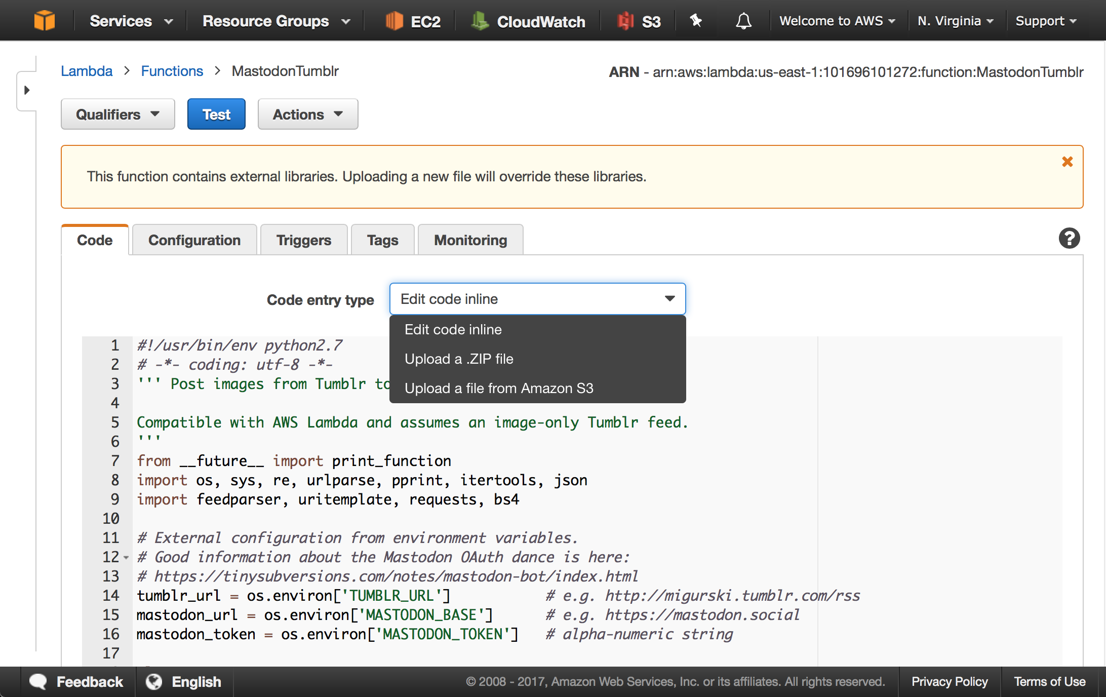
I’ve used it in three projects of increasing complexity: a script for reposting images from my Tumblr account to my Mastodon account, a simple form-based data collector, and a new service for scoring legislative district plans (more on that in a future post).
Some things worked as-advertised.
Stuff That Just Worked
- Python 3.6
- Execution limits
- Different invocation types
- Integrations with other AWS services
- AWS CLI, the command line client
For a while, only Python 2.7 was supported by AWS Lambda. This made it kind of a toy — anything serious I do in Python now, I do in version 3 to get the advantage of good unicode support. Sometime last month, Python 3.6 support was added to Lambda making it immediately compatible with my own development preferences. The Python 3.6 support is real, and comes with the full standard library you’d expect anywhere else. It’s possible to write serious code and deploy it now.
The documented limits seem to work as promised: functions can reliably run for up to five minutes, and the provided Context object will tell you how much time you have remaining in milliseconds. When you go over time (or over memory, though I have not experienced this) the function is halted without notice. Execution logs go to Cloudwatch, where the amount of billed time is recorded.
There are two invocation types, “Event” and “RequestResponse”. The first is used in situations where you want to trigger a function and you don’t care about its return value, such as scheduled tasks. The second is used when you need the response immediately, and is especially useful together with API Gateway for writing functions that can be called by users via an HTTP request. Event invocation is pretty useful: you can’t run a Lambda function directly from a queue, but you can invoke the function as an Event and let it run for an indeterminate period of time while responding immediately to a user request. It’s a useful way to get queue-like behaviors cheaply.
Generally, interactions with other AWS services work well. I’m new to Cloudwatch Logs, but it’s the only output mechanism available for debugging a Lambda function running on the platform. When a function is retried and fails twice, a warning message can be sent via SNS or pushed to a queue. Lambda functions are not ordinarily accessible from the public web, but the API Gateway service makes it possible to map a URL to a function so it can be used on a website. All basic stuff, but it works together effectively. I’ve found it useful to keep numerous browser tabs open with the AWS Console because it can be confusing to track each of these services.
Finally, the AWS CLI is a great command-line client for all AWS services. Terminology between the developer console, the CLI, and the underlying Boto SDK is consistent, and actions available in a browser are equally available via the CLI client. This makes it possible to script certain deployment tasks as part of an automated process, and experiment with AWS actions before writing code.
Some other things about Lambda remain a pain.
Stuff That Sucks
- Editing code
- Configuring API Gateway
- Development environments
Editing non-trivial code is a bummer. The basic interface to Lambda is an editable text box where you can type (or paste) code directly. In my browser, Safari on OS X, certain operations like copy/paste frequently fail in the text box. A Zip archive upload is provided as an alternative, and the AWS CLI can let you do this programmatically. On slow internet this introduces a prohibitive time delay uploading large function packages. Heroku’s Git model and integration with service like Github feels much more mature and conducive to a smooth development and deployment flow.
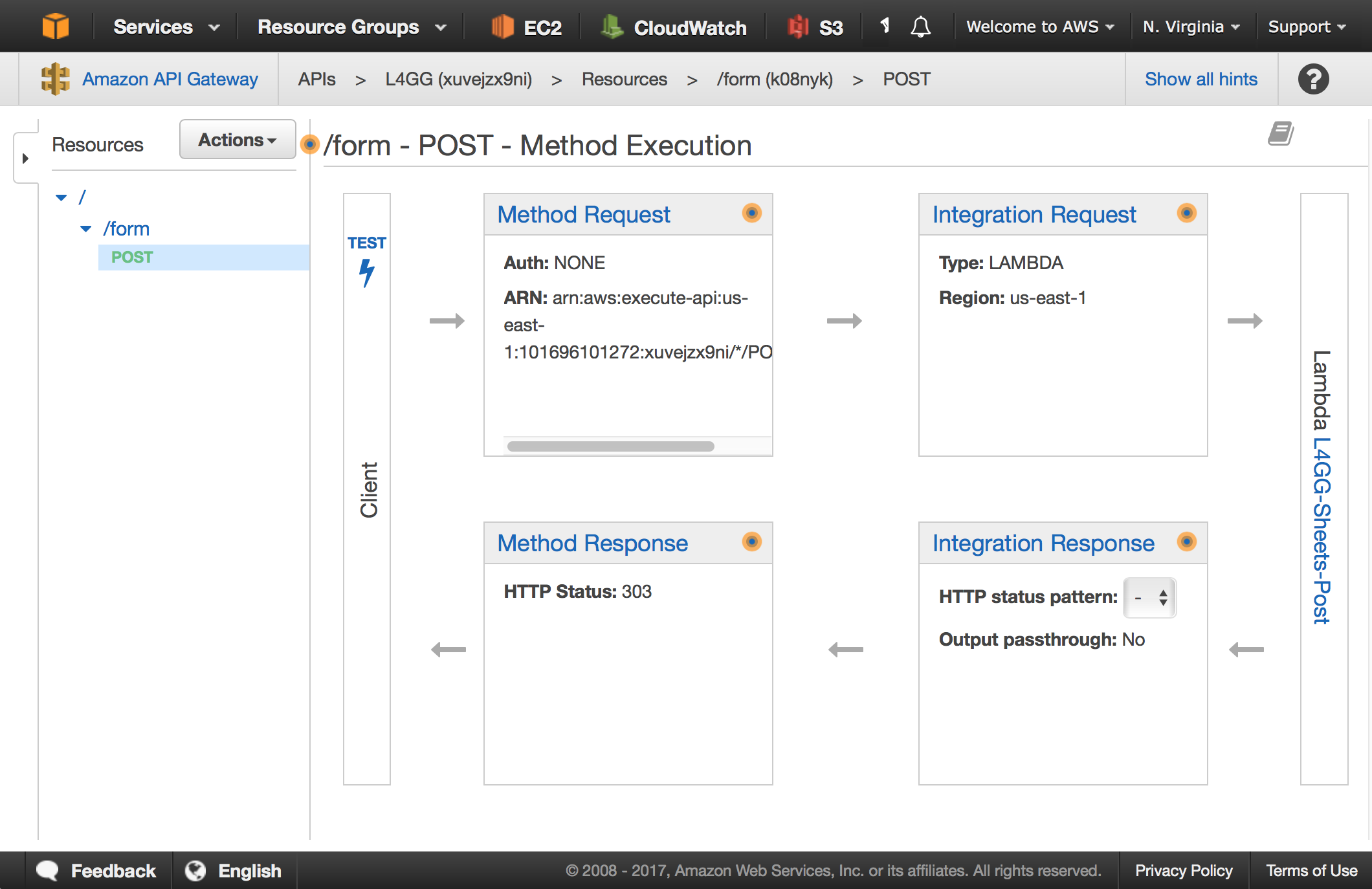
Working with the API Gateway service is unfortunate, with four interlocking pieces of configuration: Method Request, Integration Request, Integration Response, and Method Response. Configured settings in each are interdependent, such as the status code and header behaviors in the two response configurations. Getting “normal” HTTP things like form submissions to work involves some pretty weird Stack Overflow driven development, and generally feels hacky. I have mostly found configuring API Gateway to be a trial-and-error process. I’ve heard that Swagger helps with this in some way, but it also appears to overengineer a lot of unrelated things so I’ve ignored it.
Finally, it’s difficult to spin up a quick dev environment with all these services. I’ve ended up continuously deploying to production as I work, not dissimilar from old-style FTP-based development. Heroku has always done this very well with entire stacks magicked out of Github pull requests, and the recently-departed Skyliner.io platform did a great job with AWS configurations specifically. AWS API Gateway does have the concept of deployment stages, but it’s only one piece of the overall picture. AWS Cloudformation is supposed to help with this, but it’s big and impenetrable and I haven’t yet invested the time to understand if it’s an answer or more questions.
Fortunately, a bunch of other things I thought would be difficult turned out to work really well in Lambda after a bit of effort to learn more about the model.
Stuff I Learned
- Packaging for deployment
- Deploying from a CI service
- Including compiled binaries
- Uploading one well-tested package for multiple functions
- Using Proxy Integration to make requests sane
As soon as I wanted to use Amazon’s Python SDK Boto to talk to other Amazon services from Lambda, I realized I was going to need to build a package larger than a single file. Lambda’s deployment advice shows how to use Pip to build a zip archive for upload to Amazon, so I’ve been adding that to project build scripts. Pip’s target directory option creates the right structure for Lambda’s use, which means that my usual requirements declarations now just work with Lambda.
Once Boto was added to the package, the size immediately ballooned to several megabytes. Boto is pretty big, and doesn’t include an option for building a minimal version. So, I was creating code builds much too large to effectively upload from my home DSL or my mobile tether. I wanted to be able to deploy via incremental Git pushes as Heroku allows, and fortunately Circle CI’s deployment feature made this possible. After adding master branch deployment to my testing configurations, I no longer needed to wait for lengthy network transfers on my local connection.
The next addition that ballooned my package sizes was GDAL, a compiled binary library for working with geographic data. Fortunately, Seth Fitzsimmons and Matthew Perry have each worked on this before and provided details on making GDAL work with Lambda. Seth in particular has become something of an expert in getting hard-to-compile binary software like GDAL and Mapnik working on platforms like Lambda and Heroku. I’m enormously lucky to be able to benefit from his work. I used Seth’s Docker-based build hints to include GDAL in the Lambda packages. With GDAL’s addition and a few other dependencies, the overall package size had increased to 25MB so I was grateful for Circle CI’s role in the process.
The actual differences between different function packages were quite miniscule by this point, so I’ve been uploading a single package to Lambda for multiple functions and using a minimal entry point script to provide handler functions. This organization has helped in a few ways. When Lambda invokes a handler from within a module, it doesn’t allow for relative imports that are useful for building a real package. I looked for ways around this and found a 2007 note from Guido van Rossum arguing that “running scripts that happen to be living inside a module’s directory” is “an antipattern”. Moving those scripts out to a short file outside the module is closer to the spirit of Guido’s intended usage. Also, it makes comprehensive testing of a module easier to complete.
After messing around with API Gateway’s various input and output options, I’ve concluded that Lambda Proxy Integration is the only way to go. Lambda handlers will never see CGI-style HTTP input as Heroku applications do, but API Gateway sends the next best thing with a dictionary of HTTP input details. These are under-documented so it’s taken some trial-and-error to get input working. I’ve considered writing a small Lambda/Flask bridge using these objects in order to write an application that can be fully run locally, and hopefully the example provided in Amazon’s docs is sufficiently comprehensive.
Conclusion
Working with Lambda still feels fairly uphill, and I’m hoping to improve on some of the challenges above. As I’ve been writing an application with no users, it’s been easy to update live Lambda functions. A next step would be to configure a second development environment with all the necessary interconnecting parts. I’m pretty pleased with the tradeoffs, assuming that Lambda’s scaling advantages work as-promised.

May 9, 2017 4:17pm
three open data projects: openstreetmap, openaddresses, and who’s on first
I work in or near three major global open data collection efforts, and I’ve been asked to explain their respective goals and methods a few times in the past couple months. Each of these three projects tackles a particular slice of geospatial data, and they can be used together to build map display, search, and routing services. There are commercial products that rely on these datasets you can use right now including Mapbox Maps, Directions, and Mapzen Flex. Each data project started small and is building its way up to challenge proprietary data vendors in a familiar “slowly at first, then all at once” pattern. Each can be used as a data platform, supporting new and interesting work above.
These are some introductory notes about the three projects, please let me know in comments if I’ve missed or misrepresented something. I’m looking at four things:
- Project history
- What kind of data is inside?
- How is data licensed?
- Who uses it, and where?
OpenStreetMap - openstreetmap.org
OpenStreetMap (OSM) is an early, far-reaching open geodata project started by Steve Coast in 2004. OSM’s goal is a global street-scale map of the world, and over thirteen years it has been largely achieved. OSM data collection started in the United Kingdom around London, expanded to western Europe and the U.S., and later other countries. Initially an audacious project, OSM communicated its aims through projects such as a 2005 collaboration with Tom Carden producing a ghostly map of London made up of GPS traces collected via a courier company. OSM became convincing around 2006/07 when larger-scale imports such as U.S. Census TIGER/Line seeded whole-country coverage beyond the U.K. and Europe.
OSM data is built on user-contributed free-form tags. Over time, a core set of well-understood descriptions for common features like roads, buildings, and land use has emerged. Today, OSM boasts strong global data coverage in urban and rural areas.

An important rubric for OSM data edits is verifiability: can two people in the same place at different times agree on tags for a feature based on its appearance? There will always be debates about precise tagging schema but generally it’s possible to agree on features like residential roads, motorways, one-way streets, building footprints, parks, and rivers. Historically, OSM editors have preferred direct visits and observation of features to “armchair mapping,” a term for editing based on remotely-collected data such as satellite imagery.
OSM data has always been distributed with a license that requires attribution and share-alike. Before 2012 this was a Creative Commons (CC-BY-SA) license with copyright belonging to individual project contributors. Since 2012 the license is the Open Database License (ODbL) with copyright belonging to the OpenStreetMap Foundation (OSMF). OSMF is governed by an elected board that also holds the OSM name and trademark. ODbL requires that datasets derived from OSM also be released under the ODbL license per the share-alike clause. Many derived works such as renders or pictures of the data are not covered by the ODbL. There has long been a measure of controversy and fear, uncertainty, and doubt connected to the ODbL. OSMF publishes some guidelines about its applicability and is working on further guidance for its behavior in cases like search and geocoding. Nevertheless, major companies like Mapbox, Telenav, Apple, Uber, Mapzen (Samsung), and others have found it an acceptable license for many uses.
- OpenStreetMap Foundation homepage
- Open Database License links and information
- Open Database License Relicensing FAQ from 2012
OSM is of sufficiently high quality in populated areas to act as a display map rivaling proprietary commercial data. Thanks to its open license, mapping apps for offline use on mobile devices are a popular genre of applications for normal use. Mapbox in particular has built a substantial display mapping business on OSM data. OSM’s data quality for routing uses has also been growing, and both Mapzen and Mapbox offer commercial routing services with the data. OSM lacks certain features of proprietary routing data providers such as consistent turn restrictions and speed limits, but higher-level telemetry efforts can backfill this gap and even provide realtime traffic.
In recent years OSM has become a critical tool for international aid agencies like the Red Cross, and is often used as a reference map for disaster preparedness and response. For remote areas, organizations such as Digital Globe and Facebook are experimenting with satellite imagery feature detection techniques to improve the map, while Humanitarian OpenStreetMap Team (HOT) has provided ground mapping support and programs in locations such as Indonesia, Kibera, Haiti, Nepal, and elsewhere.
- Humanitarian OpenStreetMap Team homepage
- Facebook’s announcement of AI-assisted road tracing for OSM
- Map Kibera from 2009
- My own blog post on ca. 2016 trends in OSM editing
OpenAddresses - openaddresses.io
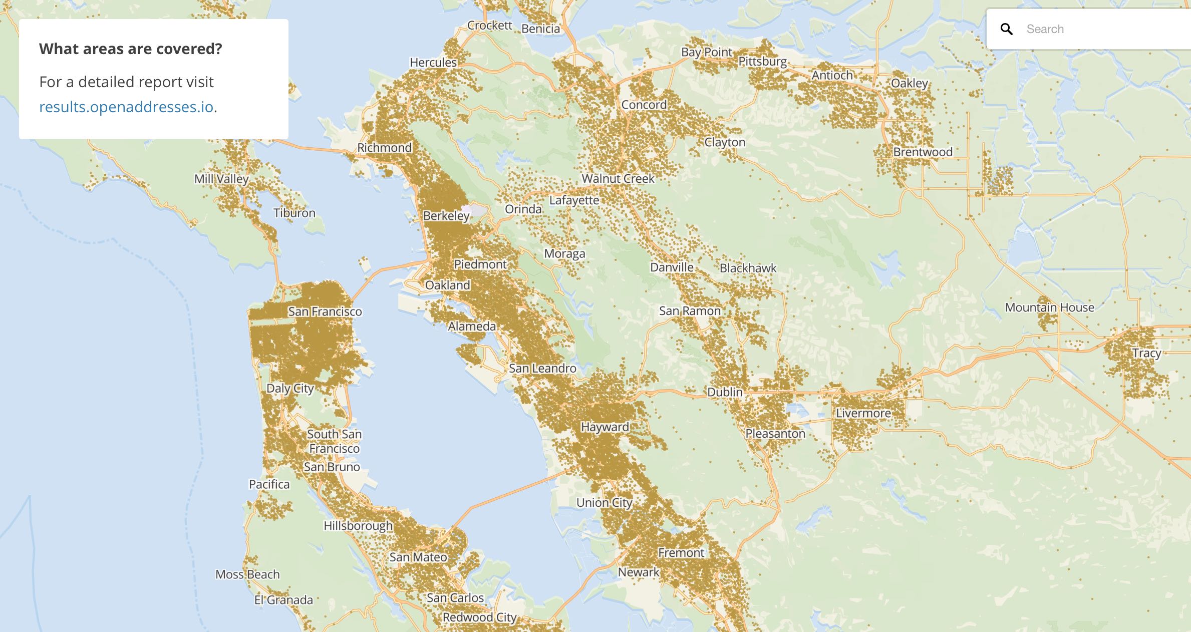
OpenAddresses (OA) is a relatively young project, started in 2014 by Ian Dees. OA’s goal is a complete set of global address points from authoritative sources. The first revision of OA was a spreadsheet of data sources compiled by Ian, after a suggested import of Chicago-area addresses was rejected by OpenStreetMap’s import working group. Nick Ingalls joined the project and produced the first automated code for processing OA data and began republishing aggregated collections of data. Metadata about address data sources moved from the initial spreadsheet to Github, where it was possible for a larger community of editors to use Github’s pull request workflow to add more data. I incorporated Nick’s code into a continuous integration process to make it faster and easier to contribute. Today, OA has ~460m address points around the world, with complete coverage of dozens of countries. The U.K. is notably missing, due to the privatization of Royal Mail several years back.
- First OpenAddresses spreadsheet data collection
- OpenAddresses sources on Github
- Guidelines for OA contributors
- Current OA data available for download
An important criteria for inclusion in OA is authoritativeness: the best datasets are sourced from local government authorities in a patchwork quilt of frequently-overlapping data. In the U.S., duplicate addresses might be sourced from city, county, and state sources. In many international cases, a single national scale data source like Australia’s GNAF provides correct, complete coverage. OA publishes point data, though points might come from a combination of rooftop, front door, and parcel centroid sources. OA’s data schema divides addresses into street number, street name, unit or apartment number, city, postcode, and administrative region. Only the street number and name are required for a valid OA data source.
OA’s JSON metadata files describing an address source are licensed under Creative Commons Zero (CC0), similar to public domain. The address data republished by OA keeps the upstream copyright information from its original sources. In some cases, sources require attribution. In a small number of cases, source license include a share-alike requirement. License features required by upstream authorities are maintained in OA metadata, and downstream users of the data are expected to use this information.
- Sample JSON metadata for addresses in Australia
- Sample JSON metadata for addresses in Alameda County, California
- Explanation of “share-alike” license requirements
OA data coverage varies worldwide, depending on open data publishing norms in each country. In the U.S., OA data covers ~80% of the population, and has been growing as small local authorities digitize and publish their address data. In some countries, complete national coverage exists at a single source. OA can be used as a piecemeal replacement for proprietary data on a country-by-country basis, or state-by-state in the United States. Mapzen’s search service uses OA data for both forward and reverse geocoding. Many OA data sources come from county tax assessor parcel databases, which may only partially reflect a full count of street addresses. It’s common for geocoders to use interpolation to fill in these spaces, with examples from Mapzen and Mapbox showing how.
Data contributors come from a variety of backgrounds. In some cases, paid contractors are working to expand OA coverage. In others, academic experts on address data seek out and describe international sources. Sometimes, a single large country import comes via a local expert.
Who’s On First - whosonfirst.mapzen.com
Who’s On First (WOF) is a gazetteer for international place and venue data started in 2015 by Aaron Cope at Mapzen, and now maintained by a data team. Data is stored as GeoJSON geometries with additional properties in numerous interconnected Github repositories. Data typically stored in WOF includes polygons for countries, administrative divisions, counties, cities, towns, postcodes, neighborhoods, and venues. WOF also accepts point data for venues and businesses. WOF properties can be very detailed, and typically feature multiple names for well-known places, such as “San Francisco,” “SF,” and even colloquial names like “Frisco.” Some WOF properties point to other datasets, such as Wikipedia or Geonames. These are called concordances, and make WOF especially useful for connecting separate data efforts. WOF geometries come in a variety of flavors, such as mainland area for San Francisco vs. the legal boundary that includes parts of the Bay and the distant Farallon Islands. Features in WOF each have a single numeric identifier, and can be connected in hierarchical relationships by way of these IDs.
- 2015 announcement of Who’s On First
- California, San Francisco, and Transamerica Building in WOF.
- Summary of WOF links to Wikipedia

WOF data can be quite free-form, and at various times new kinds of data such as postcodes or business locations have been imported en masse. Special consideration has been paid to unique features like New York City, which spans several counties in New York and is comprised of boroughs. As a result, WOF data can be considered late binding. It’s up to a user of WOF to determine how to interpret the complete hierarchy and narrow the list of properties to a smaller set of useful ones. Five levels in the placetype hierarchy are standard: continent, country, region (like a state), locality (like a city), and neighbourhood.
WOF’s license is a combination of upstream projects under CC-BY (GeoNames and GeoPlanet), Public Domain (Natural Earth and OurAirports) and other licenses. Data quality varies due to the diversity of sources: some data comes from SimpleGeo’s 2010 data, some from Flickr- and Twitter-derived Quattroshapes, and some from official or local sources. Quality is good and WOF places generally include accurate location and size, but geometries are not necessarily suitable for visual display. Attribution is required, but no WOF data is under a share-alike license.
A major user of WOF data is Mapzen’s own search service, via the Pelias project. WOF results for venues and places are returned directly in Mapzen Search, and also used at import time to provide additional hierarchy for bare address points.
Mapzen is the primary sponsor of Who’s on First, and most data enters the project by way of Mapzen’s own staff and contractors. Contributions are governed via Github, and the many repositories under the “whosonfirst-data” organization are the authoritative sources of WOF data. The project provides downloadable bundles of data by placetype in GeoJSON format, such as as the five core hierarchy levels of continents, countries, regions, localities, and neighborhoods.
- WOF data organization in Github
- Downloadable bundles of WOF data
- Pull request template for WOF contributors
Land Of Contrast
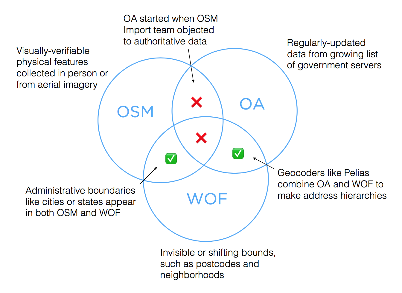
The boundaries between each of these datasets are fairly clear, with some overlaps.
- OA began when Ian Dees was unable to convince OSM’s Import group to accept Chicago addresses. Authoritative addresses can violate OSM’s verifiability heuristic, because they don’t always come with a visible house number. Authorities also update data continuously, which can be hard to reconcile after an initial one-time import to OSM. The two datasets would diverge.
- There are some addresses in OSM, typically formatted using the Karlsruhe schema. Availability varies.
- WOF includes boundaries which are often invisible, such as postcodes and neighborhoods. They are therefore hard to verify through surveys or remote mapping, making them a poor fit for OSM.
- Some easily-verifiable boundaries like city and state borders appear in both OSM and WOF, though they’re often implemented as connected linestrings in OSM and closed polygons in WOF, reflecting the uses of each data set.
- Both WOF and OA eschew OSM’s ODbL share-alike license clause, so that they can be used in tandem to run geocoders. OSMF is trying to come up with formal guidance for use with geocoders, but meanwhile it’s simpler to offer attribution-only data from WOF and OA when serving search results.
Apr 6, 2017 6:17pm
building up redistricting data for North Carolina
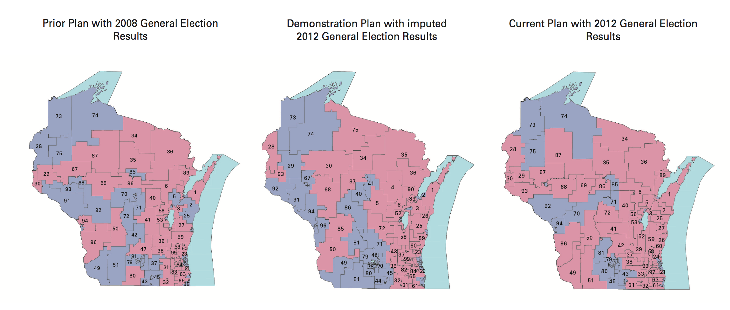
The 2020 Decennial Census is getting closer, and activity around legislative redistricting is heating up. It’s normal for states to redraw lines in connection with the Census, but we’re also seeing legal challenges to Republican gerrymanders in states like Wisconsin, North Carolina, Virginia, and elsewhere. There’s a big opportunity here to look holistically at state district boundaries and their effects on votes, but it’ll only be possible with high-quality, detailed, and easily-accessible data about past votes. I’ve been working on a set of such data for North Carolina’s 2014 general election, and I’m publishing it in CSV, GeoJSON, and Geopackage formats.
Problems
Many common measures of district plan quality (like the efficiency gap for partisan outcomes or racial demographics for the Voting Rights Act) are quite intuitive, but we need a common set of facts to work from.
Right now, those facts are hard to get for a variety of reasons:
- Getting precinct-level geography data often requires 1-on-1 requests and local state knowledge, so it’s often only requested by journalists or researchers who need it for some specific project. Ryne Rohla’s recent to build a national precinct map of presidential races is a great example of this: “Hundreds of emails and phone calls and months of work later, here’s what I came up with… For a number of states, I had to create precinct shapefiles almost entirely by hand.”
- Other efforts like the LA Times California map echo Rohla’s, with duplicative and overlapping efforts to gather the same data. The U.S. Census ran a 2010 Voting Tabulation District shapefile program to assemble some of this data, but for predictive purposes the data should be more recent.
- Vote totals typically require manual or custom data entry. The Open Elections project (OE) is helping tremendously with this, offering a central space for unified data collection. OE’s efforts are resulting in a growing collection of cleanly-formatted vote totals.
- Some data must be imputed, or inferred from neighboring data. For example, votes in an uncontested legislative district with only a single major-party candidate can’t be used to predict how a competitive race would look in that district. You need data for other races and other districts to make educated guesses, and this is tricky.
I’ve been learning what I can about legislative district plans to determine how feasible it would be to gather such data and make it available to political staff, journalists, and members of the public for the upcoming wave of redistricting efforts. An easy-to-get and easy-to-use baseline of code and data for district plan fairness would make it possible for anyone to rapidly and accurately respond to a proposed plan. There’s a big opportunity here for an online, web-based tool that can do this but it’ll need data that’s not yet collected in one place.
North Carolina
A few weeks ago, I looked at partisan outcomes for randomized redistricting plans in Wisconsin based on the efficiency gap metric. I generated thousands of possible plans, and came up with predictions for outcomes based on Professor Jowei Chen’s randomized Florida redistricting paper. I’m using this work to support work on comprehensive databases of electoral data, such as the election geodata repo that Nathaniel Vaughn Kelso and I have been working on and Open Elections.
This week, I shifted my attention to another priority state, North Carolina. As Stephen Wolf points out in DailyKos,
It’s the only one with truly competitive races for president, Senate, and governor. Remarkably, though, not a single seat is expected to change hands in the state’s House delegation, where Republicans hold a lopsided 10-to-3 advantage over Democrats.
The 2014 general election featured over 40% unopposed State Senate seat elections. In 21 of 50 races, no one bothered to compete on one side.
North Carolina is also home to some jaw-dropping partisan racial shenanigans detailed in The Atlantic:
“In North Carolina, restriction of voting mechanisms and procedures that most heavily affect African Americans will predictably redound to the benefit of one political party and to the disadvantage of the other,” Motz wrote. “As the evidence in the record makes clear, that is what happened here.”
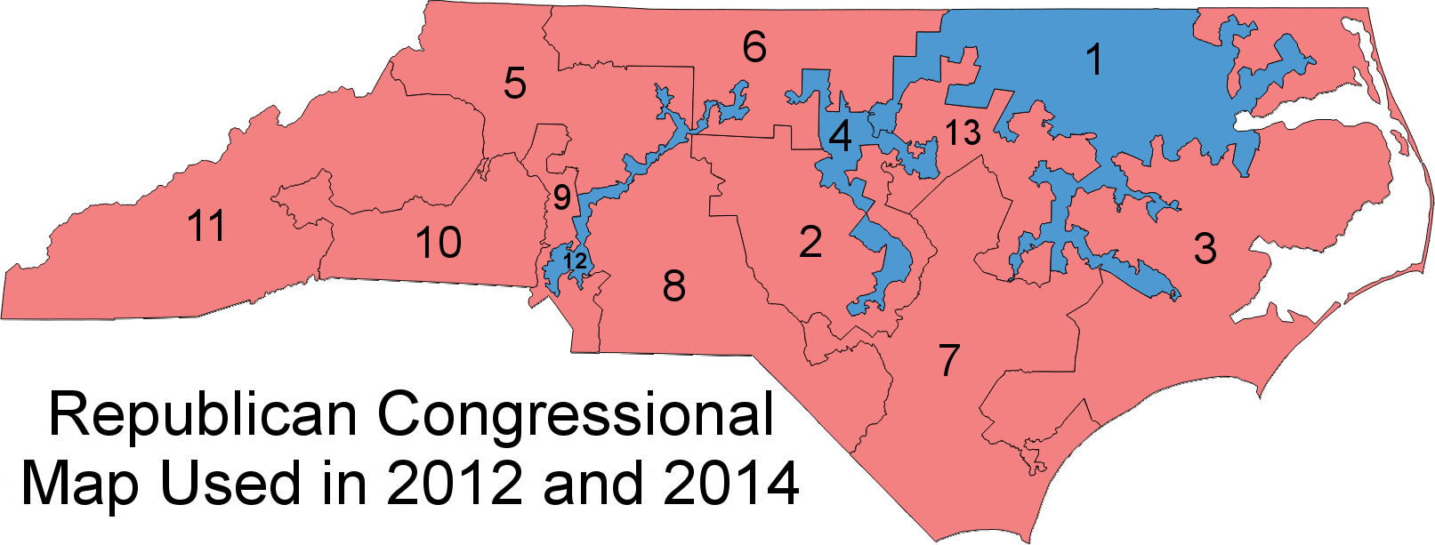
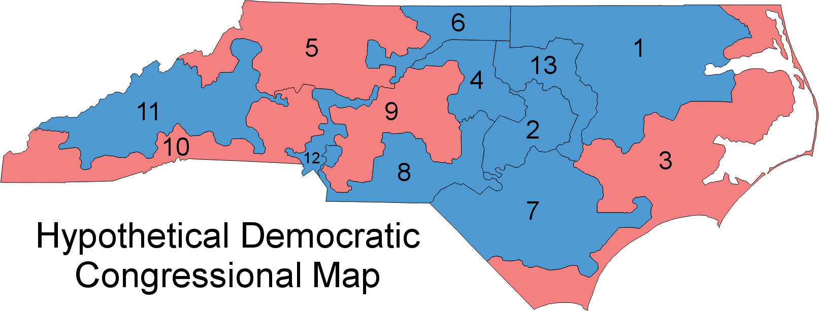
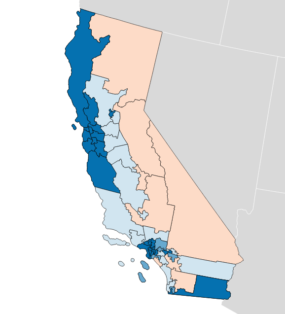
Overall, North Carolina looks like a state with artificial barriers erected by Republican lawmakers during a time when the overall state voting population is migrating leftward. The state’s U.S. Congressional district plan shows this cleary:
Stephen Wolf again:
Following the 2010 census, Republicans crammed as many Democrats as they could into just three districts, taking in parts of dark-blue Charlotte, Durham, Greensboro, Raleigh, and other cities, along with black voters in the rural northeast, almost all of whom vote Democratic. When Republicans couldn’t pack in Democrats from other liberal cities like Asheville in western North Carolina or Wilmington in the southeast, they cracked them between two seats containing other heavily Republican turf. With surgical precision, Republicans spread out their own voters almost perfectly evenly among the other 10 districts, making sure that none would be either blue enough to be vulnerable or too heavily tilted to the right such that Republican votes would “go to waste.”
New Data
Luckily, North Carolina also features excellent geographic and electoral coverage:
- Open Elections has precinct-level 2014 data
- Election Geodata has 2014 precinct geographies
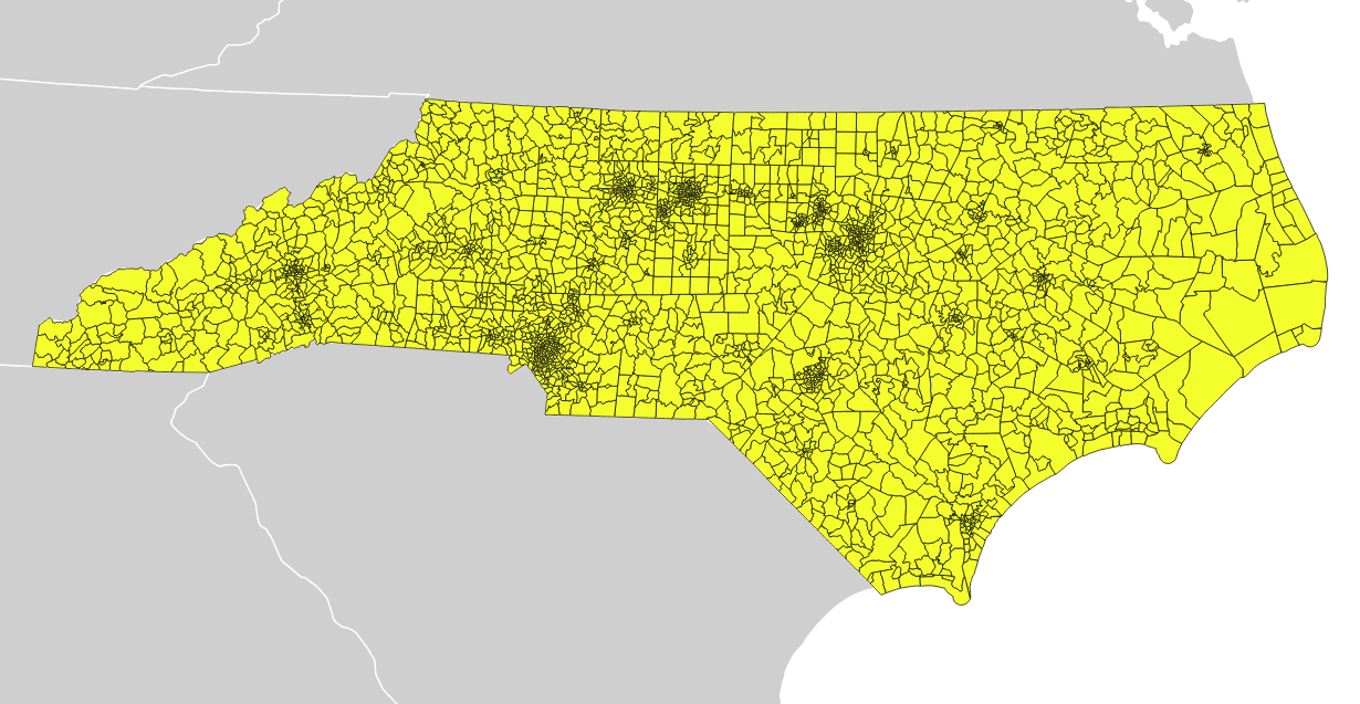
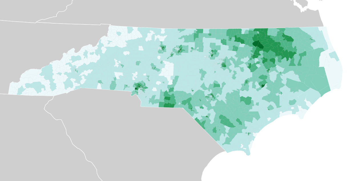
Taken together and combined with American Community Survey 2015 data from Census Reporter, it’s possible to generate a resonably accurate picture of 2014 voter behavior and demographic information for all 2,725 precincts in North Carolina:
- CSV file: nc_complete-2014.csv
- GeoJSON file: North-Carolina-2014.geojson.gz (9.2 MB compressed)
- Geopackage file: North-Carolina-2014.gpkg.gz (18.9 MB compressed)
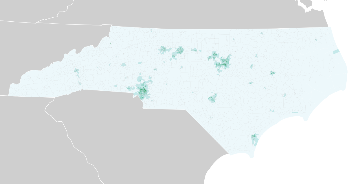
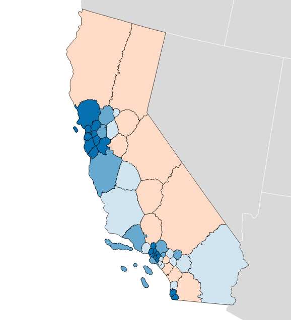
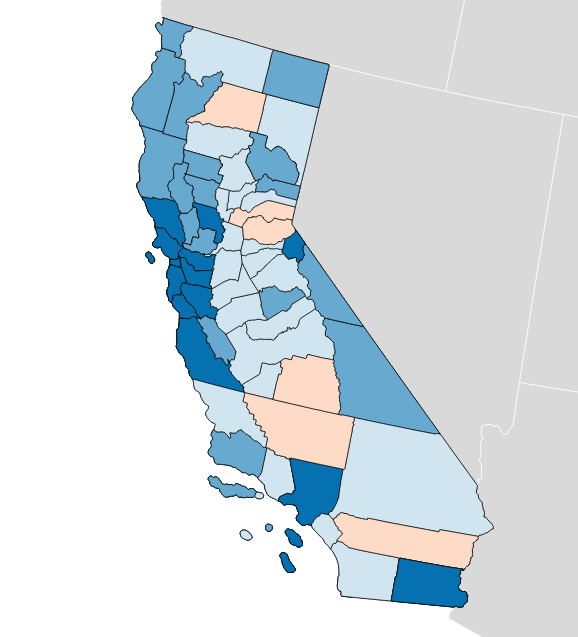
A quick look through the data illustrates some of the patterns in Stephen Wolf’s article. The population density is much higher around Raleigh and Charlotte, covered by the three Democratic districts in North Carolina’s current U.S. House district plan:
Variables like education level and income tend to cluster around those two areas as well:
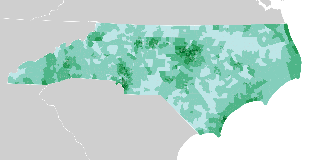
Median income:
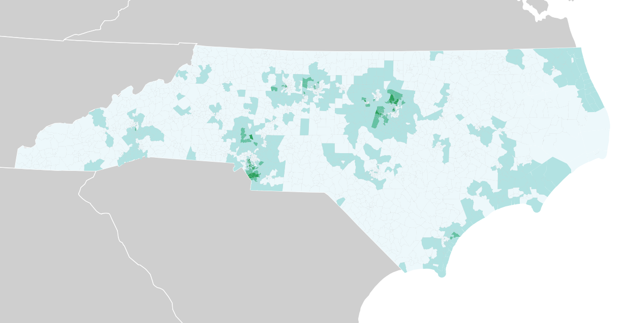
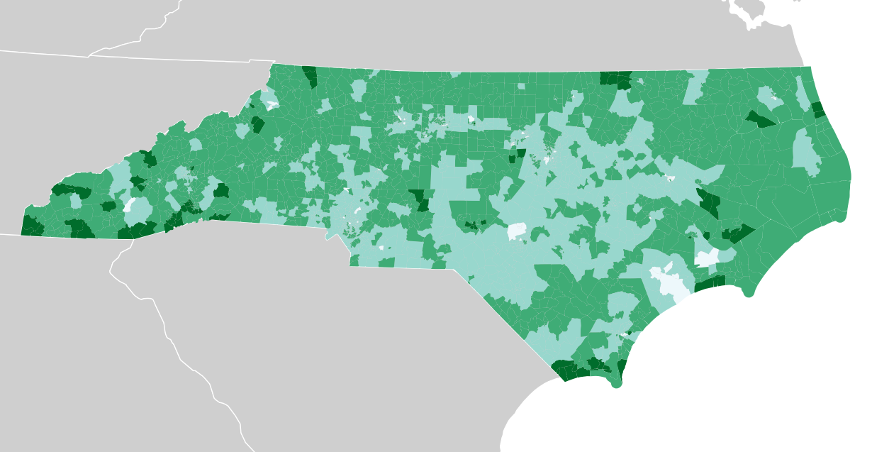
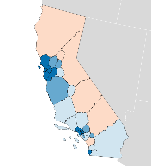
Other variables like the African American population or median age show other patterns, such as the dense concentration of black voters in the rural northeast:
Median age:
What’s possible with this data?
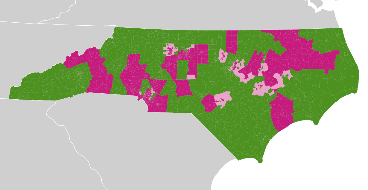
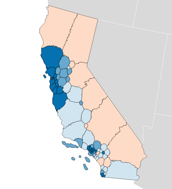
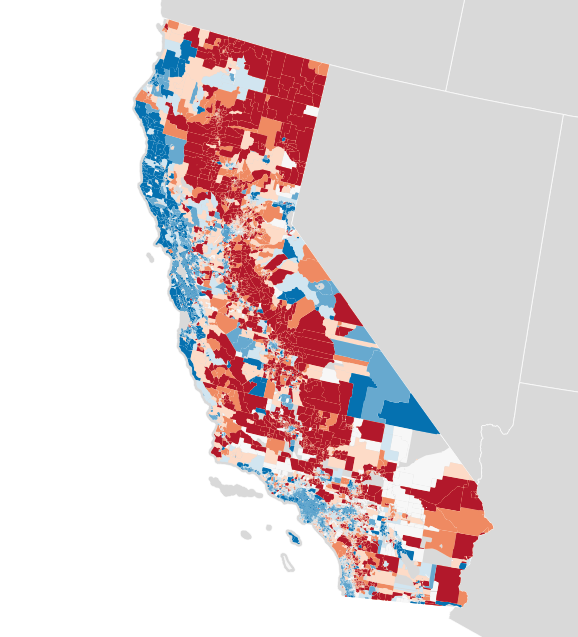
In columns labeled “contested”, I marked precincts with single-candidate races. There are many of these, visible in these two maps of State Senate and State House precincts with green showing contested races, purple showing uncontested races, and lighter pink showing a mix where more than one kind of race was tallied in a given precinct. Every one of these purple areas will need to have its vote totals estimated from other statistics:
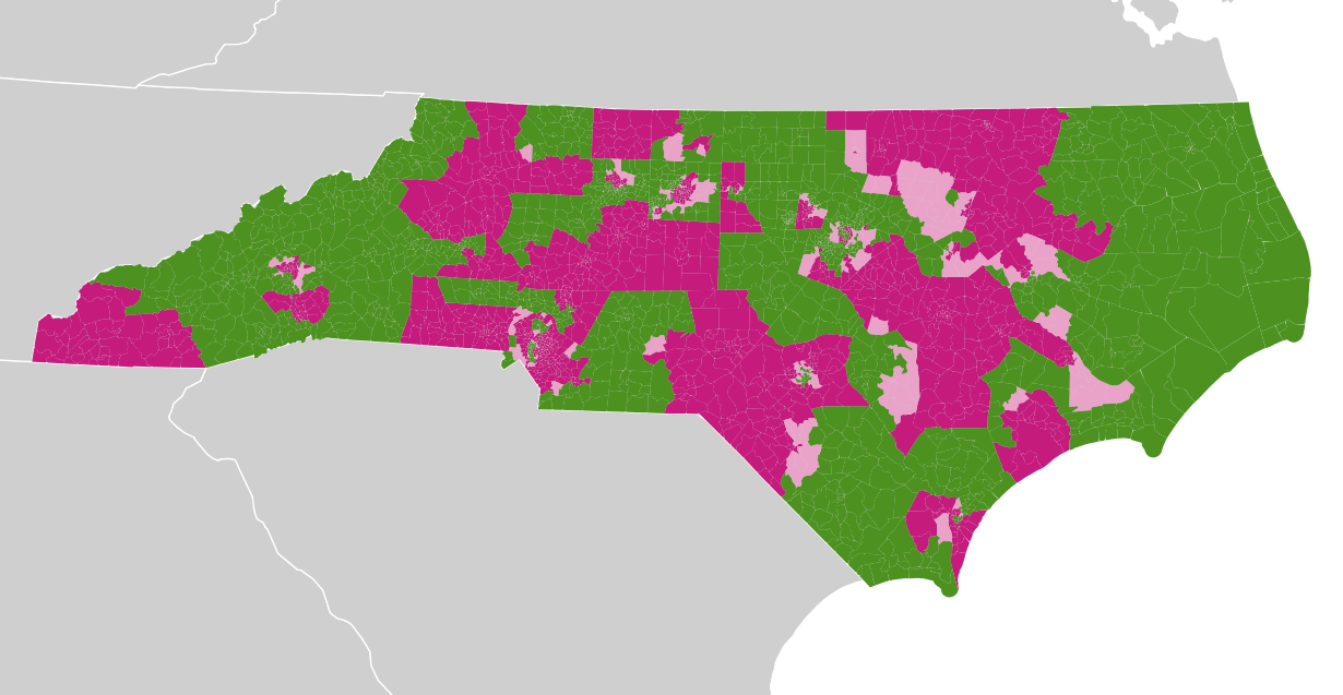
With vote counts predicted for the purple precincts using demographic and other data for the green precincts, it should be possible to create new maps like this from Stephen Wolf, with accurate predictions of partisan outcomes for new plans:
There are some easy next steps with this data.
For example, Nelson Minar recommends running the green precincts through an algorithm like Principal Component Analysis (PCA). The value of PCA, as Nelson and my friend Charlie Loyd suggest, is that it can quickly point out which input variables strongly explain variation as a hint about what’s important when trying to impute new values. For example, is age important, or income?
Heavier machine-learning approaches such as neural networks might do a good job finding hidden patterns in the data, and coming up with good predictions based on all available input data. ML has a negative reputation for reinforcing bias and offering opaque results, but the point here would be to guess at plausble vote counts in the purple precincts. Tensorflow and Scikit-Learn would be the tools to try here.
Growing New Data
If you want to help with geodata, browse the issues in the repo to find data that needs collecting.
Meanwhile, the annual NICAR conference for digital journalism brought a renewed call for participation from the Open Elections project. Project cofounder Derek Willis particularly calls out these areas in need of data entry:
North Carolina and Virginia are two important states with electronic data on the way, and volunteers are working on Wisconsin. Try some of the links above to find data entry tasks for Open Elections.
Thanks to Nathaniel, Nelson, Ruth, and Dan for reading an early version of this post and providing helpful feedback.
Mar 20, 2017 6:57pm
district plans by the hundredweight
For the past month, I’ve been researching legislative redistricting to see if there’s a way to apply what I know of geography and software. With a number of interesting changes happening including Wisconsin’s legal battle, Nicholas Stephanopoulos and Eric McGhee’s new Efficiency Gap metric for partisan gerrymandering, and Eric Holder’s new National Democratic Redistricting Committee (NDRC), good things are happening despite the surreal political climate in the U.S.
My stopping point last time was the need for better data. We need detailed precinct-level election results and geographic boundaries for all 50 states across a range of recent elections, and lately the web has been delivering on this in spades.
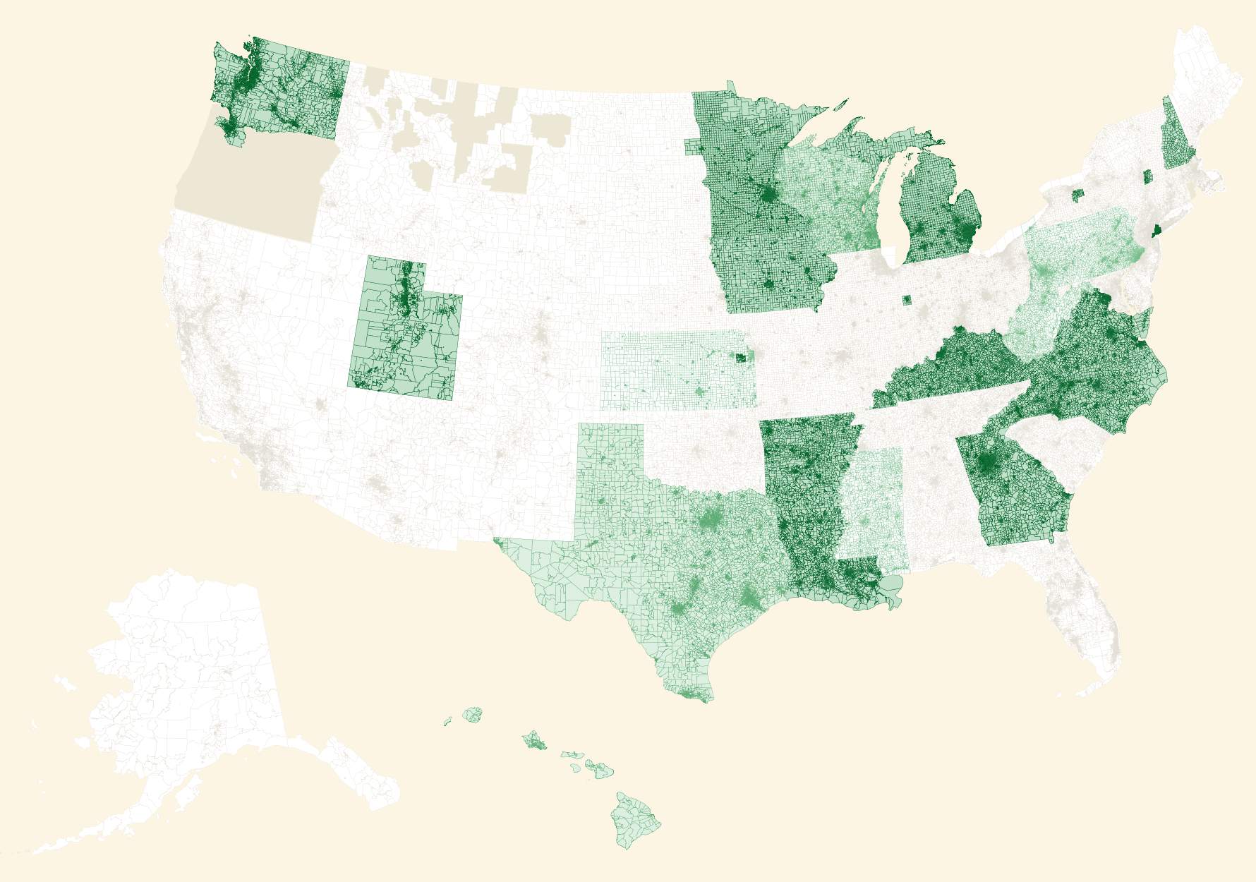
My former Stamen and Mapzen colleague Nathaniel Vaughn Kelso created a new home on Github for geographic data, and the collection has grown swiftly. In our research, we also found this excellent overlapping collection from Aaron Strauss and got in touch. This is a current render showing overall data coverage and recency (darker green states have data from more recent elections):
If you want to help, browse the issues in the repo to find data that needs collecting.
Meanwhile, the annual NICAR conference for digital journalism brought a renewed call for participation from the Open Elections project. Project cofounder Derek Willis particularly calls out these areas in need of data entry:
North Carolina and Virginia are two important states with electronic data on the way, and volunteers are working on Wisconsin. Try some of the links above to find data entry tasks for Open Elections.
So, the volume and quality of data required for accurate measurement of partisan gerrymandering has been growing. Previously, I’ve been using detailed California data to experiment as described in my previous post a couple weeks ago. Wisconsin is a particularly high-profile state in this area, and we happen to have great 2014 general election precinct level data in the repositories above.
Wisconsin
This week, I’ve switched my focus to Wisconsin and experimented with a bulk, randomized approach. Borrowing from Neil Freeman’s Random States Of America idea and Professor Jowei Chen’s randomized Florida redistricting paper, I generated hundreds of thousands of district plans based on counties and census tracts and attempted to measure their partisan efficiency gap for U.S. House votes.
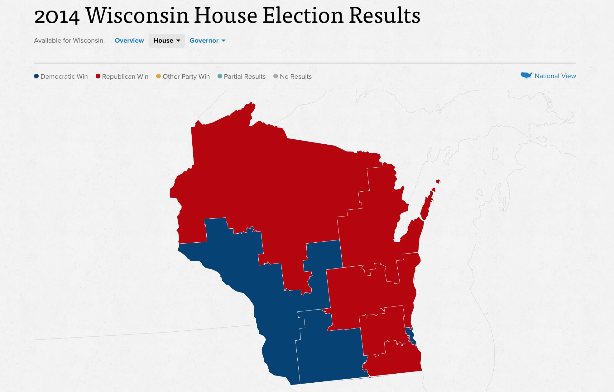
Wisconsin’s 2014 general election resulted in five Republican congressional seats and three Democratic ones, with 1,228,145 votes cast for Republicans and 1,100,209 votes cast for Democrats. There are just eight Congressional districts in Wisconsin, and all candidates in 2014 ran with a major-party opponent. Unopposed races present a special challenge for efficiency gap calculations, and I’m happy to have skipped that here. This is a results map from Politico:
My process is coarse and unsophisticated, but it adequately demonstrates the use of randomization and selection for both counties and tracts. Random plans make it possible to rapidly generate a very wide set of possibilities and navigate among them, selecting for desired characteristics. Code is here on Github.
This is a progress report. Some caveats:
- All random plans produce valid contiguous districts, because of the graph-traversal method I’m using.
- Most random plans don’t produce equally-populated districts, because I have not yet taken this into account when building plans. I’m experimenting with selecting valid plans from a larger universe.
- Most random plans produce Republican-weighted efficiency gaps, because liberal voters tend to cluster geographically in cities and towns.
Here are some partisan-balanced county-based plans:
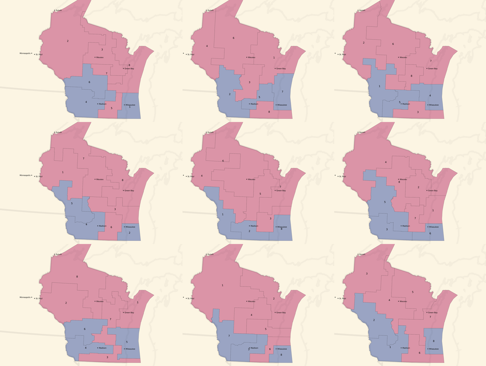
And here are some partisan-balanced tract-based plans:
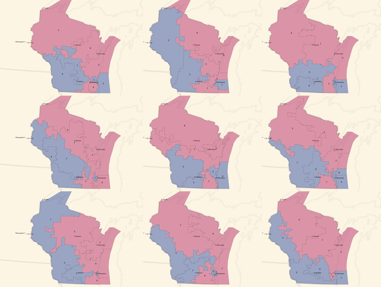
The plans are all random, but a few common features jump out immediately:
- Milwaukee and Madison are both strongly Democratic cities, and come up blue in all randomized sample plans.
- The southwest of the state also tilts Democratic, and comes up blue in all randomized sample plans.
- The resulting seat balances hovers between 5 Republican / 3 Democratic and an even 4/4 split, which generally reflects the slim 5% Republican statewide vote advantage.
We can turn the dial to the right, and look at some unbalanced, pro-Republican county-based plans:
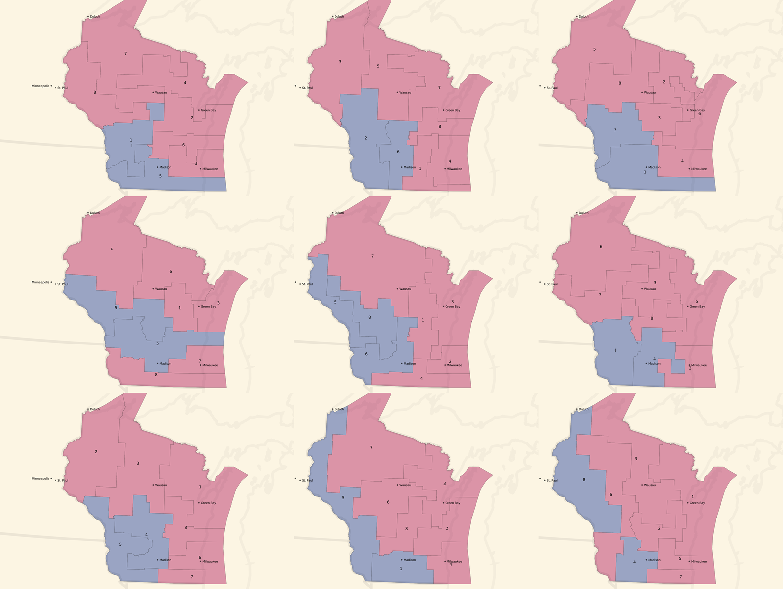
Unbalanced, pro-Republican tract-based plans:
Most of these unbalanced plans show a seat balance that shifts closer to 6 Republican / 2 Democratic seats, and the blue around Milwaukee and in western Wisconsin is often erased.
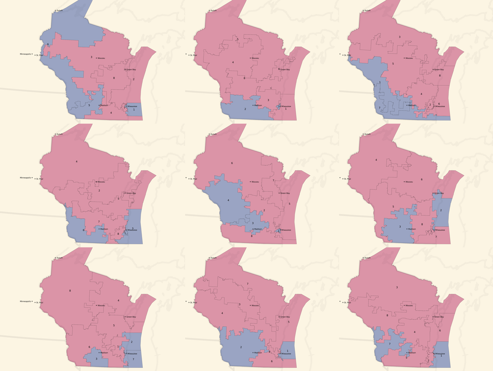
Or, we can turn the dial to the left, and look at some unbalanced, pro-Democratic county-based plans:
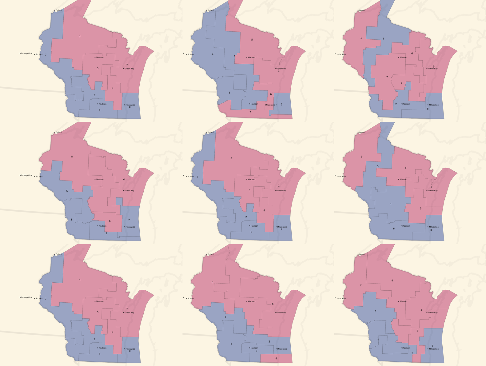
Unbalanced, pro-Democratic tract-based plans:
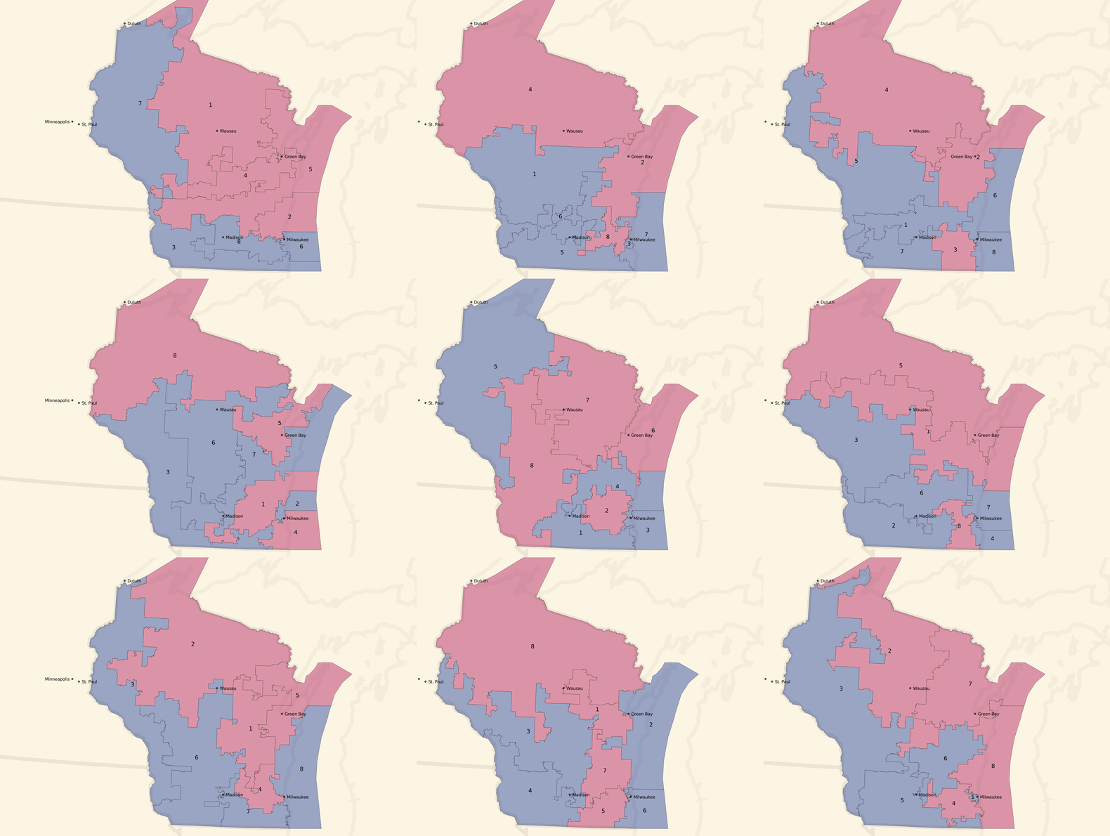
These are less dramatic, but you can see a few instances of 5 Democratic / 3 Republican seat advantages and a lot more 4/4 balances. The original geographic distribution remains, but the blue areas creep northwards.
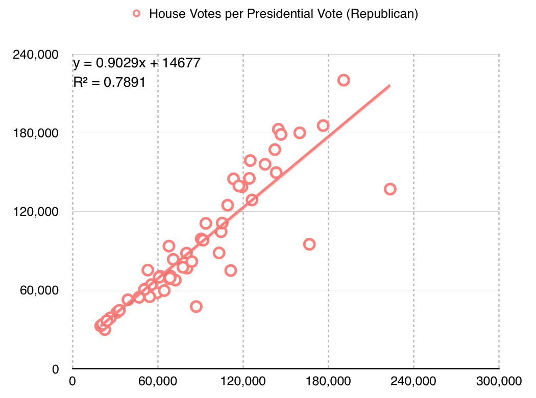
We can zoom out a bit, and look at scatterplots of the county and tract approaches instead of maps. These plots show left/right efficiency gap plotted on the x-axis, and population gap (ratio between highest-population and lowest-population district) on the y-axis. Right away, the first graph shows us some limitations of building district plans from counties: it’s hard to get the necessary population balance required for a legal district, and many randomized plans result in lopsided population distributions. All of the sample plans illustrated above have been pulled from the bottom edge of this graph:
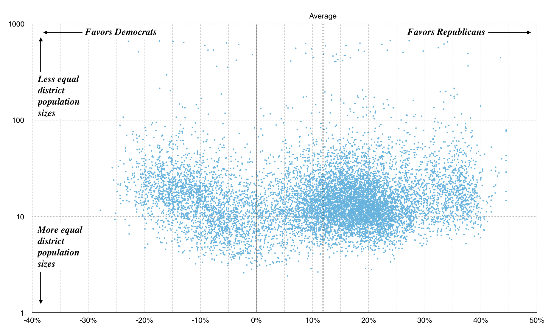
Graph made with Nathaniel Vaughn Kelso
Because U.S. Census tracts are population-weighted, the tract-based plans fare a bit better with many more showing up near 1.0:
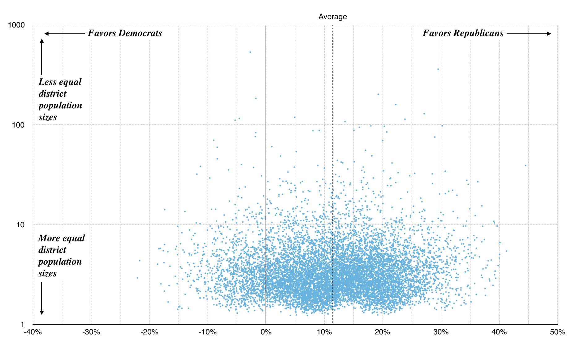
Graph made with Nathaniel Vaughn Kelso
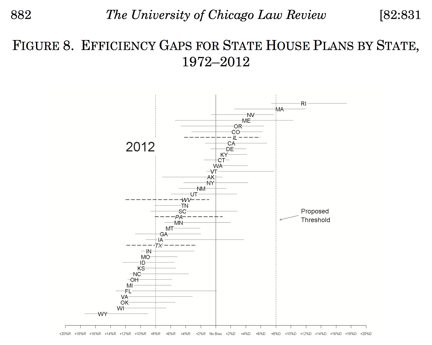
The average efficiency gap for both county and tract plans is around 12%. This is outside McGhee and Stephanopoulos’s suggested 8% cutoff. In other words, in drawing random districts you are more likely to accidentally gerrymander Big Sort urban liberals out of power than the reverse because they are more geographically concentrated.
If you’re interested in checking out some of the district plans I’m generating and selecting from, I’ve provided downloadable data here, with one JSON object per plan per line in a pair of big files using Census GEOIDs for counties and tracts:
Next Steps
- With a way to generate a population of random candidates, run an optimizer to find the “best” candidate for the criteria we want: hill climbing, genetic algorithms, etc. The key here is to define a score for a plan that incorporates several factors: population and partisan balance, demographics, etc.
- Knowing that random plans can lead to big population imbalances, improve the plan generator to make equal-population plans more likely. Population gaps are a baseline requirement for a valid plan, so waste less time generating and evaluating these.
- Look at state legislative results. How many candidates ran unopposed? Can we generate similar plans for Wisconsin’s 33-seat Senate and 99-seat Assembly?
Thanks to Nelson, Zan, and Nathaniel for feedback on early versions of this post.
Mar 4, 2017 6:32pm
baby steps towards measuring the efficiency gap
In my last post, I collected some of what I’ve learned about redistricting. There are three big things happening right now:
- Wisconsin is in court trying to defend its legislative plan, which is being challenged on explicitly partisan grounds. That’s rare and new, and Wisconsin is not doing well.
- A new metric for partisan gerrymandering, the Efficiency Gap, is providing a court-friendly measure of partisan effects.
- Former U.S. Attorney General Eric Holder is building a targeted, state-by-state strategy for Democrats to produce fairer maps in the 2021 redistricting process.
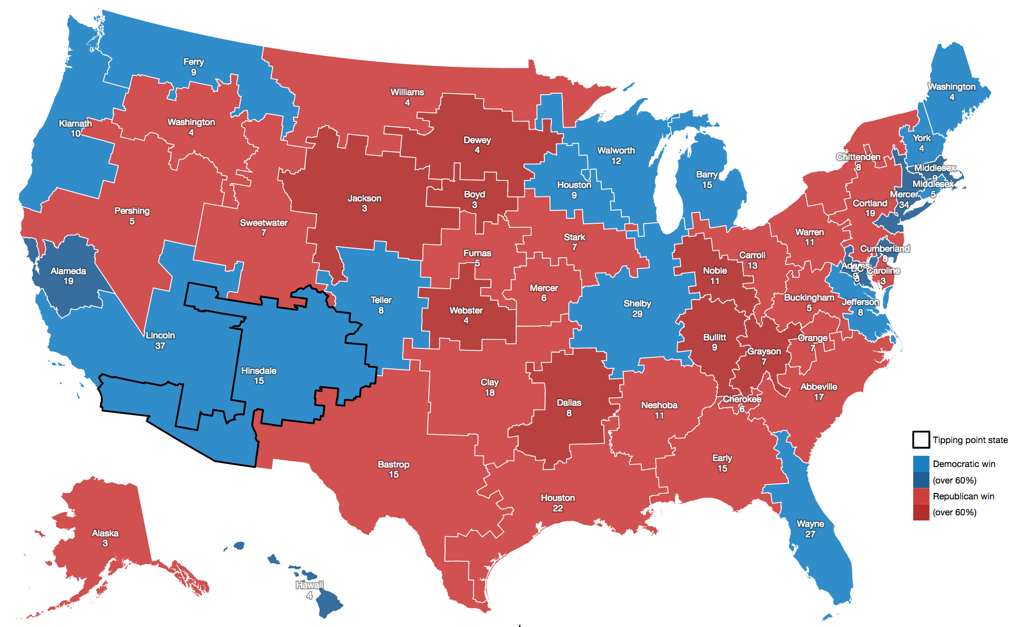
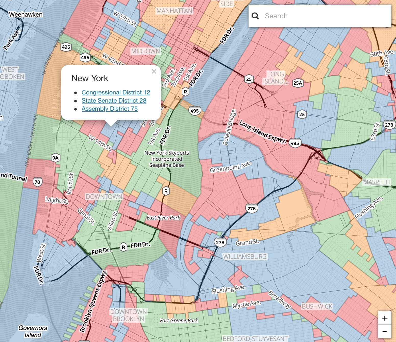
Use this map to find out what three districts you’re in.
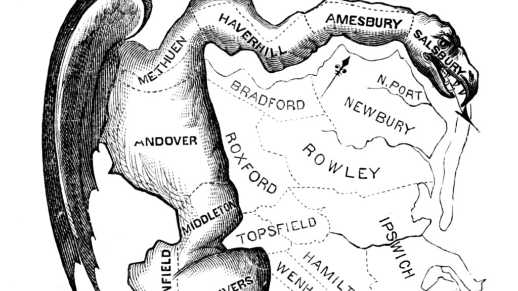
Gerrymandering is usually considered in three ways: geographic compactness to ensure that constituents with similar interests vote together, racial makeup to comply with laws like the Voting Rights Act, and partisan distribution to balance the interests of competing political parties. The original term comes from a cartoon referencing a contorted 1812 district plan in Massachusetts:
Since publishing that post, I’ve been in touch with interesting people. A few shared this article about Tufts professor Moon Duchin and her Tufts University class on redistricting. Looks like I just missed a redistricting reform conference in Raleigh, well covered on Twitter by Fair Districts PA. Bill Whitford, the plaintiff in the Wisconsin case, sent me a collection of documents from the case. I was struck by how arbitrary these district plans in Exhibit 1 looked:
Combined with Jowei Chen’s simulation approach, my overall impression is that the arbitrariness of districts combined with the ease of calculating measures like the efficiency gap make this a basically intentional activity. There is not an underlying ideal district plan to be discovered. Alternatives can be rapidly generated, tested, and deployed with a specific outcome in mind. With approaches built on simple code and detailed databases, district plans can be designed to counteract Republican overreach. There’s no reason for fatalism about the chosen compactness of liberal towns.
I’m interested in partisan outcomes, so I’ve been researching how to calculate the efficiency gap. It’s very easy, but heavily dependent on input data. I have some preliminary results which mostly raise a bunch of new questions.
Some Maps
The “gap” itself refers to relative levels of vote waste on either side of a partisan divide, and is equal to “the difference between the parties’ respective wasted votes in an election, divided by the total number of votes cast.” It’s simple arithmetic, and I have an implementation in Python. If you apply the metric to district plans like Brian Olson’s 2010 geographic redistricting experiment, you can see the results. These maps show direction and magnitude of votes using the customary Democrat blue and Republican red, with darker colors for bigger victories.
Olson’s U.S. House efficiency gap favors Democrats by 2.0%:
Olson’s State Senate efficiency gap favors Democrats by a whopping 9.7%:
Olson’s State Assembly efficiency gap also favors Democrats by 9.8%:
So that’s interesting. The current California U.S. House efficiency gap shows a mild 0.3% Republican advantage. Olson’s plans offer a big, unfair edge to Democrats, though they have other advantages such as compactness.
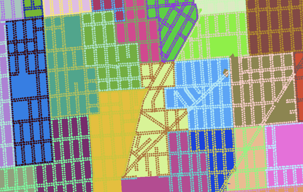
You can measure any possible district plan in this way: hexbins, Voronoi polygons, or completely randomized Neil Freeman shapes. Here’s a fake district plan built just from counties:
This one shows a crushing +15.0% gap for Democrats and a 52 to 6 seat advantage. This plan wouldn’t be legal due to the population imbalance between counties.
Each of these maps shows a simple outcome for partisan votes as required for the efficiency gap measure. Where do those votes come from? Jon Schleuss, Joe Fox, and others at the LA Times on Ben Welsh’s data desk created a precinct-level map of California’s 2016 election results, so I’m using their numbers. They provide two needed ingredients, vote totals and geographic shapes for each of California’s 26,044 voting precincts. Here’s what it looks like:
When these precincts are resampled into larger districts using my resampling script, vote counts are distributed to overlapping districts using a simple spatial join. I applied this process to the current U.S. House districts in California, to see if I got the same result.
There turns out to be quite a difference between this and the true U.S. House delegation. In this prediction from LA Times data the seat split is 48/8 instead of the true 38/14, and the efficiency gap is 8.6% in favor of Democrats instead of the more real 0.3% in favor of Republicans. What’s going on?
Making Up Numbers
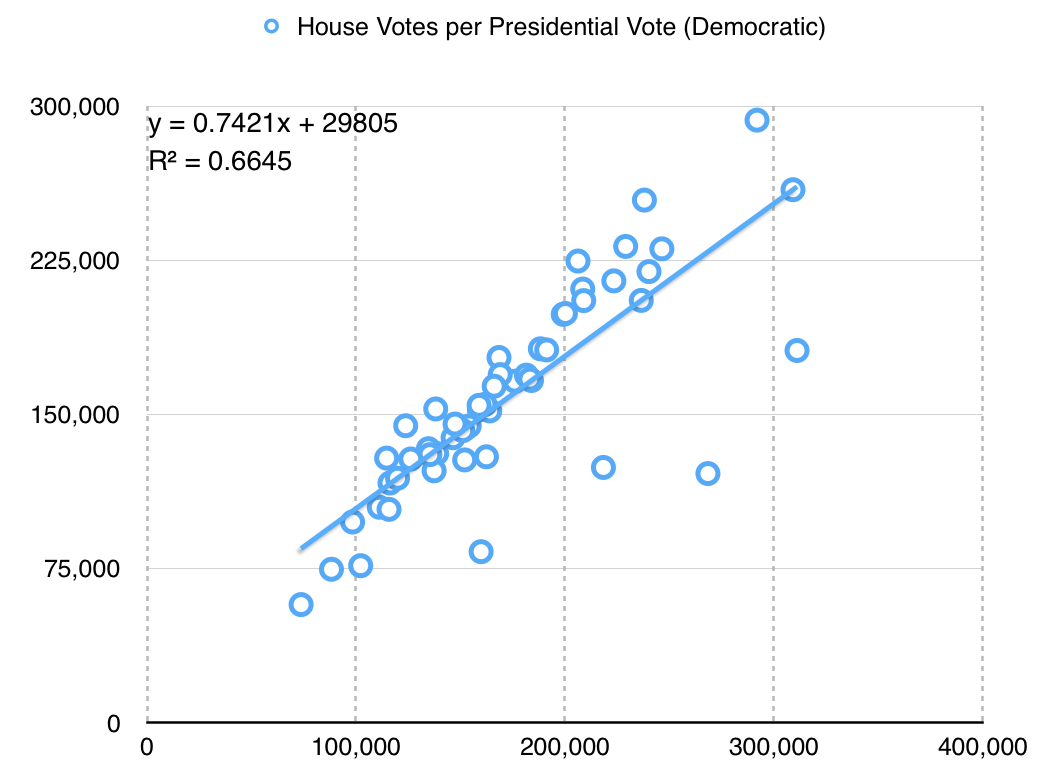
The LA Times data includes statewide votes only: propositions, the U.S. Senate race, and the Clinton/Trump presidential election. There are no votes for U.S. House, State Senate or Assembly included. I’m using presidential votes as a proxy. This is a big assumption with a lot of problems. For example, the ratio between actual U.S. House votes for Democrats and presidential votes for Hillary Clinton is only about 3:4, which might indicate a lower level of enthusiasm for local Democrats compared to a national race:
The particular values here aren’t hugely significant, but it’s important to know that I’m doing a bunch of massaging in order to get a meaningful map. Eric McGhee warned me that it would be necessary to impute missing values for uncontested races, and that it’s a fiddly process easy to get wrong. Here, I’m not even looking at the real votes for state houses — the data is not conveniently available, and I’m taking a lot of shortcuts just to write this post.
The Republican adjustment is slightly different:
They are more loyal voters, I guess?
Availability of data at this level of detail is quite spotty. Imputing from readily-available presidential data leads to misleading results.
Better Data
These simple experiments open up a number of doors for new work.
First, the LA Times data includes only California. Data for the remaining states would need to be collected, and it’s quite a tedious task to do so. Secretaries of State publish data in a variety of formats, from HTML tables to Excel spreadsheets and PDF files. I’m sure some of it would need to be transcribed from printed forms. Two journalists, Serdar Tumgoren and Derek Willis, created Open Elections, a website and Github project for collecting detailed election results. The project is dormant compared to a couple years ago, but it looks like a good and obvious place to search for and collect new nationwide data.
Second, most data repositories like the LA Times data and Open Elections prioritize statewide results. Results for local elections like state houses are harder to come by but critical for redistricting work because those local legislatures draw the rest of the districts. Expanding on this type of data would be a legitimate slog, and I only expect that it would be done by interested people in each state. Priority states might include the ones with the most heavily Republican-leaning gaps: Wyoming, Wisconsin, Oklahoma, Virginia, Florida, Michigan, Ohio, North Carolina, Kansas, Idaho, Montana, and Indiana are called out in the original paper.
Third, spatial data for precincts is a pain to come by. I did some work with this data in 2012, and found that the Voting Information Project published some of the best precinct-level descriptions as address lists and ranges. This is correct, but spatially incomplete. Anthea Watson Strong helped me understand how to work with this data and how to use it to generate geospatial data. With a bit of work, it’s possible to connect this data to U.S. Census TIGER shapefiles as I did a few years ago:
This was difficult, but doable at the time with a week of effort.
Conclusion
My hope is to continue this work with improved data, to support rapid generation and testing of district plans in cases like the one in Wisconsin. If your name is Eric Holder and you’re reading this, get in touch! Makes “call me” gesture with right hand.
Code and some data used in this post are available on Github. Vote totals I derived from the LA Times project and prepared are in this shapefile. Nelson Minar helped me think through the process.
In closing, here are some fake states from Neil Freeman:
Feb 20, 2017 10:30pm
things I’ve recently learned about legislative redistricting
Interesting things are afoot in legislative redistricting! Over the past ten years, Republicans have enacted partisan gerrymanders in a number of state houses in order to establish and maintain control of U.S. politics despite their unpopular policies. I’ve been learning what I can about redistricting and I’m curious if there’s something useful I could offer as a geospatial open data person.
This post is a summary of things I’ve been learning. If any of this is wrong or incomplete, please say so in the comments below. Also, here’s an interactive map of the three overlapping districts you’re probably in right now:
Three exciting things are happening now.
First, Wisconsin is in court trying to defend its legislative plan, and not doing well. It’s a rare case of a district plan being challenged on explicitly partisan grounds; in the past we’ve seen racial and other measures used in laws like the Voting Rights Act, but partisan outcomes have not typically been considered grounds for action. It might be headed to the Supreme Court.
Second, a new measure of partisan gerrymandering, the Efficiency Gap, is providing a court-friendly measure for partisan effects. Defined by two scholars, Nicholas Stephanopoulos and Eric McGhee, the measure defines two kinds of wasted votes: “lost votes” cast in favor of a defeated candidate, and “surplus votes” cast in favor of a winning candidate that weren’t actually necessary for the candidate’s victory. Stephanopoulos sums it up as “the difference between the parties’ respective wasted votes in an election, divided by the total number of votes cast.”
Wisconsin happens to be one of the biggest bullies on this particular block:
This New Republic article provides a friendly explanation.
Third, former U.S. Attorney General Eric Holder has created the National Democratic Redistricting Committee (NDRC), a “targeted, state-by-state strategy that ensures Democrats can fight back and produce fairer maps in the 2021 redistricting process.” Right now, I’m hearing that NDRC is in early fundraising mode.
So that’s a lot.
I sent some fan mail to Eric McGhee and he graciously helped me understand a bunch of the basic concepts over coffee.
One thing I learned is the significance and use of political geography. As Marco Rogers has pointed out, liberals and democrats clump together in urban areas: “Look at the electoral maps. Drill into the states. What we see is singular blue counties, clustered around cities, in an endless sea of red.” At Code for America, we worked with a number of cities that fell into this pattern, and frequently they were looking to CfA for help dealing with blue town vs. red county issues.
Jowei Chen, associate professor of political science in Michigan, has an extensive bibliography of writing about legislative districts. In his 2013 paper Unintentional Gerrymandering, Chen demonstrates how a sampling of possible redistricting proposals can maintain partisan bias:
In contemporary Florida and several other urbanized states, voters are arranged in geographic space in such a way that traditional districting principles of contiguity and compactness will generate substantial electoral bias in favor of the Republican Party.
Geometry is a red herring. Over the years I’ve encountered a few geometry optimizations for proposed districts, including this one from Brian Olson, written up in the Washington Post:
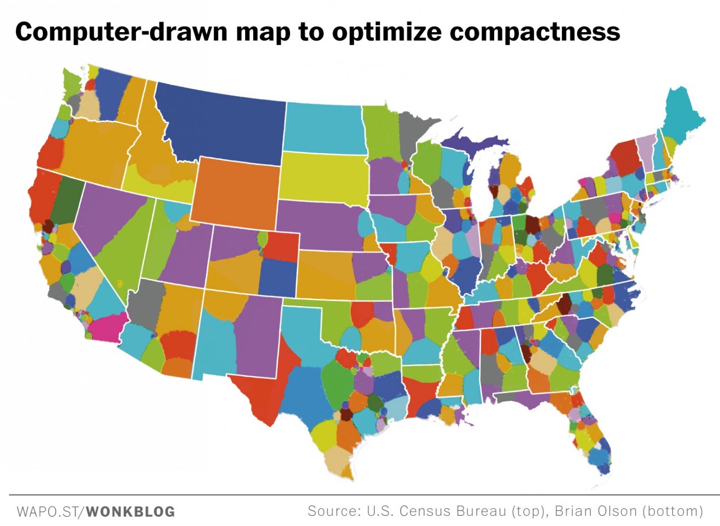
Olson’s proposed district plans
While compactness is desirable in a district, Olson’s method prioritizes visual aesthetics above political geography, and he notes some of the factors he ignores on his site, such as travel time: “it might be the right kind of thing to measure, but it would take too long.” Olson’s method selects aesthetically pleasing shapes that are fast to calculate on his home computer. I think that’s a terrible basis for a redistricting plan, but the goofy shapes that exist in many current plans are a popular butt of jokes:

Gerrymandering T-Shirts by BorderlineStyle
Chen particularly calls out how cartographic concerns can be a dead-end:
Our simulations suggest that reducing the partisan bias observed in such states would require reformers to give up on what Dixon (1968) referred to as the “myth of non-partisan cartography,” focusing not on the intentions of mapmakers, but instead on an empirical standard that assesses whether a districting plan is likely to treat both parties equally (e.g., King et al., 2006; Hirsch, 2009).
However, geography is not insurmountable.
In a later 2015 paper, Cutting Through the Thicket, Chen argues through statistical simulations that legislative outcomes can be predicted for a given redistricting plan, and plots the potential results of many plans to show that a given outcome can be intentionally selected:
A straightforward redistricting algorithm can be used to generate a benchmark against which to contrast a plan that has been called into constitutional question, thus laying bare any partisan ad- vantage that cannot be attributed to legitimate legislative objectives.
Here’s Florida’s controversial 2012 plan shown as a dotted line to the right of 1,000 simulated plans, demonstrating a “clearer sense of how this extreme partisan advantage was created:”
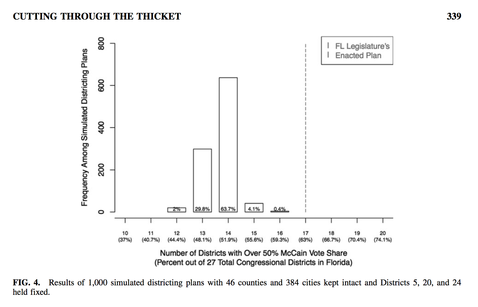
A graph from Chen’s 2015 paper showing simulated partisan outcomes for Florida district plans
Chen concludes that the position of the dotted line relative to the modal outcomes shows partisan intent, if you agree that such an outcome is unlikely to be random.
In 2010, Republicans systematically generated skewed partisan outcomes in numerous state houses, as documented in this NPR interview with the author of Ratf**ked:
There was a huge Republican wave election in 2010, and that is an important piece of this. But the other important piece of Redmap is what they did to lock in those lines the following year. And it's the mapping efforts that were made and the precise strategies that were launched in 2011 to sustain those gains, even in Democratic years, which is what makes RedMap so effective and successful.
“RedMap” was a GOP program led by Republican strategist Chris Jankowski to turn the map red by targeting state legislative races:
The idea was that you could take a state like Ohio, for example. In 2008, the Democrats held a majority in the statehouse of 53-46. What RedMap does is they identify and target six specific statehouse seats. They spend $1 million on these races, which is an unheard of amount of money coming into a statehouse race. Republicans win five of these. They take control of the Statehouse in Ohio - also, the state Senate that year. And it gives them, essentially, a veto-proof run of the entire re-districting in the state.
Holder’s NDRC effort is a counter-effort to RedMap. They’re planning electoral, ballot, and legal initiatives to undo the damage of RedMap. Chen’s simulation method could allow a legislature to overcome geographic determinism and decide on an outcome that better represents the distribution of voters. Chen again:
We do not envision that a plaintiff would use our approach in isolation. On the contrary, it would be most effective in combination with evidence of partisan asymmetry and perhaps more traditional evidence including direct testimony about intent and critiques of individual districts. As with Justice Stevens’ description of partisan symmetry, we view it as a “helpful (though certainly not talismanic) tool.”
So, back to the efficiency gap.
McGhee and Stephanopoulos’s measure counts actual votes in real elections. That’s helpful to courts trying to determine whether a given plan is fair, because it does not rely on guessing about possible outcome from public opinion. Chen’s approach provides a statistical expectation for what a normal plan could do, as well as ways to adjust plans based on desired outcomes. Calculating the efficiency gap for a proposed district plan is complicated, because you need to account for cases where simple red/blue data is missing, such as a uncontested races. You have to impute the potential vote in each proposed new district.
To do this, you need precinct-level election data. Jon Schleuss, Joe Fox, and others working with Ben Welsh at the LA Times Data Desk recently created the most detailed election result map ever made for California. In other states, the data is often not available online, and must be specially requested from sometimes-unhelpful officials. Eric McGhee told me that many experts working on redistricting use a dataset maintained by DailyKos, an independent liberal news website.
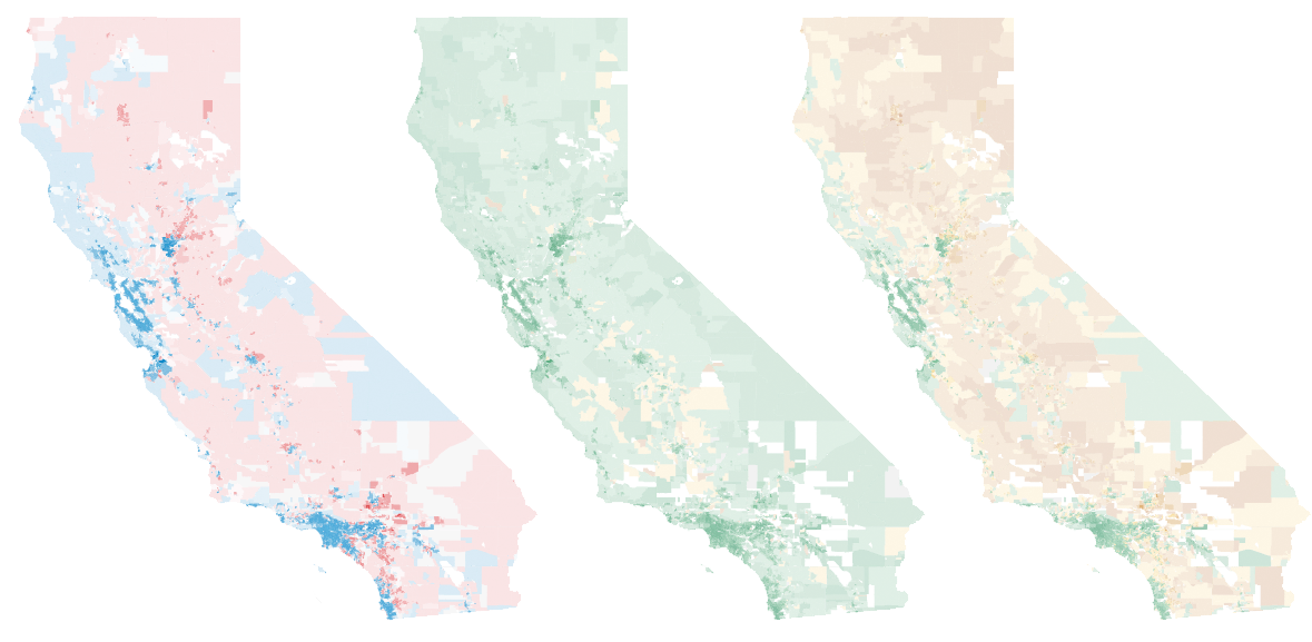
LA Times maps of California’s 2016 election results
There’s a big opportunity here for a carefully-vetted online tool that could calculate measures like the efficiency gap for a variety of districting plans. For my part, I’m getting started understanding the sources and types of data that might help pull district plans in a fairer direction. If you’re curious about your own district, find yourself on this map:
Jan 26, 2017 6:44am
oh no
A dumb thing I made:
Probably a bad idea, sorry @dorrismccomics: https://t.co/3pe3GTZ1IB pic.twitter.com/R1COaChbFp
— Michal Migurski (@michalmigurski) January 24, 2017
A response from Alex Norris!
@dorrismccomics @michalmigurski pic.twitter.com/azb8asLfVA
— Alex Norris (@dorrismccomics) January 24, 2017
Jacob takes it to politics:
@michalmigurski @dorrismccomics pic.twitter.com/fiOijGw0LT
— Jacob Harris (@harrisj) January 24, 2017
This was unexpected:
I will not disrupt the notifications of @michalmigurski or @dorrismccomics anymore after this but thank you again for this entertainment pic.twitter.com/1HzAWPTcFf
— []V[]iggy 🐺🦎🎋 (@mountatlas) January 24, 2017
Oh no.
@dorrismccomics @regisRquoi @michalmigurski pic.twitter.com/aPC3L199HC
— Guillermo Bianchi (@starg09) January 24, 2017
subscribe to ![]() this site.
|
contact Michal Migurski
this site.
|
contact Michal Migurski