tecznotes
Michal Migurski's notebook, listening post, and soapbox. Subscribe to ![]() this blog.
Check out the rest of my site as well.
this blog.
Check out the rest of my site as well.
Dec 1, 2015 6:33pm
week 1,984: back to the map
After 2½ years as Code for America CTO, I’m moving on to the next thing. Starting December 14, I’ll be joining a crew of former Stamen colleagues & clients, CfA friends, OpenStreetMappers, and co-geobreakfasters at Mapzen, part of Samsung Accelerator. If Mapzen was a game show, it’d be This Is Your Life. I’ll be combining my background in open source mapping and my more recent experience working on CfA technology products to lead a team making writings, demos, tools, and entry points for Mapzen’s work on routing, search, transit, and the brainmelting beauty of Tangram. We’re actively hiring (especially front-end developers), so please get in touch.
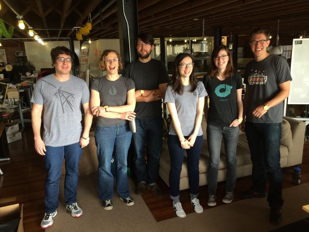
I will miss Code for America greatly, particularly the technology and product crew we built to deliver new communications and engagement approaches for digital government, the three years of fellowship classes we collaborated with, the whole staff of people making it work, and that one time my team dressed like me for April Fools.
This month is an especially hard time to go, with a major victory from Dan Hon on Child Welfare Services technology procurement—if you are a California design or dev shop, bid on this project to literally save children’s lives. It’s also an auspicious time to go, with a few key colleagues like Cyd Harrell and Frances Berriman heading out and a break between the 2015 and 2016 fellowship classes.
Onward.
Nov 15, 2015 8:07pm
bike eleven: trek roadie
I‘ve started doing long monthly rides with a group of fellow Stamen alums. On honor of Eric, we call ourselves The Rodenbikes. At first, I was using the Schwinn touring bike with an internal hub, but after the July ride toting beers and burritos I decided it was time to switch to a bike better-suited to longer rides. One of us is training for the 2016 AIDS Lifecycle, and my heavy, crunchy retro-grouch bike was leaving me far behind.
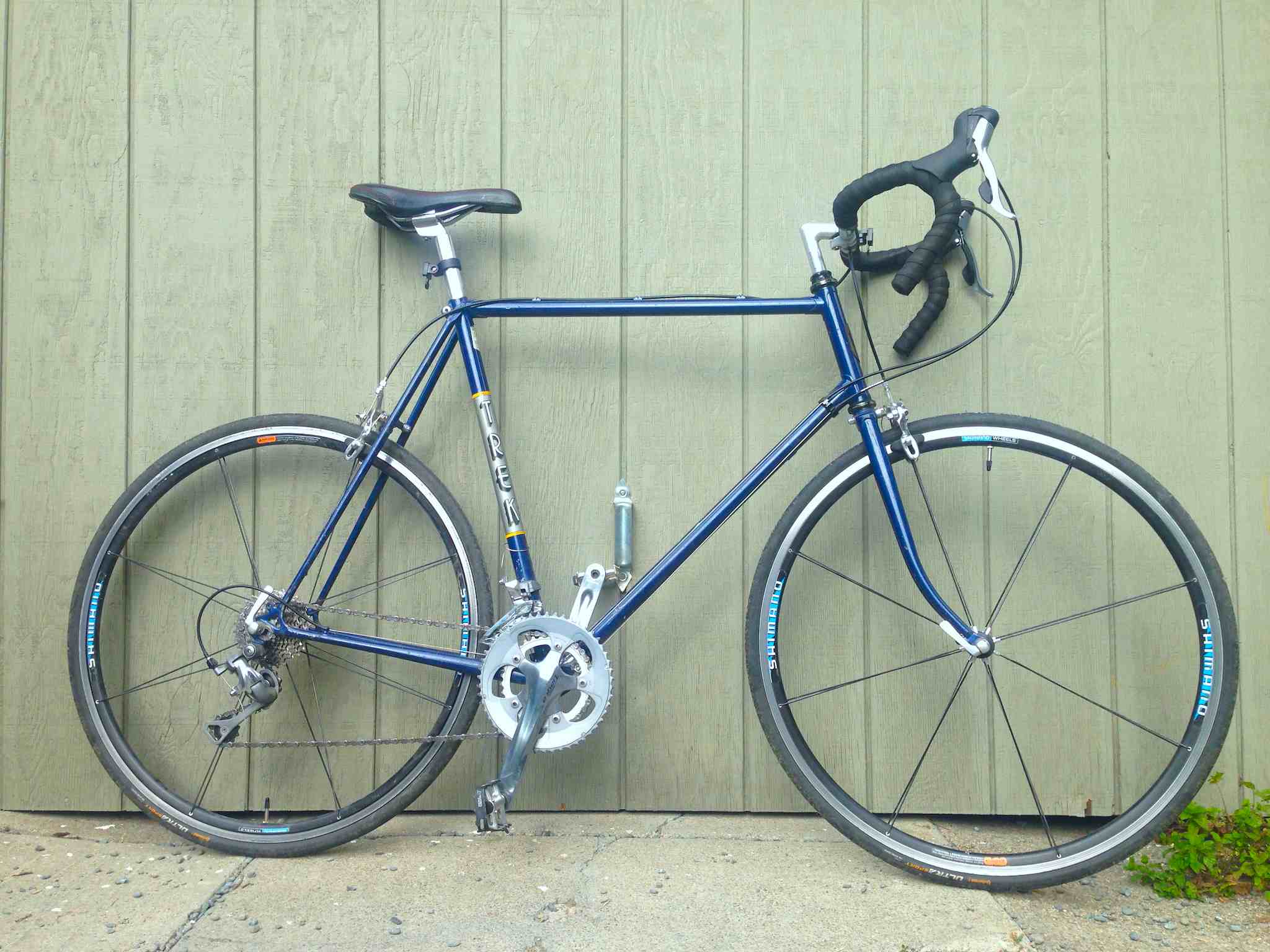
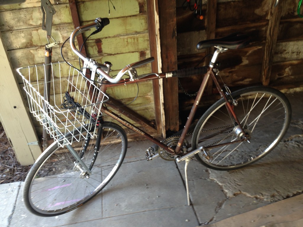
Earlier in the year, I had already bought a used old-style Trek frame and wasn’t yet sure what style of bike I wanted to use it for. I decided to make it into a road bike:
This is my first regular road bike, with gears and slicks.
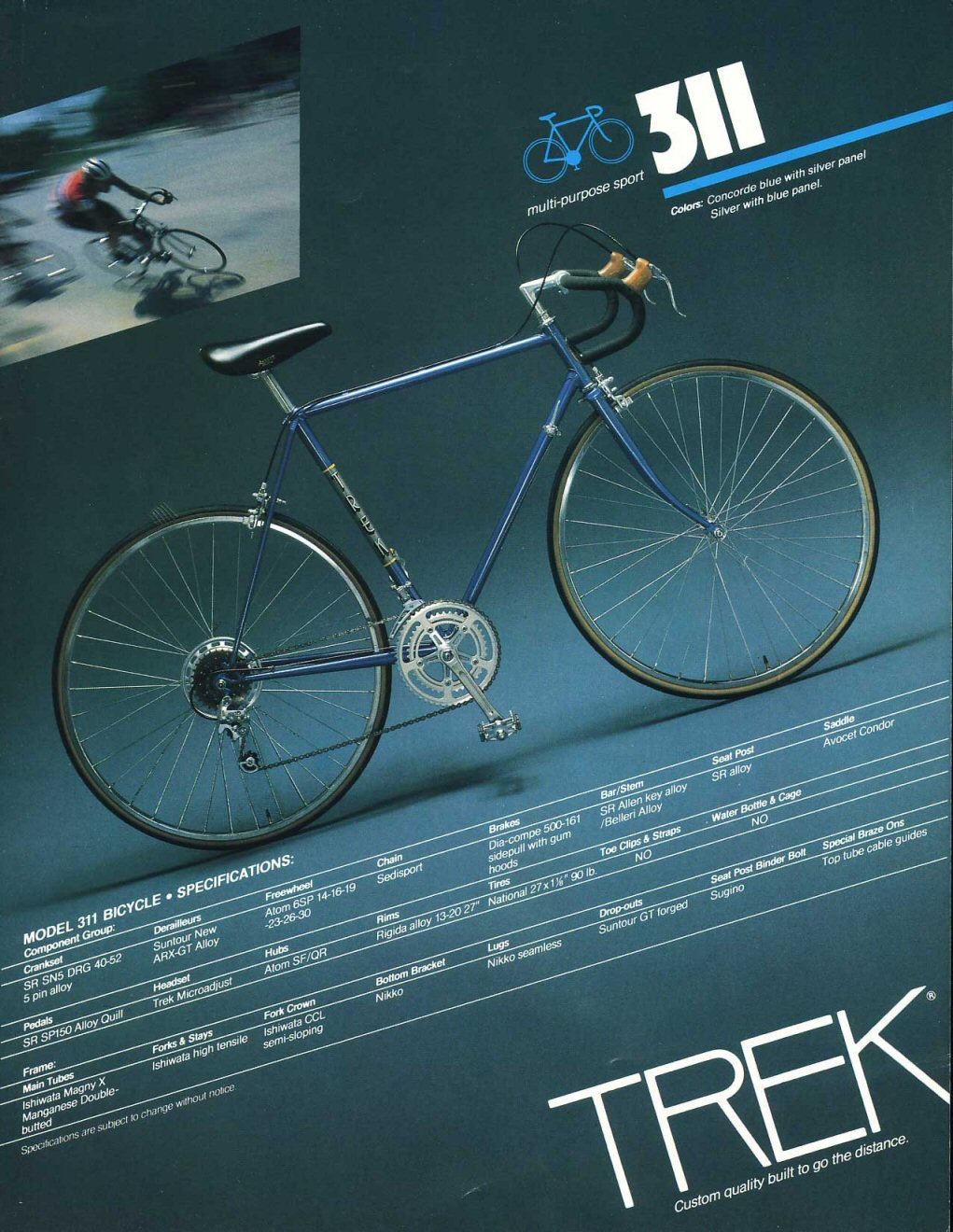
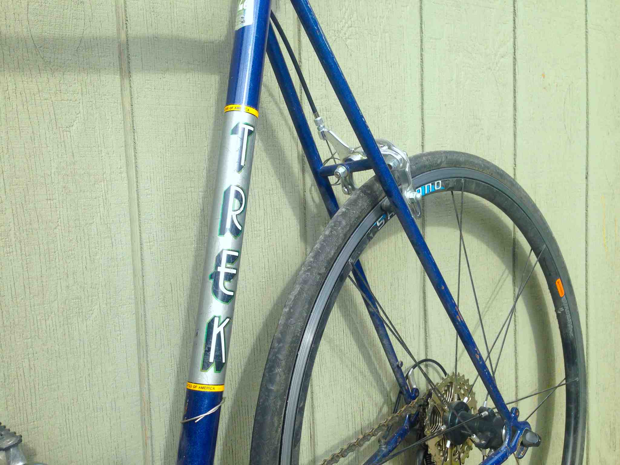
The frame is a 1982 Trek 311 “multi-purpose sport.” It’s at the low-end of the 1982 product line, using slightly-cheaper tubing and (I imagine) lower-grade components.
The paint job is in fine condition, and I bought it as a raw frame with no attached parts other than a headset to hold the fork on. I had been looking for something with the classic vertical Trek logo:
One of the first challenges I encountered on this project was parts selection. Initially, I attempted to piece together a groupset from separate purchases, pricing cranks and derailleurs individually and trying to arrive at a complete bicycle. After a few weeks of research and talking with bike stores, I learned that it would make more sense to buy a complete groupset from a single manufacturer that was known to work as a unit. I decided on the Shimano Tiagra groupset, the fourth-tier kit for road cycles. Researching bike components is surprisingly difficult. Shimano’s website is sloppy and unreliable, and seems to be written for an audience of mostly distributors and retailers.
Missing Link Bicycle Co-Op had the most helpful sales people, and assisted me in thinking through my options and their effects on performance and weight. I decided to buy all the parts with them, except for the wheels.
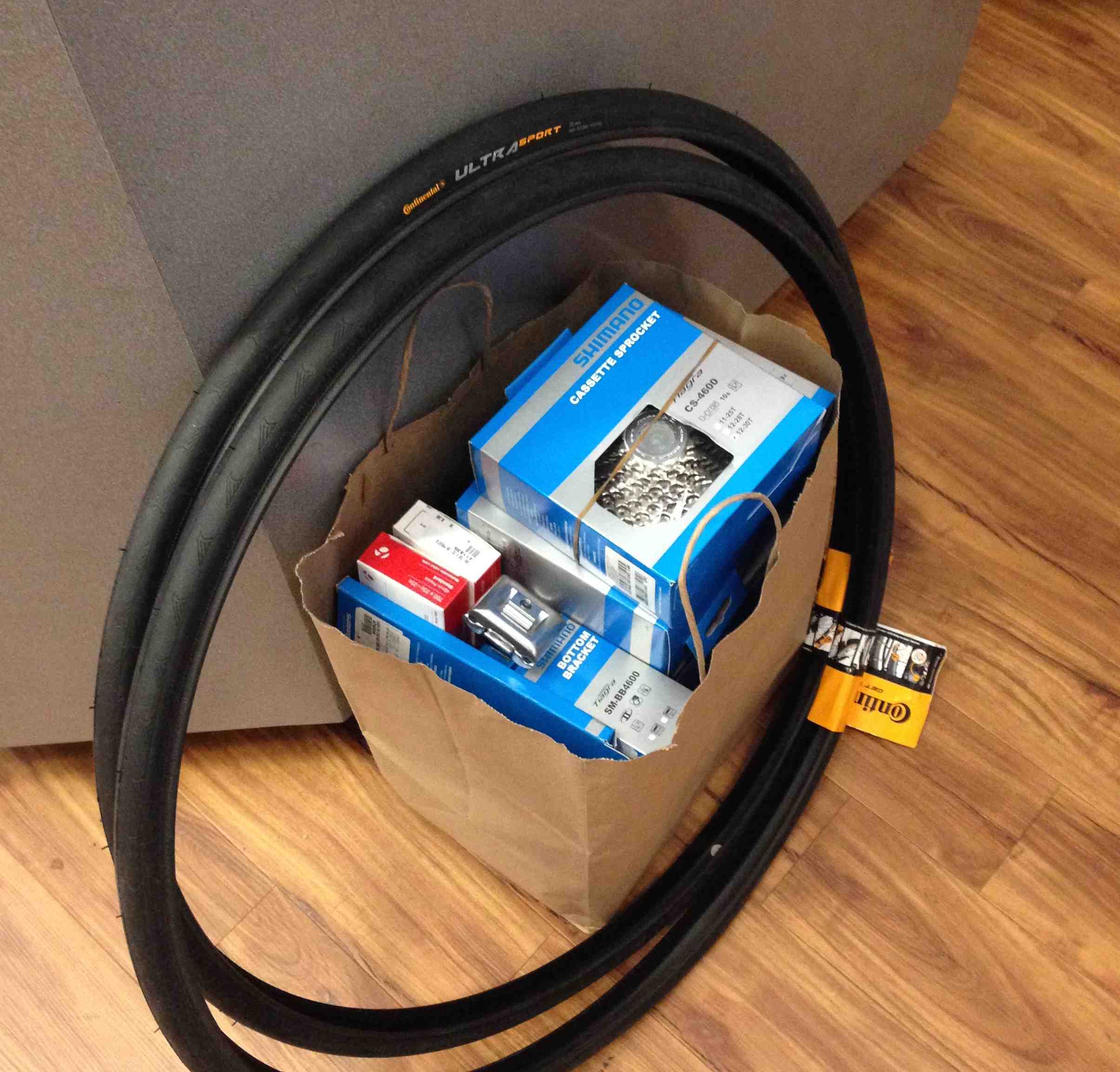
I bought the wheels used instead, to take advantage of lower prices and easy compatibility with major manufacturer parts from Shimano.
The other big challenge was cable routing, something I’d never done before with a road bike. On most modern bikes, there are cable stops on the frame and a plastic cable guide that screws into the bottom bracket:
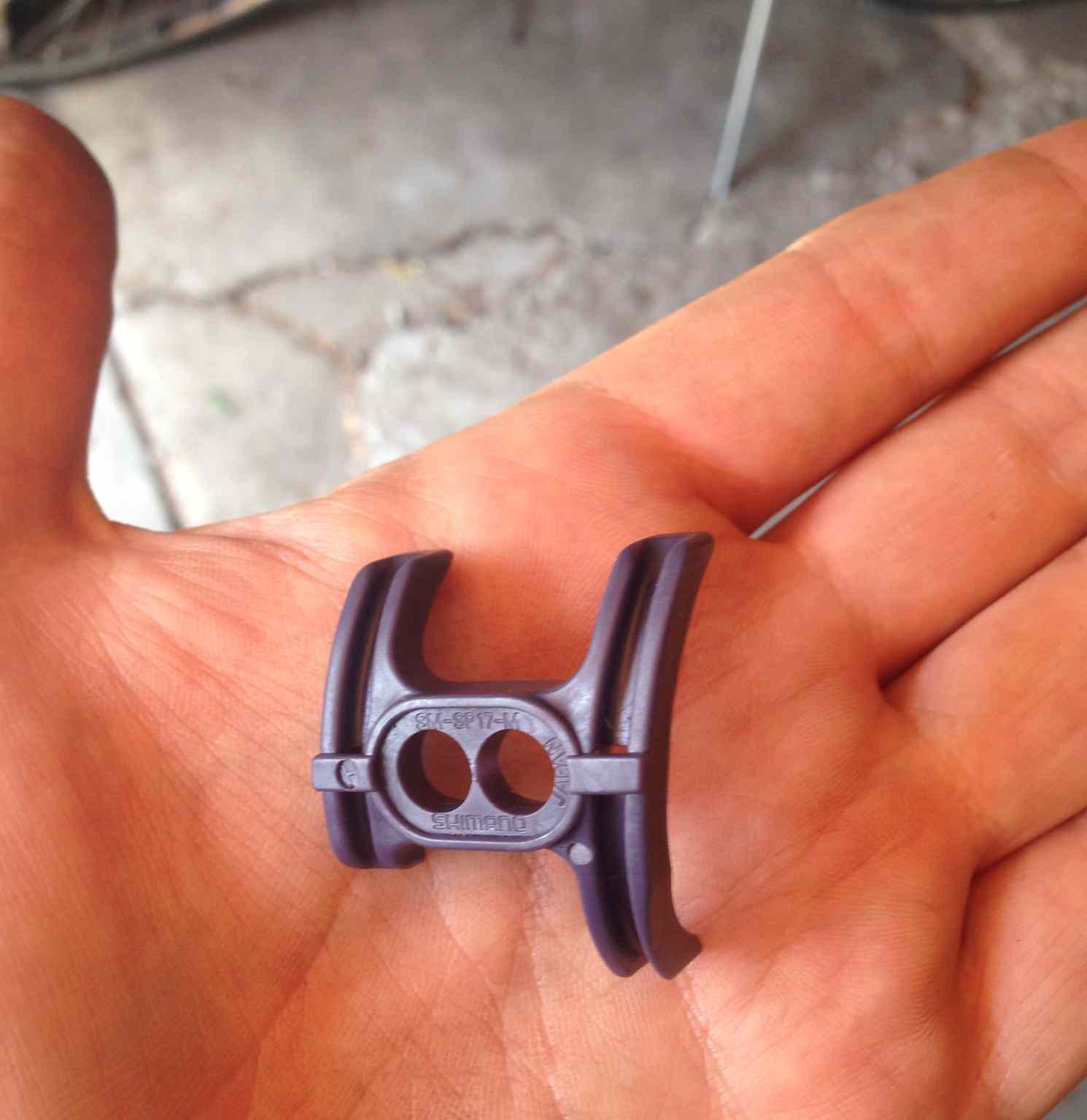
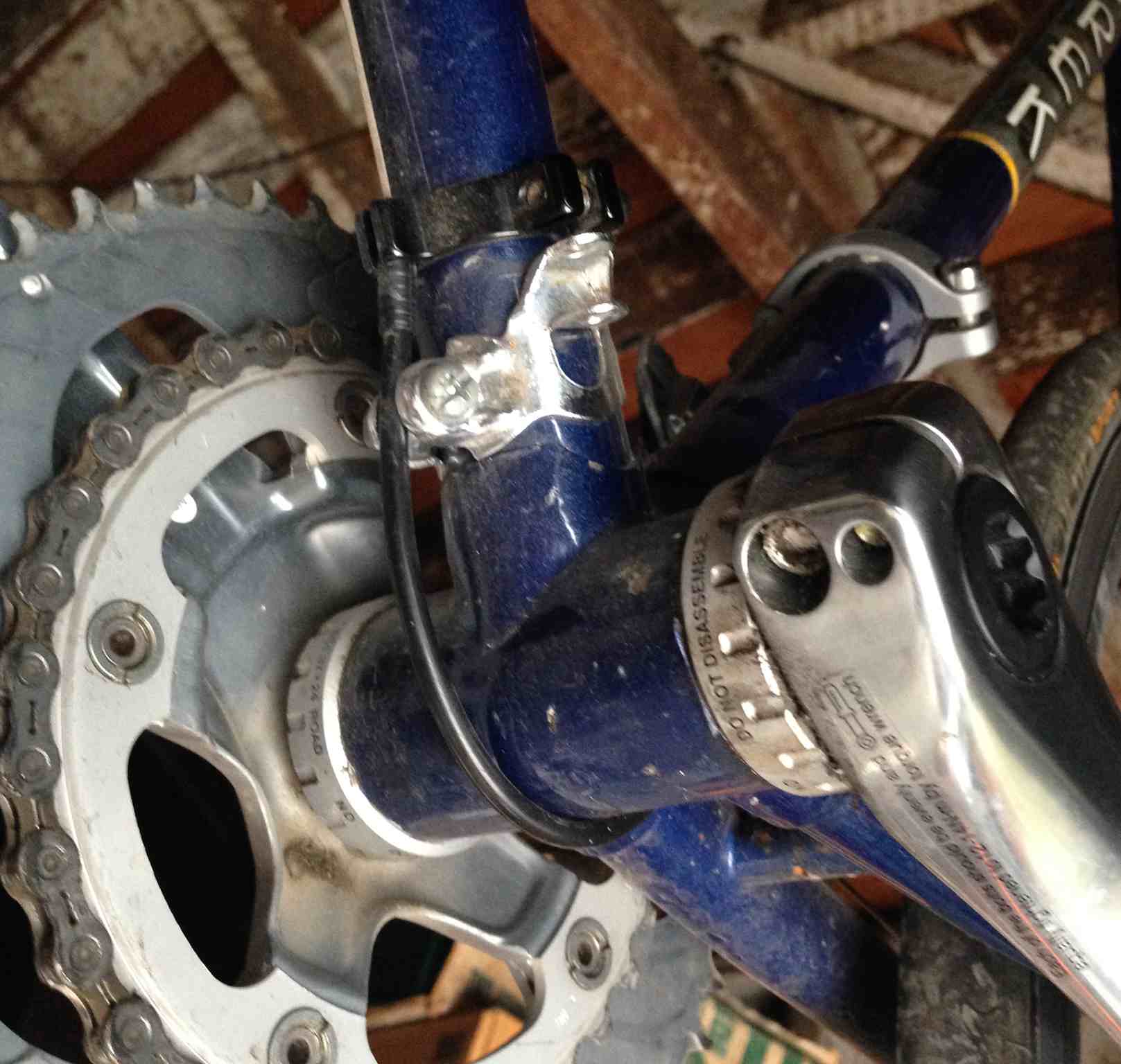
The Trek 311 frame was built for downtube shifters, and lacked stops or a threaded hole for the guide. I had to improvise somewhat, and found Origin8 cable stops as well as a used metal cable guide in my parts bin from previous projects.

It looks like this from the bottom, with a pair of Origin8 singles routing the front derailleur cable under the bottom bracket and the vintage Shimano guide holding the rear derailleur cable taut above:
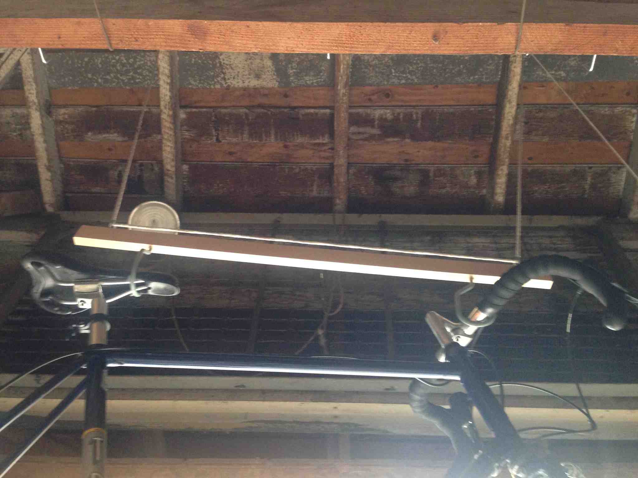
Finally, as the sixth bike in my one-car garage I had run out of room along the walls. Since this bike was going to be used for big occasional rides instead of regular commuting and shopping like the others, I rigged a pulley system to the ceiling to pull the bike up and out of the way when it wasn’t in use:
The ride has been great. We’ve done three big rides with it: 45 miles from SF to Halfmoon Bay and back, 80 miles around the Bay via Dumbarton Bridge, and 70 miles round the San Pablo Reservoir and along Richmond Bay Trail.
Nov 2, 2015 12:18am
code like you don’t have the time
I’m in management these days, and I’m still an active developer of open source projects. I enjoy code, I want to keep my hands in open data initiatives like OpenAddresses, I value a connection to current practice, but it’s a way of spending time that competes directly with Day Job.
I’ve been working on a set of choices that make it possible to advance an open source software project in small, manageable increments, based around three values: predictability, accessibility, and repeatability.
My primary evenings-and-weekends project these days is OpenAddresses and the Machine repository that processes the data. My first commit to Machine was almost a full year ago, and it’s been evolving ever since despite being in continual contention with all the other evening-and-weekend responsibilities I have to my life and health away from the keyboard. At any given moment, development might be interrupted by dinner, a movie, a night out, or a long bike ride. This is a catalog of the tools and practices I’m using to make it possible to work on OA long-term, using time and energy sustainably along the way.
Easy To Predict
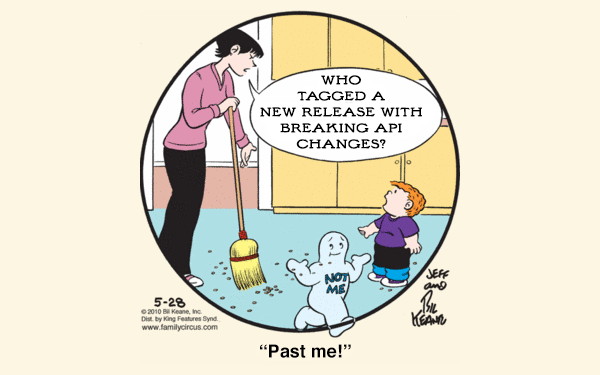
Semantic Versioning (Semver) is a requirement for any open source code project.
Under this scheme, version numbers and the way they change convey meaning about the underlying code and what has been modified from one version to the next. … Software using Semantic Versioning MUST declare a public API. This API could be declared in the code itself or exist strictly in documentation. However it is done, it should be precise and comprehensive. A normal version number MUST take the form X.Y.Z where X, Y, and Z are non-negative integers, and MUST NOT contain leading zeroes. X is the major version, Y is the minor version, and Z is the patch version. (Tom Preston-Werner)
Semver is not to be confused with Sentimental Versioning: “You may explain the system you create, if the beauty is enhanced by understanding it. You may just improvise new numbers from your mood on that day. The only important thing, is that the version number must be meaningful to you, the author.” The documentation clause of Semver requires that a public API be specified for the version numbers to mean anything. It’s a way of making and keeping promises to collaborators such as your bigger, meaner, future self.
If a project is anything other than a library of code, such as a website, a running service, or a specification, it becomes important to coordinate changes in a stable way. OpenAddresses is all of those things. Take this ticket from the Ops repository as an example: it’s a proposal to modify the data source syntax, which will impact both the code that processes OA data sources and the documentation in the sources repository. To maintain continuous stability over the lifetime of this change, each move needs to be small and atomic, able to be interrupted at any moment for any reason.
- Get input in Ops so we know we’re making a good choice.
- Pick a small part of the work to implement and deploy.
- Modify the Machine code so it supports the new behavior without breaking support for the old.
- Deploy changes to any running instance.
- Document the new behavior publicly, once it’s deployed and reflects reality.
I’m on a flight right now, so the last step above could be interrupted by turbulence or failed #planeclub wi-fi. The steps are in place to brace against instability. The image of coordination I try to keep in mind is crossing a river over a series of stepping stones: regain balance at each step, and never fall in when the wind kicks up.
(Secret Service agents bracing themselves against helicopter prop wash)
Easy To Access
To ensure your work is accessible, you need documentation, you need eyes on that documentation, and you need software unit and integration tests on everything.
It's called Accessibility, and it's the most important thing in the computing world. The. Most. Important. Thing. … When software—or idea-ware for that matter—fails to be accessible to anyone for any reason, it is the fault of the software or of the messaging of the idea. It is an Accessibility failure. (Steve Yegge)
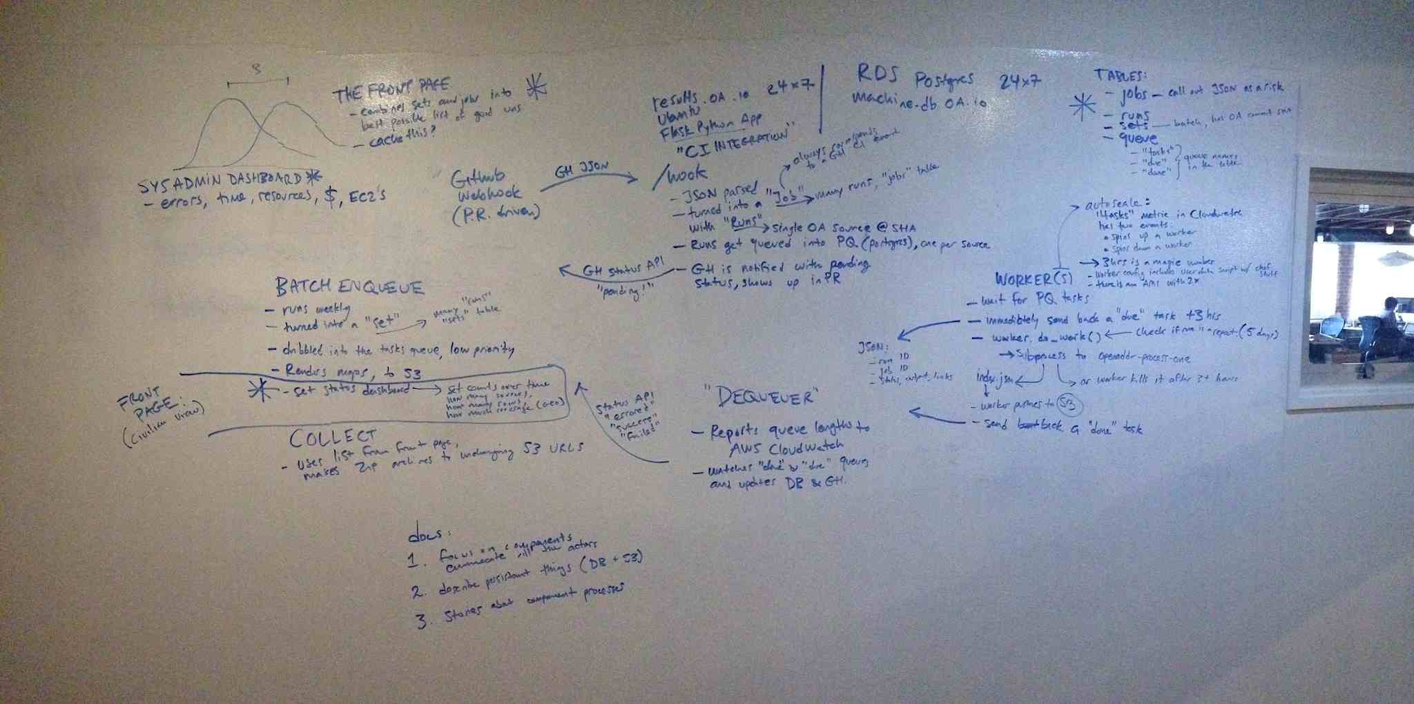
To make the Machine accessible to new contributors, we worked out a high-level set of documents that focus on four main areas: moving pieces like commands and scripts, persistent things like datastores, processes like the lifecycle of test jobs, and externalities like Amazon Web Services account information. This is the result, and this is where the work happened. Everything is cross-referenced and linked to source code, and I’ve attempted to ensure that everything can be linked with a stable URL.
So much of Machine lives in my head that I reached out to Nelson Minar for help. We set up a sort of interrogation, where I attempted to draw everything, he poked at my drawing with questions, and we added and removed detail until it made sense. Nelson recommended the four-part focus on components, processes, storage, and externals above, and the work is in this thread. The docs are not auto-generated. Even on older projects like TileStache, we wrote human documentation defining the API for Semver purposes that’s separate from machine documentation enumerating the code. They serve different purposes.
Tests are the other critical piece of this puzzle. In dynamic languages like Python, tests fill a need that overlaps with static types in other languages—they help ensure that a method does what it’s supposed to do, and back-fill the clarity exiled by rigid DRY. Machine is covered by bucketloads of tests, and I’ve been slowly improving my instincts for good unit tests as I’ve worked.
Easy To Repeat
Andy Allan’s 2012 post about getting started with Chef hooked me on using it for configuration management, for this reason:
Configuration management really kicks in to its own when you have dozens of servers, but how few are too few to be worth the hassle? It’s a tough one. Nowadays I’d say if you have only one server it’s still worth it–just–since one server really means three, right? The one you’re running, the VM on your laptop that you’re messing around with for the next big software upgrade, and the next one you haven’t installed yet. (Any Allan)
Previously, I’d always used shell scripts to configure services. Chef can be used the same way, with the key difference that a Chef recipe/cookbook/whatever defines an end-state rather than a process. It will “converge” the state of your system, taking whatever actions are needed to adjust it to match the declared intent (using a tedious, cringeworthy metaphor-cloud of kitchen words). In OpenAddresses, we have a few example pieces of Chef use:
- Complete cookbooks and recipes in the chef directory.
- A run script to call instead of chef-solo commands.
- Role files like this one where configuration details end up.
- Recipes consisting of resources such as this simple one.
At this point, I will probably never again run a server without involving configuration management in some form. The converge concept is too much of an improvement over simple bash scripts to ignore. If you’ve already started from a bash script, try adapting this simple base chef configuration with its one weird recipe. You don’t need to install a Chef server, or do any of the other crazy multi-machine fleet things either; chef-solo alone provides much of the benefit.
Lastly, it’s important to repeatability that your environment doesn’t slip around too much while you’re off doing something else. If months or years might pass between opportunities to devote significant time to a project, you don’t want your welcome back to be a continual module update juggling act. For this reason, stick to a language’s standard library wherever possible. Python advertises itself as “batteries included,” which will often rescue you from unpredictably changing requirements. Your code is the interesting part; rely only on modules outside a standard library if they’re stable, provide significant functionality, and themselves comply with Semver. At the system level, try to rely on package managers like Debian’s Apt and look for signs of stability in system releases such as Ubuntu’s Long-Term Support concept. Packaging is hard, espeically if you’re reliant on someone upstream from you doing it right:
I am not at all happy with the one package manager per programming language situation. I am old and crotchety and I’m tired of how every programming language keeps rediscovering just how fucking hard packaging and software distribution is. It really deserves to be elevated to hardest problem in computer science, ahead of cache invalidation and naming things. (JordiGH comments on Kevin Burke)
Conclusion
These practices and tools have made it possible to make steady, incremental progress on OpenAddresses with a group of collaborators over the past year. I’ve kept the work predictable, accessible, and repeatable. Even though Machine’s bus number is still close to 1, I’ve tried to keep the bus moving so slowly that it poses less of a risk while keeping the excitement focused on the 213m+ addresses we’ve managed to collect.
Oct 25, 2015 7:25pm
projecting elevation data
I enjoy answering questions about geospatial techniques, and I’ve been trying to do it on this blog where others might benefit. I’ve done one about historical map projections and another about extracting point data from OSM.
I got an email from Djordje Spasic, a Serbian architect working on a project in Barcelona and trying to understand how to use elevation data in a modeling environment:
I am trying to create a digital terrain model of Barcelona, based on an .asc file, but in Rhino 5 application without the usage of NumPy. I attached the .asc file below. … I googled a bit and looks like both cell width and height should be 0.000833333333 decimal degrees. … There is one problem with this: I noticed that terrain model looks a bit stretched in east-west direction. Meaning, that the width of the cell is a bit too large. This got me thinking: is this due to significant latitude to which .asc file corresponds to (41.35 North)? I thought that maybe I could somehow not use equal cell width and height.
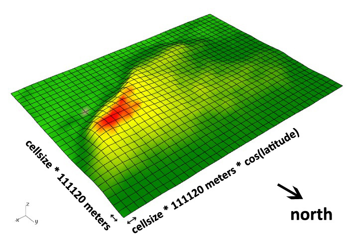
Djordje got in touch because of a hillshading script I had written, though I’ve also written a full library for tiling digital elevation models. Elevation data can be a pain to work with if you’re not familiar with either geographic projections or tools for working with raster data. Fortunately, GDAL does both if you know how to use it, and it comes built-in to QGIS, the desktop GIS application.
Based on the 0.00083 degree resolution, his data probably comes from the Shuttle Radar Topography Mission (SRTM) 3-arc-second data set, which has worldwide coverage at 1/1200° resolution. It’s also often known as the 90-meter dataset, because 1/1200° of latitude is a little over 90m on Earth.
The tricky part is that degrees of longitude aren’t a consistent width on a spherical earth, and Djordje was getting confused about how to apply this dataset to an architectural model in a small, flat location. I pulled together some OpenStreetMap metro extract data for Barcelona, opened everything in QGIS, and set the projection to the UTM grid zone for Barcelona, 31N. UTM uses the conformal Mercator projection, and visualizing the layers immediately showed the stretching that Djordje described:

The cells are indeed about 90m North-South, but quite a bit less than that East-West due to the curvature of the earth’s surface. At the equator, they’d be square. At the poles, they’d be infinitely narrow. Here, the aspect ratio is about 1.2:1. Djordje’s first instinct was to simply scale the cells. That’d work for a small patch such as this, but would introduce distortions at larger sizes such as a whole city (approx. 27m of difference from southern to northern Barcelona over 1/4° of latitude).
It’s a relatively simple two-part operation to get the .asc file into a more correct form: first warp it, then translate it to a usable data format.
Warping on the command line is pretty easy:
gdalwarp -r cubic \
    -s_srs EPSG:4326 -t_srs EPSG:32631 \
    Barcelona_elevations.asc out.tif
Skipping the command line and warping in QGIS is also easy, using the menu command Raster ➤ Projections ➤ Warp.
EPSG:4326 is the spatial reference for unprojected degrees, and matches the source dataset of SRTM. EPSG:32631 is a spatial reference for Mercator meters in UTM zone 31N, a convenient choice for this location. I might also have chosen Google Maps Mercator if I didn’t care about meters specifically, or created a new projection centered on Barcelona if I wanted to be much more precise and have geographic North pointing exactly up. -r cubic uses a smoother interpolation function to generate new elevation values between the existing ones, similar to resizing a photo in Photoshop. The output file is a GeoTIFF, and looks like this in QGIS:

The individual pixels are now square, and at a known size of 78.9m on the ground. The grid is 34×34 instead of 34×29, after warping and interpolating new values to cover the same area. The visual differences between the two are minimal:

The format translation needs to be a second step, because GDAL and QGIS don’t know how to write to the ASCII grid format from the warp operation. I’m not sure why this is the case, but here is the second command:
gdal_translate -of AAIGrid out.tif out.ascTranslation is also available in QGIS as a menu command, under Raster ➤ Conversion ➤ Translate.
Aug 30, 2015 9:54pm
the bike rack burrito n’ beer box
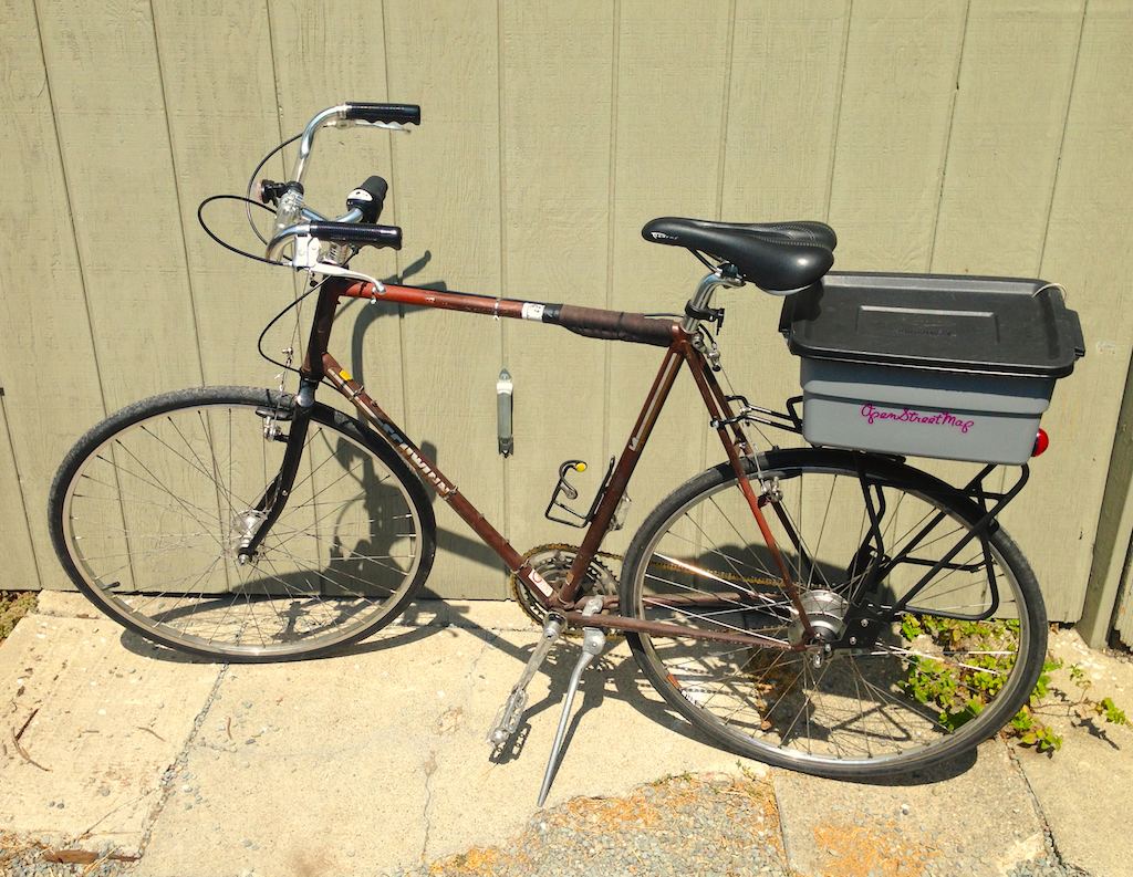
For bike day trips, keep a six-pack of beer cans cold and three burritos hot with this insulated rack-mountable box.
I switched the Schwinn touring bike from a front basket to a rear-mounted rack, and assembled this insulated box using $20 in parts from a hardware store and an art supply store. It should work for any rear-mounted bicycle rack with a flat top.
The box is a Rubbermaid 3 Gallon tote. Home Depot sells them for $5.27:
The insulation is plain styrofoam. I had a few sheets of 1" foam around the house, but it was slightly too thick to fit into the box leaving room for the six-pack (5.2" × 7.8" × 4.83"). Michael’s Art Supplies sells 5/8" sheets for an extortionate $5 apiece; two 12" × 12" sheets were enough for the sides:
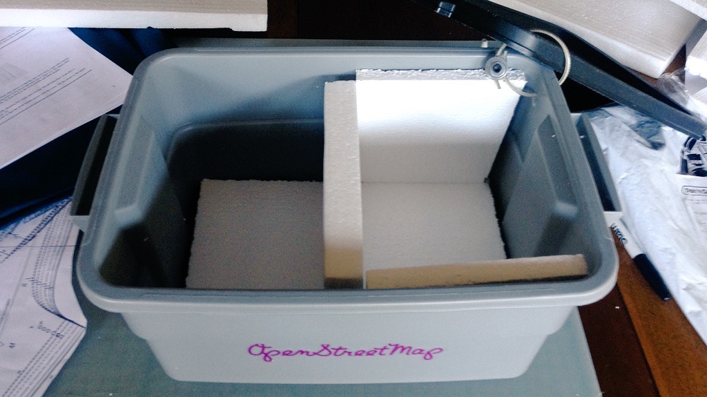
Use a sharp utility knife to cut the foam. The tote tapers slightly toward the bottom and has curved corners, so use the knife to trim off a bit of the bottom and corners of each of the four side panels until a six-pack fits snugly into the box:
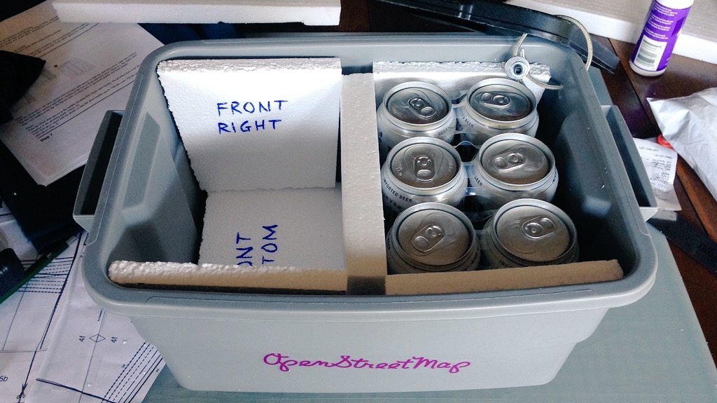
I labeled each of the panels so I wouldn’t be confused about how to fit them in, and wrapped the cut edges with clear packing tape so bits of styrofoam wouldn’t fly all over the place.
To mount the box to the rack, mark four points on the bottom of the tote box up against the inside corners of the rack top; it will look like this from the bottom when you’re done:
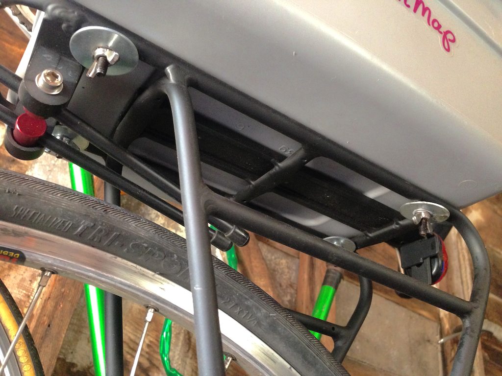
Each mount point is made from a three washers, a screw, and a wingnut.
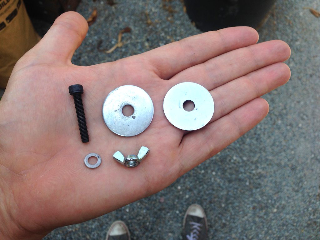
The screw here is fairly long, to make it possible to attach and detach the tote box without removing the wingnuts completely. They can simply be unscrewed, and the natural flexibility of the tote container will make it possible to bend the large washers around the rack. I use large fender washers to catch a complete interior corner of the rack on the bottom, and to distribute the stress on the bottom of the tote box. Smaller washers will distort the box and allow the screws to bend until they detach from the box while riding over bumps.
Make a sandwich from the washers, and use the tiny one to capture the screw head at top:

I used metric M5 screws for everything, to match most other bike components.
When you drill the four holes you’ve marked on the bottom of the box, use a bit slightly narrower than the screw threads so everything fits tightly. This should keep water from splashing up into the box from below, if you ride in the wet.
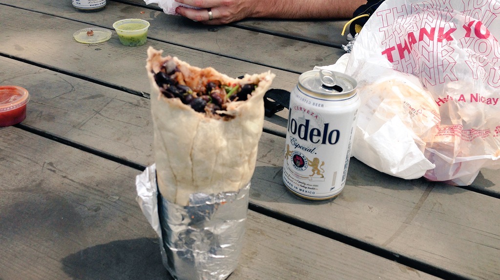
I tested the box on day-long ride in July. We started out with cans cold from the fridge and burritos hot from Burrito Express at 10am, and ascended Palomares Road over the next couple hours. We descended into Fremont, and made our way west along Alameda Creek to Coyote Hills Park where we stopped to eat around 3pm. After five hours in near 90° heat, the burritos were deliciously hot and the beers were acceptably cold.
Aug 15, 2015 6:08pm
a historical map for moving bodies, moving culture
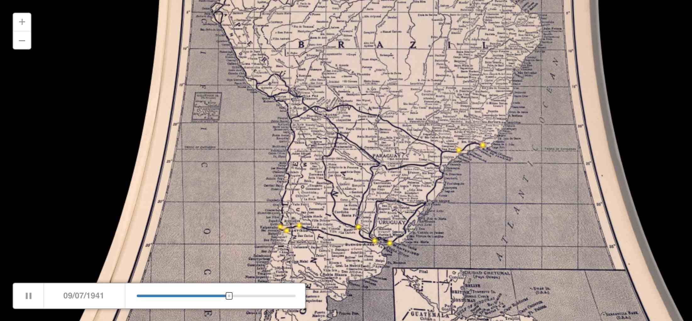
Similar to my quick adaptation of OSM data the other day, Kate Elswit recently asked for data and mapping help with her Moving Bodies, Moving Culture project. MBMC is a series of exploratory visualizations all based on the 1941 South American tour of American Ballet Caravan. The goal here was to adapt a Rand McNally road atlas from 1940 as a base map for the tour data, to “to see how different certain older maps might be, given some of the political upheaval in South America in the past 80 years.”
Kate is using Github to store the data, and I’ve written up a document explaining how to do simple map warping with a known source projection to get an accurate base map.
This is a re-post of the process documentation.
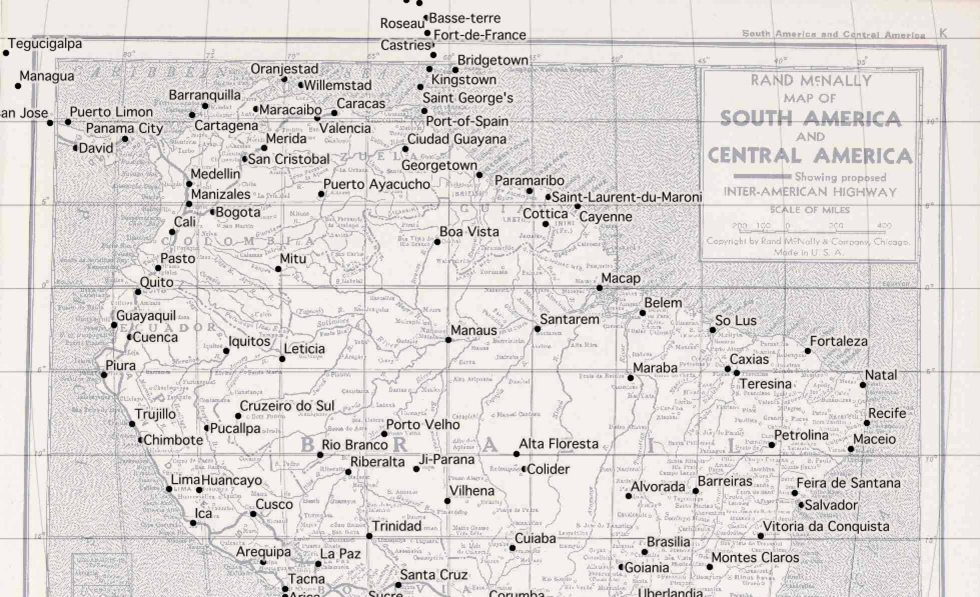
Start by downloading a high-res copy of the Rand McNally 1940 map. Follow the image link to the detail view:
Vector Data and QGIS
This downloads a file called 5969008.jpg.
Download vector data from Natural Earth, selecting a few layers that match the content of the 1940 map:
The projection of the 1940 map looks a bit like Mollweide centered on 59°W, so we start by reprojecting the vector data into the right PROJ.4 projection string:
ogr2ogr -t_srs '+proj=moll +lon_0=-59' \
    ne_50m_admin_0_countries-moll.shp \
    ne_50m_admin_0_countries.shp

ogr2ogr -t_srs '+proj=moll +lon_0=-59' \
    ne_50m_populated_places-moll.shp \
    ne_50m_populated_places.shp

ogr2ogr -t_srs '+proj=moll +lon_0=-59' \
    ne_50m_graticules_5-moll.shp \
    ne_50m_graticules_5.shp
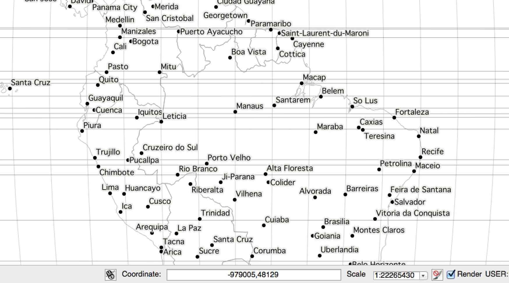
In QGIS, the location can be read from the coordinates display:
Warping The Map
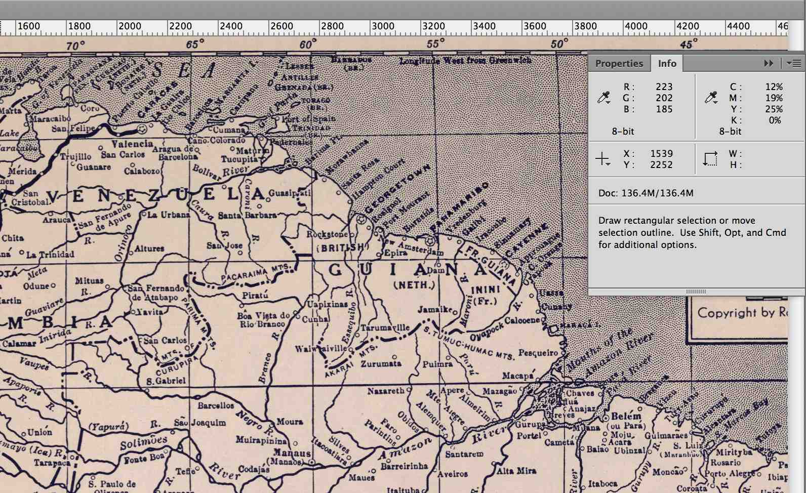
Back in the 1940 map, corresponding pixel coordinates can be read from Adobe Photoshop’s info panel:
Using GDAL, define a series of ground control points
(GCP) centered on cities
in the Natural Earth data and the 1940 map. Use gdal_translate
to describe the downloaded map and then gdalwarp
to bend it into shape:
gdal_translate -a_srs '+proj=moll +lon_0=-59' \
    -gcp 1233 1249 -1655000 775000 \
    -gcp 4893 2183 2040000 -459000 \
    -gcp 2925 5242 52000 -4176000 \
    -gcp 1170 3053 -1788000 -1483000 \
    -gcp 2256 6916 -767000 -6044000 \
    -of VRT 5969008.jpg 5969008-moll.vrt

gdalwarp -co COMPRESS=JPEG -co JPEG_QUALITY=50 \
    -tps -r cubic 5969008-moll.vrt 5969008-moll.tif
Opening the result in QGIS and comparing it to the 5° graticules shows that the Mollweide guess was probably wrong:
The exactly horizontal lines of latitude in the original map suggest a pseudocylindrical projection, and a look at a list of examples shows that Sinusoidal might be better. Try it all again with a different PROJ.4 string:
ogr2ogr -t_srs '+proj=sinu +lon_0=-59' \
    ne_50m_admin_0_countries-sinu.shp \
    ne_50m_admin_0_countries.shp

ogr2ogr -t_srs '+proj=sinu +lon_0=-59' \
    ne_50m_populated_places-sinu.shp \
    ne_50m_populated_places.shp

ogr2ogr -t_srs '+proj=sinu +lon_0=-59' \
    ne_50m_graticules_5-sinu.shp \
    ne_50m_graticules_5.shp
The pixel coordinates will be identical, but the locations will be slightly different and must be read from QGIS again:
gdal_translate -a_srs '+proj=sinu +lon_0=-59' \
    -gcp 1233 1249 -1838000 696000 \
    -gcp 4893 2183 2266000 -414000 \
    -gcp 2925 5242 52000 -3826000 \
    -gcp 1170 3053 -1970000 -1329000 \
    -gcp 2256 6916 -711000 -5719000 \
    -of VRT 5969008.jpg 5969008-sinu.vrt

gdalwarp -co COMPRESS=JPEG -co JPEG_QUALITY=50 \
    -tps -r cubic 5969008-sinu.vrt 5969008-sinu.tif
The results looks pretty good:
Cutting Tiles
For web map display, convert the warped map to map tiles using
gdal2tiles.py
starting at map zoom level 6:
gdal2tiles.py -w openlayers -z 0-6 \
    -c 'Rand McNally 1940' -t 'Map of South and Central America' \
    5969008-sinu.tif tiles
Convert all generated PNG tiles to smaller JPEG images using Python and convert:
python convert-tiles.py
Here it is in CartoDB:
Aug 13, 2015 6:15am
the other openstreetmap churches post
Scott Murray wrote the other day asking about getting Church data out of OpenStreetMap:
What is the easiest way to extract a list of a specific type of features from OSM for a particular area? For example, say I want all of the churches ( feature type: building / church ) in London, and the name, lat, and lon for each. Ideally all of this would end up in a simple CSV. This would be a one-time extract, and I don’t need to update it again later.
It was a pretty quick process, so I wrote it up for him and asked his permission to re-post here. I figured others might run into the same need. Today, Steven Vance in Chicago posted a response to a near-identical question with a different approach. There are many ways to skin this cat, and possibly not enough guides on this kind of retail data extraction from OpenStreetMap.
This is what I sent to Scott:
Since you’re asking for a major urban area, I would expect that London is part of the Mapzen metro extracts.
I downloaded a copy of the London OSM2PGSQL SHP data, because I know that it tends to be a closer (and often messier) representation of what’s in the OSM source database. If I was looking for roads or something else that I felt confident was already a defined and separate layer, I would download the IMPOSM SHP data. If I was looking for something outside a covered city, then I’d need to go digging in the Planet and I would be sad (edit: I’d follow Steven’s advice).
Next I looked on the OSM wiki to see how churches are tagged. The suggested tag is amenity = place_of_worship.
Then I used ogr2ogr, a tool in the GDAL family, to quickly peel out all the tag matches. I could do this interactively in QGIS as well, but I find the command line to be a speedier way to get what I want. ogr2ogr can be a pain in the butt to install, but I’ve found that it’s something of a secret hidden easter egg in Postgres.app, so if you install that you can find ogr2ogr hidden inside.
Here’s the conversion to get the OSM ID and the name for all places of worship:
ogr2ogr \
    -select 'osm_id, name' \
    -where "amenity = 'place_of_worship’” \
    london_england_osm_point-amenity-place_of_worship.shp \
    london_england_osm_point.shp
At this point I opened the shapefile in QGIS to see what’s there, and saw this this:

That looks right, so I convert it to a CSV preserving the geometry in (Y, X) fields, also using ogr2ogr:
ogr2ogr \
    -f CSV -lco GEOMETRY=AS_YX \
    london_england_osm_point-amenity-place_of_worship.csv \
    london_england_osm_point-amenity-place_of_worship.shp
Aug 9, 2015 4:51pm
platforminess, smartness, and meaningfulness
This week, I’ll be speaking at two Bay Area tech events:
On Wednesday, IxDA San Francisco is hosting Making Data Meaningful, where I’ll be joining designers from Facebook, Automatic, and Jawbone to talk about meaning and data.
On Thursday, SAP is hosting Accelerating Smart Cities in Palo Alto, where I’ll be joining a (regrettably all-male) group of technology and government experts to talk about smartness and cities.
This is me trying to get some thoughts straight while I prepare.
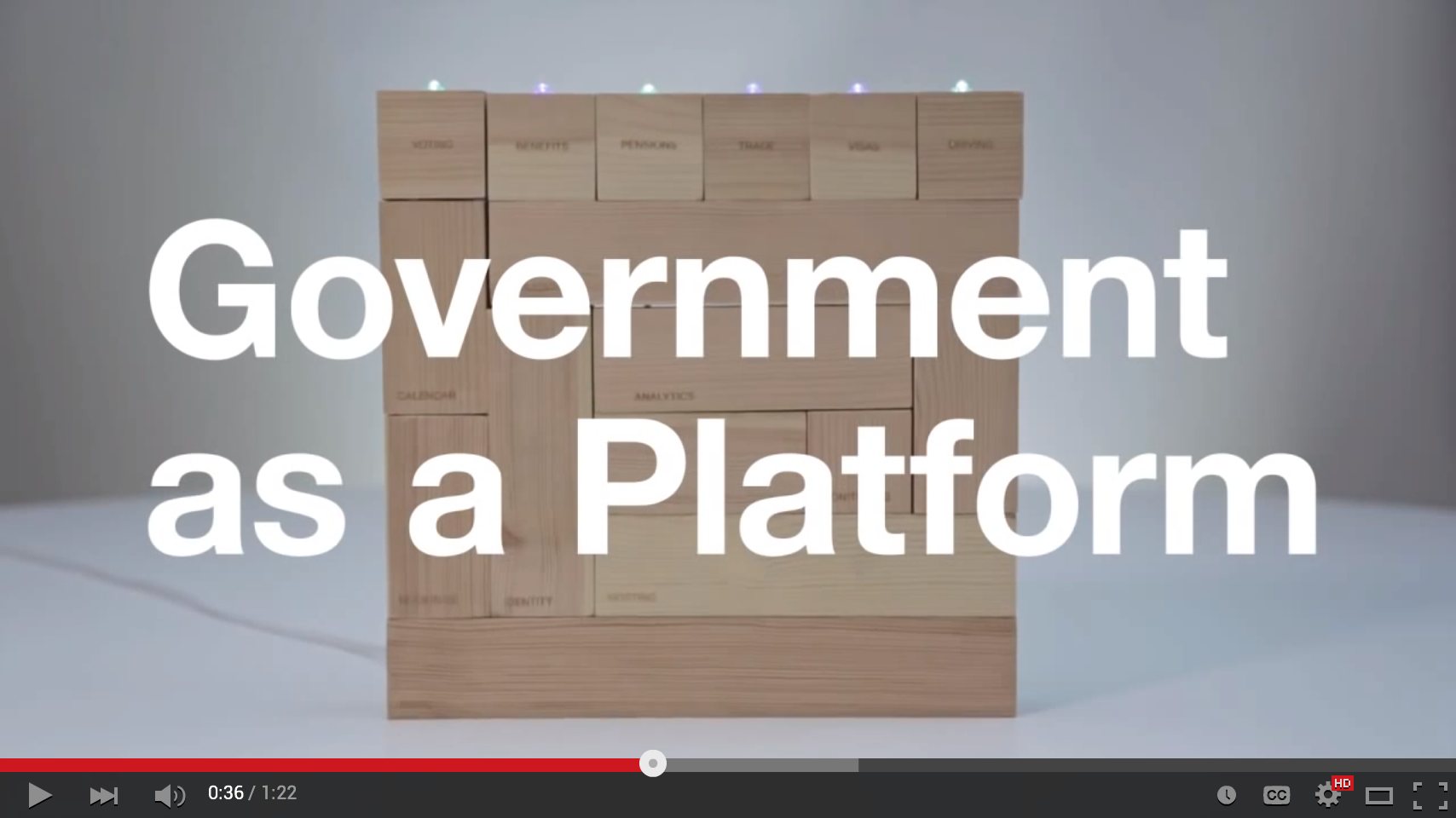
When I first met my now-boss Jen Pahlka and got excited about Code for America, it was 2010 and Tim O’Reilly was starting to unveil his “government as a platform” meme. For tech people like me, it’s an evocative and potent image and I’ve been wondering why. The UK’s Government Digital Service made this video to attempt an explanation, and it misses the mark:
I’ve been re-reading Science in Action. Eight years later, there are a lot of ideas in Latour’s book directly applicable to what makes a platform and what’s missing from the GDS video. Latour uses the Roman two-faced god Janus as a recurring illustration, contrasting ready-made science that you learn in a school textbook with science-in-the-making that you learn in the news.
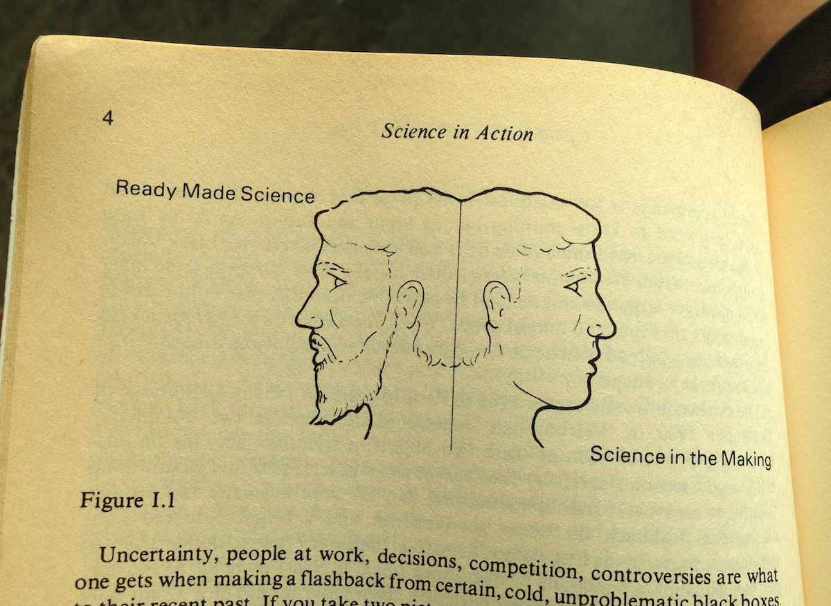
Uncertainty, people at work, decisions, competition, controversies are what one gets when making a flashback from certain, cold, unproblematic black boxes to their recent past. If you take two pictures, one of the black boxes and the other of the open controversies, they are utterly different. They are as different as the two sides, one lively, the other severe, of a two-faced Janus. “Science in the making” on the right side, “all made science” or “ready made science” on the other; such is Janus bifrons, the first character that greets us at the beginning of our journey.
The Janus illustration appears repeatedly, showing the difference between settled facts on the left and the process by which they’re made on the right:
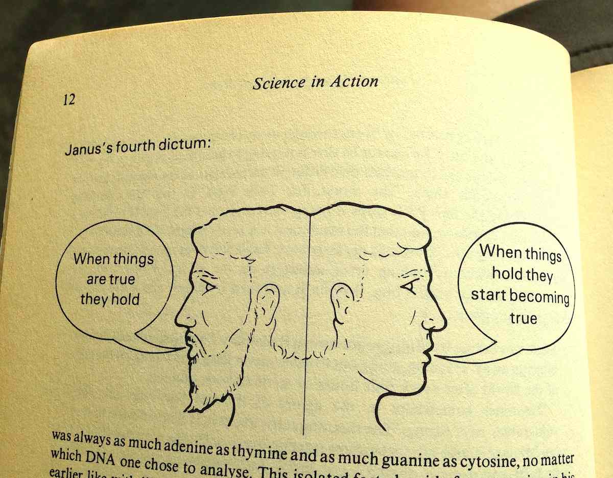
On the right is where the messy controversies of science and technology happen, and usually they’re in the form of suggested truths being put to a test. When things “hold,” they work for new people in new contexts. The chemist’s double-helix shape of DNA is used by the biologist to explain how genetic information is copied. Pasteur’s work on bacterial vaccines is used by farmers to keep their sheep and cows alive. The GDS video shows the platforminess of technology as a settled truth with neatly-shaped blocks, but without those other people using the platform for support it doesn’t mean anything.
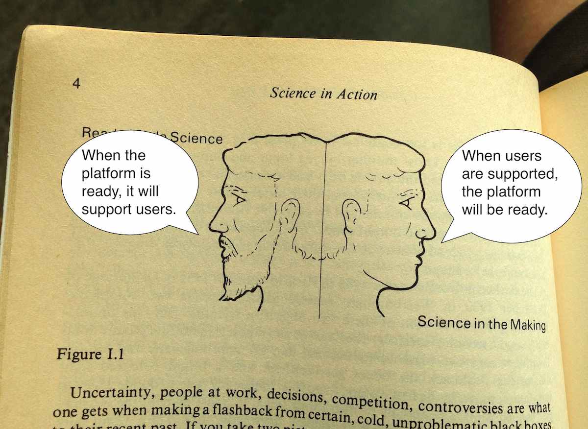
So, nothing is a platform until it’s used as one.
Meanwhile, there are a few potential visions of what a government platform might look like. Specific actors work on the right side of Janus developing and promoting visions to make them real. The winning bingo words are “big data,” “smart cities,” “internet of things,” and so on.
Adam Greenfield (author of Against The Smart City) ties a few of these threads together in a recent edition of his weekly email letter:
So the idea that we will somehow use the data we garner to “make wiser decisions” about our own lives is something I find naive at best. If other parties will almost always better be able to use data to act in ways that are counter to my interests (and even do me harm!) than I will be able to marshal the time, effort and energy to use them in ways that advance my interests, then the house always wins. And this is particularly problematic as one failing “smart city” initiative after another gets reframed and repositioned as an “urban IoT” project.
The initiatives fail to hold, and are recast into new initiatives.
Government has always had high potential for running platforms, because platforms are essentially made of regulations. The web platform is a set of rules for how markup, addresses, and state transfers work together. The Amazon services platform is a set of rules for how computers, networks, and credit cards work together. The Interstate Highway platform is a set of rules for how roads, tax dollars, and cars work together. All those pieces can be swapped out, but the rules that bind them hold. In the GDS video metaphor, rules might specify the acceptable size and weight of a block but not its material or color. It should reference the idea of other people in the picture, the potential for new actors to use those blocks for support.
Where government has failed at platforms is in delivery. Outgoing GDS director Mike Bracken immortalized their approach with his “Strategy is Delivery” meme, jumping the gap between isolated rule-setting and the services that deliver those rules. Implementation is a pre-digital, book-length exploration on the same theme from 1973: “If one wishes to assure a reasonable prospect of program implementation, he had better begin with a high probability that each every actor will cooperate. The purpose of bureaucracy is precisely to secure this degree of predictability.” Delivery secures predictability by making things real. Dan Hon has published CfA’s point of view on service delivery with respect to technology procurement, with a special focus on connecting that bureacratic probability machine to the original user needs that set it in motion.
Mikey Dickerson of USDS illustrates this using his modified hierarchy of needs. It’s his response to the lack of platform thinking at Healthcare.gov in 2013, and the platform metaphor is right there in the picture of the pyramid:
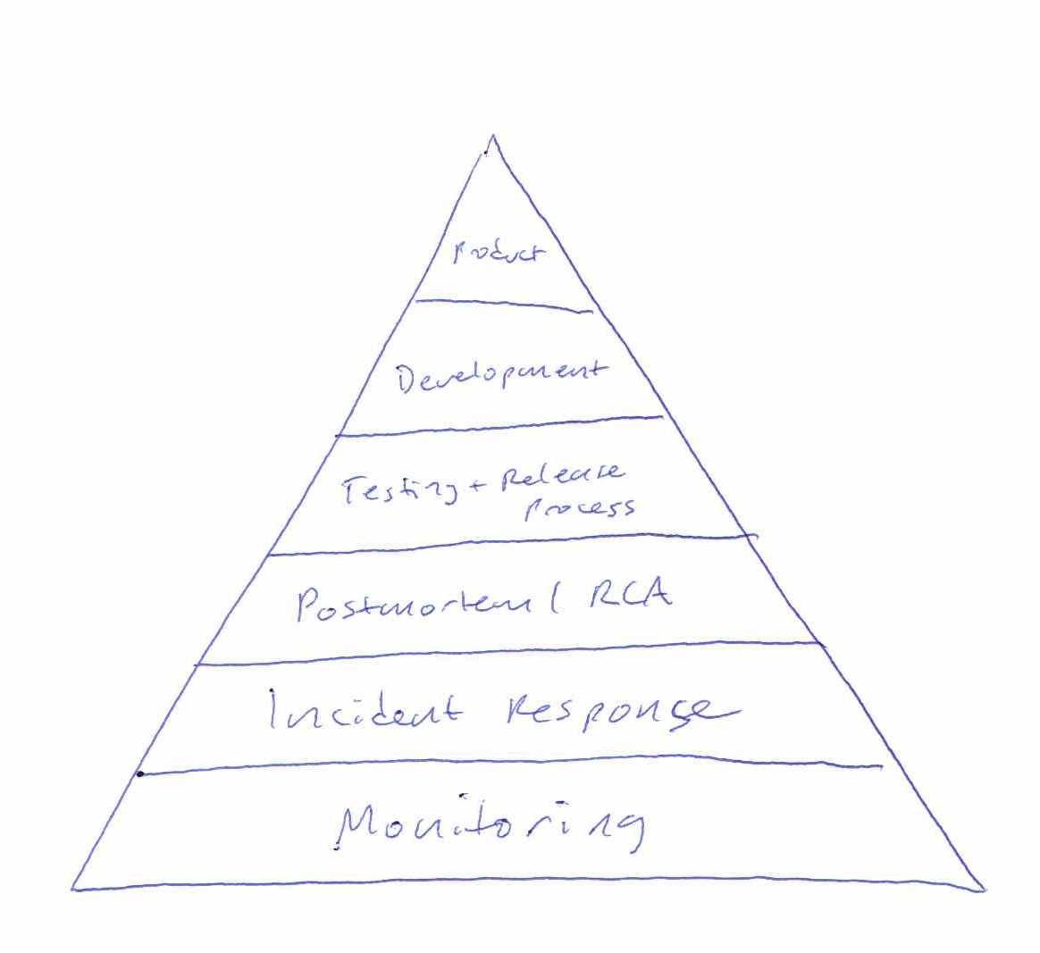
Without a foundation of monitoring or incident response, it was impossible to know that Healthcare.gov worked. The policy intent was not being delivered. The individual components were all being individually monitored by the contractors responsible for them, but little effort was spent securing predictability by enforcing coordination so that outages could have an agreed-upon boundary. Without the platform of common language about the system, the pyramid is just a tower of babel.
Faced with these same challenges, the private sector often simply folds (pivots). Phil Gyford runs a cherished record of tone-deaf service shutdowns called Our Incredible Journey. Markets get resegmented, teams sell themselves to bigger companies, and engagement gets prioritized over service delivery. However, public servants don’t pivot.
Returning to the topic of the Accelerating Smart Cities and Making Data Meaningful events, “smart” and “meaningful” can only be used in retrospect as a judgement of success. A city government is mandated to meet certain needs of its residents. Having met those needs is the only way in which it can be said to be smart. Urban informatics dashboards, mass data collection, and coordinated networks of magic talking light poles are not user needs. Having been available, current, and usable is the only way in which data can be said to be meaningful (to borrow from Renee Sieber’s definition of open data). Having supported novel uses by other people is the only way in which a government can be said to be a platform.
Jul 5, 2015 7:21pm
writing a new continuous integration service for openaddresses
We’ve been working on an update to the technology behind OpenAddresses, and it’s now being used in public.
OpenAddresses is a global repository for open address data. In good open source fashion, OpenAddresses provides a space to collaborate. Today, OpenAddresses is a downloadable archive of address files, it is an API to ingest those address files into your application and, more than anything, it is a place to gather more addresses and create a movement: add your government’s address file and if there isn’t one online yet, petition for it. —Launching OpenAddresses.
Timely feedback is vital to a shared data project like OA, something I learned many years ago when I started contributing to OpenStreetMap. In 2006, tiles rendered many days after edits were made, and the impossibility of seeing the results of your own work gated participation. Today, the infrastructure behind OSM makes it easy to see changes immediately and incorporate them into other projects, feedback vital to keeping editors motivated.
Last year, we automated the OpenAddresses process to cut the update frequency from weeks or months to days. Now, we’d like to cut that frequency from days to hours or minutes.
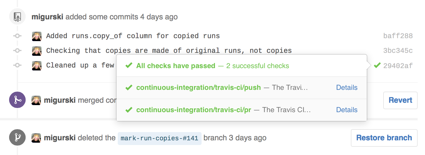
OpenAddresses is run from Github. If you host a code project there and you’re serious about code quality, it’s likely that you’ve configured Travis or Circle to automatically run your test suite as you work. For external contributors sending pull requests to a project, CI services make it easy to see whether changes will work:
OA has always used Travis CI to verify the syntax correctness of submitted data, and it will tell you that your JSON is valid and that you’re using the right tags. We wanted to be able to see the true results of integrating that data into OA. Ordinarily, Travis itself might be a good tool for this job, but OA sources can take many hours to run, and a single PR might include changes to many sources. So, we needed to roll our own continuous integration service.
What’s New
Creating our own service to run OA source submissions required three parts:
- A web service to listen for events from Github.
- A pool of workers to act on those events.
- Communication back to Github.
The web service is the easiest part, and consists of a simple Flask-based application listening for events from Github. These events can be signed with a secret to ensure that only real requests are acted on. There are dozens of event types to choose from, but we care about just two: push events when data in the OA repository is changed, and pull request events when a contributor suggests new data from outside. Events come in the form of JSON data, and it takes a bit of rooting around in the Github API to determine what actual files were affected. Git’s underlying data model (more, easier) is helpful here, with commits linked to directory trees and trees linked to individual file blobs. Each event from Github is turned into a job of added or changed source data, and each individual source is queued up for work. Nelson chose PQ for the queue implementation since we’re already using Python and PostgreSQL, and it’s been working very well.
The worker pool is tricky. It’s wasteful to keep a lot of workers standing around and waiting, but you still want to act quickly on a new submissions so people don’t get antsy. There are also a lot of interesting things that can go wrong. Amazon’s EC2 service is a big help here, with a few useful features to use. Auto Scaling Groups make it easy to spin up new workers to do big jobs in parallel. We’ve set up a few triggers based on the size of the queue backlog to determine how large a group is needed. When there have been tasks waiting for a worker for longer than a few minutes, the pool grows. When no new tasks have been waiting for a few hours, the pool shrinks. We use Amazon Cloudwatch to continuously communicate the size of the queue. We have struck a balance here, aiming for results within hours or minutes rather than seconds, so we only grow the pool to a half-dozen workers or so.
Finally, Github needs to know about the work being done. As each task is completed, a status of "pending", "success", or "failure" is communicated back to Github where it is shown to a user along with a link to a detailed page. Commercial CI services use the Commit Status API to integrate with Github, and it’s available to anyone. The tricky part here is how to differentiate between failed jobs and ones that simply take a long time. In our case, we have a hard limit of three hours for any job, and judge a job to have failed when it’s been AWOL for more than three hours. Right now, we’re not retrying failed jobs.
Next Steps
There are still bugs and weird behaviors in the CI service, so I’m shaking those out as I watch it in action.
We are continuing to run the batch job process. There’s nothing else that can generate the summary page at data.openaddresses.io for the time being, so the new continuous integration feature is being used solely to inform data contributors within pull requests. I’d like to replace the batch job with a smaller one that schedules missing sources, renders maps, and summarizes output. Then we can kill off the old batch process.
Jun 21, 2015 10:31pm
state of the map 2015
Two weeks ago I was in New York for State Of The Map 2015, the annual OpenStreetMap conference.
2014’s event was in DC, and I had kind of a hard time with it. Good event, but dispiriting to come back to the community after a year away and encountering all the same arguments and buillshit as 2013 and before.
This year in New York was awesome, though. It felt as though some kind of logjam had been cleared in the collective consciousness of OpenStreetMap. Kathleen Danielson, new international board member, delivered a mic-drop talk on diversity. New York designers and urbanists were in attendance. A wider variety of companies than ever before sponsored and presented.
I was a last-minute addition to the program, invited by Brett Camper to take over moderation of his panel on vector rendering. There is video now on the website (here is a direct Youtube link for when the permalink-haters who do the site each year break all the current URLs).
We had four participnts on the panel.
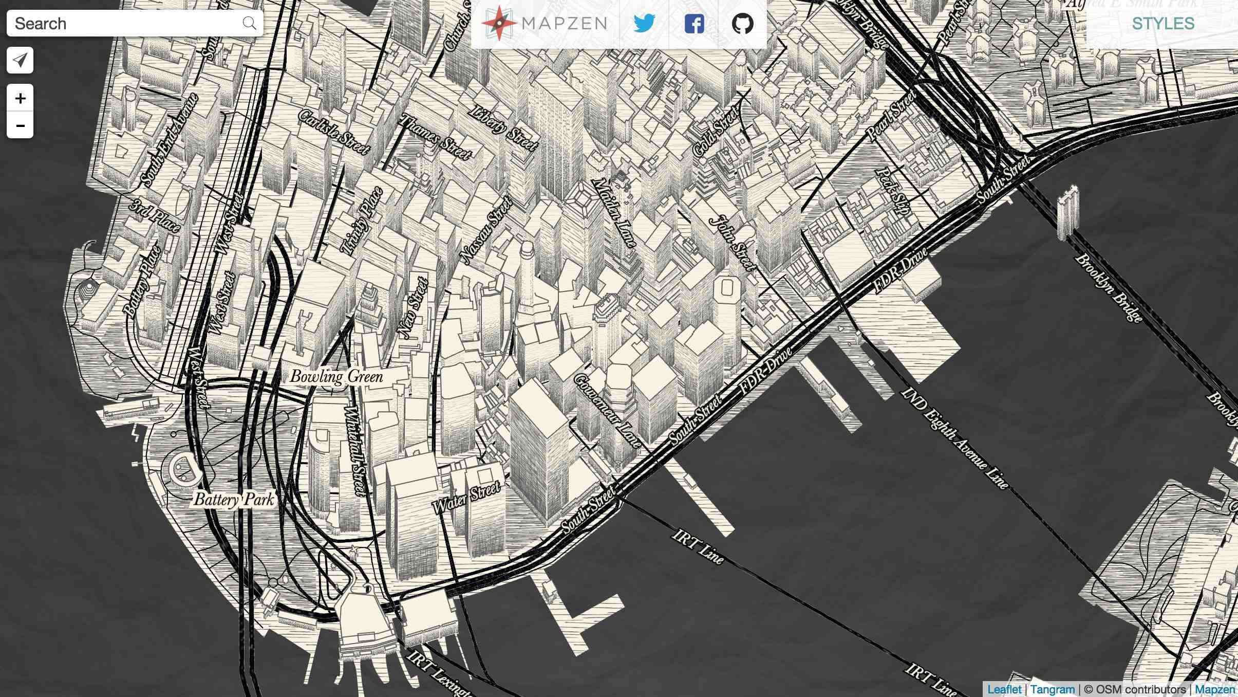
Matt Blair from Mapzen works on the Tangram rendering engine, a WebGL rendering layer for in-browser delivery of responsive, dynamic, and funny maps like this sketchy style:
Mapzen has been doing a bunch of interesting things with 3D, and when I visited the office Peter Richardson had a bunch of printed Manhattan tiles on his desk, including this one of 16/19300/24630 with Grand Central and the NYPL viewed from the north:
Konstantin Käfer from Mapbox works on the new GL rendering product, and he’s been producing a regular stream of new rendering work and data format output throughout the three years I’ve known him. Konstantin shared this gorgeous animated view of a map zooming from Boston to Melbourne, showing off dynamic text rendering and frame-by-frame adjustments:
Hannes Janetzek of OpenScienceMap produces a rendering product intended for scientific use. His work is used to support academic research, and he was unique on the panel for not having a commercial product on offer: “OpenScienceMap is a platform to enable researchers to implement their ideas, to cooperate with others, and to share their results.”

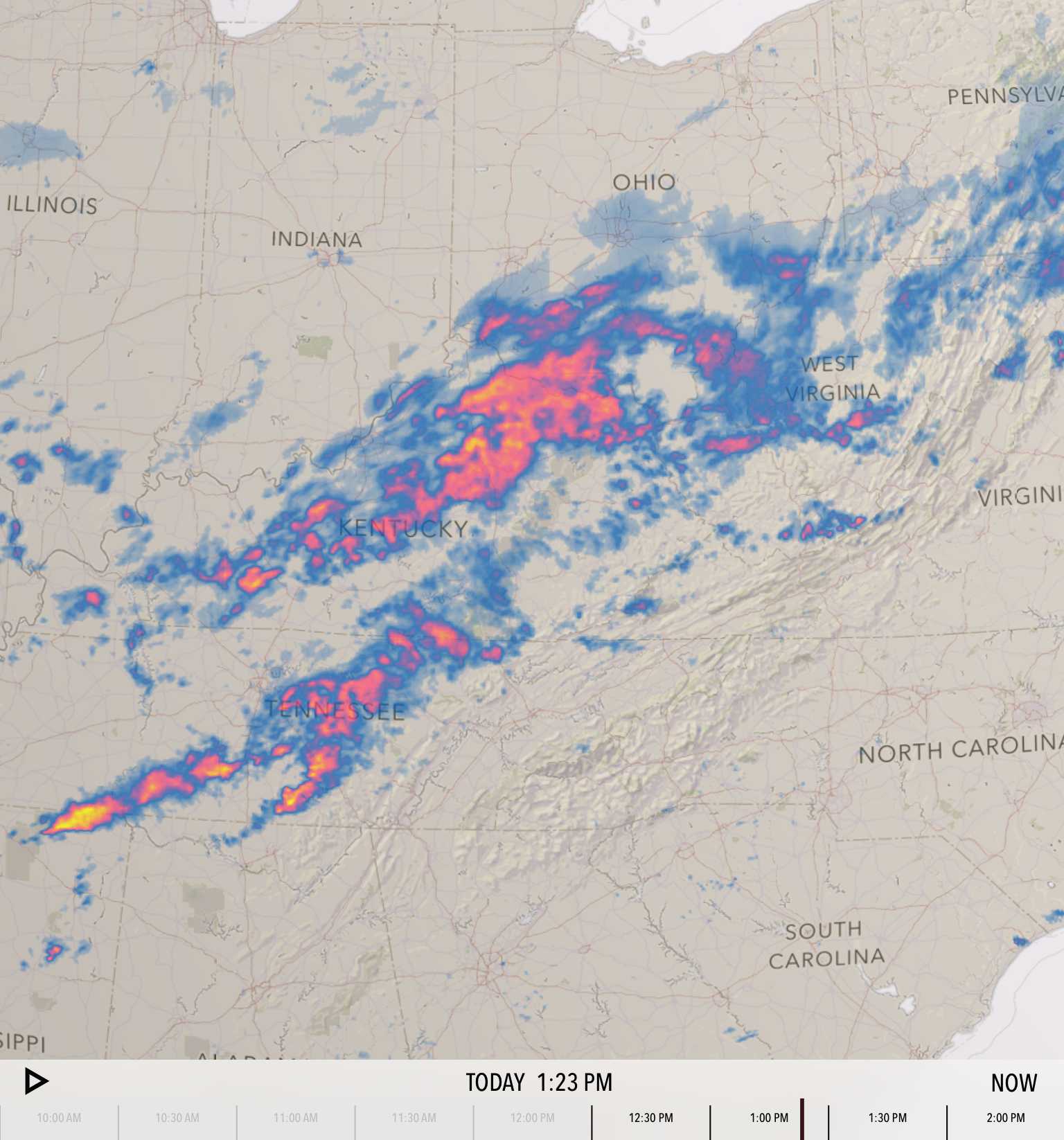
Steve Gifford of WhirlyGlobe-Maply is primarily in the consulting business, and his open source 3D globe rendering platform is used by the current number two app in the Apple app store, Dark Sky. The rendering output of Steve’s work is typically different from the other three, in that he’s mostly delivering zoomed-out views of entire regions rather than the street-level focus of OpenScienceMap, Mapzen, and Mapbox. It was telling that everyone except Steve identified text rendering and labeling as their primary difficulty in delivering vector-driven client-side renders.
Steve’s rendering pipelines commonly cover more raster rendering than the others, such as this screen from Dark Sky showing stormy weather over Ohio and Kentucky:
I produced a bunch of vector rendering work two years after I left Stamen, and I enjoyed moderating a panel on a topic I’m familiar with without having any skin in the game. It’s super exciting to see all of this happening now, and it feels a bit like OSM raster rendering in 2006/07, when Mapnik was still impossible to install but a growing group of people like Dane were nudging it forward into general accessibility. I give vector tiles and vector rendering another 1-2 years before it tips from weird research and supervised, commercial deployment into wide use and hacking.
Mar 9, 2015 2:12am
bike ten: schwinn touring, v2
I’ve installed an internally-geared hub on the Schwinn touring frame.
I had originally expected to get a Sturmey-Archer 5-speed, but numerous bike shops told me that they were seeing a high rate of returns on the Sturmey’s, so I picked a Shimano instead. The rear dropout spacing on the Schwinn is just 126mm while the hub is 130mm across. It needs a bit of stretching to get the wheel in.
I used the equipment and help at the fabulous SF Bike Kitchen to get this made. It needed two trips, one to put together the basics and a second shorter trip to true it all into shape. Adam’s help last year gave me the confidence to try this out, and Esther from Bike Kitchen staff helped me understand dish and tension.
I swapped in a pair of Velo Orange Montmartre handlebars to accommodate the shifter. They look a little nicer than the flipped-back bull horns I had previously, but the shifter itself is kind of a disaster.
It’s big and knobbly and really doesn’t fit anywhere useful. I placed it on the right bar-end like Sheldon Brown’s Raleigh International, but he’s got his on a drop bar while mine’s right under my wrist. I’m looking for alternatives here; most of the Shimano products for this purpose look like cheap stereo equipment. I did run into a guy on BART with an interesting stem-mounted Shimano shifter that looked to be made of milled steel, but apparently it’s a pre-release prototype by Mission Bicycle, and the only one currently on the road. They sounded surprised when I called to ask them about.
The internal hub is a dream, and overall the bike continues to take shape slowly.
Update: Trying this variant with a bar-end extension:
Jan 7, 2015 7:38am
blog all oft-played tracks VI
This music:
- made its way to iTunes in 2014,
- and got listened to a lot.
I’ve made these for 2013, 2012, 2011, 2010, and 2009. Also: everything as an .m3u playlist.
10. Voyou: Houseman
Gem pointed me to DJ Jeb Edwards’ Beat Bash mixes early in the year, each a themed collection of late 80’s and early 90’s dance music. Some industrial, some hip-house, some techno. Voyou’s Houseman was included on March 6th in a selection of Cold War tracks.
9. Pet Shop Boys: Bolshy
We saw Pet Shop Boys perform in Oakland in the spring, a fantastic show. I hadn’t realized they were touring in support of a new album. Fluorescent is another good track on that album.
8. Gidge: You
Neb proudly called out Gidge as a new addition to the slooowly-changing music rotation in his convertible.
7. Aphrodite’s Child: The Four Horsemen
I was curious to learn more about Vangelis, composer of the 1982 Blade Runner soundtrack. Aphrodite’s Child was his Greek progressive rock band formed in 1967, with Demis Roussos, Loukas Sideras, Anargyros Koulouris, and Vangelis Papathanassiou on keyboards. I found this song sticky, and was briefly scared that I like new age music. I had a song called Four Horsemen last year too, a popular theme.
6. µ-Ziq: Roy Castle
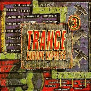
From the altogether-excellent Trance Europe Express vol. 3 compilation, which also introduced me to Biosphere and other key trance and ambient artists in college.
5. The Melvins: A History Of Bad Men
True Detective featured music selected by T Bone Burnett, and there’s a chunk of music here that I pulled together from track listings for the series. A History Of Bad Men can be heard in the background of the bar scene where Rust goes to meet Ginger.
4. Grinderman: Honey Bee (Let’s Fly To Mars)
More from True Detective. Honey Bee comes in right at the end of the infamous six-minute tracking shot.
3. Bosnian Rainbows: Eli
I played this one when Burrito Justice had me on his show in November. Haunting.
2. SIL: Windows (Original Mix)
Basically perfect 1991 Amsterdam prog-house.
1. Junior Vasquez: Live at Sound Factory 1993
A complete mix of New York disco and house.
