tecznotes
Michal Migurski's notebook, listening post, and soapbox. Subscribe to ![]() this blog.
Check out the rest of my site as well.
this blog.
Check out the rest of my site as well.
Jun 9, 2017 10:31pm
blog all dog-eared pages: human transit

This week, I started at a new company. I’ve joined Remix to work on early-stage product design and development. Remix produces a planning platform for public transit, and one requirement of the extensive ongoing process is to have read Jarrett Walker’s Human Transit cover-to-cover. Walker is a longtime urban planner and transit advocate whose book establishes a foundation for making decisions about transit system design. In particular, Walker advocates time and network considerations in favor of simple spatial ones.
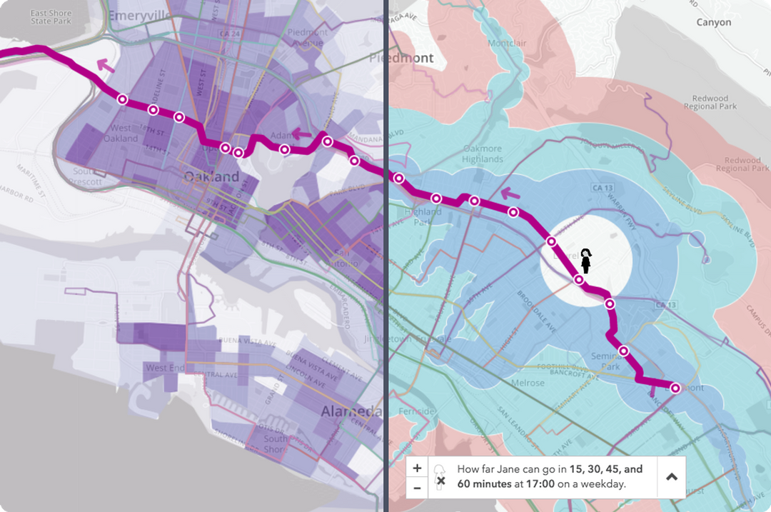
Many common public ideas about transit system design are actually misapplied from road network design when the two are actually quite different. For example, the frequency of transit vehicles (headway) has a much greater effect than their speed on the usability of a system. Uninformed trade-offs between connected systems and point-to-point systems can lead to the creation of unhelpful networks with long headways. Interactions between transit networks and the layout of streets they’re embedded in can undermine the effectiveness of transit even when it exists. All of this suggests that new visual mapmaking tools would be a critical component of better transit design that meets user needs, like the “Jane” feature of the current Remix platform showing travel times through a network taking headways into account. Here’s how far a user of public transit in Oakland can move from the Laurel Heights neighborhood on a weekday:
There’s an enormous opportunity here to apply statistical, urban, and open data to the problems of movement and city design.
These are a few of the passages from Human Transit that piqued my interest.
What even is public transit, page 13:
There are several ways to define public transit, so it is important to clarify how I’ll be using the term. Public transit consists of regularly scheduled vehicle trips, open to all paying passengers, with the capacity ti carry multiple passengers whose trips may have different origins, destinations, and purposes.
On the seven demands for a transit service, page 24:
In the hundreds of hours I’ve spent listening to people talk about their transit needs, I’ve heard seven broad expectations that potential riders have of a transit service that they would consider riding: 1) It takes me where I want to go, 2) It takes me when I want to go, 3) It is a good use of my time, 4) It is a good use of my money, 5) It respects me in the level of safety , comfort, and amenity it provides, 6) I can trust it, and 7) It gives me freedom to change my plans. … These seven demands, then, are dimensions of the mobility that transit provides. They don’t yet tell us how good we need the service to be, but they will help us identify the kinds of goodness we need to care about. In short, we can use these as a starting point for defining useful service.
On the relationship between network design and freedom, pages 31-32:
Freedom is also the biggest payoff of legibility. Only if you can remember the layout of your transit system and how to navigate it can you use transit to move spontaneously around your city. Legibility has two parts: 1) simplicity in the design of the network, so that it’s easy to explain and remember, and 2) the clarity of the presentation in all the various media.
No amount of brilliant presentation can compensate for an overly-complicated network. Anyone who has looked at a confusing tangle of routes on a system map and decided to take their car can attest to how complexity can undermine ridership. Good network planning tries to create the simplest possible network. Where complexity is unavoidable, other legibility tools help customers to see through the complexity and to find patterns of useful service that may be hidden there. For example, chapter 7 explores the idea of Frequent Network maps, which enable you to see just the lines where service is coming soon, all day. These, it turns out, are not just a navigation tool but also a land use planning tool.
On the distance between stops, pages 62-63:
Street network determines walking distance. Walking distance determines, in part, how far apart the stops can be. Stop spacing determines operating speed. So yes, the nature of the local street network affects how fast the transit line can run!
How do we decide about spacing? Consider the diamond-shaped catchment that’s made possible by a fine street grid. Ideal stop spacing is as far apart as possible for the sake of speed, but people around the line have to be able to get to it. In particular, we’re watching two areas of impact.
First, the duplicate coverage area is the area that has more than one stop within walking distance. In most situations, on flat terrain, you need to be able to walk to one stop, but not two, so duplicate coverage is a waste. Moving stops farther apart reduces the duplicate coverage area, which means that a greater number of unique people and areas are served by the stops.
Second, the coverage gap is the area that is within walking distance of the line but not of a stop. As the move stops farther apart, the coverage gap grows.
We would like to minimize both of these things, but in fact we have to choose between them. … Which is worse: creating duplicate coverage area or leaving a coverage gap? It depends on whether your transit system is designed mainly to meet the needs of transit-dependent persons or to compete for high ridership.
On Caltrain and misleading map lines, pages 79-80:
Sometimes, commuter rail is established in a corridor where the market could support efficient two-way, all-day frequent rapid transit. Once that happens, the commuter rail service can be an obstacle to any further improvement. The commuter rail creates a line on the map, so many decision makers assume that the needs are met, and may not understand that the line’s poor frequency outside the peak prevents it from functioning as rapid transit. At the same time, efforts to convert commuter rail operations to all-day high-frequency service (which requires enough automation to reduce the number of employees per train to one, if not zero) founder against institutional resistance, especially within labor unions. (Such a chance wouldn’t necessarily eliminate jobs overall, but it would turn all the jobs into train-driver jobs, running more trains)
This problem has existed for decades, for example, around the Caltrain commuter rail line between San Francisco and San Jose. This corridor has the perfect geography for all-day frequent rapid transit: super-dense San Francisco at one end, San Jose at the other, and a rail that goes right through the downtowns of almost all the suburban cities in between. In fact, the downtowns are where they are because they grew around the rail line, so the fit between the transit and urban form could not be more perfect.
…
Caltrain achieves unusually high farebox return (percentage of operating cost paid by fares) because it runs mostly when it’s busy, but its presence is also a source of confusion: the line on the map gives the appearance that this corridor has rapid transit service, but in fact Caltrain is of limited use outside the commute hour.
On cartographic emphasis and what to highlight, pages 88-89:
If a street map for a city showed every road with the same kind of line, so that a freeway looked just like a gravel road, we’d say it was a bad map. If we can’t identify the major streets and freeways, we can’t see the basic structure of the city, and without that, we can’t really make use of the map’s information. What road should a motorist use when traveling a long distance across the city? Such a map wouldn’t tell you, and without that, you couldn’t really begin.
So, a transit map that makes all lines look equal is like a road map that doesn’t show the difference between a freeway and a gravel road.
…
Emphasizing speed over frequency can make sense in contexts where everyone is expected to plan around the timetable, including peak-only commute services and very long trips with low demand. In all other contexts, though, it seems to be a common motorist’s error. Roads are there all the time, so their speed is the most important fact that distinguishes them. But transit is only there if it’s coming soon. If you have a car, you can use a road whenever you want and experience its speed. But transit has to exist when you need it (span) and it needs to be coming soon (frequency). Otherwise, waiting time will wipe out any time savings from faster service. Unless you’re comfortable planning you life around a particular scheduled trip, speed is worthless without frequency, so a transit map that screams about speed and whispers about frequency will be sowing confusion.
On the effects of delay in time, page 98:
In most urban transit, what matters is not speed by delay. Most transit technologies can go as fast as it’s safe to go in an urban setting—either on roads or on rails. What matters is mostly what can get in their way, how often they will stop, and for how long. So when we work to speed up transit, we focus on removing delays.
Delay is also the main source of problems of reliability. Reliability and average speed are different concepts, but both are undermined by the same kinds of delay, and when we reduce delay, service usually runs both faster and more reliably.
Longer-distance travel between cities is different, so analogies from those services can mislead. Airplanes, oceangoing ships, and intercity trains all spend long stretches of time at their maximum possible speed, with nothing to stop for and nothing to get in their way. Urban transit is different because a) it stops much more frequently, so top speed matters less than the stops, and b) it tends to be in situations that restrict its speed, including various kinds of congestion. Even in a rail transit system with an unobstructed path, the volume of trains going through imposes some limits, because you have to maintain a safe spacing between them even as they stop and start at stations.
On fairness, usage, and politics, page 105:
On any great urban street, every part of the current use has its fierce defenders. Local merchants will do anything to keep the on-street parking in front of their businesses. Motorists will worry (not always correctly) that losing a lane of traffic means more congestion. Removing landscaping can be controversial, especially if mature trees are involved.
To win space for transit lanes in this environment, we usually have to talk about fairness. … What if we turned a northbound traffic lane on Van Ness into a transit lane? We’re be taking 14 percent of the lane capacity of these streets to serve about 14 percent of the people who already travel in those lanes, namely, the people already using transit.
On locating transit centers at network connection points, pages 176-177:
If you want to serve a complex and diverse city with many destinations and you value frequency and simplicity, the geometry of public transit will force you to require connections. That means that for any trip from point A to point B, the quality of the experience depends on the design of not just A and B but also of a third location, point C, where the required connection occurs.
…
If you want to enjoy the riches of your city without owning a car, and you explore your mobility options through a tool like the Walkscore.com or Mapnificent.net travel time map, you’ll discover that you’ll have the best mobility if you locate at a connection point. If a business wants its employees to get to work on transit, or if a business wants to serve transit-riding customers, the best place to locate is a connection point where many services converge. All these individual decisions that generate demand for especially dense development—some kind of downtown or town center—around connection points.
…
In the midst of these debates, it’s common to hear someone ask: “Can’t we divide this big transit center into two smaller ones? Can’t we have the trains connect here and have the buses connect somewhere else, at a different station?” The answer is almost always no. At a connection point that is designed to serve a many-to-many city, people must be able to connect between any service and any other. That only happens if the services come to the same place.
On the importance of system geometry, page 181:
We’ve seen that the ease of walking to transit stops is a fact about the community and where you are in it, not a fact about the transit system. We’ve noticed that grids are an especially efficient shape for a transit network, so that’s obviously an advantage for gridded cities, like Los Angeles and Chicago, that fit that form easily. We’ve also noticed that chokepoints—like mountain passes and water barriers of many cities—offer transit a potential advantage. We’ve seen how density, both residential and commercial, is a powerful driver of transit outcomes, but that the design of the local street network matters too. High-quality and cost-effective transit implies certain geometric patterns. To the extent that those patterns work with the design of your community, you can have transit that’s both high-quality and cost-effective. To the extent that they don’t, you can’t.
On looking ahead by twenty years, page 216:
Overall, in our increasingly mobile culture, it’s hard to care about your city twenty years into the future, unless you’re one of a small minority who have made long-term investments there or you have a stable family presence that you believe will continue for generations.
But the big payoffs rest in strategic thinking, and that means looking forward over a span of time. I suggest twenty years as a time frame because almost everybody will relocate in that time, and most of the development not contemplated in your city will be complete. That means virtually every resident and business will have a chance to reconsider its location in light of the transit system planed for the future. It also means that it’s easier to get citizens thinking about what they want the city to be like, rather than just fearing change that might happen to the street where they live now. I’ve found that once this process gets going, people enjoy talking thinking about their city twenty years ahead, even if they aren’t sure they’ll live there then.
subscribe to ![]() this site.
|
contact Michal Migurski
this site.
|
contact Michal Migurski
Comments (1)
Per the comments being brought up in quotes from pp.31-32 and pp.62-63 regarding acknowledgement and utilization of street network: One aspect that is missing from Remix that would directly address those concerns is the presence of a true network graph of existing paths (e.g. OSM nodes, ways). Without that, we simply see a given transit network’s accessibility in isolation. Of course, we can visually associate a network’s context with the underlying map tiles, but without a representative street network graph, we’re unable to garner true accessibility measures. For example, effective transit service can serve to augment significant physical barriers. Growing up in San Diego, getting across canyons to move from one mesa to another is quite an undertaking. High frequency (or, rather, terrible, low frequency) bus service, allowed me to “hop” from one mesa to another, but only gave me reasonable accessibility to the areas near that routes’ stops. By layering a transit system represented a network graph over an existing street (walk) network graph, localized impacts of a transit system’s augmentation of the existing network becomes more clear. There are a number of more academic tools that have dived into this. My favorite is: https://github.com/UDST/pandana
Posted by kuanb on Tuesday, July 18 2017 12:17am UTC
Sorry, no new comments on old posts.