tecznotes
Michal Migurski's notebook, listening post, and soapbox. Subscribe to ![]() this blog.
Check out the rest of my site as well.
this blog.
Check out the rest of my site as well.
Mar 28, 2011 8:12am
walking papers cheaply
Where was I.
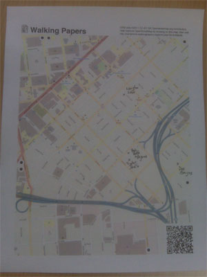
Since launching Walking Papers almost two years ago, we’ve seen a volume of activity and attention for the site that we never quite anticipated, not to mention the thing where it’s currently living at the Art Institute Of Chicago.
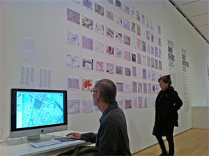
(photo by Nate Kelso)
A thing that’s always bothered me is that for all the whizz-bangery of the SIFT technique for parsing images, we’ve had about a 50/50 success ratio on the scanning process. A lot of this is attributable to low-quality scans and blurry QR codes, but that just serves to underscore the issue that Walking Papers should be substantially more resilient in the face of unpredictable input. More to the point, it should work with the kinds of equipment that our surprise crisis response user base has available: digital cameras and phonecams. They fit in your pocket and everyone’s got one, unlike a scanner. Patrick Meier from Ushahidi and Todd Huffman have been particularly badgering me on this point.
(tl;dr: help test a new version of Walking Papers)
Fortunately, around the same time I was looking for answers I encountered a set of Sam Roweis’s presentation slides from the Astrometry team: Making The Sky Searchable (Fast Geometric Hashing For Automated Astronomy). Bingo!
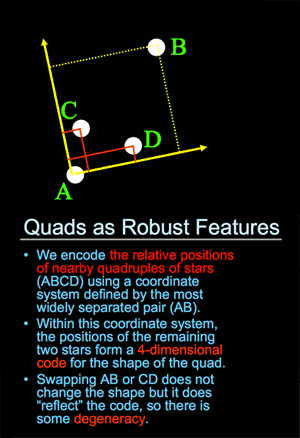
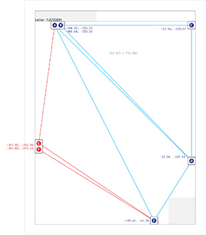
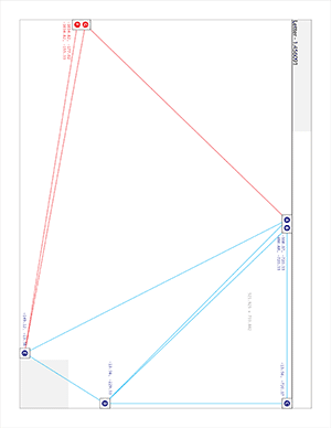
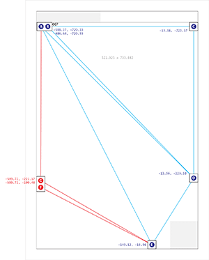
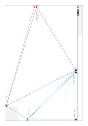
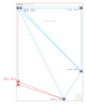
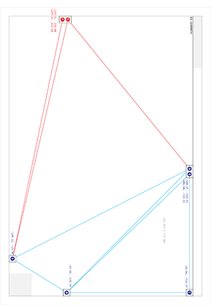
Dots are the answer. Dots, and triangles. The Astrometry project (which by the way is on Flickr) uses sets of four points to make a “feature”, while I went for three with the addition of a set of inter-triangle relationships that have to be satisfied:
That’s an image of all six size/orientation combinations supported by Walking Papers, and the placement of dots on each. The five blue dots to the top and right maintain their relative positions regardless of print style and act as a kind of signature that this is in fact a print from Walking Papers. The remaining two red dots differ substantially based on the size of the paper and the print orientation, making it possible to guess page size more reliably than with the current SIFT-based aspect ratio method. The entire arrangement is only “ratified” by a successful reading of the QR code in the lower right corner.
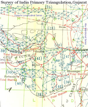
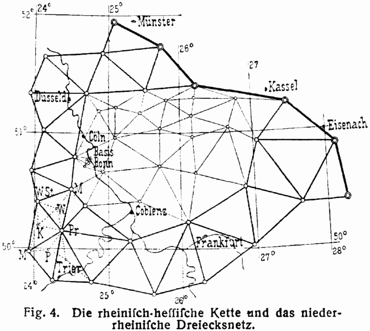
This triangle traversal put me mind of the Great Trigonometrical Survey of India, an early 19th century mapping effort by the British led by George Everest:
Finally, in 1830 Everest returned to India. He started by triangulating from Dehra Dun to Sironj, a distance of 400 miles across the plains of northern India. The land was so flat that Everest had to design and construct 50 foot high masonry towers on which to mount his theodolites. Sometimes the air was too hazy to make measurements during the day so Everest had the idea of using powerful lanterns, which were visible from 30 miles away, for surveying by night. … The survey’s line of triangles up the spine of India covered an area of 56,997 square miles, from Cape Comorin in the south to the Himalayas in the north.
The process of finding these dots starts with an image like this:
…and moves on to an intermediate step that looks for all localized dark blobs using a pair of spatial filters:

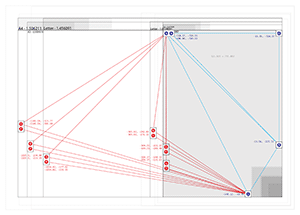
Once we have a collection of candidate dots, the problem looks quite similar to that faced by Astrometry: looking for likely features based on similar triangles, starting with the three blue dots in the upper right, and walking across the page to find the rest.
If you’re inclined to help test this new thing, I’ve installed a version of the cameraphone code branch at camphone.walkingpapers.org. When I’m satisfied that it works as well as the current Walking Papers, I’ll replace the current print composition and scan decoding components with the new version, and helpfully we’ll start to see even more scans and photos submitted.
Thank you!
Mar 28, 2011 6:39am
safety maps is go
We made a new thing live a few days ago, it’s called Safety Maps.
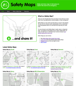
It’s a collaboration between myself, Tom Carden, and most significantly Adam Greenfield and Nurri Kim’s Do Projects imprint. Nurri has been exploring language and visual representation around disaster preparedness, and I was incredibly attracted to the need for gentleness in communication when creating something that should ideally never be used: “Have you ever thought about how you’d stay in touch with your loved ones if your city experienced a natural disaster or other emergency?”
The purpose of the service is generating emergency preparedness maps for family members and loved ones. “Make it, print it, cut it, fold it, save it, and share it.” You select a disaster scenario, name a meeting spot, and the service cooks up a set of PDFs meant to be printed and kept in a wallet or stuck on a fridge. Nurri created a soft-toned, muted energy look for the service, and we chose maps with minimally abrasive colors intended to act as a subtle and constant reminder of ever-present danger counterbalanced by ever-present love.
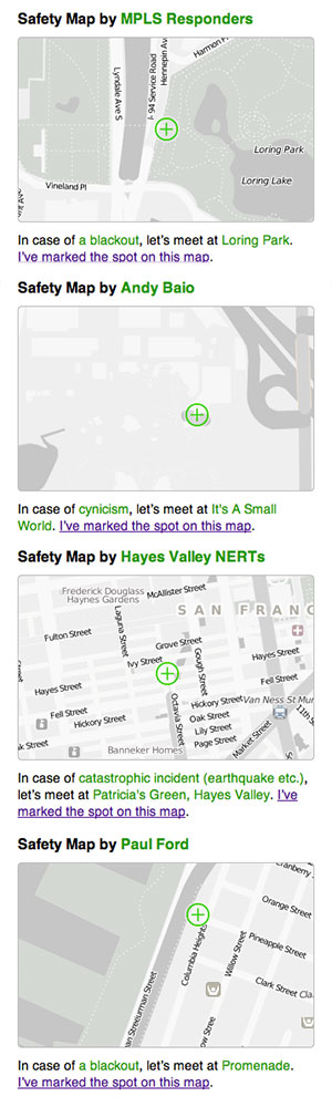
We’ve seen a pleasing stream of visitors to the site, and maybe surprisingly there are about four unlisted (private or hidden) maps created for every publicly shown one on the front page. In and amongst the predictable yuks and zombie jokes, we’ve had a number of serious and poignant submissions. Some of the public ones come from established neighborhood safety groups like NERT, others are from individuals—MPLS Responders, Andy Baio, Hayes Valley NERTs, Paul Ford (“So that we can admire the darkness of downtown NYC”) and others:
subscribe to ![]() this site.
|
contact Michal Migurski
this site.
|
contact Michal Migurski