tecznotes
Michal Migurski's notebook, listening post, and soapbox. Subscribe to ![]() this blog.
Check out the rest of my site as well.
this blog.
Check out the rest of my site as well.
Dec 31, 2011 7:19am
solar stylesheet
A little more Mapnik work for the week: Aaron Huslage and Roger Weeks of Tethr asked about a map stylesheet for OSM data that could generate maximally-compressed tiles to fit onto a portable GIS / disaster response system they’re prototyping.
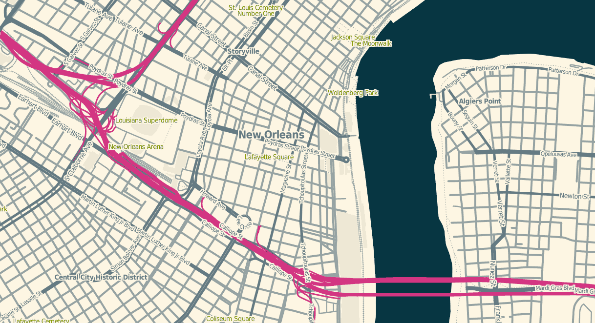
OSM Solar is a response to that requirement, and generates tiles that in many cases are 30%-40% the size of their OSM Mapnik counterparts. The job is mostly accomplished through drastic color reduction to a 4-bit (16 color) palette and aggressive pruning of details: parks are named but not filled, buildings are just barely visible for minimal context, color transitions and road casings are avoided.
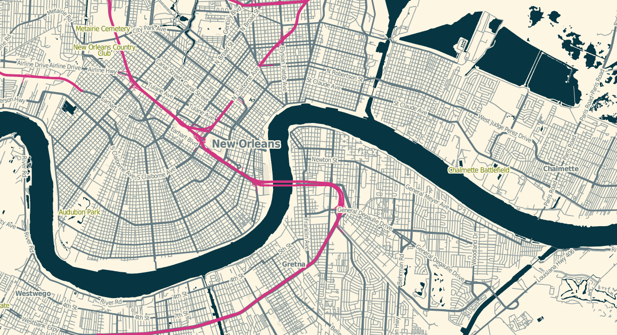
The colors are sampled from Ethan Schoonover’s Solarized, “Precision colors for machines and people.” They’re designed for editing text, but work well for maps too. I’ve plucked out a narrow range, made the freeways bright magenta, and otherwise left everything alone.
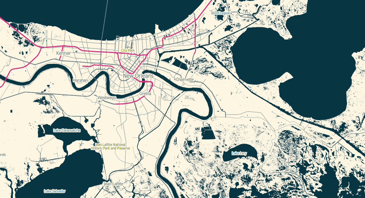
The stylesheets can be found on Github, and I’ve tried to minimize external dependencies to the absolute minimum PostGIS, Mapnik, and osm2pgsql setup imaginable. If you use this to render tiles, you’ll want to use TileStache because it understands what to do with the included 16-color palette file.

Dec 29, 2011 8:07am
blog all kindle-clipped locations: normal accidents
I’m reading Charles Perrow’s book Normal Accidents (Living with High-Risk Technologies). It’s about nuclear accidents, among other things, and the ways in which systemic complexity inevitably leads to expected or normal failure modes. I think John Allspaw may have recommended it to me with the words “failure porn”.
I’m only partway through. For a book on engineering and safety it’s completely fascinating, notably for the way it shows how unintuitively-linked circumstances and safety features can interact to introduce new risk. The descriptions of accidents are riveting, not least because many come from Nuclear Safety magazine and are written in a breezy tone belying subsurface potential for total calamity. I’m not sure why this is interesting to me at this point in time, but as we think about data flows in cities and governments I sense a similar species of flighty optimism underlying arguments for Smart Cities.
Loc. 94-97, a definition of what “normal” means in the context of this book:
If interactive complexity and tight coupling—system characteristics—inevitably will produce an accident, I believe we are justified in calling it a normal accident, or a system accident. The odd term normal accident is meant to signal that, given the system characteristics, multiple and unexpected interactions of failures are inevitable. This is an expression of an integral characteristic of the system, not a statement of frequency. It is normal for us to die, but we only do it once.
Loc. 956-60, defining the term “accident” and its relation to four levels of affect (operators, employees, bystanders, the general public):
With this scheme we reserve the term accident for serious matters, that is, those affecting the third or fourth levels; we use the term incident for disruptions at the first or second level. The transition between incidents and accidents is the nexus where most of the engineered safety features come into play—the redundant components that may be activated; the emergency shut-offs; the emergency suppressors, such as core spray; or emergency supplies, such as emergency feedwater pumps. The scheme has its ambiguities, since one could argue interminably over the dividing line between part, unit, and subsystem, but it is flexible and adequate for our purposes.
Loc. 184-88, on the ways in which safety measures themselves increase complexity or juice the risks of dangerous actions:
It is particularly important to evaluate technological fixes in the systems that we cannot or will not do without. Fixes, including safety devices, sometimes create new accidents, and quite often merely allow those in charge to run the system faster, or in worse weather, or with bigger explosives. Some technological fixes are error-reducing—the jet engine is simpler and safer than the piston engine; fathometers are better than lead lines; three engines are better than two on an airplane; computers are more reliable than pneumatic controls. But other technological fixes are excuses for poor organization or an attempt to compensate for poor system design. The attention of authorities in some of these systems, unfortunately, is hard to get when safety is involved.
Loc. 776-90, a harrowing description of cleanup efforts after the October 1966 Fermi meltdown:
Almost a year from the accident, they were able to lower a periscope 40 feet down to the bottom of the core, where there was a conical flow guide—a safety device similar to a huge inverted icecream cone that was meant to widely distribute any uranium that might inconceivably melt and drop to the bottom of the vessel. Here they spied a crumpled bit of metal, for all the world looking like a crushed beer can, which could have blocked the flow of sodium coolant.
It wasn’t a beer can, but the operators could not see clearly enough to identify it. The periscope had fifteen optical relay lenses, would cloud up and take a day to clean, was very hard to maneuver, and had to be operated from specially-built, locked-air chambers to avoid radiation. To turn the metal over to examine it required the use of another complex, snake-like tool operated 35 feet from the base of the reactor. The operators managed to get a grip on the metal, and after an hour and a half it was removed.
The crumpled bit of metal turned out to be one of five triangular pieces of zirconium that had been installed as a safety device at the insistence of the Advisory Reactor Safety Committee, a prestigious group of nuclear experts who advise the NRC. It wasn’t even on the blueprints. The flow of sodium coolant had ripped it loose. Moving about, it soon took a position that blocked the flow of coolant, causing the melting of the fuel bundles.
During this time, and for many months afterwards, the reactor had to be constantly bathed in argon gas or nitrogen to make sure that the extremely volatile sodium coolant did not come into contact with any air or water; if it did, it would explode and could rupture the core. It was constantly monitored with Geiger counters by health physicists. Even loud noises had to be avoided. Though the reactor was subcritical, there was still a chance of a reactivity accident. Slowly the fuel assemblies were removed and cut into three pieces so they could be shipped out of the plant for burial. But first they had to be cooled off for months in spent-fuel pools—huge swimming pools of water, where the rods of uranium could not be placed too close to each other. Then they were placed in cylinders 9 feet in diameter weighing 18 tons each. These were designed to withstand a 30-foot fall and a 30-minute fire, so dangerous is the spent fuel. Leakage from the casks could kill children a half a mile away.
That’s completely insane.
Dec 27, 2011 1:21am
angry, productive birds
You can control time when you can see it.
For a few years now, we’ve been diligently recording our time spent on various projects at Stamen. Earlier this year, I wrote a small Protovis-based browser app that makes this time visible so we can act on it. It looks like this:
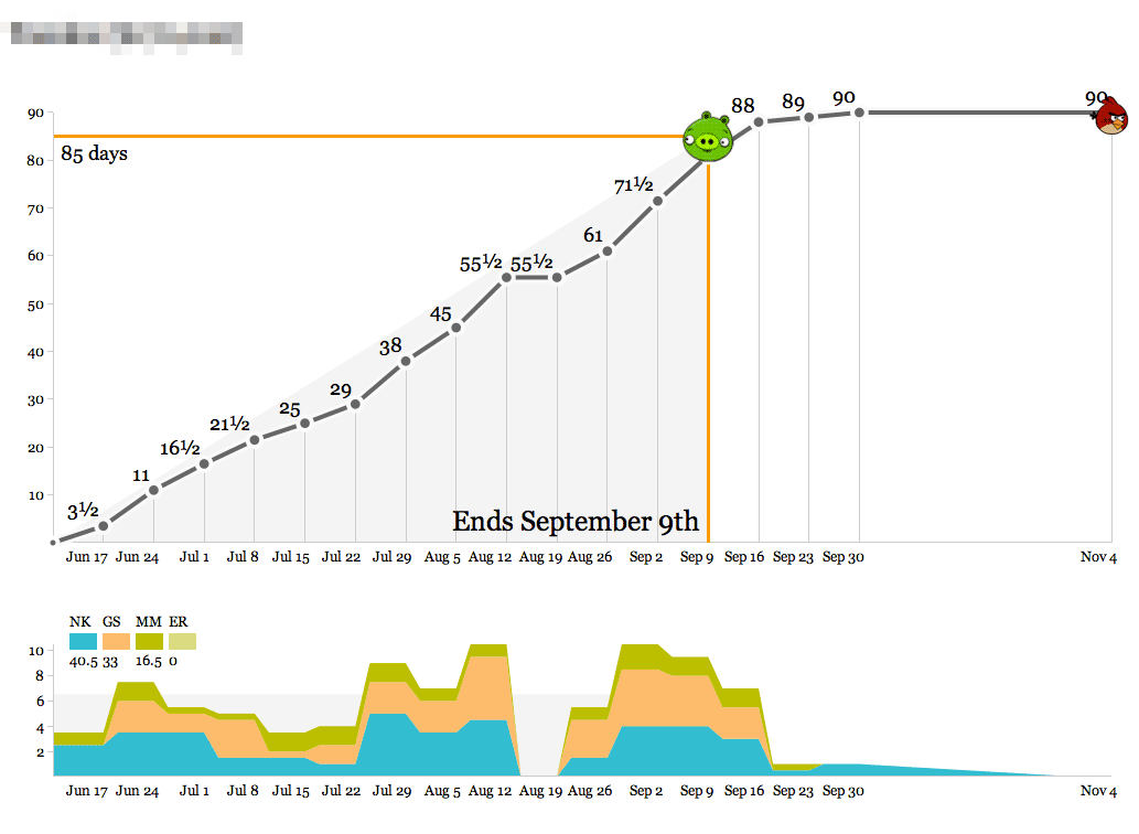
- The object of the game is to hit the pig with the bird.
- Bird over the pig means the project is at risk of losing money.
- Bird past the pig means it’s at risk of being late.
Time is recorded in half-day-or-larger chunks. Zeroes are meaningful for when all you’ve done is a meeting or a phone call. Clients don’t actually see these; they’re for institutional memory, internal sanity checks, comparisons to other numbers, and definitely not for billing. We’ve always used a big, gridded-out whiteboard to record our time, and we do it on Fridays in a big group in the corner room so everyone can see what everyone else is up to. The whiteboard looks a lot like this actual web page form:

There’s a big wall of the bird graphs up in the back of the office, and they get printed out weekly so everyone can see what our work looks like on any given project. Here’s one that’s currently in progress:
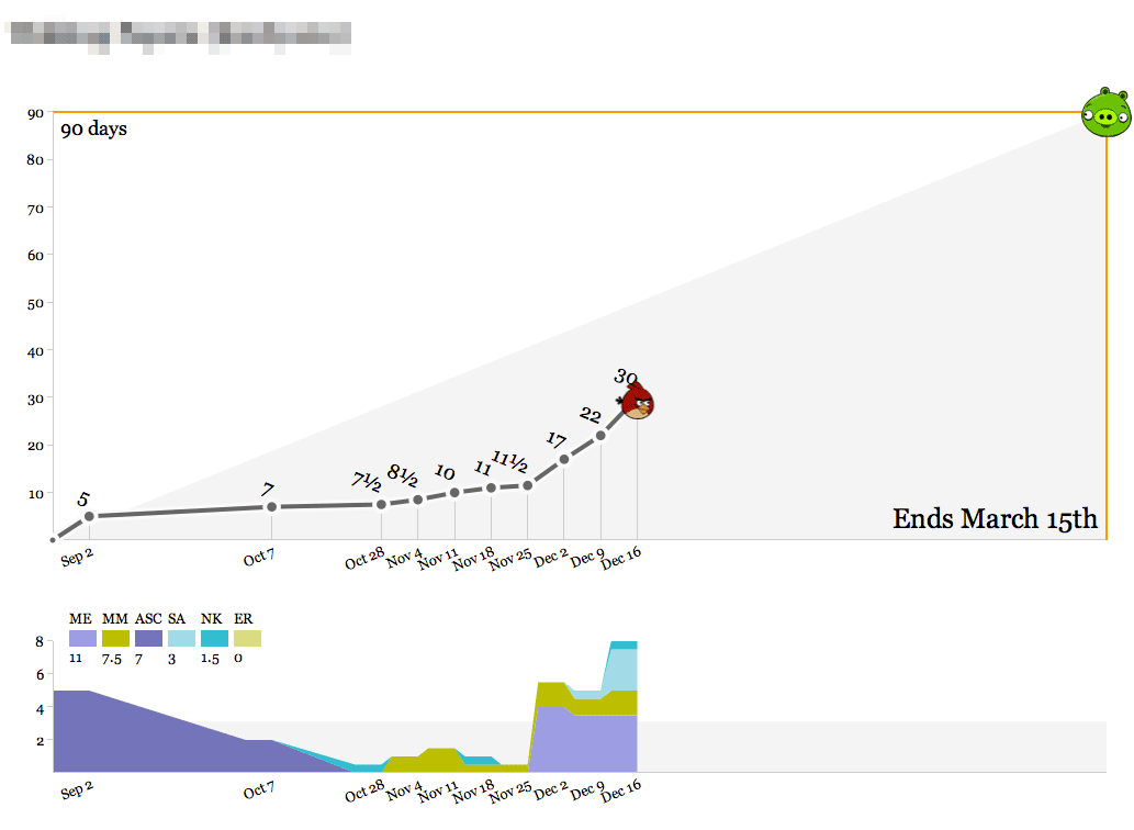
We’ve spent about a third of the total time spread out over the past few months, slowly at first and recently accelerating with a new addition to the team. As we get into the real meat of the project between now and March, we’ll pace ourselves and ideally come in at 90 days. The outside edges of the top graph—90 days and March 15th—are decided at the beginning of the project, and represent a target delivery date and an educated guess at the number of person-days we should spend to maintain a healthy margin. As with all round-looking numbers there’s some slop space built into this, but it serves as a useful guide.
Here’s a short, speedy project:
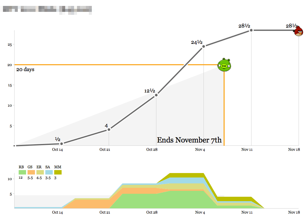
The bottom graph shows the breakdown of who’s working on the project each week. At first glance this one looks like it went overtime, but that last week of time was actually compressed into the days between Nov 4th and Nov 7th, and the final mark on the right represents clean-up time and a project post-mortem meeting. This project was a fast, easy win for a recurring client we enjoy working with.
Here’s us learning something new:
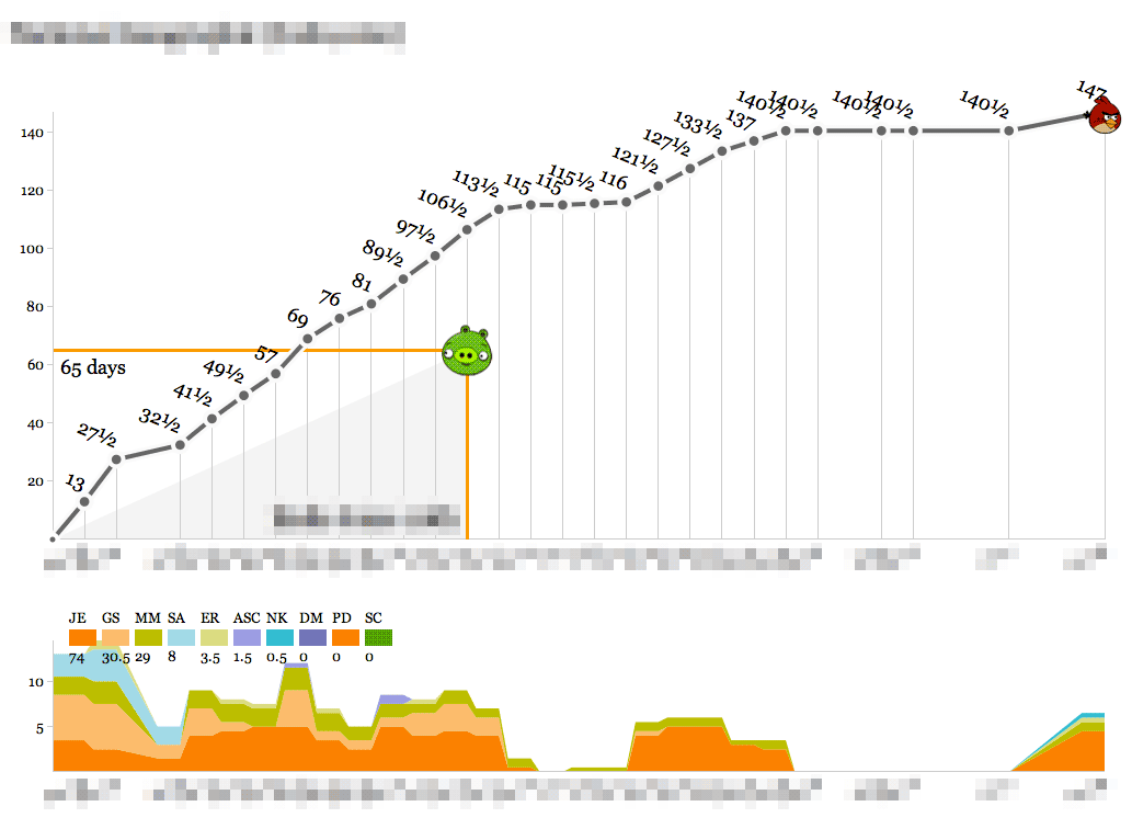
This one definitely cost a substantial amount of research and development time, and the bump in the second half of the timeline represents a series of post-delivery revisions with the client after a period of quiet for reviews. On a strict time/money basis this looks like a tragedy, but looks can be deceiving. The new knowledge, experience and goodwill from this project should go a long way toward balancing out the sunk time.
By contrast, here’s almost the opposite picture:
An intense ramp of upfront work representing almost half of the studio’s total resources, following by a launch right in the middle and a relatively calm second half. The budget for this one was designed around known-knowns, an unmissable public release, and a lot of headroom which we were fortunate to not have to cut into.
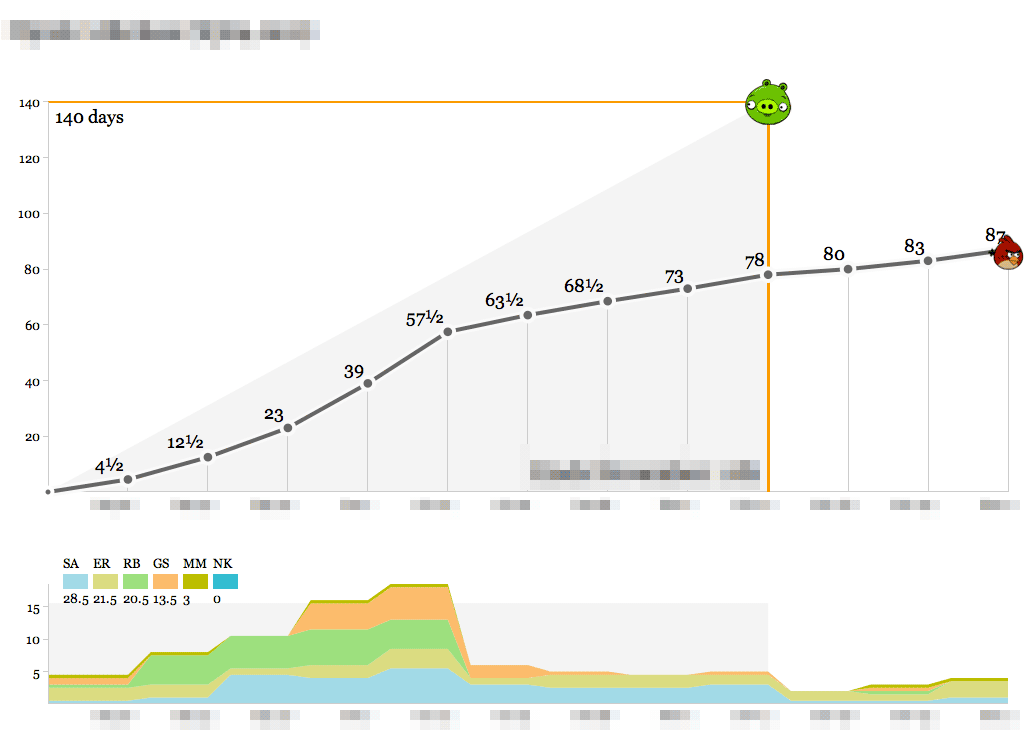
Finally, here’s the ideal:
Steady progress toward a known goal, very little deviation from the plan and ultimately a delivery right on the nose with a few mails and a November post-mortem thrown in.
We’ve used these graphs as the simplest-possible visualization of how we spend our time so we know how we’re doing relative to the budget for a project. Operationally, the data output of these graphs feeds directly into an accrued revenue model that lets us predict our income earlier. The day/week granularity makes it possible to collect the data as a team without making everyone unhappy with management overhead, and the bias toward whole- or half-day increments helps stabilize fractured schedules (not for me, though—my time is probably the most shattered of anyone in the studio).
If you want to set these up for yourself, the code that drives the birds is in an as-yet undocumented repository on Github with a few Stamen-specific things, and requires PHP and MySQL to run. I’ll write up some installation and user documentation and clean it up if there’s enough interest.
Dec 20, 2011 7:33am
OSM terrain layer: come and get it
TL;DR: We’re making the terrain map available as a US-only tile layer. It has shaded hills, nice big text, and green where it belongs. The map is made of 100% free and open data, including OpenStreetMap for the foreground and USGS landcover and national elevation for the background. Code here.

Left unchecked, I’d hack at the map indefinitely without launching anything. This week I shaved a few final yaks and now there are U.S. map tiles for you to use, along with an interactive preview. Tile URLs come in the same format as other slippy map tiles, they look like this:
http://tile.stamen.com/terrain/zoom/x/y.jpg
You can add a subdomain to the beginning to help pipeline concurrent browser requests, e.g. a.tile.stamen.com, b.tile.stamen.com, up to d.
The source for everything is on Github, but it’s in a messy, half-described state which Nelson Minar is helping triage and disentangle.
Notable Yaks
The street labels and route shields for this map probably accounted for the majority of the time spent. I’m using a combination of Skeletron and route relations to add useful-looking highway shields and generate single labels for long, major streets. One particular OpenStreetMap contributor, Nathan Edgars II, deserves special mention here. I feel as though every time I did any amount of research on correct representation or data for U.S. highways, NE2’s name would come up both in OSM and Wikipedia. He appears to be responsible for the majority of painstakingly organized highways on the map. Thanks, Nathan!
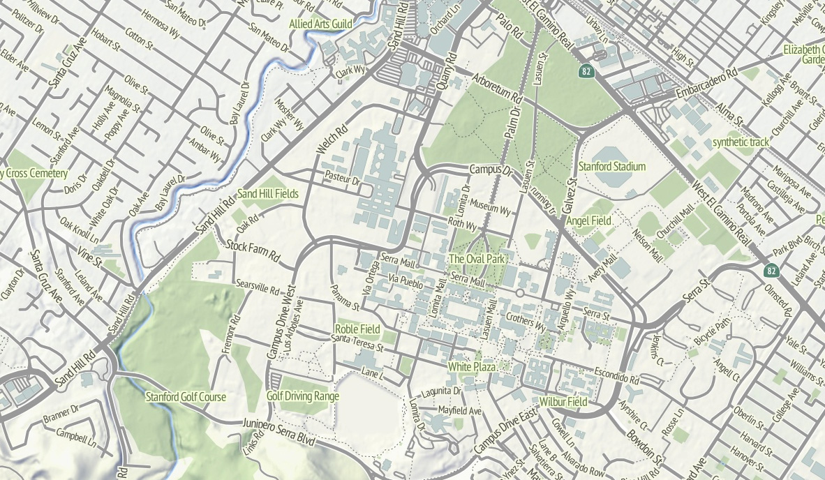
Skeletron also helped handle the dual carriageways, a common peculiarity of geographic street data where the individual sides of divided roadways are in the database as separate one-way lines, visible in the image of Stanford above. It can make for some pretty frustrating renders (the “MarketMarket DoloresDolores GuerreroGuerrero” problem I’ve mentioned before) so I’m literally processing every major street in the continental United States at a range of four different zoom levels to do the merging. There’s a great big code repo showing how it works; skeletron-roads.sh is the important part; I’ll get some shapefiles posted someplace useful in the near future.
I’ve done a bit of High Road-style work with town names to figure out the range of representations in OpenStreetMap, and I think I’ve figured out a scheme for about zoom 12 and above that allows major cities to show at high priority and not flood the map with a layer of useless GNIS “hamlets” like Peralta Villa. It still looks wrong to me in places, but it’s a lot better than OSM’s omission of Boston in favor of Cambridge until zoom 10.
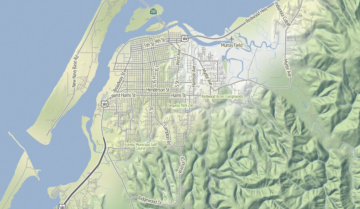
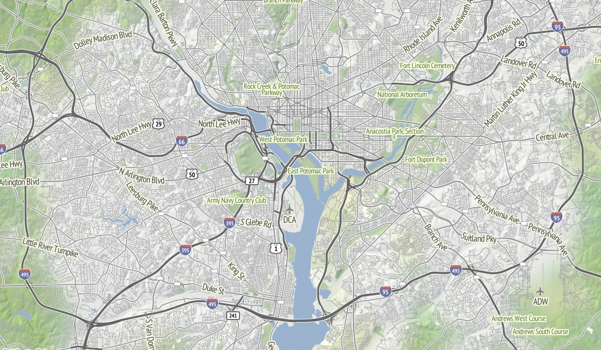
I’m thinking that Stamen can probably commit to OSM updates about once every month or so, since we’re not Frederick Ramm and have to do them semi-manually. Because this map style makes such an explicit and noticeable difference between major and minor roads, I’m expecting many resulting changes to be road classification edits. For example, Nathaniel reclassified a bunch of streets in his hometown of Eureka from residential to tertiary or secondary to reflect the major routes around town, and now they are labeled more usefully at lower zooms.
Pretty Pictures
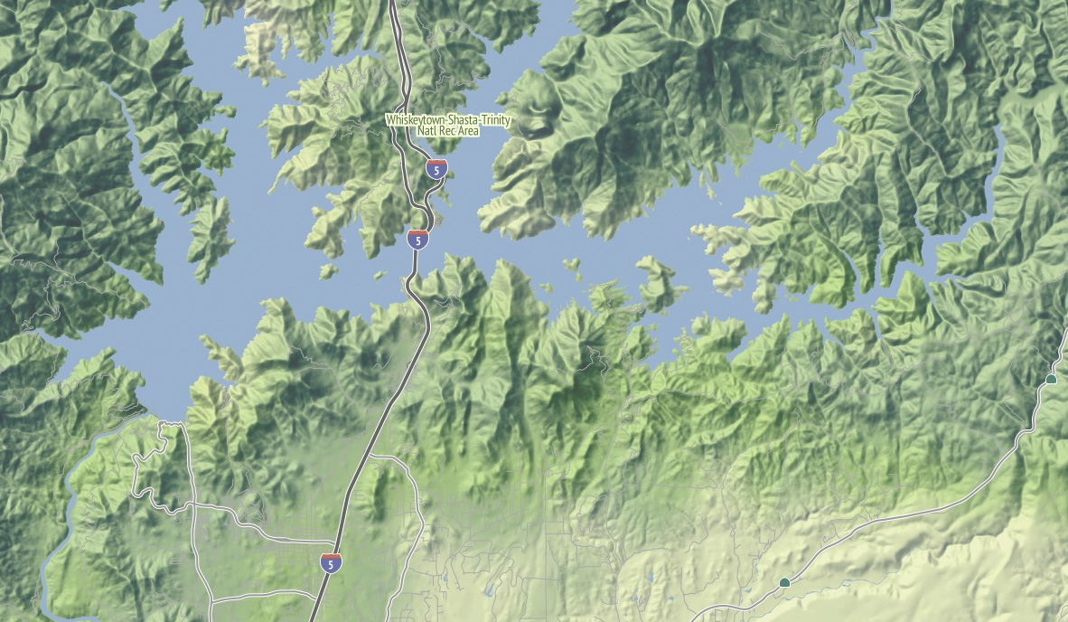
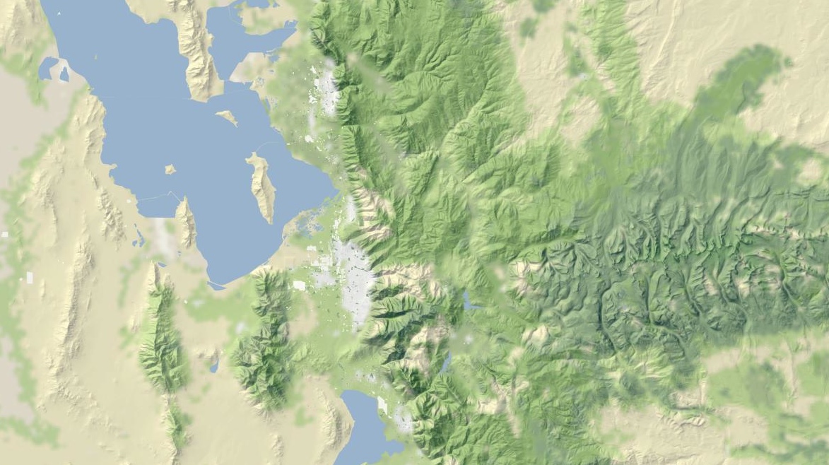
I love this image of Lake Shasta, with the sharply-rising hills around the land and Interstate 5 loping through. This is the northern end of the Central Valley, and the landscape here rapidly shifts to larger, more complex hills as you move north.

Madison, Wisconsin sits between two lakes, and there is a small plaque on the southwestern side of the state capitol building showing how deep under ice you’d be at the same spot 15,000 years ago. I like how the regular grid of the town adapts itself to that narrow spit of land between the two lakes, which I’m told are good for ice fishing and driving during the winter. Thanks to NACIS, I spent a fun few days here in October.
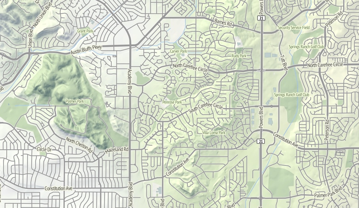
The interaction between the suburban cul-de-sac development and the foothills in this part of northeast Colorado Springs renders well with the warm sunlight on the northwest slope. I’d be curious to know of there’s a difference in property prices here, maybe between the southern exposures to the right and the northern exposures to the left?
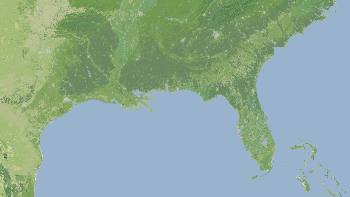
I continue to be fascinated by the topography of the Appalachians. Birmingham has this incredible swirl-hill to its immediate southeast, and I wonder if any of these large-scale structures are obvious at ground level when you’re among them?
Dec 5, 2011 8:19am
OSM terrain layer: background tiles now available
Lots of progress this week on the map, including state borders, more city labels, parks, and improvements to highway rendering at low zoom levels. Some forthcoming progress, too: more states, local points of interest, and Nate Kelso’s airport data and icons.
The thing that’s definitely ready is the base terrain, so I’ve decided to give it a little push before I release the rest of the map. Look, here’s a tile. This is another, and this is an interactive preview (shift-double-click to zoom out). Tile URLs come in the same format as other slippy map tiles, they look like this:
http://tile.stamen.com/terrain-background/zoom/x/y.jpg
You can add a subdomain to the beginning to help pipeline concurrent browser requests, e.g. a.tile.stamen.com, b.tile.stamen.com, up to d.
This terrain background tile layer is intended for use where you might otherwise choose satellite imagery because you don’t want text or other map junk showing up. It’s meant to recede quietly into the background, give useful terrain context, and look good with points and data in front. You can use them with OpenLayers, Modest Maps, Leaflet, Polymaps and even the Google Maps API.
The tiles are defined for the continental United States, and include land color and shaded hills. The land colors are a custom palette developed by Gem Spear for the National Atlas 1km land cover data set, which defines twenty-four land classifications including five kinds of forest, combinations of shrubs, grasses and crops, and a few tundras and wetlands. The colors are at their highest contrast when fully zoomed-out to the whole U.S., and they slowly fade out to pale off-white as you zoom in to leave room for foreground data and break up the weirdness of large areas of flat, dark green.
Also at higher zoom levels, details from OpenStreetMap such as parks and land use patterns begin to show up, as in this example of Almaden Valley and the Santa Cruz Mountains:

The hills come from the U.S.-only ten-meter National Elevation Dataset, which allows for usable hills at zooms as high as 16 or 17. Instead of cross-blending NED 10m with SRTM and its many holes, I’ve simply downsampled the full resolution data to provide for smoother hills at lower zooms, and over time I’ve come to prefer this approach to Google Terrain’s much more crispy hills.
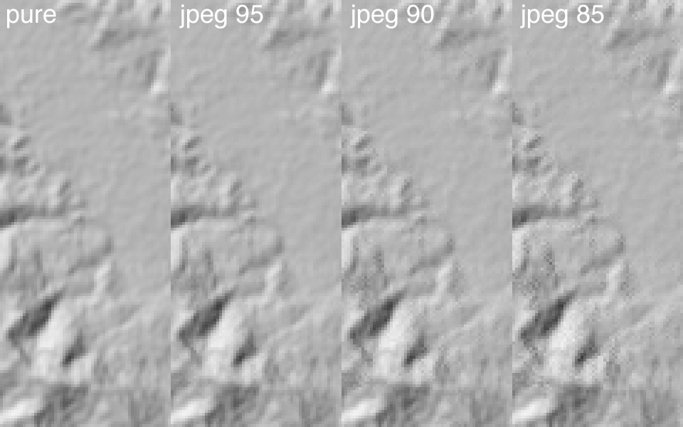
There’s some mildly interesting stuff going on with the shading, where I’ve decided to pre-process the entire country down to zoom 14 “slope and aspect” tiles (in some places, zoom 15) stored in two-channel 8-bit GeoTIFFs compressed with JPEG at quality=95 (here’s a sample tile for Mount Diablo—check out its two channels in Photoshop). The short version of this is that every bit of elevation data is stored in a form that allows for rapid conversion to shaded hills with arbitrary light sources, and still compresses down to sane levels for storage. It’s a happy coincidence that 256 levels of 8-bit grayscale is enough to usefully encode slope and degrees of aspect, though it took a bit of trial and error to determine that JPEG quality really needed to be 95 to remove ugly artifacts from the shaded output.
Check out read_slope_aspect() and save_slope_aspect() in the DEM-Tools code if this sounds interesting.
Anyway.
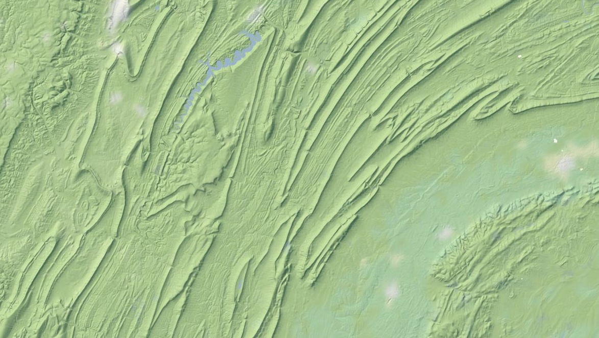
I particularly like the appearance of the layer in places like Pennsylvania’s ridge-and-valley Appalachians, with its sharp ridges and long smooth transitions. At this zoom level, you can still see the base green of the forested landscape:
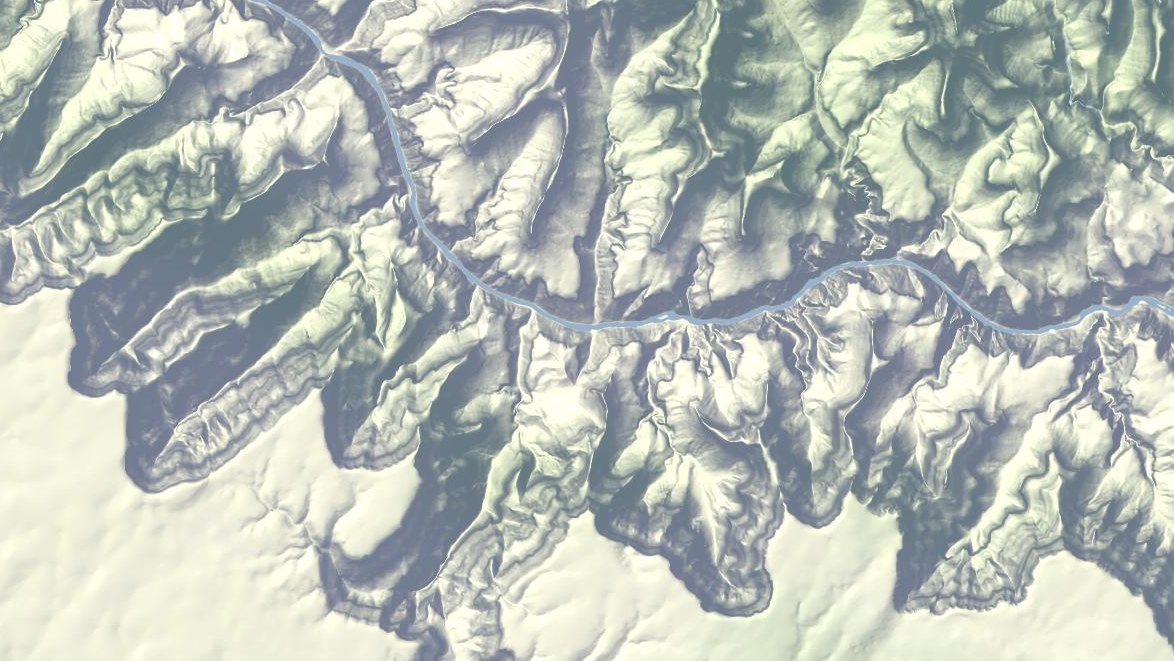
Further out west, here’s part of the Grand Canyon in all its Haeckelian glory:
Use the tiles and tell me what you think. In a few weeks, if all goes according to plan, there’ll be a layer just like this one with all the OpenStreetMap goodness in the foreground.
subscribe to ![]() this site.
|
contact Michal Migurski
this site.
|
contact Michal Migurski