tecznotes
Michal Migurski's notebook, listening post, and soapbox. Subscribe to ![]() this blog.
Check out the rest of my site as well.
this blog.
Check out the rest of my site as well.
Dec 27, 2011 1:21am
angry, productive birds
You can control time when you can see it.
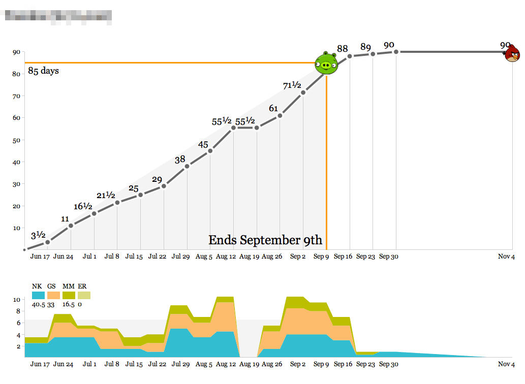
For a few years now, we’ve been diligently recording our time spent on various projects at Stamen. Earlier this year, I wrote a small Protovis-based browser app that makes this time visible so we can act on it. It looks like this:
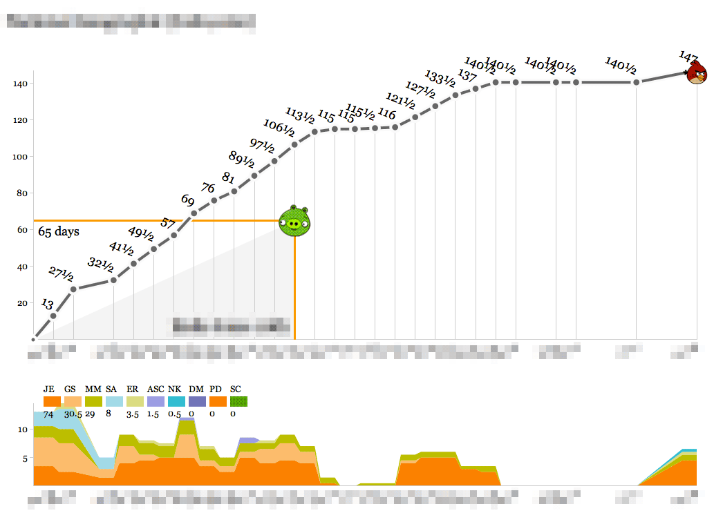
- The object of the game is to hit the pig with the bird.
- Bird over the pig means the project is at risk of losing money.
- Bird past the pig means it’s at risk of being late.
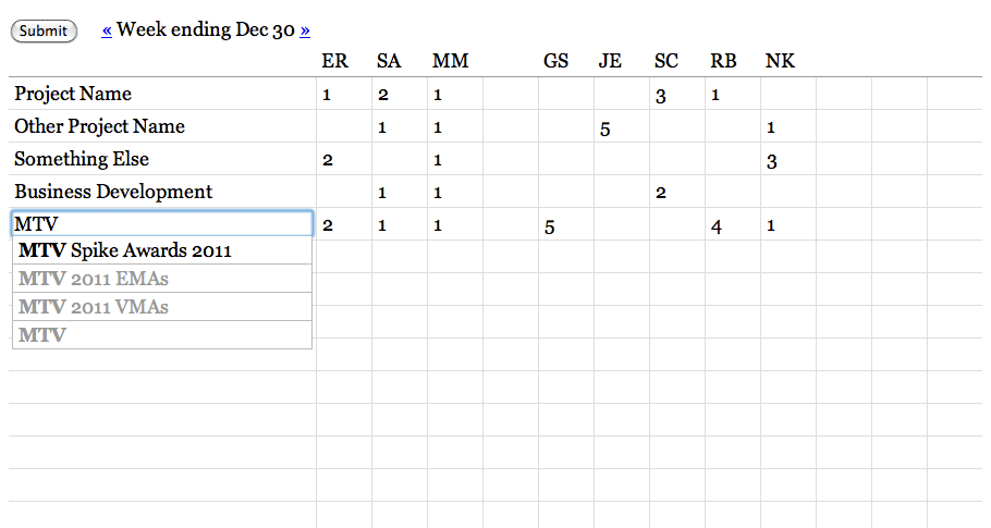
Time is recorded in half-day-or-larger chunks. Zeroes are meaningful for when all you’ve done is a meeting or a phone call. Clients don’t actually see these; they’re for institutional memory, internal sanity checks, comparisons to other numbers, and definitely not for billing. We’ve always used a big, gridded-out whiteboard to record our time, and we do it on Fridays in a big group in the corner room so everyone can see what everyone else is up to. The whiteboard looks a lot like this actual web page form:
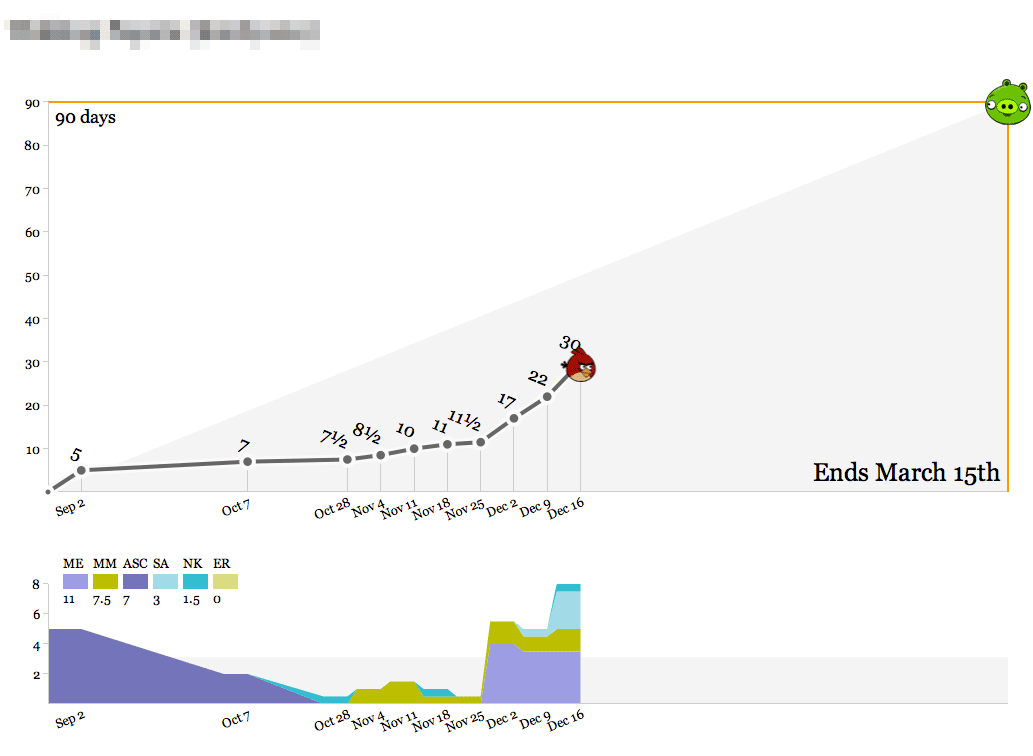
There’s a big wall of the bird graphs up in the back of the office, and they get printed out weekly so everyone can see what our work looks like on any given project. Here’s one that’s currently in progress:
We’ve spent about a third of the total time spread out over the past few months, slowly at first and recently accelerating with a new addition to the team. As we get into the real meat of the project between now and March, we’ll pace ourselves and ideally come in at 90 days. The outside edges of the top graph—90 days and March 15th—are decided at the beginning of the project, and represent a target delivery date and an educated guess at the number of person-days we should spend to maintain a healthy margin. As with all round-looking numbers there’s some slop space built into this, but it serves as a useful guide.
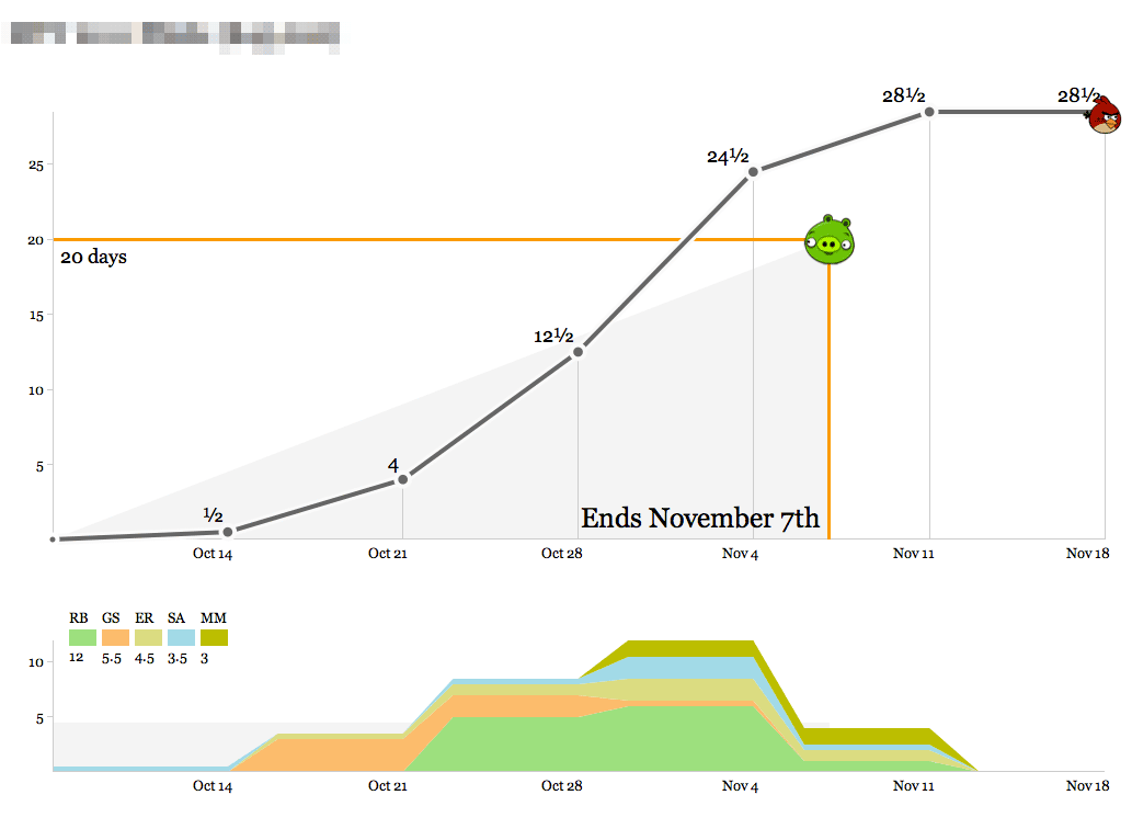
Here’s a short, speedy project:
The bottom graph shows the breakdown of who’s working on the project each week. At first glance this one looks like it went overtime, but that last week of time was actually compressed into the days between Nov 4th and Nov 7th, and the final mark on the right represents clean-up time and a project post-mortem meeting. This project was a fast, easy win for a recurring client we enjoy working with.
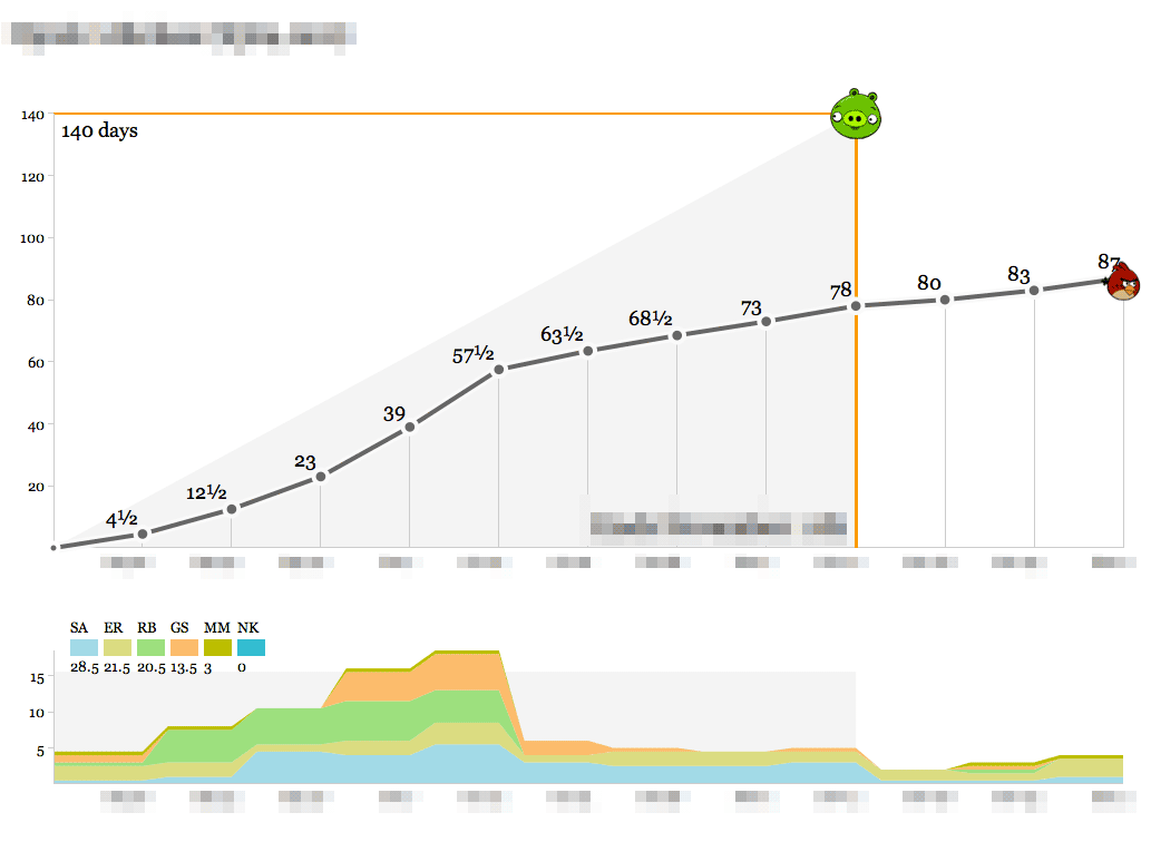
Here’s us learning something new:
This one definitely cost a substantial amount of research and development time, and the bump in the second half of the timeline represents a series of post-delivery revisions with the client after a period of quiet for reviews. On a strict time/money basis this looks like a tragedy, but looks can be deceiving. The new knowledge, experience and goodwill from this project should go a long way toward balancing out the sunk time.
By contrast, here’s almost the opposite picture:
An intense ramp of upfront work representing almost half of the studio’s total resources, following by a launch right in the middle and a relatively calm second half. The budget for this one was designed around known-knowns, an unmissable public release, and a lot of headroom which we were fortunate to not have to cut into.
Finally, here’s the ideal:
Steady progress toward a known goal, very little deviation from the plan and ultimately a delivery right on the nose with a few mails and a November post-mortem thrown in.
We’ve used these graphs as the simplest-possible visualization of how we spend our time so we know how we’re doing relative to the budget for a project. Operationally, the data output of these graphs feeds directly into an accrued revenue model that lets us predict our income earlier. The day/week granularity makes it possible to collect the data as a team without making everyone unhappy with management overhead, and the bias toward whole- or half-day increments helps stabilize fractured schedules (not for me, though—my time is probably the most shattered of anyone in the studio).
If you want to set these up for yourself, the code that drives the birds is in an as-yet undocumented repository on Github with a few Stamen-specific things, and requires PHP and MySQL to run. I’ll write up some installation and user documentation and clean it up if there’s enough interest.
Comments (3)
As a controller for a small engineeringh firm, I've been searching for something like this for years. I'm handy with PHP and MySQL, and will be checking back! Count me in.
Posted by Joel D on Thursday, December 29 2011 7:10pm UTC
I like it! Makes perfect sense... I found that the end of day (or week) guesstimating of my hours spent on each project was wildly frustrating and insanely inaccurate. After implementing a time tracking tool (http://www.tsheets.com) I found that tracking my time actually became fun - much like what you have going on in your angry productive birds project above. Having this visual to look at the project as a whole is invaluable for reporting and future projections - love it! Will check back.
Posted by Kelsie on Tuesday, January 3 2012 9:18pm UTC
Very nice. This looks like a very clear and encouraging way to track time on a project. I'd be very interested to try it with my architecture practice and see how it responds to the stages of design and construction tasks.
Posted by Rob Annable on Wednesday, January 4 2012 7:58pm UTC
Sorry, no new comments on old posts.