tecznotes
Michal Migurski's notebook, listening post, and soapbox. Subscribe to ![]() this blog.
Check out the rest of my site as well.
this blog.
Check out the rest of my site as well.
Jan 14, 2011 9:07pm
this tract again
I’m sad to have almost completely fallen off the wagon with my winter sabbatical posts, initially because holidays intervened and later because of habit.
A bunch of interesting things have happened with This Tract since I announced it in October. It was always a one-day hack, but has seemingly bubbled up to greater visibility just in the first few weeks of 2011. Working backwards…
This week I’m in New York City, purely by coincidence at the same time at the Microsoft Social Computing Summit. Tuesday, Chrys Wu and Jenny 8. Lee invited me a talk at Hacks/Hackers, where I spoke about Crimespotting and This Tract.

I posted my slides online, in PDF form. Kennedy Elliott is working on a better set of notes from the talk.
I had a chance to visit Steven Romalewski at CUNY’s Center For Urban Research with Nate Kelso earlier that day, which helped crystallize a lot of what’s interesting about census data for a project like This Tract. We spent a few hours chatting about the emerging value of vector-based public data sets pretiled into directly usable form, something we first experimented with around the PolyMaps project and a bit of early work in the project that ultimately led to Stamen’s efforts for Bing Maps. In particular, the way we’re using FIPS codes as a pivot yields interesting benefits for creators of country-wide public data maps in the form of reduced storage requirements. Using known codes like FIPS or other identifiers can help eliminate the need for expensive, large-scale storage of pre-rendered choropleth tile imagery for an entire country, for each relevant variable. CUNY is doing this using ESRI tools and the Flash AMF format, but that’s just an implementation detail.
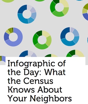
Last week, Fast Company made This Tract their Infographic Of The Day, followed by a very nice post from Nathan Yau.
I credit this to the help of Craig Mod, who offered a bit of rapid, focused design advice and implementation around the textual layout of the site the previous week. Craig helped loosen up the appearance of the site, moving a giant slug of technical details from the top of the page to the bottom, opening up the visual design of the header, and finally suggesting that it was important to provide a few hot-links to interesting tracts. I chose San Francisco City Hall, Disneyland in L.A., Harvard University, and New York’s Chinatown. This ended up being really important on Wednesday, when the FCC Census Block API we rely on to eliminate the need for a hosted spatial database stopped working (Oracle). It was back up a day later, and in the mean time Tom Carden suggested that I connect those suggested links to known tracts so people could at least see what This Tract does, even if it didn’t work for everywhere at the time.
A major change I made prior to Craig’s intervention was the replacement of Google Charts API with Protovis, which had a few benefits. Interactively-labeled, dynamic pie charts could be rendered in the browser. The overall page layout could be made multi-column, thanks to the elimination of the 900px-wide Google pie chart images with potentially-long labels. I could also use Economist-style donut charts, which I completely love. I took advantage of the narrower charts to switch to a dynamic, responsive layout with media queries. In a modern browser, narrowing your browser window should at some point convert the page layout to a tall, narrow column (as it used to be) instead of the now-default comparisons.
Finally, I found this explanation of tracts generally while doing research for the H/H talk, it seemed worth calling out:
Census tracts are small, relatively permanent statistical subdivisions of a county. Tracts are delineated by a local committee of census data users for the purpose of presenting data. Census tract boundaries normally follow visible features, but may follow governmental unit boundaries and other non-visible features in some instances; they always nest within counties. Designed to be relatively homogeneous units with respect to population characteristics, economic status, and living conditions, census tracts average about 4,000 inhabitants.
Such minute attention to the best possible way of representing people in space, when “it’s a short jump from numbers to stories” as Kate Lutz says.
subscribe to ![]() this site.
|
contact Michal Migurski
this site.
|
contact Michal Migurski
Comments
Sorry, no new comments on old posts.