tecznotes
Michal Migurski's notebook, listening post, and soapbox. Subscribe to ![]() this blog.
Check out the rest of my site as well.
this blog.
Check out the rest of my site as well.
Jun 26, 2011 2:42am
seeing like a state, lying with pictures
![]()
Eyeo Festival is this week in Minneapolis, and I’m gathering notes for my panel with Mark Hansen, Laura Kurgan, and Lisa Strausfeld. I’m thrilled that Mark extended an invitation, especially since our conversation will be about data visualization and social justice:
This panel will look into the relationship between data (collection | sharing | analysis | visualization) and social justice. What can we reveal about the state of things by creating new views of the data? Can making the data more meaningful actually effect change in society?
We’re up on Wednesday afternoon just before the closing wrap-up, and as I consider some initial answers to the questions above I keeping coming back to Seeing Like A State, James C. Scott’s book-length argument on visibility and power, recommended to me a few years ago by Adam Greenfield. I’m finding myself expanding the premise of the panel somewhat: do we reveal new things about society by viewing data, or do we bend society into new forms by choosing data that can be viewed?

Scott talks about the state and his examples are mostly large-scale agricultural programs and high-modernist city planning, but I’m seeing echoes of his argument in current excitement about infographics and visualization as a medium, well-documented in blogs like Fast Co Design, Infosthetics, and artfully lampooned by Phil Gyford last year. The core piece of terminology in Seeing Like A State is “legibility”, and as a powerful institution demands more its methods shift from descriptive to prescriptive, from more-effectively seeing reality to modifying reality to make it more easily seeable.
Page 38 defines the problem, from the point of view of the state:
Rural living in seventeenth- and early eighteenth-century Denmark, for example, was organized by ejerlav, whose members had certain rights for using local arable, waste, and forest land. It would have been impossible in such a community to associate a household or individual with a particular holding on a cadastral map. The Norwegian large farm (gard) posed similar problems. Each household held rights to a given proportion of the value (skyld) of the farm, not to the plot land; none of the joint owners could call a specific part of the farm his own. Although it was possible to estimate the arable land of each community and, making some assumptions about crop yields and subsistence needs, arrive a plausible tax burden, these villagers derived a substantial part of their livelihood from the commons by fishing, forestry, collecting resin, hunting, and making charcoal. Monitoring this kind of income was impossible.
My co-panelist Laura Kurgan is maybe best-known for her astonishing Million Dollar Blocks project, a data investigation into New York prison spending dating back to 2004. Million Dollar Blocks has always been a favorite of mine, for a few reasons: our instinctual response at Stamen to this type of data is to put a slider on it, but Laura Kurgan and Eric Cadora went with the much more expressive, emotional $1,000,000 cutoff to make a point. If you’re not from Brooklyn it’s not even all that important which blocks make the cut. A slider is a slider and a million bucks is a million bucks, but only one of them fits into a short headline to make the point truly armor-piercing. The name of the project gathers up a jumble of data and history and offers it up in a legible form that snaps into instant relief the wisdom of spending seven figures on incarceration.
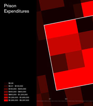
If you can’t see the value, you can’t judge its relative worth.
Back to Scott, Page 39:
As long as the common property was abundant and had essentially no fiscal value, the illegibility of its tenure was no problem. But the moment it became scarce (when “nature” became “natural resources”), it became the subject of property rights in law, whether of the state of the citizens. The history of property in this sense has meant the inexorable incorporation of what were once thought of as free gifts of nature: forests, game, wasteland, prairie, subsurface minerals, water and watercourses, air rights (rights to the air above buildings or surface area), breathable air, even genetic sequences, into a property regime. In the case common-property farmland, the imposition of freehold property was clarifying not so much for the local inhabitants—the customary structure of rights had always been clear enough to them—as it was for the tax official and the land speculator.
The imperative of legibility is a result of scarcity, and the audience for it may not necessarily be its subjects. “The order in question is most evident, not at street level, but rather from above and from outside” (page 57).
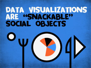
Moving on to visualization of data for non-state entities or corporations, many of them have the same state-scale needs and means at their disposal. The blanket term for this is business intelligence (or “insight” if you prefer the advertisements in airport terminals), and we’re seeing the popularization of infographics derived from this genre change focus from inward-facing charts (such as Stephen Few’s work on bullet graphs) to “snackable social objects” as Brad and Jesse from JESS3 call them. I won’t say too much about that except to point out one terrible, terrible bit of nonsense by David McCandless to illustrate what happens when large, interested entities decide to push the idea of visualization as a way to package and communicate facts.
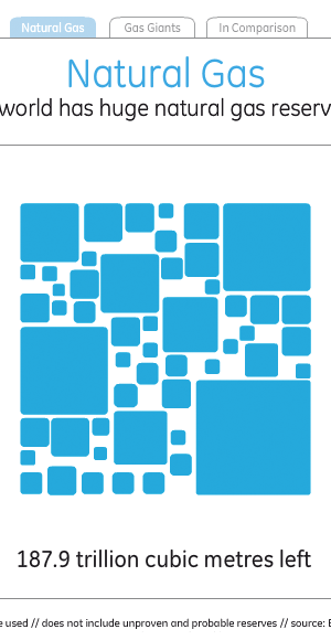
David made it for General Electric, which says this about its efforts in visualization:
At GE, we believe data visualization is a powerful way to simplify complexity. We are committed to creating visualizations that advance the conversation about issues that shape our lives, and so we encourage visitors to download, post and share these visualizations.
It’s just one number, but you can roll over each one of the little squares to see a country’s reserves (as measured by BP in 2010), which sort of makes you think of a heatmap until you start to wonder about the grout in between all the bricks that adds up to almost a full fifth of the total visual area.
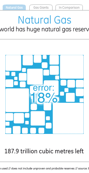
Switching to the “comparison” tab is where this choice of visual style comes home to roost, and it becomes obvious that McCandless’s decorative decisions clash with GE’s stated goal of advancing the conversation.
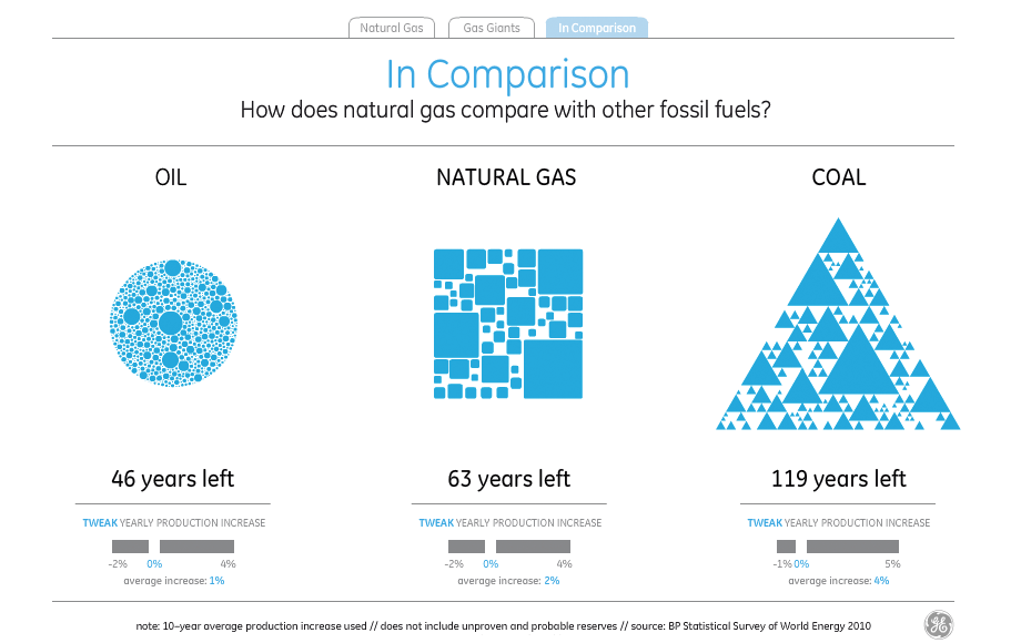
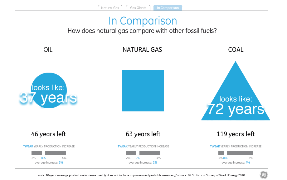
I’ve not found a way to make those numbers and shapes match up. Doing the same trick as above with visual density, it looks as though the amount of visual error in the white parts between the shapes reaches as high as 50%.
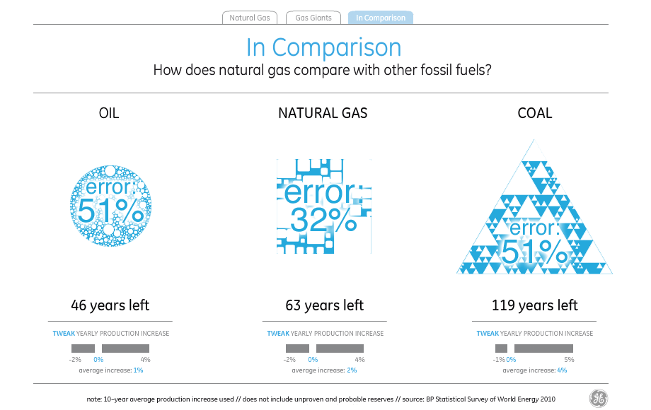
If you treat the natural gas supply of 63 years as a standard and try to read the visual density of the shapes to represent oil and coal to the left and right, you end up with visual variables very different from what the numbers say. The amount and density of blue circles understates the amount of oil by 17 years, while the amount and density of blue triangles understates the amount of coal by a shocking 62 years, making it look like there’s less coal than natural gas.
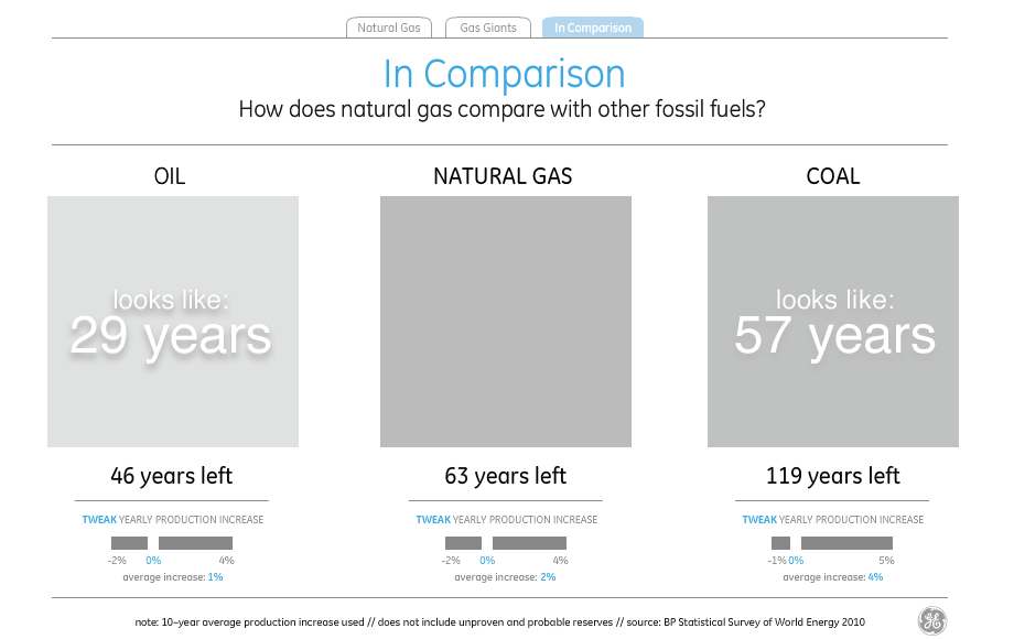
Just in case David really meant the shapes to be interpreted as filled-in and all those little bits are just him wanking around in Flash, I checked and found that the shapes still consistently understate everything except natural gas by as much as 40%. Since the title of the visualization is “the world has huge natural gas reserves”, I guess one way to make the point is to lie about the oil and coal reserves.
It’s obvious that even if McCandless’s snow job on the part of General Electric managed to show accurate numbers, it would still illustrate many of the characteristics of abstract legibility from Seeing Like A State. From page 80,
State simplifications have at least five characteristics that deserve emphasis. Most obviously, state simplifications are observations of only those aspects of social life that are of official interest. They are interested, utilitarian facts. Second, they are also nearly always written (verbal or numerical) documentary facts. Third, they are typically static facts. Fourth, most stylized state are also aggregate facts. Aggregate facts may be impersonal (the density of transportation networks) or simply a collection of facts about individuals (employment rates, literacy rates, residence patterns). Finally, for most purposes, state officials need to group citizens in ways that permit them to make a collective assessment. Facts that can be aggregated and presented as averages or distributions must therefore be standardized facts.
It’s worth noting that James C. Scott isn’t blindly criticizing statistical simplifications: “They are anything but simple-minded, and they are often wielded with great sophistication by officials. … the grouping of synoptic facts necessarily entails collapsing or ignoring distinctions that might otherwise be relevant.” (page 81). What he does criticize is the misinterpretation or outright modification of objective reality to fit that synoptic view, and this is where the argument becomes relevant to the panel again.
My response to all this is something to the effect that people should help other people to see and represent their world usefully and accurately. While it’s so often true that the power of synoptic viewing is available only to those members of society perched near the top, I can think of a number of cases where that same power is distributed democratically. The U.S. Census and U.S.G.S. both come to mind as organizations whose data product is made relentlessly public as a matter of normal operation, giving ordinary citizens the means to see their world as the state chooses to see it. The same state apparatus that puts people in prisons helps create the conditions under which Laura Kurgan can research the financial impact of those prisons.
Public data projects like Wikipedia or OpenStreetMap similarly provide for the creation of high-quality, shared data sets that cannot be taken away once released, thanks to the parallel efforts of legal experts like Creative Commons, the Free Software Foundation, and others.
The data issue I hope we manage to touch on in the panel might be better phrased as how to use new views of data to activate the creation and maintenance of reliable social data.
![]()
subscribe to ![]() this site.
|
contact Michal Migurski
this site.
|
contact Michal Migurski
Comments (3)
I posted this to McCandless's blog post (http://www.informationisbeautiful.net/2011/great-infographics-no-13/) on Friday and he never moderated it. I guess I was a bit more, well, diplomatic than you were: I’m curious. The shapes of oil, natural gas, and coal are beautiful; but what’s up with all the empty space? The triangle, the square and the circle (to a lesser degree) aren’t “complete”, and because there’s no way to dissect them it’s impossible to tell what the size of the blue means in relation to the remaining space. Do the smaller circles and triangles in the other shapes correspond somehow to the portions for individual natural gas producers in the square? I get a vague sense that the squares’ sizes are proportional to production, but there aren’t any numbers to compare so it’s left to the viewer to ponder. The “Gas Giants” tree maps also contain huge gaps, and in the “biggest proven reserves” variation the Russian Federation takes up much more actual space (32%, by my quick calculation) than the 23.7% figure it lists. What’s up with that? Of course, without the data to hand it’s really difficult to determine whether these visualizations are telling an accurate story. Any chance GE would be willing to share it with the world?
Posted by Shawn Allen on Monday, June 27 2011 5:10am UTC
I took a look at the Gas visualization. The first thing that stuck out for me was that the natural gas reserves square (as a whole) looked much too small relative to the gas-consumption per year square. Based on the inforgraphic, it looks like we'll be out of natural gas in 20 or 30 years. But, if you click on "years left", it states "63 years left". So, I took a screenshot of the image, compared the sizes, and (ignoring the gaps between boxes) it appears that the reserves box is 260x260 pixels while the yearly consumption box is 40x40 pixels. Mathematically, that works out to 42 years, not 63 years, and that's assuming all the gaps between boxes are filled in. So, visually, it looks like quite a bit less than 42 years of gas is left. My conclusion: the infographic makes it look like there's a lot less gas than there actually is.
Posted by Brit on Sunday, July 3 2011 8:57pm UTC
I looked at the gas visualization before finding this blog. I thought the pictures communicated very little except for comparing countries against each other. Is there supposed to be a message in here? Can't say I care much since the underlying data is already from a biased source. One possibly interesting observation though: Take the comparison chart and adjust the "yearly production increase" slider so that each resource has roughly the same years left... (aim e.g. for 61) you'll see that all the figures have roughly the same height. Therefore the scaling here is chosen according to the bounding box, and the amount of "blue" in each picture has nothing to do with anything.
Posted by Mikael on Monday, July 4 2011 5:09am UTC
Sorry, no new comments on old posts.