tecznotes
Michal Migurski's notebook, listening post, and soapbox. Subscribe to ![]() this blog.
Check out the rest of my site as well.
this blog.
Check out the rest of my site as well.
Aug 31, 2007 12:51am
digg arc history
I just posted a visual diary of Digg Arc development to the Stamen blog. Go check it out, and relive the glory...


Aug 29, 2007 1:53am
minilogue
Two Minilogue tracks doing it for me today:
- Inca (26.9MB)
- Certain Things About Us, Part 1 (15.2MB)
This is also not half bad:
- Audion: Fire (14.9MB)
Aug 21, 2007 6:53am
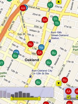
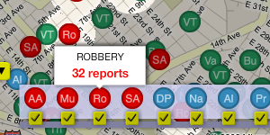
oakland crime maps IX: post-launch
Last week, we launched Oakland Crimespotting, capping off eight months of the occasional data sketching I've been recording on this site. I've covered a few speculative topics here that didn't graduate to the public version of the site, and there have been a number of interesting new things that were sure to add.
The initial work on scraping (post I, post II) is still in use. Thankfully, the city hasn't changed CrimeWatch much since December, so our nightly collection runs are still chugging along happily. We do four collections every evening: past four days, and then individual days a week, two weeks, and one month in the past. The overlap is because we've noticed that the Oakland PD amends and modifies crime reports, and the whole map site is frequently down altogether.
Two later pieces (post III, post IV) introduced an idea on time-based display, but ultimately it was effective to just drop in the dots and add live draggy/zoomy controls. This is something we've consistently found with other projects, too: it's so often the case that the "right" design is not the technically complicated one, but the one that gets feedback and interactivity just so.
Finally, I wrote up a few pieces (post VI, post VII) on public data indexing. This is something I continue to find interesting, but at the volume of traffic we're pushing, it's totally unnecessary. Turns out MySQL is kind of awesome at this sort of thing.
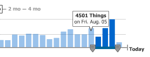
There are two big features on the map interface that only emerged when designing and developing it with Tom and Eric. The date slider is something that we shamelessly nicked from Measure Map, though we added the bit where per-day columns act as a display showing which data has been loaded. This part is still under active development. The idea is that the background should be draggable, to allow people to navigate back further in time than 30 days.
Measure Map:
Ours:

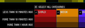
The second is the crime type picker, an interface whose affordances we borrowed from Newsmap. This one's quite simple, but it does trigger the visual spotlight effect that makes it possible to pick out crimes of a certain type throughout the map.
Newsmap:
Ours:
It was important that every view of the map be linkable and sharable, so we imported a number of ideas that Tom developed for our last map project, Trulia Hindsight. The thing to watch for is how the URL of the page you're looking at changes as you pan and zoom around. It can be copied, shared in an e-mail, sent over IM to a friend, and posted in a blog.
An "official" API has not been described or announced, but it will most likely include the site's Atom / GeoRSS feeds. These implement a small subset of the OpenSearch request specification:
- bbox is a geographical bounding box in the order west, south, east, north.
- dtstart and dtend are start and end dates, in YYYY-MM-DDTHH:MM:SSZ format.
Look for these hanging off of the /crime-data endpoint.
The site is hosted on Amazon's EC2 service, on a 10 cent/hour virtual server running Debian Linux, MySQL, Apache, and PHP. The static maps are generated by Aaron Cope's recent addition to Modest Maps, ws-compose.py. It's a BaseHTTPServer that stitches tiles into map PNG's, and I've been running four of them (and caching the responses) for the past week with no troubles.
I've rediscovered the joys of procedural PHP4 with this project. EC2 has proven to be a real champ, allowing us to set up a test machine, deploy a living site, but always holding out the possibility of migration to a "real" server. At a total of $80/month, the virtual Debian machine may last for a while.
Next steps may include San Francisco and Berkeley.
Aug 15, 2007 11:16pm
oakland crime maps VIII: first public launch
I promised we'd have something to show, right? In response to the red wave of homicides that swept Oakland two weeks ago, Tom and I published a visual map of crime reports in Oakland.
I'll write more later, but for now go and explore.

Aug 10, 2007 4:31pm
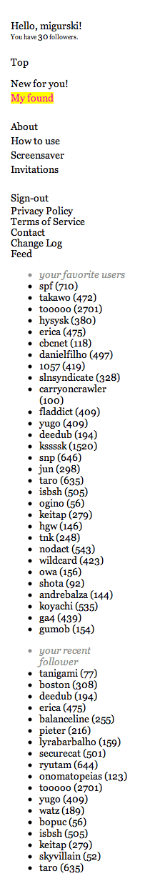
ffffound! updated
FFFFOUND! got some updates that seem to answer two of my comments from last week. I now know who my followers are, and whose images I consistently like. Something interesting I pay attention to when browsing the site: because it's Japanese there are a lot of obviously-Japanese usernames around. The list of my followers seems to be largely "western" names. I'm curious if a closer look at the site would reveal any clear difference in tastes between the U.S./Euro and Asian user populations? I do tend to post a lot of characteristically western images. I also consider it a feature that the site is so image-focused that there's not generally very much text around.
Aug 5, 2007 7:04pm
blog all dog-eared pages: the social life of small urban spaces

The Social Life of Small Urban Spaces is a brief book on urban plaza design from William Whyte, author of The Organization Man. Here, Whyte focuses on behavior in urban plazas of the sort generally found at the foot of corporate skyscrapers in New York, San Francisco, and other major cities. Various building ordinances and rules require that developers include such plazas in their design, but they are wind-blown and vacant as often as not. This book is the summary of an ethnographic study of these spaces, based on extensive filming of use patterns in 1980.
As with Organization Man, Whyte is a sharp observer and pithy commentator.
Social Life focuses on several topics in turn: crowds (and why people like them), sitting space, fountains, bums, food vendors, and filming techniques for study. The book argues that architects and developers imbue their developments with an emotional tenor that people instinctively pick up on, and shows how it affects use and health. There's a lot here that's directly applicable to social systems on the web, such as passages on distrustful design and "megastructures", the car-focused, inward-facing malls and complexes popular in cities over the past few decades. Whyte isn't optimistic about their future, and I think there are lessons to be learned by inward-facing online destinations such as Facebook.
In the same vein, Wired editor Chris Anderson recently gave up on Second Life because "if you're going to evoke real world conceits such as "places" that you "go to", then you've got to deal with real world expectations of those places. We don't like like empty buildings in RL; why should be more tolerant of them in SL just because there are traces of those who have been there before?"
Overall, Whyte's focus on describing use shows how optimistic architectural renderings break down in the face of natural human use patterns. I especially enjoyed the contrast between Whyte's choice of images for an example megastructure, the Detroit Renaissance Center. Here's an image typical of Google's image results for the center:

Here's Whyte's street-level view:

Bleak.
It's a hopeful book, though - no problem seems insurmountable in the face of realistic expectations and a hot dog stand or two.
Page 19, on crowds:
What attracts people most, it would appear, is other people. If I belabor the point, it is because many urban spaces are being designed as though the opposite were true, and that what people liked best were the places they stay away from. People often do talk along such lines; this is why their responses to questionnaires can be so misleading. How many people would say they like to sit in the middle of a crowd? Instead, they speak of getting away from it all, and use words like "escape", "oasis", "retreat". What people do, however, reveals a different priority.
Page 23, on similarity:
The strongest similarities are found among the world's largest cities. People in them tend to behave more like their counterparts in other world cities than like fellow nationals in smaller cities. Big-city people walk faster, for one thing, and they self-congest. ... Modest conclusion: given the basic elements of a center city - such as high pedestrian volumes, and concentrations and mixtures of activities - people in one place tend to act much like people in another.
Page 33, on benches:
Benches are artifacts the purpose of which is to punctuate architectural photographs. They're not so good for sitting. There are too few of them; they are too small; they are often isolated from other benches or from whatever action there is on the plaza. Worse yet, architects tend to repeat the same module in plaza after plaza, unaware that it didn't work very well in the first place.
Page 35, on chairs:
The possibility of choice is as important as the exercise of it. If you know you can move if you want to, you feel more comfortable staying put. This is why, perhaps, people so often move a chair a few inches this way and that before sitting in it, with the chair ending up about where it was in the first place. The moves are functional, however. They are a declaration of autonomy, to oneself, and rather satisfying.
Page 61, on distrust and "undesirables":
Many corporation executives who make the key decisions about the city have surprisingly little acquaintance with the life of its streets and open spaces. ... To them, the unknown city is a place of danger. If their building has a plaza, it is likely to be a defensive one that they will rarely use themselves. Few others will either. Places designed with distrust get what they were looking for and it is in them, ironically, that you will most likely find a wino.
Page 64, on guards and plaza mayors:
...it is characteristic of well-used places to have a "mayor". He may be a building guard, a newsstand operator, or a food vendor. Watch him, and you'll notice people checking in during the day. ... One of the best mayors I've seen is Joe Hardy of the Exxon Building. He is an actor, as well as the building guard, and was originally hired by Rockefeller Center Inc. to play Santa Claus, whom he resembles. Ordinarily, guards are not supposed to initiate conversations, but Joe Hardy is gregarious and curious and has a nice sense of situations. ... Joe is quite tolerant of winos and odd people, as long as they don't bother anybody. He is very quick to spot real trouble, however.
Page 85, on megastructures:
The ultimate development in the flight from the street is the urban fortress. In the form of megastructures more and more of these things are being put up - huge, multipurpose complexes combining offices, hotels, and shops - such as Detroit's Renaissance Center, Atlanta's Omni International. Their distinguishing characteristic is self-containment. While they are supposed to be the salvation of downtown, they are often some distance from the center of downtown, and in any event tend to be quite independent of their surroundings, which are most usually parking lots. The megastructures are wholly internalized environments, with their own life-support systems. Their enclosing walls are blank, windowless, and to the street they turn an almost solid face of concrete or brick.
Page 89, on the inevitable decline of megastructures:
And it is going to date very badly. Forms of transportation and their attendant cultures have historically produced their most elaborate manifestations just after they have entered the period of their obsolescence. So it may be with megastructures and the freeway era that bred them. They are the last convulsive embodiment of a time passing, and they are a wretched model for the future of the city.
Appendix A is a guide to using film in research.
Page 103, on research fatigue:
But, thanks to the long term time span of our study, we got our second wind and finally learned a few simple but important lessons. The crux is evaluation. Taking the film is easy. So is showing it. It's even fun. But when you start figuring out, frame by frame, what the film has to tell, and what it means, you will find the process can be enormously time consuming, and before long, tedious. That's where it all breaks down. Unless you master this phase, you will not stay the course. Happily, there are ways to shortcut the tedium, greatly speed up evaluation, and in the process make it more accurate.
Page 109, on being careful:
The real danger comes in photographing illicit activities, especially when you do it without realizing it. Our narrowest call was when we set up a perch on the fourth floor of a building in the middle of a block on 101st Street. The object was to observe the social life on the stoops and fire escapes. Before long, Cadillacs with out-of-state license plates began stopping in front of the building opposite, and there was considerable movement in and out of the basement door. A wholesale heroin operation was under way. ... At length it was discerned that a look-out with binoculars was alerting people to the impending arrival of police cars. The, one day, we saw on the film that the binoculars were trained directly on our camera. We withdrew.
Aug 1, 2007 12:24am
blog all dog-eared pages: sketching user experiences

Sketching User Experiences is Bill Buxton's new book arguing that the process of sketching is distinct from prototyping, and an integral part of design. Buxton opens with the canonical example of great design, Apple's iPod, to show that its "overnight" success actually came after 3+ years of development and updates, and moves on to talk about the lack of design in typical software organizations. These two topics are slightly out-of-tune with the remainder of the book, but I believe they were included to bridge the main thesis to Buxton's role as a Microsoft researcher. In particular, I like the argument for introducing an explicit design phase to the world of software development in accordance with Fred Brooks' opinion that mistakes caught early are mistakes fixed cheaply.
About 1/3rd through the book (see page 111, below), Buxton cuts to the chase with an 11-point definition of sketching as distinct from prototyping. Most importantly to Buxton, sketches are fast, cheap, and divergent. They develop quickly with only minimal detail to make a point, and are intended to communicate the essential ideas of a maximally-wide variety of design possibilities.
He also calls out the example of IDEO's Tech Box, a curated company library of technological toys and materials enabling rapid exploration and research in product design. This was the book's most explicit tie to Mike Kuniavsky's Sketching In Hardware conference series, demonstrating how the characteristics of a good sketch transcend pencil and paper.
Page 36, on wooden maps:
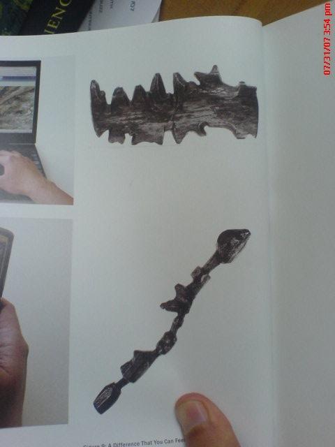
These are 3D wooden maps carved by the Ammassalik of east Greenland. The larger one shows the coastline, including fjords, mountains, and places where one can portage and land a kayak. The thinner lower maps represents a sequence of offshore islands. Such maps can be used inside mittens, thereby keeping the hands warm; they float if they fall in the water; they will withstand a 10 metre drop test; and there is no battery to go dead at a crucial moment.
Page 69, on the difficulty of making new things:
It suddenly occurred to me that our company was not alone in this situation. Rather, as far as I could make out, virtually ever other software company was pretty much in the same boat. After establishing their initial product, they were as bad as it as we were. When new products did come from in-house development, they were generally the result of some bandit "skunk works" rather than some formal sanctioned process (not a comforting thought if you are a shareholder or an employee). Across the board, the norm was that most new products came into being through mergers or acquisitions.
Page 73, on why:
My belief is that one of the most significant reasons for the failure of organizations to develop new software products in-house is the absence of anything that a design professional would recognize as an explicit design process. Based on my experience, here is how things work today. Someone decides that the company needs a new product that will do "X". An engineering team is then assigned to start building it. ... The only good thing about this approach is that one will never be accused of not conforming to the original design. The bad news is that this is because there is no initial design worthy of the term.
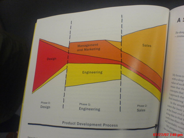
Page 76, on a suggested product development process:
Page 90, on the Trek Y-Bike:
The engineering prototype shown in Figure 28 works. If you look at the photo carefully, you will see that if you added pedals, sprockets, wheels, a chain, brakes, and handle-bars to this prototype it would be perfectly functional. You could ride it. ...it is almost certain that it would be a commercial flop. Why? Anyone can see that the bike is not complete. Not because of the missing parts, but because the design is not complete. What is obvious here with mountain bikes is not obvious with software. My impression is that what we see in Figure 28 relfects the state in which software products ship. They kind of work, but are as far from complete as this version of the bike is.
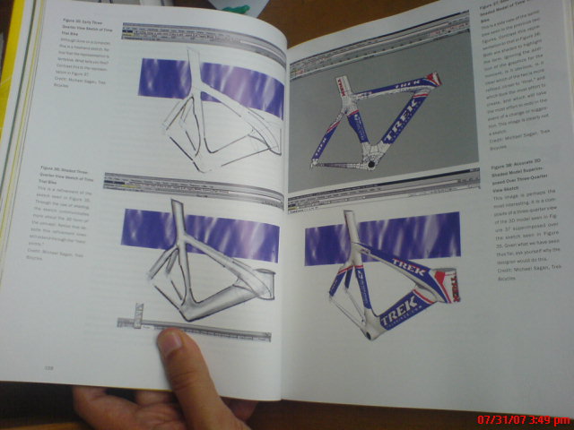
Page 108-109, some example sketches of bicycles showing speed and disposability:
Page 111, on a definition of sketching:
Quick: A sketch is quick to make, or at least gives that impression.
Timely: A sketch can be provided when needed.
Inexpensive: A sketch is cheap. Cost must not inhibit the ability to explore a concept, especially early in the design process.
Disposable: If you can't afford to throw it away when done, it is probably not a sketch. The investment with a sketch is in the concept, not the execution. By the way, this does not mean that they have no value, or that you always dispose of them. Rather, their value depends largely on their disposability.
Plentiful: Sketches tend not to exist in isolation. Their meaning or relevance is generally in the context of a collection or series, not an isolated rendering.
Clear vocabulary: The style in which a sketch is rendered follows certain conventions that distinguish it from other types of renderings. The style, or form, signals that it is a sketch. The way that lines extend through endpoints is an example of such a convention, or style.
Distinct gesture: There is fluidity to sketches that gives them a sense of openness and freedom. They are not tight and precise, in the sense that an engineering drawing would be, for example.
Minimal detail: Include only what is required to render the intended purpose or concept. Lawson (1997, p.242) puts it this way: "... it is usually helpful if the drawing does not show or suggest answers to questions which are not being asked at the time." Superfluous detail is almost always distracting, at best, no matter how attractive or well rendered. Going beyond "good enough" is a negative, not a positive.
Appropriate degree of refinement: By its resolution or style, a sketch should not suggest a level of refinement beyond that of the project being depicted. As Lawson expresses it, "... it seems helpful if the drawing suggests only a level of precision which corresponds to the level of certainty in the designer's mind at the time."
Suggest and explore rather than confirm: More on this later, but sketches don't "tell," they "suggest." Their value lies not in the artifact of the sketch itself, but in its ability to provide a catalyst to the desired and appropriate behaviors, conversations, and interactions.
Ambiguity: Sketches are intentionally ambiguous, and much of their value derives from their being able to be interpreted in different ways, and new relationships seen within them, even by the person who drew them.
Page 169, on the IDEO Tech Box:
It consists of hundreds of gadgets. Most are laid out on open shelf-like drawers. Some are toys, and are just there because they are clever, fun, or embody some other characteristic that may inspire, amuse, or inform (or perhaps all three). Others might be samples of materials that could be useful or relevant to future designs. ... Since the Tech Box is a kind of mini library or musem, it has someone from the studio who functions as its "curator" or "librarian." And like conventional libraries, all of the objects in the collection are tagged and catalogued so that supplementary information can be found on the studio's internal website. As an indication of how much store the company puts in having its employees have a shared set of references, there is a Tech Box in every one of their studios worldwide. Furthermore, even though anyone can add things to the collection, if you do, you must get one for the Tech Box in every on of the studios. These are circulated to the other studios by the local curator, who also makes sure that the appropriate entry is made into the associated web database.
Page 215, on the unevenly-distributed future:
Here we see the same thing. The period from concept to product is about 20 years in the industry in general, and in user interface technologies, specifically. So much for fast-changing technology! ... If history is any indication, we should assume that any technology that is going to have a significant impact over the next 10 years is already 10 years old!
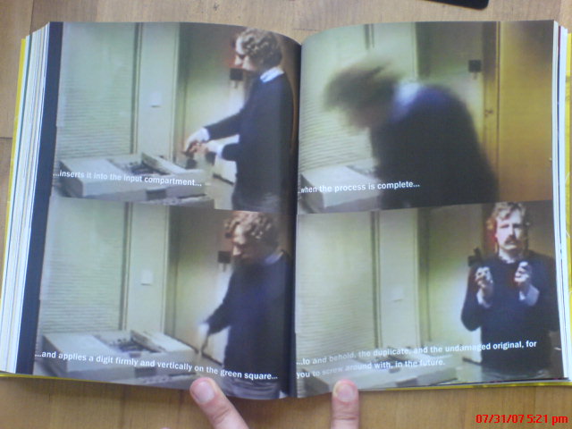
Pages 350-351, on video sketches of matter duplication:
Page 413, on iconoclasm:
If you are going to break something, including a tradition, the more you understand it, the better job you can do. The same is true in classical art and design education. There are classes such as printmaking, life drawing, and water colour, whose purpose is to lay a solid foundation in technique. This underlies the complementary set of classes that focus on the content of the work - the art rather than the technique.
Page 418, in closing:
Like the word "mathematics," I think the word "future" should be pluralized, as in "futures." As long as it is singular, there is a bias toward thinking that there is only one future. That takes the emphasis, and attendant responsibilities, away from the reality that there are many possible futures, and that it is our own decisions that will determine which one we end up with.
subscribe to ![]() this site.
|
contact Michal Migurski
this site.
|
contact Michal Migurski