tecznotes
Michal Migurski's notebook, listening post, and soapbox. Subscribe to ![]() this blog.
Check out the rest of my site as well.
this blog.
Check out the rest of my site as well.
Feb 2, 2007 7:38am
oakland crime maps III
I haven't been neglecting my Oakland Crime work, just quietly plugging away at it in my off hours. I'm getting to a point where I can start to think about visual presentation, which I'm hoping will be an improvement on the traditional pins-in-a-map GMaps mashup style. I'm moving on two fronts: designing a possible display metaphor for the crimes, and writing software so I can do this in Flash and continue to take advantage of the highly-available, highly-detailed map tile collections from Google, Yahoo!, and Microsoft.
First, interface display. Crime leaves an imprint on the place and time it is committed, and a visual representation should reflect this. I've been thinking about this in terms of residual hauntings:
A residual haunting is a playback of a past event. The apparitions involved are not spirits, they are "recordings" of the event. Video and audio tapes capture sounds and images on a film of special material that has been oxidized or rusted. Certain building materials, such as slate used in older castles and stone structures and iron nails used in many older buildings, have properties similar to that of the tapes. When a traumatic event occurs or a time of heightened emotions, these materials record the event for future playback.
Any personal experience in a crime-prone neighborhood underscores this characteristic: the feeling of fragile safety, heightened alertness, and sensitivity to rumor or hearsay. There are places in Oakland and San Francisco where few non-residents dare to visit. These tend to be on the wrong side of the freeway, and even the brave or foolhardy artists and warehouse hipsters from "outside" who move there do so in packs, hiding inside secured buildings and staying separate from the local street life. The aura of street crime in these areas is strong, and daily movements feel like travels through hostile territory. Entire cities can take on the coloration of their most dangerous parts, leading to generalizations about Oakland being an inherently dangerous place. Sometimes, gentrification may set in and dull the impact of past crime.
In thinking about how to represent these halos on a map, my first idea was to calculate a linear relationship between space and time, and model them as spheres. For example, a mugging or burglary may impact the neighborhood for a few blocks in each direction and linger in memory for a few days. Car break-ins and petty theft can go entirely unnoticed, while homicides make the evening news in neighboring towns. It should be possible to establish a correspondence like "one block equals one day", and assign various influence radii to classes of crime.
This has a direct usability benefit: when selecting a time range to view on a visual map of crime incidents, Crime Watch shows only the crimes that occurred within that span. With spherical halos around each event sized proportionately to their severity, it should be possible to display pins on a map along with some indication that major events may have happened near the selected range, providing a backplane of additional information. Overlapping spheres would give a dynamic, shifting sense of how dangerous a given area is and help in time navigation by hinting at incidents just beyond the selected parameters.
Crime has a social weight, which should be represented by the effect it has on its spatial and temporal neighborhood. Dan Catt brought up this same concept as it relates to geo-aware mobile phone apps and Flickr's new machine tags feature, suggesting an application that gives your handset a light buzz when you pass over a place where some emotional event took place. I fully expect Aaron to have something like already running on one of his Python-and-GPS-enabled Nokias.
Adam clued me in to a slightly different way of thinking about this problem:
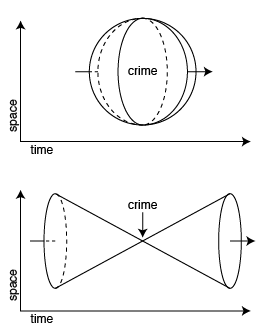
On top is my original, spherical zone of influence. On the bottom is a set of radiating cones suggested by a few of his comments. Each event still has a mass, but in the sense of general relativity rather than campfire ghost stories.
Adam:
Think of the "light cone" of a murder spreading ... it should be additive. Two murders on my block is more than twice as bad as one, because it tips my block into another region of possibility space.
The difference leads to the second picture, where the crime remains a localized event as it happens, but sends ripples through time and space. The forward influence is obvious, the backward influence less so. I think that both directions are necessary for two reasons: just one wouldn't have the interface navigational advantage of seeing around the horizon in each direction, and there are often social preconditions that lead to disturbing events happening in a given place and time. Jane Jacobs likes to talk about "border vacuums" in urban spaces, places such as open plazas that normal people avoid because the emptiness feels intuitively dangerous.
"Violence is a force acting on a place" (Adam again).
Visually, the radiating circles would need to be outlined rather than filled, to suggest the pond ripple connection and minimize clutter. Scrubbing time in one direction or another would expand and contract these ripples, hinting at the direction of their cause. The open question I have is about limits: spheres have an obvious limit, their radius, but cones do not. Do lower-intensity crimes simply have a shorter cone with an identical slope?
The second thing I've been hammering away at is a Flash-based, open source tile display engine for maps or large images. My friend Darren has been plotting a map-based application that would need to run on mobile phones and I want to do sparkly vector graphic overlays, so working with him to target Flash and FlashLite was a no-brainer. Expect to see this sometime in the coming weeks, since we're nearing completion.
subscribe to ![]() this site.
|
contact Michal Migurski
this site.
|
contact Michal Migurski
Comments
Sorry, no new comments on old posts.