tecznotes
Michal Migurski's notebook, listening post, and soapbox. Subscribe to ![]() this blog.
Check out the rest of my site as well.
this blog.
Check out the rest of my site as well.
Aug 15, 2015 6:08pm
a historical map for moving bodies, moving culture
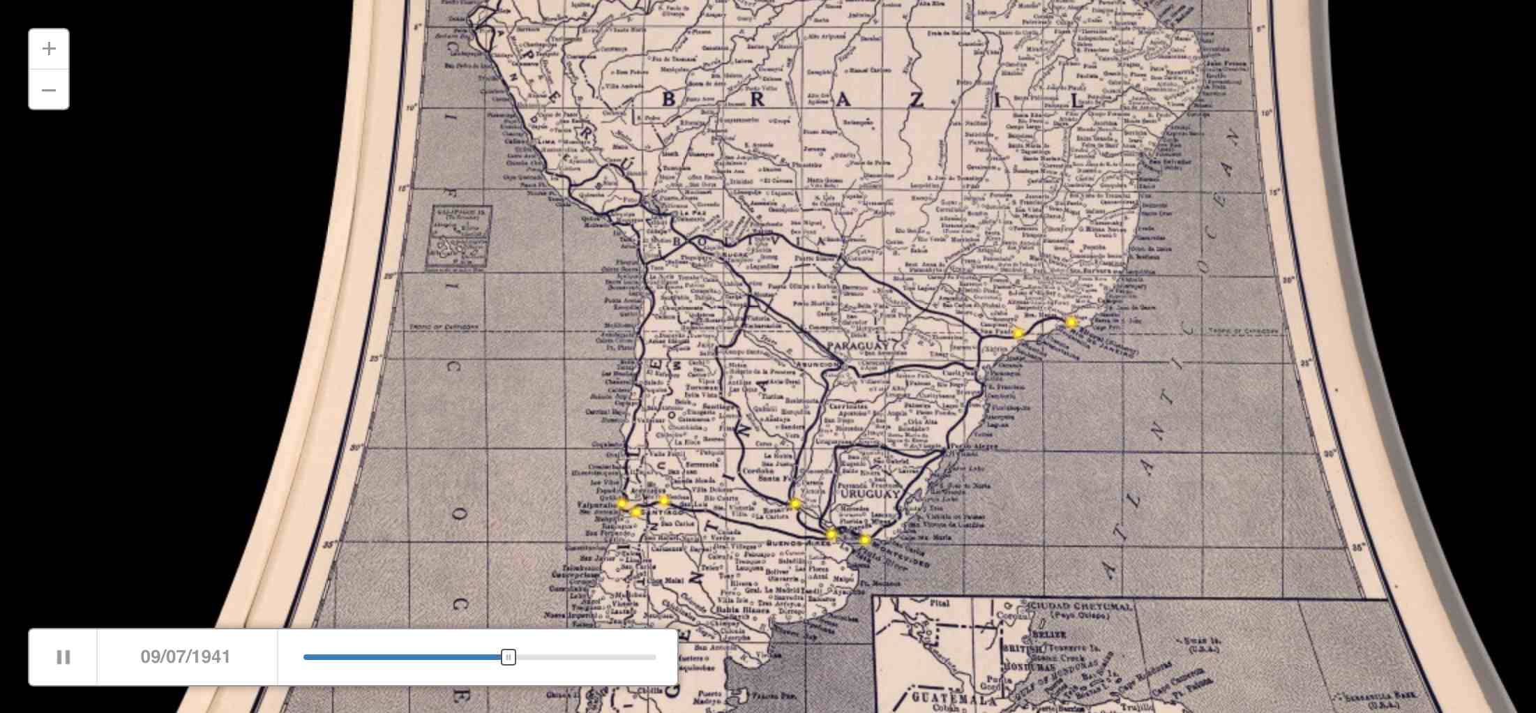
Similar to my quick adaptation of OSM data the other day, Kate Elswit recently asked for data and mapping help with her Moving Bodies, Moving Culture project. MBMC is a series of exploratory visualizations all based on the 1941 South American tour of American Ballet Caravan. The goal here was to adapt a Rand McNally road atlas from 1940 as a base map for the tour data, to “to see how different certain older maps might be, given some of the political upheaval in South America in the past 80 years.”
Kate is using Github to store the data, and I’ve written up a document explaining how to do simple map warping with a known source projection to get an accurate base map.
This is a re-post of the process documentation.
Start by downloading a high-res copy of the Rand McNally 1940 map. Follow the image link to the detail view:

Vector Data and QGIS
This downloads a file called 5969008.jpg.
Download vector data from Natural Earth, selecting a few layers that match the content of the 1940 map:
The projection of the 1940 map looks a bit like Mollweide centered on 59°W, so we start by reprojecting the vector data into the right PROJ.4 projection string:
ogr2ogr -t_srs '+proj=moll +lon_0=-59' \
    ne_50m_admin_0_countries-moll.shp \
    ne_50m_admin_0_countries.shp

ogr2ogr -t_srs '+proj=moll +lon_0=-59' \
    ne_50m_populated_places-moll.shp \
    ne_50m_populated_places.shp

ogr2ogr -t_srs '+proj=moll +lon_0=-59' \
    ne_50m_graticules_5-moll.shp \
    ne_50m_graticules_5.shp
In QGIS, the location can be read from the coordinates display:

Warping The Map
Back in the 1940 map, corresponding pixel coordinates can be read from Adobe Photoshop’s info panel:

Using GDAL, define a series of ground control points
(GCP) centered on cities
in the Natural Earth data and the 1940 map. Use gdal_translate
to describe the downloaded map and then gdalwarp
to bend it into shape:
gdal_translate -a_srs '+proj=moll +lon_0=-59' \
    -gcp 1233 1249 -1655000 775000 \
    -gcp 4893 2183 2040000 -459000 \
    -gcp 2925 5242 52000 -4176000 \
    -gcp 1170 3053 -1788000 -1483000 \
    -gcp 2256 6916 -767000 -6044000 \
    -of VRT 5969008.jpg 5969008-moll.vrt

gdalwarp -co COMPRESS=JPEG -co JPEG_QUALITY=50 \
    -tps -r cubic 5969008-moll.vrt 5969008-moll.tif
Opening the result in QGIS and comparing it to the 5° graticules shows that the Mollweide guess was probably wrong:

The exactly horizontal lines of latitude in the original map suggest a pseudocylindrical projection, and a look at a list of examples shows that Sinusoidal might be better. Try it all again with a different PROJ.4 string:
ogr2ogr -t_srs '+proj=sinu +lon_0=-59' \
    ne_50m_admin_0_countries-sinu.shp \
    ne_50m_admin_0_countries.shp

ogr2ogr -t_srs '+proj=sinu +lon_0=-59' \
    ne_50m_populated_places-sinu.shp \
    ne_50m_populated_places.shp

ogr2ogr -t_srs '+proj=sinu +lon_0=-59' \
    ne_50m_graticules_5-sinu.shp \
    ne_50m_graticules_5.shp
The pixel coordinates will be identical, but the locations will be slightly different and must be read from QGIS again:
gdal_translate -a_srs '+proj=sinu +lon_0=-59' \
    -gcp 1233 1249 -1838000 696000 \
    -gcp 4893 2183 2266000 -414000 \
    -gcp 2925 5242 52000 -3826000 \
    -gcp 1170 3053 -1970000 -1329000 \
    -gcp 2256 6916 -711000 -5719000 \
    -of VRT 5969008.jpg 5969008-sinu.vrt

gdalwarp -co COMPRESS=JPEG -co JPEG_QUALITY=50 \
    -tps -r cubic 5969008-sinu.vrt 5969008-sinu.tif
The results looks pretty good:

Cutting Tiles
For web map display, convert the warped map to map tiles using
gdal2tiles.py
starting at map zoom level 6:
gdal2tiles.py -w openlayers -z 0-6 \
    -c 'Rand McNally 1940' -t 'Map of South and Central America' \
    5969008-sinu.tif tiles
Convert all generated PNG tiles to smaller JPEG images using Python and convert:
python convert-tiles.py
Here it is in CartoDB:
subscribe to ![]() this site.
|
contact Michal Migurski
this site.
|
contact Michal Migurski
Comments
Sorry, no new comments on old posts.