tecznotes
Michal Migurski's notebook, listening post, and soapbox. Subscribe to ![]() this blog.
Check out the rest of my site as well.
this blog.
Check out the rest of my site as well.
Apr 30, 2007 6:59am
cameras, twitter, style sheets
Three things that are making me happy right now:
- My Sony/Ericsson w810i phone camera.
- The page layout on Twitter.
- display: in-line and background-color in CSS.
I got the new phone after my going-on-four-year-old Nokia was stolen in February. It was the only decent candybar phone being offered by any of the local providers, and I switched from Verizon to Cingular just to get it. In addition to accepting MP3's of P+B as ringtones, it has a camera on it that totally beats the pants off the Nokia N90 that I tried out last year.
I also recently came crawling back to Twitter, after leaving in a huff in four or five months ago. This time, I'm being less profligate with the friends feature and I'm posting mostly pictures instead of words. I like the idea of Twitter as a constrained medium for short bursts of communication, and the fact that a few of the people I know using it don't make an extra effort to page back into posts they've missed. It's a very in-the-moment style of update, and I think it's far more appropriate to camera phone snaps than Flickr. They give you a permalink for your "tweets", but it's not a focal point like on the photo-sharing sites. This makes Twitter a better home for throwaway shots, albeit one that has no built-in photo upload mechanism.
This is where twitter-pic.php comes in, a stupid-simple PHP script that accepts e-mails on STDIN and pushes their image contents to Twitter. Images too fleeting to post here belong there.
Technology aside, I very much like Twitter's page layout. Their default is a giant, statically-placed, user-defined background image with blocks of text-filled color in the foreground. It's quite elegant, and very CSS-appropriate. I keep noticing these little technology-driven design details being celebrated and even jumping media boundaries. Tom showed me a UK magazine the other day that's using text block backgrounds directly nicked from the default rendering of an in-line element with a defined background color. This particular detail has a cultural resonance as well, after six years' worth of popping up in the news in the form of redacted government documents (see New York Times and John Emerson).
This has really been a long way of saying that I just redesigned my website incorporating phonecam pictures, giant backgrounds, and blocky text backgrounds, and that you should let me know what you think.
Apr 20, 2007 7:46pm
blog all dog-eared pages: the box

When I read, I often mark interesting pages and then forget about them. This is an effort to note what I found interesting about non-fiction books I've finished, starting with The Box, Marc Levinson's excellent book about the containerization of the shipping industry. I read it about two months ago.
Pages 12-13:
The importance of innovation is at the center of a second, and rapidly growing, body of research. Capital, labor, and land, the basic factors of production, have lost much of their fascination for those looking to understand why economies grow and prosper. The key question asked today is no longer how much capital and labor an economy can amass, but how innovation helps employ those resources more effectively to produce more goods and services. ... Even after a new technology is proven, its spread must often wait until prior investments have been recouped; although Thomas Edison invented the incandescent lightbulb in 1879, only 3 percent of U.S. homes had electric lighting twenty years later. The economic benefits arise not from innovation itself, but from entrepreneurs who eventually discover ways to put inventions to practical use.
Page 53:
Malcolm McLean's fundamental insight, commonplace today but quite radical in the 1950's, was that the shipping industry's business was moving cargo, not sailing ships. That insight led to a concept of containerization quite different from anything that had come before. McLean understood that reducing the cost of shipping required not just a metal box but an entire new way of handling freight. Every part of the system - ports, ships, cranes, storage facilities, trucks, trains, and the operations of the shippers themselves - would have to change. In that understanding, he was years ahead of almost everyone else in the transportation industry.
Page 184:
"Containerization cannot be considered just another means of transportation," Besson told Congress in 1970. "The full benefits of containerization can only be derived by logistic systems designed with full use of containers in mind."
Apr 20, 2007 6:59am
digg's api is public
Digg launched their API this evening, something that's been a long time in coming. We first worked with Digg to help design it back in mid-2006, in support of the Digg Labs project that launched in late summer. Since that time, and among other work, we've been slowly expanding its range and working out kinks and inconsistencies. Today, I'm proud to say that the new Digg API totally kicks ass.
Available endpoints include lists of stories, users, diggs, topics, and comments. The whole thing is available in four flavors: XML, JSON, Javascript, and serialized PHP. We designed in a few niceties for site owners, like being able to search for stories based on URL or domain, and added awareness of friends, users, and comments. We did not design any read/write endpoints, because the jury is still out on how to support digging and submission via an API without letting in all the crazy hackbots. Stay tuned on that one.
Also included in today's announcements are the contest and the Digg Flash Development Kit, the latter developed by Shawn. Although we're not releasing the display code used to run Stack or Swarm, everything else used to build those tools is included: API support, call scheduler, object model, etc. It's quite a bit to get my head around.
Apr 20, 2007 1:29am
disinfographics
Dion Hinchcliffe is a blogger responsible for an intimidating volume of writing on web 2.0, ajax, service-oriented architecture, and other such topics. To accompany his articles, he creates a torrent of infographics that are a clear example of muddled thinking. Arrows point this way and that, boxes sit inside boxes, and labels abound: consumption, viral feedback, REST, engagement. Fortunately, they're all served up from an open directory, so here are a selection of my all-time faves. Click on each to see the full-res original!
This is the first Dion Hinchcliffe infographic I ever saw. Things that struck me: the "mutual sense of community" label under the people (oh, that's where that goes), the arrows labeled REST, HTTP, JSON, and SOAP, and the public edge of the enterprise peeking into the cloud from the right:

I assume there are sentences containing the following words in the accompanying article:

This one has the obligatory internet web cloud:

The important part of this chart is the five blobs to the right, yet the full internal structure of an AJAX application is shown to the left:

"You can't make requests to servers other than the one the page is from":

I like the little thread pinwheels here:

The people consume, create and consume, and socially consume:

The Einsteinian gravity-sheet here is awesome:

The cloud has been upgraded to "2.0":

"The web is growing":

I thought for sure the fall trend for 2006 was open platforms closing up in response to the lure of acquisition:

Apr 12, 2007 7:32am
people as pixels: arirang
I've seen photos of North Korea's Arirang Festival before - it's the archetypal mass calisthenics, card stunts, and gymnastics you've seen in many news photos for years. Still I don't think I was quite prepared for everyoneforever's pointer to an official TV ad for the event. (Could also be the Faithless talking) Go watch it.

It's the same kind of scary-wonderful as UVA's LED displays (1, 2, 3) and Triumph Of The Will. Leni Riefenstahl and UVA both let you see their pixels; they emphasize the large scale of what you're seeing by revealing the tiny elements that compose it. Arirang is powerful, because each one of those moving, jumping, swaying dots is a human being bent (literally, figuratively) into shape as part of a single performed piece. There are a few super-intense shots near the middle/end that alternate between close-ups of color-coded dancers and long shots of massively-parallel synchronized acrobatics. A few of our projects, such as Digg Labs and MoveOn, give me the shivers when I look at the data collections we're working with and see the individual, emotional decisions through all the pixels, rows, and elements. With Labs in particular, the last time we pushed a major update was right around the time that James Kim and his family were lost in Oregon. Our testing data was live, and constantly threw reminders to the surface in the form of hopeful and later tragic headlines.
Apr 10, 2007 6:48am
global voices online relaunches
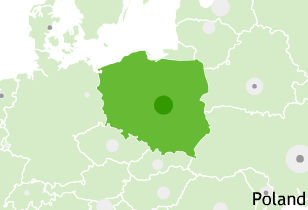
Boris got a fresh overhaul of GVO out the door this morning, and it looks fantastic. The entire site has been updated, with swooshy drop-down tab areas for the previously-weird tag clouds, and just a general sprucing and buffing throughout. The site aggregates an epic volume of content from blogs around the world, with special focus on bloggers from outside Western Europe, North America, and Australia.
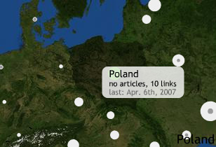
I helped in a small way, by implementing the contextual maps on the site's country and region pages. Boris saw the need for these things to provide some framing for local issues by showing their relationship to news from neighboring places. This was the project I worked on when I visited Tokyo last month. This project is one of a short list of early applications for Modest Maps, an ActionScript library I've been working on with Darren, Shawn, and Tom since January. We used satellite imagery courtesy of NASA's Blue Marble and country borders from the Mapping Hacks data collection.
The maps currently fit in the sidebar, but a week's worth of tonkatsu-fueled brainstorming had us thinking about a few other possibilities:
- Five minutes of playing with the Nintendo Wii's geographical news globe made it obvious that a full-screen version made sense.
- A little bit of geocoding applied to GVO's extensive backcatalogue could lead to stories linked to specific cities instead of just countries.
- It should be possible to drag, pan, and zoom these, but not in their current tiny sidebar home.
The maps have two states, roll over them on the GVO site to see both:
Apr 2, 2007 8:00am
sunday ride
We rode 14.8 miles through Oakland, Berkeley, and Emeryville this afternoon. Stopped for a Zywiec near mile 12, site of this totally sweet kid-trap playground.
subscribe to ![]() this site.
|
contact Michal Migurski
this site.
|
contact Michal Migurski