tecznotes
Michal Migurski's notebook, listening post, and soapbox. Subscribe to ![]() this blog.
Check out the rest of my site as well.
this blog.
Check out the rest of my site as well.
Apr 20, 2007 1:29am
disinfographics
Dion Hinchcliffe is a blogger responsible for an intimidating volume of writing on web 2.0, ajax, service-oriented architecture, and other such topics. To accompany his articles, he creates a torrent of infographics that are a clear example of muddled thinking. Arrows point this way and that, boxes sit inside boxes, and labels abound: consumption, viral feedback, REST, engagement. Fortunately, they're all served up from an open directory, so here are a selection of my all-time faves. Click on each to see the full-res original!
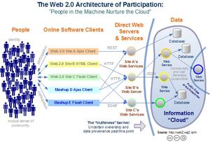
This is the first Dion Hinchcliffe infographic I ever saw. Things that struck me: the "mutual sense of community" label under the people (oh, that's where that goes), the arrows labeled REST, HTTP, JSON, and SOAP, and the public edge of the enterprise peeking into the cloud from the right:
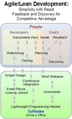
I assume there are sentences containing the following words in the accompanying article:
This one has the obligatory internet web cloud:
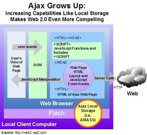
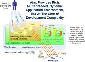
The important part of this chart is the five blobs to the right, yet the full internal structure of an AJAX application is shown to the left:
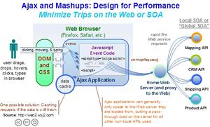
"You can't make requests to servers other than the one the page is from":
I like the little thread pinwheels here:
The people consume, create and consume, and socially consume:
The Einsteinian gravity-sheet here is awesome:
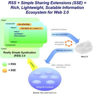
The cloud has been upgraded to "2.0":
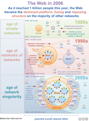
"The web is growing":
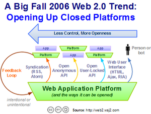
I thought for sure the fall trend for 2006 was open platforms closing up in response to the lure of acquisition:



Comments
Sorry, no new comments on old posts.