tecznotes
Michal Migurski's notebook, listening post, and soapbox. Subscribe to ![]() this blog.
Check out the rest of my site as well.
this blog.
Check out the rest of my site as well.
Jan 24, 2007 6:36am
spatial vision
I was recently reminded of one of my major "ah ha!" moments from my undergrad years at U.C. Berkeley.
It was in Russell De Valois' class on the biological basis of vision, and concerned Hubel and Wiesel's work on information processing in the visual system. It was one of those end-of-semester lectures where huge chunks of material from previous lessons slide around and sort of lock into place, suddenly making sense as a complete body of work. It was not the other kind of end-of-semester lecture, where animal rights activists pie your professor in class because of his past experimentation on live cats and monkeys.
The majority of the course had focused on how the eye and the primary visual cortex in the brain convert incoming light signals into higher-level information. Not quite recognizing faces or reading letters, but enough to pick out basic visual features such as edges, colors, and movement.
In general, the retina at the back of the eye is spotted with light-sensitive neural cells called rods and cones. Each of these cells is connected to further cells in the eye and later in the brain. Signals from each cell can excite or inhibit the cells that it's connected to: make them fire strongly, or prevent them from doing so. It turns out that simple combinations of cells in groups yield receptive fields (visual patterns) that have a center-surround shape, like this:
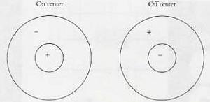
The left field responds positively to a bright spot of light surrounded by darkness, while the right field responds positively to a dark spot surrounded by bright light. Importantly, neither field responds much at all to large areas of unvarying brightness or darkness - detection of change turns out to be pretty much the one thing the visual system does, in varying combinations. You can imagine a group of light-sensitive cells feeding a single cell further back in the chain with a combination of positive and negative connections, maximizing the response when the exact center/surround pattern is seen.
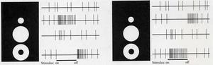
These images show typical readings from neurons under various conditions, showing how excited they get when they see the pattern they're sensitive to:
This image shows how massively-redundant and parallel connections between neurons might work to get the results above, driving input from each receptor in the retina to a growing network of visual neurons deeper in the brain:

Hubel and Wiesel's work sticking electrodes into cat brains while they (the cats) looked at moving patterns showed how specialized brain cells in the visual system are. Almost by accident, they discovered that one cell might be responsive to a short, bright horizontal line, while another might prefer a long, dark vertical stripe. Many cells also showed sensitivity to movement. A combination of delayed connections among all those neural pathways might cause a cell to respond just to a bright line moving diagonally up and to the right. The primary visual cortex in the back of your brain is full of such cells, all with a narrowly-defined job to do.
...people often complain that the analysis of every tiny part of our visual field - for all possible orientations and for dark lines, light lines, and edges - must surely require an astronomic number of cells. The answer is yes, certainly. But that fits perfectly, because an astronomic number of cells is just what the cortex has. Today we can say what the cells in this part of the brain are doing, at least in response to many simple, everyday visual stimuli. I suspect that no two striate cortical cells do exactly the same thing, because whenever a microelectrode tip succeeds in recording from two cells at a time, the two show slight differences - in exact receptive field position, directional selectivity, strength of response, or some other attribute.
The bright line drawn around all of this evidence is that this same inhibitory/excitatory structure, made of the same cells with a small variety of connections, can be responsible for a lot of selective patterns besides just dots:
- Spatially, the center-surround fields in the first image see spots.
- Connected in combinations such as long rows or areas, they see lines and edges at various orientations.
- When short delays are introduced, they see movement of spots, lines, and edges in specific directions over time.
- When limited wavelengths are taken into account, they see color in the form of red/green, green/red, yellow/blue, and blue/yellow opposites. Experiments show that people use only limited information from edges and changes to perceive color anyway.
- When signals from each eye are combined, they do basic stereoscopic vision, helping to fuse images into a coherent whole.
De Valois' work tied all of this together, and ultimately showed how all of these neural combinations weren't just detecting simple patterns, but could actually be made to compute Fourier transforms. If the center-surround structure varied in size, it could be interpreted as a spatial frequency detector, rather than just a line or dot detector. All this, in eight or so layers of dense cellular connections. The repetitiveness of neural connections is what makes this possible - calculations performed in a few milliseconds in the brain are much more expensive using computers, which must process pieces of information one at a time, in serial.

Jan 5, 2007 7:29am
hiding in plain sight
I'm reading Malcolm Gladwell's latest for The New Yorker, and thinking about why visualization, network analysis, data mining, and graph theory are rapidly becoming interesting to a growing number of people right now.
From the article:
Of all the moments in the Enron unravelling, this meeting is surely the strangest. The prosecutor in the Enron case told the jury to send Jeffrey Skilling to prison because Enron had hidden the truth. ... But what truth was Enron hiding here? Everything Weil learned for his Enron expose came from Enron, and when he wanted to confirm his numbers the company's executives got on a plane and sat down with him in a conference room in Dallas. Nixon never went to see Woodward and Bernstein at the Washington Post. He hid in the White House.
In a nutshell, I think this passage captures what's different about corruption now vs. corruption then, which the article refers to as the difference between a puzzle (missing information must be found, e.g. Watergate's Deep Throat) and a mystery, characterized by excessive information and lots of noise. I'm seeing a lot of pushing in this direction from a bunch of smart people: Jeff Heer created Exploring Enron, a visual analysis application for corporate e-mail, while Adrian Holovaty thinks that newspapers need to fundamentally change and better adapt to DBA-thinking.
I think Jeff's more on-target than Adrian, mostly because Jeff is working on the analysis side of things, rather than the data creation side. I don't think the value of a newspaper is in its ability to populate a SQL table of obits or mayoral appearances, especially if the meat of the news is in the margins. Read the article for some finance-geeky details of Enron's accounting showing how hard it is to see a clear picture through the fog of hype, even when all the relevant facts are right there in front of you. The comments on Adrian's post ("microformats!" "semantic web!") reduce reporters to glorified UPS guys, waving their little hand-held journo-data-collectors around instead of asking insightful questions.
Jan 3, 2007 5:46am
oakland crime maps, part II
Last week, I described my first steps towards extracting usable location and crime detail information from Oakland's CrimeWatch II application. I showed how to access maps for specific times, places, and crimes in Oakland, and how to parse those maps for crime icons using simple visual feature extraction.
Since then, I've moved on to extracting more detailed information for those matched crime icons, and roughly geocoding them to within an acceptable distance of their true location. I'll describe more of the process in this post.
Linked downloads:
- Current python client: Crime.tar.gz (40K, requires additional libraries PIL, Numeric, and Twisted)
- SQLite 3 database of Oakland crimes, September through December 2006: crime.db.gz (732K)
My initial image parsing script, scan-image.py, could only extract crime locations from a single map. In order to get a full picture of events throughout the city, I would need to be able to access over a hundred maps for every day: eight city council districts (including Piedmont, where nothing ever happens) and fourteen types of crime ("arson", "alcohol", etc.), so the next step was to construct a client script that would be able manage a large number of map downloads. The first iteration of this client was a simple shell script, which placed JPEG files into a directory. After I ran this a few times, it became obvious that the long response times from the CrimeWatch server (20-40 seconds) were going to make testing tedious.
Instead of spending a lot of idle time waiting for requests to return,
I turned to Twisted Python for
an asynchronous framework that would manage multiple pending requests,
servicing each only as responses became available. I started by making
several modifications to the twisted.web.client.HTTPClientFactory
and twisted.web.client.HTTPPageGetter classes that would support
a persistent cookie jar, to make each request appear to be originating
from a single browser session. New map requests are dispatched every few
seconds, and the JPEG responses inspected immediately upon return.
This first iteration used a single cookie jar, and worked well up to the
map-parsing step.
I quickly discovered that retrieving details about individual crimes was going to require a different approach. The initial map requests result in an image map-like response, and details on individual crimes must be retrieved by clicking on map hot spots:
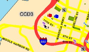
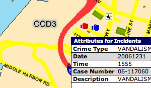
For each crime detail, a complete round-trip to the server must be made, a new map JPEG must be downloaded (it includes a mark showing the clicked spot), and two separate iframes (the first displays a "loading" message) must be requested to access the table of detailed information. My first attempt to get to these deeper details was done asynchronously, and I quickly noticed that I was seeing incorrect results due to a server-side session model that assumed each browser was accessing a single map at a time.
So, the final downloading agent begins a new session for each map. These are requested in parallel, but the resulting crimes for each are requested in serial, like this:
  ----+- map A, crime A1, ..., crime An
      |
      +--- map B, crime B1, ...
      |
      +----- map C, ...
      |
      +------- ...
The primary tool that makes this process tolerable is Twisted. It supports an asynchronous programming model that makes it a breeze to set up dozens of simultaneous browser sessions, and spread their requests out over time to avoid overloading the CrimeWatch server. It has been persistent fear of mine that this process would be nipped in the bud as soon as a CrimeWatch admin noticed my relentless pounding of their service from a single IP. That, and getting a knock on the door from the Oakland PD.
Scraping the crime detail table is performed by BeautifulSoup, another Python wonder-tool. This one is a loose HTML parser written by Leonard Richardson, and its handling of badly-mangled, invalid markup is truly heroic. Not everything in CrimeWatch's responses could be parsed out of HTML, unfortunately: several important details, such as the URLs of the iframes above, has to be regexped out of embedded javascript.
The next step in the process is geocoding each crime, assigning it a latitude and longitude based on its map location. CrimeWatch publishes no geographical information beyond the map images themselves, so this part is necessarily an approximation. Fortunately, CrimeWatch also promises that the data is only accurate to within the nearest city block, so the fudge-factor of geocoding events from an image is probably acceptable.
I'm taking advantage of the fact that the City Council District base maps remain static across requests, covering the same area regardless of the crime or time I'm searching for. This allowed me to search for reference points on each map that I could geocode manually. This was probably the most tedious part of the project, because I had to find three widely-spaced, well-rendered reference points for each district map. To find the location of map points, I used Pierre Gorissen's Google Map Lat/Lon Popup, a simple javascript application that places markers on Google Maps and reports their exact latitude and longitude. I chose three widely-spaced reference points for each district, such as these District 3 locations:
- Near Portview Park
Point on map, according to Photoshop: 466, 607
Latitude, longitude, according to Google Maps: 37.805775, -122.342656. - 14th St. & East 20th St.
Point on map: 1861, 862
Latitude, longitude: 37.793211, -122.240968. - Broadway & 51st St.
Point on map: 1719, 132
Latitude, longitude: 37.834429, -122.252373.
Using three such points and the assumption that the map is a linear projection (or close enough), determining the geographical positions of each crime placed on the map is a short bit of algebra. Cassidy tipped me off to the fact that the linear system can be represented by this pair of equations, where x and y are icon points on the map:
  latitude  = (a1 × x) + (b1 × y) + c1
  longitude = (a2 × x) + (b2 × y) + c2
Finding the a1, b1, c1, a2, b2, and c2 is possible by solving the following two systems, based on the three known points:
    37.805775 = (a1 ×  466) + (b1 × 607) + c1
    37.793211 = (a1 × 1861) + (b1 × 862) + c1
    37.834429 = (a1 × 1719) + (b1 × 132) + c1
  -122.342656 = (a2 ×  466) + (b2 × 607) + c2
  -122.240968 = (a2 × 1861) + (b2 × 862) + c2
  -122.252373 = (a2 × 1719) + (b2 × 132) + c2
This is described and implemented in some detail in the notes for a talk that Darren and I gave at Flash Forward NYC last year, Putting Data on the Map.
Finally, each named, dated, geolocated crime is written to a small database. SQLite has been a major godsend for this purpose, because it requires no configuration and is implemented as a simple library that reads and writes static files.
The end result of this process is a SQLite 3 database file containing crime incidents for all of Oakland from September, October, November, and December of 2006. I did a rough pass (14-day samples, with high risk of overlaps for common offenses, i.e. probably not as accurate as it could be) for those four months just to get the data, and I will be re-examining them in greater detail and retrieving additional data over the course of January.
Jan 2, 2007 7:10pm
digg swarm screens
I've encountered two Digg stories in the past few days that are no more than pointers to interesting views of Swarm:
"Watching the diggs go up and up on Digg.com was insane. I switched to Swarm and this is what it looked like."
"This is what happens when a digger does nothing but digg every new link that pops up."
Jan 2, 2007 4:26am
3000
The New York Times has published 3000 Faces, an interactive infographic of U.S. military casualties in the Iraq War, to-date:
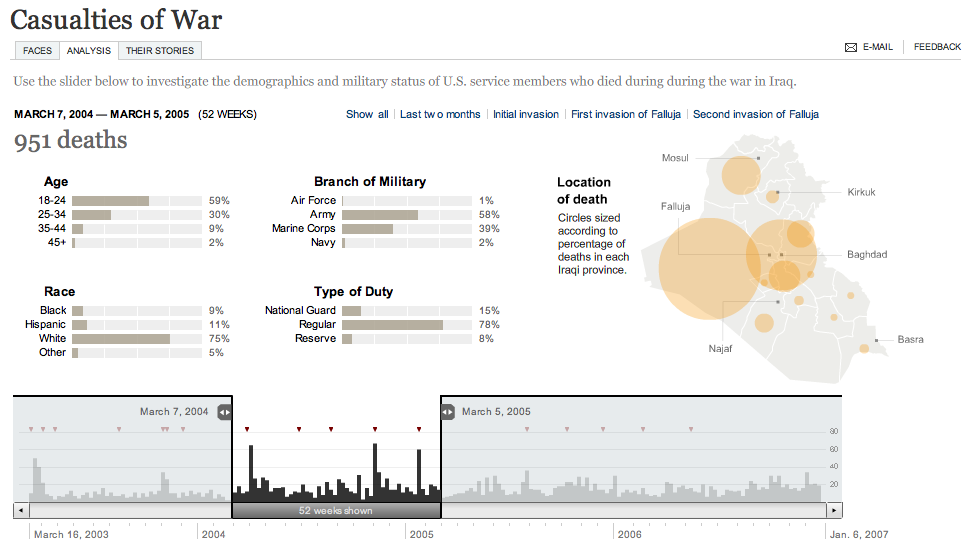
Try the application at nytimes.com.
Casualties are classified according to age, race, service, duty, and time and location of death. The primary control for the graph affords selection of a variably-sized slice in time, for example the 52 weeks I have chosen in the screenshot above, between March 2004 and March 2005. This is the heaviest continuous one-year stretch of the war, encompassing the beginning of the campaign against al-Sadr, the second invasion of Fallujah, and the January 2005 Marine helicopter crash that killed 31.
All aspects of the chart react to the time slider: the date at top changes, breakdown charts in the middle adjust themselves, and location circles in the map on the right scale accordingly.
The time interface serves three functions:
- It's a bar chart displaying the casualties per week over the almost four-year course of the war.
- Small markers at the top note significant events, e.g. "Constitution approved" or "Saddam Hussein captured."
- Input widget, for modifying the remainder of the graph.
The combination of display and interface in the time slider is strongly influenced by Google Finance:

Google Finance's central line graph also serves the same three functions: stock price display, news event markers, and input slider.
The entire casualty analysis application makes liberal use of tooltip-style information displays, which display detailed statistical information above the looser, less-detailed graphics:
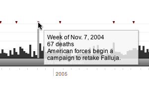
Daniele Galiffa of Mentegrafica compares it to Minard's Napoleon's Retreat chart made famous by years of magazine advertisements for Edward Tufte seminars. He also says that improved understanding would result from additional data-mining features ("what was the worst day for white men?"), but I disagree. The tooltips demonstrate how selective hiding of information helps increase the overall information density of the graph, and the single input mechanism makes it a more accessible browsing tool for historical information. The pertinent information here is event-based, answering questions about the spikes in the chart, and offering direct links to significant points in the upper-right-hand corner. The one significant feature missing is the capacity to bookmark views into the data. Fortunately, there are only two possible variables for each view (start date, end date), but it would be interesting to provide a direct URL to the 52 weeks of heaviest casualties, above. For comparison, Google Finance also offers no way to link to a particular view that I'm aware of. Yahoo's new beta Finance charts do offer the fragment-style direct links first demonstrated by Kevin Lynch (e.g. this view of the same HAL data as the Google screenshot above), at the cost of an otherwise heavily over-featured application.
Martin Wattenberg and Fernanda Viegas's group at IBM is also doing some work in this direction, with their forthcoming Many Eyes project (look for "democratizing visualization" on this page). The two central features of Many Eyes that pique my interest are thumbnails and direct links to application states, simple technical additions that greatly multiply the usefulness of the application as a vehicle for argumentation or simple sharing.
Overall, I think the New York Times application is an example of serious, cutting-edge journalism, offering readers (?) a way to make and test theories about the progress of a long-term event. It's valuable in the same way as the terror alert vs. approval rating chart, and for many of the same reasons. The barrage of noise generated by the 24-hour news cycle is desperately in need of simplifying views that help illustrate co-occurence and possible causality of news events.
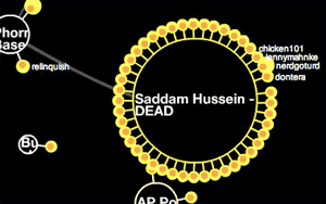
In contrast, John Emerson offers his own take on the latest milestone.
subscribe to ![]() this site.
|
contact Michal Migurski
this site.
|
contact Michal Migurski