tecznotes
Michal Migurski's notebook, listening post, and soapbox. Subscribe to ![]() this blog.
Check out the rest of my site as well.
this blog.
Check out the rest of my site as well.
Jun 10, 2010 7:05am
swishy curves, where you want them
There's a short series of posts in here, but I'm out of practice with blogging so I'll start with just this.
I've exhumed some of last year's thinking on heat maps, and re-encountered Zach and Andy's excellent series of posts on geographic isolines. Zach Johnson posted some ideas on a quick-and-dirty method for generating isolines from a field of point measurements, using the Delaunay triangulation (which I've mentioned before). Andy Woodruff followed up with ideas about curves, specifically the problem of passing smooth curves through a set of points.
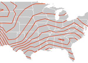
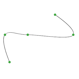
The general idea is to go from this:
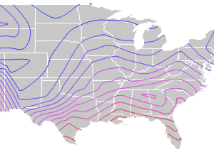
...to this:
...using a process somewhat like this:
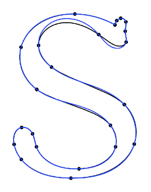
("S" from Raph Levien)
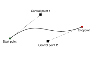
Anyway. Splines are pretty much a solved problem, in the sense that your typical graphics library is going to support at least cubic splines - Flash, SVG, etc. all have native methods for making smooth curves between two endpoints with two additional control points. If you've used Adobe Illustrator at any time in the past 23 years, you'll know how this works:
Andy writes about the generation of curves that are smooth, yet guaranteed to pass through a full set of points without appearing discontinuous. What makes this difficult is that there are an infinite number of solutions, generally differentiated by the amount of tension or distance along connections between pairs of points. It's also difficult to express these solutions using control points; where do you place them? Often you need to make assumptions about the correct slope through a given point, and often those assumptions lead to some weird-looking results.
With a bit of basic algebra it's possible to deconstruct these smooth curves into a set of parametric equations. The trick is to introduce a new independent variable, t, which represents progress along the curve through a third dimension. T is for time, because it makes sense to think about x and y in the image plane varying through time. You can find a smooth curve through any set of points - a straight line through two points, a quadratic curve through three points, a cubic curve through four points, etc. I'm stopping at four points and the cubic curve, it looks good and is easy to calculate.
Here's one such 2D cubic curve:
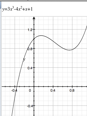
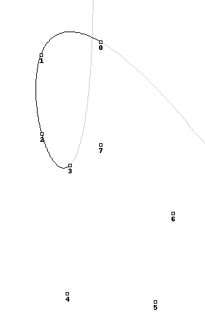
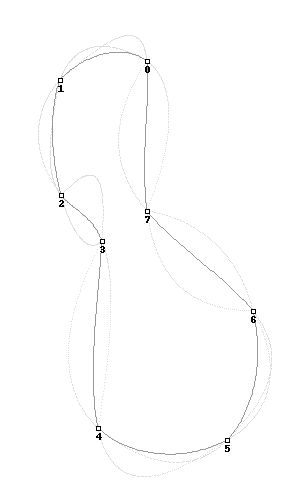
It might look familiar if you've ever used a TI-81. The twisty math bit here is that given a set of any four arbitrary points, it's possible to generate one such curve that passes through them all. The second twisty math bit is that you can do this for the x and y components of the curve separately, creating two separate functions over t that move through space and describe a curve. Wikipedia has an excellent article on systems of linear equations, though I avoided most of the tedious algebra by using Sympy, a symbolic math library for Python that does the work. This is the resulting function, and here is an animation showing eight separate cubic functions over a set of eight arbitrary points:
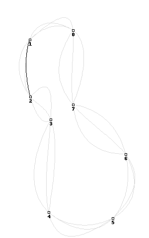
Here's the same image showing all the functions overlaid on top of one another, with the "closest" central one highlighted in turn:
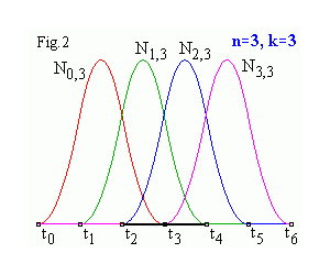
This is the third twisty math bit. To create a single, smooth curve out of all these pieces, you adjust the relative influence of each one over its length using a basis function. They're described in excruciating detail at ibiblio.org, where you can scroll down that page to play with some interactive java applets. I've cheated, and used sine waves that still look something like this over the length of the curve:
Putting it all together, you get this transition from simple cubic curves to a complete, smooth system that closes a full set of points:
The code for all this is a bit of a hairball (also syntax-highighted), but I hope potentially useful.
One reason I find this method interesting is that the end product is actually not a curve at all, but a series of points joined by straight line segments. You provide the illusion of a curve by make lots of them, and very short. This means that the resulting "curves" are trivially compatible with geographic software like PostGIS or Mapnik, and therefore possible to simplify using tools like Mapshaper, distribute in formats like Shapefile, and render with plain old Tilecache. At the cost of additional file size, you are freed from Flash and dumped wide-eyed and blinking in the world of actual geography.
subscribe to ![]() this site.
|
contact Michal Migurski
this site.
|
contact Michal Migurski