tecznotes
Michal Migurski's notebook, listening post, and soapbox. Subscribe to ![]() this blog.
Check out the rest of my site as well.
this blog.
Check out the rest of my site as well.
Mar 21, 2006 6:16pm
google finance
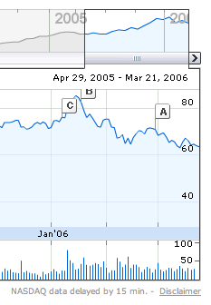
So it's been a while since I've gushed about something here, especially something from Google. Today's release of Google Finance is pretty damn cool, though. Not being a money guy, I can't speak to the accuracy or value of the information below the fold, but the chart and news panes at the top of each page are stunning.
Few things I'm noticing in my first ten minutes:
- News integration is cool. First thing I find myself doing when viewing any sort of time-series is attaching meaning to events. A good example of this is the famous George Bush ratings chart pegged to terror alerts, showing sharp upticks as a result of / caused by DHS terror alerts. Google has pulled in their News database to connect stories to price events. It's not clear to me whether they're searching for stories on days with higher-than-average price velocity (the msft charts seems to support this) or attaching the most written-about or linked-to stories without regrad to stock activity. The latter feels more intuitively interesting to me, since it opens the possibility that snowballing stories which take days or weeks to reach momentum would be represented, even if they don't cause sharp, obvious price discontinuities.
- The graph is fantastic. Speedy, implemented in Flash, granular, informative. It's easy to choose your time window, and they offer two separate views of price information. One is a low-detail five-year history, the other is a high-detail specific timeframe history with trading volume below.
- The current value is big and bold. It should be obvious from the style I've chosen for post dates on this site that I'm a fan of big, bold, short values set in Helvetica. Google's font for Finance is Arial, Helvetica and, and they made the current price big. And bold.
- In spite of all this, Yahoo!'s much older Finance application offers quite a bit more detail on their stock pages. Although Yahoo! doesn't use .swf or javascript much, the forced page reload means that at any point a user can copy the contents of the browser location bar and send the exact graph they're looking at to someone else. This is a big deal, and it's surprising to see that the older applications are the ones that respect REST more. It's the reason I often go back to Yahoo! Maps in favor of Google or Yahoo! new Goog-alike map.
- No comparisons? Lame.
There's room for improvement, but those charts are insanely great.
subscribe to ![]() this site.
|
contact Michal Migurski
this site.
|
contact Michal Migurski
Comments
Sorry, no new comments on old posts.