tecznotes
Michal Migurski's notebook, listening post, and soapbox. Subscribe to ![]() this blog.
Check out the rest of my site as well.
this blog.
Check out the rest of my site as well.
Dec 25, 2009 8:34am
explaining in video
Phil Gyford wrote:
Like you, when I read two mentions of the same concept within a few days, I exclaim in a voice hearty enough for all to hear, "That's a blog post!" I am barely tolerated by the librarians.
My threshold, three, is slightly higher. Here are three examples of recent explanatory videos that all use a similar visual technique to help communicate a point.
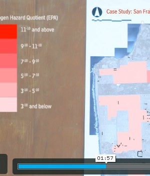
First is Local Code : Real Estates, a finalist in the WPA 2.0 competition sponsored by UCLA Citylab. It's an exploration of so-called paper or unnaccepted streets, and the uses they might be put to as agricultural or garden spaces. I hesitate to say too much, because my colleague Sha Hwang helped produce the video, but the project here overstates its case a bit. There may be a few square miles of unaccepted streets in SF, but a lot of the big ones are in completely shitty places, saturated by decades of industrial ground poison and far from people who might care for them. Still, the maps in this explanation are just lovely. They are presented as physical artifacts with digital overlays, often visibly laid down on a desk prior to HUD activation.
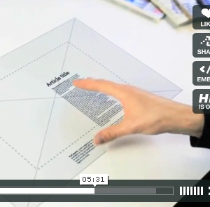
This video from UK Stamen pals BERG presents a hypothetical future magazine browsing concept, recently characterized as a "mating call" from publishers to Apple's rumored tablet device. Jack explains the navigation metaphor while pointing at a virtual desk display interspersed with other magazines. The proposed device is shown in use, on a train, in a kitchen with overlaid graphics and simulated hand motions.
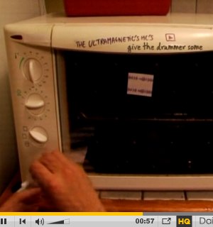
Finally Anthony from Hype Machine links to this dissection of the Prodigy track Smack My Bitch Up, showing how it is constructed from previous pop music with a sort of paper prototype of a beat loop, with bits of tape and marker used for interface.
Each of these videos bounces physical, shaky reality off of digital graphics. The Prodigy making-of video pulls in animated play heads and jokingly deputizes a microwave timer as a pitch bender. Sha matches GIS-style graphics to loosely-positioned maps of San Francisco, rapidly communicating the informal attainability of the project and the kind of workmanship of risk ultimately necessary to pull it off in physical reality. The BERG video is the superstar in this collection, perfectly meshing objective reality and objective content of thought. Designer Timo Arnall is responsible for this seamlessness here and in a few other similar concept videos, and he's elevated the state of this particular art to an absurd level. I get goosebumpy just watching this thing over and over - look how every bit of shake and depth-of-field in the recorded image is perfectly followed by the overlaid concept graphics. Jack and Timon have managed to communicate the functionality of a nonexistent digital device in post-production, using just a piece of plastic and some hand motions as a stepping stone.
Anyway, look, it's Christmas. Time to crash out.


Comments (1)
Be sure to also watch the *other* "Making of Smack my Bitch Up" video, the one which reconstructs the song out of samples in Ableton: http://www.youtube.com/watch?v=eU5Dn-WaElI&fmt=18
Posted by Andrew on Friday, December 25 2009 5:47pm UTC
Sorry, no new comments on old posts.