tecznotes
Michal Migurski's notebook, listening post, and soapbox. Subscribe to ![]() this blog.
Check out the rest of my site as well.
this blog.
Check out the rest of my site as well.
Apr 16, 2012 5:54am
hachures
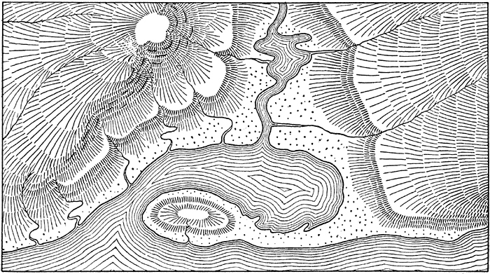
Hachures are an old way of representing relief on a map. They usually look a bit like this, and they’re usually hand-drawn:
I’ve been playing some some simple algorithmic ways to generate hachure patterns with input elevation data.
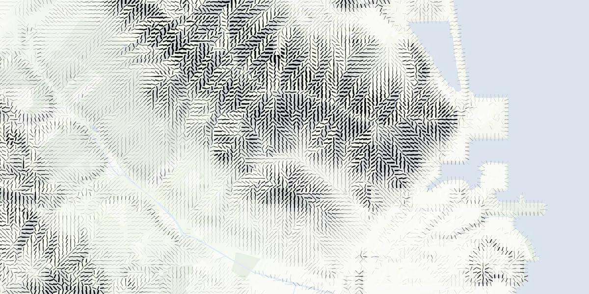
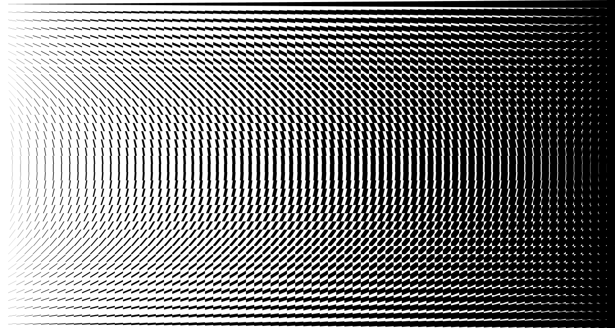
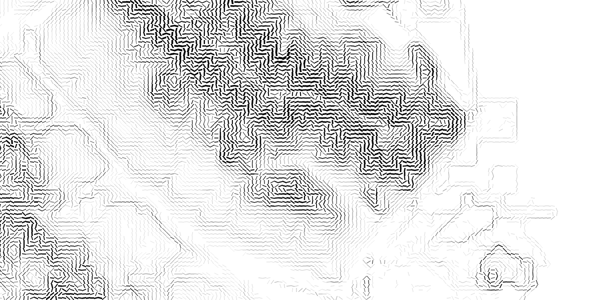
They’re rather New Aesthetic, with the regular-spaced grid based this pattern that encodes slope and aspect together:
You can align the marks with the slope, or across it (as with contour lines). The latter results in some pretty blocky-looking hills; my feelings about these are mixed:
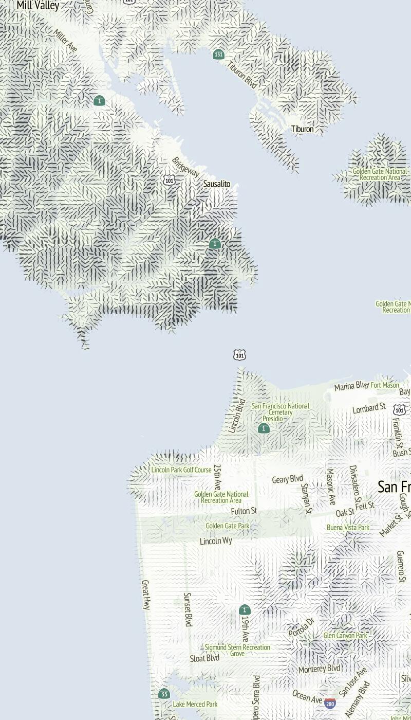
I especially enjoy the smooth appearance of hills in San Francisco using the orientation along the slope. Things get even more interesting when minimal labels are added on top:
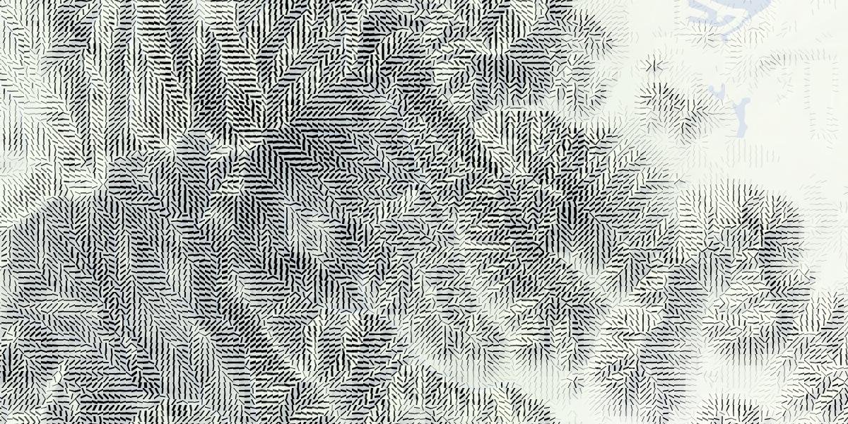
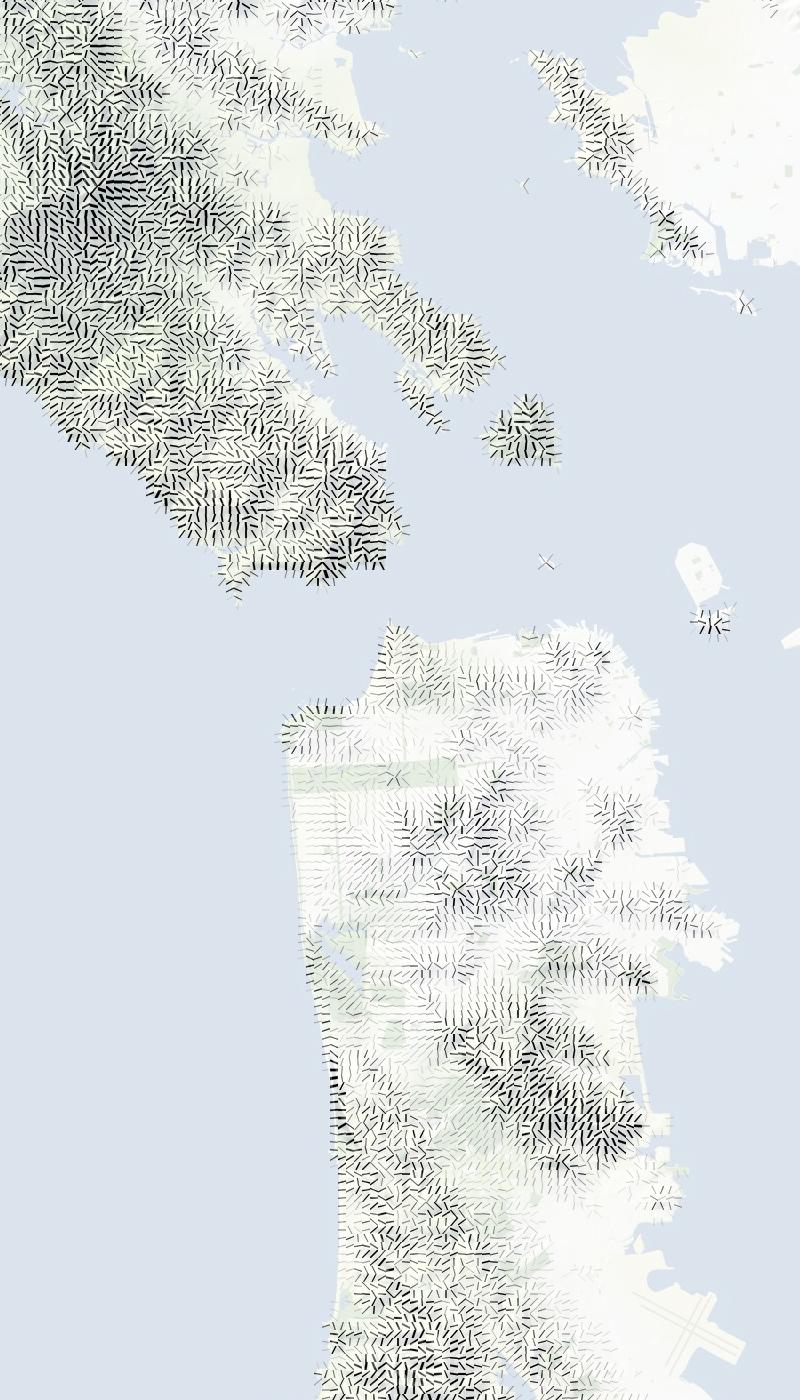
Also, good things happen at relative-low zoom levels, where the relative size of hills and marks gives everything a spiny, written-on appearance:
Have a look through a collection of renders for more examples.

Comments (18)
It's great to see you again experimenting with new things! Hachures are interesting in themselves, but I don't think I'd ever use them on a map myself. However, I see them as a bit of a "gateway" technology in digtial cartography - if hachures are shown to be possible, then other interesting things become plausible, like slope-direction dependent cliffs and especially scree. These share a certain amount of "you could only ever draw these by hand" mythology. I think the missing link in your hachures is length. By using a grid of hachures the length varies by aspect in an unintentional way - i.e. the diagonals are longer than east-west strokes. I think the key to slope steepness is more in the length of the stroke, rather than in the thickness, but that might be a personal interpretation. I wonder if the length is as straightforward as each stroke having a constant height gain? I mean if each stroke starts on a 100m contour interval and runs on the normal up to the 200m mark, which is what the slopes on the right-hand edge of your initial image look like. I haven't drawn hachures myself, so there might be pitfalls if the length varies with slope in a more complex way. Also, instead of a fixed grid, I'd be interested to hear if you've experimented with slope or aspect "zones". One thought would be to split the area up into polygons of similar slope angles, then fill each polygon with a (correctly orientated) repeating patterns of correct-length strokes. I'm not sure whether that would give artefacts at the boundaries between the zones, however. Overall, I look forward to seeing more!
Posted by Andy Allan on Monday, April 16 2012 9:32am UTC
I'd love to reveal the hachures with a touch (on an iPad, say) to reveal the relief while following a route. Will my route feature a lot of ascents and descents for instance. Playing with them, a bit like iron filings, or those cool terrain maps that Magneto/Ian McCellan could make in the X-Men movies... Hard I imagine when basic slippy map navigation takes up a lot of the existing gesture repetoire. Oh well. Lovely stuff Mike as usual!
Posted by Matt Jones on Monday, April 16 2012 10:50am UTC
There's no reason you couldn't make your hachure look exactly like the real thing, using existing techniques from the non-photorealistic rendering literature (if, of course, that's what you're after.) NPAR and SIGGRAPH both have lots of material to start with. Look for terms like "hatching", "streamline placement".
Posted by Cassidy Curtis on Monday, April 16 2012 1:25pm UTC
Here's Greg Turk's original paper on streamline placement: http://www.cs.duke.edu/courses/spring03/cps296.8/papers/InteractiveStreamlinePlacement.pdf And then, here's one that uses reaction-diffusion in a pretty interesting way: https://research.cs.umn.edu/mw_writing/images/a/a6/Drawing_with_the_Flow_(paper).pdf What you might like about that last one is that it works entirely in image space (pixels, not vectors) so it may lend itself more naturally to your tile-making process...
Posted by Cassidy Curtis on Monday, April 16 2012 1:57pm UTC
Sorry, bad link on that last one. Here's the Sanderson paper I meant to link to: http://www.fusiongrid.org/research/papers/sanderson_Vis04.pdf
Posted by Cassidy Curtis on Monday, April 16 2012 2:02pm UTC
These are beautiful. I can't wait for you guys to release a fully-realized basemap with them.
Posted by Elijah on Monday, April 16 2012 3:26pm UTC
The things you made look awesome!! The original hachules are transverse connecting lines between contours, right? Would it be possible to draw lines between contours, and then not render the contours?
Posted by Benjamin Golder on Monday, April 16 2012 4:27pm UTC
Wow, neat! Fun to see this kind of thing. Have you tried rendering just traditional contour lines? I find they help a lot on Google's terrain map, particularly zoomed in at z=15 or so. I agree with Andy's column that varying the length of the lines could break up the grid effect.
Posted by Nelson on Monday, April 16 2012 5:12pm UTC
Andy: I think you're probably right about length; I'm using only line thickness and orientation but it should be equally easy to generate a pattern with the same correct overall visual density that uses shorter, fatter lines instead of long thin ones. Zones would also make for an interesting pre-compilation step. As it is, I'm using a deeply stupid approach that's mostly intended for ease of tiling. Maybe cutting along elevation contours would still allow for a square pixel-based pattern that looks less rigid than this. Matt: thanks! One thing I've not tried is the reaction-diffusion approach that Cassidy mentions in the comments; Nate Kelso sent over a few links to papers that apply this to flow fields; should be relatively easy to do with a single map, less so with continuous tiles. Cassidy, that Greg Turk paper is awesome. Both remind me of Martin and Fernanda's recent Wind project http://hint.fm/wind/. Nelson, Ben: plain old contours may be next. =)
Posted by Michal Migurski on Monday, April 16 2012 7:19pm UTC
Funny enough, I was just ranting to a friend the other day how absolutely cool cartography can be, and how much information you can portray with the use of hatching. Yes... I am a map geek and proud of it.
Posted by Tom Evans on Wednesday, April 18 2012 11:19pm UTC
Mike's work has inspired the ever-productive Eric Fischer to take a try at hachures: http://www.flickr.com/photos/walkingsf/7096566761/in/photostream
Posted by Nelson on Saturday, April 21 2012 12:45am UTC
not quite the same, but have you seen this?: http://www.screepainter.com/index.html sorbus
Posted by Sorbus on Tuesday, April 24 2012 6:05pm UTC
Scree Painter is fantastic!
Posted by Michal Migurski on Tuesday, April 24 2012 6:49pm UTC
Nice Mike. This is amazing work. Have you talked with Elbie Bentley about hatchures? I haven't seen her since NACIS 2009 where she presented her atlas that was made with Dr. Margaret Pearce. http://drjill.net/2009/11/atlas-of-explorations-for-the-pacific-railroad-some-love-for-the-hand-drawn-map/
Posted by Sam Pepple on Thursday, May 3 2012 5:56pm UTC
Hey Sam! I've not met Elbie before, maybe at NACIS this year?
Posted by Michal Migurski on Thursday, May 3 2012 8:39pm UTC
She is somewhat off the radar near the Carolinas (N.?) doing a PhD. You should reach out to her and encourage her to come.
Posted by Sam Pepple on Friday, May 4 2012 3:46pm UTC
Nice! Another article using this method is: Desktop Hachure Maps from Digital Elevation Models: www.mbmg.mtech.edu/pdf/gis_hachure.pdf An interesting addition with this method is that " hachure width is thicker for steeper slopes" which is very similar to the screenshots you've shown. Will be checking back on your progress!
Posted by maning on Monday, May 14 2012 10:59am UTC
I made a similar attempt a few years back with QGIS and GRASS GIS on hillsigns and hachures. https://epsg4253.wordpress.com/2012/05/14/alternatives-to-relief-shading/
Posted by maning on Monday, May 14 2012 11:57am UTC
Sorry, no new comments on old posts.