 →
→
Click for full-size images
Michal Migurski, July 20, 2005.
Last month I collected some examples of Mac and web-based applications that I thought were particularly effective at displaying listed content. I’ve used details from those interfaces to draft an initial redesign of Reblog’s appearance.
Reblog has about a half-dozen distinct screens and views, but this draft focuses on the two that are most frequently used: the feeds list and the item view. Feedback on this draft is heartily encouraged.
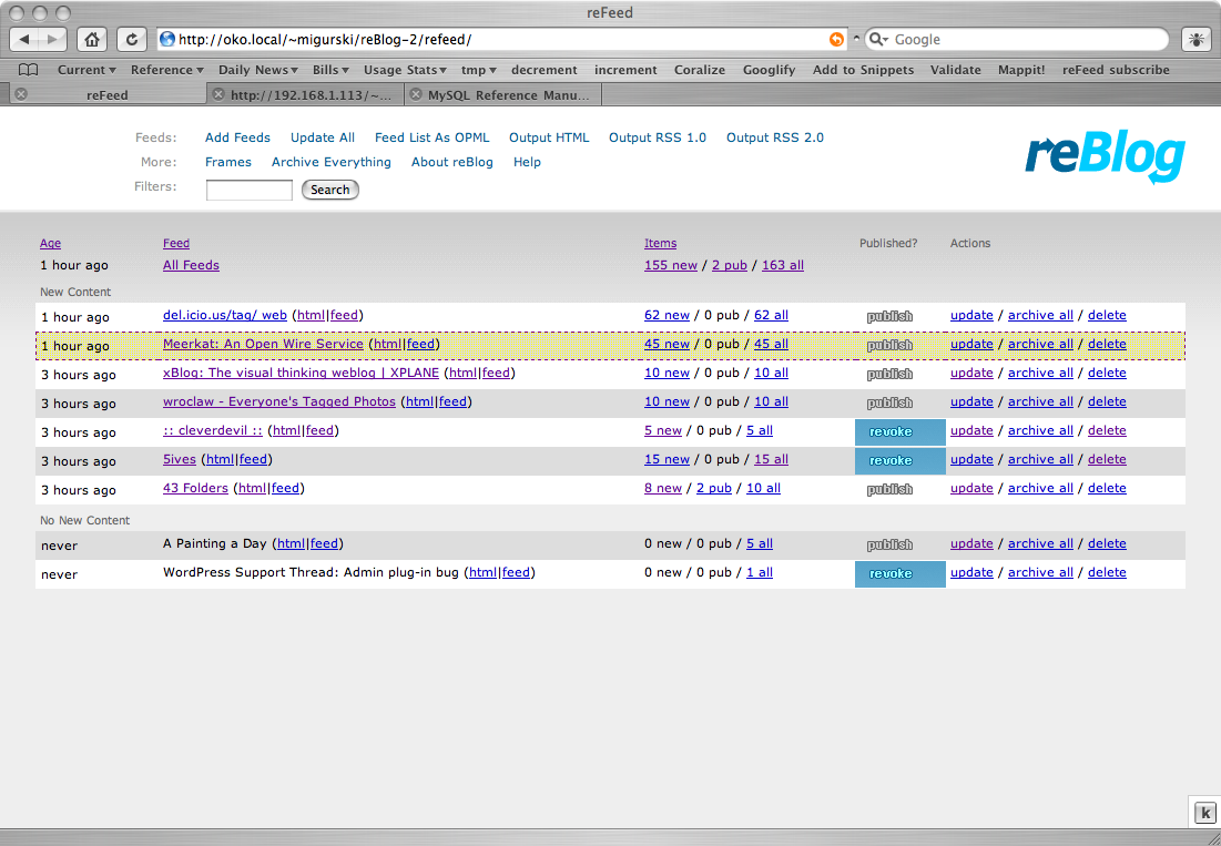
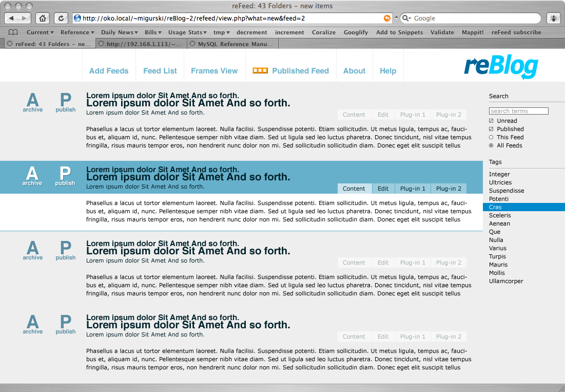
This is the general feeds list. In a heavily-used Reblog, there might be hundreds of individual feeds listed here. The old version (on the left, below) used alternating row colors, which have a distracting vertical rhythm. This is compounded by the use of thin dotted lines and a yellowish haze to denote single-feed focus. The header contains a large number of options, most of which are holdovers from Feed On Feeds, Steve Minutillo’s PHP + MySQL RSS aggregator that formed the foundation for early drafts of Reblog. The feed details on the right (“update / archive all / delete”, and the new, published and total item counts) are rarely-used, and have been described as “confusing noise”.
In the new version of this page (right, below), I’ve culled out a ton of unnecessary information. The horizontal bars are completely gone, as are about 50% of the items in the header. I’ve moved the “publish” interface element to the left, next to the column that shows when each feed was last updated. See below for more information on these columns. The search box from the header has moved to the right-hand side, where it joins a list of tags.
Tags are new addition to Reblog, brought on by one user’s desire to categorize feeds so he could read his “A-list” before moving on to lower-priority items. The search form and tags persist between the feed and item lists. It’s a deliberate echo of Safari’s RSS interface.
Individual feed mechanics such as subscription details have been moved into a small set of tabs within the currently-focused feed, labeled “Tags” & “Subscription” in the comp. Though not shown here, my intent is that these rarely-used tabs will expand the highlighted row to reveal form elements and extra links.
I’ve tried to be more consistent with terminology as well. In the current version of Reblog, I use the terms “published” and “public” interchangeably, but Boris has pointed out that they don’t really mean the same thing. So I’ve switch instances of the latter to the former.
→
Click for full-size images
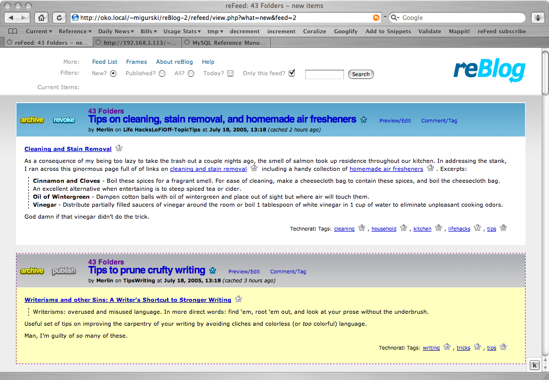
This is the items list. It often contains items from one feed at a time, but it might also contain all new items, all items matching some search term, or some other selection. Here, I’ve also removed a lot of boxy CSS junk. The currently-focused item is shown with a sharp blue highlight. This row color may be gray if the item has not been published, as in the current version. The unfocused items are not boxed or outlined in any way, which makes them more legible.
I’ve replaced the puffy yellow and blue action buttons with large, bold Helvetica letters. I think these look better, but I’m still not satisfied with the terminology available to me. “Archive” and “Publish” are obvious, but the opposites are not. I use “Disinter” and “Revoke”, each of which are weird. My hope is that this won’t matter so much when users are comfortable with the application and the related visual feedback.
The tabs in the highlighted item (“Content”, “Edit”, “Plug-in ...”) replace the current text content with forms or other display. A huge reason for this rewrite of Reblog is plug-in support, and certain plug-ins will need to be expressed in the interface. These tabs offer plug-in developers an easy way to inject visual or input elements into Reblog without having to mess with the templates directly.
 →
→
Click for full-size images
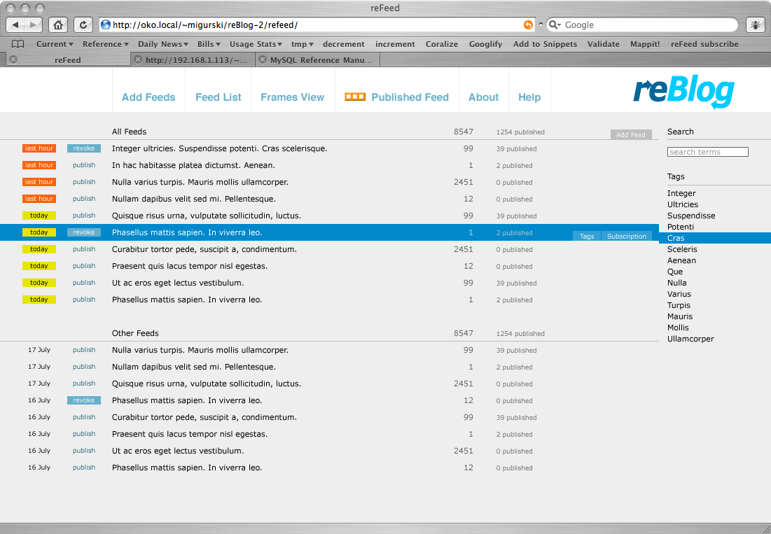
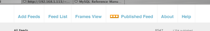
The new header drastically pares down the amount of interface
confusion in the current version of Reblog. Three links to
various formats of republished content (HTML, RSS 1 & 2)
have been replaced by one. “Update All” and
“Archive Everything” are gone; I think these
are flat-out unnecessary. The first, because it’s a
slow-ass process and updating everything is supposed to be done
via cron. The second, because it’s a lot of
useless power to put in user’s hands. The orange thing
next to the published feed link is my Internation Symbol for RSS.
I’m keeping the frames view (not shown here) because someone somewhere probably uses it, and them might get mad if I took it away. It’s just two vertically-oriented frames, with the feeds on the left and the items on the right.
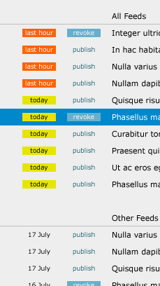
The current version offers a lot of detail on when a feed was last updated, e.g. “2 minutes ago” or “July 15, 2005”. I like 37Signals’ approach in Basecamp much better, since relative times really only seem to matter if they fall into one of two classes: just a few minutes ago or sometime today.
The feed lists are broken into two groupings, here marked “All Feeds” and “Other Feeds”. The idea is that I want to show the entire list, even if many feeds don’t match the current selection criteria. The top list might consist of feeds with new items, feeds tagged with a given tag, or feeds with items matching some search term. The bottom list is simply everything else.
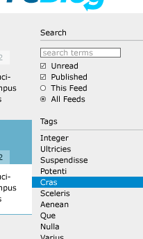
This is essentially the same search form as the current version of Reblog, but pushed to the right and modified slightly. Instead of radio buttons for “New”, “Public” and “Both”, I’ve got checkboxes for “Unread” and “Published”. Unchecking both means you get everything, so perhaps the labels should have “Just” prepended to them...
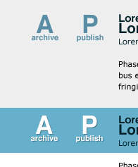
These are the new action buttons, up close and personal. They’re less puffy than before, and the big letters correspond to the keyboard shortcuts which perform the same action. Pressing “Publish” publishes an item, turns the item background from gray to blue, and changes the button to say “R. revoke”. Pressing “Archive” hides an item, except for its title, and makes the item no longer show up as “new” in the feeds list.