ReBlog Look & Feel Overhaul Notes
Michal Migurski,
June 28, 2005.
I’ve been planning a visual overhaul of ReBlog’s stylesheets. They
are starting to look puffy and dated, and it’s time to cut
out a little fat. Here, I’ve collected a small group of
application fragments that I think are particularly good designs
to emulate.
These are applications whose presentation of tabular and listed
information is particularly effective. They manage to pack a lot
of information into a small space without sacrificing clarity,
and all the native (non-web) applications also feature
interactive current-row highlights.
-
Most Apple applications use solid blue, full-bleed row
highlights. I find these tremendously attractive. They cut
down sharply on UI clutter, and with a subtle gradient can
look intrinsically meaningful.
-
Each example features high information density—small
type, clear divisions between rows/columns, not a lot of clutter.
-
Generally, no column divisions, especially in
tabular lists.
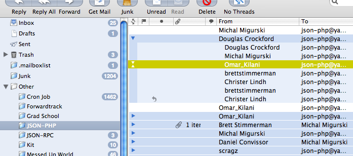
This is Apple’s OS X e-mail client, Mail 2.0.
It feels significantly more polished than Mail 1.0. I’d be
much happier with it if MailEnhancer still worked.
-
Icon-like message count indicators in mailbox pane. These
become animated pie charts when new messages are being
fetched from the IMAP server, simultaneously showing
uncertainty about contents and progress.
-
Threads grouped in right-hand message pane, using shared
light-blue background color. Color of most-current message
background extend along left-hand side to bracket the entire
thread.
-
Contrasting yellow for current message is muted, so it
provides hue contrast without looking too flourescent.
-
Not shown: when browsing messages, Mail will subtly
highlight related messages in the same window, so that
threads or relevant conversations can be picked out.
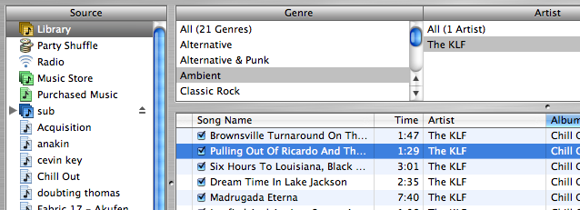
iTunes is
Apple’s MP3 player. Here, I am looking through my music
collection using the “browse” view in version 4.8.
-
Slight monochrome gradient row highlight in left-hand
playlist pane. This feels “solid” in comparison
to the flat-color row highlights in the browsing panes.
-
Two differences in highlight styles: playlist has a gradient
highlight while the browsing panes have flat colors. Active
pane highlight is blue, while inactive pane is gray. Shows
focus, differentiates roles of the two halves of the
interface. The gray vs. blue distinction seems to hold
throughout most of OS X’s newer applications.
-
Nice icons in playlist pane.
-
Possibly the most visually-cluttered app here.
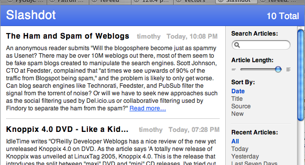
Safari
2.0 has a new built-in RSS reader. It borders on useless,
but the appearance of each feed in the browser is very handsome.
I'm very frustrated that Apple has chosen to auto-convert all
RSS resources from the “http://” protocol to
“feed://”. This prevents me from seeing the
actual contents of a feed unless I use cUrl or Mozilla.
-
Minimal.
-
Very little decoration or explanation. Author names and
dates are shown without commentary, and most lines &
edges are light enough to be almost invisible on my screen.
-
The “Article Length” slider is pure
genius. It’s implemented completely in HTML and
Javascript (plus a few Safari-specific CSS properties whose
names start with “-apple-”).
-
When the page is scrolled, the blue header and the
right-hand sidebar do not move. This maintains context
and focus, especially in long feeds where the majority
of the text is below the fold.
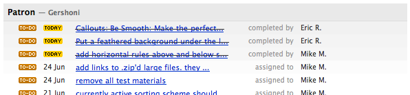
Basecamp is a project
management web application. This screen grab shows only the
appearance of a hypothetical to-do list.
-
Cute icons in left-hand column show categories of items in
lists: “To Do”, “Milestone”, etc.
Tiny, tiny text throughout is frustrating.
-
Keeping listed items around after they’ve been
completed usefully shows progress. They are crossed-out, so
it’s difficult to accidentally mistake them for being
still-open.
-
Goog example of interface design “at the
source”—because the designer and the programmer
were the same, it was feasible to keep the data
minimal so that the design could be minimal.
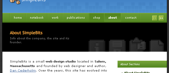
Simplebits is Dan
Cederholm’s website and portfolio.
-
Subtle depth cues in the navigation bar show clear
difference between on, off, and
:hover states. Here, “About” is the
current page, so it is shown in bold on a concave field,
surround by convex buttons. “Shop” has been
rolled-over by the mouse, so it has changed from convex to
flat.
-
The single-pixel lit edges are super-swanky.
-
More tiny text. WTF?
Home