tecznotes
Michal Migurski's notebook, listening post, and soapbox. Subscribe to ![]() this blog.
Check out the rest of my site as well.
this blog.
Check out the rest of my site as well.
Nov 26, 2012 7:13am
teasing out the data
I spoke in New York two weeks ago, about the shyness of good data and the process of surfacing it to new audiences. I did two talks, one for the Visualized conference and the second for James Bridle’s New Aesthetic class at NYU’s Interactive Telecommunications Program.
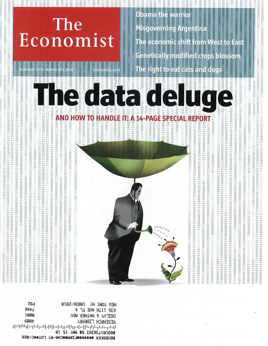
In February 2010, The Economist published its special report on “the data deluge,” covering the emergence and handling of big data. At Stamen, we’ve long talked about our work as a response to everything informationalizing, the small interactions of everyday lives turning into gettable, mineable, patternable strands of digital data. At Visualized, at least two speakers described the bigness of data and explicitly referenced the 2010 Economist cover for support. I’ve been trying to get a look at the flip side of this issue, thinking about the use of small data and the task of daylighting tiny streams of previously-culverted information.

Aaron Cope joked about the concept of informationalized-everything as sensors gonna sense, the inevitability of data streams from receivers and robots placed to collect and relay it. I recently spent a week in Portland, where I met up with Charlie Loyd whose data explorations of MODIS satellite imagery arrested my attention a few months ago. Charlie has been treating MODIS’s medium-resolution imagery as a temporal data source, looking in particular at the results of NASA’s daily Arctic mosaic. Each day’s 1km resolution polar projection shows the current state of sea ice and weather in the arctic circle, and Loyd’s yearlong averages of the data show ghostly wisps of advancing and retreating ice floes and macro weather patterns. The combined imagery is pale and paraffin-like, a combination of Matthew Barney and Edward Imhof. I’m drawn to the smooth grayness and through Loyd’s painstaking numeric experimentation with the data I remember the tremendous difficulty of drawing data from a source like MODIS. Nevermind the need to convert the blurry-edged image swaths, collected on a constant basis from 99-minute loops around the earth by MODIS’s Aqua and Terra hardware, the downstream use of the data by researchers at Boston University in 2006 to derive a worldwide landcover dataset is an example of interpretative effort. The judgements of B.U. classifiers are tested by spot checks in the United States, visits to grid squares to determine that there are indeed trees or concrete there. The alternative 2009 GLOBCOVER dataset offers a different interpretation of some of the same areas, influenced by the European location of the GLOBCOVER researchers and the check locations available to them. Two data sets, two sets of researchers, two interpretations governed by available facts, two sets of caveats to keep in mind when using the data.
Civic-scale data offers some of the same opportunities for interpretive difficulty. For years I’ve been interested in the movements of private Silicon Valley corporate shuttles, and thanks to the San Jose Zero1 Biennial we’ve been able to support that fascination with actual data.

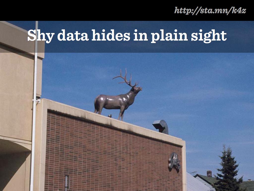
At Visualized, I explored the idea of good data as “shy data,” looking at the work we did in 2006/2007 on Crimespotting and our more-recent work on private buses. The city of San Francisco had already studied the role of shuttle services in San Francisco, yet the report was not sparking the kind of dialogue these new systems need. Oakland was already publishing crime data, but it wasn’t seeing the kinds of day-to-day use and attention that it needed.
Exposing data that’s shy or hidden is often just introducing it to a new audience, whether that’s The New York Times looking at Netflix queues or economists getting down in the gutters and physically measuring cigarette butt lengths to measure levels of poverty and deprivation.
The Economist-style “data deluge” metaphor is legitimate, but seems somehow less cuspy than completely new kinds of data just peeking out for the first time. The deluge is about operationalized, industrialized streams. What are the right approaches for teasing something out that’s not been seen before, or not turned into a shareable form?
subscribe to ![]() this site.
|
contact Michal Migurski
this site.
|
contact Michal Migurski