tecznotes
Michal Migurski's notebook, listening post, and soapbox. Subscribe to ![]() this blog.
Check out the rest of my site as well.
this blog.
Check out the rest of my site as well.
Mar 19, 2012 8:00am
tinkering with webgl
With some help from Ryan and Tom, I’ve been wrapping my pea-sized brain around WebGL. I’m doing my usual start-from-the-bottom thing so it’s been a great exercise in understanding a programming paradigm built around static lists and buffers. I’ve worked like this before, but not extensively and not with a render output this smoking fast.
It’s all simple stuff so far, but I’m chasing two ideas: using WebGL for simple 2D output with an added speed bump, and driving it from SVG or the HTML DOM. None of the examples below will work unless you’re using a current WebGL-compliant browser, which for me was Chrome 17.
The elephant is me figuring out the basics of viewport transformations that match pixel positions, image textures, and simple animation passed via vertex buffers:
The monkey is a test to see how many things I can throw around on a screen without sacrificing framerate, as well as some sanity checks on coding style. Turns out, the answer is “lots”. Interesting things happen with this one when you switch to and from its tab; I’m using a basic timeout-based mechanism for the little face particles, and it clearly falls into a regular rhythm.
The unicode patterns (borrowed from Sarah Nahm) are governed by an invisible D3 force layout, and are a test of synchronization between multiple “programs” and driving a visual effect from a geometric layout. Also additive blending for punchiness. Try dragging the boxes:
These are some of the resources I’ve been using to get up to speed:
- Learning WebGL
- OpenGL Shading Language wiki
- CAAT implementation notes
- Mozilla Developer Network (with best practices)
- Raw WebGL from Opera
I’m still not totally comfortable with the programming approach of maintaining collections of static lists in preference to objects and other data structures, and I’ve been avoiding three.js until I can get comfortable with how WebGL works for simple, two-dimensional graphics. No lighting effects or spinny statues quite yet.
Mar 11, 2012 6:39pm
county papers
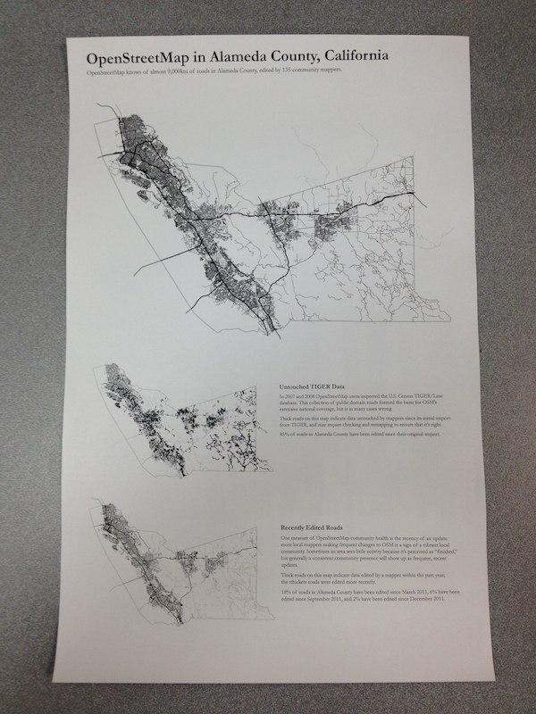
I’ve been playing with ways to represent U.S. OSM involvement at the county level. This is in part spurred by some of Thea Aldrich’s work since the last State Of The Map U.S. as well as by Martijn Van Exel’s Temperature of local OpenStreetMap Communities. The county-equivalent is a basic unit of administrative power, a common baseline for Census demographic statistics, often home to GIS professionals, and guaranteed to cover any given piece of land in the United States. It’s a great way to divide a dataset like OpenStreetMap, so I’ve started to experiment with useful print representations of counties for looking at map coverage.
(PDF download, 21MB)
The visual design is rather primitive so far, with just three maps on a single tabloid printout as a quick test. At top is a basic representation of OSM coverage, a sort of “what do we know” for streets. Next is a map of TIGER/Line status, highlighting streets which remain untouched since their initial import in 2007 and probably overdue for review. Finally, a map showing recently-edited streets, which looks a little more interesting the Austin, Texas render. Each is rendered using Mapnik and Cairo’s PDF output from a recent OSM Planet extract.
There are intentional echoes of Newspaper Club’s Data.gov.uk Newspaper here.
My afternoon test prints suggest a few things:
- Printers have a very hard time with fine linework, so I’m switching to halftones for the smaller maps.
- I need to get many more layers of information in there, including buildings, parks, points of interest, etc.
- Maps will look better when printed large.
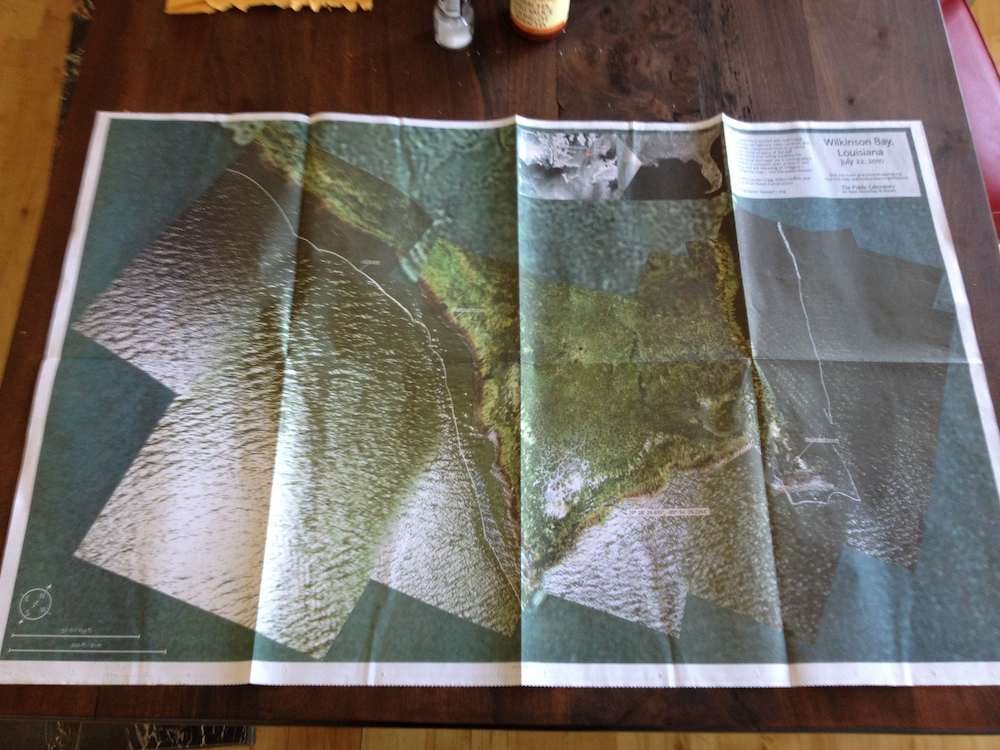
- I should do a newspaper run like Grassroots Mapping did recently, the output looks great:
Code can be found in Github under CountyOSM. You are not expected to understand it.
Mar 9, 2012 5:16pm
“nice problem to have”
A mail from OSM Board member Richard Fairhurst, to the OSM-Talk mailing list about Apple’s recent use of our data, with links added for posterity:
3500 tiles per second. Seriously. In Grant’s words on Twitter: “Massive jump in #OpenStreetMap traffic due 2 Apple news: t.co/nB4ffgYy Fighting fires 2 keep systems up”
switch2osm.org fell over. Yep, so many people wanting to find out about switching to OpenStreetMap that WordPress crapped itself (ok, not the hardest target but hey ;) ).
More contributors. We’ve had people come into IRC saying “I want to fix this park name, how do I do it?”. Regular IRCers have been reporting a noticeably greater number of new editors in their areas. Or as someone just asked on IRC: “hmm did the apple fanbois drink the OSM koolaid and crash our servers with zealous mapping?”
I think we’ve had a higher peak of publicity today than we’ve ever had —higher than the Foursquare switch even, or the Google vandalism incident. We’ve been Slashdotted; we’re #6 on Hacker News. We’ve been on The Verge, Forbes, Wired, Ars, Gizmodo, and all the Mac sites—that’s taking OSM to people who’ve not heard of us before. We might not be the front page of the New York Times yet, but we’re getting there!
And one of the best things has been that people like how we’ve handled it. From Forbes: “OpenStreetMap itself has been much more polite about the whole thing. ‘It’s really positive for us,’ OSM founder Steve Coast told Talking Points Memo, ‘It’s great to see more people in the industry using OSM. We do have concerns that there wasn’t attribution.’.”
From a comment at Hacker News: “While I think it’s quite messed up that a company as rich as Apple can’t abide putting credits for people who have put some really good work in (I’ve even made small updates to OSM in my time) I do think that this is a very classy move by the OSM people, no ranting blog post or ‘Apple stole our stuff’, welcoming people presents a much better image of the project.”
Or The Verge: “Granted, OSM took this as an opportunity to get in the public eye by piggybacking on the iPad’s media fanfare; I applaud them for their maturity in their statement though. Many companies would’ve latched onto this and unleashed the lawyers threatening this and that, but they chose to be civil, point out the missing attributions, and say they are ‘we look forward to working with Apple to get that on there.’ A little civility goes a long way (in my book). I’m quite sick of the mudslinging in this space.”
Thanks to everyone who’s put the hours in today, to all the coders and sysadmins who sweat blood to not only keep OSM running but make it easier and faster... and to every single mapper making a map so amazing that everyone wants to use it.
cheers
Richard
Mar 6, 2012 7:49am
2sleep1
I am kinda losing my mind over this hour-plus ambient audio/video construction by Goto80 and Raquel Meyers:
Press play, go fullscreen and lie down. 2SLEEP1 is a 66-minute playlist of audiovisual performances in text mode, designed to make you fall asleep. Made by Raquel Meyers and Goto80.
The first and fourth tracks are especially genius.


Mar 4, 2012 1:41am
bandwidth
Webkit size profiles of a few sites I visit, ordered from smallest to largest.
Metafilter: 0.2MB
Metafilter’s front page is probably my most-visited and most-interesting thing. It’s a wall of solid text and not a lot of images. Still, the volume of actual content is smaller than the volume of javascript, which itself is about 80% jQuery (minified). It’s not immediately clear to me what jQuery is doing for Metafilter.
Google Homepage: 0.5MB
I don’t actually visit Google.com much and I typically have Javascript suppressed for the domain when I do, but the default experience looks like this: half a megabyte, 60% of which is a single .js file clocking in at 300KB.
OpenStreetMap: 0.64MB
The bulk of OSM’s Javascript use is taken up by OpenLayers, an epic bandwidth hog coming in at 437KB minified. You can build custom, minified versions of OpenLayers with just the features you want; I’ve never successfully gotten one below 250KB. Based on my experience with Modest Maps, I think it should be possible to get the core functionality of OpenLayers across in 100KB, tops. The next 100KB of Javascript on this site is a minified archive of Sizzle and jQuery. The remaining 16% of the bandwidth for this page is the visible map and all other content.
New York Times: 0.76MB
The Times is a toss-up depending on when you’re looking at it; I just reloaded and saw the overall size jump to 1.4MB, then reloaded again and saw it drop to 0.5MB. It’s the front page of a major paper, so the ratio of actual content (text and images) to code and stylesheets looks to be in the 2 or 3 to one range, which is decent.
Github, My User Page: 0.99MB
I spend an inordinate amount of time on Github these days. It’s balanced heavily toward code and stylesheets, with about a three-to-one ratio of framework to content. Github’s Kyle Neath has an excellent presentation on responsive web design where he shows how despite the heavy load of Javascript and CSS used in Github’s interface, the all-important “time to usable” metric is still pretty fast for them. He contrasts this to Twitter, which… ugh, more on them below.
My Home Page: 1.1MB
Here’s me; essentially 100% Actual Content, mostly images. I switched to big, stretchy images a little while back, and I’ve gotten more free with the sizes of things I post.
The Awl: 1.36MB
Page sizes take a sharp upward tick here. Most of The Awl is Javascript, though it appears to be largely custom with the usual slug of jQuery sitting in the middle. A majority comes from widgetserver.com and ytimg.com, so I’m going to guess it’s lightboxes and ad server junk.
The Verge: 7.4MB
Lots and lots of pictures. So many that after a minute or two, I wondered whether something had gone wrong with my network connectivity. Below all the images, there is 300KB of minified jQuery, thanks to the inclusion of jQuery UI. Also, 244KB of fonts which in Safari prevents any text from loading until this item is done.
A Single Tweet: 2.0MB
Twitter allows you send 140 characters in a tweet, which (when you add entities, hashtags, and all that) ends up in the 4KB range as represented in the JSON API. 140 is what you see, so I’m going to go out on a limb and suggest that a single tweet page on Twitter has about a 15,000-to-one ratio of garbage to content.
I get links to tweets by mail, etc. on a regular basis, and the aggressive anti-performance and apparent contempt for the web by Twitter’s designers is probably the thing that gets me most irrationally riled-up on a daily basis. How does this pass design review? Who looks at a page this massive, this typically broken and says “go with it”?
It’s mind-boggling to me that with the high overlap between web developers/designers and iPhone users on AT&T’s network, there isn’t more and smarter attention paid to the sizes of the things we’re slinging around the network. The worst sins of the Flash years are coming back with a vengeance, in the form of CSS Frameworks and the magic dollar sign. There has seriously got to be a better way to do this.


