tecznotes
Michal Migurski's notebook, listening post, and soapbox. Subscribe to ![]() this blog.
Check out the rest of my site as well.
this blog.
Check out the rest of my site as well.
Feb 23, 2010 12:05am
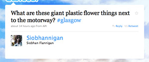
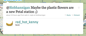
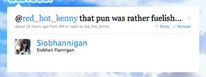
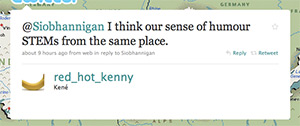
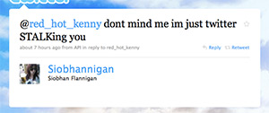
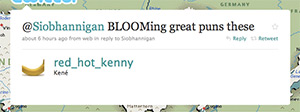
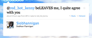
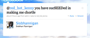
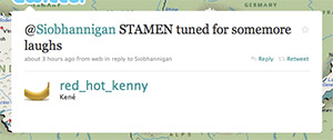
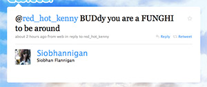
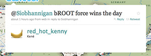
punversation
Is it creepy, in a stalkerish way, to repost someone else's conversation from Twitter? Eric found these two using the usual "stamen" vanity search, they're hilarious.

Feb 22, 2010 6:04am
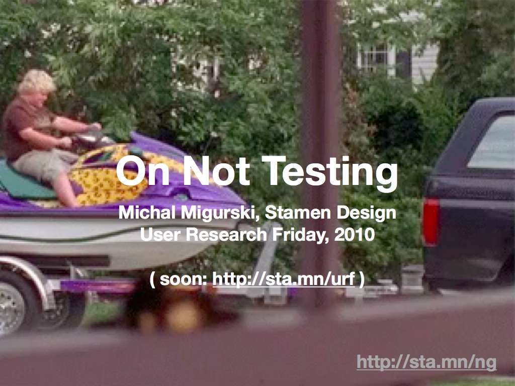
user research friday
Nate Bolt of Bolt|Peters invited me to speak at User Research Friday last week. My obvious first reaction was "user research? We don't do any." Nate was interested in the perspective of a design firm that has no formal process for user testing or research, so I did my best to coalesce a bit of our most recent thoughts on astonishment and novelty for the packed house at their SOMA offices.
These are my talk notes and slides. Some of the things here actually came out of my mouth!

I'm here because Stamen Design doesn't do user research, and I hope I can explain why we've made that choice in our work and continue to stand by it.
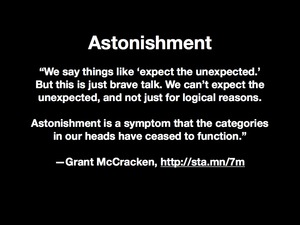
I'm going to show a few of our projects that I think benefitted from a lack of user research, but I'll start by talking a bit about astonishment. I've become interested recently in thinking about how people respond to novelty. Anthropologist Grant McCracken talks about astonishment as a "jamming" of your powers of action, an inability to function and respond to external events, a subversion your own sense of reality.
User research, to me, is an attempt to mitigate and control astonishment by determining what an audience believes or expects, and where possible delivering on that belief and expectation. User research promises stability and predictable outcomes, and I think that we're at a curve in the road where the idea of stability is just not all that interesting. I'm not arguing for chaos, but a kind of targeted novelty that probes out the edges of our expectations and helps us keep our beliefs and behaviors continually fresh.
It's worth keeping in mind that targeted novelty can rapidly become chaos. Who here has heard of Google Buzz? Do you remember the announcement, accompanied by breathless claims of game-changing excitement? The rush to verb every noun and crown Google victor in the social wars of the late aughts? The launch of Buzz was a fascinating experiment in modifying expectations around email, the internet's most boring communication medium.
Unfortunately, it was also a total, unmitigated cluster fuck.
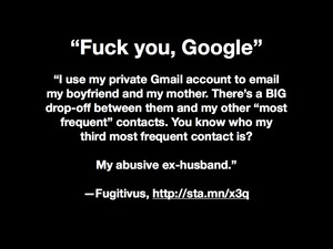
I think we have to assume that Google performed basic, ass-covering user research on this project, right? What do you think the odds are that in their user-testing labs they might have come across a user like Fugitivus, a blogger hiding from her abusive ex and using email to communicate with close family members? By involuntary launching Buzz at GMail's 175 million members, Google introduced the pressure of public performance into a private communication medium, outing human rights activists, confidential sources, secret friends and battered wives.

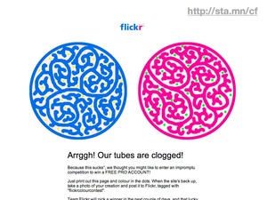
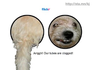
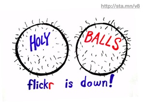
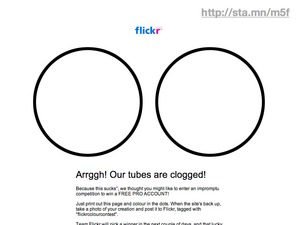
There's an alternative to the Buzz model of foisting novelty on people, and I think that Flickr is a classic example of a better way to operate on the web. Flickr is famous inside of Yahoo and out for having a basically cavalier attitude to commonly-accepted wisdom about testing, assurance, predicability, and all-around maturity. What that means is that sometimes, Flickr screws up. This is the Flickr coloring contest, hastily assembled during a multiple hour, unexpected engineering emergency from 2006. Flickr had and has a world-class community management approach that can respond to crisis with humor. The coloring contest kept anxious community members busy while terrifying technological feats were performed to unclog the tubes.
Aaron Cope, formerly of Flickr but presently with us at Stamen, believes that Flickr's ability to successfully respond with this kind of deft flexibility to a crisis is a result of a caring, trusting relationship between the site and its users. This relationship seems to extend to all areas of the site, from emergency management to regular day-to-day feature development that prizes speedy development, deployment, and public response over plans and assumptions. I believe that user research played very little role in the creation of experiences like Flickr, because the site is not something that could have been predicted or tested in lab: it's a whole-body novelty situation.
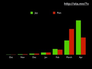
Sites like Flickr start small, and grow through organic additions to the user base. This short graph of Twitter's early history from Blaine Cook tells a similar story of humble beginnings, sudden floods of interest, rapid response to community desire, and ultimately the triumph of joy over pain through building and testing in public, with real people.
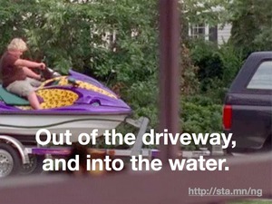
I'm going to show some of our work, but the point I'm making is: get the jetski out of the driveway and into the water.
Labs was a dominant thread in Stamen's work from about 2006 through 2008. The project was blessed from the start: Kevin Rose contacted us personally, and was intimately involved in the sketching and development process of the first Labs pieces. Whatever you think about the Digg community - it's nerdy, and male, and everything else - Kevin was deeply in tune with the cultural tastes of his userbase. The video game metaphors and API development was all of a piece, and this was the kind of project that was going to see success just because the strong, visible leader of the community identified it as worthy of attention.
The site now looks like a completed artifact, but it's worth noting that at the time it was a wide open playing field. No one really knew what the "labs" terminology was going to mean, and no one was doing this kind of live community visualization on quite the same scale. Our own development testing put us in synch with the Digg community, and we were working with live data from day one. We'd pretty much have to wrap up our work by about 6:00pm PDT, because that's when the Digg community was in bed in Europe, at dinner on the East Coast, and commuting on the West Coast.
Many of the Labs pieces saw multiple public iterations that were a direct result of vocal, frequently bitchy feedback from the Digg community. All of it was valuable, and we did our research in the open, letting people see multiple iterations of the work. The hallmark of this project set was visibility and basic openness, which bought us a great deal of goodwill.
Who here is familiar with OpenStreetMap?
OSM is a freely-licensed world map created by volunteers in the style of Wikipedia. The project has always valued praxis over correctness. Founder Steve Coast claims that he developed the project after growing so frustrated with existing copyright regimes in the UK and refusing to bother with complicated specification documents showing how he ought to proceed.

Walking Papers is an experimental, paper-based editing tool for OpenStreetMap. It's an alternative to cumbersome GPS technology, based on the use of the QR code, an application of basic computer vision for cell phones widely deployed in Japan but only just now becoming known in the US.
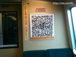
Here's a current ad on BART with Lawrence Hall of Science Geek Night event details stored in a QR code. I think this would have been unimaginable just a few years ago, but now you all have magic touch computers with cameras in your pockets, so here we are.
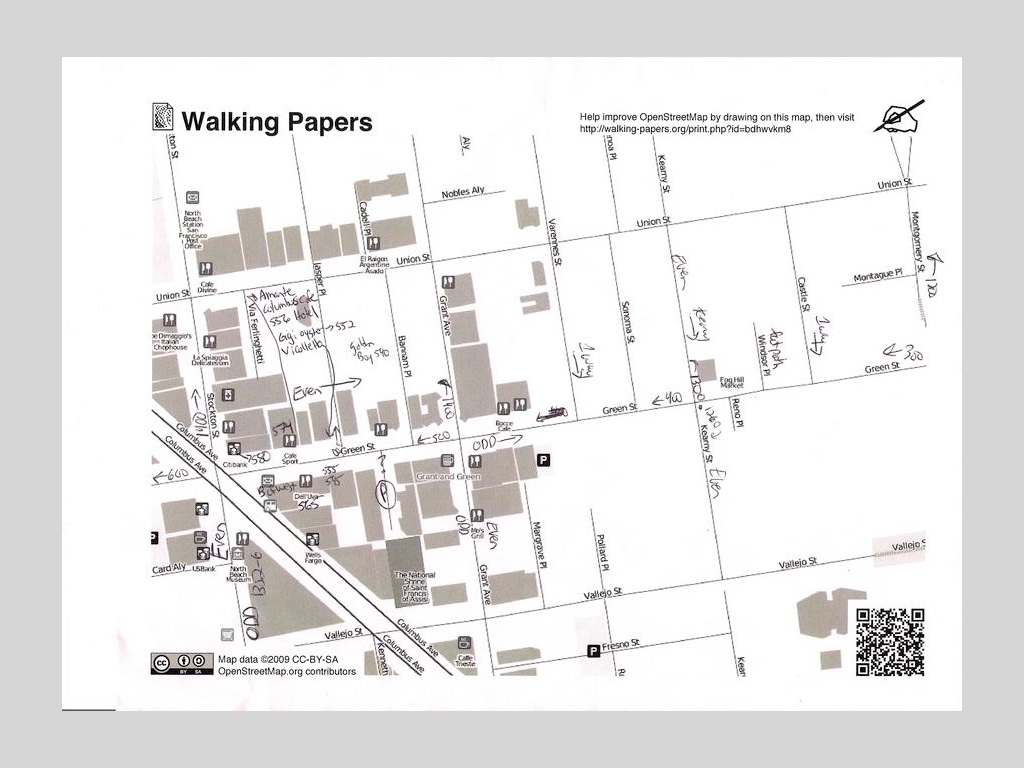
When you pair the QR code with OpenStreetMap, you get a printable piece of paper that can encode basic information about its geography in a machine readable form.
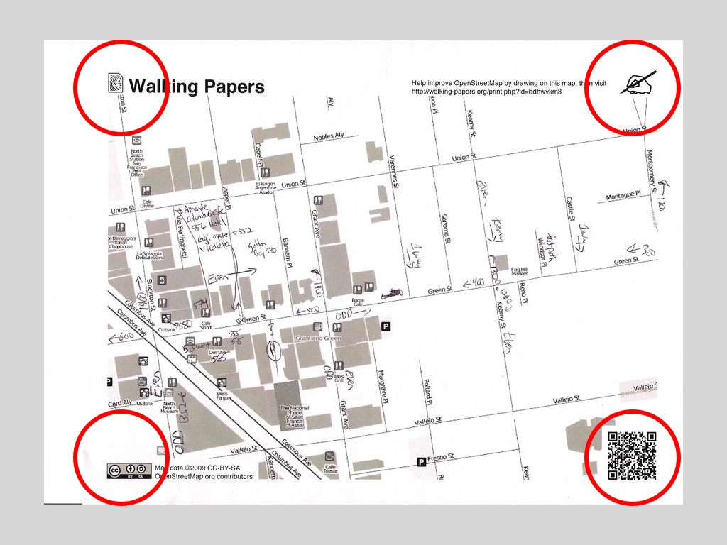
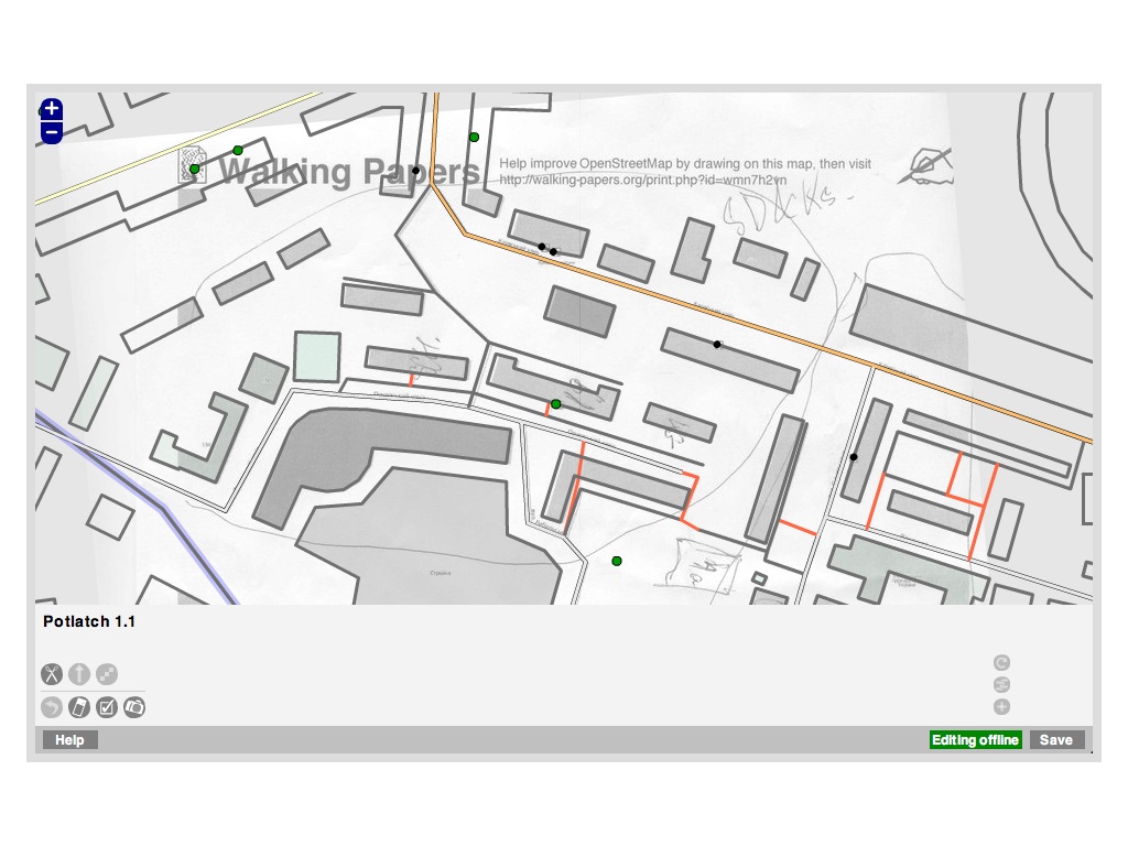
Users of Walking Papers mark up these maps with information they'd like to add to OpenStreetMap, scan those maps in, and then trace their additions in existing OSM tools normally designed for tracing GPS trails or aerial imagery.
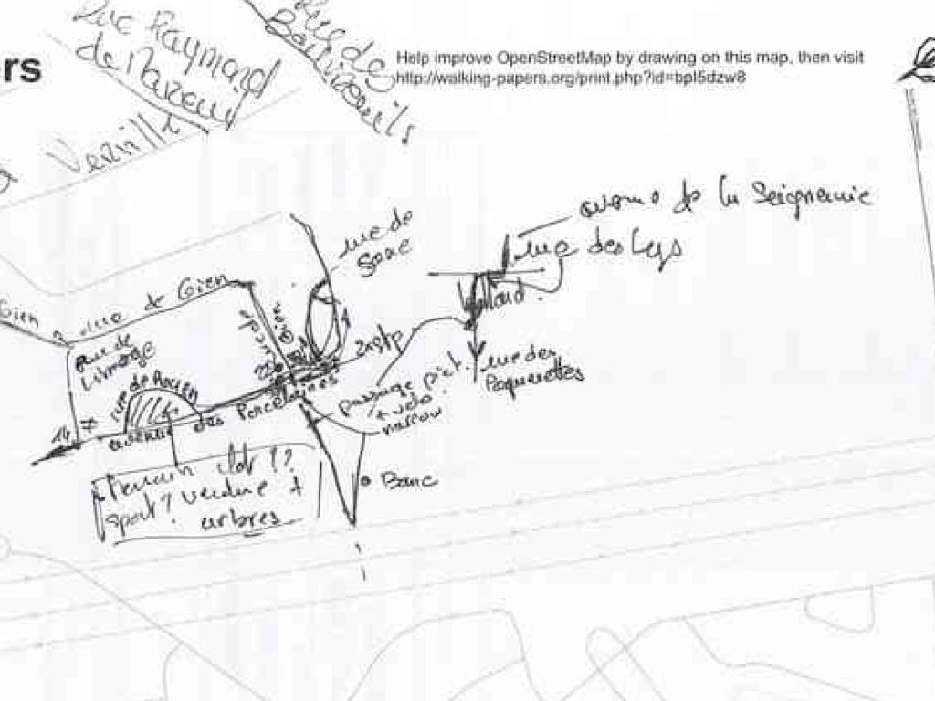
The first thing that surprised me when launching the project was that US users were a surprising minority of the base. Here are a user's notes from Mennecy, France.
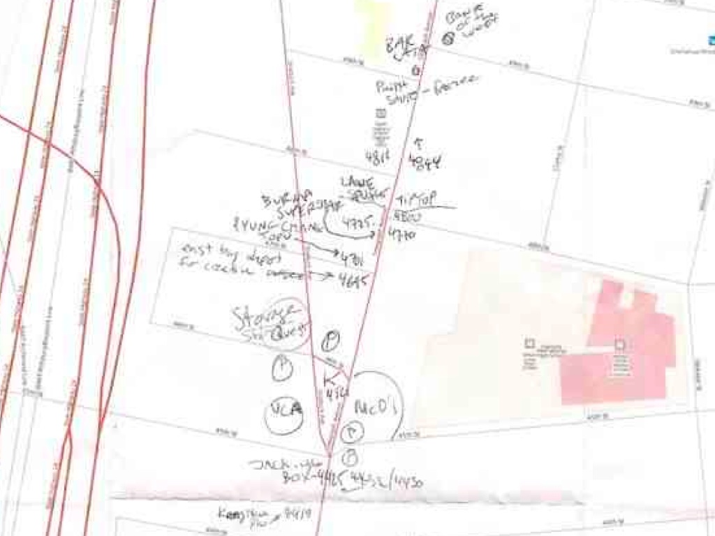
This is me making notes about businesses along Telegraph Avenue, in Oakland's Temescal District. Lanesplitter Pizza is in the center.
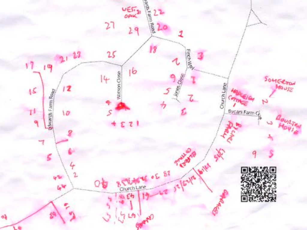
This is a rain or sweat smudged map of individual address points from the UK.
We didn't know it at the time, but a lot of geographic data collection happens using simple paper tools that talk to one another.
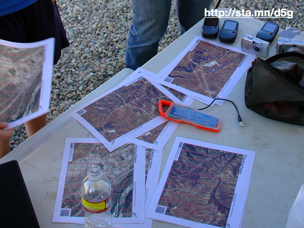
The second thing that surprised me was that I had unwittingly stumbled into a sort of holy grail of the disaster response community. This photo is of an adaptation I made to Walking Papers at an event in Camp Roberts, CA, which combined up-to-date satellite imagery of Afghanistan with photography from test flights of unmanned aerial vehicles. All the conversations I've since had about Walking Papers have focused less on the ease of carrying pieces of paper around San Francisco, and more on the need to use paper in remote environments.
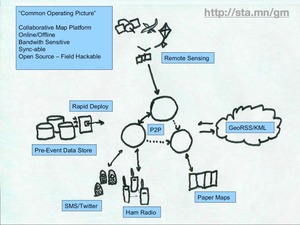
It turns out that members of the OSM foundation had already been considering the universe of possibilities around data input and output. In this napkin sketch from Mikel Maron, we see paper in the corner with a double-headed arrow that he says was a joke at the time. The rest of the picture shows possible connections to other parts of the web, other kinds of hardware. None of this was within our view when we first started thinking about the paper issue in isolation.
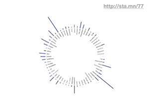
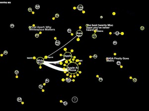
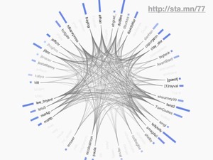
The O'Reilly Emerging Technology conference had a long-time IRC-based backchannel where participants could chat about sessions and speakers as they were happening. It relied on a 20 year old technology comfortable and natural for Unix hackers but not so much for journalists, designers, and other normals. Still, we used the opportunity to eavesdrop on this live communication channel in an automated fashion to create these live, self-updating diagrams of who was talking to whom while the event progressed. I think we've always been interested in ways of tapping into ongoing conversation streams and showing them back to their participants, but in the past this has meant cajoling people to make a special effort to come to a shared medium like IRC. The #etech channel was live for the duration of the event, and effectively dead afterward.
Fast forward to now, and suddenly all these dreams we had about visualizing ongoing conversations can be made real because of the explosive growth of Twitter. What makes Twitter interesting is that it's a performative medium, a place where you know you're being listened to and write as though you are in public. It's broadcast, and explicitly so. It's interesting because very little of the Twitter we know now could have been predicted or tested for beforehand. It could only be used in the wild and reacted to. Like Google Buzz earlier, you simply have to try it *with everyone else* to know whether it makes sense or not.
Metafilter's Matt Haughey used it last year to spread the news about his diagnosis of a brain tumor, and thought a bit about use of the service in emergency situations. What can you predict about a service when what you want it to become a utility?
It's so incredibly interesting, we've been doing a bunch of work with Twitter since last year.
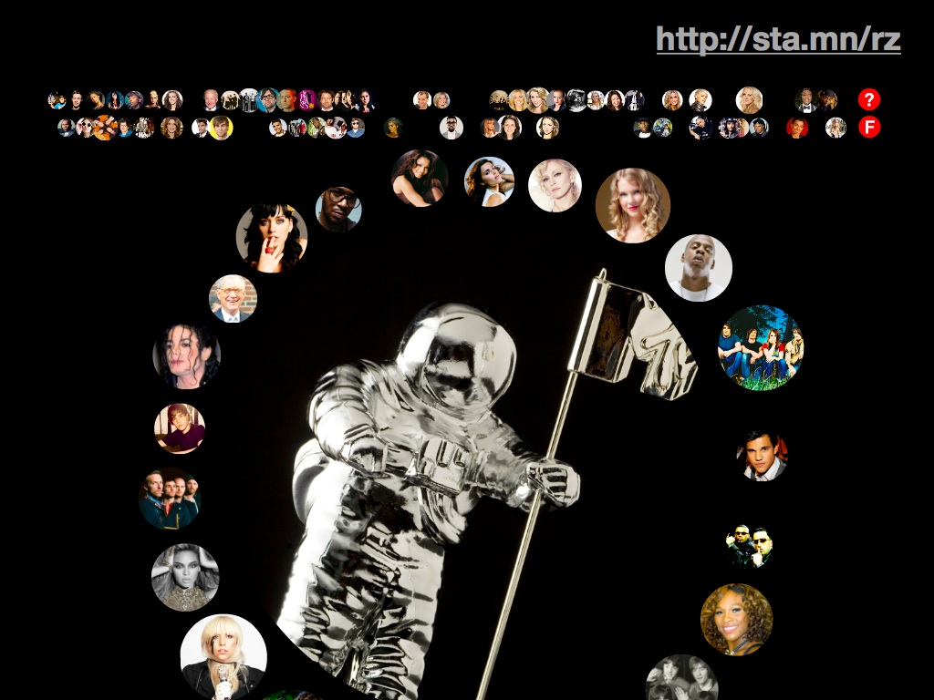
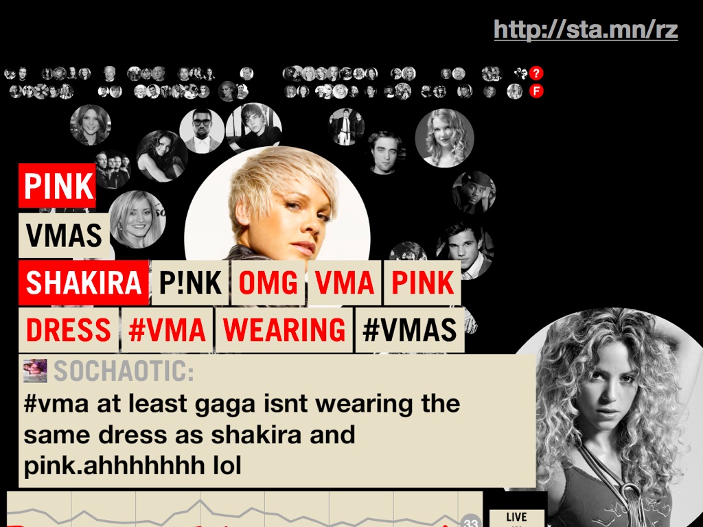
This is our live tracking application for the 2009 MTV Video Music Awards. On these screens, you can see each artist or performer represented as a jiggling chit that shrinks and grows based on the live conversation volume about that person. Here we can see a bit of conversation about Pink and Shakira.
You might remember the moment when Kanye West interrupted Taylor Swift's acceptance speech. Here it is replayed as a bubble graph, with the two stars on the screen at the same time, followed by instantaneous crowd disapproval of Kanye West.


So, this kind of crowd call and response is something that we think is going to get pretty important over the next few years. It's going to be especially interesting because it's going to become normal and expected over that time.
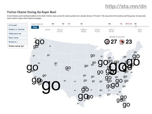
Every live event will come with a live analysis of what the audience is doing, like a country-scale version of those America's Funniest Home Videos audience clicker boxes. The amazing graphics department at the New York Times thought it was interesting to map live Twitter traffic during last year's Superbowl, as entertainment and information.
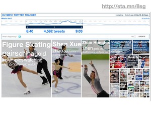
Right now, we have an ongoing project with NBC Olympics exploring these same themes in the form of a dynamic, self-updating tree map.
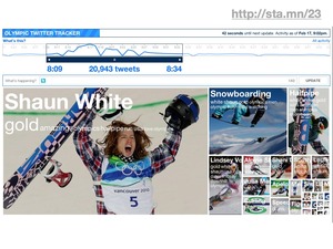
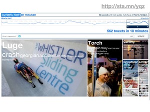
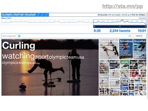
At this point in my talk prep, I stopped writing everything down and ad-libbed it all. In and amongst all these bits of NBC Olympics stuff, I called out this amazing NPR blog post about the "weird poetry" of the twitter tracker.
Summing Up
The negative way of phrasing my argument is that it's hard to test everything, and doubly hard to test new things. Some stuff you just have to push out into the world and see what happens.
The positive way of phrasing my argument is that for the astonishing and the novel, you're better off pushing your ideas into the real world early, and testing with the reactions of real people who aren't self-consciously test subjects. Start small, listen carefully to your users, and grow in the direction where they want to take you. Give yourself room to fail, and understand that the trust of your fellow travelers is an important part of the equation.

The doubly-positive way of phrasing my argument is Just Effing Do It.
Feb 8, 2010 8:34am
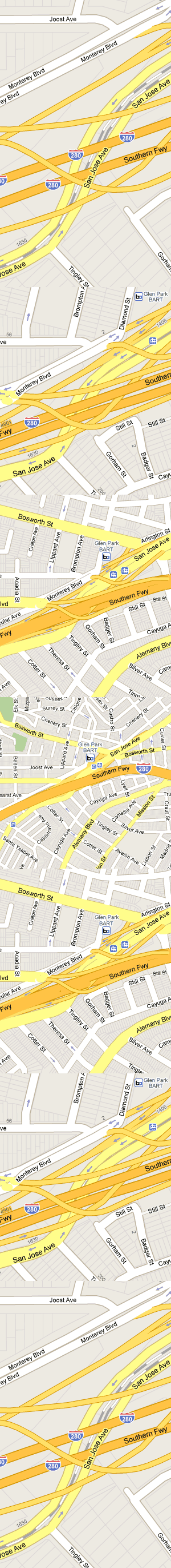
zoom transitions
There's something really nice going on in this series of zooms around San Jose Ave and 280. I like the introduction of layering as the details move into focus:
Feb 5, 2010 12:51am
commute cinema
Two short videos from my morning commute.
-
I started recording this one right at the moment I swiped my credit card to pay for my TransLink pass (it's like a Bay Area Oyster card). From swipe to "transaction completed" takes about 45 seconds on these machines, with a disturbing amount of detail in between. "Dialing host" alone took most of that time. I thought credit card transactions were a solved problem?
-
This guy was riding up Market St at 10am on his tall bike. When he came to red lights, he'd have to circle a bit to avoid a tortuous dismount/remout cycle. He looked pretty badass up there.
Feb 2, 2010 6:18am
the hose drawer
Last week, Stamen was involved in the MTV Hope For Haiti Now telethon. It was apparently the largest such fundraising effort in history, pulling down over $60 million in what the New York Times called "a study in carefully muted star power".
So it was, you know, a pretty intense event to be a part of. With about a week or so of lead time, we put together an interactive map showing moderated Twitter messages connected to the live event and relief for Haiti generally. It was also part of the post-show on television.
It looks like this:
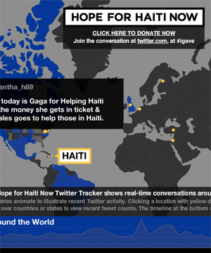
Sha and I traveled to Los Angeles to work out last minute kinks and watch over the project. Aaron was up here, carefully seeing to the smooth operation of the engine driving the Twitter collection process for the duration. Much of the office pulled together to crank out this project on pretty much no notice, and it was an inspiring and energetic effort.
I want to talk about that engine, though - it's occupied most of my headspace since we all got back from the holidays, headspace ordinarily full of geography and cartography. After dabbling in the consumption and development of real-time API's for a few years, we've started working with the high-volume Twitter stream this year. Back in 2007, Kellan Elliot-McCrea and Blaine Cook opened our eyes to the possibilities of streaming APIs with their series of Social Software For Robots talks. We poked at XMPP and other persistent technologies a few times, but what really whet the appetite was a project we did with MTV for the 2009 Video Music Awards, our first large-scale public project connected to the Twitter streaming API. The VMA project was a collaboration with social media monitoring company Radian6, who handled the backend bits. Given Stamen's development and design focus it was only going to be a matter of time before we started pawing at that backend technology ourselves.
The consumption and moderation system we have developed was christened "Hose Drawer" by Aaron, a name that neatly encapsulates two strands in our recent interests:
- "Hose" draws on Blaine's joking references to "drinking from a fire hose" about live streams of Twitter's real-time database, and now graces the official name of the service itself. The complete feed is called the fire hose, while a limited feed for casual users is the garden hose. I've heard that the names persist internally, with names like "hose bird cluster", referring to Twitter's avian mascot, among others.
- "Drawer" is a nod to last year's Tile Drawer, an EC2 virtual machine image for rendering OpenStreetMap cartography. We're thinking about a future where this kind of functionality is as much a piece of furniture as a PC, albeit one that can be created out of thin air and destroyed just as quickly. With a growing selection of infrastructure products, Amazon's Web Services are making it possible for us to develop services that act like products, materialized by small python scripts that bootstrap themselves into multi-machine clusters.
This is the naming convention you get from living the pun-driven life*.

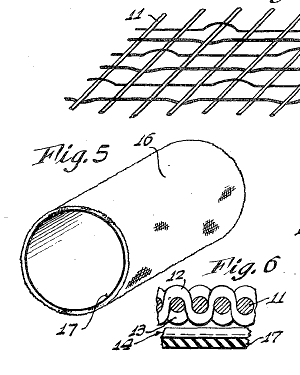
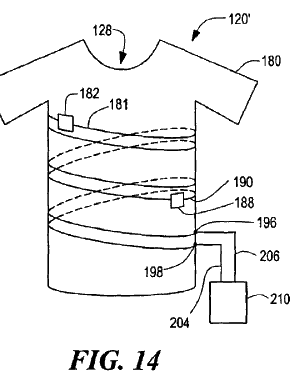
The firehose offers a continuous flow of data, yet requires us to break that flow down into discrete chunks. I've been thinking a bit about this process in our work since Tiles Then, Flows Now, my 2008 Design Engaged talk about map tiles and continuity, so much so that I see the process of breaking and reforming continuity everywhere around me. I flew several times last month, and each time I passed through security I thought about the check-in process as an elaborate map/reduce implementation, atomizing a stream of passengers into packets of shoes, laptops, jackets, bags and bodies. Numerous fascinating patents cover the splitting up of a steady flow, from t-shirts cut from unending tubular knit fabrics, to continuously-cast steel to simulated egg yolks sliced from unbroken cylinders.
Scott Bilas, whose Continuous World Of Dungeon Siege paper I drew on heavily for DE 2008, describes the challenges of writing a streaming system in the world of video game design:
The core problem that we had so much trouble with is that, with our smoothly continuous world, there are no fixed places in the world to periodically destroy everything in memory and start fresh. There are no standard entry/exit points from which to hang scripted events to initialize or shut down various logical systems for plot advancement, flag checking, etc. There is no single load screen to fill memory with all the objects required for the entire map, or save off the previous map's state for reload on a later visit to that area. In short, not only is the world continuous, but the logic must be continuous as well!
The pattern we see here is to keep crises small and frequent, as Ed Catmull of Pixar says in an excellent recent talk. When describing the difficulty Pixar's artists had with reviews ("it's not ready for you to look at"), he realized that the only way to break through resistance to reviews was to increase the frequency until no one could reasonably expect to be finished in time for theirs. The point was to gauge work in motion, not work at rest. "So often that you won't even notice it," said Elwood Blues.
I'm interested to see where we can take this product-that-isn't-a-product. We're going to be using it for an upcoming high-profile sports broadcasting client (you'll hear more about this in another two weeks), and the stress tests administered by the Haiti telethon have shown exactly where we need to do more work. Oddly the overall performance was great, but we found ourselves occasionally needing to go tweet diving through the database, looking for specific messages that were good for television. This ability to reach in a meddle with the guts, place yourself on a calm island in the middle of the stream, rewind the tape and alter the flow, is the next type of control we're experimenting with.
subscribe to ![]() this site.
|
contact Michal Migurski
this site.
|
contact Michal Migurski