tecznotes
Michal Migurski's notebook, listening post, and soapbox. Subscribe to ![]() this blog.
Check out the rest of my site as well.
this blog.
Check out the rest of my site as well.
Nov 2, 2009 7:31am
the future is staring us in the face
That's the line we use around the office whenever the subject of HTML and canvas comes up - we use Adobe Flash for most everything now, but we don't expect that situation to last forever. The work done by Mozilla on Gecko and Apple on WebKit is one possible future for online design and visualization, and it's turning slowly to face us right about now.
A few developments during recent years have brought us here.
One of the first widespread demonstrations of canvas viability as an interactive medium came from legendary Javascript developer John Resig, who ported the popular educational / artistic Processing environment to Javascript and released Processing.js to the world in May 2008 or so, just about 1 1/2 years ago. At the time, the library was lauded as an "amazing hack" (Andy Baio). Christopher Blizzard said:
The web is going to win, filling the market niche where Flash and other similar technologies found their hold. And John's little project can hopefully act as a great catalyst to take us there. Thanks, John!

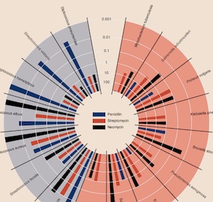
Earlier this year, Mike Bostock and Jeffrey Heer at Stanford released Protovis, a visualization toolkit focused on the use of "marks" to build up graphical charts and visualizations from raw Javascript function chains. The library is currently implemented using SVG, but when they first launched everything rendered smartly to HTML canvas. The language Mike and Jeff developed to express these marks is succinct, and beautifully flips the logic of normal charting on its head: instead of decided on (say) a pie chart at the outset and filling in the constituent wedges, you build up a complete chart from patterns of basic geometry and data. You might end up with a pie chart in the end, but you might also end up with something much more subtle and expressive, like this reinterpretation of Burtin's antibiotics chart. I dare you to try this with Google Chart API.
Finally, as we work on increasing amounts of public, government, and civic work, we're mindful of the relative opacity of Adobe's various transmission formats, as noted by Sunlight Labs in Adobe Is Bad For Government. They're talking about PDF files in particular, but I liked this excerpt from an Adobe open government white paper: "Since the advent of the web, an entire infrastructure has evolved to enable public access to information. Such technologies include HTML, Adobe PDF, and Adobe Flash technology." Not wrong, necessarily, but then again Froot Loops is also part of a balanced breakfast so there you go.
Anyway, interesting times.
Usually when I experiment with a new technology like this one, it's nice to revisit an old problem or two, to see if some new light can be shed on it with a new tool. Coincidentally, while John Resig was releasing Processing.js in May 2008, I was busy working on some ideas for flea market mapping. I had recently found GDAL, a toolkit for manipulating digital raster maps, and rubbersheeted a collection of old Oakland road and real estate maps to match the one true cartographic projection. The annoying bit in the middle of this process is a three-way dance between a graphics program, a web browser, and a text editor for the collection of ground control points used to warp the image:
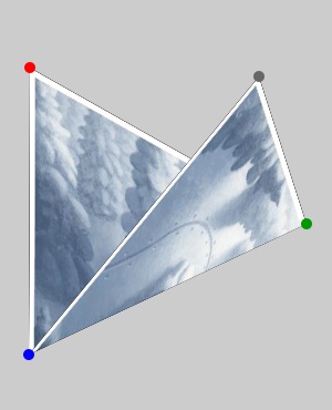
One of the simple things that canvas can do really well is transform and clip bitmaps, so it's possible to take an image file, turn it into a set of triangles, twist and bend them, and rapidly render the result. Cassidy Curtis clued me in to the linear math behind these operations many years ago, it really does just turn out to be a bunch of arithmetic.
This will be important later.
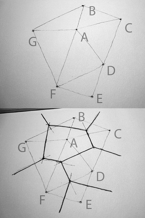
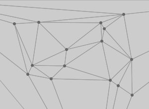
A thing about triangles is that there are some good algorithms for taking a bag of points and making sets of triangles out of them. Delaunay triangulation in particular is a simple, aesthetically pleasing mesh useful for dividing up a space defined by known points. Fred Scharmen has been writing about manual performance of graphics algorithms, and he has an excellent recent post on drawing the Delaunay triangulation and the Voronoi diagram.
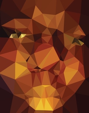
Amsterdam designer Jonathan Puckey has been exploring a similar vein with his triangulated portraits, though sticking to the computer all the same.
The algorithm is quite simple, trivially easy to implement in Javascript. Look, here's mine:
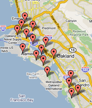
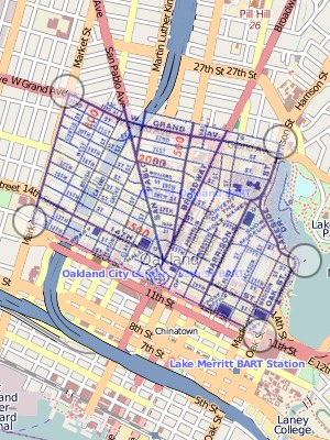
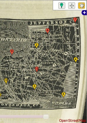
Put these things together, and you get a way to perform image deformation and rubbersheeting in the browser without the use of Flash. I wrote a demo that shows a few pieces in action. First, it uses the Javascript port of Modest Maps, and introduces a map provider based on Zoomify for the manipulation of potentially very large tiled images. Second, it overlays each interactive map with a canvas element. One is used to display the triangulated mesh of control points, the other shows a preview of the image deformed to match the underlying geography. You can see here how five points nicely handle the area around downtown Oakland:
Both maps can be panned around, and zoomed with the mousewheel. Move the circular control points around on each side to see how they change the visual display. I've tested this with Firefox and Safari on a Mac, and the resulting interaction is just a little bit snappier in the latter. There's a distracting visual flickr in both, which I'm sure could be dealt with by double-buffering the canvas or some similar optimization.
There are a few things here I really like about the canvas interface. It seems to use a stack model for the drawing state (with save() and restore() instead of the more traditional, cryptic push() and pop()) to save things like clipping paths and coordinate transformations. This makes it possible to load the image pyramid tiles into the warped view asynchronously, throwing a transformation and clipping triangle into an array with a bunch of closures and callbacks to blit out pixels when images are loaded. It's not particularly encapsulated or object-oriented, but it does keep the pixel manipulation model working consistently. Something that canvas definitively lacks compared to an environment like Flash is any concept of object identity - once you draw out a shape, it's promptly forgotten and unavailable for things like mouse hit tests. This is what SVG is for I gather, and I hear that the original Processing environment has some of the same limitations.
One thing I've also found is that the current implementations of this technology are complete CPU hogs, as measured by the readiness of my Macbook to kick its cooling fan into high gear - canvas-only interfaces like Ask Ken devour cycles.
I certainly believe it's a possible improvement over the interaction model of the current state-of-the-art in online map warping, Schuyler Erle and Tim Waters's New York Public Library Map Rectifier. God bless those guys but the modal interface with server round-trip for retrieving a preview can get a bit clumsy.
I'm fervently hoping that an approach like this triangulated mesh can bump the interactiveness and usability of the NYPL map project, whose output could be so incredibly useful to an old map collection.
More broadly, I'm finding that the plugin-free development route might be a good one to pursue for real, mature interactive work. The rendering engines behind Safari and Firefox and becoming ubiquitous on desktop and mobile devices, and if you're willing to ignore the increasingly-irrelevant Internet Explorer and the occasional cooling fan overdrive you should be golden. Tom uses an informal measurement of the number of animated objects an environment can simultaneously throw at a screen, and canvas is definitively catching up to Flash quickly, while retaining the critical benefit of a fast, seamless start, something that Java has always lacked.
subscribe to ![]() this site.
|
contact Michal Migurski
this site.
|
contact Michal Migurski